For the last few weeks you guys have been requesting a House Crashing post with photos of the other six Homearama homes in the show, so we slipped through and snapped a bunch of pictures of each house, just like we did for this Homearama House Crash from 2012 (that’s your warning that this post is extremely image-heavy). Everyone who has attended the show so far seems to have different favorites, which is definitely part of the fun (there’s a “people’s choice” award that everyone who passes through can vote for, and each of the seven boxes have a ton of papers in them).
All of the houses in the show sit on a cul-de-sac and are numbered, so we’ll do the most logical thing and start with House #1, which was built and designed by LeGault Homes.
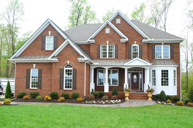
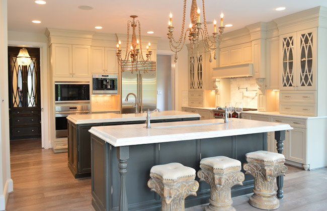
Perhaps the most luxuriously decorated home of the show, it has some of the coolest cabinetry we’ve seen in a while. Their kitchen included double islands – one with a standard sink, and one with a prep sink that could be used for housing ice/drinks at a party. Note the coordinating dark, mirrored cabinets through the doorway into the mudroom.
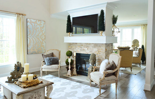
The living room also had a double-sided fireplace with a seating area behind it.
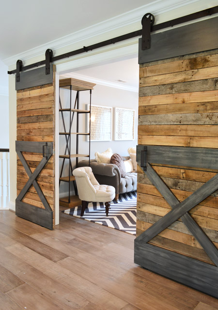
Upstairs there were sliding barn doors that fooled me into thinking they had lots of metal trim (only when I touched them did I realize that gray “steel” is just painted wood).
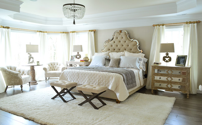
Here’s the main bedroom, which had awesome light streaming in – along with a lot of upscale, light colored furnishings.
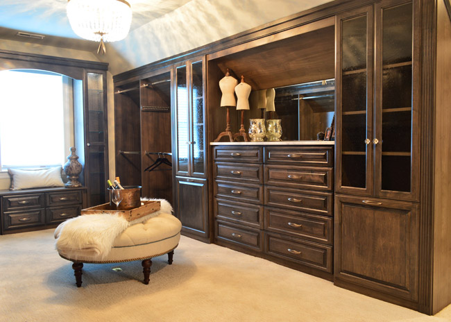
One frequent trend that we saw in other houses was a closet that was accessed by walking through the main bathroom – and this home boasted one of the most upgraded ones we’ve seen. In addition to being spacious and full of nice cabinetry, it even had its own drink station / coffee bar complete with a mini fridge.
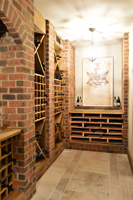
Speaking of beverages, this is the only home in the show with a basement – and they used some of that space to create a wine cellar. The stacked shelving on the far end is made from pallets and provides even more bottle storage.
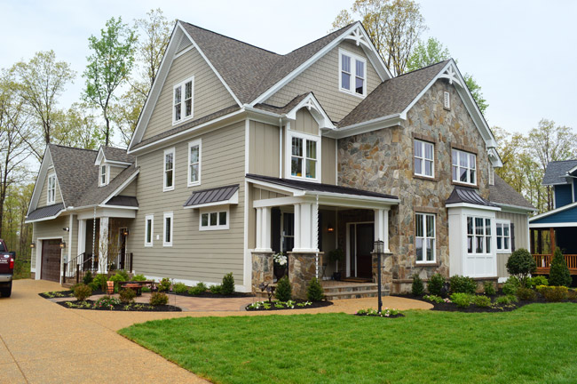
Now let’s skip over House #2 (that’s ours) and go straight to #3, which is built by Southern Traditions and designed by Elaine Reeder. They’ve got a really pretty stone accented exterior (with some tin awnings along with a few white rain chains) that we’ve been admiring from afar for a while, so it was nice to finally get to peek inside.
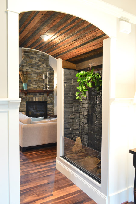
This house has a lot of interesting mixes of materials, like in this little passage between the foyer and the living room that combines a rustic wood ceiling with a stone wall water feature.
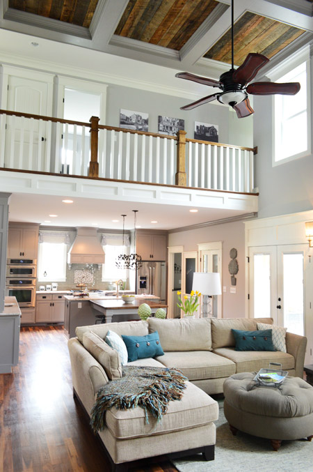
The main area of the home is nice and open, with a two story living room that carries the rustic wood look into the coffered ceiling above.
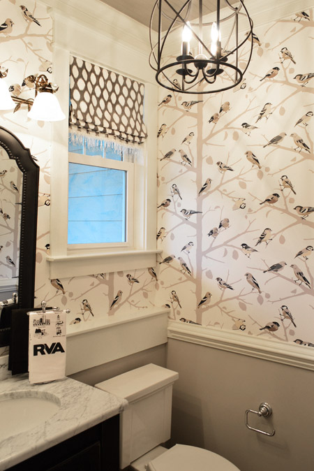
They also went bold in the half bathroom downstairs with this graphic bird wallpaper over the wainscoting. There’s even a little local touch with the Richmond RVA hand towel.
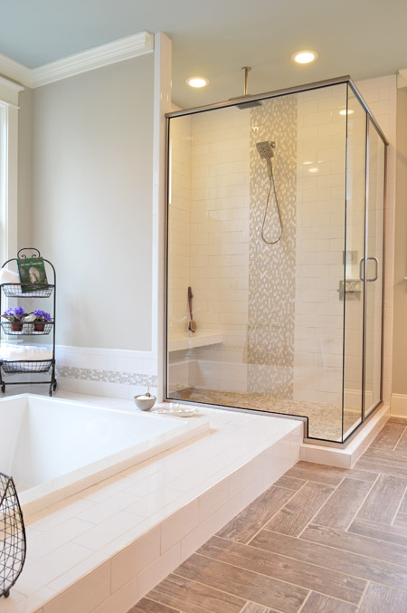
And the en-suite bathroom included something we’d never seen before: a sunken tub.
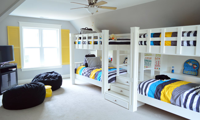
Upstairs they turned the playroom into a sleepover room with two pairs of built-in bunkbeds. The builder’s carpenter built them from scratch (including the hidden drawers in the steps) and they certainly got our wheels turning more than your ordinary bonus room does.
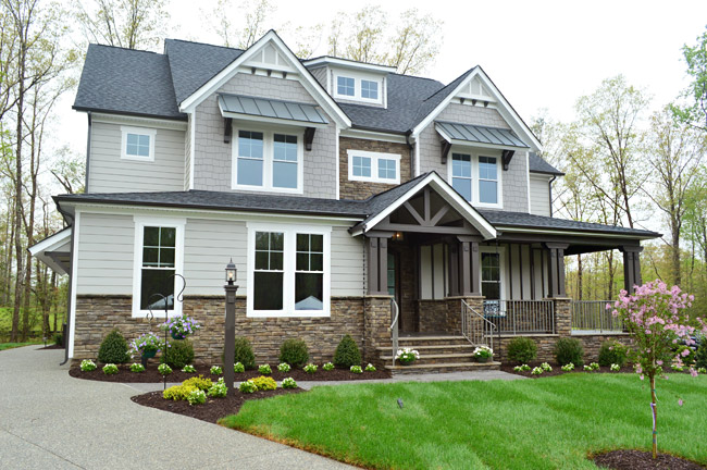
House #4 is built and designed by Ray A. Williams Custom Homes, and it brought some nice dark exterior trim to the show (which is something we’ve admired on a few homes in our own neighborhood).
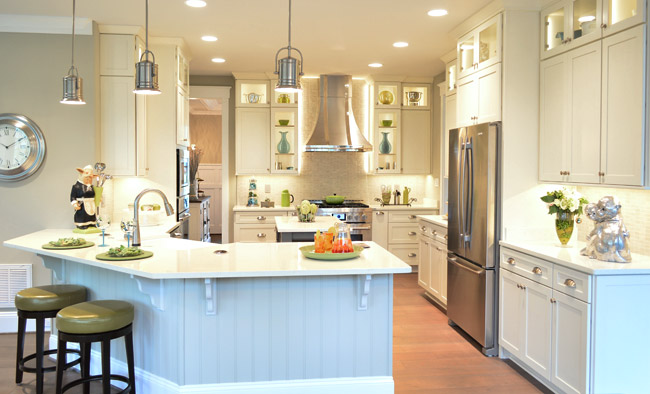
Their kitchen was one of those where you flip the lights on and it’s like the clouds part for a moment and you hear a chorus of angels singing. And of course Sherry was loving the silver monkeys on the far right.
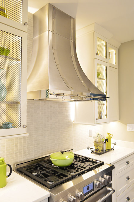
There were also great details like the metal straps on the hood and the mesh on some of the glass cabinet doors.
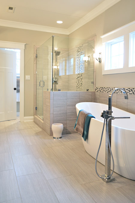
This home probably had the most modern bathroom of them all, complete with small mosaic accent tile and sleek glass shower doors.
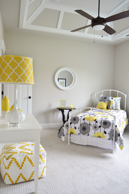
One of the architectural themes of this house were the decorative ceilings throughout, like this paneled one in one of the bedrooms.
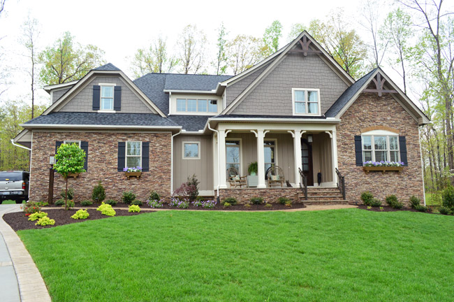
Next door is House #5, which is built by Harring Construction and designed by Diana Ragsdale. She decorated one of our favorites from last year – and we love the look she pulled off this year too.
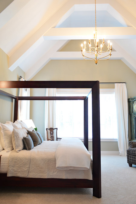
One of the highlights was the main bedroom, which had this awesome vaulted ceiling and stunning gold chandelier.
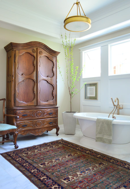
The gold details continued into the en-suite bath fixtures as well. How awesome is a bathroom that can fit such a giant wooden wardrobe?
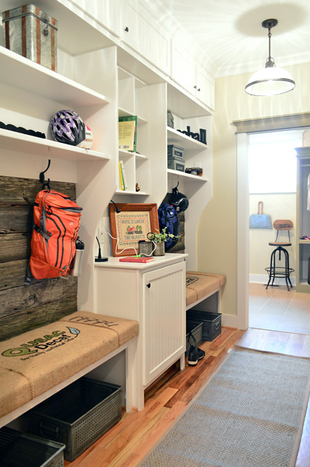
The mudroom had great built-ins too, with a nice rustic touch by using old grain sacks as the bench fabric and reclaimed wood across the back.
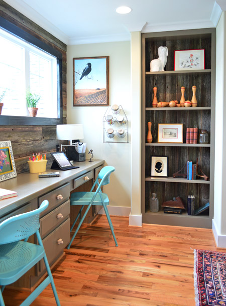
That reclaimed wood, which was found at Diana’s friend’s North Carolina barn, continued upstairs where it accented the back wall of a desk area that was carved out of an otherwise empty hallway space (as well as on the back of that built-in bookcase).
Speaking of bookshelves, in the nearby boys room there’s one that acts as a secret doorway…
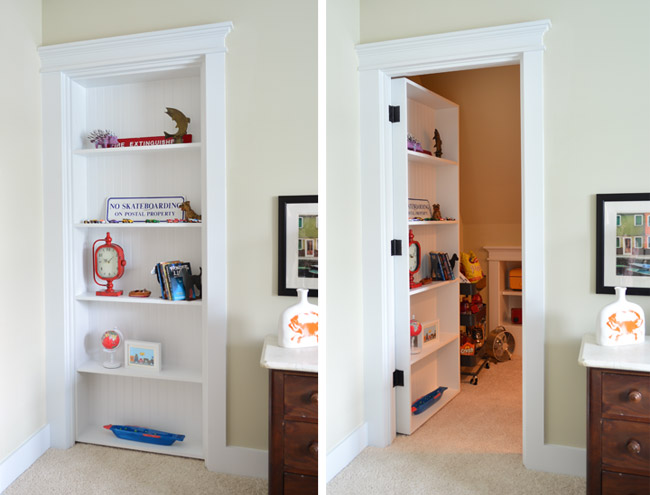
… which leads to a tucked away TV/video game room. My 16-year-old self would’ve flipped for something like this. Although I probably would’ve just practiced my marching band music in there. #nerd
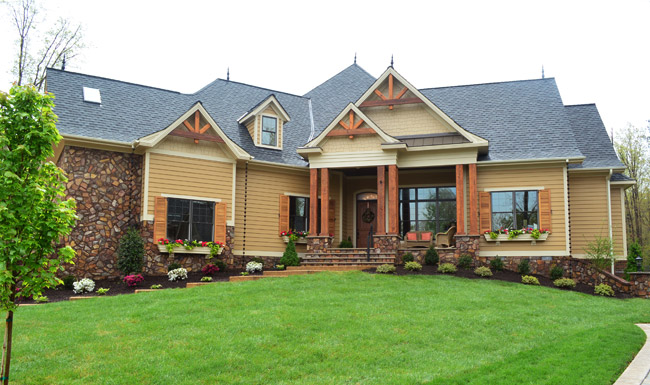
Next door is House #6, which was built by Falcone Custom Homes and designed by Catherine Stanley. It’s one of the largest in the show and it boasts some of the grandest features (it’s known as “the one with the pool” to almost everyone who worked on Homearama).
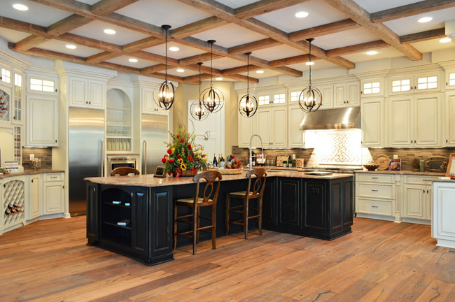
The kitchen sports a separate fridge and freezer and a 100-bottle wine rack, not to mention a pretty expansive ceiling beam detail.
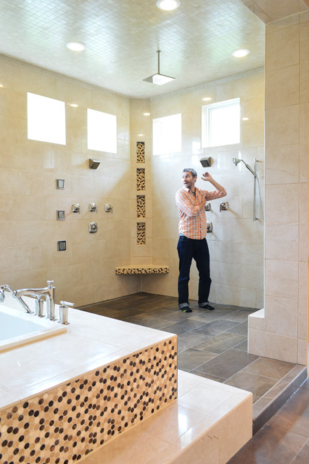
And the en-suite bathroom is unlike anything we’ve ever seen. The bath/shower area alone is 600 square feet and has an infinity tub, rain showerhead, and body spray jets all around. I had to snap one of my infamous “John for scale” shots just to illustrate how big it really was.
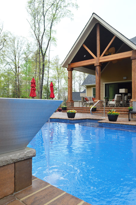
And here’s the pool, which we shared briefly during construction. The outdoor area has lots of other fun features like this combo water/fire feature in the foreground (I couldn’t figure out how to turn the fire on, so you’ll have to use your imagination).
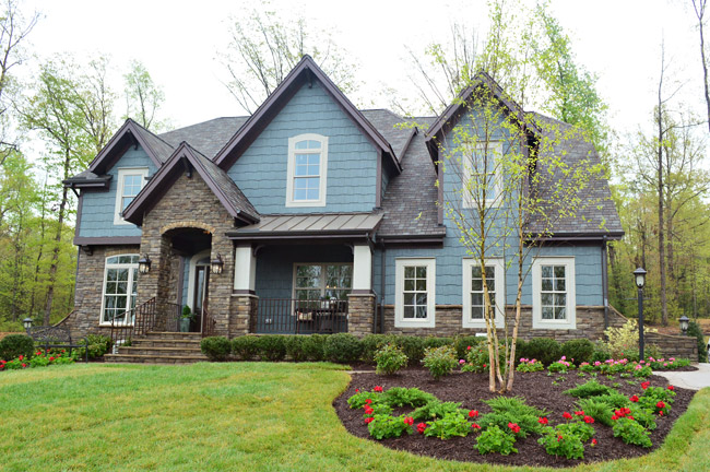
Rounding out the cul-de-sac is House #7, built by LifeStyle Builders and designed by Priscilla George. We spotted a few similar choices between this one and ours – like both choosing a blue exterior paint color – even though ours was deeper and theirs was lighter and mixed with more stone and dark trim along the roofline.
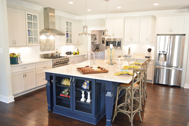
This home also sports a navy kitchen island, but the leg details and glass fronted end cabinet add a nice twist. They also went for some accent tile over the stove and a stainless range hood with chrome lights over the island.
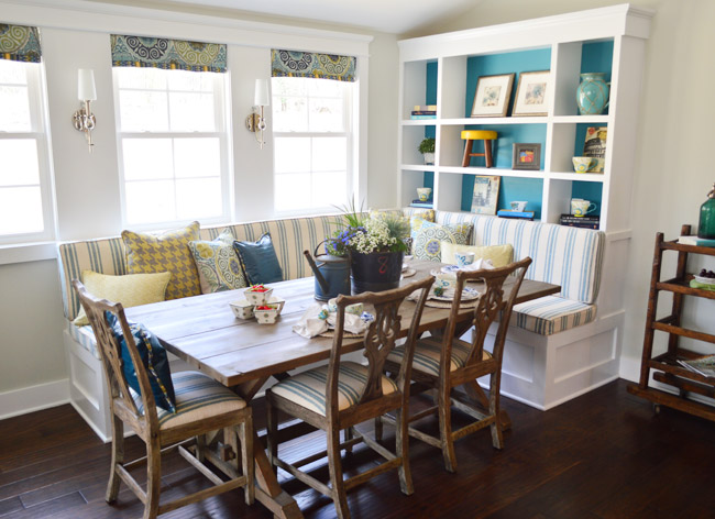
And they also did a built-in banquette, although it was L-shaped and had chairs on the other two sides. We especially loved the cheerful teal backs of the bookshelves.
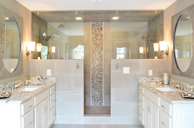
In the en-suite bathroom, they also had a dual shower area – but they created two distinct zones (one side featured a tradition and rain-shower head, while the other had a bench and handheld shower).
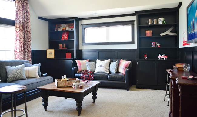
Upstairs they went bold in a bonus room by going all black with the trim and built-ins, which would make for some cozy TV watching for sure.
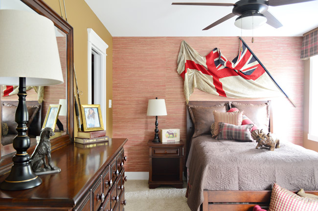
And each of the bedrooms had an interesting theme/style. I was especially drawn to this one with the cool old flag against the grasscloth wallpaper. I think I may be developing a thing for flags, much like my existing map and bike tendencies…
So 30+ pictures later, I’ll wrap this up. There’s plenty more to see in person if you can make it out, but at least you’ve hopefully gotten a flavor for the other homes. And while I’m sure there are plenty of source questions out there (“what’s this paint color?” “where’d that furniture come from?”) we sadly don’t know a lot off the top of our heads and most of the Homearama crew is occupied this weekend with the show itself. So feel free to ask away, but please be patient if the answers don’t come right away (we’re hoping Justin drops in with info within a few days for you).
Psst – Wanna see more showhouse info & photos? Click here for Our Full Showhouse Tour, which includes final pictures of every room, the floor plan, budget info, a video walk-through, and shoppable showhouse furniture & accessories.

Lynne says
Habitat is such a great organization, it’s awesome you’re doing this for them!
I think my favorite feature is the living room in house #2 w/ the balcony overlooking it. My parents’ house has a modified version of this, and it’s great for talking to someone upstairs w/o having to run all around the house.
Also totally envious of the mudroom in house #5. My front hall is long, narrow, and lacking a closet.
I have to say, your house still is the winner in my book. It seems so functional and liveable. Some of these are too over the top for my tastes. A 600sf bathroom? Why does anyone need a shower that big? The wash stall at my barn is no bigger – if it weren’t for the stairs I could bring my horse in there for a bath!
Steve Odyell says
I operate a Christmas light installation company (unfortunately not in the RVA area) and all of these houses have amazing halls to deck! It’d definitely be a block full of Christmas cheer!
Nina D says
Hey, the pillows on the sofa in House #3? I have those! How cool am I?!? ;-)
Thanks for posting all these cool pix – – that was a lot of fun. (I like House #2 best….)
Courtney says
Meh…..yours is the best by far!
Erin says
So totally unrelated, but I spotted your book on the Anthro site! Wasn’t sure if you’d seen it, but I thought the bookends they were advertising looked very “you!”
http://www.anthropologie.com/anthro/product/home-office/27210285.jsp?cm_sp=Grid-_-27210285-_-Regular_40#/
YoungHouseLove says
Isn’t that crazy?!
xo
s
Bridget says
I would like to have a slumber party in each of those homes!!! They are all great, including yours!
Linda says
Toured Homerama today. The YHL house is definitely my favorite. Just felt liveable and comfy. And I loved the punches of color throughout the house. Some of the others, while quite beautiful and elegant, felt a little cold to me. Loved the built-ins in the children’s bedrooms of your house. Your purple rooster added a fun, quirky element to the girl’s room! You should post pics of the boy’s room. Absolutely adorable. I also liked #5. It felt homey and cozy too with the beautiful antiques, vintage pieces and rugs. These two houses are decorated in a manner that I can relate to! The only negative is the distance from the Richmond area. Being a native Richmonder (and resident of Bon Air), it felt a long ways from Richmond! But a lovely subdivision. You two did a fantastic job. You should be very happy with the results of your hard work!
Laura says
So sorry to be one of these ppl, and it’s totally cool if you can’t respond, but if someone knows where the bird wallpaper is from I would hug you!
YoungHouseLove says
Justin stopped by and said it’s by Sarah Richardson :)
xo
s
Linda says
The bird wallpaper is by Shumacher, I believe the name is “A-twitter”. Sarah Richardson used it in one of her homes. I tracked it down and it is in my powder room. You can also get it with colors, which is what I have. Love it!!
YoungHouseLove says
Thanks so much Linda!
xo
s
Justin says
The bed is from Greenfront Furniture in FarmVille, VA. You can speak to Cindy there and she can help you out!
Michelle @ A Healthy Mrs says
They are all so beautiful!
Marie says
I might be slightly biased but I also have impeccable taste (if I do say so myself)…..and you guys blew the “competition” outa the water. Grand-friggin’-slam. I know you guys are trying to be modest, (but I’m nosey) so when you say you donated your design fee what does that mean? Like if we lived in China and I was the Chinese IRS how many yuan would you have donated if you had to put a number on it? Did the other designers get paid to design the houses?
YoungHouseLove says
Every decorator/designer was paid the same amount for this year-long project, so we feel strange revealing the fee since it’s not just ours that we’d be revealing. But it’s safe to assume that Habitat will make a nice chunk of change between the donation from the builder, a percentage of event/ticket sales from Homearama, and our fee :)
xo
s
Tail between legs says
Re-reading my comment, I realize it was rude to ask. Sorry :( you guys are awesome, humble, generous people and that’s the only thing that matters
YoungHouseLove says
No worries at all :)
xo
s
Erin says
Headed out to Homearama tomorrow! Looking forward to seeing it all in person.
Julie says
I gotta say, I love yours the best. But I am not surprised. The only way to make it better is to steal the pool. :)Great job!
Claire says
I planned my Homearama recap for today too before I even saw your post! Your house was my favorite but I left so late on Saturday that they had already shut down the voting station. Slip in a vote with my name on it!
Meagan says
Wow! Amazing!
I would LOVE to know where the canopy bed is from in house #5 when you guys get the information!! Please shoot me an email. Thank you!!
YoungHouseLove says
Hope Justin stops by with that info for ya!
xo
s
Rachael says
I think this is such an interesting experiment. It’s brilliant the way the houses are aspiring to a whole host of income brackets. Personally, as much as I LOVE yours, #2 is my favourite. It’s the ceilings.
#1 makes me feel a little sad. I really hope there comes a day when American interior design stops doing terrible interpretations of Euorpean id. Because, when you have an entire industry that gets things so right so many times, that’s one thing they always get so wrong.
Rachael says
#3! I misread that #2 was yours!! :D
justME says
As my union is facing a contentious negotiation to protect our jobs and we are dragged through the mud because we “make too much money” I look at my kitchen with the peeling laminate flooring and sagging cabinets and wonder what I am doing wrong. How nice that people can afford such opulence and never have their livelihoods questioned in the press.
Rachael says
Have you seriously never seen a sunken bath by the way?!!
YoungHouseLove says
Neither of us have seen one in person. We’ve seen Scarface ;)
xo
s
April says
All these houses are amazing and beautiful with the detail. I still gravitate towards your color and design. I feel your personality shines a lot more and seems more “lived in” than some of the others, less cold. Thanks for sharing the other homes.
Shaunacey says
well, I officially want a bigger house, with a new kitchen, scratch that a new EVERYthing AND a wine room.
My husband is going to be unimpressed!
Amy says
I’d love to know where the light fixture came from in the powder room with the bird wallpaper. I have that paper (in the colored version) to use in our powder room and love the light with it.
All these houses were gorgeous and have such great ideas!
Fiona @ Jackadaw says
Wow. I’ve really enjoyed the journey you have let us come on with you in designing your project. Thanks for giving us a peek at the other homes too. I can appreciate how much time and effort has gone into all of them, and there are some details in each that I like, but yours is certainly more my style than any of the others by a long way. I couldn’t imagine living in any of the others either as they are currently styled or even if they were styled more to my taste. Yours, I could move in tomorrow and be happy there forever! It just feels fresher, younger, more approachable and comfortable. Only wish I could visit in person to soak in more. Can’t wait for the outdoor pics.
Emily says
I went today- it was so much fun!! They all looked fabulous and a lot of work obviously went into all of them…. but your house was incredible! I appreciate all of the details and I got so any good ideas from all the homes. You did a wonderful job!!
Magally says
Richmond has some beautiful homes! So wish i could come up there to see them myself. However, I wonder if the designers were given different budgets? Why are some of the homes much fancier than others?
YoungHouseLove says
The budgets (and house sizes) were set by each builder individually (some homes are being sold for $250,000+ more than others) and many of these homes have decorators who own furniture stores (Diana has an awesome local store called Izzie’s) or the builders themselves have purchased all of this furniture to furnish other models so they got to reuse it in this show (for example, almost all of House #1?s furniture was in another showhouse we saw a while back, so once that ended they stored it and then brought it over here).
xo
s
robyns says
house #1, I am curious….are the toilet seats button tufted too? seems to be a design thread thru out the ENTIRE house.
YoungHouseLove says
Nope, they’re just white and sparkly clean :)
xo
s
Jennifer says
It’s cuh-razy how big these houses are. I mean, a 600 square foot bathroom? That’s almost half the size of my entire (nicely sized to me) house, and literally the size of a house I rented for years before buying! I can’t even imagine keeping up with it all, but is sure is fun to look!
Jessica says
Wow… a 600 sq ft shower area!? In grad school, our whole apartment was 450 sqft. With two people. And five bicycles. Haha.
Liz || Shopping My Closet says
Wow! Very beautiful houses!
Liz @ http://www.shoppingmycloset.com
dominique says
As a lot of people have already said, I totally love yours the most! Maybe I’m biased, since read your blog every day :) But I definitely agree that most of these houses are totally over the top. The decor in most of the homes says nothing about the owners except excessiveness. Yours doesn’t feel “McMansion” but instead, inviting and comfortable.
Catherine says
Obviously I am a fan of yours as a blog reader but, really, I think your house is my favourite by far. I love the layout of your house but the decorating you guys did was so real and welcoming and beautiful that it stands out for me. There were some elements in a couple of the other homes that were nice but none of them look as cohesive as your design. Anyway, you guys did a fantastic job and for a good cause!
Marie says
Thank you for doing this! So cool to be able to look in and see all of the houses! I have to say that yours is my favorite by a mile! I did love the kitchens in numbers 5 and 7 though. But, even still, your kitchen was my fav! Congrats on an awesome build, guys!
Emily @ Life on Food says
These house seem so big. I love looks at the different exteriors and landscape too. I need some inspiration for our house.
Bec says
Wow, these are lovely, but who on earth would have the time to clean them?! They’re enormous. Just the bathrooms would take ages.
Jackie says
All the homes are BEAUTIFUL!! I can’t believe the pricing starts at around 250+
I live in Southern New Hampshire. The homes in this area that are priced at $250,000 all need a complete remodel. I really need to make a move to the south. Those beautiful homes would cost 1.2 million in this area. Wow!! What a difference. I loved all the photos…Thanks!
YoungHouseLove says
These actually start in the low 600s – but $250+ would be amazing!
xo
s
Meredith says
Wow, $250K (and up) gives me heart palpitations. I live in IA, and $250K would get you a VERY nice house. There are nice (small) houses available for $90K. I guess this is why cost-of-living is a thing… :)
Jackie says
Starting at $600,000 makes more sense. I misread the $250+….”some builders are selling at 250+ more than others”.
Beautiful homes!
Janelle @ Two Cups of Happy says
I am seriously crushing on all of the soaker tubs and glass showers! Also, that huge bathroom that’s 600 sq ft is the size of my ENTIRE apartment. Haha.
Kristi says
Holy gorgeousness! I love your house so much that we are coming from Detroit next weekend to see the home show! Gahhhhhhhh! So stinking excited! Roadtrip!
YoungHouseLove says
That’s amazing! Hope you have the best time!
xo
s
Carolyn says
I’m actually appalled at the square footage, ostentatious decor, and frivolous living these homes represent. They are very pretty, but Its nauseating to see how money has been spent that could have been used to do MUCH good in the world. Makes me appreciate me plain jane suburban rancher.
Redkimba says
Ditto.
VICKI C says
RE–POT FILLERS–
we bought house with one where there is island next to stove counter and prep sink to empty any pot you might have used w/lots of water…
BUT I don’t use that pot filler–
it seems like it has collected sediment over time since house was built –we bought it 4 or 5 yrs old–because when I tried to run a pot of water using it there was lot of cloudy water…
And there is no way I can think up to remedy that problem except to fill lots of pots of water and just empty them one after another…
IF there was a hose I could connect to the pot filler and run to the prep sink, I could run water through the line easily but don’t think there is such a thing…
Megan Frank says
If I could have one (yours excluded), I would pick house number four. Mostly because I love the outside look and the wrap around porch. I also love the detailed bedroom ceiling. But I love the kitchen and bath of #7 (much like yours).
But really, I’d still choose yours. You had the right about of interesting unique elements, without feeling like it would need an expensive remodel in five years to keep up with the times (like I feel like that reclaimed wood trend won’t last so that one house might become dated really soon).
Also I love the John-scale. These homes are truly huge!
Redkimba says
Ok, I’m not saying this to flatter you or anything but I like the design of your house the best. It’s light, fresh, family friendly and consistent throughout. I suspect there are some things you might have changed. For example, that mantle is huge. So is the kitchen island and the table in the breakfast nook. They’r e all good ideas but bigger isn’t necessarily better. They seem to be out of proportion for practicality. The houses are big so I am assuming that these items were the result of the architecture and you were either surprised or knew they were coming but were powerless to stop them.
On the other hand, the other houses had to deal with the same problems and they didn’t do any better. You were wise to not put the TV over the fireplace. The viewing angle is not practical.
But I love your YHL touches. The furnishings are not rich and let’s face it, the people who buy these houses will be house poor for a long time. But they are colorful, whimsical and the design vision is consistent throughout the house.
Nice job! I likey.
Richmond1 says
Beautiful homes. I can’t pick a favorite because I like little bits from most of them. I see why my builder is blowing off the “little guys” in the other neighborhoods they are working on because they are too busy building these big show houses! Personal experience of many, many in my neighborhood makes it terribly hard for me to in any way recommend one of those first builders up there in that post.
Chase says
I LOVE house 4, but truly, it’s impossible to pick a favorite. I agree with you John – If I had that nook off my bedroom behind a secret bookcase as a kid? Oh my goodness I’d have been so happy.
AmandaC says
Wow, that was FUN to look through. We’re considering putting in wood floors soon and I’m smitten with the light color wood floors in house #1. Any idea what kind of wood or better yet, manufacturer info? Also, do you guys prefer factory finished or site finished hardwoods in a kitchen?
YoungHouseLove says
I believe in most of these homes they finish on site (our builder did that and it looked amazing). As for what type is in House #1, I hope Justin stops by with that info for you!
xo
s
Betty says
Justin says:
May 8, 2014 at 4:14 pm
Those floors are getting rave reviews. Locally, they are from Costen Floors but just in case you are out of town the floors are Johnson Maple Hardwood Floors, English Pub Series and the color is Moonshine.
YoungHouseLove says
Thanks Betty! So hard to keep track of which questions she responded to with six houses in the mix :)
xo
s
Trish says
The houses are very beautiful, but please forgive me that I don’t understand the need for so much opulence in times of so much difficulty. My duplex, that I rent, is 700 Sq.Ft. total. It would almost fit in the bathroom where you did your John for size photo. I just don’t understand the “McMansion” mentality I guess, but each to their own, live and let live. I am perfectly content in my small space, and others are content in their large ones; so I guess that is all that matters in the end.
Anastasia says
I saw in one of your replies to someone you mention this house feels like “you” & I think that is a huge advantage you had over the other houses. They are all beautiful but feel so grand and impersonal. You guys were able to envision your future selves and see function/necessity of a room vs “this looks nice”
You guys have really evolved in your styling a your own personal homes over the years while the other designers and builders are probably more used to focusing on thinking about catering to the masses.
I’m rambling but what I’m trying to say is your house feels move in ready for any family and finds it’s self casual and airy but still visually amazing. Great job!
Leah says
Best. Post. Ever. !!! Thanks for the incredible eye candy, YHL!!!!!!!
Amy says
I still love your exterior the most, after seeing the rest. House #6 is just a distant 2nd. Could you please link yours to this post? Trying to get back to yours has been a bear. Thanks! :)
YoungHouseLove says
Here’s the last post we shared about ours, although we don’t have a thorough tour yet (working on that!): https://www.younghouselove.com/2014/05/the-heart-of-the-show-home/
xo
s
Tia says
Have you noticed a shift towards more formal spaces from the 2012 homes to these? 2012 had inviting, family spaces – great storage ideas (hooks, niches, boxes) with a lot more take-home ideas. These seem to invite a “look dont touch, and don’t curl your feet up onto the couch” kind of living style. Yours is really the only exception – no contest which is probably the favourite home of all. Two kids and Burger did you good!
YoungHouseLove says
That’s a good question! I think there were some informal/kid friendly spaces in a lot of them, but this group of builders/designers did seem to go pretty formal in some spaces like kitchens and foyers and stuff. I bet if you got 7 other decorators and builders together it could swing the other way though, so a lot of it might just be their preference/aesthetic :)
xo
s
Marissa says
They’re all beautiful! But ya’lls (yes i’m from Texas) is still my favorite! It has so much character! The others kind of say “hey i’m very rich!” I love love love the floorplan you came up with, its perfect! Great job Petersiks!
Vicki K says
Thanks for all the great shots. One of our favorite things to do is look at model homes for decorating ideas and to also see what you can get “for the money”.
Can you tell me what price range these homes will be sold in? Interesting to see how comparable it will be to California prices.
YoungHouseLove says
There’s a pretty wide range, from the 600s (our house and a few others) to the 800s-900s (like the one with the pool).
xo
s
Melissa says
Hi. Any idea who makes the lift fixture in the powder room of house 3. The one with the bird wall paper? Thanks.