When we look back at how we updated our previous homes, there are more than a few design decisions we regret – so we’re breaking down five things that we’d go back and do differently if we had a time machine. And ding-dong, the deck is gone! Yup, we ripped that monster off the house, and the yard’s already feeling awesomely open – but checking this item off our to-do list has actually just added more to it (it’s like the plot of ‘If You Give A Mouse A Cookie’). We also check Sherry’s Color of The Year predicting skills, and John explains why he rejects tool brand monogamy.
You can download this episode from Apple Podcasts, Google Play, Stitcher, and TuneIn Radio – or listen to it below! Then use this page to check out any links, notes, or photos we referenced. Note: If you’re reading in a feed reader, you might have to click through to the post to see the player.
What’s New
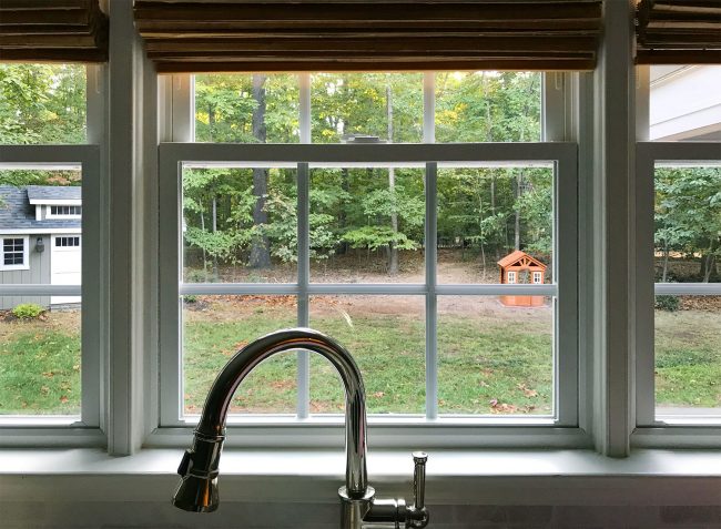
- You can hear more about WHY we wanted to remove our deck, all that info is at the beginning of Episode #51
- Above is the view from the kitchen now that it’s gone (the deck railing blocked all of the grass that’s now visible, which has Sherry leaping for joy)
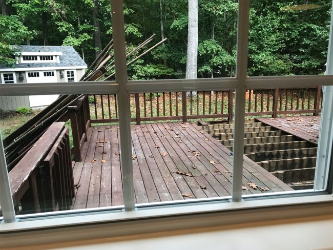
- As we mentioned in the episode, we don’t have a comparable “before” from that angle, but here’s a shot Sherry took during demo from our other kitchen window. You can see how dominating the deck was from this vantage point – sort of like a big cage that was dropped in the middle of our yard.
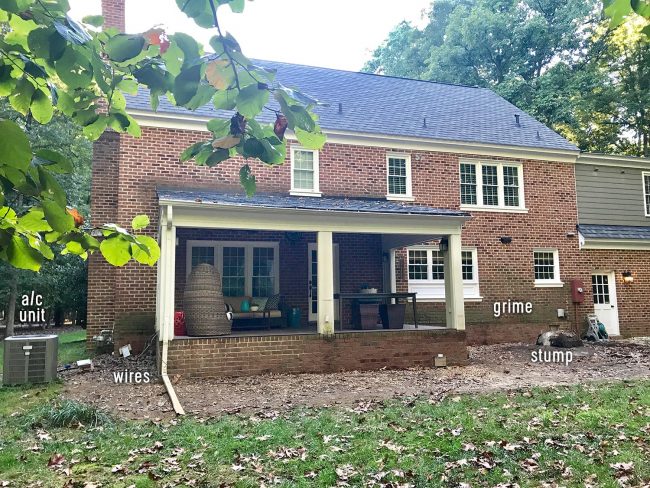
- Here’s how things were looking as soon as the deck was removed. We love how much more original and open the back of the house looks without that big deck tacked on – but I’ve labeled some of our “problem areas” for ya:
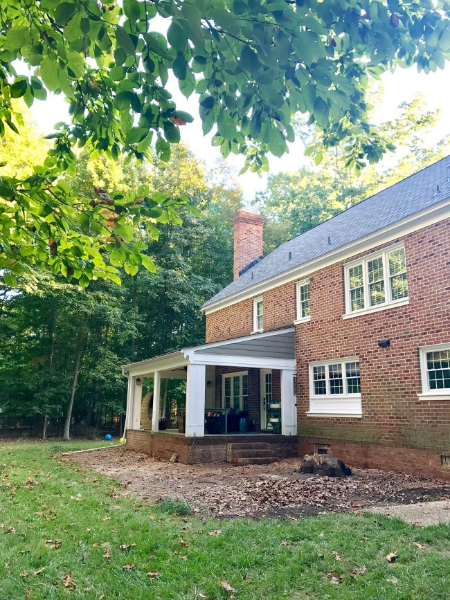
- Here’s a view from the other side, where you can see the massive stump (boo!) but also the original brick steps (yay!)
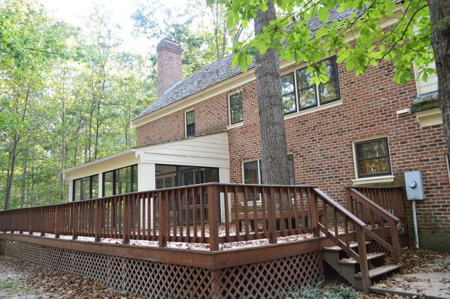
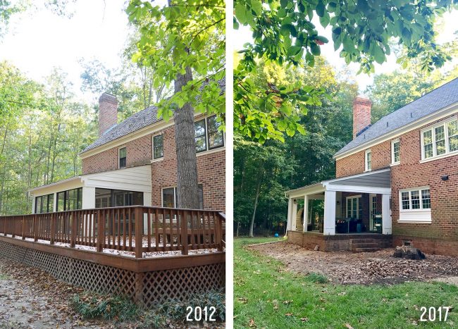
- Here’s a flashback to 2012 before we moved in of the deck, with the tree that belonged to that stump. It was so large and so close to our house that the inspector and our tree guy encouraged us to remove it asap, which we did, leaving that stump under the deck.
- As we mentioned, we’re happy to have checked a few things off our list, like moving the air conditioning unit, having our electrician wrangle all the loose wires, and getting the stump ground. So now it’s looking more like this:
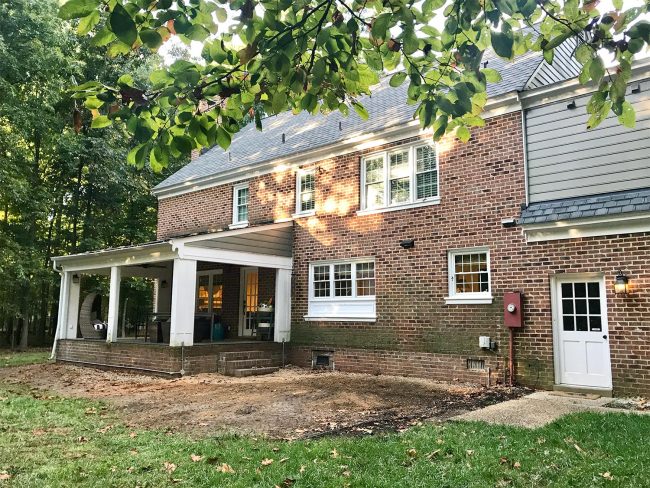
- Still a BIG work in progress (these photos really remind me that I need to powerwash the brick – sheesh!), but we’re encouraged by how open the yard is feeling compared to when we bought the house.
What’s Not
- Here’s where you can read all about Sherwin-Williams’ Color of the Year 2018 (which isn’t too far off from what we just painted our clawfoot tub)
- We’ve talked previously about other Color of the Year announcements, like Behr’s 2018 color in Episode #61 and Benjamin Moore’s 2017 color in Episode #23.
Design Regrets
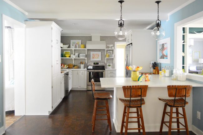
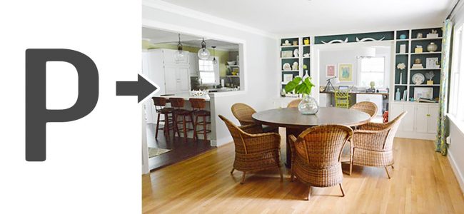
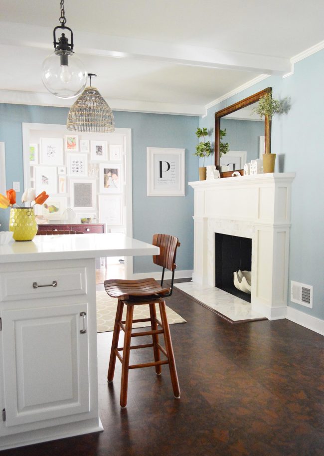
- It was in Episode #62 that we offhandedly mentioned our first regret, the P-shaped opening in our second home’s kitchen/dining (above).
- You can also see some of our other regrets in that photo (like the floor change and one of the two tall towering cabinets that were on both sides of the kitchen instead of grouped together on one wall).
- For the life of me I can’t find this photo in high-res, so this is the best one I could dig up to show why Sherry keeps calling it “p-shaped”
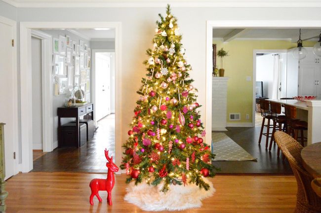
- The photo below – which features one of our favorite Christmas trees we ever did – also shows off some of these issues. Namely the floor changes (hardwoods in the foreground, cork at right in the kitchen, parquet at left in the hall – and again beyond the kitchen in the living room)
- But that shot doesn’t show two other flooring changes that occurred on the back side of the house: there was wide-planked pine in the master bedroom and tile in the sunroom, both of which were off of the parquet living room.
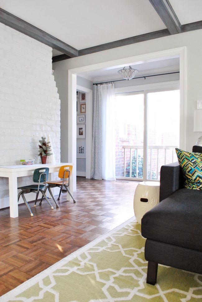
- I show this next picture not because of the floors, but because it shows the back of the fireplace that we think would have been even more awesome if we had doubled-sided it so people could enjoy it from the kitchen or the living room side of the wall.
- We were so happy with where this side of the fireplace (in the kitchen) ended up after we made it over – just imagine this being on the other side too!
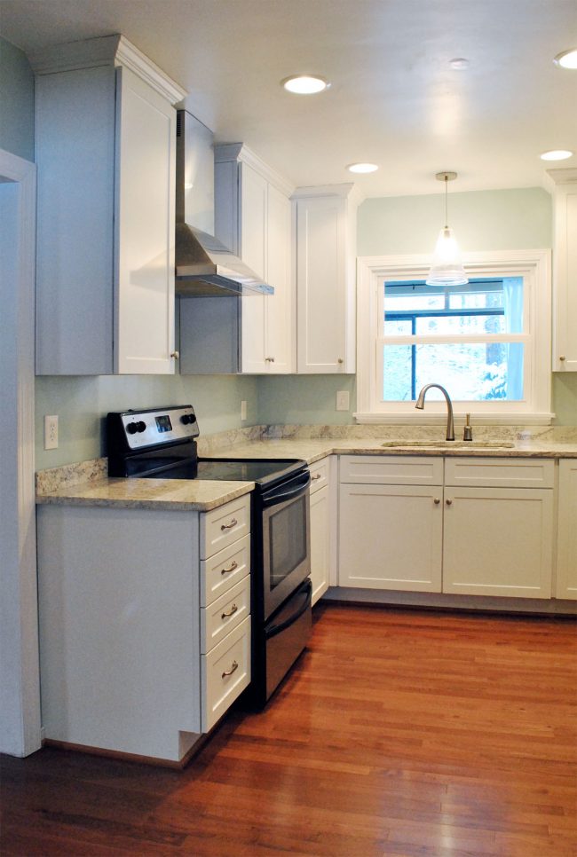
- Below is a shot of the kitchen in our first house (back when blog photo standards were much lower, ha!). This photo is from the day we moved out, hence it being totally empty, but it gives you a good sense of how much it could’ve benefitted from a backsplash.
- And here’s that post we mentioned about adding a backsplash to my aunt’s house (really, a first-time tiler can do this)
- You can also learn more about our experiences with hardwood floors that are laid and then stained/sealed in place (this post is about that process in our current home and this one’s from our first home), as well as how we laid prefinished hardwood upstairs (both the nail down and the glue down type).
- You can also see more of our previous before & afters on our house tour pages: here’s our first home, our second home, and our current home.
We’re Digging
- Here is the $90 Ryobi ONE+ Cordless Hybrid Trimmer/Edger that I bought for use at the beach house (and around our own home). I love that the “hybrid” part means it can plug in if the battery dies.
- And if you wanna give The Good Place a try, you can binge Season 1 on Netflix and catch Season 2 airing currently on NBC (don’t skip Season 1 though! Season 2 won’t make any sense!)
If you’re looking for something we’ve dug in a past episode, but don’t remember which show notes to click into, here’s a master list of everything we’ve been digging from all of our past episodes.
And lastly, a big thank you to Universal Furniture for sponsoring this episode. You can enter to win $10,000 in new dining room furniture at UniversalFurniture.com/YHL now through October 16th.
Thanks for listening, guys!
*This post contains affiliate links*

