If you saw our before & after post about the beach duplex demo, then you know we’ve got some big plans for the duplex’s floor plan. We want to make the most of the given space – and we’re even adding on a smidge more – so it can sleep more people, offer more bathrooms, and generally improve the feeling of being in this cool old house. Before each side had only one full bath (!!!), so we’re hopeful that we have nowhere to go but up. So we’re back today with some floor plans to show you exactly what we intend to do. And the nerd inside of me is extremely excited about it.
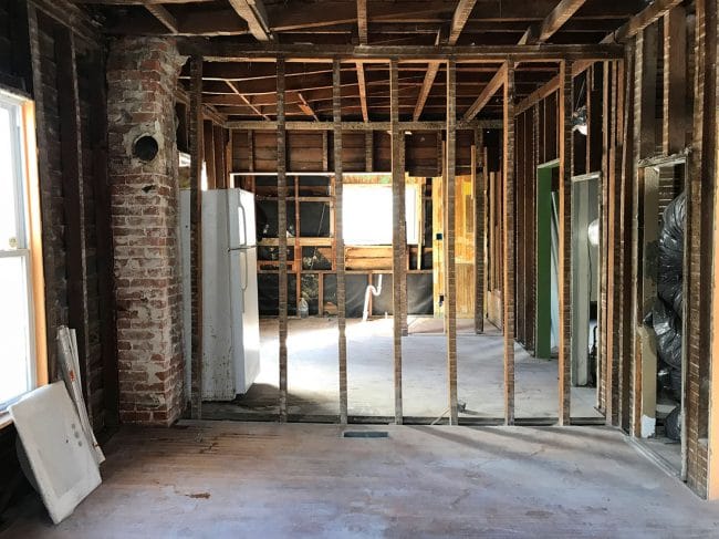
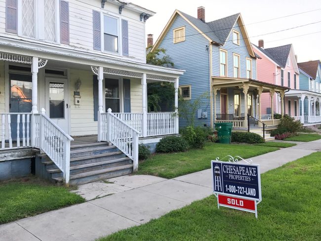
If you’re new around here or aren’t sure what we mean by “the duplex,” you can catch up on everything in detail here. But the short version is that it’s a rundown duplex that we bought last fall to renovate and turn into a weekly vacation rental. It’s just one house away from our pink beach house in Cape Charles, VA, which is located on the Chesapeake Bay of Virginia’s Eastern Shore. So far it has just been gutted and once the weather starts cooperating, we’ll finally get to start rolling on exterior improvements like a new non-leaking roof and some new not-rotten siding.
The Before
The two halves of the duplex are nearly identical, just mirrored along the central wall that separates them. They have separate addresses and we intend to keep them separate so that they can be rented separately (although a larger family might rent both sides to have the whole house for a week). All of the changes we make will be the same on each side, so we’re just going to focus on the LEFT side of the house as you face it from the street. But again, each side will remain a mirror image when it comes to floor plan/layout. As for decorating them, Sherry thinks it’ll be fun to decorate them slightly differently. Think cousins and not identical twins.
But back to the floor plan. First of all, since it’s a common layout question we have been getting a lot on social media: we aren’t doing an interior door to make it optional for someone staying in one side of the duplex to open that door and have access to the other side. This isn’t possible due to code reasons, but the front doors of each side literally couldn’t be closer (and under a covered porch) so if a larger family rents both sides for the week it is basically the shortest walk ever to get from one side to the other:
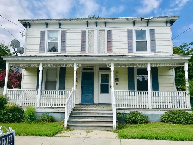
Each side is a little under 1,300 square feet, and when we bought it each side only had two bedrooms and one full bathroom – all on the second floor. We don’t believe that was the original floor plan (it was extremely choppy with doorways and lights in very odd places) so we’re just doing our best to make the house feel more original, intentional, efficient, and less oddly closed off – since we’ll probably never know the original floor plan. Although we do know that the house has always been a duplex as far as we know. There are two lots and two different house numbers as far back as we can go. You can see before photos in this post & walk through it on video to get more of an idea of how oddly things were laid out.
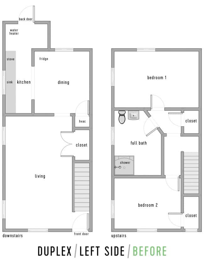
Note: The pencil drawings we’ve been working on with our contractor were too hard to read in photographs, so we’ve recreated them as well as we can using free online software called HomeStyler and then we added our own labels in Photoshop. They are mostly to scale, but some details are approximate.
The After (or at least, The Plan)
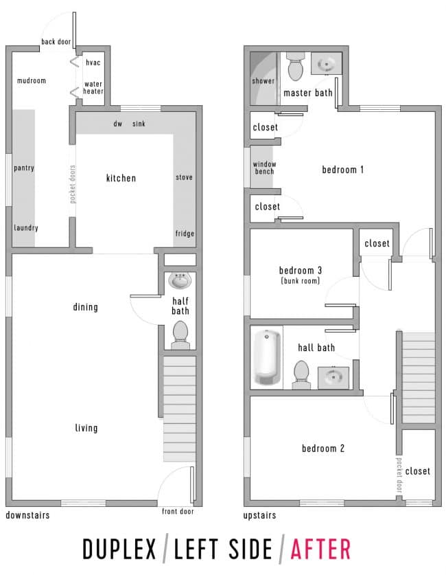
I’ll take you through all of the major changes in a moment using side-by-side floor plans, but here’s an overall look at what we’re planning to do. When we’re done, each side will go from 1 bathroom to 3 (well, two full ones and one powder room), and from 2 bedrooms to 3. And yes, we spontaneously break out in full body sweats when we think about having to tile all six bathrooms and install two kitchens once the walls go back up, so let’s not talk about that right now, mmmkay?
Downstairs Living Areas
I know it’s often easier to understand changes when you can see the before and after floor plans side-by-side, so that’s what we’ve done below. This is just the front half of the downstairs (the before is on the left, and the after is on the right, with numbered labels that I’ll get into in a moment).
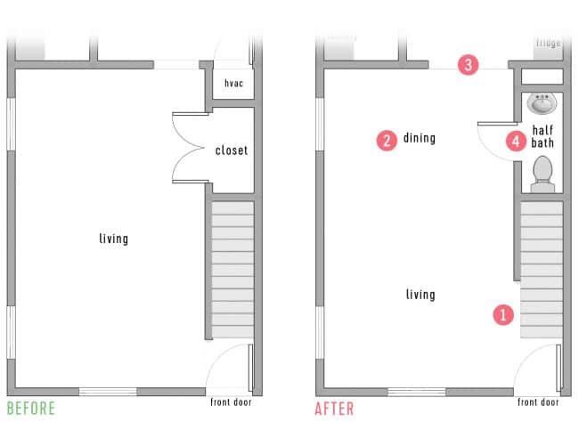
Here’s a quick summary of the big changes in this part of the house:
- We’re opening up the wall that separates the stairs from the living area so that the entry vestibule gets more light and is less claustrophobic.
- The living area is quite large (we’re not sure how the previous occupants used it) so we’re planning to use the back half of it as a casual dining area since it will be right off of the kitchen. Exact furniture plan TBD, but we love Chris & Julia’s open dining room & living room.
- To create better flow and sight lines between the kitchen and the dining area, we’re widening this doorway.
- Since the current downstairs has no bathroom, we’re turning this large closet area under the stairs into a powder room. A few people said they worry about bathroom smells wafting into the dining area but my parents have a beach rental with an extremely similar layout and it works out really well. Anyone doing something smelly wants to go upstairs instead of doing it right off of the living area anyway. Is that TMI? Probably. But the point is that we think it’ll be just fine.
For reference, this is what that space is looking like at the moment.
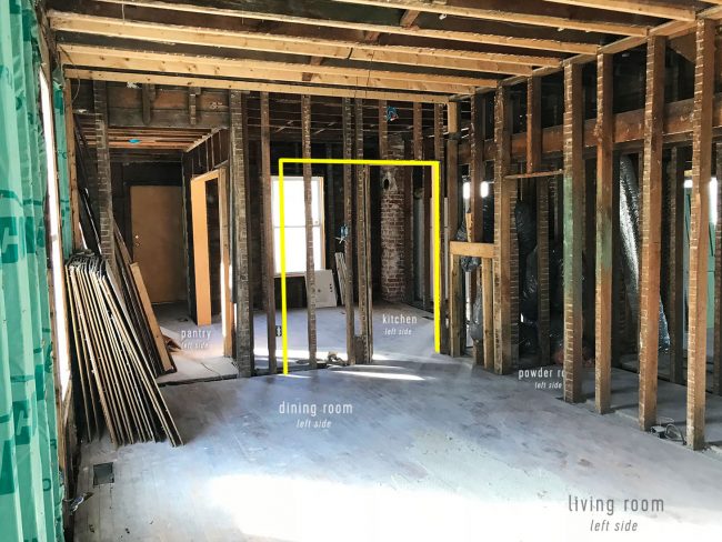
We’re hoping to open up the side of the stairs, which was formerly enclosed all the way down to the first step.
Downstairs Kitchen Areas
The back half of the downstairs was pretty hardworking before, but we’re making it work even harder – incorporating laundry, a larger kitchen, and even a “mudroom” zone for people coming in from the back door. There will also be an outdoor shower by the back door, so people will wash the sand off there, then enter through the mudroom, and toss their towels into the washer or hang them up in the mudroom area. We are hopeful that the combination of an outdoor shower and a tiled room to enter through with laundry/mudroom capabilities will keep a lot of sand out of the rest of the house.
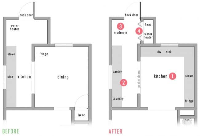
Again, looking at the before and after plan side-by-side, here are the highlights:
- We’re moving the kitchen into the larger former dining space so that we can greatly increase storage, counter space, and even add a dishwasher. Exact layout TBD, and we may incorporate a small (maybe movable) island or baking cart in the center.
- The former kitchen (which wasn’t the original kitchen location, since that area used to be a side porch) will become laundry/pantry space. We think it will be nice to continue the cabinetry in here to visually extend the kitchen, but we’ll be adding pocket doors so that it can be closed off – especially if laundry noise needs to be muffled. Plus, we just love pocket doors in these old homes. They feel original and cool (even if they haven’t always been there, like the ones we added to the back bedroom in the pink house). Note: I know laundry/pantry sounds weird together. It’s basically just going to be a laundry/mudroom with extra cabinetry for various storage needs – sort of like this.
- This back section of each side was fairly unused apart from the water heater and a toilet (just on the right side, kinda sitting out in the open). Since it opens to the backyard, we want to create a space for sandy gear and towels in the form of a small mudroom, just beyond the outdoor shower.
- We’ll also put a utility closet back there that can hide stuff like the HVAC system and a tankless water heater.
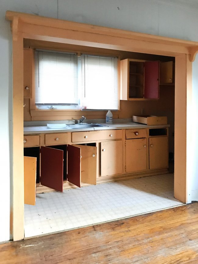
Here’s a view of the old kitchen that was in that former side porch when we bought the house. The future mudroom and utility closet will go just beyond the right side of where these creamsicle-colored cabinets once were.
And since we’ve landed on “mint” as the accent color for this project, we’re thinking the pocket doors that will go in this doorway (which, again, will separate the future kitchen from the future pantry/laundry) might look something like this charming door from Yellow Brick Home’s kitchen… just two of them since the opening will be double wide like the one above.
Upstairs, Front Bedroom, & Hall Bath
Moving upstairs, let’s start at the front of the house:
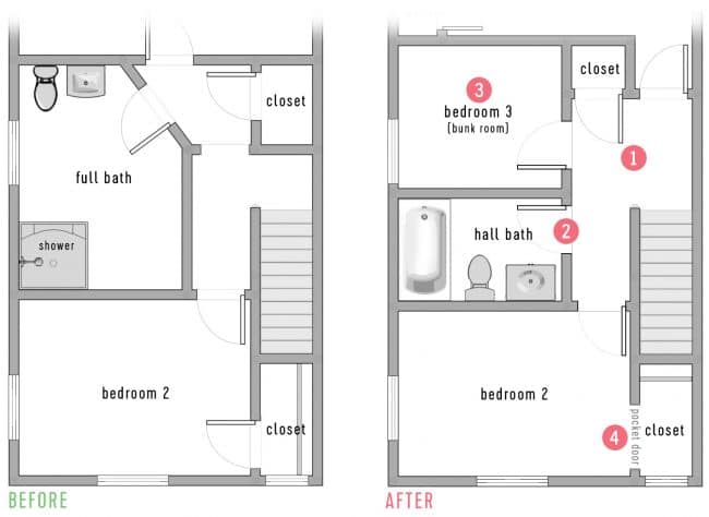
Just like downstairs, the space up here hasn’t really been used to its maximum potential (we believe things were constantly being chopped up/changed/moved just based on some odd light placements, etc). And since maximizing the beds and baths is important for a vacation rental, this is what we’re planning to do:
- The area at the top of the stairs is very cramped and feels cut off, so we’re giving it a more spacious landing without losing the linen closet
- The bathroom up here was unnecessarily large, so we’re basically splitting it in half to make a more modest space that’s still large enough for a tub/shower combo (probably a drop-in tub with a tile shower surround).
- By splitting the bathroom and stealing a little bit of space from the main two bedrooms, we’ll be able to create a third sleeping space (similar to our beach house’s bunk room, but probably a little larger).
- Not much is changing in the front bedroom. It will get a hair smaller and we plan to re-orient the closet. The closet has a beautiful window in it (the one with the diamond grill pattern seen from the front) but the old owner had it boarded over and covered with drywall (!!!) so they could run a closet bar across the opposite wall. To uncover the window and let the light shine in, we’ll move the closet bar to the wall across from the window (where it will be hidden from view in the bedroom thanks to being tucked into that nook) and use a pocket door, which we hope will encourage people to leave it open and let the light shine in.
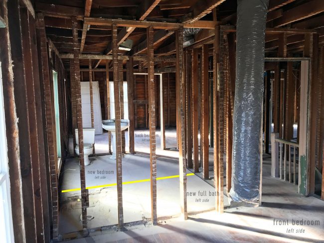
This is what the view from the front bedroom looks like right now, so you can kind of see how the bathroom will be split:
Upstairs, Back Bedroom, & Attached Bath
This is the area of the house where we are actually adding space, which is going to earn us another full bath that is also an ensuite. Woot!
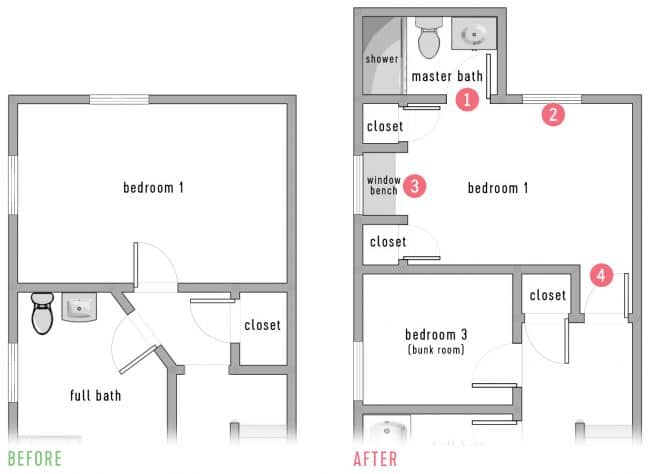
But there is more than just an added bathroom going on back here, so here’s what you should take note of:
- This “bump out” on the back of the house already exists downstairs (remember the mudroom and utility closet?) so we already have approval from the town to continue that footprint upstairs and bump out the second floor to match it. The cheapest way to do an addition is to build on top of something that already has a foundation/footers, so we’re excited to just pop the second floor out. It won’t be a huge bathroom (probably just a walk-in shower) but we always love having our own ensuite bathroom when we travel, so we think it’ll be a big bonus.
- Since we’re losing the existing back window (it will become the bathroom door) we got approval to add a new window so that we don’t reduce natural light in this bedroom.
- This room was already very long, but by stealing some square footage for the bunkroom it got even more elongated. So we landed on the idea of adding two built-in closets (with drywall and proper doors) on either side of the side window. It makes the room shape a bit more natural and gives the room the closet it still needed – plus we think we may use the other one as a locked owner’s closet.
- We used this same trick in the pink house, but by pulling the bedroom door into the hallway a little bit (in this case to line up with the linen closet door) it creates a “vestibule” for the inswing of the door. Since the bed will likely go on that right wall (facing the window bench) this means the door doesn’t open right into the nightstand.
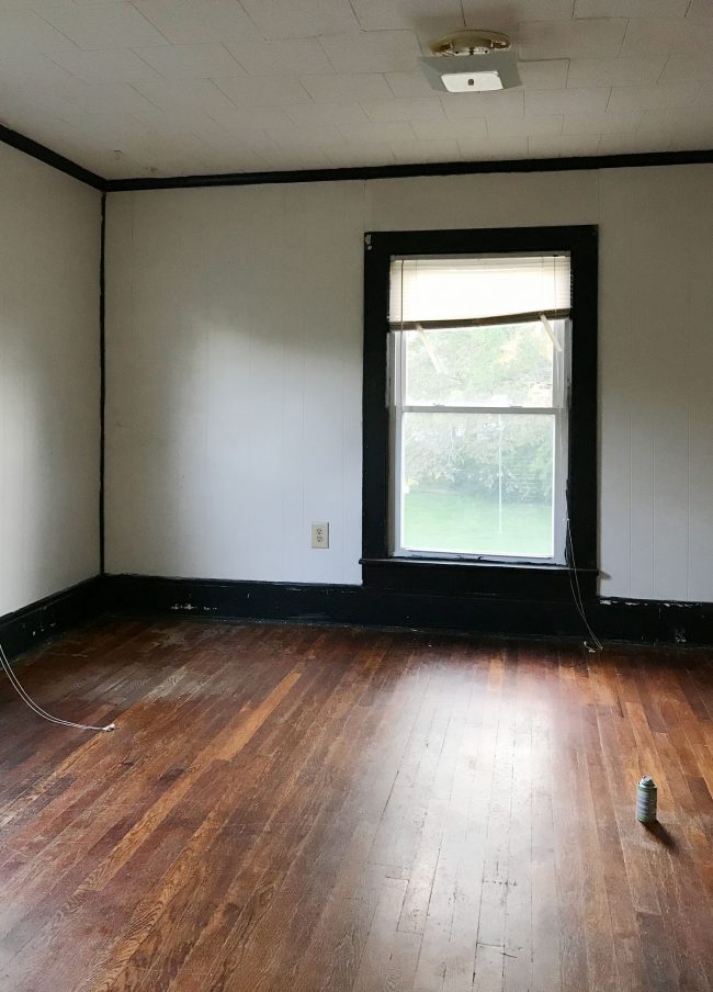
This is what that bedroom originally looked like (that’s the window that’s becoming a bathroom door) so we’re looking forward to making it feel more welcoming.
I’ll leave you guys with one parting look at the full “after” floor plan:

If it’s like the pink house, we know this is not likely to be our last iteration of these plans. We’ve done most of our tweaking already, but some things are dependent on how some construction shakes out. For instance, this plans assumes we can make room for the upstairs HVAC system in the attic. That’s not a certainty yet, so it could throw a wrench in our plans. We’ll keep you posted…

