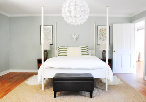
We did a little more bedroom noodling. Noodling, not canoodling. *Blush* Anyway, we last left off after moving our Alaskan prints together over the bed and surprising ourselves by getting a new rug:
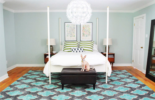
And there were a few commonly asked bedroom questions in the 800+ comments on Monday’s post, which were:
- have you considered getting larger bedside tables?
- can the bed go on another wall?
- will you repaint? maybe in a darker color?
- what are your plans for the nook to the left of the bed?
- what about changing out the pillows/painting the bed & tables/getting a longer bench/switching the lamps, etc?
The short answers to those are: yes but it’s complicated, no, we’re open to it down the road, adding an armoire or a built-in, oh yeah all that stuff is still on the agenda we just haven’t gotten to everything yet.
To elaborate, we’ve definitely considered larger side tables, but the door would swing into anything larger than what we already have on that side, as you can from this old door-open pic (we did a secret book project to the front of this door, so we can’t snap an updated shot).
We don’t want to move the bed to the left since the chandelier wouldn’t be centered above it anymore (we could do a larger table on the left, but we have plans for an armoire or large built-in for the nook to the left of the bed and don’t want to crowd that). We could reverse the door to make it swing into the hall instead of the room, but it might jam up the hall to have a door out there. We couldn’t do a pocket door (we have duct work/electrical in that wall) but have thought about a barn door on a track (which could rest where the leaning mirror lives in the picture above this one), but we’ve considered using that in a spot nearby (more details when we decide if we’ll actually go for it!) so we don’t want that to be too repetitive. We’ll keep you posted no matter what we decide though!
As for if the bed can move, the floor plan of this room is a definite challenge thanks to “things” on each wall (two very off-centered windows, a nook across from the door, and a nook with the sink tucked into it on another wall, and a chandelier in the exact center that looks off if the bed isn’t in the right place). The chandy even lines up with the mirror above the sink, so we don’t want to swag it or move it since aligning things like the bed, the chandy, and the mirror make the room feel balanced/less wonky. So we’ve tried the bed in a bunch of spots, but the place that works best for us is where it lives now (it’s the only long flat wall in our entire room).
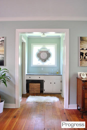
It just doesn’t look centered on the chandelier or the windows in any other spots, and we actually like the placement a lot in person since we wake up to the chandelier being perfectly reflected in the mirror above the sink (it’s so hard to capture in 2-D but it’s the thing everyone falls in love with in person). As for repainting the walls, especially in a darker color, we’re definitely open to it but we’ll be refinishing the floors in a dark mocha color someday and the rug is pretty dark (and the room doesn’t get a ton of light) so we’ll think long and hard before we do anything rash. We’re just getting started, so everything is fair game for tweaks (painting furniture, switching out accessories, etc). Many things like those lamps and the bench are just leftovers from our first house that got plopped down “just-for-now” (Burger uses that bench to get into bed, so it’s our version of Doggie Steps until we get something better – haha).
So now that we’ve hopefully answered those common questions, let’s get to the fun part. Noodling. The first thing we played around with were the pillows and a few other small accessories. The pillows actually inspired a little art switch (since the floral shams were a little busy with the old botanicals that were hanging there).
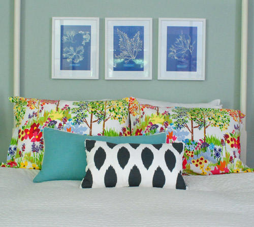
From up close, this mix was fun (the shams are from Pottery Barn two years back, the blue bolster is from Marshall’s, and the front accent pillow is from HomeGoods a few months back). But from far away, the new art was way too small for our tastes. Oops.
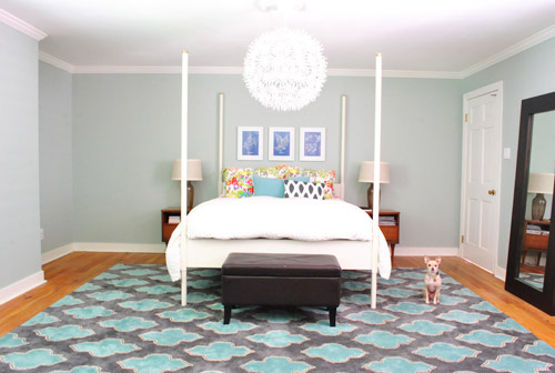
We want the whole room to feel balanced, so with very tall vertical items on all of the other walls like the door to the bedroom, the windows with ceiling-height curtains (which will be switched out, hopefully soon), and the sink nook with a mirror over it…
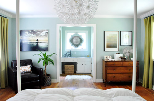
… this art was just too squat and didn’t feel as balanced as the larger Alaskan prints had. But we did like the general concept of adding different colors with pillows – just to break up all the blue on blue action.
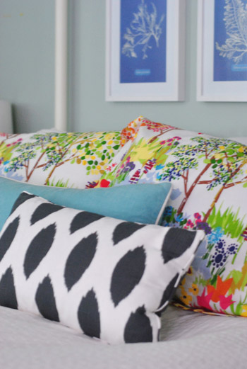
We’re so glad we banged in three tiny nails to give that art a go, even if we didn’t like it once we got ‘er done. It’s all about trial and error (and spackle!) at our house. Haha.
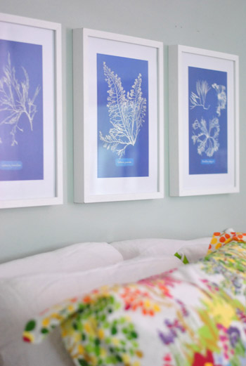
Oh and the prints are from Ikea! We found them for $2.99 for all three (in a clearance bin) and know we’ll eventually find the right spot for them. We already had the frames (also from Ikea, but they hung in our first house), so it was just a $2.99 failed experiment. Haha, so not too bad.
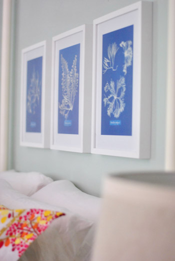
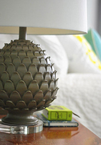
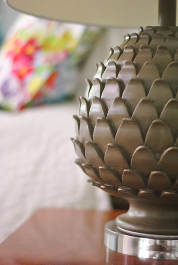
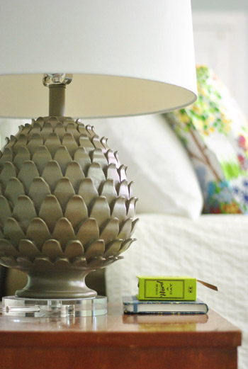
Oh and we also picked up some new lamps! They’re artichoke-ish, which is a totally new shape for us when it comes to lamps (we have like ten gourd lamps, so we were psyched to play around with a new silhouette). They were from HomeGoods ($49 a pop, including the extra large shades).
The original lamps that we had on either side of the bed used to live in our first house’s living room and were over five years old, so we figure we’ll either find another spot in the house for them (we have completely untouched rooms like the playroom and the sunroom to tackle) or yard sale/craigslist ’em if we can’t.

See how much more balanced and substantial the new ones look (with their larger, wider shades and darker bases) in comparison to the old ones above?
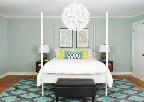
They even seem to make the side tables feel wider, which is nice for balance. And the rounder more textured shape of the new lamps also ties into the chandelier, which is a total happy accident (we definitely didn’t think about that when we fell for them in the store, haha). Oh and ignore the different pillows on the bed in the pic above. We’ll get there in a minute.
It’s nice that the putty color of the lamps isn’t too crazy to compete with the pillows or the rug, but the shape is full of interest and dimension.
Oh and see that book on my side table called One Word A Day? John and Clara got it for me for Mother’s Day along with a pretty pink tulip bouquet and some vases. It’s a one-word journal that John thought I could use to record one hilarious Clara-sentence per day instead of just one word to describe my day (which is how it’s meant to be used). Now we won’t forget the time I said “we might have to rearrange your room again” and she said “Yes! Put some ice cream on it!”
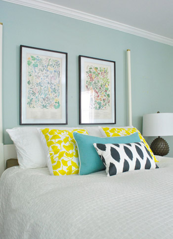
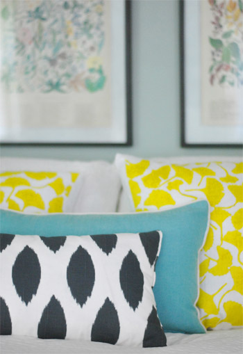
But back to the bedroom. Since the smaller art didn’t work, it was back to our Alaskan botanicals with some different pillows. We landed on this pop of yellow with the teal bolster to tie things into the rug and the deeper navy and white pillow in the front to ground it all. For anyone wondering, those two yellow ginko leaf shams are from a small shop in Northern VA (don’t know the name, but it was in Old Town, Alexandria), but they’re made by Dermond Peterson if that helps.
But you know me, pillows are nomadic in our house, so they might be completely different the next time we share bedroom pics. Yes, pillow swapping is right up there with watching Parks & Rec while eating Oreos around here.
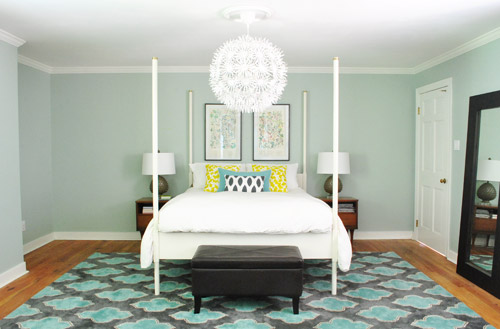
Sure, we still have some major furnishings missing, but it’s fun to see some happy new pillows (with a few warm yellow pops to balance all the blues). And the dark tones in the smallest accent pillow, the botanical frames, and the lamp base relate nicely to the slate/navy tones in the rug without being too matchy.
The lamps just might be our favorite little change (favorite big change = the rug of course).
So that’s where we are. We don’t play poker or bet on horses, so I guess trial and error decorating is how we get our kicks. Haha. Oh yes, we’re daredevils.

We’re still entertaining a ton of possibilities, like:
- switching out the old curtains (for sure!)
- possibly painting the bed in a deep charcoal color
- finding/making a longer bench for the end of the bed
- possibly painting or refinishing the cherry-colored side tables & dresser (on the other side of the room)
- adding an armoire or built-in to that nook next to the bed
- possibly repainting the walls down the road
- painting the ceiling
- possibly removing the posts from the bed (although we like them in the photoshopped renderings below, so maybe not)
- switching out the pillows/bedding as we go
- bringing in a lot more art/furniture in general so it’s not so empty
- staining the beat up & yellowed floor a rich mocha color
- possibly adding a barn door which would allow for larger side tables
- lots of things I’m probably forgetting – haha, but check out this post and this post for mentions of other potential plans
Some might be things we tackle this month while others might not get done for years (like refinishing those floors). But just look how much of a difference that one change can make. Mmm, dark wood floors (thanks Photoshop!) = our happy place.
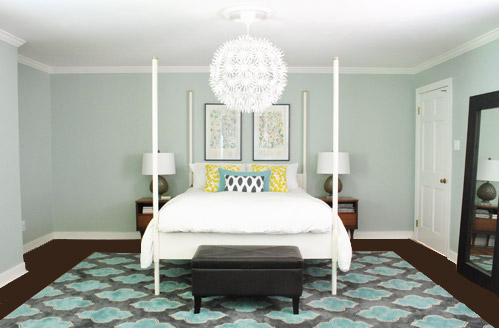
And after a bunch of other tweaks, we’ll just have to see where we end up! Maybe here?
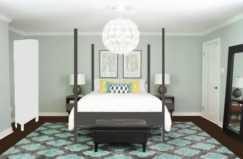
Or here?
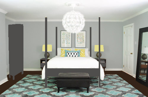
Or here?
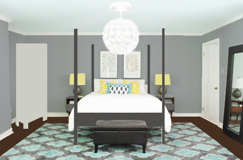
Don’t mind the bad Photoshop. I guess that’s part of the fun, huh? In the meantime, have you ever hung something new only to learn that you loved the first choice better? Have you made any easy lamp or pillow switcheroos in your house lately?

Kristen @ Popcorn on the Stove says
LOVE the new lamps. LOVE THEM! They really fit in well with the geometric print of the rug. I really like the floral pillow shams but I think I prefer the yellow options.
Have you thought about how you would paint Ed the Bed? It looks so much more dramatic in grey (I, for one, am a fan!).
YoungHouseLove says
Oh yes, we’d just sand him a little to rough things up and then prime and paint him and hope for the best! The hardest part would probably be removing our organic mattress (it weighs as much as 50 dead people).
xo,
s
Christi says
I love the new rug, but have you thought about a bigger bed? Or a chaise (sp?) on the right?
YoungHouseLove says
We’re very happy with our bed (and feel weird in a bed bigger than a queen, like we’re sleeping alone on an island, haha). As for a chaise, it’s just not the most functional thing for us, so we’d rather add something we could use for storage, like an armoire or built-in for the nook on the left!
xo,
s
Christi says
We share our bed with a 100 lb lab so the need for extra space makes sense!!!
Kristen says
Hey – I was trying to figure out how to post – maybe someone already did, but I was looking through this month’s Real Simple and in one of their room re-do’s they totally used your new bedroom rug! They definitely paid over $900 for it:-)
t says
I like the small changes you made and the new rug; I’m glad you stuck with the Alaskan prints – they look great in that space. As far as adding other things such as furniture, your room looks so restful and spacious the way it is (and there is less to dust and clean). Sometimes you don’t have to fill every space just to fill it.
YoungHouseLove says
Oh yes, we mainly just plan to bring in an armoire or add a built-in to the nook for some nice balance (with the door on the other side of the room) and some functional storage. Other than that, just a bigger bench would be nice at the foot of the bed! So not a full furniture suite or anything, haha.
xo,
s
Melanie says
I switch things around ALL the time, especially picture frames. I just get bored of looking at the same thing, in the same place all the time. When I was younger I use to switch my bedroom around a lot, so much that my furniture started to break! Oops. Thankfully, I can’t move our living room furniture because it’s all too big and heavy – I’m only 4 foot 9 inches tall, so I’m pretty limited at what I can push around a room! :P
I’m glad you stuck with the two big floral prints above the bed, they look like they were meant to go there.
annabelvita says
I love the way the pillow switch and the new lamps both tiethe bed more into the rug and some of those photoshop changes are awesome.
I recently cut up a lovely-but-not-working-for-us dresser to turn it into a much needed cabinet! http://annabelvita.com/2012/05/24/turning-a-dresser-into-a-cabinet/ – oh and I painted some plain wood knobs as an interim hardware solution, that I ended up prefering after trying out the fancy pants ones I’d always intended to use!
YoungHouseLove says
SO much fun! I love that!
xo,
s
Robin @ our semi organic life says
Such fun! You just never know where you’ll end up!
Andrea says
Hi there, I’m a daily reader of your blog and love it. I’m SO jealous of the deal you got on that rug– way to shop! Have you thought about moving that large standing mirror to the little nook on the other side of the bed?
YoungHouseLove says
Oh yes, we just have eventual plans to put an armoire or built-in there, and I don’t want to wake up and spook myself with my own reflection in the mirror- haha.
xo,
s
Jenne says
Love the new pillows! What about angling the bed into that corner on the left? Would be totally curious to see what that looked like! :)
YoungHouseLove says
Just doesn’t work since the chandelier looks off and if you move it out enough to make room for side tables there’s a huge triangle of wasted space behind it!
xo,
s
dana says
oh, I love that last option!
Amy says
Me too- I love the grey walls and painted ceiling!
Wendy - Old Town Home says
I absolutely LOVE your new artichoke lamps. They’re adorable and so happy looking. The scale seems to be a better fit for your room as well.
I’ve been “tweaking” our sun porch lately, and I actually liked it more before I started. I took down our old curtains and am now sorry I did. http://www.oldtownhome.com/2012/5/14/Sun-Porch-Makeover-Gone-Wrong/index.aspx I think I have a painting project in my future this weekend, because what we have going on in there now isn’t working for me. It’s all about trial and error! :-)
YoungHouseLove says
Aw, happy trial and error-ing Wendy! You’ll totally get there someday (at least that’s our mantra around here, haha).
xo,
s
lizkayl says
I love it. My first thought yesterday was that it looked off, but once you stain the floors, it’ll look a lot more together and just need little tweaks. I LOVE the idea of the wood frame for the bed (maybe ORB?) to go with the darker floors.
Laura @ DMHB says
I LOVE the new lamps! I think they are just the right thing. As far as the little nooks go, have you guys considered more of a built in look? That would also look nice, but right now I’m leaning toward the 3rd picture. Making the bed dark is so dramatic, and even a little posh! I like it :)
YoungHouseLove says
Oh yes, we mentioned that an armoire or a built-in is our big plan for that nook (just didn’t do that for the rendering since it’s harder, haha)! Hope it helps!
xo,
s
Christa M says
It’s progress! Where is the Duvet from? I love it!
YoungHouseLove says
That duvet is from Ikea about 6 months ago. I think they still sell it!
xo,
s
Natalia says
I love the last photoshopped rendition – I say gooooooo for it!!!
Marla says
100% improvement. The mocha floors would be awesome extra credit.
tae says
The tweaks look great! Love the rugs, new pillows and lamps!
I think the dark leather of the bench is throwing you off in figuring out what’s not quite right about the room. Maybing try tackling that before painting the walls or furniture? Can’t wait to see where you end up.
YoungHouseLove says
Love that idea! We have been keeping our eye out for a thrift store one we can snag and reupholster/paint/stain! Here’s hoping we find one soon!
xo,
s
annabelvita says
Could Burger use the old nailhead ottoman from the living room until you figure it out?
YoungHouseLove says
Ooh never tried that! Thought something round might be weird, but you know what, it could work! Will have to keep you posted!
xo,
s
Stefanie D. says
sherry – do you think john looks like phil phillips?
YoungHouseLove says
Just googled him. I can see it a little. I think John is more angular, but kind of similar looking!
xo,
s
Laura says
looks awesome! I love the last photoshop pic! what do you do with the throw pillows on the bed when you sleep?
YoungHouseLove says
They go on the chair on the other side of the room. Sometimes Burger’s snoozing on them and he gives us the evil eye when we toss them over.
xo,
s
Niki says
I LOVE the bed in black. That really adds dimension to the room. Can’t wait to see what you do!
(Also, yesterday I asked about rug pads…I was only exaggerating about rugs lasting 100+ years…although many do)
YoungHouseLove says
Haha, that does make sense since so many auctions have antique wool rugs from the 1800s and 1900s!
xo,
s
Kristen says
You know the design on the rug sort of looks like it matches the design in the bathroom window!! Sweet!
YoungHouseLove says
Haha, isn’t that a happy accident?
xo,
s
Jessica D says
i just want to say that i love ready both this blog and the family blog! we live in military housing on post but once we are able to settle down, i will be putting all of these great ideas, suggestions, tips, etc to use! thanks so much for brightening my day with your post! you 4 (burger too) rock!
YoungHouseLove says
Aw thanks Jessica!
xo,
s
Natalie says
I’m actually going to D.C. this weekend! What shop did you get the pillows from and can you name a shop that I shouldn’t miss while I’m there?
YoungHouseLove says
So sorry, I have no idea of the name. It was like Red Shed or Bunny Barn – ugh, that’s not right. It was a sweet sort of country place in Old Town, Alexandria. I would just walk around Old Town and shop. I love it there!
xo,
s
Christine says
Red Barn Mercantile, in Old Town Alexandria? Is that it? That’s a sweet spot.
YoungHouseLove says
We have been there too (even posted about it and loved it!) but I don’t think that’s where they’re from. Might have been getting that confused though!
xo,
s
Amanda says
Red Barn Mercantile? Interestingly enough, they appear to be having a pillow sale (http://www.redbarnmercantile.com/).
YoungHouseLove says
Haha, we have been there too, but I don’t think the pillows came from there. Love that store though!
xo,
s
Mollie says
European Country Living perhaps in Old Town?
love the grey bed! the horse photo art may look kind of cool above the bed down the road too (not that you need more suggestions). :)
Ryan says
LOVE the yellow pillows with the blue : )
Lana says
What about a paneled wall or an upholstered wall behind the bed? Paneling that was dark or green (like your curtains) might be cool and maybe make it feel “bigger” over on that side of the room.
YoungHouseLove says
Always another possibility! We talk about a stencil back there or an accent color, just not quite sure where we’ll end up yet.
xo,
s
Kelli says
I love the rug and new lamps and and ALL of it! :) you’re doing a great job! I love your side tables where did you find them? Oh and what color is on the walls now?
Kelli
YoungHouseLove says
Thanks Kelli! The side tables were super cheap from a yard sale ($10 I think?!) and the walls are Carolina Inn Club Aqua by Valspar. Hope it helps!
xo,
s
amy says
Oooh I love those lamps. Artichoke is definitely on trend! Great tweaks… and I look forward to things as they develop. :)
Erin H. says
I love the idea of painting the bed. I never would have thought of that! If you decide on a barn door, I would love to see that tutorial. I think they are lovely! (P.S. I like your last photoshop rendering most.)(P.P.S. Cute lamps!)
Karen says
Love the idea of painting the bed gray, but not crazy about yellow lampshades.
I think y’all have so much space between the end of your bed and your bathroom that a couple of chairs and a small table, or a settee, would look really good at the end of your bed. A bench… even a bigger one… seems kind of lost there.
YoungHouseLove says
We just always think about function (especially John, who would never buy a piece of furniture that wouldn’t be used) so the idea of a settee or a table down at the foot of our bed would totally be “ornamental” and not functional since we don’t have a need for anything more than the chair we have in the corner. Perhaps as our kiddos get bigger and our needs change that could change though!
xo,
s
Marin says
I love the last 2 options!
Reenie says
Option #3 for me :)
Monika says
Very nice guys! I love the little tweaks.
Vidya @ Whats Ur Home Story says
So…..love the new shams. Both. do you remember the shop n DC where you got the ginko pillows? I have been ogling over those artichoke-ish lamps for some time now. Some thing about that shape is really eye catching. Glad you went with the bigger lamps. Waiting to see how the rooms grows….:)
We are finally ready to tackle our landscaping project. Got the help of a landscaping consultant like you guys. Think we have it nailed down.
http://whatsurhomestory.com/yard-upkeep-part-ii/
YoungHouseLove says
So sorry, I wish I knew the store. It was in Old Town, Alexandria – so maybe just walk around there? I love it there! And so glad you got a landscaping consult!
xo,
s
Vidya @ Whats Ur Home Story says
Sherry,
Found those pillows here but $$$$$.
http://thesouthernhome.com/dermond-peterson-pillows/dermond-peterson-ginkgo-ochre-pillow/
I’m sure you guys might have scored a deal.
YoungHouseLove says
Hoooooolley moley! Ours must have been oversewn or something (those are some of the reasons they get discounted, if the pattern or stitching isn’t perfect).
xo,
s
Ali Miller says
MMmm. Sherry, I am in love with those new large pillows on the bed. I had two thoughts.
1. Your new lamps with the artichoke base would be awesome for the sunroom also. Something to me about the artichoke shape says, “indoor/outdoor space”.
2. Also, I see a wonderful slightly low built in for the cubby-hole with maybe some bookshelves above. I am dreaming of a sweet spot to set/display your jewelry (I hope that’s your side of the bed.) …it would also be pretty to see as you come in the door!
YoungHouseLove says
Fun ideas! Always a possibility!
xo,
s
laura says
I love the lamps with the bright white shades and those pops of bright yellow from the pillows added a lot!!! Looking good. I am anxious for those dark floors….it made everything look so luxurious!
Meagan says
Photoshop option 3 is my favorite! And I am loving those yellow pillows…I think they are perfect. I think painting the bed grey is a grey idea…I think party of what is off is the white bedding on a different white frame…and I love white bedding – so painting the bed is a great solution.
Karina says
I love your bedroom as it is (great job), but the last Photoshopped pic is perfection!
Beth says
Cool lamps ! I love your third option of a possible “new” room. Love your ideas !
Tracie@Gurtler+Home says
I definately like that option with the white armoir. I think it balancs out the white door very well. So I know we don’t get a vote, but that would be mine. Haha
Allyn says
Oh, I really love the bed painted charcoal! Makes it look swanky.
While I do love the lamps, the main reason I got excited when I saw them is that they reminded me that I’m cooking artichokes for dinner.
My love of food rules my mind.
YoungHouseLove says
Hahaha, mmmm, artichokes.
xo,
s
Libby says
Paint the bed!!! Seriously. I think it would look amazing. All this time I’ve been secretly hoping you’d paint the walls a dark color, but once I saw the bed painted in a dark charcoal and the floors stained darker, I loved the color. Plus it would give the bed much more presence and contrast with the white bedding and the light walls.
PS. Changing out those pillows made a huge difference!
Courtney says
I’m liking the “bad” photoshop. It actually tricked me for a half second at first since my eyes were focused on the bedframe, and I thought it was a pretty good placeholder. Have you tried out a built-in photoshop rendering? I’d love to see what ideas you have for a built in–it just seems so perfect for that nook!
YoungHouseLove says
I was lazy so I thought an armoire was easier, but John is more excited about a built-in (someday, haha) so it’s a strong possibility for where we’ll end up with the nook.
xo,
s
Laura M says
Hi there. Not sure if you’ve seen it but House Beautiful actually featured a painted Edland bed a little over a year ago. It was actually the reason we considered an Ed for ourselves but alas our ceilings were too low. Anyway I think painting it would look great. Love you guys!
YoungHouseLove says
Love that!
xo,
s
yadira batres says
I like how you moved the pillow cases from your guest room, it gives the room even more pop.
I seen those in the pottery barn website all the time and I’m always tempted to get them for my guest room, once I get to it hahaha!
would you consider putting back the other two frames at ether side of the nightstands again or will you put them somewhere else?
<3 Yadi B.
YoungHouseLove says
We’re not sure where they’ll end up but we’ll keep you posted!
xo,
s
Erin says
Mocha floor and gray bed mock ups get two thumbs up.
Was thinking if you want to get into major remodeling (ha!), you could wall up the opening to the sink area, break through the closet from the bedroom and add a door on the far left side (where the closet is now) to have a larger, more private bathroom. That would give you a large wall for your bed directly opposite where it is now. You’d have to find a place to build a closet in your bedroom, but for you guys, easy peasy. What’s a little closet and walling up an opening when you’ve done kitchen remodeling.
YoungHouseLove says
Yeah, we have thought about that but we’d lose the light from the window above the sink (and we love that reflection of the chandelier in that mirror). It would also make for an 18 x 4′ room back there, which is super long and narrow, so we’re not sure it’s better than leaving it all open so it feels less bowling-alley-ish, ya know?
xo,
s
Christine says
The yellow pillows are doing it for me. I’m probably the eighth person to ask, “which small shop in D.C.?” I like the tall white thingy in the nook. It seems to complement the white door opposite. Have you thought about a bench, sort of like a window seat(without the window), with a really high, paneled or upholstered back to sort of mirror the door? I am a sucker for reading nooks like that! You could even have those little reading lamps on the side walls.
YoungHouseLove says
We have thought about a reading nook but don’t know how much it would get used (we read in bed) and love the idea of storage (for all my extra pillows, hahaha). As for the small shop in DC, I wish I knew! It was in Old Town Alexandra, so maybe just walk around and shop there?
xo,
s
Emily says
I love the photoshop picture with floor darkened! I actually said oooo out loud. I can’t wait to get out of apartments and into a house I can experiment with!
Kate says
I would LOVE to see the bed painted a charcoal color. I was surprised by how soothing the room looked in the first photo shop rendering. I didn’t realize how much the white bed stood out against the rug and walls. I also feel like it makes more sense out of the wall color, because you can see how it ties into the rug. The white bed distracts my eyes from it.
Hopefully I’m making sense, haha. If not, the tl;dr version: 1 vote for painting the bed!
YoungHouseLove says
Haha, I agree! We love how it looks in photoshop so it’s definitely on the consideration list!
xo,
s
Beth says
I agree! Love the pillows! No offense, I think the white bed has been bothering me for a while. Love the look of the darker bedframe. It grounds the room.
Jess @ Little House. Big Heart. says
Love the yellows pillows with the new accent pillows. They pull the rug in MUUUCH more. Good thing you have a thing for pillows, Sherry, so you can have lots of extras to play around with!
PS. Since I know you love pillows so much, you should check out the pillows I made last night !
YoungHouseLove says
So cute!
xo,
s
Katy @ The Non-Consumer Advocate says
I love, love, love your new rug, and have decided to start keeping an eye out for a bedroom rug. We’re currently rocking a bare pine floors look, which is always awash with dust bunnies.
I won a local “What Not to Wear-ish” kind of deal, where a stylist comes to my house and we go through my closet together, but I want to clean/organize/style my bedroom before I have the woman over. Maybe I’ll work on the bedroom today.
I like how you’re taking your time with your bedroom, which allows you to find all those great ideas and inspiration. It when we rush that we end up with purchases that we later regret.
Katy
YoungHouseLove says
No way Katy! Congrats on winning that! I hope you make out like a bandit with a whole new wardrobe! I love that you have to clean/style things before she comes (like how people clean before their cleaning lady comes).
xo,
s
Christen says
The lamps really help balance! I have a similar one in white from Home Goods. I actually think all three Photoshop pics are awesome choices (third is my favorite). But more than anything else… YAY for your mention of Parks and Rec. LOVE that show!