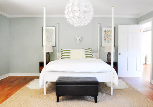
We did a little more bedroom noodling. Noodling, not canoodling. *Blush* Anyway, we last left off after moving our Alaskan prints together over the bed and surprising ourselves by getting a new rug:
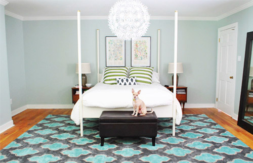
And there were a few commonly asked bedroom questions in the 800+ comments on Monday’s post, which were:
- have you considered getting larger bedside tables?
- can the bed go on another wall?
- will you repaint? maybe in a darker color?
- what are your plans for the nook to the left of the bed?
- what about changing out the pillows/painting the bed & tables/getting a longer bench/switching the lamps, etc?
The short answers to those are: yes but it’s complicated, no, we’re open to it down the road, adding an armoire or a built-in, oh yeah all that stuff is still on the agenda we just haven’t gotten to everything yet.
To elaborate, we’ve definitely considered larger side tables, but the door would swing into anything larger than what we already have on that side, as you can from this old door-open pic (we did a secret book project to the front of this door, so we can’t snap an updated shot).
We don’t want to move the bed to the left since the chandelier wouldn’t be centered above it anymore (we could do a larger table on the left, but we have plans for an armoire or large built-in for the nook to the left of the bed and don’t want to crowd that). We could reverse the door to make it swing into the hall instead of the room, but it might jam up the hall to have a door out there. We couldn’t do a pocket door (we have duct work/electrical in that wall) but have thought about a barn door on a track (which could rest where the leaning mirror lives in the picture above this one), but we’ve considered using that in a spot nearby (more details when we decide if we’ll actually go for it!) so we don’t want that to be too repetitive. We’ll keep you posted no matter what we decide though!
As for if the bed can move, the floor plan of this room is a definite challenge thanks to “things” on each wall (two very off-centered windows, a nook across from the door, and a nook with the sink tucked into it on another wall, and a chandelier in the exact center that looks off if the bed isn’t in the right place). The chandy even lines up with the mirror above the sink, so we don’t want to swag it or move it since aligning things like the bed, the chandy, and the mirror make the room feel balanced/less wonky. So we’ve tried the bed in a bunch of spots, but the place that works best for us is where it lives now (it’s the only long flat wall in our entire room).
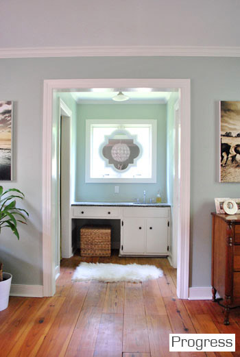
It just doesn’t look centered on the chandelier or the windows in any other spots, and we actually like the placement a lot in person since we wake up to the chandelier being perfectly reflected in the mirror above the sink (it’s so hard to capture in 2-D but it’s the thing everyone falls in love with in person). As for repainting the walls, especially in a darker color, we’re definitely open to it but we’ll be refinishing the floors in a dark mocha color someday and the rug is pretty dark (and the room doesn’t get a ton of light) so we’ll think long and hard before we do anything rash. We’re just getting started, so everything is fair game for tweaks (painting furniture, switching out accessories, etc). Many things like those lamps and the bench are just leftovers from our first house that got plopped down “just-for-now” (Burger uses that bench to get into bed, so it’s our version of Doggie Steps until we get something better – haha).
So now that we’ve hopefully answered those common questions, let’s get to the fun part. Noodling. The first thing we played around with were the pillows and a few other small accessories. The pillows actually inspired a little art switch (since the floral shams were a little busy with the old botanicals that were hanging there).
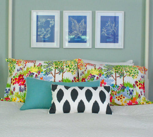
From up close, this mix was fun (the shams are from Pottery Barn two years back, the blue bolster is from Marshall’s, and the front accent pillow is from HomeGoods a few months back). But from far away, the new art was way too small for our tastes. Oops.
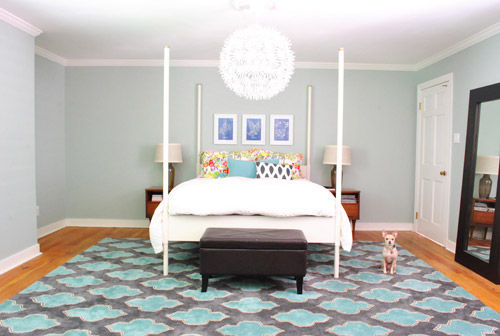
We want the whole room to feel balanced, so with very tall vertical items on all of the other walls like the door to the bedroom, the windows with ceiling-height curtains (which will be switched out, hopefully soon), and the sink nook with a mirror over it…
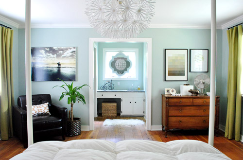
… this art was just too squat and didn’t feel as balanced as the larger Alaskan prints had. But we did like the general concept of adding different colors with pillows – just to break up all the blue on blue action.
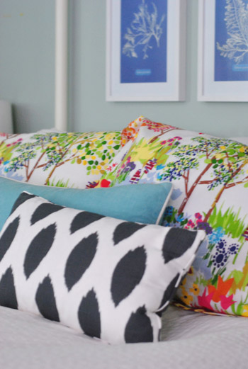
We’re so glad we banged in three tiny nails to give that art a go, even if we didn’t like it once we got ‘er done. It’s all about trial and error (and spackle!) at our house. Haha.
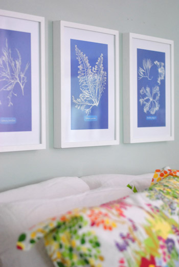
Oh and the prints are from Ikea! We found them for $2.99 for all three (in a clearance bin) and know we’ll eventually find the right spot for them. We already had the frames (also from Ikea, but they hung in our first house), so it was just a $2.99 failed experiment. Haha, so not too bad.
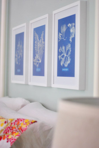
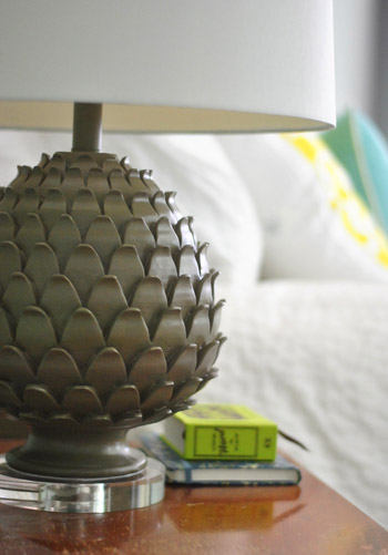
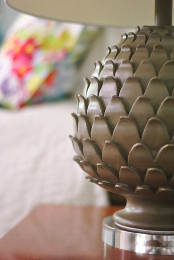
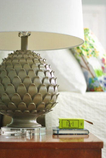
Oh and we also picked up some new lamps! They’re artichoke-ish, which is a totally new shape for us when it comes to lamps (we have like ten gourd lamps, so we were psyched to play around with a new silhouette). They were from HomeGoods ($49 a pop, including the extra large shades).
The original lamps that we had on either side of the bed used to live in our first house’s living room and were over five years old, so we figure we’ll either find another spot in the house for them (we have completely untouched rooms like the playroom and the sunroom to tackle) or yard sale/craigslist ’em if we can’t.

See how much more balanced and substantial the new ones look (with their larger, wider shades and darker bases) in comparison to the old ones above?
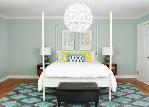
They even seem to make the side tables feel wider, which is nice for balance. And the rounder more textured shape of the new lamps also ties into the chandelier, which is a total happy accident (we definitely didn’t think about that when we fell for them in the store, haha). Oh and ignore the different pillows on the bed in the pic above. We’ll get there in a minute.
It’s nice that the putty color of the lamps isn’t too crazy to compete with the pillows or the rug, but the shape is full of interest and dimension.
Oh and see that book on my side table called One Word A Day? John and Clara got it for me for Mother’s Day along with a pretty pink tulip bouquet and some vases. It’s a one-word journal that John thought I could use to record one hilarious Clara-sentence per day instead of just one word to describe my day (which is how it’s meant to be used). Now we won’t forget the time I said “we might have to rearrange your room again” and she said “Yes! Put some ice cream on it!”
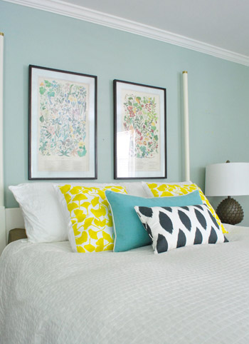
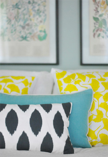
But back to the bedroom. Since the smaller art didn’t work, it was back to our Alaskan botanicals with some different pillows. We landed on this pop of yellow with the teal bolster to tie things into the rug and the deeper navy and white pillow in the front to ground it all. For anyone wondering, those two yellow ginko leaf shams are from a small shop in Northern VA (don’t know the name, but it was in Old Town, Alexandria), but they’re made by Dermond Peterson if that helps.
But you know me, pillows are nomadic in our house, so they might be completely different the next time we share bedroom pics. Yes, pillow swapping is right up there with watching Parks & Rec while eating Oreos around here.
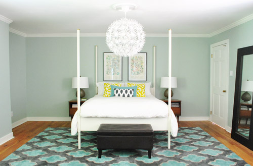
Sure, we still have some major furnishings missing, but it’s fun to see some happy new pillows (with a few warm yellow pops to balance all the blues). And the dark tones in the smallest accent pillow, the botanical frames, and the lamp base relate nicely to the slate/navy tones in the rug without being too matchy.
The lamps just might be our favorite little change (favorite big change = the rug of course).
So that’s where we are. We don’t play poker or bet on horses, so I guess trial and error decorating is how we get our kicks. Haha. Oh yes, we’re daredevils.

We’re still entertaining a ton of possibilities, like:
- switching out the old curtains (for sure!)
- possibly painting the bed in a deep charcoal color
- finding/making a longer bench for the end of the bed
- possibly painting or refinishing the cherry-colored side tables & dresser (on the other side of the room)
- adding an armoire or built-in to that nook next to the bed
- possibly repainting the walls down the road
- painting the ceiling
- possibly removing the posts from the bed (although we like them in the photoshopped renderings below, so maybe not)
- switching out the pillows/bedding as we go
- bringing in a lot more art/furniture in general so it’s not so empty
- staining the beat up & yellowed floor a rich mocha color
- possibly adding a barn door which would allow for larger side tables
- lots of things I’m probably forgetting – haha, but check out this post and this post for mentions of other potential plans
Some might be things we tackle this month while others might not get done for years (like refinishing those floors). But just look how much of a difference that one change can make. Mmm, dark wood floors (thanks Photoshop!) = our happy place.
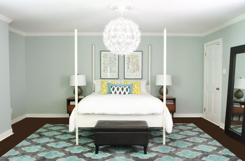
And after a bunch of other tweaks, we’ll just have to see where we end up! Maybe here?
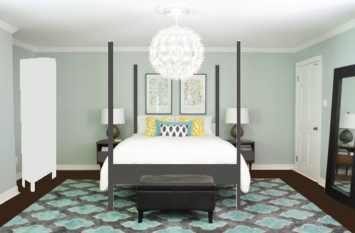
Or here?
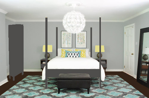
Or here?
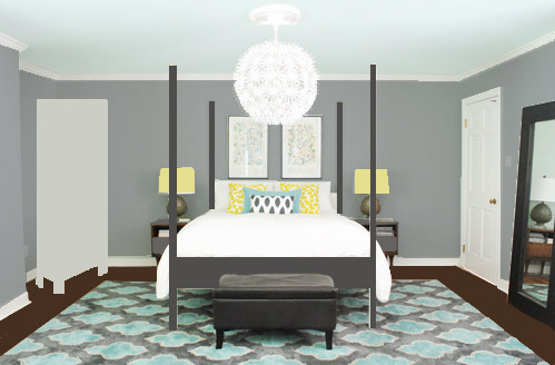
Don’t mind the bad Photoshop. I guess that’s part of the fun, huh? In the meantime, have you ever hung something new only to learn that you loved the first choice better? Have you made any easy lamp or pillow switcheroos in your house lately?

amyg says
I think painting the bed in a grayish color is the solution! I would have never thought of that, but it looks perfect to me in the photoshop renderings.
Chelsea says
Oooo I love the lasst one! I’m a sucker for a painted ceiling! I just painted the walls in my bedroom Copley Grey (BenMoore) and the ceiling Smoke, a beautiful light blue/grey (also BenM)
Kim says
There is so much interesting home decor commentary in this post, but this is all I could focus on:
“Now we won’t forget the time I said ‘we might have to rearrange your room again’ and [Clara] said ‘Yes! Put some ice cream on it!'”
I laughed out loud at my desk. That little girl is hilarious! Gotta love her.
YoungHouseLove says
Haha, she has a one track mind! Well two-track: animals/worms/creatures & ice cream.
xo,
s
Susan says
Read your entry about the new rug the other day and then was catching up on reading my “Real Simple” magazine and saw it again in their “peace makeovers” feature…. hope its just as peaceful at the Petersiks!
http://www.realsimple.com/home-organizing/organizing/room-makeovers-00100000080537/page9.html#16
YoungHouseLove says
Isn’t that so funny?!
xo,
s
Lisa says
I like the changes! I also like the idea of the gray bed…it looks like it will work better in the space and make the white duvet pop.
Have you thought about ditching the side tables completely and perhaps putting in some shelving on both sides of the bed? It would still work with the door and you could do as many or as few as you want. You could also use baskets on the shelves or under them to store things you don’t want sitting out all the time. Anyway, those stands just seem lost….
Here are some examples – http://www.cb2.com/storage/furniture/slice-grey-wall-mounted-storage-shelf/f5963
http://www.houzz.com/bedside-shelf
http://www.etsy.com/listing/76806173/floating-wall-shelf-fun-modern-wood?utm_source=googleproduct&utm_medium=syndication&utm_campaign=GPS
Anyway – lots and lots and lots of options for using shelves on the wall instead of a piece of furniture.
YoungHouseLove says
Ooh those first ones are really fun! But pricey! Especially if we wanted 2 – 4! We got our side tables at a yard sale for $10 I think, so we’d love to see if we can work with them for a little while, and down the road if we can’t we’ll definitely course correct!
xo,
s
Erin says
I love the new lamps – the shape is wonderful! Also, that teal bolster pillow looks great with the rug!
jennT says
I <3 the new rug, but I don't know how I feel about painting the bed darker. I'm a total sucker for all things wood–could you strip and refinish it in a nice mahogany or deep cherry stain?
also, yes, I have a wall where a leetle clock used to hang, but I switched it to a beautiful wood cutout ($2 from a fundraiser white elephant sale) that is the same circular shape but larger. I am in total <3 <3 <3 with the shape (and the deeply stained wood) but I dislike not being able to glance up at the clock from just about everywhere in our living space. Perfect solution is easy–an awesome, larger clock. Unfortunately, those cost money. :(
YoungHouseLove says
It’s actually laminate from what we can tell, so it can’t be stripped to reveal wood, only painted a different color! Oh and as for larger clocks, try Target – sometimes they have them on sale!
xo,
s
Earthy Nicole says
I love the Alaskan prints, so I’m glad the Ikea prints lost the battle. I also happen to really like the floors so I’ll be sad when you refinish them. Anyways, you guys know way more than I do when it comes to home decor so I’ll leave ya to it :)
xx
YoungHouseLove says
Aw thanks Nicole! I think it’s just a personal preference thing. They’re really orange/yellow for our tastes, so we think it’ll look more restful when they’re less fiery!
xo,
s
Mandy says
Oooo I LOVE the new pillows! The third photoshop picture is my favorite. Love the charcoal bed, light grey armoire and yellow lampshades! LOVING the new rug too!!
I know it’s been gone for a awhile, but whatever happened to your west elm bedspread?
YoungHouseLove says
It’s in the playroom with a bunch of other waiting to be used things! Since we have a few untouched rooms we figure we might use it somehow, or we’ll just craigslist/yard sale it down the line!
xo,
s
Christy says
Those lamps are perfect! Love the dark floor photoshop too. What a difference that will make. I was also gonna suggest the mirror in the nook with the house plant, even just temporarily until you do the armoir. It seems like it would make good sense there instead of just leaning on the other wall. But take that with a grain of salt, you guys have way more of a decorators eye than I do. I love what you do and love all the jumping around from space to space. Keeps us on our toes, haha!
YoungHouseLove says
I just don’t want to wake up and see my sleepy face staring back at me (scary! Haha).
xo,
s
jennT says
forgot to mention how much I like the yellowy lampshades on the middle-darker wall… :)
The Mrs @ Success Along the Weigh says
I love how your bedroom looks like a boutique hotel. So cute!
We bought these awesome bubble glass double gourd shaped lamps from Pottery Barn (online only) and when we got them they were HUGE on the nightstands. Thankfully they take them back in stores and I ordered another set that are perfect for the space. I still kind mourn the originals though. I should probably buy a bigger house. HA!
Anne says
I am kind of liking the darker walls in the last option. I think bedrooms feel more cozy with dark walls. Good luck tweaking things!
Oh and if you ever decide to get rid of your bedside tables, can I call dibs?? I heart them.
YoungHouseLove says
Haha, sure Anne! We might just move them to another room if they don’t work in here though. We love rotating things out like that!
xo,
s
Taya says
Love the “new” yellow pillows with the teal and navy/white smaller pillows! It definitely balances out the colors in the room! I am currently playing around with pillows and such, especially with the bed in our guest bedroom (of our new home). Trying to figure out what works best and not wanting to purchase anything new since it will hopefully, eventually be a nursery.
Happy DIYing!
Crystal says
We moved from the smaller bedroom downstairs into our larger upstairs bedroom last year and recently just retreated back to our old bedroom. Why all the drama? I never loved that bigger room. I couldn’t fill it up the way it needed so it always just looked too empty with big sections of unfilled walls. I love our room now and can’t think why I spent the time and money to put new carpet, trim, paint and build custom closet organizers for a room that now will only get the occasional out of town guest! I think that is happening for you guys in a way. Your old bedroom was cozy and now you have a lot of space. It’s a new scale to contend with. I built a bench for our house based on ana-white design and it was super easy so a new bench would likely be a quick step in the right direction. Plus it is trickier to go with bright colors and mixed patterns– you’ll get there!
YoungHouseLove says
I totally agree! Our first bedroom was so cozy! We love having a bathroom connected to our master and a walk-in closet (two things we didn’t have at our first house) but all the space is definitely throwing us! Hopefully over time we’ll crack the code though! We are excited to see where it’s going now that we have the new rug!
xo,
s
Tracy says
Oh man…if this were a poll, that last photoshopped image would totally be getting my vote. It looks AMAZING. Love it love it love it. And I think turning Ed gray would be the best ever. Totally changes the room.
my honest answer says
Did you change the filials (is that what they’re called) on the top of the bed posts? Surely I can’t have missed it, I read every post! Unless I’m just misremembering how they were. Which is equally possible.
YoungHouseLove says
Oh yes, that’s here: https://www.younghouselove.com/2011/09/side-tables-and-other-bedroom-tweakage/
xo,
s
A Wife and her Carpenter says
I’m loving the last picture! The pops of color on the shades and the armoir and the floor and the new bed color…oh there is just sooo much to love! But I definitely think the botanical pictures and the new pillows are all perfect together.
It is definitely coming together…
Oh and just a little tutorial I’m sure you have already become privy too, but since you mentioned barn doors:
http://theletteredcottage.net/diy-sliding-door/?utm_source=feedburner&utm_medium=feed&utm_campaign=Feed%3A+TheLetteredCottage+%28The+Lettered+Cottage%29
YoungHouseLove says
Love that tutorial! Thanks!
xo,
s
Julie says
When I read your “what we may do” list at the end of this post, and it says “paint the bed”; I suddenly found myself thinking, “that’s it!!”. Now, of course, my opinion doesn’t matter at all -I like everything you guys do! However, I really think the bed being a deep, rich, dark color would REALLY make a huge difference!
Just my .02 cents!
Steph H. says
LOVE LOVE LOVE that last photoshop image! I am a HUGE fan of painted ceilings. Love that you put the aqua-y color on the ceiling and the grey on the walls. That would be such a pretty picture to wake up to each day. You all do such a great job with your house and creating your own style. :-)
Heaven B says
I like the idea of a wider bench at the end of your bed. And I might have tried taller lamps. Without the prints on either side, that space looks too empty to my eyes.
I really love that rug. It’s so pretty.
Julie says
My husband thinks reading your blog is trouble. He said it overstimulates my already stimulated out-of-control cluster of ideas I already have going haha! I think the new lamps look amazing in the room! Same with that burst of yellow in the pillows! Isn’t it satisfying when you do that trial and error but you hit the success bang on instead of the error? LOVE IT!!! Great job guys!
YoungHouseLove says
Haha, I love your already stimulated out of control cluster of ideas!
xo,
s
Carli says
What a fun post!! I love the changes you’re working on. It’s so encouraging to see trial and error from someone else’s perspective. Makes me want to take more risks in my house :) Ps LOVE the rug, new lamps and pillows!! Barn door also sounds fab!
And parks and rec? I die. Funniness overload.
Liz Massingill says
Mmmhmm, I see a pattern in those photoshopped mock-ups! I predict a grey bed in your future!
Staci @ My Friend Staci says
Man, I’d hate to see Beach Club Cabana (or whatever the paint color is called) go, but that last mock-up looks absolutely FANTASTIC!
Also, I bet those blue framed prints would be an easy and temporary way to put some color in the hall bathroom…? :D
YoungHouseLove says
Haha, I like the idea of them in the hall bath- didn’t even think of that!
xo,
s
kate says
I love the artichoke lamps but I think what’s throwing me off is the chandelier, actually :( The artichoke lamps (and the room in general, really) are kinda earthy to me, and the chandelier is so prickly and modern. I do love it though…it’s just kinda throwing me off.
Or, maybe it’s just not conveying well in the pictures?
Either way, the room looks great. Def. paint the bed gray…love it.
kate says
Now that I look at the ps versions, I like the chandelier MUCH better with the gray bed. Maybe my problem is that there’s too much white going on…
I guess I just actually don’t know what the heck my problem is haha.
YoungHouseLove says
Haha, we were having the same issue. It’s hard to picture stuff and then Photoshop comes along and helps you out! We definitely like it painted so it’s on the list!
xo,
s
Dana says
I LOVE LOVE LOVE the second to last photoshop rendering at the end of the post. It would be nice to have the walls be a slightly lighter shade of gray, so you have contrast with the bed color. Maybe some textured/waffle crisp white curtains would look great with that wall color, too!
Jessie says
Paint the bed, pronto! This weekend! It looks so much more upscale and substantial, and ties together the new rug and wall color!
Chris says
I am beyond jealous of how BIG your bedroom is ours. Ours is TINY – a queen bed and two side tables centered in the room leave us each a path to get in bed, and I STILL crammed a dresser on my side. I have to open the drawers standing sideways! But this post inspires me to at least get rid of some (most) of the clutter so I can see what space we do have!
Natalie says
Ed looks fantastic painted! I hope that happens! And I’m voting for option #2 and built ins.
Kim says
Loving the changes! It’s awesome the way you guys can piece together a room little by little over time instead of redoing a room all at once (which often leads to things being matchy-matchy…something I’m majorly guilty of).
This bedroom is starting to feel much less first-house-YHL and more second-house-YHL (though of course I loooved your first house too!)
YoungHouseLove says
Hah, it’s so funny you say that because we were saying that too! It’s feeling more like “now us” and less like “then us.”
xo,
s
Rebecca in NC says
Those lamps are AWESOME!
Meredith says
Love the new artichoke lamps! It DOES make the nightstands look wider, crazy. I didn’t like the idea of painting Ed charcoal when you mentioned it the other day, but now that I see it I’m a believer! I’m definitely a fan of photoshop pic #3 with the painted ceiling, swoon!
Emilie says
I love Dermond Peterson’s stuff – they have a great online store! I don’t see those exact pillows but there’s lots of fun bright stuff available. http://www.dermondpeterson.com/shop/?PHPSESSID=33f5600d44705930e241221aaeb8d533
YoungHouseLove says
So much fun!
xo,
s
Lori says
The new lamps look great and I love the third photoshopped rendition of your potential plans – gray walls and painted ceiling – reminds me of a super hip hotel room!
Mrs M says
I really like the updates. The Home Goods pillow is GREAT with the rug. Love the new lamps, too. In the final pic everything seems to scale/like it fits in a great way — the Alaska prints take on a whole new life!
Christie says
I absolutely LOVE the last photoshopped picture. Totally loving everything about those ideas. :-)
julie g. says
I’m loving all the changes! I can’t remember the size of the rug in the living room but the new bedroom rug would also look fantastic in there and vice versa with the living room rug. I think that is the best part about using the same basic colors all over the house because you can switch things up so much easier. Noodle on…
YoungHouseLove says
The living room rug needs to be even bigger for giant Karl (12 x 14!). Isn’t that crazy? The bedroom one is 9 x 12.
xo,
s
Erica says
I love the light gray and the darker bed. I also love the new pillows and the lamps. My bed linens are all white and I have struggled to add nice accent pillows. You new pillows have inspired me to add some new pillows to my all white bed.
Jenn @therebelchick says
I have such an oddly shaped bedroom – the original space was increased but the previous owners left two portions of the wall so that the room is essentially divided into two spaces. Each time you post photos of your bedroom, I have space envy! We are so cramped!
Madelaine says
I’m not reading all the comments, so this has probably been said a zillion times already, but…
Love the new lamps! And from the first picture with the new rug, I was thinking grey walls would be so nice!
I also like the idea of a charcoal Ed. I’m sure you will hit the right notes eventually. Have a fun time with the process!
LauraC says
Wow, in the time it took me to read the post, you got 50 comments.
So Monday, the kids’ rug I was waiting for came! Great color, yeah! Yesterday I threw up some patches of paint I thought would be great with it (just to test; going for sky blue) because we already had the color in our office, but it looks awful. Too dark and purply – though it’s not that way at all in our office. Back to the drawing board with that one. So while you’re working on your bedroom, I’m doing the kids’. I agree the little tweaks make the biggest difference. Slowly but surely!
YoungHouseLove says
Aw, good luck Laura!
xo,
s
smith207 says
Burger looks so cute in that one photo- like a little statue next to the bed.
YoungHouseLove says
Haha he’s like a fake dog that we just use as a prop.
xo,
s
Bernadette says
Have you thought about just dying your curtains?
I just used i-dye for the first time and got really great results. I found it at an art supply store. The RIT dye made me nervous that it would stain my machine because it said to run a cycle with bleach after, so I was on the hunt for a different dye. This i-dye stuff comes in a dissolvable packet (no mess! yay!) and they have formulas for natural fibers and synthetic fibers…and my machine came out clean in the end :)
YoungHouseLove says
Oh yes I love iDye! I’ve used it for the chair covers in our dining room! It’s so easy! The curtains could definitely get a dye job, although we would first like to try to use them in the playroom since we like the color and think they could be a fun starting point for that room!
xo,
s
Sherry from BC says
Love the new tweaks….the lamps sort of have a vibe like the light fixture and the yellow/turquoise is great. They have a great shape/texture. Much better. I still feel you need a blast of fuschia/magenta in there especially since the Reader Redesign last week. Have you thought of trying to photoshop in that armoire?
YoungHouseLove says
Always a possibility- if John will go for it. Haha. It’s as much his room as mine, so I would need him to love it for us to go there. Ya never know though!
xo,
s
Sara R says
I love your bedroom! The rug is gorgeous! Awesome find!
I would love to “steal” the wall color. Could you tell me exactly what the color is called? We’re expecting a baby this fall and it seems like the perfect serene color for a nursery!
YoungHouseLove says
It’s Carolina Inn Club Aqua by Valspar. Good luck with your nursery!
xo,
s
Vanessa says
Throwing in my vote for the third picture. Loving the grey walls and painted ceiling. Ed will thank you and if he doesn’t you can always change him back. And the lamps are killer. What a difference! I love watching your process/progress. It reminds that it doesn’t all happen at once!
Marisa says
So not really related to this post – BUT, I was at World Market yesterday and they have the greatest ceramic animal serving dishes! I found the pig (http://www.worldmarket.com/product/index.jsp?productId=4054048) and elephant (http://www.worldmarket.com/product/index.jsp?productId=12566288) online, and I thought they had another in store as well. Also, a metal tortoise platter that would be pretty rocking for your outdoor dining! (http://www.worldmarket.com/product/index.jsp?productId=3902865)
YoungHouseLove says
Haha- so cute!
xo,
s
Joanna says
mmm I am LOVING the changes! Those big prints are definitely complimentary to all other photos, etc. in the room! And those lamps: to die for! I think the bigger shades really did balance things out.. and the pops of color from the rug and the new pillows really helped the color on the wall pop too, in my opinion :) Now, for some changes, I am definitely diggin’ the white and then adding color accents, so I like the white. Buuuuttt with your kitchen being so white, maybe it would be nice to have a change? Actually, now that I think about it, a lot of your house had that ethereal, yet pops of color. Love it!!!
YoungHouseLove says
Everything is definitely still up for tweaking, so we’re definitely open to changing things as we go and keeping you posted!
xo,
s
heather s. says
Love the new lamps and I can’t wait to see where the IKEA prints go but I still vote for getting rid of the four posters on the bed. Even if you paint them, they feel like they are constraining the area around the bed to a tight box.