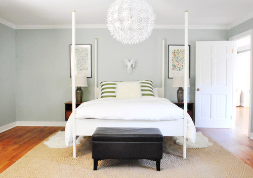
We did a little more bedroom noodling. Noodling, not canoodling. *Blush* Anyway, we last left off after moving our Alaskan prints together over the bed and surprising ourselves by getting a new rug:
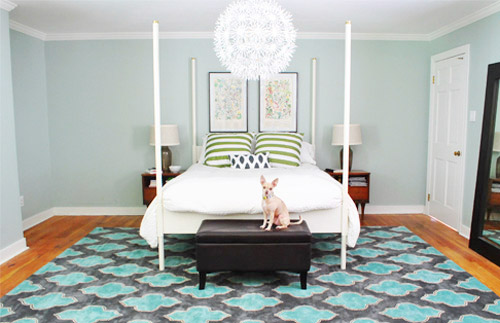
And there were a few commonly asked bedroom questions in the 800+ comments on Monday’s post, which were:
- have you considered getting larger bedside tables?
- can the bed go on another wall?
- will you repaint? maybe in a darker color?
- what are your plans for the nook to the left of the bed?
- what about changing out the pillows/painting the bed & tables/getting a longer bench/switching the lamps, etc?
The short answers to those are: yes but it’s complicated, no, we’re open to it down the road, adding an armoire or a built-in, oh yeah all that stuff is still on the agenda we just haven’t gotten to everything yet.
To elaborate, we’ve definitely considered larger side tables, but the door would swing into anything larger than what we already have on that side, as you can from this old door-open pic (we did a secret book project to the front of this door, so we can’t snap an updated shot).
We don’t want to move the bed to the left since the chandelier wouldn’t be centered above it anymore (we could do a larger table on the left, but we have plans for an armoire or large built-in for the nook to the left of the bed and don’t want to crowd that). We could reverse the door to make it swing into the hall instead of the room, but it might jam up the hall to have a door out there. We couldn’t do a pocket door (we have duct work/electrical in that wall) but have thought about a barn door on a track (which could rest where the leaning mirror lives in the picture above this one), but we’ve considered using that in a spot nearby (more details when we decide if we’ll actually go for it!) so we don’t want that to be too repetitive. We’ll keep you posted no matter what we decide though!
As for if the bed can move, the floor plan of this room is a definite challenge thanks to “things” on each wall (two very off-centered windows, a nook across from the door, and a nook with the sink tucked into it on another wall, and a chandelier in the exact center that looks off if the bed isn’t in the right place). The chandy even lines up with the mirror above the sink, so we don’t want to swag it or move it since aligning things like the bed, the chandy, and the mirror make the room feel balanced/less wonky. So we’ve tried the bed in a bunch of spots, but the place that works best for us is where it lives now (it’s the only long flat wall in our entire room).
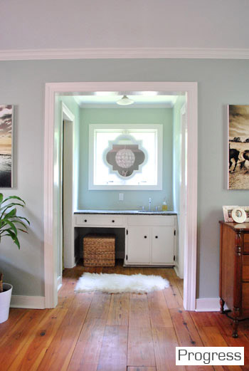
It just doesn’t look centered on the chandelier or the windows in any other spots, and we actually like the placement a lot in person since we wake up to the chandelier being perfectly reflected in the mirror above the sink (it’s so hard to capture in 2-D but it’s the thing everyone falls in love with in person). As for repainting the walls, especially in a darker color, we’re definitely open to it but we’ll be refinishing the floors in a dark mocha color someday and the rug is pretty dark (and the room doesn’t get a ton of light) so we’ll think long and hard before we do anything rash. We’re just getting started, so everything is fair game for tweaks (painting furniture, switching out accessories, etc). Many things like those lamps and the bench are just leftovers from our first house that got plopped down “just-for-now” (Burger uses that bench to get into bed, so it’s our version of Doggie Steps until we get something better – haha).
So now that we’ve hopefully answered those common questions, let’s get to the fun part. Noodling. The first thing we played around with were the pillows and a few other small accessories. The pillows actually inspired a little art switch (since the floral shams were a little busy with the old botanicals that were hanging there).
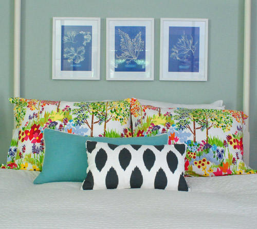
From up close, this mix was fun (the shams are from Pottery Barn two years back, the blue bolster is from Marshall’s, and the front accent pillow is from HomeGoods a few months back). But from far away, the new art was way too small for our tastes. Oops.
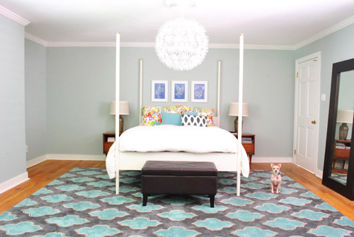
We want the whole room to feel balanced, so with very tall vertical items on all of the other walls like the door to the bedroom, the windows with ceiling-height curtains (which will be switched out, hopefully soon), and the sink nook with a mirror over it…
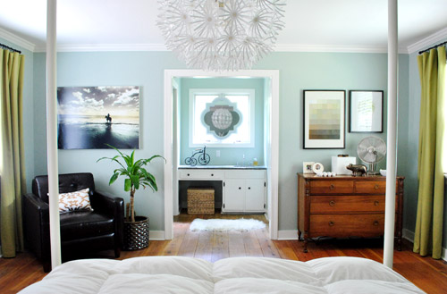
… this art was just too squat and didn’t feel as balanced as the larger Alaskan prints had. But we did like the general concept of adding different colors with pillows – just to break up all the blue on blue action.
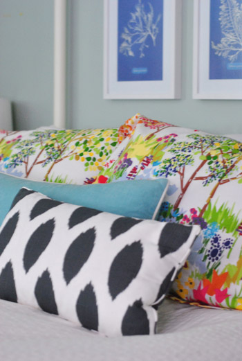
We’re so glad we banged in three tiny nails to give that art a go, even if we didn’t like it once we got ‘er done. It’s all about trial and error (and spackle!) at our house. Haha.
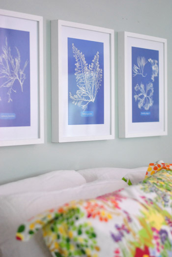
Oh and the prints are from Ikea! We found them for $2.99 for all three (in a clearance bin) and know we’ll eventually find the right spot for them. We already had the frames (also from Ikea, but they hung in our first house), so it was just a $2.99 failed experiment. Haha, so not too bad.
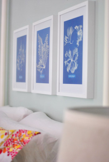
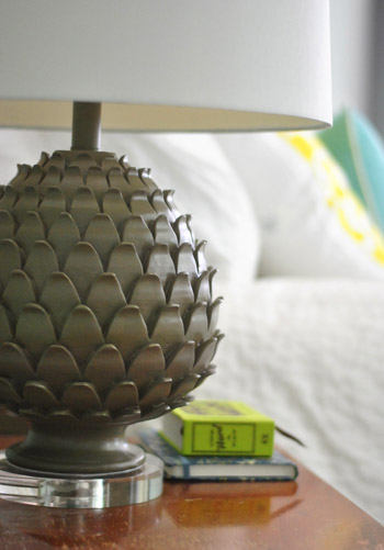
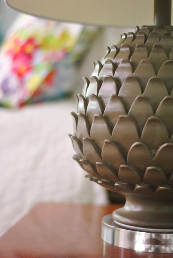
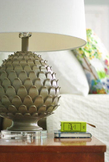
Oh and we also picked up some new lamps! They’re artichoke-ish, which is a totally new shape for us when it comes to lamps (we have like ten gourd lamps, so we were psyched to play around with a new silhouette). They were from HomeGoods ($49 a pop, including the extra large shades).
The original lamps that we had on either side of the bed used to live in our first house’s living room and were over five years old, so we figure we’ll either find another spot in the house for them (we have completely untouched rooms like the playroom and the sunroom to tackle) or yard sale/craigslist ’em if we can’t.

See how much more balanced and substantial the new ones look (with their larger, wider shades and darker bases) in comparison to the old ones above?
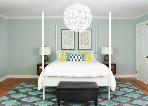
They even seem to make the side tables feel wider, which is nice for balance. And the rounder more textured shape of the new lamps also ties into the chandelier, which is a total happy accident (we definitely didn’t think about that when we fell for them in the store, haha). Oh and ignore the different pillows on the bed in the pic above. We’ll get there in a minute.
It’s nice that the putty color of the lamps isn’t too crazy to compete with the pillows or the rug, but the shape is full of interest and dimension.
Oh and see that book on my side table called One Word A Day? John and Clara got it for me for Mother’s Day along with a pretty pink tulip bouquet and some vases. It’s a one-word journal that John thought I could use to record one hilarious Clara-sentence per day instead of just one word to describe my day (which is how it’s meant to be used). Now we won’t forget the time I said “we might have to rearrange your room again” and she said “Yes! Put some ice cream on it!”
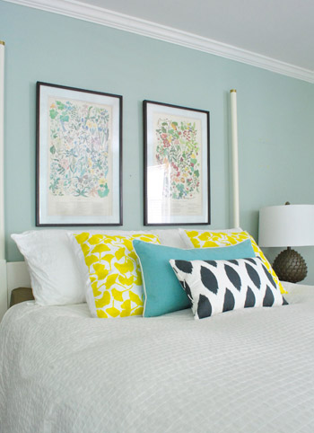
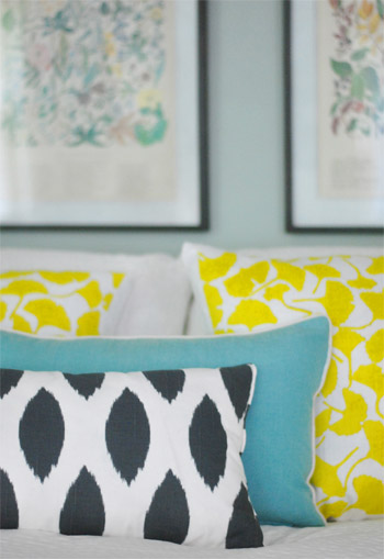
But back to the bedroom. Since the smaller art didn’t work, it was back to our Alaskan botanicals with some different pillows. We landed on this pop of yellow with the teal bolster to tie things into the rug and the deeper navy and white pillow in the front to ground it all. For anyone wondering, those two yellow ginko leaf shams are from a small shop in Northern VA (don’t know the name, but it was in Old Town, Alexandria), but they’re made by Dermond Peterson if that helps.
But you know me, pillows are nomadic in our house, so they might be completely different the next time we share bedroom pics. Yes, pillow swapping is right up there with watching Parks & Rec while eating Oreos around here.
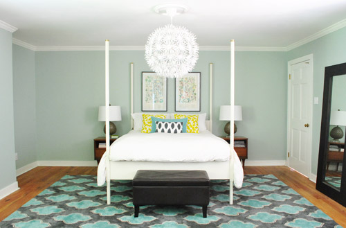
Sure, we still have some major furnishings missing, but it’s fun to see some happy new pillows (with a few warm yellow pops to balance all the blues). And the dark tones in the smallest accent pillow, the botanical frames, and the lamp base relate nicely to the slate/navy tones in the rug without being too matchy.
The lamps just might be our favorite little change (favorite big change = the rug of course).
So that’s where we are. We don’t play poker or bet on horses, so I guess trial and error decorating is how we get our kicks. Haha. Oh yes, we’re daredevils.

We’re still entertaining a ton of possibilities, like:
- switching out the old curtains (for sure!)
- possibly painting the bed in a deep charcoal color
- finding/making a longer bench for the end of the bed
- possibly painting or refinishing the cherry-colored side tables & dresser (on the other side of the room)
- adding an armoire or built-in to that nook next to the bed
- possibly repainting the walls down the road
- painting the ceiling
- possibly removing the posts from the bed (although we like them in the photoshopped renderings below, so maybe not)
- switching out the pillows/bedding as we go
- bringing in a lot more art/furniture in general so it’s not so empty
- staining the beat up & yellowed floor a rich mocha color
- possibly adding a barn door which would allow for larger side tables
- lots of things I’m probably forgetting – haha, but check out this post and this post for mentions of other potential plans
Some might be things we tackle this month while others might not get done for years (like refinishing those floors). But just look how much of a difference that one change can make. Mmm, dark wood floors (thanks Photoshop!) = our happy place.
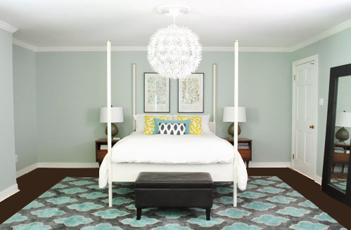
And after a bunch of other tweaks, we’ll just have to see where we end up! Maybe here?
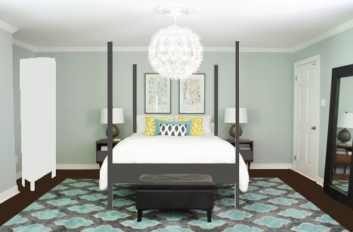
Or here?
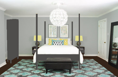
Or here?
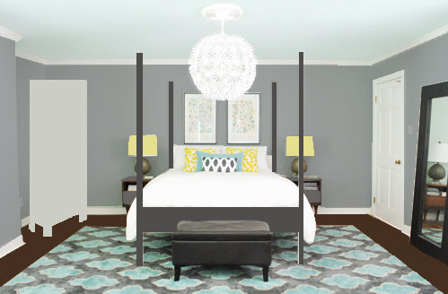
Don’t mind the bad Photoshop. I guess that’s part of the fun, huh? In the meantime, have you ever hung something new only to learn that you loved the first choice better? Have you made any easy lamp or pillow switcheroos in your house lately?

heather s. says
Oh yeah – and please no gray walls. Your house has so many gray rooms already!
YoungHouseLove says
Haha, it’s true! Everyone was pushing for gray walls on Monday so in the comments I actually said “we have a lot of gray walls already” – haha.
xo,
s
gia says
You must have a secret room in your house full of pillows. I’d love to see all your pillows in one shot. haha
I love this room!
YoungHouseLove says
Haha- the playroom = insane. It’s full of secret book projects too, otherwise we’d totally share photos of the chaos.
xo,
s
Mary B says
Love all the tweaks you guys are doing! My fave photoshop is the middle one with the dark gray armoire – how about a pop of the yellow on the nightstands? Like Clara’s chair! Although I do understand keeping main pieces neutral.
Your blog inspires me all the time – today I’m getting my paint on & redoing my 4 yr. old’s room into a big boy space. Mixed emotions about that one! Time to pack away the toddler bed… sniff, sniff…
YoungHouseLove says
That could be really fun too Mary! Love it! Good luck getting your paint on! Sniff, sniff is right!
xo,
s
Staci @ My Friend Staci says
One more comment, just to be annoying. Hah. Just wanted to say how much I loooooooove the far side of the bedroom. The chair and dresser, with the moody artwork, and the plant, and the little bike, it’s just so perfectly scaled and styled!
YoungHouseLove says
Aw thanks Staci!
xo,
s
Katie H. says
You could also switch the door so that it opens into the room to the left, instead of to the right… that might give you more room.
YoungHouseLove says
We actually thought about that but it would rub against the rug (it’s a really thick rug) so we’d have to shorten it, rehang it, and we’re not sure if it’s weird since a door typically swings towards a corner and not into the middle of the room! You never know where we’ll end up though!
xo,
s
Rebecca says
How about big ceiling medallions on the wall on either side behind the bed? I think something(s) large there would be good for the room’s scale. I’ve seen them used on another blog but I’m on my phone and don’t have the bookmark :-). Oh and I vote yes to charcoal on Ed but keep your wall color :-)
YoungHouseLove says
Always another possibility!
xo
s
Amelia R. says
Love the updates so far; from my perspective, just changing out the green striped pillows made the whole room look better. Looking good!
Kristi says
LOVE your idea of painting the bed. It looks fantastic in the photoshopped images – creates a whole extra layer of depth to the room. Go for it!
Carolyn says
to me…the dark floor seal the deal! no pun intended.
YoungHouseLove says
Haha, agreed.
xo,
s
erin says
i love the new artichoke lamps! what a great shape! have you thought about painting them a deep eggplant color? i think they would really pop! and the color would still work with everything else that you have in there.
YoungHouseLove says
I wouldn’t rule it out down the road! Although for now we love the putty color with some pops of color in the rug/pillows/art.
xo,
s
Heidi P. says
OHMYGOSHILOVETHOSELAMPS!!! Love love love artichoke patterns. Aaaand, LOOOOOOOOOVE the ginkgo pillows!!! Ginkgo leaves are the symbols for my landscape design business. Those pillows make me happy! :D
YoungHouseLove says
Aw, thanks Heidi!
xo
s
jja says
Much better now! Old frames were to long and to narrow for that spot.
maria says
I like the last option the best, because for me the “not quite it” thing about this room is the bed…either add a canopy or cut off the posts. As is, the posts aren’t functional and they aren’t very attractive, so it just looks like clutter. Then in addition, the floor color and mirror color and furniture colors aren’t compatible, plus more color from lamps and pillows, and it gets too busy and more cluttered feeling (for my taste).
I say get the furniture in agreement color-wise, then the artwork and lamps will be able to star in the show without competition from the stage set.
*I love you guys*
YoungHouseLove says
Thanks Maria! As we mentioned in the list of things we’re considering down the line, those bed posts could definitely go. Although after we saw them photoshopped in charcoal we really liked them (many other folks seem to really like that look too) so I think it’ll all come down to personal preference! Lots more to do though! Should be fun to see where we end up!
xo,
s
Michelle says
I love the last photoshop as well. A lot of paint work there, but it would look SO good when done :)
I love all of your throw pillows. All of them. Everywhere :P
Also, I’m no pro or anything, but I just feel like the built-ins would work better in that nook than a pre-existing armoire. It would just looked more filled and finished. That said, I know building built ins is a big undertaking. But you guys are so crafty! :)
YoungHouseLove says
Yeah, John’s gunning for a built in and I love that idea! I was just too lazy to photoshop it since it was easier to make a wonky armoire. Haha.
xo,
s
Bernadette says
Built-ins would be a gorgeous initial focal point from the doorway! And a good place to add a dark color, like you did in the dining room built-ins – so pretty!
Brynn says
Love that you use the term “wonky”.
Also, in case your taking a vote, #2 was my favorite.
monica says
I think you guys were having the same “problem” that I have with decorating the bedroom ….it’s really big! If there is not enough eye candy to grab your interest or if things don’t go together perfectly the room looks stale. I am really digging the dark brown bed, it gives the room some weight and I like the second or third photoshopped rooms. Either would look great!
cappy says
I did not get a chance to read the other comments, so if this is a repeat-just tell me to read earlier comments :0)
Anyways, how do you change out the color in your photos on photoshop? If this is a lengthy question, would you consider a photoshop tutorial as a post? I just got photoshop and not having any luck with photos. Love the changes!
YoungHouseLove says
John and I both learned photoshop in high school and college, so it’s a bit of a learning curve for sure. There are lots of ways to change the color of things, but in this case I used the select tool to “cut out” the shape of the bed and then dumped color on it in a new layer on top of the original layer. You can also make a new layer and just color with the brush tool (that’s how I did the yellow shades). Hope it helps!
xo,
s
Teri says
love the lamps! Maybe a duvet in a soft gray?
YoungHouseLove says
Always another possibility!
xo,
s
jodi says
wow! the lamps make SUCH a difference. love how it’s all coming together.
and yes, parks & rec = <3
Esther says
I love the last Photoshop picture, looks so cool and cozy!
bachsbythebeach says
this very random, but I LOVE when I see your dog in these posts! “dont’t forget about me” hahah
YoungHouseLove says
Oh yes, he’s a ham for the camera. Sometimes we’ll aim it at Clara to take her pic and he’ll run over in front of her. Haha. Total camera hog.
xo,
s
beth says
I just love those lamps! I agree they do make the bedsides more substantial.
I really enjoy your blog and you guys are so positive and friendly…good luck with all your endeavors!
take care!
YoungHouseLove says
Aw thanks Beth! Good luck to you with everything too! You guys are so nice. We love ya.
xo,
s
Jenna says
Oooh option #3 for the bedroom is awesome. So warm and cozy!
Jane Lynch says
The Alaska prints are actually old Williamsburg prints. When I first got married in 1979 they were all the rage in the new “country” decorating craze. You would get your birth month, or marriage month. I had several.
YoungHouseLove says
So fun!
xo,
s
Brandi says
LOVE your last concept with the blue ceiling and grey walls! And the lamps are fab too – this is great inspiration to update our master bedroom!
Suzy says
I also love the lamps & pillows…too cute & interesting..bet Clara liked them. Like the darker floor option but not sold yet on the charcoal bed color. I kinda still like the white.
Bet you can score an armoire at a flea market or antique mall. I just purchased an awesome buffet at a local antique mall already painted. I just love those secret hidden treasures at small downtown areas. It is like a big scavenger hunt. The prices are always so great!
Brittany says
I love the new tweaks and the charcoal bed idea! I have been tweaking our master bedroom for months too! And I still have a huge list of to do’s until I’m finished. I just blogged about it yesterday ironically enough. I need to paint the campaign dresser glossy white, paint the end tables and floor mirror, add new curtains (hopefully in navy and teal), and possibly change out the bedding (just for starters). I feel like we are def on the same wave length with the navy/teal and bedroom tweaking.
Here’s a link to the post if you want to check it out.
http://www.thesundrenchedbungalow.blogspot.com/2012/05/master-bedroom-initial-but-definitely.html
YoungHouseLove says
Such a pretty room, love that chandelier!!!!
xo
s
Elizabeth says
I really like the last photoshopped picture!!
Pam C says
The lamps are great. Have you considered moving the chair to the left side of the bed? I tend to love symmetrical design but something in me would love to see the chair over in that corner.
YoungHouseLove says
Always another for-now possibility! I think down the line we’ll get more function from a storage piece (armoire or built-in) in that nook since the chair works in the current corner, but it could be fun to move it around just for now! Ya never know, haha.
xo,
s
Angela says
Love your new lamps! I absolutely love your wall colour as is too. It’s so calm. I have a similar colour and it glows in the morning light in such a lovely way. I do love how the charcoal bed colour in your photoshop pic makes the wall colour look perfect with your rug. I’d go that way! Hmmm, maybe I will…
Julie says
I love the new small touches, baby steps, right? My random suggestion would be to put the frame back up and drape a light canopy around. We live under much needed mosquito net back home, but at this point I think I will always want something around the bed. It’s so cosy, and really adds a lot to the room.
YoungHouseLove says
Always a future possibility!
xo,
s
gena says
FWIW, I think the room looks lovely and serene as is! I love the Alaskan pictures and soft walls. The rug grounds the space and your crazy chandelier pops. I love the white bed and although the dark floors would look nice, the light floors are too!
I love the bathroom window/vanity – I think it makes the room sing sophistication and “age”…..
YoungHouseLove says
Aw thanks Gina! So sweet of you to say.
xo,
s
Brooke says
I love the final picture! It’s reminds me of the wall/ceiling colors I chose for our living room. We painted the walls a dove-gray color, and to give the room a little “oomph,” I convinced my husband to paint the ceiling a very pale blue (slightly more toward aqua than powder blue). I love the idea of a colored ceiling in a bedroom even more, since you (potentially) spend some time looking up at it from bed!
Jenn says
I love, love, love the last photoshop rendering. The painted bed and the grey walls look fabulous with the rug and the white duvet!
Focal Point Decorating says
Kinda funky, but cute!
Amy @ Seven Grey Sweaters says
Really nice job! I love the lamps and pillows. And the last Photoshop image is amazing!
Just a thought — that wrapped canvas photo on the other side of the room might look great above the bed. 2 lamps + 2 frames + 2 tables + 4 bedposts is a whole lot of repetition. It would be good to simplify with one larger piece of art (and maybe experiment with asymmetry when it comes to the bedside tables?).
I LOVE that you share progress on your blog, and not just “reveals.” It’s so fun to follow along. :)
YoungHouseLove says
We tried holding that canvas up but it wasn’t tall enough (looked too squat). We’re definitely always open to switching out the art over time though!
xo,
s
Jen@The Decor Scene says
I ABSOLUTELY LOVE the last picture!!! Love the direction your ideas are going in. The last picture just says “welcome, come on in to my bedroom and relax and stay awhile”. Can’t wait to see where you wind up in the end. All great ideas!!! And I love the pop of yellow you put into the room. Gorgeous!!! :)
M says
Have you considered moving the leaning mirror into the alcove to the left of the bed? It would balance out the door on the right side until you find the armoire/perfect furniture piece.
Love, love, love your current wall color mock up with the charcoal gray painted bed. Stunning!
YoungHouseLove says
Oh yes, we could do that for now but eventually think an armoire or built-in would be more functional for us. I’m scared my morning face reflected back at me from bed will scare me. Haha.
xo,
s
Tiffany says
McDiggn those lamps.
YoungHouseLove says
Haha, McLovin McDiggn.
xo,
s
Ty Lee says
In my tiny apartment I am constantly doing the Furniture Shuffle.
And then I constructed (of out leftover wood and old broken furniture, and Ikea Storage) a vintage-apothecary-style console table, and have no place to show it off (yet… it will be going in my new, not-so-tiny house), so it’s just sitting in my master bedroom, awkwardly next to my dresser. My master bedroom has an entire wall of sliding closet doors, but those doors are MIRRORED. I have never been able to find a way to get our furniture to work in that space. The console table, I admit, doesn’t help at all.
ilana says
I hope you don’t end up painting the walls gray. I love the blue walls, and you have a bunch of gray in the house.
YoungHouseLove says
Haha, it’s true! I actually said that in the comments for the first rug post (lots of folks were gunning for gray walls but we pointed out that we already have a lot of those, haha).
xo,
s
Becky :) says
Hey guys! Looking good. LOVE the rug! Question: How do you guys hang your IKEA frames?
THanks!
YoungHouseLove says
Those three little ones? We just banged in a tiny nail and rested the lip of the frame on each one. They’re really light and deep enough to usually do well with that (you can use poster putty to hold them in place if you think they’ll shift and look crooked over time).
xo,
s
Ally says
I’m loving *ALL* the different looks, Youngsters…variety is the spice of life! :)
(If you do decide to paint “Ed” in a somewhat more moody paint shade, he will miraculously transform into “Eduardo O’Suave” of Reechmond, Veergeenia :)
xox
YoungHouseLove says
Hahahahahah, I love it.
xo,
s
Elizabeth says
I love the changes you made. I think the lamps and new pillows really pulled everything together. All of your noodling is inspiring–it reminds me I don’t have to get it right the first (or even 5th) try. Thanks for being so open about your experiences!
Elizabeth says
One more thing–West Elm has some super cute white paper mache animals. They aren’t ceramic, but I had to share.
http://www.westelm.com/products/paper-mache-wall-art-small-wildebeest-w656/
YoungHouseLove says
Love those!
xo,
s
Shauna says
I forget how awesome the view into the bathroom (with all the artwork and the dresser) looks. But I never remembered seeing that little tricycle…has Jigsaw (from the Saw movies) been in your house?? HAH.
When you go for a wardrobe for the left-side nook, I have the Aspelund and I love it. http://www.ikea.com/us/en/catalog/products/80157214/
We use it for coats, boots, and craft supplies in our tiny apartment. It looks a lot like a more expensive ikea option, has room for baskets on top, and I think would look amazing repainted.
You guys are so awesome. I love posts like this.
YoungHouseLove says
haha, yes, we joke about the jigsaw trike all the time, haha. Thanks for the aspelund tip too!
xo,
s
Lila Smyth says
I love the colors of the pillows you decided on. They are great. The sink space is so so charming. My pillows are nomadic too :). Gotta love the giant euro pillows for leaning against while watching a movie! Great lamps too.
Abby says
I love the new lamps! A little traditional but still fresh and modern- great choice! I have to say I didn’t think of painting Ed, but I like him dark with the gray walls! Can’t wait to see what you do!
Amelia @ House Pretty says
It’s so nice to see that other people decorate this way! I love the new lamps and pillows – they’re small changes, but they really help tie everything together. And of all the photoshopped pics, my favourite is the one with the darker floors (leaving the bed frame and side table as is), that’s just me :)
Megan says
Love the lamps! They are exactly like you said – the right color, shape, and size to help start balancing your room. What if you put a dark throw on the end of the bed? A little contrast without repainting?
I’ve been tweaking things around my house. It started last fall when I fell back in love with peacocks (my daughter was one for Halloween) and so began my color saga with my house. I am now in the middle (as in the first coat is drying while I eat lunch and blog) of painting my hallway a very similar peacock blue to your guest room. I have to paint the trim too – going all white like the rest of the rooms I’ve worked on – and it’s paired with pretty, original, hardwood floors. I can’t wait!
YoungHouseLove says
I love the dark throw idea! We definitely plan to keep tweaking the bedding as we go! And your peacock hallway sounds amazing! Mmm, with crisp white trim. Yum.
xo,
s
julie says
I LOVEEEEEEEEEEEE the lamps!
Lauren says
Nice updates!
So why is that nook to the left of the bed even there? Like is it of some structural significance? I know your master bedroom is an addition, but I’m trying to understand why they put the nook there in the first place. What did the old homeowners use it for?
YoungHouseLove says
From the back outside, it looks great, so we’re glad it’s there, we just have to make sense of it from the inside. Haha. See that big window in the back of this pic? They bumped it out on both sides, so that’s the other side of that bump out. I think the old homeowners had a dresser tucked into it.
xo,
s