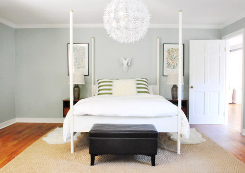
We did a little more bedroom noodling. Noodling, not canoodling. *Blush* Anyway, we last left off after moving our Alaskan prints together over the bed and surprising ourselves by getting a new rug:
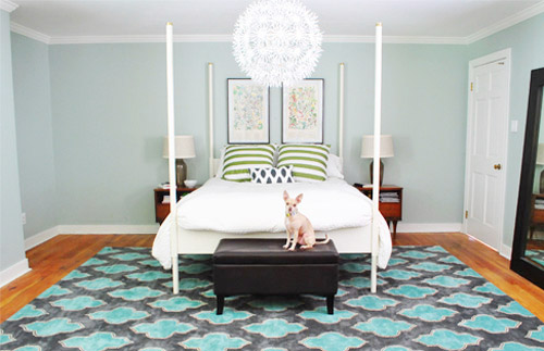
And there were a few commonly asked bedroom questions in the 800+ comments on Monday’s post, which were:
- have you considered getting larger bedside tables?
- can the bed go on another wall?
- will you repaint? maybe in a darker color?
- what are your plans for the nook to the left of the bed?
- what about changing out the pillows/painting the bed & tables/getting a longer bench/switching the lamps, etc?
The short answers to those are: yes but it’s complicated, no, we’re open to it down the road, adding an armoire or a built-in, oh yeah all that stuff is still on the agenda we just haven’t gotten to everything yet.
To elaborate, we’ve definitely considered larger side tables, but the door would swing into anything larger than what we already have on that side, as you can from this old door-open pic (we did a secret book project to the front of this door, so we can’t snap an updated shot).
We don’t want to move the bed to the left since the chandelier wouldn’t be centered above it anymore (we could do a larger table on the left, but we have plans for an armoire or large built-in for the nook to the left of the bed and don’t want to crowd that). We could reverse the door to make it swing into the hall instead of the room, but it might jam up the hall to have a door out there. We couldn’t do a pocket door (we have duct work/electrical in that wall) but have thought about a barn door on a track (which could rest where the leaning mirror lives in the picture above this one), but we’ve considered using that in a spot nearby (more details when we decide if we’ll actually go for it!) so we don’t want that to be too repetitive. We’ll keep you posted no matter what we decide though!
As for if the bed can move, the floor plan of this room is a definite challenge thanks to “things” on each wall (two very off-centered windows, a nook across from the door, and a nook with the sink tucked into it on another wall, and a chandelier in the exact center that looks off if the bed isn’t in the right place). The chandy even lines up with the mirror above the sink, so we don’t want to swag it or move it since aligning things like the bed, the chandy, and the mirror make the room feel balanced/less wonky. So we’ve tried the bed in a bunch of spots, but the place that works best for us is where it lives now (it’s the only long flat wall in our entire room).
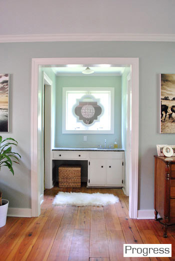
It just doesn’t look centered on the chandelier or the windows in any other spots, and we actually like the placement a lot in person since we wake up to the chandelier being perfectly reflected in the mirror above the sink (it’s so hard to capture in 2-D but it’s the thing everyone falls in love with in person). As for repainting the walls, especially in a darker color, we’re definitely open to it but we’ll be refinishing the floors in a dark mocha color someday and the rug is pretty dark (and the room doesn’t get a ton of light) so we’ll think long and hard before we do anything rash. We’re just getting started, so everything is fair game for tweaks (painting furniture, switching out accessories, etc). Many things like those lamps and the bench are just leftovers from our first house that got plopped down “just-for-now” (Burger uses that bench to get into bed, so it’s our version of Doggie Steps until we get something better – haha).
So now that we’ve hopefully answered those common questions, let’s get to the fun part. Noodling. The first thing we played around with were the pillows and a few other small accessories. The pillows actually inspired a little art switch (since the floral shams were a little busy with the old botanicals that were hanging there).
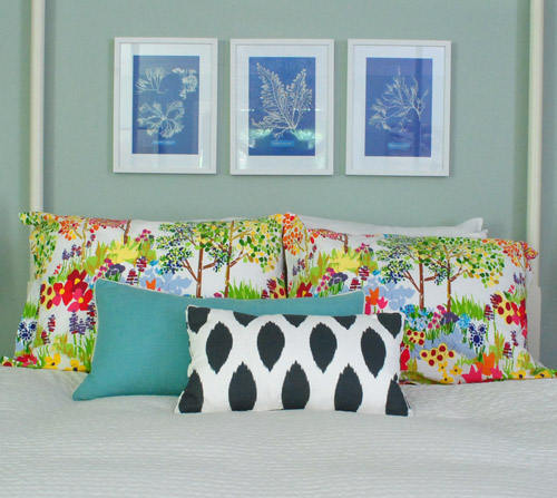
From up close, this mix was fun (the shams are from Pottery Barn two years back, the blue bolster is from Marshall’s, and the front accent pillow is from HomeGoods a few months back). But from far away, the new art was way too small for our tastes. Oops.
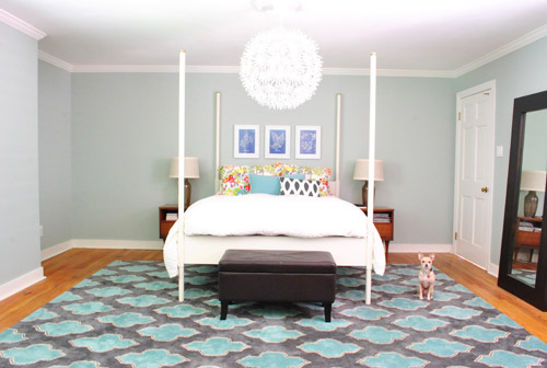
We want the whole room to feel balanced, so with very tall vertical items on all of the other walls like the door to the bedroom, the windows with ceiling-height curtains (which will be switched out, hopefully soon), and the sink nook with a mirror over it…
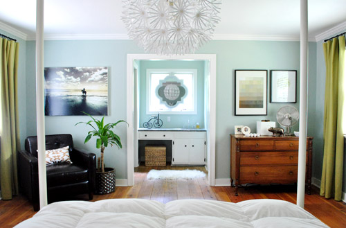
… this art was just too squat and didn’t feel as balanced as the larger Alaskan prints had. But we did like the general concept of adding different colors with pillows – just to break up all the blue on blue action.
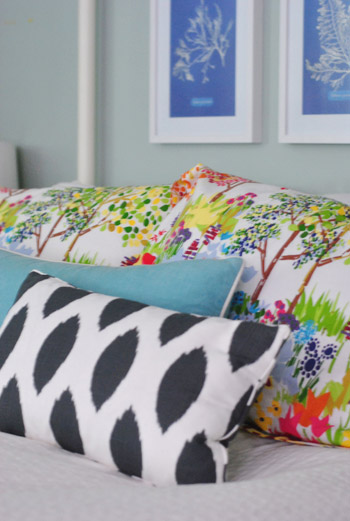
We’re so glad we banged in three tiny nails to give that art a go, even if we didn’t like it once we got ‘er done. It’s all about trial and error (and spackle!) at our house. Haha.
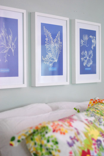
Oh and the prints are from Ikea! We found them for $2.99 for all three (in a clearance bin) and know we’ll eventually find the right spot for them. We already had the frames (also from Ikea, but they hung in our first house), so it was just a $2.99 failed experiment. Haha, so not too bad.
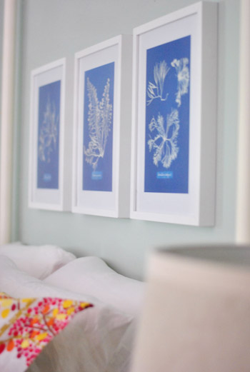
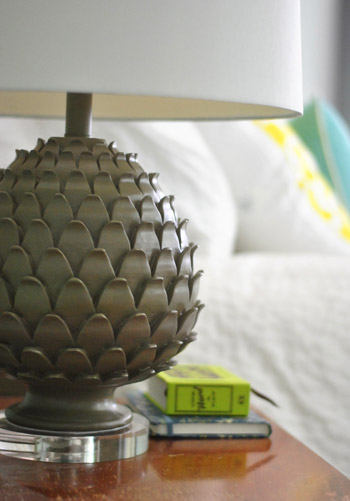
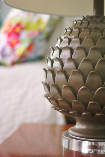
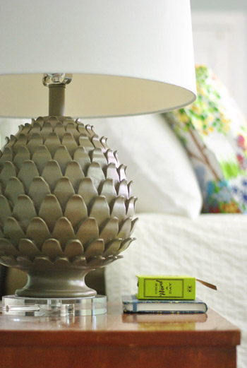
Oh and we also picked up some new lamps! They’re artichoke-ish, which is a totally new shape for us when it comes to lamps (we have like ten gourd lamps, so we were psyched to play around with a new silhouette). They were from HomeGoods ($49 a pop, including the extra large shades).
The original lamps that we had on either side of the bed used to live in our first house’s living room and were over five years old, so we figure we’ll either find another spot in the house for them (we have completely untouched rooms like the playroom and the sunroom to tackle) or yard sale/craigslist ’em if we can’t.

See how much more balanced and substantial the new ones look (with their larger, wider shades and darker bases) in comparison to the old ones above?
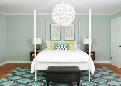
They even seem to make the side tables feel wider, which is nice for balance. And the rounder more textured shape of the new lamps also ties into the chandelier, which is a total happy accident (we definitely didn’t think about that when we fell for them in the store, haha). Oh and ignore the different pillows on the bed in the pic above. We’ll get there in a minute.
It’s nice that the putty color of the lamps isn’t too crazy to compete with the pillows or the rug, but the shape is full of interest and dimension.
Oh and see that book on my side table called One Word A Day? John and Clara got it for me for Mother’s Day along with a pretty pink tulip bouquet and some vases. It’s a one-word journal that John thought I could use to record one hilarious Clara-sentence per day instead of just one word to describe my day (which is how it’s meant to be used). Now we won’t forget the time I said “we might have to rearrange your room again” and she said “Yes! Put some ice cream on it!”
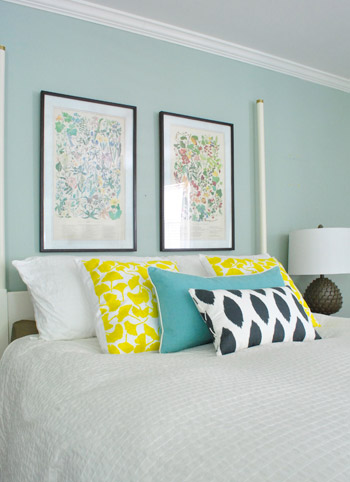
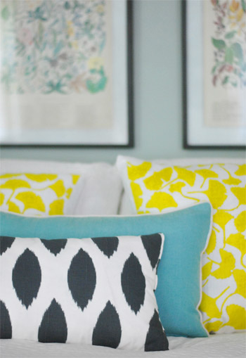
But back to the bedroom. Since the smaller art didn’t work, it was back to our Alaskan botanicals with some different pillows. We landed on this pop of yellow with the teal bolster to tie things into the rug and the deeper navy and white pillow in the front to ground it all. For anyone wondering, those two yellow ginko leaf shams are from a small shop in Northern VA (don’t know the name, but it was in Old Town, Alexandria), but they’re made by Dermond Peterson if that helps.
But you know me, pillows are nomadic in our house, so they might be completely different the next time we share bedroom pics. Yes, pillow swapping is right up there with watching Parks & Rec while eating Oreos around here.
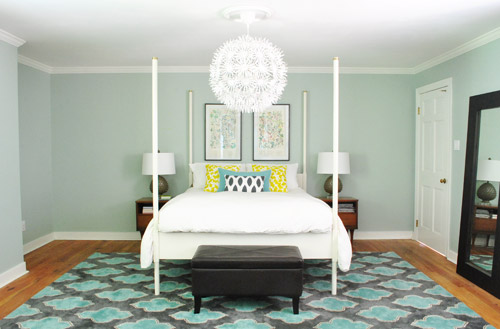
Sure, we still have some major furnishings missing, but it’s fun to see some happy new pillows (with a few warm yellow pops to balance all the blues). And the dark tones in the smallest accent pillow, the botanical frames, and the lamp base relate nicely to the slate/navy tones in the rug without being too matchy.
The lamps just might be our favorite little change (favorite big change = the rug of course).
So that’s where we are. We don’t play poker or bet on horses, so I guess trial and error decorating is how we get our kicks. Haha. Oh yes, we’re daredevils.

We’re still entertaining a ton of possibilities, like:
- switching out the old curtains (for sure!)
- possibly painting the bed in a deep charcoal color
- finding/making a longer bench for the end of the bed
- possibly painting or refinishing the cherry-colored side tables & dresser (on the other side of the room)
- adding an armoire or built-in to that nook next to the bed
- possibly repainting the walls down the road
- painting the ceiling
- possibly removing the posts from the bed (although we like them in the photoshopped renderings below, so maybe not)
- switching out the pillows/bedding as we go
- bringing in a lot more art/furniture in general so it’s not so empty
- staining the beat up & yellowed floor a rich mocha color
- possibly adding a barn door which would allow for larger side tables
- lots of things I’m probably forgetting – haha, but check out this post and this post for mentions of other potential plans
Some might be things we tackle this month while others might not get done for years (like refinishing those floors). But just look how much of a difference that one change can make. Mmm, dark wood floors (thanks Photoshop!) = our happy place.
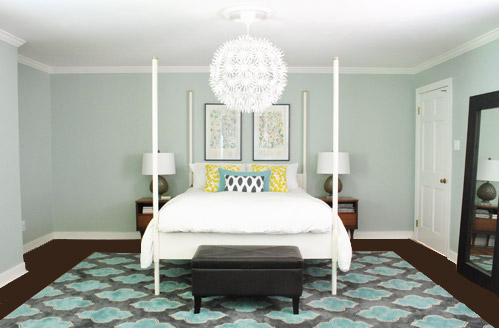
And after a bunch of other tweaks, we’ll just have to see where we end up! Maybe here?
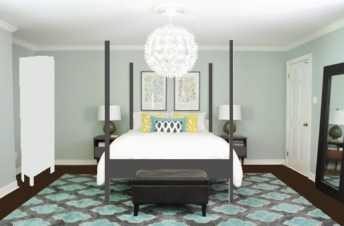
Or here?
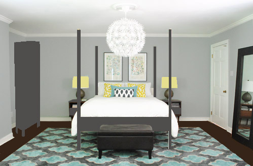
Or here?
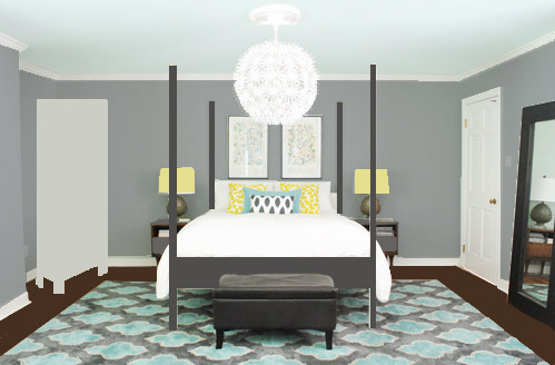
Don’t mind the bad Photoshop. I guess that’s part of the fun, huh? In the meantime, have you ever hung something new only to learn that you loved the first choice better? Have you made any easy lamp or pillow switcheroos in your house lately?

Lauren says
Have you guys thought about a built-in bookcase type situation for that nook? Maybe some closed cabinets on the bottom where you can keep extra blankets, bedding, and throw pillows? And then have bookshelves on top with a sort of “mini-bedroom-library” or something?
YoungHouseLove says
Oh yes, some sort of built-in for the nook is at the top of our list (it was easier to add an armoire in photoshop, but John is gunning hard for a buit-in so we’ll likely do that someday!
xo,
s
cara says
I love the renderings with the rich dark floors….changes the look of the room more than all the other little changes. I’m sure whatever you do will look great!
Kate says
Ya know, I really love this room for the most part I think part of the challenge may be that the tall bed-posts just seem to creat extra vertical lines that compact the bed and the art into too narrow of an alley on that wall. Not critisizing, just oberserving….
YoungHouseLove says
Yes, we mentioned that we’re not above removing those posts in the down-the-road bullets at the end, but we like how they look in the charcaol rendering! I think in person they add interest and some coziness to a room that’s really big and empty feeling. Sort of creating a space within a space.
xo,
s
Erin says
(Non-decor-related comment coming right up…)
I love the word a day journal idea! I have a 5 year journal that I started the year I was having my baby. I’m on my second year and it’s so fun to see what we were doing last year (especially as it relates to the baby). I hope she gets a kick out of reading it when she’s 12 or 20 or whatever. :)
YoungHouseLove says
That’s so cute!
xo,
s
Carrie says
Just pulling those green stripped pillows makes the rug and the wall color work better for me. I knew you had a vision but the green stripeys never worked for me and that was clogging my brain cells.
I LOVE photoshop #1! I would live in that room for sure! :)
Mara says
Your design aesthetic is spot on, so I’m reluctant to give this idea, but seeing that y’all are maniacs (and I use that word affectionately!) for the spray paint, and that the lamps actually remind me of pineapples and not artichokes — how about a little pop of yellow on your nightstands?! Also: thumbs up for painting the bed (you could always go back to white at some point).
YoungHouseLove says
Ooh that could actually be fun down the line! We’ll have to see where we end up!
xo,
s
LeAnna says
painting the bed charcoal would look fantastic! At least, it does in your photoshop mock-up! Really grounds the bed in the room. It’s fun to watch the transitions as you guys figure out what works for you!
Tanya says
I would paint the bed and the night stands. In the pictures the night tables seem so small beside the bed I think that if they were painted to stronger color that it would help ground things. Have you considered some open shelving on the left wall; floor to ceiling with brackets. It would be great open storage, or if wide enough you could have baskets. It would also allow for some more decorative elements. Have you considered a larger bench/settee at the foot of your bed? We just moved into our third house and I am still trying to finish up our master. I feel for you because you have so much open space at the foot of your bed that it does make it challenging to cozy things up; I had this problem in our last house. Can’t wait to see what you come up with!
YoungHouseLove says
Oh yes, read this post for those answers! A longer bench is definitely on the agenda as well as the potential for built-ins in the nook on the left and painting the bed/night stands. All are a possibility!
xo,
s
Bernadette says
Have you though about dyeing the curtains? I just did my first dye project with i-dye and loved the product (got it at an art supply store, it’s more expensive than RIT brand, but it seems to be a lot simpler and less messy). Your curtains are still a beautiful texture perfect for the room, just the wrong color :)
YoungHouseLove says
Oh yes, we have used iDye (for the covers of our dining room chairs) and love it! We like the color of the curtains for the playroom (and have the right amount) so we might try using them in there first and if that doesn’t work we can always dye them!
xo,
s
Misty says
Don’t paint the walls. The color looks good and repainting seems a bit wasteful since you just painted them. But painting the bed and nightstands is a good idea. You probably already have dark gray paint from the ceiling beams in the living room. Keep up the theme of working with what ya got.
YoungHouseLove says
Oh yes, as we mentioned in this post we have no immediate plans to paint the walls at all! That’s something we would do down the line after a lot of thought if we didn’t like them with everything else going on, but so far we love them and would much rather paint Ed charcoal and refinish those floors!
xo,
s
Melissa says
i vote for grey walls and aqua ceiling!
kim says
with that rug a darker grey bed, A decision must be made on either the light airy look. Or a more dramatic moody look. You seem to be straddling the two and not really getting were you want to go. JMO ;) (Just My Opinon)
YoungHouseLove says
Oh yes, we mentioned this room is definitely in flux, so it doesn’t make much sense as-is but we can’t wait to see it evolve! We loved the photoshopped rendering of Ed in charcoal, so it’s definitely a strong contender. Will keep you posted!
xo,
s
Kasey Befeler says
Just an fyi on barn doors: We have three in our house and we absolutely love them, but.. they don’t afford the same type of privacy as a regular door, or even a pocket door. The tracks the doors hangs from offset them from the wall just a bit so (at least with ours), there is a tiny gap on either side when the doors are shut (even though the doors overlap the walls on either side) that little eyes could potentially peek through. :)
YoungHouseLove says
Thanks for the heads up. My sister has a bunch in her house so we know exactly what you’re talking about.
-John
Ashley says
Grey walls + yellow lampshades + grey Ed = bomb diggity!
JCass says
We also LOVE the look of dark-stained hardwood floors. In our old house we replaced carpet in our living room/office with dark ipe floors, which were totally gorgeous… until our dog stepped foot on them. You could see every single off-white hair that he shed. Does Burger shed, or are y’all crazy swiffer-ers or vacuumers like me?
YoungHouseLove says
Burger fortunately isn’t not a shedded – mainly because he just does haven’t that much hair (he’s already small and his belly is completely bald). But we still are pretty crazy about vacuuming.
-John
Christine says
I loved the photoshop yellow lampshades! They really popped.
jimbeam says
Architecturally speaking, a door to a master bedroom should have more privacy than that. If you started moving/creating walls, you would likely have to move that light fixture (but you are no stranger to that!)
If you were to move that door – in a photoshop kind of way :) – does it make more sense somewhere else?
YoungHouseLove says
Sadly it can’t move anywhere else on that wall (that’s the exterior alley where we’re adding our deck, so there’s no more house for it to connect to) and the only other wall that connects to the inside of the house would mean putting a door right where our console/sofa are in the living room, which just makes no sense!
xo,
s
My Boys' Teacher says
Oh dear LOL! The second you guys show even a *hint* of “something being off” all the armchair quarterbacks come rushing to the scene. You are such good sports :)
It’s looking great, love it. Once you get that armoir in that “off” feeling will evaporate. I think it’s just that from that camera angle everything looks kind of piled in the middle like you moved it to vacuum around it. I’m sure it’s not at all like that in person. It’s a feeling created by the camera angle..not being able to see the whole room at once. Once the armoir’s in the rest of us will be able to see what you see a little easier.
YoungHouseLove says
Yeah, it definitely does look more clumped in the photo than it does in person – but it still is helpful in helping us figure out how to bring more balance to the room!
-John
Bethany [at] Powell Brower Home says
WOW – i love the darker color! great job guys and gals!
Margaret says
We have a similar nook and I’m trying to get brave enough to do a built in….it would be great to have an example to follow ;)
Ellie says
Love the new yellow pillows!!!! If you’re considering painting the ceiling, you should look into tin tiles or the anaglypta wallpaper. It’s blind embossed in a ton of different patterns and it looks awesome painted on the ceiling! A family friend of mine used it on her ceiling and painted it a burnished gold so it looked like tin tiles.
YoungHouseLove says
Cool! Thanks for the tip!
-John
Kristen says
I love IKEA white furniture. Seriously, Love with a capital L. But when I saw the bed photoshopped in the dark charcoal color, I thought…oh HELLO! :-)
Meredith says
Lookin’ good, guys!
I have a very random question. I am thinking of doing something with my kitchen table that is similar to the dining arrangement you had in your first house. Do you have a picture of how close the chairs were to the shelves? I don’t know how far away to put the table without making people bump their heads, so I’m not sure if there’s room in my kitchen for that type of arrangement. Thanks!
YoungHouseLove says
We just pushed out the chairs as if someone was sitting in them and gave about 12″ inches beyond that, just to be sure nothing would bump. Maybe 32″ total from the table to the front of the shelves?
xo,
s
John @ Our Home from Scratch says
Your bedroom is sweet. Wide plank floors, perfectly decorated. Darkening them up would be a fun, yet stain & poly-stinky project. Our master bedroom is still a builder grade blank canvas. Can’t wait to start chipping away at it.
Michelle N says
Love the new lamps! Heading to Home Good today to see what I can find.
Do you guys use the app Shopkick? I recently discovered it! It’s really cool you earn points just for walking into certain stores. Some stores have Instant Surprises. For example the surprise for my local Target is $5 off when you spend $50. Or you can get a coupon to scan at check out. With the points you can buy gift cards to places like Target, Starbucks, Best Buy! The app also lets you know what’s on sale and deals for ShopKick. I love it and it’s so fun. You just have to make sure the app is open when you walk into the store to earn points. You can also scan certain items to earn more points.
Anyway…enough about the app. haha I just wanted to share because I know how much you love to save!
YoungHouseLove says
Sounds awesome! We’ll have to try it!
xo,
s
Kitty O says
I can imagine how annoying it is to get 500 comments suggesting 500 different things–can’t please everybody–but I’ll add my two cents: I loved those bright green and white striped pillows you had before! I actually looked all over for some for my room and am now considering making my own. They seemed to compliment the blue walls and coordinated with the green curtains. Of course, if you change other things it won’t matter–just saying.
But more importantly (to me), please don’t paint those night stands! While I’m not one of those purists who thinks wood should never be painted, I love mid-century stuff in its original condition. Nice wood tones are part of the mid-century aesthetic, and while painted furniture can look really cool and modern, the combination of modern lines and *real* wood is so hard to come by today. (Similar styles in stores like Ikea and West Elm or whatever are often cheap veneer; I don’t mind painting that stuff!) Also, the stained night stands tie in nicely with your lovely antique dresser on the other side of the room.
You know, I think I must be alone in thinking your room was coming along really well already! I kinda thought you just needed a built-in in the nook and would be good to go.
YoungHouseLove says
Aw thanks Kitty! We never take painting any sort of wood lightly (we know how hard it is to strip it back to its original condition- ugh!) so we’ll think long and hard if we ever decide to take a brush to them. More likely would be painting something newer or laminate – like Ed the bed or the built-in we might add! Will keep you posted!
xo,
s
Sue Mayhue says
The bench at the foot of the bed should be longer. Everything else looks great. Love the grey tones in the pics.
YoungHouseLove says
Oh yes, that’s on the agenda! See those bullets at the bottom? Lots to do!
xo,
s
Lisa in Seattle says
Three things made me gasp out loud: 1. The mocha-shopped floors. 2. The contrast of the white chandy against the light blue ceiling. 3. The melon-papaya accents in the Real Simple room makeover link. The yellow is nice, but having seen the other color with your new rug – hotcha!
Kitty O says
Oh man, I just noticed that you’re considering the possibility of painting the dresser too! Oh, nononono. I guess I *am* one of those purists who thinks antiques shouldn’t be painted if they’re in good condition. Well, maybe not always; I have an ornate Victorian side table that looks really cool painted black. But I also think every room needs some wood tones (and not just on the floor), and stained *real* wood says quality to me. I only paint the cheap or damaged stuff.
YoungHouseLove says
We definitely won’t do anything rash, I promise! We’d love to refinish the floors first and then see what we think once they change (we might love some softer wood tones that no longer compete/blend with the orange floors). Will keep you posted!
xo,
s
Emily says
Super cute lamps! I’m loving watching the room transformation! And I’m kind of obsessed with the photoshop version of the dark bed, gray walls, and blue ceiling. It looks sooo good! I’m excited to see what happens!! :)
alex says
What if you guys did a built in sort of mimicing the ones in your dining room, cabinets below, flat top, a variety of shelving dimensions? I love the dark floor mock up, not too keen on the dark bed though, i think it almost ruins the flow of the room, especially since you have such earthy elements on the bathroom opening side…and its such a cheerful room to wake up to it seems. Maybe painting in a brighter but less intrusive color…the possibilities are endless. Love it though and I’m generally so impressed by the end result…I.e, your kitchen color now, I didn’t really like it at first but its like the sun in your solar system of a home Hahaha.
sue says
Hi guys… can i suggest a product such as 3M for hanging your artwork… it’s a removable velcro/sticky tab thing that comes in varying strengths for different weighted artwork/etc… i’ve rented most of my life and it’s been invaluable… it’s a super easy way to hang artwork without marking your walls (not recommended on papered walls, but plaster is completely fine), you simply stick one side of the tab to the back of your artwork & the other to the wall… simples! perfect for people such as yourselves who like to move things around a bit! :)
YoungHouseLove says
Oh yes we love that stuff! It’s what we used to hang some art on our wall of penny tile in the kitchen!
xo,
s
Larissa says
I love carpet.
I love lamp.
YoungHouseLove says
I love comment.
-John
Caroline says
Your new rug is in this month’s issue of Real Simple magazine! It’s in an organizing feature (page 84 if you want to check it out). It’s listed at $949 for an 8×10, so you guys got a great deal!
YoungHouseLove says
We noticed that – so funny right!
-John
Olivia says
Have you thought about doing a wallpaper accent wall behind the bed?
YoungHouseLove says
John has actually been into the idea of a stencil or wallpaper on that wall- so we’ll have to see where we end up!
xo,
s
Katie @ JK Homestead says
I love the colorful pillows and artwork. And the new lamps are beautiful. Good change. My favorite photoshop pic is with the charcoal gray bed and nightstands (current color walls). It’s a great compliment and has a better presence in the space. When you eventually refinish the floors, that will make a huge difference as well. Love it. :)
Lindsey E. says
We are about to add some hardwoods in our new house and stain some exsisting ones the same color. I love the color of wood you guys want to stain yours. Do you have any idea what color it’s called so I can try to look for it? Thanks!
YoungHouseLove says
It might just be unstained wood (ours is pine which doesn’t even appear to ever have been sealed, so it’s stained all over the place- but you can use a clear sealer to keep the look).
xo,
s
Frida says
Love new rug and the pillow changes! Just to throw in another idea…have you thought about maybe changing Ed into a “real” canopy bed (adding extra, horizontal posts). Because right now he’s kinda in between. Also, the bed posts are blocking the lamps, almost crossing them out visually which seems to be quite distracting (maybe it’s just the angle of the shot though. I think with some added beams to the bed and maybe some very light curtains you might not need additional art work between those bed post…off to see if I can find a picture of what I mean…
Anyway, love to see what you come up with!
YoungHouseLove says
Yeah, those posts don’t block the lamps much in person (since you walk around the room and see them from either side of the bed, etc) but in pics it’s a drag that they go through the lamps! Haha. And Ed actually has top slats that we removed (they were really tight on the chandelier) but we might get them back up there someday! You never know!
xo,
s
Sonda Jordan says
Something fun to try above your bed in place of the botanical prints could be handmade giant silhouette’s of your guys faces, looking towards each other with “kissing” lips mounted on the wall so the wall space between the faces looks like a vase. You could paint them yellow?
YoungHouseLove says
Fun! Always another fun possibility!
xo,
s
Crystal @ 29 Rue House says
I get you Sherry. Hopefully you’ll know what I mean. Haha. Our house has so much work and it’s not from lack of ideas just that it takes us forever to get somewhere. And speaking of awkward rooms, we’ve got a really awkward living room (lots of windows, doorways, and stairs plus it’s long and skinny) that we’re trying to come up with a layout in our minds but finding it really difficult. I think I’m just going to go the let it slowly-evolve-over-time-and-we’ll-get-there-when-we-get-there-route.
Those photoshopped floors are beautiful btw!
YoungHouseLove says
Aw thanks Crystal! I get you right back. Haha.
xo,
s
Stefanie says
I still much prefer the prints above the side tables, with a smaller statement piece (like a faux ram’s head) in the middle – I feel like the bed space looks small and cramped in such a large open (empty on that side) room. That may just be me. Or maybe it’s you too, but you can bear to replace Ramsey quite yet. I understand. *Pause for moment of silence for Ramsey*
LURVE the lamps. I’m in CA but am hoping to happen upon those babies when I hit up my own Homegoods tomorrow. *Fingers Crossed*
Amy says
I love number two gray bed gray bed!…I have gray walls in my main living areas but I think the blue makes your bedroom feel cozy and relaxed!…ps I think a barn door covering the doorway into the bathroom would be amazing!…seeing the sink from the bed is a little weird to me!
Lilly says
Love all the new tweeks my fav are te lamps. I just bought some similarish lamps off craigslist painted them and switch the shades. They were listed @ $40 n I got them down to $25 for te pair. I’m in love with my new stray dog artichoke wanna be lamps. I love all the fun photo shop pics cant wait to c wut u end up doing. I also love the new rug its so fun n totally changes the look of the room. I really like how u guys are not afraid to admit u did a bad first choice or second n went back to the first idea I’m constantly doing the same thing @ home since we have a limited budget. It’s also nice to know that I’m nt the only one who painted my bedroom a year ago and feel like the color might not be working same with my nightstands I bought a pair a year ago and I’m not feeling them lately. I’m contemplating o painting them even thought my hubby will kill me because we bought them new. Thank u for all the inspiration u guys offer day to day.
Anne says
After your Target post, I’m all for adding coral to your colour scheme in the bed room. It would spice the all blue-green-and-yellow colour palette up while still being subtle enough to go along nicely whith those colours. Otherwise I’d like you to use more yellow accessories as they brighten up the room. :) Can’t wait to see what you make of it! You have great taste that’s just up my alley so I’m certain you’ll turn into something special (Even without coral or yellow tones. ;))! xx
YoungHouseLove says
Love me some coral- just have to get John on that train since it’s his room too. Haha. We’ll see!
xo,
s
Emily says
The last photoshop rendering = the best!
A says
Looks good! Gotta admit, I hated those green striped pillows on the bed. Sorry. They looked off to me. Especially once you added that awesome new rug. This is a good temporary look!
Suzanne says
Love the pillows and the new lamps! Have you guys ever thought about putting the bed at an angle in the room. When looking at the bed, I’m thinking the corner on the left, opposite of the bedroom door. Just a thought! Might complicate a nightstand on each side but could also create a cozy seating area at the foot of the bed. Now I’m ready to change up our master bedroom this weekend!
YoungHouseLove says
We actually moved it all over and tried it in that left corner on an angle but it created a huge negative triangle of nothing behind it (since we needed space for the bed and the night stands on an angle it was just really awkward). The chandelier also wasn’t centered anymore on the bed and just looked quasi crazy. Haha. But we tried!
xo,
s
Hannah says
I love the new lamps! And I loved them even more (if that’s possible) in the photoshopped version with the yellow shades. Definitely helped tie in the yellow pillows. If we’re voting, I like the third/last photoshop option :)
Sarah says
Those new lamps make a huge difference! And I’m loving the pillows that you added. For above the headboard, what about one piece of substantial, graphic art? Maybe something like this (http://www.mbantua.com.au/image.php?id=6463) but bigger? I like the idea of something in a contrasting color like plum there!
Do I get a vote in what you do next? Yes?! Great! I think refinishing the floors is the next step — it seems like it’s mentioned in half of the posts that you do and I think it would help you be able to finish more things — this room, the slipcovers in the dining room, etc. And, it would look gorgeous! I like to get the “big” projects out of the way first so that I can see some substantial impact.
With just a few changes, your bedroom is much more YOU!
YoungHouseLove says
We love the idea of someday having one giant piece of art up there, so we’ll have to see where we end up! As for refinishing the floor, we’d love to do that someday but we’re not sure when we’ll have the time to get ‘er done. With book stuff on the horizon for this fall we’re nervously trying to finish the deck this summer and then might want a breather so some smaller more manageable projects might be what the doctor ordered! Haha.
xo,
s
Caitlin says
Hi Sherry!
Love the new pillows! I think the pop of yellow is really fun… and I love it with the teal. I have a quick question (which I hope you haven’t already answered, if so.. I’m sorry!) but how does having white bed linens work for you? I love the idea of the white duvet, but my hubby… well… sweats a lot (haha) and I’m afraid I would be washing it every day. Any insight for me? Thanks so much!
-Cait
YoungHouseLove says
One thing that helps is we’ve actually got darker sheets, so usually they’re between us and the white duvet cover. We haven’t really found that this duvet needs much more washing than our old patterned blue one – and in some ways its easier because it’s all white. Hope that helps!
-John