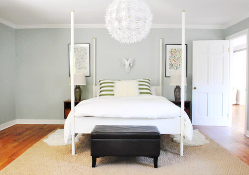
We did a little more bedroom noodling. Noodling, not canoodling. *Blush* Anyway, we last left off after moving our Alaskan prints together over the bed and surprising ourselves by getting a new rug:
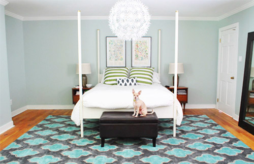
And there were a few commonly asked bedroom questions in the 800+ comments on Monday’s post, which were:
- have you considered getting larger bedside tables?
- can the bed go on another wall?
- will you repaint? maybe in a darker color?
- what are your plans for the nook to the left of the bed?
- what about changing out the pillows/painting the bed & tables/getting a longer bench/switching the lamps, etc?
The short answers to those are: yes but it’s complicated, no, we’re open to it down the road, adding an armoire or a built-in, oh yeah all that stuff is still on the agenda we just haven’t gotten to everything yet.
To elaborate, we’ve definitely considered larger side tables, but the door would swing into anything larger than what we already have on that side, as you can from this old door-open pic (we did a secret book project to the front of this door, so we can’t snap an updated shot).
We don’t want to move the bed to the left since the chandelier wouldn’t be centered above it anymore (we could do a larger table on the left, but we have plans for an armoire or large built-in for the nook to the left of the bed and don’t want to crowd that). We could reverse the door to make it swing into the hall instead of the room, but it might jam up the hall to have a door out there. We couldn’t do a pocket door (we have duct work/electrical in that wall) but have thought about a barn door on a track (which could rest where the leaning mirror lives in the picture above this one), but we’ve considered using that in a spot nearby (more details when we decide if we’ll actually go for it!) so we don’t want that to be too repetitive. We’ll keep you posted no matter what we decide though!
As for if the bed can move, the floor plan of this room is a definite challenge thanks to “things” on each wall (two very off-centered windows, a nook across from the door, and a nook with the sink tucked into it on another wall, and a chandelier in the exact center that looks off if the bed isn’t in the right place). The chandy even lines up with the mirror above the sink, so we don’t want to swag it or move it since aligning things like the bed, the chandy, and the mirror make the room feel balanced/less wonky. So we’ve tried the bed in a bunch of spots, but the place that works best for us is where it lives now (it’s the only long flat wall in our entire room).
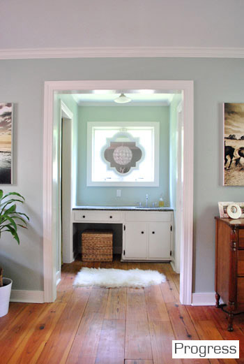
It just doesn’t look centered on the chandelier or the windows in any other spots, and we actually like the placement a lot in person since we wake up to the chandelier being perfectly reflected in the mirror above the sink (it’s so hard to capture in 2-D but it’s the thing everyone falls in love with in person). As for repainting the walls, especially in a darker color, we’re definitely open to it but we’ll be refinishing the floors in a dark mocha color someday and the rug is pretty dark (and the room doesn’t get a ton of light) so we’ll think long and hard before we do anything rash. We’re just getting started, so everything is fair game for tweaks (painting furniture, switching out accessories, etc). Many things like those lamps and the bench are just leftovers from our first house that got plopped down “just-for-now” (Burger uses that bench to get into bed, so it’s our version of Doggie Steps until we get something better – haha).
So now that we’ve hopefully answered those common questions, let’s get to the fun part. Noodling. The first thing we played around with were the pillows and a few other small accessories. The pillows actually inspired a little art switch (since the floral shams were a little busy with the old botanicals that were hanging there).
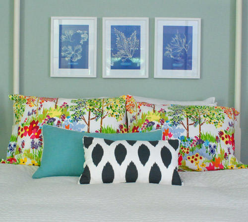
From up close, this mix was fun (the shams are from Pottery Barn two years back, the blue bolster is from Marshall’s, and the front accent pillow is from HomeGoods a few months back). But from far away, the new art was way too small for our tastes. Oops.
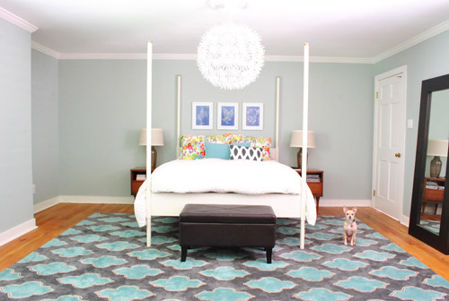
We want the whole room to feel balanced, so with very tall vertical items on all of the other walls like the door to the bedroom, the windows with ceiling-height curtains (which will be switched out, hopefully soon), and the sink nook with a mirror over it…
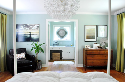
… this art was just too squat and didn’t feel as balanced as the larger Alaskan prints had. But we did like the general concept of adding different colors with pillows – just to break up all the blue on blue action.
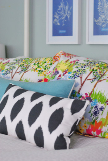
We’re so glad we banged in three tiny nails to give that art a go, even if we didn’t like it once we got ‘er done. It’s all about trial and error (and spackle!) at our house. Haha.
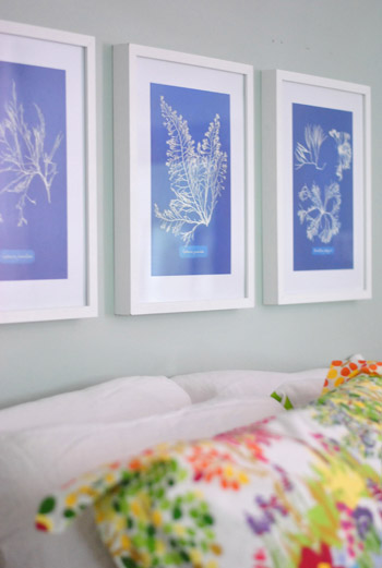
Oh and the prints are from Ikea! We found them for $2.99 for all three (in a clearance bin) and know we’ll eventually find the right spot for them. We already had the frames (also from Ikea, but they hung in our first house), so it was just a $2.99 failed experiment. Haha, so not too bad.
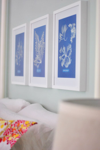
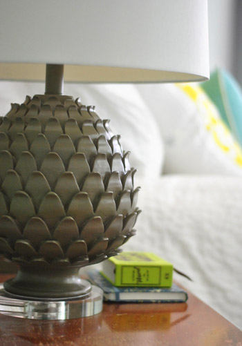
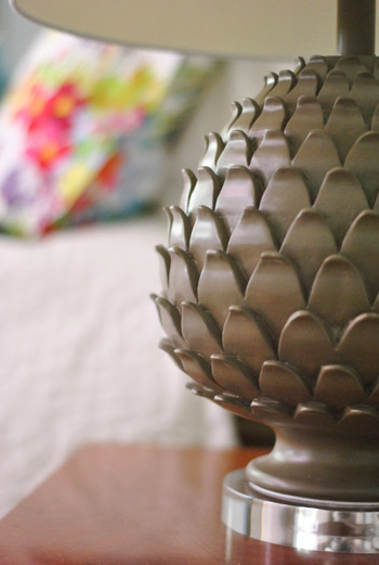
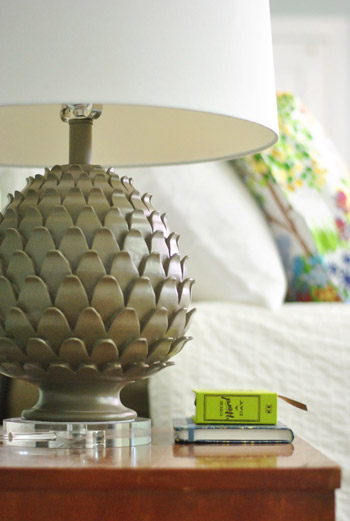
Oh and we also picked up some new lamps! They’re artichoke-ish, which is a totally new shape for us when it comes to lamps (we have like ten gourd lamps, so we were psyched to play around with a new silhouette). They were from HomeGoods ($49 a pop, including the extra large shades).
The original lamps that we had on either side of the bed used to live in our first house’s living room and were over five years old, so we figure we’ll either find another spot in the house for them (we have completely untouched rooms like the playroom and the sunroom to tackle) or yard sale/craigslist ’em if we can’t.

See how much more balanced and substantial the new ones look (with their larger, wider shades and darker bases) in comparison to the old ones above?
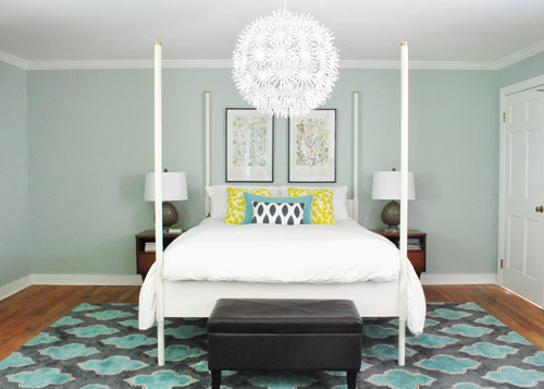
They even seem to make the side tables feel wider, which is nice for balance. And the rounder more textured shape of the new lamps also ties into the chandelier, which is a total happy accident (we definitely didn’t think about that when we fell for them in the store, haha). Oh and ignore the different pillows on the bed in the pic above. We’ll get there in a minute.
It’s nice that the putty color of the lamps isn’t too crazy to compete with the pillows or the rug, but the shape is full of interest and dimension.
Oh and see that book on my side table called One Word A Day? John and Clara got it for me for Mother’s Day along with a pretty pink tulip bouquet and some vases. It’s a one-word journal that John thought I could use to record one hilarious Clara-sentence per day instead of just one word to describe my day (which is how it’s meant to be used). Now we won’t forget the time I said “we might have to rearrange your room again” and she said “Yes! Put some ice cream on it!”
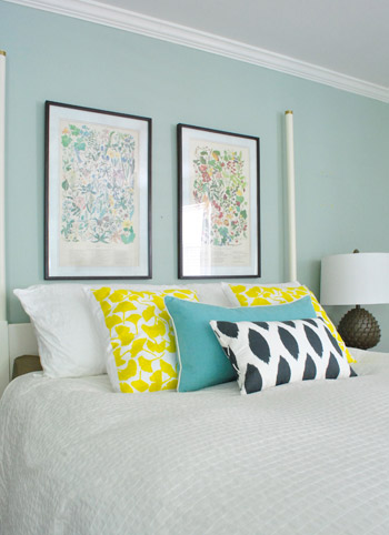
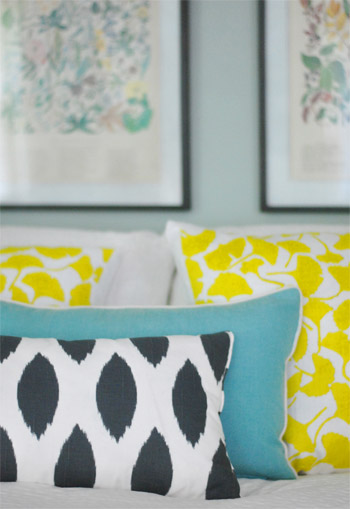
But back to the bedroom. Since the smaller art didn’t work, it was back to our Alaskan botanicals with some different pillows. We landed on this pop of yellow with the teal bolster to tie things into the rug and the deeper navy and white pillow in the front to ground it all. For anyone wondering, those two yellow ginko leaf shams are from a small shop in Northern VA (don’t know the name, but it was in Old Town, Alexandria), but they’re made by Dermond Peterson if that helps.
But you know me, pillows are nomadic in our house, so they might be completely different the next time we share bedroom pics. Yes, pillow swapping is right up there with watching Parks & Rec while eating Oreos around here.
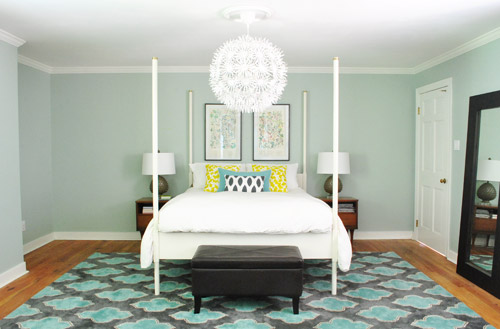
Sure, we still have some major furnishings missing, but it’s fun to see some happy new pillows (with a few warm yellow pops to balance all the blues). And the dark tones in the smallest accent pillow, the botanical frames, and the lamp base relate nicely to the slate/navy tones in the rug without being too matchy.
The lamps just might be our favorite little change (favorite big change = the rug of course).
So that’s where we are. We don’t play poker or bet on horses, so I guess trial and error decorating is how we get our kicks. Haha. Oh yes, we’re daredevils.

We’re still entertaining a ton of possibilities, like:
- switching out the old curtains (for sure!)
- possibly painting the bed in a deep charcoal color
- finding/making a longer bench for the end of the bed
- possibly painting or refinishing the cherry-colored side tables & dresser (on the other side of the room)
- adding an armoire or built-in to that nook next to the bed
- possibly repainting the walls down the road
- painting the ceiling
- possibly removing the posts from the bed (although we like them in the photoshopped renderings below, so maybe not)
- switching out the pillows/bedding as we go
- bringing in a lot more art/furniture in general so it’s not so empty
- staining the beat up & yellowed floor a rich mocha color
- possibly adding a barn door which would allow for larger side tables
- lots of things I’m probably forgetting – haha, but check out this post and this post for mentions of other potential plans
Some might be things we tackle this month while others might not get done for years (like refinishing those floors). But just look how much of a difference that one change can make. Mmm, dark wood floors (thanks Photoshop!) = our happy place.
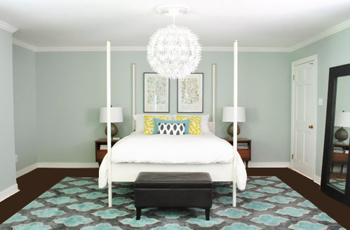
And after a bunch of other tweaks, we’ll just have to see where we end up! Maybe here?
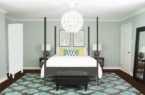
Or here?
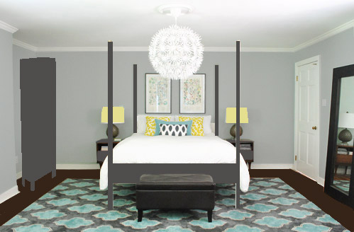
Or here?
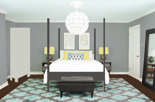
Don’t mind the bad Photoshop. I guess that’s part of the fun, huh? In the meantime, have you ever hung something new only to learn that you loved the first choice better? Have you made any easy lamp or pillow switcheroos in your house lately?

Keisha says
We are getting ready to redo our Master bedroom as well, so I am glued to your updates!
That is just crazy how switching out the lamps makes such a huge difference. It really does help the nightstands seem bigger. I like your mock ups as well. I really like the bed painted the gray color. I wonder what painting the artichokes blue and keeping the shades white would look like.
Amme says
I love the way your room is evolving. The new rug is awesome. >>>>>>But I have an off subject question for you. My mother’s day gift from my husband is that he is refinishing our front door—TOMORROW! Last night he went and bought new door hardware, but I didn’t like what he brought home. Then, I remembered you painted yours and saved $$ My question for you is: How is the ORB door front door hardware holding up since going through the fall, winter and now spring! Whew! Time flies There are 6 of us in our house and our 4 kids are constantly in and out.
YoungHouseLove says
Still holing up awesomely! We did an update post with photos a few weeks ago actually- still looks great!
xo,
s
Amme says
Oops! How did I miss that update? My mistake. Thanks.
Vanessa says
I love the new changes you’ve made! The yellow pillows look great with that rug!! And I really like the idea of the darker bed frame and lamp shades in the future. A little part of me wants you to do away with all that symmetry though… :)
Katie Wraley says
I’m sure you’ve heard this 100 times already but as I was flipping through Real Simple -June 2012 edition I saw your rug!! Thought you might like to know :)
Abby says
I really like the new yellow pillows- they definitely add some “pop”! I’m still trying to figure out how to convince hubs I need a stockpile of awesome pillows.
Meg says
I love the new rug and the photoshop of the bed painted grey. Have you tried placing the large picture that’s above the leather chair (beach scene) over the bed? I feel like you need something substantial on that wall.That’s the fun part about decorating, that you can tweak it as you go along. It looks like you have a lot of room at the end of the bed to fit 2 chairs and a small table. You both have great taste, so whatever you decide I know will look great.
YoungHouseLove says
We actually tried that but it wasn’t tall enough- sort of felt squat and a little too small for that big rectangle behind the bed. You never know where we’ll end up though!
xo,
s
Michelle N says
Have you guys seen this stuff before? Simply Spray Fabric paint…Hmmmm I wonder if it would be worth trying out.
http://www.simplyspray.com/
YoungHouseLove says
We have seen it and hear that it works well! We tried some fabric spray for a book project and it was awesome actually!
xo,
s
Jenni says
You should totally ORB Ed the Bed!!!
Laura says
I am still in love with that rug and I love the 3 Photoshop ideas that you have for the room. The mocha refinishing really makes that run “shine” and I love the blue ceiling in the 3rd idea photo! :-)
I haven’t made any small switches with decor, but I’m looking forward to doing so! We have some hand-me-down furniture coming our way in June and we’re moving in August, so I’m trying to wait until then.
karla says
i’m so obsessed with your rug!
Gigi @ Enemyoftheaverage says
I adore that new rug. Painting the walls will make the most dramatic change. After that stain the floors. Don’t touch the bed. Too much work. Change out the white sheets and the bed will pop more. You’re having issues with the art over the bed because it blends in too much with the wall colors. The scale is right, it’s just pastel layered over pastel which makes it look wonky. Paint will make all the difference in that room. Which I’m sure is just what you want to hear since you just painted it only a year ago!
Nadine says
Love the dark color of the bed. Really adds to the room. I think that is a definate on the to-do list!
Jen @ www.migonishome.com says
Ohhh Sherry, the bed would look fabulous in gray! What a great idea! I love how you are taking your time with this and not feeling pressure to move too fast to make it look perfect asap. That is how we are doing our house, even though some people make us think we should just quick get her done! :)
Sloane says
Oh! I LOVE the picture you photoshopped with the bed painted gray, the gray armoire (sp?) in the corner across from the door, and the yellow lamp shades! I love it so much I want to duplicate it in my own (future dream) house and I haven’t even seen it in real life haha. Ya’ll are doing a great job!
jeannette says
FYI DYI barn doors over at chezerbey:
http://chezerbey.com/category/barn-doors/
Bob says
Hey, in another 6 months and a dozen more changes, you’ll get there. To save you some time and effort, get rid of the bed posts and the hugemongous hanging light and you’ll be halfway home.
You’re welcome.
Barbara H. says
It’s fun watching the process of change! You are definitely on your way. One thing that keeps hitting my eye is the mat color of the botanicals. I remember that you changed it from a medium to dark green, I think, to the lighter color. I wonder, though, if chose a different dark color if it would make the prints themselves really pop out. You probably took all that into consideration when you made the change, so I’m not trying to second guess you. Have fun with your journey of change.
Hannah says
Ohhhh those mid-century side tables are so beautiful when left in their natural state. I know they were cheapies, but the wood is in such great shape..
Instead of painting the bed, you could find a charcoal duvet cover to kind of “cut” through the whiteness. Then leave the walls alone or do a very light grey color (similar to the office?)
Pic: http://postimage.org/image/4gqxpapod/
Then you can stencil the ceiling…..KIDDING! :)
YoungHouseLove says
Always another possibility for sure! Haha. Love the photoshopping!
xo,
s
jeannette says
i can’t believe you’re consulting US on how to do your bedroom.
since yew ast, i’d go with the dark stained floor first, before making any other decisions. it really is a game changer, and makes the room seem less empty and vast. the lamps are hottttt. happy trails!
Gina says
WOW, love the rug and those lamps. I saw those lamps and didn’t buy them. Why?? I’m heading out now to try and find them again!! That rug is perfect too. If you ever want to sell it I’ll buy it!
Please explain the mirror you see from your bed. Is it a quatrefoil mirror over another mirror or is it frosted around the quatrefoil shape? Whatever it is I love it!
YoungHouseLove says
It’s a quatrefoil mirror over a window (it just looks frosted because the light is blowing it out, but it’s a normal window). Here’s a post all about it: https://www.younghouselove.com/2011/01/the-deed-is-done/
-John
Gina says
Oh I forgot to mention the photoshop ideas of the bedroom are great. My favorite is the first one. Wish you guys could do some noodling at my house!
:)
Charlotte says
The new lamps are beautiful! I think the room looks very nice as is, but will definitely benefit from your plans to fill the nook area. Have you thought about adding a bed skirt? I think a bed skirt would really complete the look.
YoungHouseLove says
Never even thought about that! Will have to see where we end up!
xo,
s
Lemon says
The problem is too much symmetry. Try some asymmetry while maintaining balance. It is a challenging design concept, but you guys have mastered it in other parts of the house.
YoungHouseLove says
I totally agree! Hopefully when we add the built in in the nook we’ll get that (since it’ll go to the ceiling, so it won’t be a perfect match with the door). We also need art for the wall to the left of the nook, so that’ll hopefully help it feel a little more asymmetrical and random!
xo,
s
Candace says
i love the changes you have made so far…and the charcoal bed is interesting, but what kills the room for me is the stark white duvet.
YoungHouseLove says
We’re always open to changing the bedding as we go for sure!
xo,
s
trish says
What a difference 2 lamps and 2 yellow pillows can make! It looks like Burger is just itchin’ for you to finish up the picture taking so he can get back under the covers! Love it!
YoungHouseLove says
Haha- seriously, he was standing by!
xo,
s
heyruthie says
I’m dying for an “opposite on the color wheel” thing–for you to try something in the “orange” family for the pillows with the new turquoise rug (you could go in several diretions with the Orangey-ness: coral? tangerine? a darker burnt orange?) even if you can’t envision it, i think it may surprise you and look awesome! besides it would add that little bit of va-va-voom to your otherwise calm and serene bedroom!
YoungHouseLove says
Always a possibility for sure! We love those ginko pillows but you know me and pillows- they always change! Haha.
xo,
s
Jenn says
Looking great! I also have a large master bedroom with the funky vanity in the bedroom, so I really appreciate how you guys addressed that quirky feature. I know your aesthetic is not particularly traditional, and mine isn’t either, so I can’t believe I am about to suggest this…but I think some moldings would really “cozy up” your bedroom space, whether on the walls or the ceiling. And I KNOW you guys could come up with some fun and fresh and modern ways to use molding (or is it moulding? British version? Off to look that up as only an English major would.)
YoungHouseLove says
haha, I love it! We did think about some sort of wainscoting or molding in the hallway but never thought about it for the bedroom. Could make it cozy though- will have to see where we end up!
xo,
s
Drena says
I love the changes too :-) Big fan of the last photo shop!!! the darker bed (I think) would bring additional balance to the room, for sure!!!
Lisa T. says
Love the lamps, love the rug, love the bed in charcoal, and love, love, love the pics with Burger in them!
YoungHouseLove says
Hah, he loves to photobomb these days.
xo,
s
heyruthie says
OK, I’m a total dork, and this looks way bad because….well, let’s face it…I only have 5 minutes here, but this is one thought:
http://pinterest.com/pin/39969515413293174/
YoungHouseLove says
Hahaha, love it!!
xo,
s
Bethanyblntn says
I love the lamps! I think they add more balance to the sides then the long, narrow ones did…. I would LOVE to see the bed in the gray color, the was bothering me for some reason. You guys always pull things together so well. I can’t wait to see what you do :)
susan says
Love the grey color to add some depth in there. It’s funny that grey and yellow are so hot once again. MY nursery- as in the one that I slept in as a baby back in the Jurassic period, circa 1956- was painted grey, with a yellow crib and dresser and white swiss dot curtains. My Mom had great taste :)
Have you ever thought about building out the nook so that you have a LONG wall that’s able to have the bed centered on it
( I would put out of season storage in some built ins with vanishing hinges…you could do it in pallet wood with a fab white( or other pale color) wash.
I like Feng Shui and study it-the bed right there when you walk in can make for some issues in chi ( like being bombarded with life instead of being more relaxed). I’m sure you love all the designer wanna-bes weighing in on your room, LOL but hey-that’s what blogs are for, right?
YoungHouseLove says
I totally agree with that theory (wish the bed could be on a more secluded wall) but sadly with all the windows and nooks and a sink in the middle of one wall we just couldn’t find a better place to put it! Haha. Maybe someday we’ll crack the code!
xo,
s
Amy Brown says
May I suggest you nix the barn doors idea for the bedroom? Unless you figure out a good way to lock those you could be in trouble down the road when Clara gets a bit older and can barge in on you while you are actually canoodling! Trust me, even with a regular door, and supposed kid safety door knob covers, our 3-year-old has almost caught us in action a time or two. You will want a lock on your bedroom door for sure!
YoungHouseLove says
Never even thought about that! Good point. Haha.
xo,
s
Mamaw03T says
LOVE the lamps and LOVE the dark bed.
Vivian says
Wow, it’s amazing what the pillows and lamps do to pull the rug “up” into the rest of the room. Thanks for posting the ‘as you go’ improvements and not just showing the finished projects. Makes it easier for me to visualize baby steps in my own rooms. You guys rock.
Miranda says
I wasn’t really sure where you guys were going color-wise when you were describing it, but the Photoshop renderings made it perfectly clear. LOVE where you guys are going. Might even steal the color scheme for my own room! Can’t wait to see where it all ends up (and by the way, I am more excited about your deck project than is rational..)!
Christa @ a*typicaljourney says
Have you thought at all about dip-dying the bed frame – I know it’s kind of a trendy move, but with the clean lines you’ve got going on it could be really fun to paint the base of the frame your dark grey, up to about halfway between the footboard and top of the posts..then either leave the top white or find a super fun color to go with! If I had a poster bed, I’d totally do it :)
YoungHouseLove says
That’s such a fun possibility! As you mentioned, we wouldn’t want to do something that’s too trendy for our tastes (then we’d have to paint again when we’re over it – haha) but it could be fun. Just would have to make sure it doesn’t make things look more choppy (I think we like the dark bed because it’s somehow less contrasty with the dark rug). We’ll have to see where we end up!
xo,
s
Clare M says
Sherry, I’m so impressed with your ability to remember where you got all your pillows from especially considering how many you have. Props!
Kelly says
I love the new look! The yellow pillows look so much better with the new rug. I love the idea of painting the ceiling and the bed; the darker floors would make a huge change! A built-in would look great on that left side, too.
Kristen in Hawaii says
Agree with the majority here that the lamps are awesome! Love ’em. As for furniture and floor colors, I think that’s what’s throwing things off for you, and I think it’s because of your wall color (which I LOVE…I painted my last bedroom a very similar shade). The warm tones of the nightstands and dresser seem to bring out too much yellow-green in the paint, which makes things look a little drab and disjointed. Cool-toned paint/refinish for the furniture would be gorgeous…I love your charcoal idea! Your dresser is beautiful and would look amazing sanded down and then restained in dark charcoal so you’d still see the grain and detail of the wood. Oh, and how about putting the plant in a white pot, or a yellow one to echo your fab new pillows? Just to add some lightness on that side :) Btw…I love watching the evolution of this room!!
YoungHouseLove says
So much fun! Love all the suggestions everyone! Can’t wait to see where we end up!
xo,
s
Jessica says
I think you should paint your ceiling a warm grey.
karin says
Here’s my (badly photoshopped idea – I’m a complete sucker for makeovers) Love your blog and many congrats to all your success!
http://www.flickr.com/photos/9579639@N07/7264192906/
YoungHouseLove says
Love it! So much fun!
xo,
s
wordshipper says
Love the lamps! I think you need a bed skirt to anchor the bed and give it a more finished look…
Kait says
The new rug looks great, and I love the idea of taking the walls darker. The guestroom walls are still my favorite, so I’m obviously partial to deep/dramatic wall colors.
Natalie says
I absolutely LOVE all of the new additions to the space!! Great job, you guys! :)
Laci says
what about large map art grouped down the wall on the “nook”-side that could be re-hung someplace else once the “nook-filler” time comes.
http://jennasuedesign.blogspot.com/2012/05/bedroom-update-future-plans.html
YoungHouseLove says
I do love those maps!
-John
Jenn says
Love the lamps but I’d love them even more glossy orange!
Nikki Kelly says
I’m not sure if anyone has asked you this yet, but have you ever considered evening out your Alaska prints by putting the more saturated one in the sun for a couple of weeks? Or maybe scanning them and photoshopping them so they have a more equal color saturation? They’re so cute, but I’m always a little distracted by how different they look now that they’re so close together. Oh, and I love the darker floors! Maybe you should plan next years vacation around refinishing them before you head out of town. You know, so they can off gas while you’re gone.
Nikki Kelly @ the ambitious procrastinator
YoungHouseLove says
You and John are together on that faded thing! Haha. He notices that and I think we just have different eyes! I can stare at them and never notice- so funny! Maybe instead of color-blind, I’m fade-blind. It’s a good idea to put the brighter one in the sun for a bit to throw John a bone- haha.
xo,
s
Stephanie N says
I don’t know why, but I see open shelving in that nook. Thick, dark wood shelving. You could put storage ottomans on the floor down below them.
Love the great deal you got on that rug! Rugs are crazy expensive and who cares about a hole. It’s probably under the bed now anyway? :)
FuzzyEgg says
Have you tried moving the big framed floor mirror to the nook on the side of the bed (temporarily)? It looks hefty enough visually to fill that gaping emptiness, and it’s an easy tweak to undo if you don’t like it.
YoungHouseLove says
Oh yes, that would work for the short term except I’ll scare myself by waking up and seeing my sleepy face staring back at me in the bed. Haha.
xo,
s