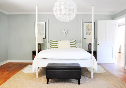
We did a little more bedroom noodling. Noodling, not canoodling. *Blush* Anyway, we last left off after moving our Alaskan prints together over the bed and surprising ourselves by getting a new rug:
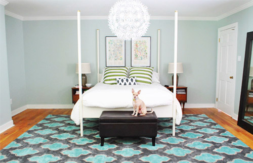
And there were a few commonly asked bedroom questions in the 800+ comments on Monday’s post, which were:
- have you considered getting larger bedside tables?
- can the bed go on another wall?
- will you repaint? maybe in a darker color?
- what are your plans for the nook to the left of the bed?
- what about changing out the pillows/painting the bed & tables/getting a longer bench/switching the lamps, etc?
The short answers to those are: yes but it’s complicated, no, we’re open to it down the road, adding an armoire or a built-in, oh yeah all that stuff is still on the agenda we just haven’t gotten to everything yet.
To elaborate, we’ve definitely considered larger side tables, but the door would swing into anything larger than what we already have on that side, as you can from this old door-open pic (we did a secret book project to the front of this door, so we can’t snap an updated shot).
We don’t want to move the bed to the left since the chandelier wouldn’t be centered above it anymore (we could do a larger table on the left, but we have plans for an armoire or large built-in for the nook to the left of the bed and don’t want to crowd that). We could reverse the door to make it swing into the hall instead of the room, but it might jam up the hall to have a door out there. We couldn’t do a pocket door (we have duct work/electrical in that wall) but have thought about a barn door on a track (which could rest where the leaning mirror lives in the picture above this one), but we’ve considered using that in a spot nearby (more details when we decide if we’ll actually go for it!) so we don’t want that to be too repetitive. We’ll keep you posted no matter what we decide though!
As for if the bed can move, the floor plan of this room is a definite challenge thanks to “things” on each wall (two very off-centered windows, a nook across from the door, and a nook with the sink tucked into it on another wall, and a chandelier in the exact center that looks off if the bed isn’t in the right place). The chandy even lines up with the mirror above the sink, so we don’t want to swag it or move it since aligning things like the bed, the chandy, and the mirror make the room feel balanced/less wonky. So we’ve tried the bed in a bunch of spots, but the place that works best for us is where it lives now (it’s the only long flat wall in our entire room).
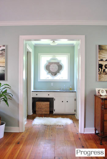
It just doesn’t look centered on the chandelier or the windows in any other spots, and we actually like the placement a lot in person since we wake up to the chandelier being perfectly reflected in the mirror above the sink (it’s so hard to capture in 2-D but it’s the thing everyone falls in love with in person). As for repainting the walls, especially in a darker color, we’re definitely open to it but we’ll be refinishing the floors in a dark mocha color someday and the rug is pretty dark (and the room doesn’t get a ton of light) so we’ll think long and hard before we do anything rash. We’re just getting started, so everything is fair game for tweaks (painting furniture, switching out accessories, etc). Many things like those lamps and the bench are just leftovers from our first house that got plopped down “just-for-now” (Burger uses that bench to get into bed, so it’s our version of Doggie Steps until we get something better – haha).
So now that we’ve hopefully answered those common questions, let’s get to the fun part. Noodling. The first thing we played around with were the pillows and a few other small accessories. The pillows actually inspired a little art switch (since the floral shams were a little busy with the old botanicals that were hanging there).
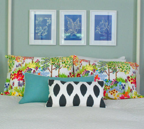
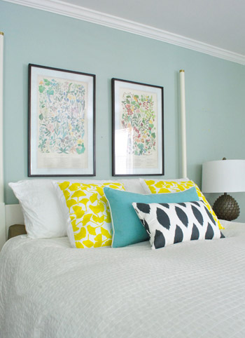
From up close, this mix was fun (the shams are from Pottery Barn two years back, the blue bolster is from Marshall’s, and the front accent pillow is from HomeGoods a few months back). But from far away, the new art was way too small for our tastes. Oops.
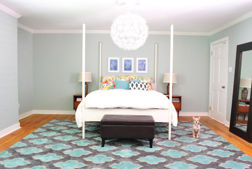
We want the whole room to feel balanced, so with very tall vertical items on all of the other walls like the door to the bedroom, the windows with ceiling-height curtains (which will be switched out, hopefully soon), and the sink nook with a mirror over it…
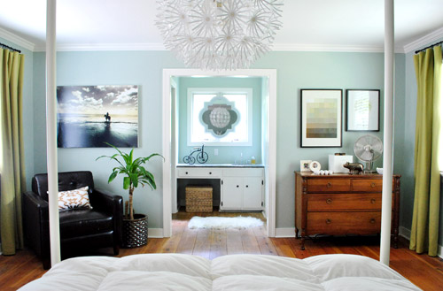
… this art was just too squat and didn’t feel as balanced as the larger Alaskan prints had. But we did like the general concept of adding different colors with pillows – just to break up all the blue on blue action.
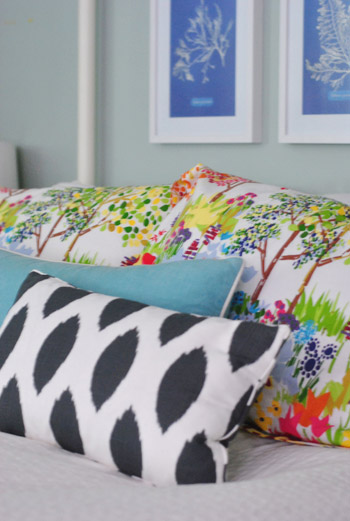
We’re so glad we banged in three tiny nails to give that art a go, even if we didn’t like it once we got ‘er done. It’s all about trial and error (and spackle!) at our house. Haha.
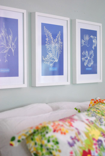
Oh and the prints are from Ikea! We found them for $2.99 for all three (in a clearance bin) and know we’ll eventually find the right spot for them. We already had the frames (also from Ikea, but they hung in our first house), so it was just a $2.99 failed experiment. Haha, so not too bad.
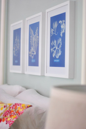
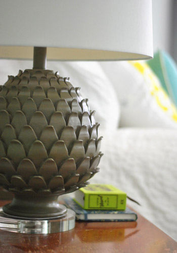
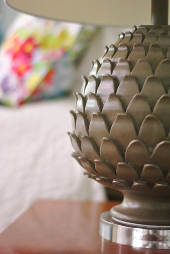
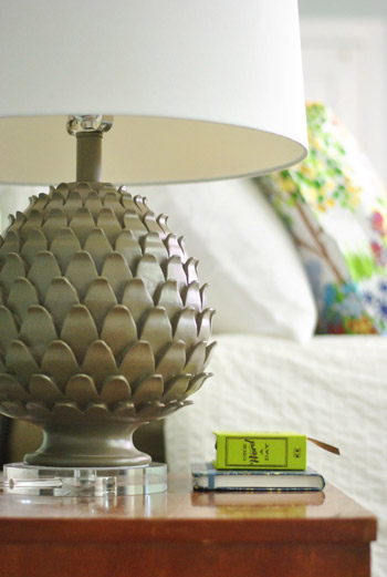
Oh and we also picked up some new lamps! They’re artichoke-ish, which is a totally new shape for us when it comes to lamps (we have like ten gourd lamps, so we were psyched to play around with a new silhouette). They were from HomeGoods ($49 a pop, including the extra large shades).
The original lamps that we had on either side of the bed used to live in our first house’s living room and were over five years old, so we figure we’ll either find another spot in the house for them (we have completely untouched rooms like the playroom and the sunroom to tackle) or yard sale/craigslist ’em if we can’t.

See how much more balanced and substantial the new ones look (with their larger, wider shades and darker bases) in comparison to the old ones above?
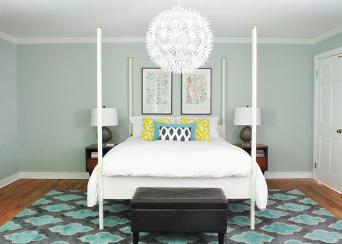
They even seem to make the side tables feel wider, which is nice for balance. And the rounder more textured shape of the new lamps also ties into the chandelier, which is a total happy accident (we definitely didn’t think about that when we fell for them in the store, haha). Oh and ignore the different pillows on the bed in the pic above. We’ll get there in a minute.
It’s nice that the putty color of the lamps isn’t too crazy to compete with the pillows or the rug, but the shape is full of interest and dimension.
Oh and see that book on my side table called One Word A Day? John and Clara got it for me for Mother’s Day along with a pretty pink tulip bouquet and some vases. It’s a one-word journal that John thought I could use to record one hilarious Clara-sentence per day instead of just one word to describe my day (which is how it’s meant to be used). Now we won’t forget the time I said “we might have to rearrange your room again” and she said “Yes! Put some ice cream on it!”
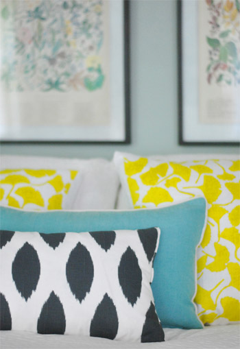
But back to the bedroom. Since the smaller art didn’t work, it was back to our Alaskan botanicals with some different pillows. We landed on this pop of yellow with the teal bolster to tie things into the rug and the deeper navy and white pillow in the front to ground it all. For anyone wondering, those two yellow ginko leaf shams are from a small shop in Northern VA (don’t know the name, but it was in Old Town, Alexandria), but they’re made by Dermond Peterson if that helps.
But you know me, pillows are nomadic in our house, so they might be completely different the next time we share bedroom pics. Yes, pillow swapping is right up there with watching Parks & Rec while eating Oreos around here.
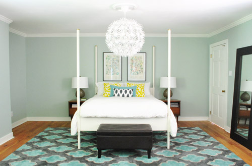
Sure, we still have some major furnishings missing, but it’s fun to see some happy new pillows (with a few warm yellow pops to balance all the blues). And the dark tones in the smallest accent pillow, the botanical frames, and the lamp base relate nicely to the slate/navy tones in the rug without being too matchy.
The lamps just might be our favorite little change (favorite big change = the rug of course).
So that’s where we are. We don’t play poker or bet on horses, so I guess trial and error decorating is how we get our kicks. Haha. Oh yes, we’re daredevils.

We’re still entertaining a ton of possibilities, like:
- switching out the old curtains (for sure!)
- possibly painting the bed in a deep charcoal color
- finding/making a longer bench for the end of the bed
- possibly painting or refinishing the cherry-colored side tables & dresser (on the other side of the room)
- adding an armoire or built-in to that nook next to the bed
- possibly repainting the walls down the road
- painting the ceiling
- possibly removing the posts from the bed (although we like them in the photoshopped renderings below, so maybe not)
- switching out the pillows/bedding as we go
- bringing in a lot more art/furniture in general so it’s not so empty
- staining the beat up & yellowed floor a rich mocha color
- possibly adding a barn door which would allow for larger side tables
- lots of things I’m probably forgetting – haha, but check out this post and this post for mentions of other potential plans
Some might be things we tackle this month while others might not get done for years (like refinishing those floors). But just look how much of a difference that one change can make. Mmm, dark wood floors (thanks Photoshop!) = our happy place.
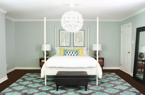
And after a bunch of other tweaks, we’ll just have to see where we end up! Maybe here?
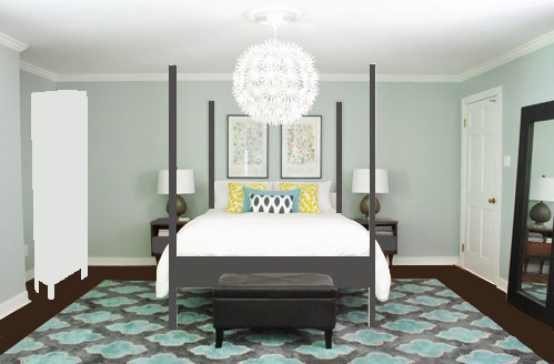
Or here?
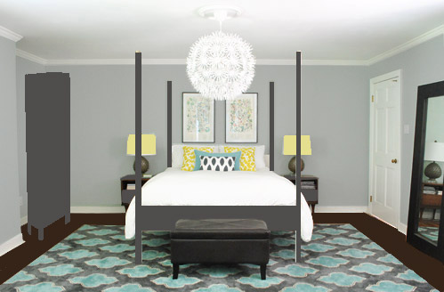
Or here?
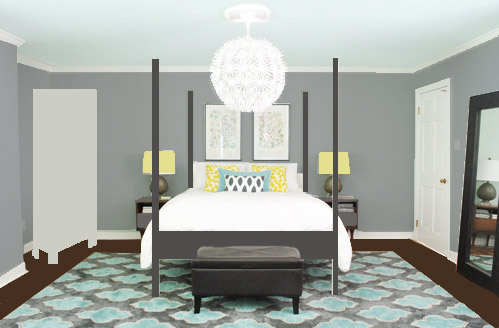
Don’t mind the bad Photoshop. I guess that’s part of the fun, huh? In the meantime, have you ever hung something new only to learn that you loved the first choice better? Have you made any easy lamp or pillow switcheroos in your house lately?

FuzzyEgg says
BTW, I <3 how the lamp bases pick up the background color of the rug.
Kat@Withywindle says
I love your journal! So cute and will be so fun to read the things Clara says in a few years. I have one sort of like that – it’s a 5 year journal and you answer a totally random question each day and see how your answer changes over the years.
Elizabeth says
I just redid our master bedroom by painting the walls gray, getting new bedding and pillows. It took me a few months to decide on the bedding and pillows. I also kept the lamps, but spray painted them and switched out the lampshades. BTW I liked your second photoshop option.:)
Erin Motz says
This room is stunning! Wow, very inspiring!
mp says
That rug … true excellence.
Jen @ Domesticated Nomad says
Okay, I’ll sound like a broken record to say this again, but it’s the white bedspread that is throwing things off. I love white spreads in the right situation (I have one actually), but in this case, you need to pop color and pattern to that bed and the pillows just aren’t enough. I can’t believe changing that is not on your possibility list. (I just now realized that I’m sounding like a bossy-pants in this comment and I don’t mean to; I’m just really tired and don’t want to go back and try again.) :) But, it’s the bedspread. I even throw down and bet you an ice cream cone or something that I’m right (of course if we had to pay up the ice cream might melt in shipment, but whatevs.)
YoungHouseLove says
Haha thanks Jen! Bedding changes are definitely on our list! Check out the bulleted rundown where it says “switching out the pillows/bedding as we go”! We’re definitely not married to anything! Haha. Except each other.
xo,
s
caroline says
Your room is really starting to come together – I get your need for it to all line up and I know you guys love symmetry but I think you can run the risk of it being a bit too all lined up and matching if you’re not careful. Personally I would love to see (freaky freaky) mismatched bedside tables – I know that would do a lot of people’s heads in but I think its matching bedsides which muck up a lot of bedrooms. You would need to find some common element of course.
Or you just need some element which is a bit uneven – not sure what – I know you have issues with the room itself being a bit uneven – so maybe it doesn’t look so symmetrical when you’re actually in it.
Rachael says
I’m seriously in love with your new rug. Great choice! I’m not sure I’d mess around with the colors in that room. They look fantastic! I’d love to see what you do with the built in.
Ella says
Have you considered changing the colour of the mats on your botanical artwork. It might give them a bit more substance and pop from a distance helping to balance the geometric rug.
Just an idea! Love what you guys do!
YoungHouseLove says
Always another fun possibility! Love it!
xo,
s
Sarah J says
Have you guys seen the trend of using kitchen cabinets as built ins in bedrooms (we all know how much you love repo’ed kitchen cabinets!) Upper cabinets might be shallow enough to fit your nook, and high enough to be a functional surface for fun things.
In regards to the ceiling, what about a hard texture, like a tin ceiling painted black or navy? You can leave the walls the soft gray but make a big impact above.
YoungHouseLove says
Good idea with the cabinets! Definitely something we’ve got on our list of things to consider.
-John
Misty says
I posted earlier but just wanted to add to it that I love the wall color and it adds a softness to the room. Also, I love the rug. Best addition to the room so far.
Maria says
Your wall color seems very, very similar to mine. Mine is a blue green color. Is yours similar in person?
YoungHouseLove says
Yes it’s sort of a blue-gray that looks blue-green or greeny-gray depending on the lighting!
xo,
s
Kierstin says
I love all the changes you’re making. Looking at your pictures, I wondered, what happened to that fantastic green and blue swirly patterned duvet cover (from West Elm?) that used to be on the bed? LOVED it. I doubt it would work with your new rug, but I was just curious.
Cheers,
Kierstin
YoungHouseLove says
We opted to go simple with the duvet cover back when we added the Alaska botanical art. You can see more about it here: https://www.younghouselove.com/2011/07/twig-berries/
-John
JLG says
I am sure you are waiting to do the floors “right” with all the messy sanding down and staining and re-polyurethaning… but I wounder if, as a “for now” you might want to do a quickie dark floor paint job or one of those poly-stains that go on top of already finished wood? It wouldn’t cause any extra work later if you are going to sand anyways when you really redo them. You could probably even do one half, let it dry and then the other half, so you can move furniture from side to side! Probably really depends on how far in the future the real floor darkening is…
YoungHouseLove says
Always another possibility! We definitely haven’t pinned down a “real” date, but with so many things on the to-do list, we try to only do things once if we can help it- so we might bounce around to other rooms and spaces and just come back and do the floors right once (or we’ll get to a point where we can’t even handle them on more day and could definitely do a shortcut-first thing like you mentioned!
xo,
s
Kadra says
Love the last photoshopped pic! The cool blue on the ceiling ties into the rug and the darker walls and bed frame seem to fill up the space more without cluttering it up with furniture. And the armoire in a putty color like that isn’t as jarring as the white but doesn’t compete against the other colors. Love it!
Kathy says
Hi!! I honestly love everything you guys do and love your blog!
Can’t wait till the book comes out! I know you have a ton
On your plate right now with the baby and all your projects but maybe one day when things slow down a little bit you could do some “Photoshop for dummies” tutorials…lol! You both are really great with Photoshop where as myself…hmm..still trying to figure it out. Something to consider maybe down the road! Best of Luck to you all. And please keep doing what you do–you make decorating, diy and making your house a home so much fun for your readers!!
Kath
YoungHouseLove says
Aw, you’re so sweet Kath! There are definitely folks who are amaaaaazing at photoshop (we’re mediocre at best, haha) but a few others have asked for that, so it might be helpful if we could get our act together!
xo,
s
Deese says
I have to say my favorite thing about this post (other than seeing the different pillows and art and how much it actually makes a difference)is the possibility of a darker bed frame. It really anchors the bed in the room. Makes it more substantial and gives the room a heavier/cozier feel.
I say paint that bed! It wont take long and wont cost too much and will have a big impact!
Just my 2 cents! :)
Bec says
Did you consider trying the smaller blue prints in a more jumbled arrangement, like
#
#. #
It might help to fill the space?
YoungHouseLove says
Alas, they’re just too small, no matter the arrangement, but we’d love to find a smaller swatch of wall for them somewhere! Will keep you posted!
xo,
s
Nadine says
Burger has a future in the movie industry, he’s very professional in the way he slips into a lot of pictures! :D
Mel says
I love the rug and the lamps. Where did you get your floor length mirror? I know you guys try to get good deals and I have found that floor length mirrors are expensive. Thanks a lot! P.S. I love the way your house is so bright and cheery!
YoungHouseLove says
John got that as a wedding gift for me 5 years ago, from West Elm- but we have since seen one that’s almost identical for much less at Ikea!
xo,
s
Hannah says
wow! i love the new lamps…and you are right! it makes the side tables seem wider! amazing how that works! :) awesome! happy weekend! :)
Barbara says
Have not read all the comments so don’t know if this came up but:
One thought for your door (though I especially like the barn door idea, want one myself!) is to replace it with two doors half that size. Would still swing in but leave room for a slightly larger, slightly taller bedside table…which I agree would add more balance to the bed. ..and would not overly compete with the future armoire.
YoungHouseLove says
Oh yes, always another possibility!
xo
s
Cherie says
I love your blog and the way you approach decorating. Thanks for keeping it real! I apologize if this has already been said but, it is not so much that the tables are to small but they are to short. If you are going to paint them maybe some new legs first? I believe Ikea carries legs?
YoungHouseLove says
Oh yes, we have talked about possibly adding castors to heighten them a bit!
xo,
s
Katie B. says
Lemme just say when I first saw the photoshopped pic with the painted bed, I was like “THAT LOOKS AWESOME!” until I realized it was only an illusion! But I think painting the bed will really transform your room. I think the darker color will relate to the rug and will anchor the room.
Anyhoo… in our tiny apartment life, I’m in the business of switcharoo-ing some frames that I’ve had forever. Four years ago, I made a little collage of 7 or 8 large frames that all have black & white flowers in them. And all the frames were black or brown. It looked super because I had this huge bold orange curtains and the room was painted a mushroomy tan. Now that we live in a creamsicle apartment, I am doing everything I can to give us some COLOR. So I’ve been spray-painting the frames… golden yellow, navy, light blue, and coral. Fun times! As you know, a little spray paint goes a long way!
YoungHouseLove says
So much fun! I love that!
xo
s
Sara says
Love that rug! I just got a new duvet cover from Joss & Main, my first purchase from them, it literally came the day after I bought it! It’s an Amy Butler duvet cover, and I’m in love with all things Amy Butler, her fabric is so pretty! I put it on the bed and just laid on it’s beautifulness :)
YoungHouseLove says
Aw, sounds like it’s awesome! Love Amy Butler!
xo,
s
Monica says
Love the new rug and the new lamps!!
I love to rearrange furniture- I do it all the time and drive my family nuts. Have you tried putting the leaning mirror to left of the bed (left as you look from the bathroom)? I think it might help with the sort of empty feeling that area has, compared to the other side of the room (the wall you look at while you are IN the bed) and sort of balance things out…
YoungHouseLove says
Oh yes, that could work for now (just was scared to wake up and see my sleepy face staring back at me- haha)!
xo,
s
Lauren says
The new lamps make a huge difference- they make the side tables look much more balanced.
I think you’re onto something with the second and third photoshopped photos. I think the bed would look great darker and the walls more of a gray color. I think it helps balance out the rug.
Ashley says
The last Photoshop rendering is by far my favorite! I especially love the yellow lamp shades!
HB says
Love the new pillows and lamps are right on! I just think you need more visual weight to the left so the armoire would be nice…but that niche sure looks like a perfect spot for some nice dark floating shelves to balance the door and large mirror! … or just a gigantic vase/urn and plop in some branches…it will definitely balance it.
PS- the existing art is great- definitely keep it.
HB says
Now I’m excited! because I think I just solved my own issue too!
How about two black floating shelves in the cubby and then a longer, same-hight but non-matching nightstand on that side, complete with orchid?! I think that would look fab-u. I’m so jealous of that rug.
YoungHouseLove says
Fun! Always another possibility!
xo,
s
Lyndsey says
PHOTOSHOP OPTION #3 love it!!
Luisa says
Yes to the pops of yellow and charcoal gray bed. It is so much more grounding. Go for it!!!
Kate says
Hi, I tried posting this on your last bedroom post but I never hit submit. I think a lot of people had the same thoughts that I did with what may be “off” about the room to you. I think it’s the proportion of the bed to the walls and ceiling. The back wall is quite wide and could easily support a king sized bed with two large nightstands. However with your preference being for a queen size bed you may need a bed with more visual heft. The four posts are creating an illusion that the bed is smaller and “skinnier” than it really is. The posts are also drawing your eyes into the space between the bed and up to the chandelier. Your eyes settle “up” when you look at the bed in pictures. Does that make sense? All of the decoration on that side of the room is between those four skinny posts.
Now this is not a critique of your furniture choices by any means. I love all of the furniture and would gladly take those nightstands off your hands. :) But you may try some photoshop mock ups of a bed without the skinny posts and with some night stands and art that make the bed area feel “wider”. Maybe some bedding (a throw blanket at the end of the bed in a wide horizontal stripe?) with a horizontal pattern. Oh, and a much wider and lighter colored bench. Maybe something in a half circle so it can pick up the circular chandelier? Upholstery on the top?
I struggle with the same bench issue as I have my grandparents king size bed set from 1959 and found an early 1960’s Lane cedar chest that has the same mid century scandinavian look but it’s more of a mini size chest. As much as I would like to use it at the foot of my bed (no footboard) it’s too small and looks dinky down there.
Oh, what about a small upholstered club chair in the nook with a poof as the ottoman? And some art behind it? Or what about moving the mirror to that space? Until you are ready to add the built ins…..
YoungHouseLove says
All possibilities! Well except maybe for wider night tables or a wider bed (check out the post for why we can’t go wider thanks to the bedroom door). As for the mirror in the nook, it could totally work for the interim but I might scare myself waking up to my own reflection. Haha. We also mentioned that we definitely want a longer bench someday! Can’t wait to see how it all evolves!
xo,
s
Elizabeth says
rooms are never really, “done”, ya know? I’ve found that out over time as my tastes change and my needs for each space in our home. In terms of bedside tables, I eventually replaced one of ours (on my side) with a garbage picked vanity — I got the idea from HB, and I liked the way it turned out…http://i831.photobucket.com/albums/zz240/whtevjenny/vanity.jpg, we all figure it out in time :)
YoungHouseLove says
So cute! I love it.
xo,
s
sara says
Hello,
I read your bedroom post last night (it looks great!) but something kept bugging me. I finally looked around my 3 bedroom, 2 bath ranch (no basement) home. We have a 3 yr old and an 8 month old. WHERE is all your STUFF? I have toddler and baby toys all over my house. Please tell me where all of Claras toys are and maybe show us a picture of your house the way it looks when its not being photographed!
YoungHouseLove says
We actually have a few “what our house looks like on an average day” videos on our video page (see the sidebar button for videos?). I promise we’re messy and human- haha. We also did a post during organizing week about where I stash and store Clara’s toys, so if you click the categories tab on the sidebar button with our cheesing faces on it and go down to our cleaning and organizing category it should be in there!
xo,
s
Kate says
Oh….have you thought about creating built ins that look like the set in your front room (dining room)? That could be awesome. It would continue the custom woodwork throughout the house. I always love that when I see that in homes. It feels so well thought out and “fancy” in a good way. Something with cabinets or drawers on the bottom and open shelving or a cabinet on top. I lived in an older home that had a raised closet with deep drawers built into the wall under the closet. They were fantastic. If I hadn’t been in the military back then (with a lot of different uniforms) I may have been able to go without a dresser and just use those drawers. They were fantastic for bulky items and the like (this was before space bags).
But wait, I just looked at the pictures again and it may not be deep enough for drawers. What the heck. Install gold specked mirrors on that nook wall, a cream colored marble sink/counter with a dark brown wood cabinet and voila! An early 1970’s mini bar steps away from your bed. The ultimate in retro luxury. ;)
YoungHouseLove says
Haha, so funny!
xo,
s
paula says
The lamps are AWESOME! Great texture.
I like the botanicals better too.
I am so, so in love with the wall color you have now, but I get how the gray would make sense with the new rug.
The photoshopped dark floors and painted bed are fantastic!
brandy says
We recently picked up the artichoke lamps too and i LOVED them until we got them home and turned them on. The shades arent lined so they look funny lit and then the metal parts of the shade arent sloped so they project on to the ceiling and make what my husband calls a spiderman web! Do yours do this? Im bummed that we’re probably going to have to return them.
YoungHouseLove says
Oh no ours don’t have that issue! I wonder if they’re different shades? We have seen lots of lamps there with the same base and different shades. Maybe keep an eye out for different shades at your place too?
xo,
s
Karen says
It’s looking so much better. I would love to see a larger bed minus the posts. They are looking fussy and blocking the view. It seems like you are designing around those posts and they are bossing you around. Don’t let them tell you where to hang your shizzle. Get rid of those bossy posters. They are boxing you in.
Sherri says
The new changes add alot to the space. The rug is to die for. You have the most amazing pillow collection!! It’s so fun how you change them on a whim. The pillows you selected for your bed really enhance the entire look of the room. Have you ever counted how many you have? 100? I’m jealous!
YoungHouseLove says
Haha, I wish! Maybe ten? They’re all stacked in our playroom. And John is not amused. I’m cut off.
xo,
s
Stephanie says
You’re so good at outlining little tweaks people can implement to make a big difference! Thanks for sharing your process of editing the little details that really make a room. Speaking of which, I was out shopping today and noticed these guys: http://pinterest.com/pin/231513237064923186/
Made me think of YHL!
YoungHouseLove says
So cute!
xo
s
Andrea says
Your rug (beautiful, by the way!) also appears on the Real Simple website today in the teenage bedroom makeover.
http://www.realsimple.com/home-organizing/organizing/room-makeovers-00100000080537/index.html
YoungHouseLove says
Isn’t that funny?!
xo,
s
Emily says
Well your pillows pulled me in and the rest is history! Love your style love that you don’t spend a fortune…. I have the same kitchen round table …..love! Diff is we liveolin a 4 yr old house…. Obviously not complaining it just doesn’t have the character…. So we need to make it….. I was totally set on a white sectional which everyone has tried to talk me out of….. Love the color of yours…. I’ve been playing with some grey ideas as well. Next up is wall paint….. I literally was going to do some thing in the dark teal family …. But after your one pic of room that came with house, it’s a bit harsh…. Love your bedroom wall color! May go in master bathroom! I am inspired by you! Thanks again!
YoungHouseLove says
Aw thanks Emily! So glad you found us! And good luck with your house!
xo,
s
Jenny says
Personally, I love your wall color and I love Ed in white. I’m a huge fan of symmetry, and in our house we use two low dressers as side tables to really ground the bed. I’m not sure that would work with your entry door, though. Your Ikea botanicals reminded me of some huge cyanotypes I made when I was a visiting artist at Cow House Studios in Ireland. They’re really easy to make with the right materials, and you could fill that wall to the left of the bed! xox
Amanda says
I swear I just saw your rug in Real Simple. Looks like you got an incredible deal on it, I’m jealous! Rug shopping is making me lose my mind. http://www.shadesoflight.com/floating-medallion-hand-tufted.html
YoungHouseLove says
Aw thanks Amanda! We just got lucky.
xo,
s
Melissa says
Just saw this rug in my “Shades of Light” catalog. The 8X10 size was 949 smacks plus shipping!!!! You saved a fortune. So awesome.
YoungHouseLove says
Love it!
xo,
s
JoAnne says
I prefer dark furniture to contrast the white trim. It’s similar to the color scheme my boyfriend and I are applying in our living room.
sgs says
totally unrelated…..i saw a similar pattern rug like yours in a post in ikea hackers …thought you would like to see it.
http://www.ikeahackers.net/2012/05/diy-bubble-chandelier-from-jara.html#more
the original blog post is in german.
s
YoungHouseLove says
Really pretty! I love that one!
xo,
s
cherise says
Wowza! What a difference the bed color makes!
Kel says
I love lamp!