We did it. Completely out of order. Yup, we finally decided what color to paint the office and went for it. Which would have been a lot easier if we had pinned down our color pick before we built our wall-to-wall two person desk. Oh well, such is DIY life. We didn’t want to rush into choosing a wall color and then hate it after we built the desk (which would have meant having to repaint everything again after the desk was built anyway). So we waited. And waited. And discussed. And rediscussed. And waffled.
And it’s a good thing that we actually did wait. Because before the desk was completed we were considering some dark muddy colors (which you might have seen on the wall here). And after the desk was built we were both 100% sure that we wanted the dark wood desktop to really pop (a dark color on the walls would just make it all blendy and muddy in there), so back to something light and airy we waffled again…
Here’s a brief synopsis of our thought pattern:
- let’s go dark and enveloping!
- wait, that + a dark wood desktop = a dark muddled space… we don’t want the dark wood to blend into the walls
- plus we’ll lose light when we convert the carport to a garage so dark walls aren’t smart
- ooh, but some bright color might be fun!
- but the attached kitchen & laundry room are bright cheerful grellow and we don’t want the office to compete since it’s right next-door
- plus we want to add bright colors and bold patterns with upholstery/accessories/art/window treatments/desk chair paint
- so bright walls would be way too much with a bunch of bright fabrics/art/accessories, especially in a room where we have to concentrate/work
- plus bright walls would be seen from the adjoined dining room which has deep teal built-ins and brightly patterned curtains, and we don’t want those to fight for attention
- hmm, this is harder than we thought
- all we know is that we want the chair-rail and molding to pop, but not too much since that might be too chaotic/in-yo-face
- and we don’t want something too dark or too bright…
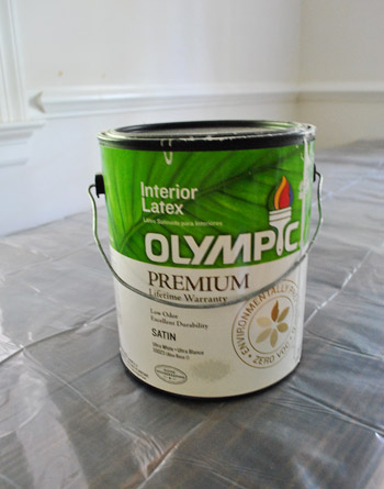
So we actually ended up exactly where we initially were six months ago: Benjamin Moore’s Moonshine (color matched to Olympic No-VOC paint in a satin finish). That’s the same soft gray that we have (and LOVE) in the living room, dining room, and hallway. Allow me to expand upon those weird stream of consciousness bullets above. We thought about going just a shade darker than Moonshine in here, but realized that we like light and bright workspaces (plus once we convert the carport into a garage – even though we plan to add windows to the exterior walls and door – we might lose a little light).
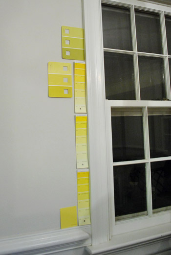
Some of you might be yawning because you were imagining something like sunny yellow (to tie in the front door)…
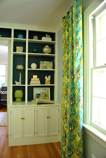
… or green (to tie in some of the tones in the living room curtains) or blue (again, to pick up on the dining room built-ins and curtains)…
… but after thoughtfully considering belaboring all of those options, we finally decided that going soft gray with the walls will really give us the freedom to bring in some seriously fun brightly colored & boldly patterned fabric (for the two desk chairs and the window treatments) along with some punchy art, bright lamp shades, and even in fresh paint for our desk chairs. We definitely like the idea of some fun cheerful pops of color in the accessories as opposed to all over the walls since we don’t want the room to feel too chaotic/hard to concentrate.
Besides, since we already have such a bright greeny-yellow tone in the middle of the house (the kitchen and laundry nook)…
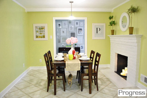
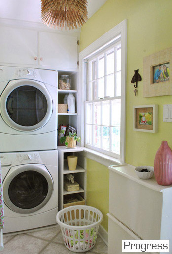
… we kind of love the idea that all of the soft gray rooms lead to the cheerful kitchen in the heart of the house. So we decided that we didn’t want some other bright color competing with it since they’re next-door neighbors. There’s something kind of nice about a burst of happy color in the center of our home with three soft platinum gray rooms around the perimeter (with pops of color in the accessories like the art/rug in the living room and the curtains/built-ins in the dining room):
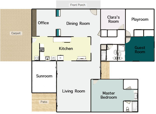
The funniest thing to us is that we only have a few unpainted rooms remaining (the playroom, sunroom, hall bathroom, master bathroom, and guest bathroom). And since those spaces aren’t ones that we spend the majority of our time in (meanwhile we practically live in the office), it’s kind of ironic that it was one of the last few that we got to. I wholeheartedly admit that the whole house color scheme above might not make much sense to you now, but hopefully once we paint those last few spaces and add touches like wainscoting in the hallway and other major furnishings/accessories that are still woefully missing (window treatments, lighting, rugs, furniture in the playroom instead of junk, etc) it’ll make a lot more sense. One step at a time.
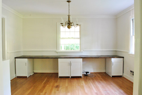
Speaking of which, our office painting method was slow & steady. First we cleared the room.
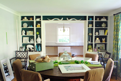
Which of course meant the dining room got full of offset office stuff:
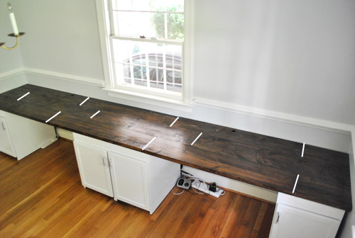
Oh and while the office was cleared we snapped some pics of the desktop since so many of you wondered where the seams fell. We had to highlight them with a white line in photoshop to help you out (they’re actually really subtle in real life, so they were impossible to see from this distance without some white-line help):
As you might notice, to the right of both of our laptops (when they’re actually on the desk) there aren’t any seams, so we don’t have any lumpy-bumpy seam-related writing issues (we write on pads and notebooks anyway, so I don’t think it would matter).
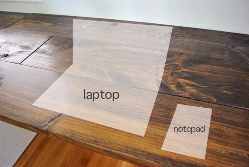
Oh and didja notice the holes in the back of the desktop behind both of our computer areas? Let’s have a little side chat about those, shall we? First we made a pilot hole where we wanted them to be (John used a paper template so they were both spaced the same distance from the wall):
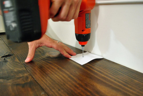
Then John used a 1 1/2″ bit…

… to drill a nice ol’ hole for all of our cords (for desk lamps, computers, the home phone, etc):

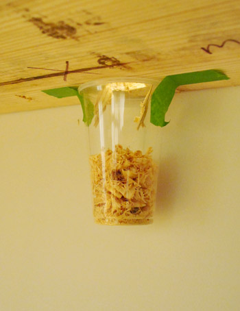
And John was a smartie pants and taped a cup under the hole to catch shavings, which was a huge time saver when it came to clean-up:
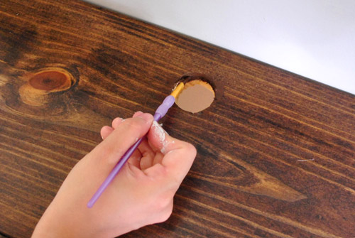
But of course the wood was unstained, so I used a little craft brush to get in there with some dark walnut Minwax to blend the hole in a bit better (we sanded things first, just to keep them nice and smooth so we don’t get splinters while retrieving cords):
So that’s how those handy holes came to be. As for how we painted the wall behind the built-in desk, the entire thing actually slides away from the back wall, so we slowly slid it out towards the middle of the room…
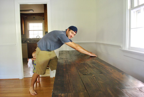
… and covered it with a giant drop cloth to protect our beloved dark wood desktop. That way we could roll/cut in behind it and then later push it back into place and paint the two sides of the wall that it blocked while it was pulled forward.
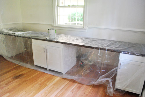
As is our tradition, John got his roll on while I did tons of cutting in (thanks to that chair rail, two doorways, and two windows). About two coats and four hours later she was looking like a soft fluffy cloud. Ugh, but ignore the light fixture. That thing’s having surgery as we speak- er, write. More on that soon.
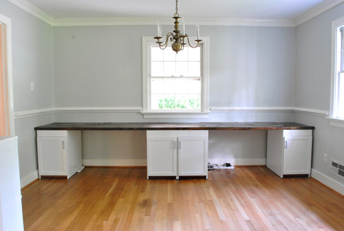
Then we just pushed the desk back against the wall and loaded everything back in there. The walls look a smidge blue-gray in these pics, but in real life they’re a true gray color (not icy blue or anything close to purple at all). Oh yeah but remember that everything on the desk is just sort of tossed there, so the leaning frames won’t stay (we need height, so we’ll probably hang some over-sized art on the walls) and everything else will likely evolve as we settle in a bit more.
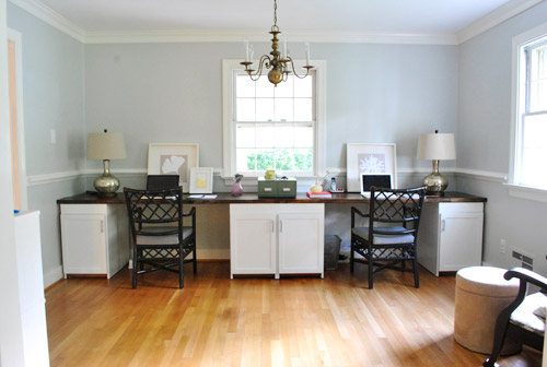
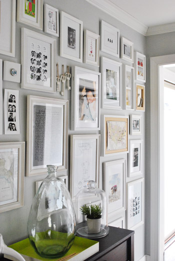
The lamps are from HomeGoods but we’re not sold so they might go back. We’re thinking we may use new lamp bases or shades as a place to add color along with art, paint on those desk chairs, patterned window treatments, etc. But thankfully we’re still as enamored with the wall color as we were when we chose it for the hallway frame gallery (the color reads more true to life in this pic)…
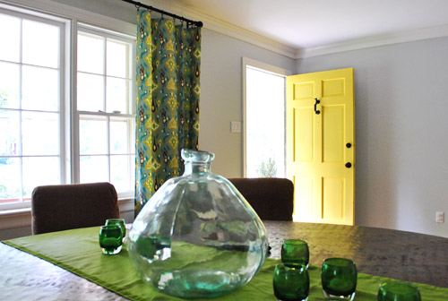
… and we definitely still love it in the dining room…
… and the living room too…
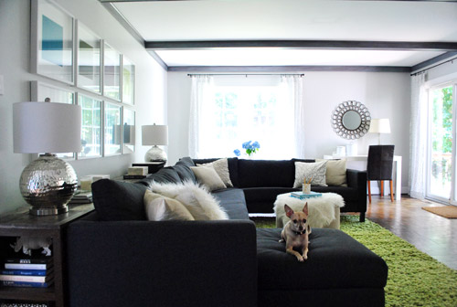
We especially appreciate how it makes the super thick crown molding and the nice chunky chair rail pop without being too high-contrast (which would also compete with our big beautiful desktop). Of course the chair rail will make a lot more sense when we hang proper art instead of leaning too-small stuff it in front of it.

And we love that this phase of the office upgrade was $0 since we still had a bunch of paint leftover from painting the dining room (we bought three cans back in January when we initially planned to paint the living room, hallway, dining room, and office all that color – and finally completed that initial plan this weekend). Only seven months later. Haha. Oh and we owe you a wide shot from the dining room of the fresh paint job, but since we’re making those aforementioned light fixture tweaks, we can’t shoot one quite yet. Soon!
But wait, there’s more than just a paint plan in here. We actually love the idea of adding a subtle tone on tone stencil around the entire room above the chair rail (hooray, no more desk shimmying necessary). We don’t want anything with too much contrast since it’ll compete with the dark teal built-ins and the fun curtains in the nearby dining room, but we’re seriously considering something like this with just a softer gray color for the feather part over our Moonshine walls (although I love the pop of yellow, so we might try it and bag it if we step back and it’s too much):
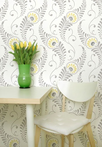
At 54 honking dollars it’s hardly a drop in the bucket (the stencil is over two feet tall and almost two feet wide to hopefully make the project go faster/smoother), but we figure that we did snag six cabinets for $6 and we built a 13 foot counter for $27… so maybe we should just bite the bullet and spend $54 for something we love. Any type of wallpaper (even the cheap stuff at Lowe’s and Home Depot) would be way more than $54 for the entire room above the chair rail, so I guess that’s another way that we’re rationalizing our possible purchase. Haha. We shall see. You know we’ll let you know when we make a final decision. We’ve never done a giant repeating stencil like this on a wall (we did stencil the floor of our first house’s sunroom) so that should be interesting too. And who knows, maybe I’ll find it as soothing as my little potato stamp project in Clara’s closet (I enjoyed that repetitive motion more than a person probably should).
Did anyone else paint their walls or drill holes into something this weekend? Or move a giant 13 foot desk? Or figure that we might be painting or drilling holes? Or dream that we had a secret son that we never told anyone about (two different commenters had that dream last week – crazy!). Oh and we painted this room four hours before my mom came to town for the weekend from NY. Nothing like a little en-route visitor to light a fire under ya.
Psst- You can see some mom-visit pics over on Young House Life today. Clara does not have a healthy fear of alligators. At all.

Sarah says
Yes, I had a YHL dream last weekend! Ok, so I was touring your house and it was kinda scary, nobody was home, or at least nobody was with me when I was touring. But, I remember knowing that Clara was napping. Then, I remember seeing the frame wall and I met you guys sitting at your table in the kitchen. You asked me what I thought of the house and I said, “The frame wall is smaller than I thought it would be…” I think we had a conversation but, I don’t remember what it was. I do remember Sherry had tiger striped eyebrows! Weird, right?
YoungHouseLove says
Haha, John loves tigers. I think he would like me more if I had tiger striped eyebrows actually. Haha.
xo,
s
Barb says
Can you give me all the specifics about that paint…color NAME, WHERE PURCHASED, and anything else I need to know. I plan to paint my bedroom in that color. The energy is there so I need to do it quick before this “PAINTING DESIRE” leaves me. I love that color…so soothing and yummy.
Thanks for giving me this in advance
I sure do appreciate YHL!!!
B.
YoungHouseLove says
Haha, sure. It’s Benjamin Moore’s Moonshine (we got that swatch from their stores) and then we bought that swatch to Home Depot and had them color match it using Olympic No-VOC paint (they had the formula for the BM Moonshine in the computer, so they looked it up and mixed it for us). We do things in a satin finish so they’re wipeable for the baby but not very shiny at all in person (might be because we have plaster walls that suck things up, so you might want to go with eggshell for a slighly less glossy look if you have drywall). Hope it helps!
xo,
s
kari @ Human, MD says
I’m currently working on painting the guest room, which is currently an awesome combination of red and white with blue airplane stencils, coupled with a killer spider man lightswitch plate. My dad’s bummed the planes are going to go, but I told him I’d replace the stencil with framed photos of old school planes (he’s a just-for-fun pilot) in red frames, so he can keep his airplane room!
Meg says
Love the color – a perfect neutral gray! We’re aching over here from painting our kitchen this past weekend (a bright, perfect turquoise!). And, come to think of it, we manned drilled – added some wall shelves for additional storage. Ooga-ooga! Here’s to checking projects off the list!
Jan says
I absolutely love your home. You guys are doing an awesome job. The colors, the furniture…everything!!
Marie says
Something that you’ll probably have to (want to) do when you build your garage is drywall the window in for a fire barrier. And then it’s bye bye sunshine. I live in an old house, when we moved in we had to drywall up our bathroom window that had a view of the garage. I haven’t done it yet, but I’ve considered putting some lights in between the drywall and opaque glass to simulate sunshine.
YoungHouseLove says
Yeah, we have heard conflicting things about that (I think it might differ by locality) but we’re safety freaks, so we’re prepared to lose that window if we have to down the line. Then we’ll probably hang a big mirror to bounce lots of light around and hopefully keep things open. Your idea of simulating sunshine is also really fun!
xo,
s
Mayra Navarro says
I love how you explain with details what lives in your brain, then brainstorm it (in writing). Then, wait, and wait, to make the smartest decision, then decide what’s going to be done. Then you really do it. This a very successful DIY team. I want a team like this one in my house. Right nah! Have a productive guys!!!
Gaidig says
What if, instead of a pop of yellow in the flowers, you tried a pop of the blue in the background of the dining room curtains? It could be a more subtle solution if you decide the yellow is too much.
YoungHouseLove says
Ooh that’s another fun possibility too!
xo,
s
ashlee says
i agree with this. i’m always cautious of using yellow with certain hardwood floors. i think in your case, blue would mesh wonderfully with the colour of your floors. plus, i’m biased because i LOVE all shades of blue. someday (and by someday i mean 70000 years from now once i’ve saved every cent possible, lol) i’d love to do wood paneled siding on my home in navy blue with crisp white trim.
Lindsay says
Did you mean to say dining room or office in this sentence: “Speaking of which, our dining room painting method was slow & steady. First we cleared the room.”
Love the color! Looks great!
YoungHouseLove says
Haha, yes. I think since it used to be the dining room of this house I slip all the time!
xo,
s
Melanie @ Mailbox Journey says
The room is really starting to come together.
Sarah in Indiana says
I just stenciled one of the walls of my bedroom with an all-over design. I love it! It was so worth the 50 bucks. I plan to blog about the stenciling this week, but there is a sneak peek of it here: http://placeofverdure.blogspot.com/2011/08/21-day-challenge-day-16-menswear.html
YoungHouseLove says
Wow- it looks great! Can’t wait to hear your tips on stenciling!
xo,
s
Andrea B says
Looks beautiful! I love love love that color. I used to be a big bright color wall person but I’m toning down a smidge lately. Actually, I seem to be going the opposite way as you guys, since you started out more toned down and decided to have fun. Mine’s the other way around, lol.
In fact, I just painted over a big bright deep teal living room this weekend. And a nook in our dining room. Now the downstairs is an even light greige and ready for some pops of colorful artwork.
Serena says
I just spent this past weekend doing a large all-over stencil in a bathroom. It’s not nearly as easy as it looks! I ended up using my blow dryer to hurry the drying process along — since you need to overlay the stencil on the last edge of your previously painted area, you need to wait till that’s dry before you can stencil the next section. Plus the stencil itself needs to be dried since you’re painting over it, and trying to line up/smooth a stencil with wet paint on it is a recipe for disaster. I ended up using a pants/skirt hanger (with the clips) to hold the stencil while I dried it.
And definitely get Elmer’s spray adhesive — it prevents seepage and it’s easier to just stick the stencil to the wall rather than having to tape it up there each time you move it.
YoungHouseLove says
Thanks so much for the tips!
xo,
s
Anna says
I love that grey color!
Lisa says
I used one of those giant trellis stencils to paint my mother in law’s foyer, which was a weirdly shaped room with 8 walls, so there was lots of matching up to do—and it didn’t take that long at all. The large size of the stencil makes it go pretty quickly. Tip–start near the ceiling, not the floor. I started near the floor and the mistakes near the ceiling are really obvious.
you can see it here:
http://trappedinnorthjersey.blogspot.com/2010/11/downstairs-foyer-stenciled.html
YoungHouseLove says
Ooh great tip! Thanks! Yours looks awesome!
xo,
s
April says
I was totally betting that ya’ll would go with a lighter hue of the teal that’s on the back of the built ins to tie it in like that! The gray is nice, and it matches the website background now!
Michelle Kersey says
Ya know…. I know someone that has some pretty stellar macro photography prints for sale… and she might even cut ya a stellar deal because she loves you all so much… ;)
YoungHouseLove says
Haha, love it.
xo,
s
LaMadre says
I was disappointed at first glance to see the choice of such a safe color but once I saw the stencil – love it. And, I will look forward to a stencil tutorial since I’ve decided to stencil a wall in one of our bathrooms. Love the idea of using such a large stencil. After a 20 hour pantry door project (one solid color of paint, combo of stencil and handpainting in a second color and then a light coat of stain which we quickly rubbed off for an aged look) – I am dreading how long an entire wall will take.
miriam says
Love the color– it’s so peaceful, and matching the office to the dining room makes sense since they’re so open to one another. That stencil would be a great way to punch things up, too. I love the textural look of tone-on-tone stencils… so much more fresh and modern than the country-cottage stencils my Mom used back in the day!
We embarked on a mat-painting project yesterday– went to the paint store for a sample size of this great moody teal (BM’s Beau Green) to make a couple of our posters pop. I imagined the sample would be 3-4 oz. of paint… turns out it’s half a quart! The good news is we love the color. I guess this weekend’s project is to find other stuff to paint Beau Green…
YoungHouseLove says
Haha, that’s funny! I’m in trouble when I have leftover paint. Don’t be tempted to paint the dog!
xo,
s
Carla says
The wood top looks great and I love the soft gray walls. Honestly, though, I’m feeling that seeing that wall through the main room seems kind of cluttered and distracting, especially with the white center piece that seems out of synch with the lovely built-ins. Also, the chairs I’ve loved since you first found them, but in that space they seem too busy and lost. Something more substantial and curved that’s padded and covered in some nice upholstery fabric would help ground that room. But as always I really enjoy the process you go through, and based on your gorgeous last home I’m really looking forward to seeing how things progress. It’s an insightful process and I learn a lot.
YoungHouseLove says
We’re definitely just getting started in here, so it’ll be fun to see where we end up! We definitely expect to make lots of mistakes along the way, haha. But we’ll keep you posted as we live and learn!
xo,
s
Pip says
Moonshine is perfect – great for focus and easy to acessorise. Thanks for sharing your colour logic, with the bright colours in the heart of your home. Had to laugh at the debate you had en-route to the gray :) it sounds very familiar (though we would have included lots of tea & coffee & chocolate to help us decide). Looking forward to the chandelier reveal!
Emily @ Merrypad says
That desk, guys. That’s probably the sexiest wooden desktop I’ve ever seen, and it looks wonderful with the cabinetry and light walls. What a beautiful piece you created!
ruthy says
love the chair rail…Thinking about adding it to our dining area. And yes…andy build a bench for the dining table and finished building our fence!…pics to come soon :)
YoungHouseLove says
Woah- you guys were busy!
xo,
s
Tra J. says
Love the color! Looking good.
The hub and I painted yesterday also. You both make it seem so easy but when we do it, it’s a mess. Maybe we just aren’t good at it. The cutting in seems easy, but we just don’t have it down yet. Maybe soon we will have an easier time.
Angela L says
I totaly had a dream about your office the other night (how do these things happen) and in the dream you panted the walls a subtle color and then brought in the rug from the old houses den (the leafy one with fun green and yellow tones) and you were all like oh how perfect that it brings in the tones from the surrounding rooms but isn’t all mathcy matchy. And then suddently you were on the Nate Berkus show and he was all OHHHH I love the rug! So weird!!!!
YoungHouseLove says
Haha, we wish we could bring in that rug but it’s too wide (the chairs when pulled out conflict with it). Sadness.
xo,
s
Donita says
Hey guys, not sure why, BUT all but FOUR of your comments are GONE. There were 118 comments, I refreshed my page and it now says FOUR!!! Just thought you might want to know that. BUMMER!!!
Donita says
OH they are back, that was weird. I even shut the page down and opened back up and it still said only 4.
YoungHouseLove says
So strange! So glad they came back to you. Haha. Computers/blogs are so quirky!
xo,
s
YoungHouseLove says
Oh no, maybe try refreshing again? We see them all on our end. So strange. Hope the glitch clears up soon!
xo,
s
Beth W. says
That happened to me the other day too, but not as dramatically- it switched from 2 comments back to 1 and then back to 2 again. I was thinking, “Maybe they commented on it and then deleted their own comment to edit it or something?” Glad to know I’m not the only one seeing that happen. Weird.
YoungHouseLove says
It might have something to do with site cache-ing (which can happen differently on different computers/browsers). Basically things cache to load faster, so sometimes it’ll show a different comment number than there really are (until it re-caches and corrects itself). Hope that makes sense!
xo,
s
ashlee says
i love that you guys have decided to use the same colours in various rooms of the house (ie moonshine in the halls, office), the yellow-green in the dining room, laundry area, etc). it gives the house such a sense of cohesiveness and makes it so easy on the eyes. love it.
i’m highly considering moonshine or a similar shade in our halls and open stairwells. our house is very dark in some ways – our house backs on a forest of ridiculously tall trees that are very close to the house. there are no sky lights in our stair wells, so while they are quite open…they aren’t really open at all. if that makes any sense. looks very dark.
but i’m hung up on grey tones with honey coloured floors (which is what we currently have). one of the benjamin moore consultants recommended we stay with greyish neutral blueish undertones so we don’t turn the entire house into honey overload.
i love that you guys ask interactive questions at the end of your posts. i tackled a paint project this weekend. i painted my daughter’s room ‘pink damask’ and she HATED it. and i didn’t do that good of a job. but boy, was she disappointed. she wanted pink, and while this WAS pink, it was a very, very, very, VERY white-pink.
so…i decided to repaint for her, and accept it is a monetary loss. then i thought – i do not have the time nor the energy to repaint this darn room. so i hired someone. he did a beautiful job. baseboards, trim, doors, ceiling, the works. we chose pampas grass by BJ, shown here – http://www.benjaminmoore.com/en-us/paint-color/pampasgrass;jsessionid=D25DTncTmBSry40jmTLqhK5Qxh3K53ndssj60SlzKvcdSG6fS5L4!-1941844292!NONE
she’s very happy with the colour and so are we. it will flow with whatever else we choose for the upstairs of the house. it’s very neutral, yet feminine.
YoungHouseLove says
Ooh that’s such a soft pretty color!
xo,
s
ashlee says
we’re really happy with it! we’re all about neutrals with small hints of colour. although..i have to admit..i’m absolutely dying inside to do something BOLD just once in my life. :)
Kristen says
Love the progress in the office! I think it was a good decision to choose the Moonshine paint color. Can’t wait to see what you’re doing with the light!
Julia Lolita says
I love that color! I’m glad you guys waited for a color that you wouldn’t end up hating. So glad it worked out for you both. Also, I’ve gotta admit…I’ve never thought about taping a cup under a table when drilling a hole to catch shavings. So smart!!
John@OurHomeFromScratch says
I really like that color choice. Grey is a serious color. Perfect for an office.
Ashlee says
Beautiful! I can’t wait to see how it looks when you add the pops of color in your details.
I love that you all painted this room while Sherry’s mom was oh her way over. That stuff motivates me too. I can think on picture frame placement for weeks, but as soon as we have a guest just hours away, I bite the bullet and put up the frame(s) or change out pictures. In fact, very rarely has anyone visited our home and seen it looking the same as our previous visitors did (no matter what the length of time between visits). So glad it’s not just me!
Sarah says
Looks very crisp and nice! I just painted our kitchen a soft gray last week (it was ’70s mustard yellow from the previous owners before that). Love the difference, and love the base it makes for other accent colors. I don’t think I could handle gray walls if I still lived in northern Illinois (5 months of cold and gray make gray walls inside just a little too chill and depressing), but here in the south I love how cool but bright it makes the room feel in the middle of a hot day.
Maria says
Looks good! Can we see a pic of how it looks coming in the front door?
YoungHouseLove says
I actually mentioned in the post that we owe you a pic from that vantage point. We’re currently doing some work on the office light fixture so as soon as we have that back together/hung we can snap that pic for everyone!
xo,
s
Michelle N says
Looks great! I love the stencil can’t wait to see what you guys decide to do in the office.
By the way have you checked out Joss & Main this morning? LA Furniture Collection has a super cute Pug Dog Sculpture! A little pricey but still cute!
YoungHouseLove says
Sounds cute! Off to check it out!
xo,
s
Sabrina says
I bought that shade for my livingroom also! I didn’t know if it would be ok to bring it into my open kitchen but I think I am going to. My mom always told me every room in your house should be a diffrent color lol
Reenie says
LOVE it. I so hope you are keeping the chandelier ~ and spray painting it a fun color….and the chairs too :)
YoungHouseLove says
Both on the list!
xo,
s
Sandra T says
Dear J & S: reading the comments/responses to this post, it has become clear to me how much you guys love to tease US! I have started to think you were purposely throwing us off track with the bright colored swatches on the office walls. And now the chandelier tease is really getting to me! Btw, I’m trying to find a new color for my kitchen. I wish I could use Moonshine, but my house colors tend towards blues/greens and brownish neutrals. Yesterday, in frustration, I mixed a terra cotta (it looked too pinky coral on the wall) I’ve been considering with a sample of brown and basically threw it on the wall. Not really, but that’s what it felt like. It actually looked doable wet, but this morning it’s just a muddy mess. Maybe a cafe au lait, tho?? Is there a brown version of Moonshine? Just joking, I think.
YoungHouseLove says
Haha, it’s less of a love of teasing than a we-don’t-want-to-jinx-ourselves thing! You know, in case said in-progress project bombs (which definitely happens around here- we change our minds mid-project all the time!). I think it goes along with how we try to tackle one small thing at a time so we don’t get too overwhelmed. Talking about stuff before it’s done feels like we might somehow jinx it. And mentioning something that’s not done yet can also elicit a ton of questions that we’d be answering in the post about it once it’s finished, so it saves us time. Hope that makes sense! And as for a brown version of Moonshine, Benjamin Moore’s Ashen Tan is awesome, and might just be perfect for you. Hope it helps!
xo,
s
Heather W says
Benjamin Moore’s Manchester Tan is great also, my color palette for my home is very similiar to the Petersiks but instead of a light grey for my hallway dining/living I went with this. It is light like the grey but gives a nice contrast to white woodwork etc without feeling to taupe or brown. It also looks good in a room/hallway with no light or in a room with light. Check it out. Hope this helps.
LauraC says
Sandra T,
I am a monochromatic neutral-lover, but I have mixed browns and grays in our home, successfully (at least I think; friends have commented on how they like it). Don’t think browns and grays can’t go together; we have a chocolate couch/love seat combo, then a large canvas print that my husband took with lots of rock/grays in it. I found a rug (from Lowes, after 1.5 years looking) that has 2-3 shades of brown against a gray background. It ties the room together very nicely. I only mention this to encourage you, Moonshine might work. Don’t automatically discount it. Brown tree trunks go very nicely against gray rock in nature, that’s why I think they can go just fine in a house. Happy decorating!
LauraC says
Oh, and I’m a blue/green gal over here too. Every room in our house that we have painted is a blue or green shade. Blue + gray = awesome!
Sandra T says
To Heather W, LauraC, and Sherry; Thanks one and all for your suggestions! Originally I was looking for a (warm) terra cotta to liven up the kitchen and as an accent to a brick wall in the adjoining den. Every red based color I have tried and even a lot of browns/tans read pink in my kitchen light (the 2 windows in that room face west). Truthfully, I’m starting to think that a neutral is my only choice, since my husband vetoed yellow and I’m staying away from greens/blues because I’ve already used those in other adjoining rooms. Soooo I’m off to try your suggestions, with a heartfelt “Thanks” to you all!
YoungHouseLove says
Good luck!
xo,
s
Erica says
Did you ever consider putting an apron or another piece of wood along the front of the desk to make the countertop more substantial?
YoungHouseLove says
Yeah, we just liked the ease of sliding the chairs in and out (they have arms, so they would hit an apron if we added one). The counters are super thick like a cutting board (2″ deep!), so in person they’re nice and chunky!
xo,
s
Amy @ this DIY life says
What about doing the stencil really subtle? Something like this: http://pinterest.com/pin/173371174/. I talked a friend into doing stripes in her guest room similar to this. We painted all the walls yellow in satin finish then taped off stripes and rather than using a different sheen of paint, we used a semi-gloss polyurethane that she had on hand. It was soooo great!
YoungHouseLove says
We’re definitely aiming for something really soft and tone-on-tone. Not sure that we want a glossy finish (although that can look really pretty) but it should be interesting to see where we end up!
xo,
s
Mary@TheGoodLife says
Geez, we are some impatient readers! Already anxious to see the light fixture, you can hardly even keep us in our seats. G’Lord, people! :)
I am all about that stencil. I am so hoping you add in the yellow highlights but maybe use grellow as a poppy color to keep it flowin’ with the rest of the house. You must have so many ideas going. I say bite the price tag bullet and get it. SO worth it.
Ugh, just got back from the weekend of hell. Toddler+ teething+ 100 degree weather+ travel+ wedding+ toddler is sick on top of it all. This blog is so good at getting my mind off yesterday and focused on being excited about our new house (not in it yet) and DIY projects. I am totally doing that yarn autumn wreath floating around Pinterest. Can’t wait to read what you’ve got goin for this afternoon!
Suzanne says
Love it! I think you should spray paint the chandy a high-gloss canary yellow…even if it’s just temporary!
Jackie says
There’s John with barefeet again! I always worry for the toes!
Amanda Wells says
Loving the gray! And the desktop. I’m a sucker for dark and dreamy wood tones. http://www.amandadovewells.com/?page_id=45
Krista says
I love the stencil – go for it! I great way to add interest without hurting your color scheme. The gray for the stencil would be darker than the wall gray, right? The yellow would tie in perfectly with the kitchen and laundry room. I can’t wait to see that.
YoungHouseLove says
We’re actually thinking it’ll be a smidge lighter, so the gray under the chair-rail will anchor things and the top part of the room won’t feel too top-heavy. We’ll have to see where we end up!
xo,
s
Nicole says
I’ve been reading for a while and I’ve never commented, but I love the way the whole is coming together.
I love this color gray. I’m totally stealing it for my next house. The color pops that you guys are planning to add will look great. I definitely think going gray was the best choice.
I LOVE that stencil. I gasped when I saw it. You have to do it! And paint the little flower petals that grellow color. I’m swooning just thinking about it.
Christina Marie says
Ugh, I had a drilling disaster this weekend… have you ever had a drill bit break off into your plaster walls? Awful, also realizing you don’t have needle nose pliers to wedge the broken bit out of said wall? Awful-awful, also ending up with a quarter sized hole in your plaster walls. You get my point.
YoungHouseLove says
Oh yes, we’ve totally been there. So sorry!
xo,
s
Angie K says
Sherry, I know you are a big pinterest fan just like me, so your thoughts for low key texture made me think of this pin: http://pinterest.com/pin/48133414/ and I had to share!!!
I also have to say that I just got back from maternity leave (healthy little baby Marcy :) and from my 1200 items in my feed reader, you guys are the only ones who kept my interest enough to read the entire articles! I was on leave wondering what Sherry and John were up to!!
YoungHouseLove says
Very pretty! And congrats on little Marcy! So sweet.
xo,
s
Wom-mom Ethne says
I’d be totally scared to do a stencil like that – I’m happy to have you try it first… I definitely prefer (in general) tans to grays for paint, but I have to say your gray is growing on me. Probably because it looks so nice with the bright whites you do.
Jess @ Little House. Big Heart. says
I love soft (or sofa ;) ) gray walls. Our living room, dining room, and hall are all painted the same cool, relaxing gray. I love the stenciling idea! I wanted to do that in our dining room, but the existing wall texture proved too much. Le sigh.
Can’t wait to see more!
seriouslysassymama says
I love that color. It is the shade both of my girls rooms. We rent, so I had to pick something neutral. Those black handles you put on your IKEA storage unit would look fierce on your desk cabinets. Just sayin….
PS. I love the lamps.
YoungHouseLove says
Yeah I’m actually debating if we should spray the hardware that came with them since it’s so similar in shape. Maybe a matte gunmetal color? Just so it’s not too matchy with the black glass pulls across the room…
xo,
s
Marney says
I LOVE the color you choose. I actually did something very similar in our bedroom. Unfortunately, the room has been unusable since we painted due to a very bad lingering smell from our Olympic No-VOC paint. I’ve contacted Olympic and I’m hoping they will take care of it. I was very excited to try out this brand of paint and very disappointed that we are having problems with it. My internet research is pointing to some type of bacteria getting into the paint either at the factory or at Lowes when they tinted it. At any rate, it has been a bummer. Since you guys use Olympic all the time, I’m assuming you haven’t had any issues, thank goodness! On another note, I love that stencil and might have to steal it!
YoungHouseLove says
Oh my gosh that stinks! Literally. So sorry for you! We were just remarking how much we love the non-smell of Olympic paint during our office paint job this weekend (it’s virtually odor free whenever we use it, so even if we leave and come home hours after painting it doesn’t have that paint smell). Hope you get it figured out!
xo,
s