We did it. Completely out of order. Yup, we finally decided what color to paint the office and went for it. Which would have been a lot easier if we had pinned down our color pick before we built our wall-to-wall two person desk. Oh well, such is DIY life. We didn’t want to rush into choosing a wall color and then hate it after we built the desk (which would have meant having to repaint everything again after the desk was built anyway). So we waited. And waited. And discussed. And rediscussed. And waffled.
And it’s a good thing that we actually did wait. Because before the desk was completed we were considering some dark muddy colors (which you might have seen on the wall here). And after the desk was built we were both 100% sure that we wanted the dark wood desktop to really pop (a dark color on the walls would just make it all blendy and muddy in there), so back to something light and airy we waffled again…
Here’s a brief synopsis of our thought pattern:
- let’s go dark and enveloping!
- wait, that + a dark wood desktop = a dark muddled space… we don’t want the dark wood to blend into the walls
- plus we’ll lose light when we convert the carport to a garage so dark walls aren’t smart
- ooh, but some bright color might be fun!
- but the attached kitchen & laundry room are bright cheerful grellow and we don’t want the office to compete since it’s right next-door
- plus we want to add bright colors and bold patterns with upholstery/accessories/art/window treatments/desk chair paint
- so bright walls would be way too much with a bunch of bright fabrics/art/accessories, especially in a room where we have to concentrate/work
- plus bright walls would be seen from the adjoined dining room which has deep teal built-ins and brightly patterned curtains, and we don’t want those to fight for attention
- hmm, this is harder than we thought
- all we know is that we want the chair-rail and molding to pop, but not too much since that might be too chaotic/in-yo-face
- and we don’t want something too dark or too bright…
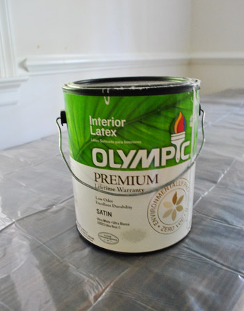
So we actually ended up exactly where we initially were six months ago: Benjamin Moore’s Moonshine (color matched to Olympic No-VOC paint in a satin finish). That’s the same soft gray that we have (and LOVE) in the living room, dining room, and hallway. Allow me to expand upon those weird stream of consciousness bullets above. We thought about going just a shade darker than Moonshine in here, but realized that we like light and bright workspaces (plus once we convert the carport into a garage – even though we plan to add windows to the exterior walls and door – we might lose a little light).
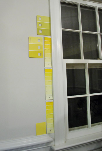
Some of you might be yawning because you were imagining something like sunny yellow (to tie in the front door)…
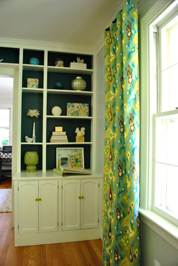
… or green (to tie in some of the tones in the living room curtains) or blue (again, to pick up on the dining room built-ins and curtains)…
… but after thoughtfully considering belaboring all of those options, we finally decided that going soft gray with the walls will really give us the freedom to bring in some seriously fun brightly colored & boldly patterned fabric (for the two desk chairs and the window treatments) along with some punchy art, bright lamp shades, and even in fresh paint for our desk chairs. We definitely like the idea of some fun cheerful pops of color in the accessories as opposed to all over the walls since we don’t want the room to feel too chaotic/hard to concentrate.
Besides, since we already have such a bright greeny-yellow tone in the middle of the house (the kitchen and laundry nook)…
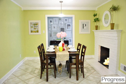
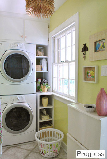
… we kind of love the idea that all of the soft gray rooms lead to the cheerful kitchen in the heart of the house. So we decided that we didn’t want some other bright color competing with it since they’re next-door neighbors. There’s something kind of nice about a burst of happy color in the center of our home with three soft platinum gray rooms around the perimeter (with pops of color in the accessories like the art/rug in the living room and the curtains/built-ins in the dining room):
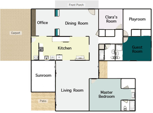
The funniest thing to us is that we only have a few unpainted rooms remaining (the playroom, sunroom, hall bathroom, master bathroom, and guest bathroom). And since those spaces aren’t ones that we spend the majority of our time in (meanwhile we practically live in the office), it’s kind of ironic that it was one of the last few that we got to. I wholeheartedly admit that the whole house color scheme above might not make much sense to you now, but hopefully once we paint those last few spaces and add touches like wainscoting in the hallway and other major furnishings/accessories that are still woefully missing (window treatments, lighting, rugs, furniture in the playroom instead of junk, etc) it’ll make a lot more sense. One step at a time.
Speaking of which, our office painting method was slow & steady. First we cleared the room.
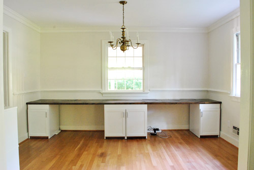
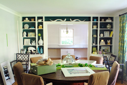
Which of course meant the dining room got full of offset office stuff:
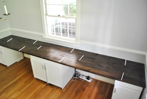
Oh and while the office was cleared we snapped some pics of the desktop since so many of you wondered where the seams fell. We had to highlight them with a white line in photoshop to help you out (they’re actually really subtle in real life, so they were impossible to see from this distance without some white-line help):
As you might notice, to the right of both of our laptops (when they’re actually on the desk) there aren’t any seams, so we don’t have any lumpy-bumpy seam-related writing issues (we write on pads and notebooks anyway, so I don’t think it would matter).
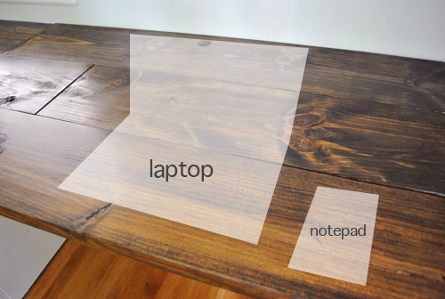
Oh and didja notice the holes in the back of the desktop behind both of our computer areas? Let’s have a little side chat about those, shall we? First we made a pilot hole where we wanted them to be (John used a paper template so they were both spaced the same distance from the wall):
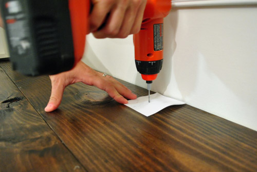
Then John used a 1 1/2″ bit…

… to drill a nice ol’ hole for all of our cords (for desk lamps, computers, the home phone, etc):

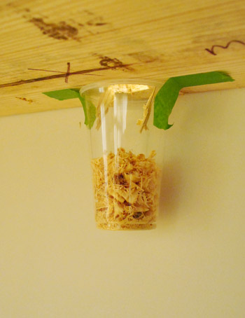
And John was a smartie pants and taped a cup under the hole to catch shavings, which was a huge time saver when it came to clean-up:
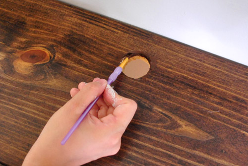
But of course the wood was unstained, so I used a little craft brush to get in there with some dark walnut Minwax to blend the hole in a bit better (we sanded things first, just to keep them nice and smooth so we don’t get splinters while retrieving cords):
So that’s how those handy holes came to be. As for how we painted the wall behind the built-in desk, the entire thing actually slides away from the back wall, so we slowly slid it out towards the middle of the room…
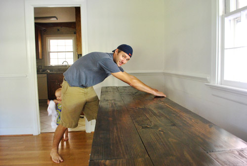
… and covered it with a giant drop cloth to protect our beloved dark wood desktop. That way we could roll/cut in behind it and then later push it back into place and paint the two sides of the wall that it blocked while it was pulled forward.
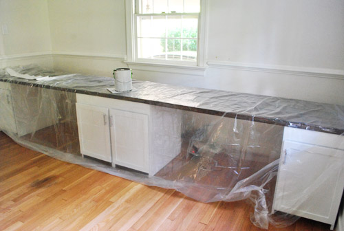
As is our tradition, John got his roll on while I did tons of cutting in (thanks to that chair rail, two doorways, and two windows). About two coats and four hours later she was looking like a soft fluffy cloud. Ugh, but ignore the light fixture. That thing’s having surgery as we speak- er, write. More on that soon.
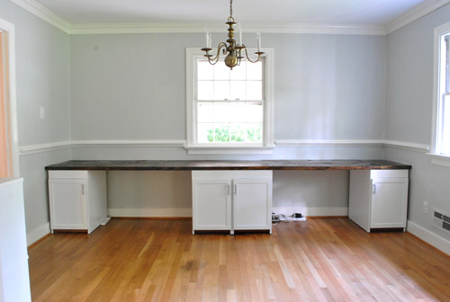
Then we just pushed the desk back against the wall and loaded everything back in there. The walls look a smidge blue-gray in these pics, but in real life they’re a true gray color (not icy blue or anything close to purple at all). Oh yeah but remember that everything on the desk is just sort of tossed there, so the leaning frames won’t stay (we need height, so we’ll probably hang some over-sized art on the walls) and everything else will likely evolve as we settle in a bit more.
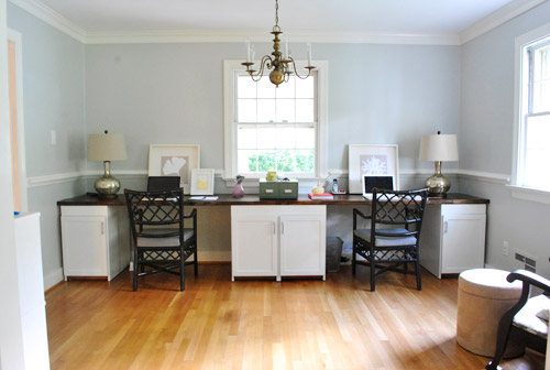
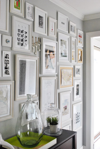
The lamps are from HomeGoods but we’re not sold so they might go back. We’re thinking we may use new lamp bases or shades as a place to add color along with art, paint on those desk chairs, patterned window treatments, etc. But thankfully we’re still as enamored with the wall color as we were when we chose it for the hallway frame gallery (the color reads more true to life in this pic)…
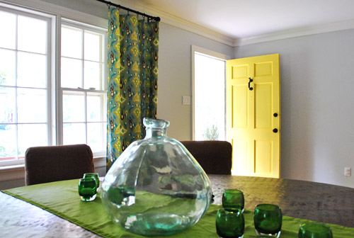
… and we definitely still love it in the dining room…
… and the living room too…
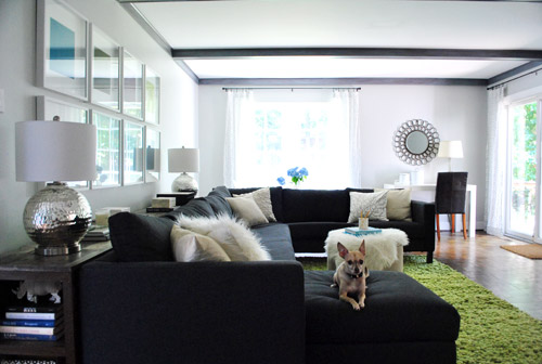
We especially appreciate how it makes the super thick crown molding and the nice chunky chair rail pop without being too high-contrast (which would also compete with our big beautiful desktop). Of course the chair rail will make a lot more sense when we hang proper art instead of leaning too-small stuff it in front of it.

And we love that this phase of the office upgrade was $0 since we still had a bunch of paint leftover from painting the dining room (we bought three cans back in January when we initially planned to paint the living room, hallway, dining room, and office all that color – and finally completed that initial plan this weekend). Only seven months later. Haha. Oh and we owe you a wide shot from the dining room of the fresh paint job, but since we’re making those aforementioned light fixture tweaks, we can’t shoot one quite yet. Soon!
But wait, there’s more than just a paint plan in here. We actually love the idea of adding a subtle tone on tone stencil around the entire room above the chair rail (hooray, no more desk shimmying necessary). We don’t want anything with too much contrast since it’ll compete with the dark teal built-ins and the fun curtains in the nearby dining room, but we’re seriously considering something like this with just a softer gray color for the feather part over our Moonshine walls (although I love the pop of yellow, so we might try it and bag it if we step back and it’s too much):
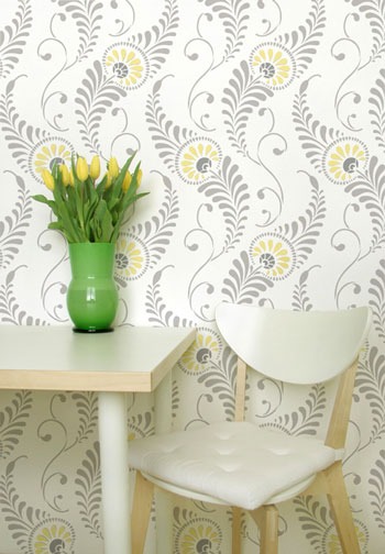
At 54 honking dollars it’s hardly a drop in the bucket (the stencil is over two feet tall and almost two feet wide to hopefully make the project go faster/smoother), but we figure that we did snag six cabinets for $6 and we built a 13 foot counter for $27… so maybe we should just bite the bullet and spend $54 for something we love. Any type of wallpaper (even the cheap stuff at Lowe’s and Home Depot) would be way more than $54 for the entire room above the chair rail, so I guess that’s another way that we’re rationalizing our possible purchase. Haha. We shall see. You know we’ll let you know when we make a final decision. We’ve never done a giant repeating stencil like this on a wall (we did stencil the floor of our first house’s sunroom) so that should be interesting too. And who knows, maybe I’ll find it as soothing as my little potato stamp project in Clara’s closet (I enjoyed that repetitive motion more than a person probably should).
Did anyone else paint their walls or drill holes into something this weekend? Or move a giant 13 foot desk? Or figure that we might be painting or drilling holes? Or dream that we had a secret son that we never told anyone about (two different commenters had that dream last week – crazy!). Oh and we painted this room four hours before my mom came to town for the weekend from NY. Nothing like a little en-route visitor to light a fire under ya.
Psst- You can see some mom-visit pics over on Young House Life today. Clara does not have a healthy fear of alligators. At all.

Andrea says
Have you thought about doing the stencil with a semi-gloss clear acrylic for subtle sheen without using different colors?
YoungHouseLove says
That’s definitely one possibility! We’re not sure if we want the glossy sheen thing in there (with the chair rail it might look even more like a dining room instead of an office with the shine-factor) so we’ll have to see where we end up! Definitely hopefully with something very subtle!
xo,
s
Andrea says
Totally makes sense…I bet a matte finish acrylic could be pretty snazzy too! Wonder if it would show up on satin paint???
YoungHouseLove says
Ooh that’s a genius question. I’m not sure. Maybe I can do a little test in the corner…
xo
s
Andrea says
I want to see pics if it works:)Good luck!!!
Haley says
I love the stencil idea, especially with the pops of yellow! Something to remind you to have fun with design as you are working. I also vote for something goofy like a giant stuffed alligator or giant Stay Puff Marshmellow man!
Jennifer says
It’s funny that you say how Moonshine doesn’t read too blue or too purple in your house. We painted a swatch in our living room and it’s SO blue, very cold looking. Just shows how much sunlight, etc. can influence a color.
Back to the drawing board.
YoungHouseLove says
Totally true! My bff went with Owl Gray, which looked totally green-ish in our house!
xo,
s
Shannon C. says
I love that you chose the same grey for the office. I think it makes the open portions of the house flow so well! And you can definitely include more color in accessories/art and in other more separate rooms.
I would definitely pick brightly colored lamps-they could really add a nice pop in there. Maybe a sue-inspired but-not-too-matchy-to-the-dining-room shade.
As always, love the room, the molding and chair rails make me drool.
Cat @Breakfast to Bed says
That cup thing is freaking genius. I wish I had a giant cup to stick my three year old when he’s eating.
YoungHouseLove says
Haha, I need one of those for Clara too!
xo,
s
Mandy says
I know I’m not anywhere near the first person her who’s had this dream….but it made me so happy that I just had to come and tell you! (and how funny is it that you coincidentally asked me about my dreams?! haha)
But anyway, so here’s the scoop. Saturday night, I bought a new table runner and was perusing the site for the table setting posts and videos (nod to Katie Bower!)……like, for hours. So I guess it’s not so strange that I dreamt about you guys haha…I don’t remember all the details anymore (should’ve written it down!) but basically, I remember stopping by your house (sure, why not? after all – Richmond, VA IS right around the corner from Bensalem, PA, right? hehe), having lunch with you, John, and Clara…and y’all were just amazingly wonderful (though why anyone would expect any less, I don’t know)….and we just walked around the house talking about projects, then went to TJ Maxx and looked at decor…haha that must’ve come from watching the “good will hunting” video…but it was just a blast hanging out with you, and I woke up feeling like I had new BFF’s =) Love that!
So hey, bestie, hope you’re all having a great day! =)
YoungHouseLove says
Haha, that’s so cute. It’s official, we’re dream bffs.
xo,
s
Mandy says
love it =)
Hilary says
Love the color – can’t wait to see the new fixture!
Stephanie says
I love the Moonshine color; so pretty and allows for your decorative pieces to shine. I’m stealing it for when I move into my new (first) house this fall.
Jamie says
Love how the office is turning out!!
My hubby and I embarked on our first painting project ever – and we could not have done it without your help!!! We had your blog up on my phone while shopping at Lowes, I did the cutting (found your 2 inch brush and it worked like a charm!) and he did the rolling. We even borrowed your Carolina Inn color in no VOC paint after our first color left us surprised/horrified (why didn’t we get a tester!)
THANK YOU!!! I heart you guys.
ps. we might need to “borrow” this color too… apparently we’re not good color pickers…
Cassity @ Remodelaholic says
You guys are totally amazing! How do you get so much done? We have been in our house for three years, and hardly any project is actually done… C’est la vie! Oh well, at least I get to live vicariously through your projects!
p.s. i am loving all the color in your house!
Aubrey says
Don’t forget, this is their full time jobs!
YoungHouseLove says
Totally! We eat sleep and breathe this stuff! Who else paints on Saturday at 9am with their mom just hours away? We’re ca-razy like that.
xo,
s
Jenna says
So I am a fairly new reader but I must say I am already addicted to your blog! It’s just fabulous. The wall color looks so great, I love how you tied it in with your house and it totally looks dreamy with the dark wood of your new desk! I am rooting for the wall stencil with yellow, but can’t wait to see what you two decide on. Without a doubt it will be lovely!
Harinee says
Love the desk-can’t wait to see what you paint the chairs!
I know you use floorplanner.com for your plans but how do you copy the plan into an image file to show on here? I can’t access the plan unless I log in to floorplanner..
YoungHouseLove says
We just take a screen grab of it. Hope that helps!
xo,
s
Harinee says
Doh! Thanks Sherry!:)
Kristi W. says
That gray shade looks great! I actually think you are very wise to pick a color that blends seamlessly into the attached dining room since the doorway is open. I think a different color might seem jarring. As you said – you can always add more color with accent pieces and art work. And your thought process was hilarious to me because we go through the exact same thing whenever we think about painting. I know we shouldn’t spend so much time waffling – it’s just paint, after all, and we can always re-do it. But you better believe we spend an exhausting amount of time going back and forth on color. Oh, how I wish we were more carefree with the paint brush! :)
Kate says
I worked on getting a Craigslist hutch painted this weekend! We were on a two week vacation (got back Saturday afternoon) but had been dying to get started on it, so I filled holes/missing laminate on Saturday night, bought all the supplies Sunday morning, and then got started with prep and painting! So far it has primer and a coat of paint, so it still has a way to go. Luckily I was able to find clear shallac that is made to cover smoke odors, so I don’t need to paint the pretty (undamanged, as opposed to the outside) wood interior. I’m painting the outside white to go with the medium tone wood, partially because I loved how your dresser came out last year!
Shelley says
Do. the. stencil. :)
Julia says
Do the STENCIL! Its beautiful! And I like the colors in the picture (yellow and grey) just as they are!
xoxoxox
Lindsey @ arkadian belle woods says
Love it! I’m working on my office/craft studio now so you guys just add to the inspiration to keep me moving!
The color is great b/c you can always add a punchy color of pics and etc which you guys are just amazing at anyways! I’m so excited to see more!
<3
Katreena says
I LOVE that you chose to stick with the soft grey! It will definitely give you more of a chance to play with colored accents and fabrics.
We recently painted our living room a burnt orange, but we kept the rest of the house a neutral pallet and we LOVE it!
Chelsea in Richmond says
Love it! Looks so great in there.
So I’ve been meaning to ask and now that you are saying it’s coming down, any way I could snag the light? I’ve been looking for an old light like that for our dining room. Many of the ones I’ve seen are big but the one in your office looks to be the right size.
Sometimes it’s hard to find my post again on your comments so please email me if you think we could work something out :-)
cabh123 at gmail dot com
YoungHouseLove says
We’re actually working with it (but tweaking it pretty heavily), so it won’t be up for sale. So sorry!
xo,
s
Sarah @ w30 says
Love, love, love it! I think it’s the perfect counterpart to the teal and happy green in adjacent rooms, and so calming.
Can’t wait to see what you do with the light fixture! :)
Andrea of Care to Breed says
I’m not a designer, but I am wondering why you didn’t choose a more industrial or actual desk lamp for the desks? The current ones scream living room or bedroom side table. They are beautiful, but you’re right, just don’t seem to fit. But, I probably wouldn’t have even thought of that if you hadn’t mentioned it! Love the transformation so far!
YoungHouseLove says
We tried the old industrial desk lamp that we had on our old desk on the new built-ins and it was so tiny and frail in comparison to the chunky 13 foot long desktop. We think for reasons of proportion it probably needs something heavier to add balance on either end of the desk and not look too piddly. Who knows where we’ll end up!
xo,
s
Deb D. says
Love the paint — think moonshine was the way to go — opens up so many possibilities. Getting inspired to paint more in our house (only two bedrooms down, everything else to go…can be overwhelming at times). Look forward to seeing what you do with light fixture and chairs.
Also, did you see Ana White’s shout out to your yellow door today?
YoungHouseLove says
No – so exciting! Can’t wait to see it! Thanks for the tip.
xo,
s
Lindsay says
Love your stencil inspiration picture! LOVE! Maybe I’m biased since gray and yellow were my wedding colors ;) Can’t wait to see what you choose!
Karen L says
Looking good. I’ve been wanting to do a stencil thing but can’t get over the price tag! I keep thinking that it is a one time thing, right? Like, you would stencil one room and then get rid of the stencil (b/c who would do the whole house in the same design?). Thus I keep scouring Craigslist and Ebay but so far I have had no luck.. Maybe you can sponsor an Old Stencil Pass Along Party! I would be happy to use the stencil and pass it along to another DIYer when I was done!
YoungHouseLove says
Haha, that could be fun. Although I have seen people reuse stencils to paint curtains or pillows or window treatments in other rooms (with different colors so it’s a varied look). That could be fun too!
xo,
s
Mollie says
that cup trick so pinterest-y of john!
Sarah @ Redhead in Ruffled Flats says
Looking good! That gray is my favorite neutral color right now! It’s so soft and airy, but white pops off of it really well and it lets colors pop better than I believe beige does.
Can’t wait to hear more about the stenciling!
Megan says
The office is coming together great. In a past post you mentioned possibly doing french doors. Are you still considering that?
YoungHouseLove says
Yes, someday down the road (read: when we save enough pennies, haha) we’d love to add them for even more architecture and the option to close off the office if it’s messy and we have company!
xo,
s
Emily says
I think it would be cool to do the stencil but maybe use a different color than the yellow? A purple from STN (sue the napkin) or maybe the grellow? Or the color from the built ins. Or maybe a combo of all? I love combos. With cheese. Mmm.
YoungHouseLove says
Haha, I love that Sue is now known as STN. And the idea of picking a color from Sue or the built ins is always another possibilities! With extra cheese of course.
xo,
s
samantha spencer says
You inspired me!I painted my whole house moonshine, and thanks to all your pictures, i didn’t even have to fight for my color!
GreenInOC says
John, I’m curious why you used that particular drill bit and not something like this:
http://en.wikipedia.org/wiki/File:Drill_arbor_holesaw_2.jpg
I’m curious because I am going to be drilling into a piece of wood furniture (I haven’t done it yet because it’s killing me to “ruin” a mid-century piece but I need to turn it into a dog crate) and I bought ones like I linked but after seeing what you chose, I’m wondering if I bought the wrong thing?
YoungHouseLove says
I’ve used one of those too, and it works well! I just didn’t get one in this case because they’re more expensive and I was hoping the 1 1/2″ bit would do the trick (thankfully it did).
-John
GreenInOC says
I’m sorry for being foolish but I am not a tool expert!
The way I read your reply it seems that the drill bit above is a one time use tool? Meaning, one hole and then it’s ruined? Did I interpret that correctly or foolishly?!
YoungHouseLove says
Oh, sorry for being unclear. Nope, neither are one-time-use tools. They both should last you quite a while, hopefully. I just didn’t own one at the size I needed, which is why I had to go purchase a new one.
-John
RVA Born and Raised says
Bravo with the paint color. I can’t wait to see how the rest of the room shapes up. Any idea what you are going to do with the light handing in the office? Replace it? ORB it??? Maybe add little yellow or green lamp shades to the candles?
YoungHouseLove says
We have a little light surgery going on today! We hope to be back with details as soon as we can! Hopefully by Wednesday after things dry and get rehung!
xo,
s
Claire says
interesting color and very cool way to catch the woodchips!
Lola says
I make my own stencils– transparency paper, cutting board and exacto-knife. I usually just lay my printed pattern under the transparency paper and cut it out, but sometimes I just free hand. They’ve all turned out so well! And saves you quite a few bucks!
YoungHouseLove says
I love that idea too! I think if we fell in love with something a bit simpler (like chevron or repeating circles) we might have the courage to try it!
xo,
s
Sandra says
Please share a moodboard for this room! :D It’s been too long!
YoungHouseLove says
So sorry! I’ve been meaning to whip up a mood board soon! I’d love to play around with fabric and color options for things like the art and the windows and the chairs!
xo,
s
stephanie says
Looks great! I think sticking with the gray was the best choice, and I had to LOL when you shared your thought process– when you mentioned painting your office, I had many of the same thoughts! (Why I thought so long and hard about the paint colors going in another person’s home is beside the point…)
By the way, I know you guys get wood cut at Lowe’s/Home Depot sometimes, so would you happen to know if they cut plywood also? I know it’s a random question, but you guys are the experts! (That and I can’t pick up the phone and call for another few hours and I’m impatient!)
YoungHouseLove says
Oh yeah, I think they do! They might only cut it once though (ex: down the middle so you can get it in the car), but they might also make more accurate cuts if you ask really nicely during off hours (ex: you need something that’s exactly 3 x 5′ from a 6 x 6′ piece of plywood). Good luck!
xo,
s
beekeebear says
I did our first painting in our new house this weekend! We painted my son’s room Aqua Smoke (Behr). No more mint green–yay!!
Though I diligently asked for No-VOC paint. I undiligently didn’t read the paint can the guy told me was no-VOC. And then I discovered (via my nose) that it was Low-VOC that night AFTER it had been painted. Needless to say, the little guy is relegated to his pack-n-play in our room for a while now. :(
YoungHouseLove says
Aw so sorry about that! Many paints have no-VOC bases but when the paint guys add the colorants there are VOCs in those. Olympic No-VOC paint also has no-VOC colorants (they’re the only paint sold at HD or Lowe’s who does that) so we love it!
xo,
s
beekeebear says
Thanks for the info, Sherry. Is Olympic’s No-VOC paint a paint and primer in one? That’s why we got the Behr Ultra Premium. ‘Cause we be lazy. :-D
YoungHouseLove says
Nope, sadly it’s not, but they also sell a no-VOC primer. We just skip primer most of the time anyway on walls that are pretty normal (not too dark or light but going extremely dark). All of the rooms in our first house weren’t painted with any primer (except for the paneling). And the only one we used primer for in this house were the dark blue guest room (so it would help with getting that deep color) and the kitchen (again because paneling calls for it). Hope it helps!
xo,
s
beekeebear says
Awesome! Thanks. :)
Leah says
Whoa- I love love love that stencil! You gotta get it! It’s so purty.
Katie says
Love the gray walls! Looks awesome…can’t wait to see how the rest of the room comes together :) So here’s a random question for you…how do you guys balance personal vs. business/work when it comes to social networking sites? Do you have personal Facebook pages or twitter or is it all for the blog? I don’t know why I care, just curious I guess :) Since you guys are so public with your life I just wondered if you were able to still use the internet for personal/private use too…
YoungHouseLove says
We’re one big mish-mash. Haha. On Facebook, we figure our readers are our friends so it’s all the same to us and we just click accept. Haha. Although we do have extra privacy settings for “YHL readers” (and friends and family members have access to more info/etc). On Twitter John has a personal account that he rarely uses with friends/family (I don’t even have one) and we also have a YoungHouseLove one that is our main one with lots of readers and family/friends in the mix. We definitely use things like Twitter/Facebook for personal use (just Facebooked a neighbor this morning about something) but we also use them for the blog too. I guess we like to multitask. Haha.
xo,
s
Lisa in Seattle says
Ah, so calm and lovely in there now. Never realized how much the all-white didn’t quite work until I saw the reveal and felt my forehead wrinkles relax. Thank you for sharing your thought process as you decided on the new/old paint color!
Everybody’s on tenterhooks about your lamp makeover, but I’m holding out for the French doors (however long it may take them to arrive). It’s embarrassing to admit how excited I am about them.
No painting, but a little drilling – we had to make a new ferret gate to keep the fuzzies out of the bedroom. John would appreciate how seriously over-engineered this thing is.
YoungHouseLove says
Haha, I bet John would love to see pics! And I’m with you- the french doors are going to make this house someday…
xo,
s
Erin @ One Project at a Time says
We painted this weekend too, and for the first time I let my little 3 year old DIYer help. It actually wasn’t the total disaster that I was expecting! http://oneprojectatatime.blogspot.com/2011/09/painting-playroom.html
Seeing as you guys are expert DIYers, you should start the Bean extra early. Get that girl a paint brush! :)
YoungHouseLove says
So pretty! I love it!
xo,
s
Laura says
First of all, I love it! The gray is perfect in there and I agree that it makes for smooth color transitions from the adjoining rooms. This last point has been a thorn in my side with my own recent color dilemma and I also solved it this weekend! Our house is one small loop, so every room goes into two other rooms to make a full circle. Can you picture that? We even have a jack & jill bathroom between the two bedrooms. Anyway, our bedroom was the last room to be painted, but it had to flow with the gray bathroom it lead into AND the clay living room AND the turquoise walk-in closet turned nursery nook. I was really stumped on this one. But after cruising around on the West Elm website came across the most perfect purple room – it’s a dark almost raisin color and that was that – I made a quick trip to benjamin moore, got some zero-voc paint and I painted our whole bedroom by myself yesterday evening. And can I just say thank you for introducing me to the wonderful little trim brush? Because it really is magical and is the only reason I could paint that quickly. Oh, and I ordered that West Elm duvet that was pictured with the purple paint (which they sell!) so my bedroom is going to look like it’s out of a catalog, but yay, it’s done so who cares! Here’s what my room will look like when my duvet cover arrives: http://www.westelm.com/products/organic-rice-pintuck-duvet-shams-b678/popup/more-views.html?active=1
YoungHouseLove says
GORGEOUS! Wow, I love it. And I love that you love that brush of mine. It really is a miracle, huh?!
xo,
s
The Simply Inspired Home says
I love that you went with Grey. It’s sophisticated, and will allow you to change out the accessories easily.
The two of you remind me of my husband and I so much, except we don’t blog nearly as much as you. Way to go.
Your project reminds my of our office space we built downstairs. Here’s the link to the photo of it.
http://simplyinspiredhome.com/wp-content/uploads/2011/08/HomeOffice-2.jpg
Looking great so far!
YoungHouseLove says
Ooh that’s so pretty! You guys did an awesome job!
xo,
s
Bethany says
Looks great! The now painted office picture, shot from in the dining room, was the first time I noticed how fantastically balanced that desk is under the window. Now that white and wood really does “pop”.
Also, great shot/angle of your living room (the pic in your post with little Burger sitting on the couch). It looks cozier than I’ve noticed. And every time I see that console behind the couch I fall a little more in love with it!
Kudos!
Valerie says
Love the grey. Great color choice. I have been searching for a perfect shade of grey for the walls in my house for the longest time… always ends up too blue. Which is a bummer. This looks lovely, and I LOVE the stencil idea. I have been considering a stencil as well, but am too scared to commit… maybe we should hold hands and do it together?
YoungHouseLove says
Haha, let’s dive in together. Virtual hand-hold coming your way.
xo,
s
Katie says
I love it! I think you were right to stick with the gray.. :) also I get what you are saying with the lamps.. but I think it’s just the shades… the off white color doesn’t do much.. the bases are beautiful though. So maybe just some new shades in a pretty color? Anyways I love everything you’ve done with your house.. It’s very beautiful! :)
YoungHouseLove says
Yeah I keep wondering if bright shades with those bases would be pretty. We also love how the round silver based lamps from the living room looked in here though – so maybe something rounder and chunkier on the bottom could work too…
xo,
s
Krystle @ ColorTransformedFamily says
I love the idea of continuing the soft gray. I don’t think you would have wanted the office screaming at visitors from the dining room. This way it blends in. I also love the stencil idea. While $54 does seam like a lot you are right when you compare it to wallcovering. I think it would look cool and sophisticated!
Rachel @ Common to Moms says
where is the yellow rug now? (is it in the guest room now? I can’t remember…) Anyway, if it’s big enough, I think it would look really great in there!
YoungHouseLove says
Sadly it’s too big (it’s so wide that our chairs conflict with it when they’re pulled out)! But we’d love pops of yellow in here for sure! Maybe in the art/window treatments/chair reupholstery & paint!
xo,
s
Carrie says
I don’t know why, but I can immediately see the orphaned horse poster in this room. Guess it just shows what a great job you’ve done of tying the whole house together!
YoungHouseLove says
Aw thanks Carrie! We’d love to get that guy in here someday!
xo,
s
Justme says
It’s a nice safe grey. However, I thought one of your resolutions was to experiment more with colour?
YoungHouseLove says
Check out this post for all the reasons we didn’t go with a bright color (didn’t want it to compete with the bright adjoining kitchen & laundry room and bold dark blue bookshelves & curtains in the nearby dining room, etc). Gray will allow us to add color in the art, window treatments, chairs, & even the lamps/shades (our resolution wasn’t just about walls, it was about going beyond basic/white curtains, lampshades, & accessories too)! And we think the stencil will go with our “take more risks” resolution since we haven’t done anything like that yet either!
xo,
s
Lindsay says
I absolutely love the new office space! And, I love your color choices ;)