We don’t talk much about our hall bathroom. In fact, in 17 months of living here, it’s been the subject of just two posts (knocking down a towel bar and fixing the toilet). And since we later used almost the same color as the inspiration room in our guest bedroom, we’re no longer planning to use that color in here, so we’re kind of back to square one. But we finally made a little lighting progress, as today’s title suggests.
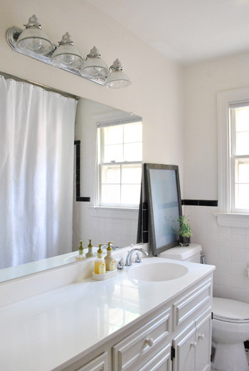
There was nothing especially offensive about the existing fixture – nor anything especially exciting about it. It felt sort of builder basic to us. And kind of “backstage make-up room” to us thanks to the long line of bulbs (long vanity + long mirror + long fixture = lots of long things). So we always told ourselves if we saw something that we liked better (maybe with more height and less width, without looking too pidly and delicate over such a large vanity and mirror) we’d upgrade and then donate the original – since we’re sure someone else might love it more than we do.
We randomly checked out a few home improvement stores over the past year and a half, but nothing really got our figurative motors running. That moment finally came about a month ago while Sherry was on Joss & Main and saw this:
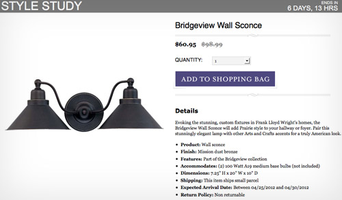
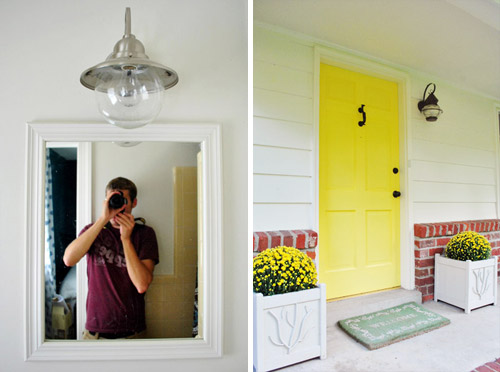
We obviously liked the dark bronze finish and also liked its sort of industrial / outdoor feel. It was mildly reminiscent of both our guest bathroom light (an outdoor fixture we installed inside for that industrial feeling) and our front porch light (which came with the house).
And at $60 (down 40 bucks from the original $100 price) it was less expensive than a lot of the alternatives we hadn’t liked as much at the home improvement store. So we pulled the trigger.
The breaking news is that we finally got around to putting this baby in (first it sat on the counter for a few weeks, taunting us). Thanks to the position of our mirror, I had the pleasure of photographing myself a lot in the process. And thanks to the bathtub being in my way, I also got to play the role of the tripod a few times. Apparently my head isn’t very level…
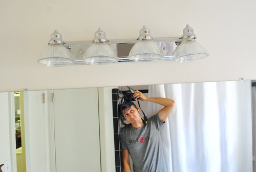
You guys have probably seen me remove a light before, but if not – after turning off the power to the whole house (our fuse box isn’t labeled carefully enough for us to trust it blindly) I carefully removed all of the glass shades and bulbs (I’m a smidge accident prone around those things) and unscrewed the fixture from the wall.
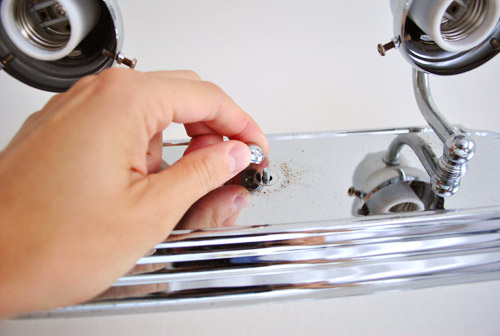
That revealed this big metal plate that was secured to the wall… along with lots of nasty dust (hence my expression).
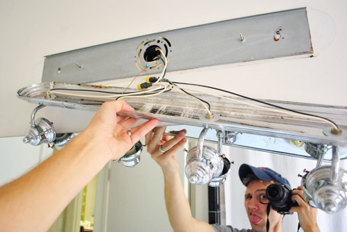
When I unscrewed the plate I was left with this imprint of what once was: some unpainted areas, a bit of rust, more dust, and some old paint drips.
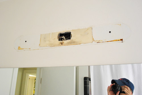
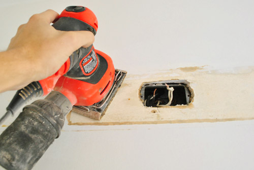
After Sherry broke out a lead paint test stick (we got a pack of them from Home Depot about a year ago and they’re still coming in handy) we were relieved to get a negative result so I broke out my cheery little palm sander to smooth out those ridges left by the previous paint job so that our re-paint job will have a better chance of looking seamless. But re-painting’s a future task since we still have to settle on a color for this room (but you know we’ll keep you posted!).
With the old fixture successfully down, we brought in the new guy. Here’s what he looked like out of the box.
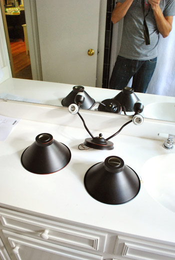
I screwed in the mounting bar (a simple task that took longer than usual because the included screws didn’t fit my junction box so we had to run to the hardware store to get different ones).
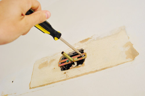
Then I attached the wires and screwed the new fixture in place. Pretend that giant unpainted spot isn’t there.
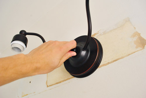
Once the metal shades were affixed and the bulbs were back in place, we had our new and improved light ready to go. My head-tripoding skills also appear to have improved.
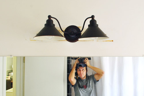
We’re charmed by the extra bit of character this light brings to the otherwise still-ignored bathroom. Thankfully, the two 100 watt bulbs are more than enough to illuminate our small bathroom, and we’re excited about how the dark color of the fixture balances some of the dark accent tile around the room. We also like that it looks sort of old (like our house and many of the other industrial lights we’ve brought in). We have big plans for framing out the mirror, painting the walls, painting the vanity, getting new vanity hardware, doing something to the window, hanging some art, etc. So although it’s not looking too amazing right now, we’re inching towards something that might look cool someday. We hope. Haha.
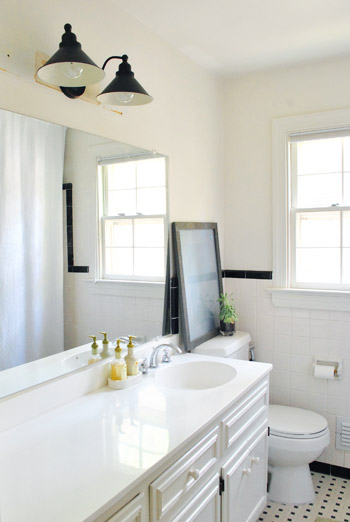
We like how our new fixture better fills the space above the mirror (thanks to more height, which balances the ceiling-height shower curtain on the other side of the room). And we’re actually really happy with the quality of this light. It looks a lot more expensive than 60 beans, just because it’s not flimsy and the dark color is really matte and authentic looking if that makes sense. The little distressed areas don’t feel too country for our tastes, but they make it feel less mass produced and more “oh this old thing, we actually inherited it from Uncle Merlin and it has some great story to tell” – even thought that’s totally not the case.
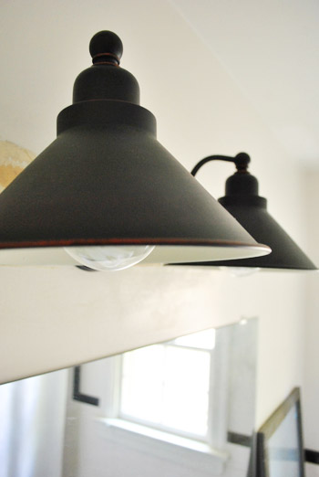
And we already dropped the old light off at our Habitat For Humanity ReStore, so the switcheroo is officially complete. Hopefully we’ll have another update post with a paint color sometime soon-ish. And that giant mirror will look a heckova lot more legit once it’s framed out. But at the rate these hall bathroom posts have been appearing so far (along with posts about the guest bathroom, the playroom, and the sunroom – which are our other virtually untouched spaces thus far), I probably shouldn’t make any promises. We’ll get there someday!
What have you guys been hanging in the bathroom? Art? Lighting? Mirrors? Any favorite bathroom paint colors to share? Do you get nervous ordering a light you haven’t seen in person? We must admit we were a little sweaty when we clicked “buy” but we’re glad we took a chance.

Brad Thomas says
I think that the finish of the new light pulls in some of the black elements in the bathroom, like the tile and framed picture.
The mirror would look great with some big fat molding around it.
Good luck
Brad Thomas
Classic Clawfoot Tubs
http://www.classicclawfoottubs.com
Heather @ What Does She Do All Day? says
I just recently replaced the old builder’s grade light fixture in our master bath. Mine didn’t look nearly as pretty underneath! It had huge holes that needed to be repaired before installing the new one. I had retiled that bathroom a couple of years ago (with the same tile you have in that bathroom!) and painted the vanity, but had not done any other work and it was in desperate need!
lisa says
Oh pretty please do a “John as a…” post, John as a tripod, John as a deck a few weeks back had me in tears! I’m sure there’s more! ;-)
YoungHouseLove says
Hahahahahahah, I love that idea.
xo,
s
Wendy says
About to update my powder room… Can you mix fixture materials? For instance, I have pewder faucet, towel holder, do i need to find a pewter light fixture for over the mirror, or could I do black? I know you’re still working on yours… Will you do a black faucet, etc., too?
YoungHouseLove says
Oh yes, you can mix metals! It can look great to have a few of each color (ex: black tile which ties into black light while chrome shower faucet and sink faucet relate to each other). As long as nothing comes out of left field and doesn’t have a friend to relate to, it’ll all look great!
xo,
s
Jillian@TheHumbleGourmet says
We’re currently in contract on a house (yay!) so posts like this are making me just itch to start renovating! Though it might help to get a mortgage first ;-)
Michelle says
Have you guys thought about painting wide black and white stripes in this bathroom?
YoungHouseLove says
Funny enough we have! And we found some cool b&w wallpaper but we’re still not sure where we’ll end up!
xo,
s
Ann says
It looks like from a magazine!
Awesome taste and work!
I wish I had such a handy man !:)
jja says
I like the bevore version more.