Hi guys! I’ve been behind the scenes messing around with tech organization while the lady wife chats about feminine products and nail polish and whatever else she has been chatting about lately (justkiddinghoneyIloveyou) but since today is the day we said we’d get on some paper/tech org – specifically some blog streamlining (but you guys can tackle anything like digital photos, filing paperwork, or cleaning up your desktop) I’m here with the goods on that. With all the organization happening around our house this week it was bound to spill over to some blog organization eventually. And the portion of our site that was feeling the most out of control was our Projects page. You know, the one under our blog header that says “Projects”?
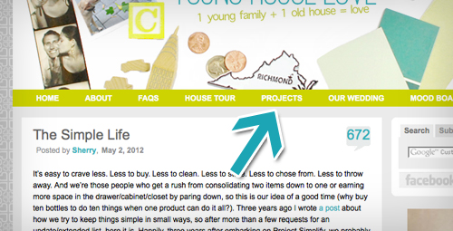
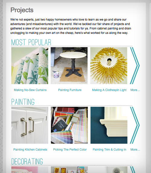
In case you’ve never visited, it’s where we attempted to sort all of our project posts into categories.
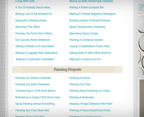
Our simple system of a linked description for each one worked well when there were only a few dozen posts to link to. But as time went on and our project tally grew, it kinda turned into this sea of text that made even our eyes cross a little bit. We last counted over 750 links on that page (admittedly with duplicates, since some projects fell into multiple categories). And we hadn’t even updated it since December, so our best guess was that we could hit 1,000 once we added five more month’s worth of links. Yikes.
So the last couple of week’s we’ve been working on an overhaul. The goals? 1. Pare down. 2. Make it easier to browse. And we say “browse” very specifically, since it’s probably best to think of this section like you might casually peruse a bookstore looking for a good read: head to your favorite section and see what title strikes your fancy. If you’re looking for a specific item, it’s probably best to hit up our information desk search bar, although it can’t hurt to breeze through the project page now that we’ve given it a nice swift kick in the pants a much-needed upgrade.
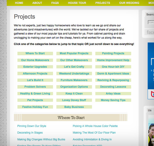
Paring down was the easier part. We condensed 26 categories into 16, eliminating a lot of duplicate listings without eliminating any projects. But as far as browse-ability? Let’s borrow from the bookstore metaphor again and just say that we gave all of our projects a cover:
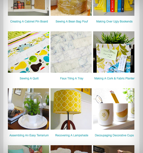
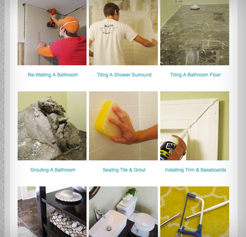
We had been planning to add photo thumbnails for a while, along with giving each category its own page (we’ve always loved project galleries with nice glossy pics like Kate’s and Stephanie’s and Layla’s) but we really had to work up the energy. Let’s just say there were some pretty decent man hours (and woman hours) spent relinking everything and creating and coding all 600+ thumbnails (we tried a few plug-ins but due to our template and our categories we learned that we had to hard code them all by hand). Whew. But now that it’s done, and our eyes don’t see code floating in front of them when we close them anymore, it was totally worth it.
Adding an image to each project makes scrolling through each category much easier on the eyes, while also hopefully helping you zero in on the type of project that you might want to tackle faster. Plus, aren’t pictures just prettier anyways?
So now there’s one main projects page with a few thumbnails of each category to give you a feel, and then you can click “more” to see an entire page devoted to each of the 16 categories, which are:
- Most Popular
- Painting
- Decorating
- Furniture Upgrades
- Crafting & Art
- Home Improvement
- Outside
- Cleaning, Organizing & Edo
- Lovey-Dovey
- Money Saving
- Kids & Pets
- Holiday
- Videos
- Projects By Month
We plan to update them every few weeks with the latest projects we’ve tackled so it should always be reasonably current (we haven’t added any of the O-R-G posts that we’ve done this week, but will add them and more in the next few weeks). The order of each of those category pages is admittedly a bit willy-nilly. We tried to put some of our favorites/most popular towards the top while keeping some logical groupings throughout the rest of it (like lumping all of our kitchen and bathroom remodeling projects together). Of course we didn’t want all of our oldest ones on the bottom (wop woppp), so we just sort of shuffled things around and embraced the random-ocity of it. So in the end it’s mostly a mixed bag. Like a book store. Just pull one off the shelf, check out the cover, and see if you want to flip it open…
Hope you guys like the little revamp. With this now complete I can turn my attention to another big organization project on my to-do list (ackthebasement). But more on that tomorrow! In the meantime, what paper/tech org have you guys taken on lately? Any tips for the group? Or are you gearing up to knock something out tonight?
Psst- If you’re shaking your fist at your screen wishing this was a more traditional organizing and paring down post, just hit up our newly organized Cleaning & Organizing page (how’s that for being meta?) where you’ll find 50 posts on the subject.

Melanie@MailboxJourney says
Awesome job guys, it looks great. I don’t even want to think about how long that took you guys though! It was definitely needed though.
Kristen @ Popcorn on the Stove says
How wonderful – the project page looks great! It was a little bit rough scrolling down through all that text so I’m glad there will be tons of photos!
Rebecca @This Nest is Best says
What a fantastic feature and organization! I’m hoping to do some updating to my own blog’s layout and design soon, particularly because I’ve just celebrated my first blogiversary!
http://thisnestisbest.com/2012/04/26/happy-blogiversary-to-me-and-you/
YoungHouseLove says
Wahoo! Happy blogiversary Rebecca!
xo,
s
Lauren@FilingJointly says
I’m *JUST* about to celebrate my first blogiversary too!! And I am SO excited about it. Gearing up to add a couple of new pages, so this post is great inspiration.
For now though I am just writing ridiculous stories about how I tried to convince my boss of the merits of napping under my desk at lunchtime.
http://www.filing-jointly.com/2012/05/things-that-would-probably-get-me-fired.html
YoungHouseLove says
Haha, I totally see your logic.
xo,
s
Courtney says
I love it; looks great! Now I can find what I am looking… With pictures. Thanks for all your hard work!
Stephanie says
I cannot even IMAGINE how long this took you, but it looks amazing, so well worth it!
annabelvita says
Hooray! I look forward to having a browse. I recently jumped ship from my old blog platform (posterous) and moved to wordpress.com (.org one day!) so there’s been lots of behind the scenes organising going on there. All my old posts are barely tagged, let along in categories and it seems every time I edit an old post, it now republishes it to the RSS feed so I feel sorry for the people who read it through that! (Oh well, I think there’s only five of them). To make the change more fun, I did make a new header (with bunting! yay!).
Wow, that was boring! Thanks for letting me vent!
YoungHouseLove says
Haha, yay bunting! I love it!
xo,
s
Brandy in Nashville says
Looks good! Have you guys dabbled in chalk paint at all? I try to keep up with you guys often, but haven’t seen you mention it. Maybe I’ve overlooked it? I know it’s all the craze right now.
YoungHouseLove says
Oh yes, it’s definitely all the rage but we haven’t tried it yet. We hear it’s awesome though!
xo,
s
heather says
It’s bad-ass. I converted an old barn window from our property into a kitchen chalkboard/cork board with it.
http://www.likeacupoftea.com/reclaimed-window-chalkboard/
http://www.likeacupoftea.com/reclaimed-barn-window-household-organizer/
Kaitlin says
It is also how we disguised our hideous fridge! The ($10) investment was so worth it, and it is holding up really well!
YoungHouseLove says
Love that!
xo,
s
heather says
It looks way better! Nice. I did something similar a while back. By similar I mean I organized my projects, not anything like you did (or as nice). I spent a majority of hours re-categorizing items as well to revamp my entire site so as I posted more it would be easier to locate items. Thankfully I only have about 160 posts to go through. I did end up making this page under my “renovations” header though, so people wouldn’t have to scroll and scroll and scroll.
http://www.likeacupoftea.com/by-project/
I need to actually throw another one in there that says “outdoor living spaces” since we’ll have deck and porch posts too that have just started. Always evolving!
YoungHouseLove says
SO pretty!! I love the type and the colors!
xo,
s
Stephen says
Well done! Looks fantastic!
Anya says
Great work, John! I love browsing your projects and getting ideas.
Just a comment about your background — when I view your website on my iPhone, I see some yellow/white votive vases as the background instead of the grey tessalating YHL hearts. Can you check and see if it’s just me?
Thanks!
YoungHouseLove says
Oh yes, that’s a smart phone glitch that you can fix on your end. Just clear the data/cookies/cache and it should be back to normal!
xo,
s
Anya says
Ok, thanks! now I just need to figure out how to do that :)
YoungHouseLove says
Haha, good luck!
xo,
s
Michele says
well done guys! i’m pretty sure there are some second graders out there who are more skilled at computer technology than i am – so i’m mucho impressed by this. the idea of sitting and putting in all that coding… it hurts my brain!
and – hey – if you finish organizing over there and your fingers are itchy for some more home organizing action, i know a house out in Seattle that would LOVE to have you visit. (hint: it’s mine.)
:) happy day!
YoungHouseLove says
Haha, we’ll be right over!
xo,
s
Hannah says
Wowee. That must have taken a long time. You two have an inspiring work ethic.
I clicked through to the Cleaning & Organizing page and chose Dealing with Bed Bugs purely for John’s awesome eyebrow-arch. I-mean-business!
Jenn says
Ummm…I’m a little obsessed with this. You’re going to have to pry my laptop away from me after I get done working today! can’t wait to browse through everything and work on my new honey-do list ;)
YoungHouseLove says
Aw thanks Jenn!
xo,
s
Kelly says
You guys have one of the best organized and most easily navigable blogs I’ve ever read. I know its partly cos yous guys are all professionals, and I’m not trying to rag on other design and DIY bloggers who don’t do this full time, but yours really keeps me coming back and reading on a consistent basis. When I visit some blogs, i just feel like I can’t even read or search them easily and so I just leave. But with yours, I can instantly access all the information you have amassed and to me, that’s what a websites for!
Ashlyn says
I agree! The unbelievable organization of this blog is one of the reasons I became addicted. I love how you link to related/previous posts on projects, and I’ve always found the projects page to be pretty easy to navigate. It’s even more beautiful now, though!
Vanessa says
Everything looks great- Love how you two are always making things easier for your readers! Thanks
Jennifer says
Thanks for taking the time to do that! I think it looks great and will definitely help! :)
YoungHouseLove says
So glad!
xo,
s
Melody says
I’d love to know how you organize your digital photos. You must have hundreds of thousands. What do you label each photo? How do you file them and categorize? I know you mentioned keeping Clara photos by month, but if you have to go dig out the thumbnail for your recovered lampshade project–how do you go find it quickly and easily? THANKS!
YoungHouseLove says
We store all of our blog photos on a cloud (amazon.cloud) and all of our personal photos are in iPhoto (where they’re ordered chronologically so it’s easy to upload them to make a family yearbook on mypublisher.com, which we do each year). We also have project photos in iPhoto (from before we upload them to cloud) but they’re ordered by category, so the “tiling the backsplash” folder won’t have a Clara pic in it, that will be in “Family 2012.” We also back the family ones up on an external hard drive and upload them to an off-site place like Flickr to keep them safe (since the blog ones are safe on the cloud).
xo,
s
emily @ go haus go says
Wow! I can’t imagine how long that took! It looks awesome and everything is definitely easier to find. I’m usually in a panic or “something’s-just-gone-wrong” situation when I’m searching through your tutorials so this eases my mind. Lol!
Mary Thomas says
Way better. Ugh all that code! Yikes!
Jessica says
Started a new job in February and I inherited the person who was here before me’s computer files and paper files. She literally didn’t have a single “folder” in her “my documents” so I’ve been slowly but surely building folders to contain the thousands of excel, word, pdf, etc files on this computer into “folders” that make some kind of sense. It’s not so easy when you have work to do and don’t know what most of the files are, but it’s totally necessary in order to keep my sanity. Thanks for the post….another motivator to get ‘er done. So far this week I’ve tackled toys, clothes, kitchen cabinets…..and now…computer files. Yay!! I am starting to feel very “zen” about it all. :)
YoungHouseLove says
Wahoo! You go Zen Jessica!
xo,
s
Hannah says
Oh. I understand the eyebrow-arch on the Bedbugs Post now… Nasty!!
Lindsey @ arkadian belle woods says
WAY TO GO GUYS! I’m working on a big organization/overhaul on my blog now…..I needed this motivation! Thanks it looks awesome!
Amiz says
I am so dang excited about this!! We’re getting ready to do an overhaul on our new house and I’ve checked out your projects page COUNTLESS hours. But it all starts to run together and give me headaches haha.
Also I just have to comment on how awesome the colors look in your thumbnails. Your house is so cheery!! I love it
YoungHouseLove says
Aw thanks Amiz! We’re definitely embracing more color in this house and it makes us happy! I call it The Clara Effect. She makes us want to have a happy cheerful house.
xo,
s
Lisa @ My Bungalow Interiors says
I was just browsing your projects page yesterday and this is such an upgrade! Thank you!! :)
YoungHouseLove says
You’re welcome! So glad to have it done!
xo,
s
Ashlene Murphree says
This is great! Can’t wait to go through it and pick out projects I would like to do in my own house!
Jenn L @ Peas and Crayons says
That’s how I have my tabs/projects/recipes set up and I looooooove it!!!! <3 Us bloggers are visual peeps =)
LOVE the upgrade kiddos! xoxo
YoungHouseLove says
Aw thanks Jenn! Yours look awesome!
xo,
s
Amy says
Is this why some of your recent updates have had a photo with some graphics over it like “Frosting a Bathroom Window” or the like?
YoungHouseLove says
That’s just because we’re dorks and we just like switching things up and playing around in Photoshop. Haha.
xo,
s
Stephanie says
Looks good! Just wanted to mention that some of the thumbnails and links are cut off on the right side (appear to be going under the ads). It may just be my computer, but I wanted to mention it.
YoungHouseLove says
Hmm, I wonder if it’s your browser, can you tell us what you’re using (ex: Internet Explorer 6, Firefox 12, etc). Sometimes things get wonky in older browsers, so updating to the latest version of yours might fix it immediately!
xo,
s
Hannah says
My browser at work seems to be doing the same thing. Not sure which edition we’re using, but its Internet Explorer. On the main project page, I can see all of the thumbnails, but the words beneath them aren’t aligned properly. And when I click onto a project category specific page, the thumbnails on the far right are then cut off.
I use Google Chrome at home, so hopefully it’ll work with a more updated browser. But wanted to pipe in and let you know it wasn’t working for this particular one.
P.S. Regardless, I’m loving the new user-friendly vibe of the project pages :)
YoungHouseLove says
Thanks so much Hannah! IE is the trickiest one! Please let us know if it looks ok on Chrome! And if anyone has the lastest version of IE, we’d love to hear if it looks ok on that so we can just recommend that folks upgrade to see it correctly!
xo,
s
Hannah says
Everything looks good on both Chrome and the most recent IE. Like you guys said, it’s probably just the outdated version. Now to convince work to upgrade :)
YoungHouseLove says
Aw thanks Hannah! So sorry for any glitches on those other browsers. It’s so hard to make it work in all of them but we’re not giving up!
xo,
s
Lindsay says
AH-Mazing! I was hoping you would redo the projects page! I tend to look back at some of your old posts for ideas and help when I start a project I know you have done so this will help a lot! The categories are great too!
Lindsey d. says
I would still love to see a “by room” organization somewhere. I’d love all your kitchen or bathroom renovation posts in one place.
YoungHouseLove says
That would absolutely be amazing someday! It would mean manually going back through all the 2,000+ posts we’ve written and categorizing them one by one (and uploading thumbnails) but it’s possible!
xo,
s
Lindsey d. says
Oh, I run a couple of websites for work, so I totally get how much work you put into the projects page, and your archives are very easy to search. It would just be amazing in the dream world to have by-room archives so I can show my boyfriend step-by-step just how “easy” (hah!) it would be to give the bathroom a facelift ourselves.
YoungHouseLove says
I would totally love that someday! We don’t have room by room categories (just first house, current house) so we’d manually have to go through all 2,000+ posts to make it happen, but it would be awesome to get that done someday!
xo,
s
Stefanie says
Have you guys thought about adding tags to each post? I know that there have been a few times I’ve come to the site and just wished I could click on a tag like “kitchen” to pare down the posts. I think it would be great to add tags like “Giveaways” “Reader Redesign” etc.
Just an idea. =)
YoungHouseLove says
We actually do have categories (aka: tags) on every post, so if you click the tab on the sidebar button with our picture on it that says “Categories” you can see those! We just have one for our current house and our first house though, not one for each room since it was getting to be too much, but someday we’d love to do a room by room feature to peruse that way. Someday!
xo,
s
Renee says
I am new to your blog and I love that you did this! So much easier to browse through projects!
YoungHouseLove says
Aw, thanks Renee! So glad you found us!
xo,
s
Khara says
Totally worth all man/woman/chihuahua hours invested. Just yesterday I was looking for any posts you guys had on hanging the open kitchen shelves and I was totally overwhelmed by the project page and ended up putting terms in the search until I found the ones relating to the shelves vs. reading all the links. Usability has now skyrocketed on the project page. Excellent job!
YoungHouseLove says
Yay, so glad!
xo,
s
Julie K says
I’m sorry – I know this has nothing to do with this post…but I can’t seem to figure out how to ask you this question anywhere else…call me a-technical… How do you like your pig speaker from West Elm?! Thinking about picking one up for a Mother’s Day gift as they are on sale!! Wanted to see how you like it!
THANKS!!!
YoungHouseLove says
OBSESSED! We listen to it nearly every day. Even when we’re doing yard work we bring Piggy outside!
xo,
s
Robin @ our semi organic life says
Looks great! Now I can waste so much more time on your site! I do have a decorating-esk question though. Recently I updated my curtain rods and am using the rings with clips for my curtains. I’ve found that the rings don’t slide over the rod smoothly – the bump where the extended portion meets the larger bit creates a no slide point. I have to jump or flick the curtain to go over that bit. What to do? Anyone?
YoungHouseLove says
Oh yeah we have that too! We don’t usually close curtains (we like faux wood blinds to block light and curtains just to add polish and height and color to a room (and to absorb noise). But we do close the ones in Clara’s room and I just flick it to go over that bump. Wish it wasn’t there, but I guess in order for them to be adjustable it’s the way they’re made. Anyone else have tips?
xo,
s
annabelvita says
I’ve tried putting some insulation tape over the seam to make it less of a bump, it improves it a little bit but isn’t perfect at all (and this is on a hidden rod so might be too visible if your rod is in plain view).
Robin @ our semi organic life says
Good to know I’m not alone atleast. I’ve seen some (ie. IKEA) that come with plastic pieces to smooth it out but mine don’t have that. Ours are hung super tall almost all the way up tall ceilings so it’s a bit of a struggle each time. Thinking a cheap DIY – tape?
YoungHouseLove says
Oh yes, maybe a thick tape like duct tape (it’ll even match if the rod is silver or you can sharpie it brown or black if it’s ORB) might work!
xo,
s
Ashley@AttemptsAtDomestication says
Nice! Adding a project page to my blog is on the to-do list for the month. After 100+ posts I think it’s time!
YoungHouseLove says
You can do it, girl! Do it now before it gets to 2,000 and you’re drowning! Haha.
xo,
s
Krystle @ ColorTansformedFamily says
Ugh, I am a tad bit jealous. I have been wanting to do this to my blog but haven’t worked up the nerve to tackle that much coding. It looks great though and I am sure all your hardworking will pay off.
YoungHouseLove says
You can do it Krystie! I would check some plug-ins that might automatically do more for you (we just didn’t have good categories and our template is a bit older, so someone newer with better categories could get it done more easily!) Good luck!
xo,
s
Shanna says
As someone who has to maintain my department’s entire web site with WordPress, I appreciate all the hard work you put in with relinking. It’s really tedious! Also, I cracked up when I clicked on the cleaning and organizing link because I saw your expression on the “Dealing with Bed Bugs” post. I guess that would be my expression too if I had to deal with them. :) Anyhow, great job with the thumbnails and the layout of three in each row. It looks really balanced and clean.
YoungHouseLove says
Thanks Shanna!
-John
Amanda says
Your recovering a lampshade pic reminded me, but did you two see Mad Men on Sunday? Don’s lamp by his bed looked like your lampshade only it was in blue of the pattern.
So cool!!!
YoungHouseLove says
No way! Didn’t see it but it sounds awesome- will have to check it out!
xo,
s
Heather G. says
This looks so great guys! Once I have projects to put into my blog (moving in 15 days!!), I hope I can have it as organized as yours :)
Great work :)
YoungHouseLove says
Wahoo! Good luck with your move Heather! And happy blogging!
xo,
s
Kate says
I’m super amazed. I’ve looked at your project list before, but seeing the pictures makes all the difference. Usually I just Googled “Young House Love Curtains (or Paint or Bathroom)” to find the project I was looking for. This show me all the posts I’ve missed and didn’t even know where on here. I can not imagine how much work that was, but it looks amazing and now I can browse through past projects. Thanks for all the extra time.
YoungHouseLove says
Aw thanks Kate! So glad!
xo,
s
Karen F says
That must have been a ton of work! Great job!
Becky says
Sherry, this is TOTALLY unrelated but Towne & Reese jewelry is on sale on Zulily today. Dangerous…but I thought you might want to know.
YoungHouseLove says
Ooh thanks! Totally dangerous. And AWESOME!
xo,
s
Lesley@ChaoticallyCreative says
John,
I like this a lot better. I have an itty bitty blog and this is very similar to how I organize my projects. I don’t have enough to break them down into categories instead they are just all under DIY. However, as I grow you have given me some great ideas for the future. I also am more apt to click on a picture than just words so way to go there too! Love the awesomeness! Lesley
YoungHouseLove says
Thanks Lesley!
-John
Carli says
Great job guys. This is definitely much easier to browse. I can’t imagine how long it took you to do this! You have so many projects to organize. Happy you did though. Its super helpful for finding inspiration. Many thanks!
YoungHouseLove says
You’re welcome Carli! So glad it’s helpful for you guys!
xo,
s
Jimmy says
I’ve been looking for a wordpress plugin that creates a page of thumbnails for my tags for a while now, and I don’t know if I’m using the wrong search terms or what. Somehow I’m still searching.
Anybody have any ideas?
YoungHouseLove says
Oh man, I don’t remember the one someone recommended to us, but it was using thumbnails from each tag, so I think it could work for you. Anyone know the name for Jimmy?
xo,
s
Brenda says
I really need to get my paid bill stubs and pay stubs and actually file them correctly instead of just having massive piles of paper all over. Maybe I’ll get on that tonight.
YoungHouseLove says
Wahoo! Go Brenda!
xo,
s
Olivia says
*!!!WOW!!!* That is a MAJOR improvement and must have been soooo satisfying to complete. The new look is super professional looking and is much easier on the eyes. Congrats!
Amy says
Great job!! It’s so purdy :)
Kelly says
I hope you realize how well spent and appreciated this time to cleanup the project page is! I was addicted to referencing your projects page long before I ever got into reading your daily posts. It’s just such a awesome resource even for those not into “following” blogs.
YoungHouseLove says
Aw thanks Kelly. So glad!
xo,
s