Hi guys! I’ve been behind the scenes messing around with tech organization while the lady wife chats about feminine products and nail polish and whatever else she has been chatting about lately (justkiddinghoneyIloveyou) but since today is the day we said we’d get on some paper/tech org – specifically some blog streamlining (but you guys can tackle anything like digital photos, filing paperwork, or cleaning up your desktop) I’m here with the goods on that. With all the organization happening around our house this week it was bound to spill over to some blog organization eventually. And the portion of our site that was feeling the most out of control was our Projects page. You know, the one under our blog header that says “Projects”?
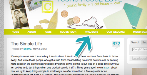
In case you’ve never visited, it’s where we attempted to sort all of our project posts into categories.
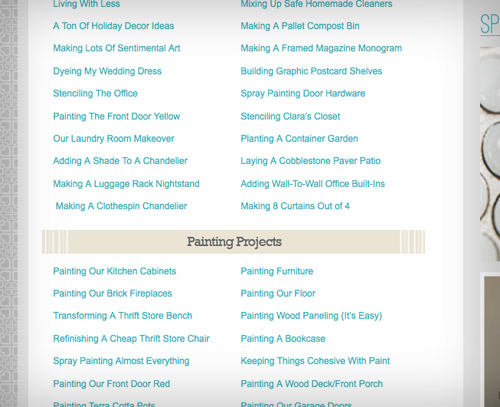
Our simple system of a linked description for each one worked well when there were only a few dozen posts to link to. But as time went on and our project tally grew, it kinda turned into this sea of text that made even our eyes cross a little bit. We last counted over 750 links on that page (admittedly with duplicates, since some projects fell into multiple categories). And we hadn’t even updated it since December, so our best guess was that we could hit 1,000 once we added five more month’s worth of links. Yikes.
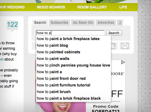
So the last couple of week’s we’ve been working on an overhaul. The goals? 1. Pare down. 2. Make it easier to browse. And we say “browse” very specifically, since it’s probably best to think of this section like you might casually peruse a bookstore looking for a good read: head to your favorite section and see what title strikes your fancy. If you’re looking for a specific item, it’s probably best to hit up our information desk search bar, although it can’t hurt to breeze through the project page now that we’ve given it a nice swift kick in the pants a much-needed upgrade.
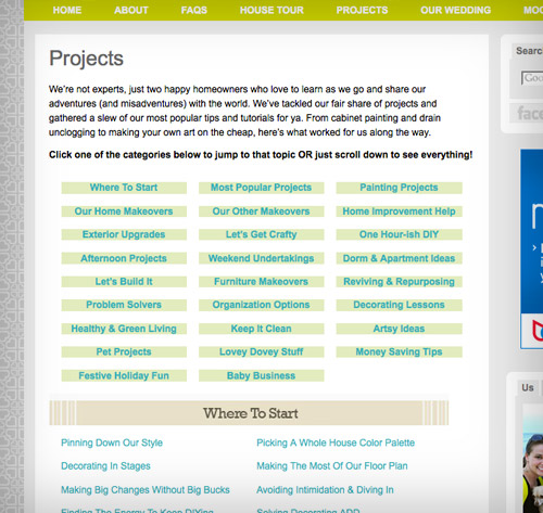
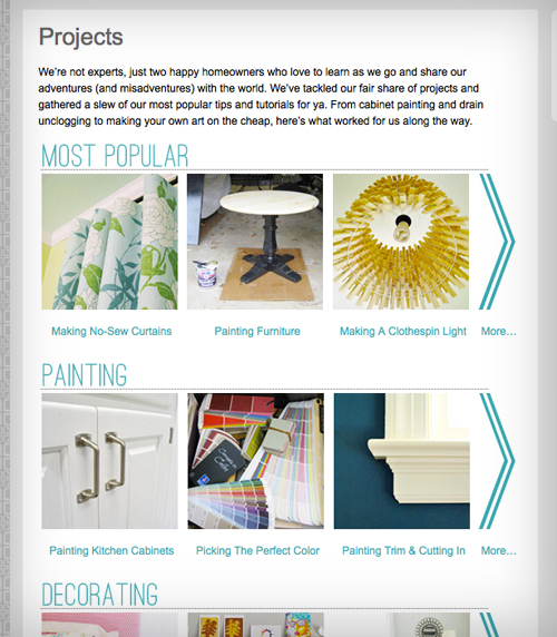
Paring down was the easier part. We condensed 26 categories into 16, eliminating a lot of duplicate listings without eliminating any projects. But as far as browse-ability? Let’s borrow from the bookstore metaphor again and just say that we gave all of our projects a cover:
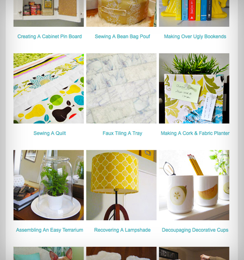
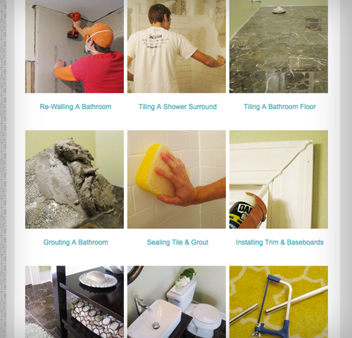
We had been planning to add photo thumbnails for a while, along with giving each category its own page (we’ve always loved project galleries with nice glossy pics like Kate’s and Stephanie’s and Layla’s) but we really had to work up the energy. Let’s just say there were some pretty decent man hours (and woman hours) spent relinking everything and creating and coding all 600+ thumbnails (we tried a few plug-ins but due to our template and our categories we learned that we had to hard code them all by hand). Whew. But now that it’s done, and our eyes don’t see code floating in front of them when we close them anymore, it was totally worth it.
Adding an image to each project makes scrolling through each category much easier on the eyes, while also hopefully helping you zero in on the type of project that you might want to tackle faster. Plus, aren’t pictures just prettier anyways?
So now there’s one main projects page with a few thumbnails of each category to give you a feel, and then you can click “more” to see an entire page devoted to each of the 16 categories, which are:
- Most Popular
- Painting
- Decorating
- Furniture Upgrades
- Crafting & Art
- Home Improvement
- Outside
- Cleaning, Organizing & Edo
- Lovey-Dovey
- Money Saving
- Kids & Pets
- Holiday
- Videos
- Projects By Month
We plan to update them every few weeks with the latest projects we’ve tackled so it should always be reasonably current (we haven’t added any of the O-R-G posts that we’ve done this week, but will add them and more in the next few weeks). The order of each of those category pages is admittedly a bit willy-nilly. We tried to put some of our favorites/most popular towards the top while keeping some logical groupings throughout the rest of it (like lumping all of our kitchen and bathroom remodeling projects together). Of course we didn’t want all of our oldest ones on the bottom (wop woppp), so we just sort of shuffled things around and embraced the random-ocity of it. So in the end it’s mostly a mixed bag. Like a book store. Just pull one off the shelf, check out the cover, and see if you want to flip it open…
Hope you guys like the little revamp. With this now complete I can turn my attention to another big organization project on my to-do list (ackthebasement). But more on that tomorrow! In the meantime, what paper/tech org have you guys taken on lately? Any tips for the group? Or are you gearing up to knock something out tonight?
Psst- If you’re shaking your fist at your screen wishing this was a more traditional organizing and paring down post, just hit up our newly organized Cleaning & Organizing page (how’s that for being meta?) where you’ll find 50 posts on the subject.

Megan F says
Can’t tell you how many times I’ve visited that project page in search of something specific only to be distracted by the many other ideas listed there and/or have had difficulty finding what I was looking for due to the extensive list. Thanks so much for taking time to make it more accessible- looks great!
YoungHouseLove says
Aw thanks Megan! So glad this helps!
xo,
s
Katherine says
How did you decide your “Most Popular” projects list? Are you able to see how many hits each project page gets, thus nominating that for the Most Popular category? Or is it based on # of comments?
Just curious!
YoungHouseLove says
It was just a guess on what posts seem to be the biggest hits. You know, the ones that continue to get comments months (or years) after we publish them, or the ones that stick out as being met with exceptional responses (a ton of comments, pinned on Pinterest, etc). It was really pretty arbitrary though- haha. We just took a guess.
xo,
s
Jessica says
That looks really good! I am Almost done with a huge paper organization which is my photos. I have them all on iPhoto but rarely remember to load them to snapfish or anything so I worry about losing them. So, I have had them all printed and am labeling every single one with date/event/names so that I can put them in albums and also so hopefully they can get passed down for decades and future generations will always know who is who. Also, I have twins and I myself will one day need a name reminder on their old pictures because they are very much identical.
YoungHouseLove says
That’s such an awesome project!
xo,
s
Pam the Goatherd says
Your cleaning frenzy inspired me to clean up the pile of papers sitting next to my computer. That’s where I keep all the info I’ve collected about nifty web-sites that I’ve torn out of the newspaper or magazines. I’m supposed to check out the web-site, either bookmark it or not depending on if I really like it or not, and then toss the piece of paper. But I don’t always have the time to check out a new web-site right away, so the pile can grow quite large. Yesterday I winnowed the current pile down to just a few select pieces of paper. Thanks for giving me a reason to “get on that”!
Rachel says
Just an FYI — your “Frosting a Door” project under home improvement links to the wrong post (it links to one where you answer some reader questions).
YoungHouseLove says
Thanks Rachel!
xo,
s
Kellerina says
Great job, guys – this makes it a lot easier to understand what the project is all about. It’s like your own little pinterest board!
Shreya says
Is it wrong that I’m a little bit in love with your new Projects page?! It looks uh-mazing!
YoungHouseLove says
Aw thanks Shreya!
xo,
s
bev olfert says
great job you guys! the new organization looks great
Sarah L says
As a “book-judger-by-the-cover” kinda girl (I know, shame, shame)I am loving the new picture-style project pages! I can’t imagine what kind of work this took but it looks awesome y’all! (And I’m sure it feels good to cross this off your To-Do lists!) Love the new layout design and love keeping up with the Petersik’s! :)
Colleen in MA says
Holy smokes – the project page looks fantastic! Nice job! Makes me wanna dig around in there and try some more.
As a print book designer turned ebook designer I appreciate all of that work you put into it. An ebook is basically a little version of a website and I can’t imagine all the work that goes into a real, humming website like yours.
BTW – that’s a question I ask myself every day it seems, as various titles cross my desk – is that something on which I can do a bulk fix with regex or is this a one by one deal??
All that to say, my sympathies for your tired eyes and I hope you got to step away from the computer for a bit and rest those puppies up!
Heather says
It looks great and is very “pin” friendly…Pinterest, here I come :)
Blair says
Thank you! The pictures / covers will making searching for things so much easier!! Love it!
Chris says
Nice timing!
I went to “Projects” yesterday for hints/inspiration on painting exterior french doors. I want to use spray paint and thought I go to the Royal couple of spray painting to find out what you thought. I tried clicking on painting your door yellow, but it took me to some other project.
I’m thinking taping off all the little squares of glass and taking the door to the yard to spray prime/spray paint would go much, much faster than priming/painting with a brush.
What do you think? And I want it to be black instead of the two hideous shades of pink it currently is…any suggestions on the color of black since there appears to be hundreds.
Lastly, I’ll never find this response, but I don’t want to have the next 4000 replies coming to my email. Is there a way for you to reply on here and to my email without me having to deal with all the other comments on your cyber organization?
Thanks!
YoungHouseLove says
Oh yes, we fixed the link to painting your door yellow! Hope it helps! As for taping off the little squares of glass and spray priming and painting, it can work- just do light and even coats to avoid drips (I usually recomment a small foam roller over spray paint for beginners since it usually looks much smoother/more pro until you get a handle oh how to apply spray paint more evenly. As for a good black color, Benjamin Moore’s Black Satin is awesome! As for the comment thing, it works for some folks (they only get our reply) while others get a million comments, so sorry it doesn’t work for you! Just leave this page open and refresh to see if a comment comes under yours or search your name or a word you used (like hideous or pink, since they might not come up as much as a work like paint or projects). Hope it helps!
xo,
s
Athena says
Great idea! I’ve been browsing the projects the past few days as well. Only, I do not see those arrows that state “More” on my web page, the advertising bar is very thick and covers that. Is it only me? Our company has just upgraded to IE8.
Love your site! (Husband hates it, though, because I give him too many projects!)
Athena says
Hates it in a good way though, he doesn’t like the work, but agrees the things make the house better. =)
YoungHouseLove says
Hmm, that’s so odd, sounds like an IE issue. Maybe try viewing it in Firefox or Safari to see if it works better that way? Wish we knew what that was happening in the newer version of IE (sometimes IE6 is really wonky so no sites load as well with that browser, but 8 shouldn’t do that). Only other idea might be to clear data/cache/cookies to see if that helps!
xo,
s
Caslani says
Love love love the new project page! It looks great, thank you for making it easier on us to find the post we want.
Karen F says
Does John now have the blogging equivalent of Sherry’s “claw hands” (from stenciling the office) after all this coding?
YoungHouseLove says
Haha, we both have crazy eyes (from staring so long at our screen we’d lose focus) but his hands look pretty good. He’s a strong, strapping lad! Haha.
xo,
s
Brandy says
You guys are great! I love that you took hours of your precious time to do this for all of us! I know it’s your “job” but it’s also very appreciated and I have probably done a dozen or so projects inspired by your blog! Thanks so much and keep it coming :)
Maggie Rose says
Ah, you may have convinced me to finally tackle editing all my tags on my blog! I’m at 850 posts I think but the first 600 I used a different tagging system and now have to go through and retag them all. It’s such a mess right now! But your new page looks great! Wish I could figure out the coding as easily as John – I manage to fumble through ok but he’s inspiring me to give it another go :)
YoungHouseLove says
You can totally do it Maggie Rose! Good luck with everything! Believe it or not, John has his fair share of frustrations and often wants to “gently throw” his computer, but in the end he usually can crack the code and figure things out!
xo,
s
Erin says
The pictures aren’t coming through for me – are you doing something different on your end, or is it a change in the security settings on mine?
YoungHouseLove says
What we hear whenever this happens randomly to one person is that it’s usually something with their office spyware or virus software or some update that they install and usually within 48 hours all the pics come back. We haven’t changed anything on our end with how we host pics for the last few years- so sorry for the trouble!
xo,
s
Centsational Girl says
Rock on J&S, it all looks amazing, your images gallery looks fan to the tastic my friends! Thanks for the linky love, pink puffy hearts comin’ atcha!
xo
Kate
YoungHouseLove says
Haha, but of course! Yours is such an inspiration!
xo,
s
Kim says
LOVE it! I just found Kate’s blog and LOVED that aspect of it.
Joy says
Hi guys – I read your posts daily, love your blog and have to congratulate you on your Projects organization. Just spend 1/2 hour checking out projects.
Dena Robbins says
Sorry, but is it just me that is having the problem of the sidebar covering the projects on the right hand side? It looks so good I cant wait to see them all! (Not that I haven’t looked at every post on there at least once!)
YoungHouseLove says
So sorry! It’s probably a browser issue (we try to design the site so that every version of every browser sees it the same way but some are glitchy- namely Internet Explorer 6 and 8). If there’s any way to update to a newer version or try using Firefox or Safari it’ll hopefully help. You can also click the title of each category on the main page and it should take you to the full pages, although they’ll still look a bit cut off on the side. Wish it was something we could fix on our end!
xo,
s
Sara says
LOVE all your projects! I’ve used a number of them for my own household projects
Emily says
You put a lot of work into this, and we thank you! It looks great! This will be really helpful!
Paula says
It’s much easier to navigate your Projects page. Thanks!
One question, though, are you guys manually populating the projects page because you don’t want every entry in a category to show up? Because if you are already tagging and categorizing your posts, you can update the page dynamically.
YoungHouseLove says
Yes, the issue is that with our template and our categories (which we have used for over 2000 posts and would have to go back and change manually if we wanted to) don’t align with the new categories on the project page. Meaning we might put something into “our current house” as a category for the post but more specifically on the project page it would be a furniture upgrade.
xo,
s
Mandy says
Ahhh. Now I will spend even more time here. I clicked on the page once before and literally asked myself “where are the pictures?”. Such a great time investment. As a big fan of your blog THANK YOU!
Lori says
I LOVE what you did with your project page! I actually did something similar recently, but my blog is just a newborn so it didn’t take me nearly as long as it must have taken you. Thanks for making things so pleasing for your readers!
http://familylovehome.blogspot.com/p/projects.html
YoungHouseLove says
That looks great Lori! Love it!
xo,
s
sylvia says
The reorg/cleanup looks AMAZING. I love the photo thumbnails; I find it easier to remember the look of something over how you might have described it. And as someone who is in the middle of a huge overhaul/fix up of a blog, I can sincerely sympathize with how long this would have taken. Well done.
Elizabeth says
I love the new search function!!
Melanie@MailboxJourney says
Ditto! Is that a plugin option or some serious coding stuff?
YoungHouseLove says
We just use Google Search (embedded into our site) so it’s all them!
xo,
s
Wendy says
Beautiful. Absolutely simple, sleek, and stunning!
Thank you for your hard work…always!
Thank you for your thoughtfulness…forever!
Thank you for your dedication to your job and your readers…eternally!
All except when you are not, of course! :-)
PS It was a nice “reminder” of why I put visuals/pictures on my final exam and quizzes! Most of us ARE visual peeps!
Tracey says
OoOooOoo…. Me likey! I didn’t find you guys till your last year in the old house, so I missed out on all the “old house” projects. And while my hubby knows how to tile, paint and repair, I don’t, so I’m looking forward to your tutorials from days of yore. (We have a shower that needs tiled! Booyah!) I love that you guys did graphic thumbnails! I’m a very visual person and just from reading this post, found about a million new posts I want to read! Faux tiling a tray? Decoupaging cups? Yes, please!!!
Lesley says
I love the organization. it is sort of pinterestlike. ooohh there is an idea. Instead of coding you could set up pinterest boards by room/project etc.
YoungHouseLove says
Ooh that would be fun! Although we like to host everything on our site just to have more control over when it’s up or down (ex: sometimes Pinterest is down and you can’t get to things over there).
xo,
s
LB says
Wowsa: Looks great! Your clean up/clean out week, partnered with The Happiness Project which, afer reading twice [trust me, it’s even better the second time ’round] has been a swift kick in the you-know-where), is getting me super psyched to halve my closet, organize my drawers, and re-work my electronic life! The Projects section is now super slick, and your organizing inspiring. :-D
YoungHouseLove says
Love that you read it twice! I loaned mine to a friend but will definitely reread it sometime!
xo,
s
Paola says
Good Job John!
I usually go straight to “search” when I am looking for inspiration but wow it makes a difference going there and seeing all those vivid pics. Love to find new projects I did not know you guys have tackled already!!!
Thanks
Momlady says
Hey guys love the re-do on the site! Small glitch notice: Removing a Weird Towel Bar links you to Replacing a Kitchen Faucet.
YoungHouseLove says
Thanks for the heads up! We’ll get on that!
xo,
s
Ellen says
Very nice! I’ve rarely visited the projects page but since I’ve declared 2012 my “year of the house” I’ll be there more often, I’m sure. Love the thumbnails and appreciate all your efforts in making your blog so user-friendly.
Laurie says
Wow It is very well done. Thank you. I will surf the project page even more!
Lindsey E. says
Looks good!
Question: How do you organize your photos on your computer? I know you have to have a lot so I’m wondering how you keep them all straight! :) I’d love the tips!
YoungHouseLove says
We store all of our blog photos on a cloud (amazon.cloud) and all of our personal photos are in iPhoto (where they’re ordered chronologically so it’s easy to upload them to make a family yearbook on mypublisher.com, which we do each year). We also have project photos in iPhoto (from before we upload them to cloud) but they’re ordered by category, so the “tiling the backsplash” folder won’t have a Clara pic in it, that will be in “Family 2012.” We also back the family ones up on an external hard drive and upload them to an off-site place like Flickr to keep them safe (since the blog ones are safe on the cloud). Hope it helps!
xo,
s
Christine@The Wily Hound says
Looks great! Your Project page was pretty organized to begin with but the pictures are a nice addition :) I’m working on retreiving and orgaizing all of my pictures since I accidentally deleted them awhile back. Sometimes I’m my own worst enemy. Haha
Nikki G says
WOW. When you guys do something you do it right! When I first started reading your blog about 2 years ago, I briefly tried to peruse the projects page but also found myself going cross-eyed after a bit. Eventually I just gave in and read all of your posts from the beginning (it was kind of a sad day when I caught back up to real-time about 6 weeks later, hahaha) :)
This upgrade is UNBELIEVABLY amazing! I was actually just looking for the balloon garland tutorial and couldn’t find it – but now that I searched your updated projects page it was super easy to find. PLUS, I’m super excited you included your Baby Center posts! Maybe that’s why I couldn’t find it a few weeks ago…
Anywho, a giant comment to just say: This upgrade is UHmazing. You guys rock.
YoungHouseLove says
Aw thanks so much Nikki! Yeah, we tried to link to all posts we have done that we thought would help, so linking over to some old BabyCenter posts was nice so now people can hopefully find that info more easily!
xo,
s
StephanieO says
That is hilarious, literally THIS MORNING I went to the projects page for the first time to find “Painting Furniture” and I was so pleased that it was so easy to find!! I’m refinishing a 20s vintage sideboard that I’ve had forever. I’ll post pics on my (rarely updated) blog and share when I’m done!
YoungHouseLove says
Haha, too funny! So glad we got ‘er done!
xo,
s
Dana says
As someone who does usability for a living, I totally appreciated this post and all the work you put into re-organizing the Projects page just to make it easier for us – your users! So glad to see you taking that into account. Just makes me like you guys that much more!! Great work. :)
YoungHouseLove says
Aw thanks Dana! We like you right back.
xo,
s
Andrea says
Love the updated projects page. It’s so much easier to search, and the pictures are a really great way to draw in people to things they otherwise wouldn’t have looked at!
Karo says
I love your blog. When I found it a year or so ago, I read virtually all of your projects page, and I’ve read your site daily since. I’ve wondered for a while how you determine the “most popular” posts. Are they the ones that receive the most comments initially, or the ones that get the most traffic later?
YoungHouseLove says
They’re just total guestimates. Haha. We just pulled a few of them from each category that we thought were favorites (due to initial comments or the fact that folks still comment on them months or years after they were published). It was pretty random!
xo,
s
Lauren says
The new and improved projects page looks so professional between the stellar photography and the website design. You all should be so proud at what you’ve accomplished by yourselves!!
YoungHouseLove says
Aw thanks Lauren! You’re so sweet.
xo,
s
Christina says
Love the project tab! Very well done :)
Missy G. says
Love, love, loving this! Y’all are so sweet to your readers. I know this change must have taken a lot of work! Thank you!
(FYI, not sure where else to post this, but there is a link mix-up in the Most Popular projects. The “Raising a Shower Curtain” links to “How to Paint Trim Like a Pro.”)
YoungHouseLove says
Thanks so much for the tip Missy!
xo,
s
Crystal @ 29 Rue House says
You guys are really making it hard to get any work done with your new project page! It’s too easy to find something to read about. If I can’t get it under control, I’m going to have to quit you during the work day! haha ;)
YoungHouseLove says
Haha, I say you take the rest of the day off! Just kidding, don’t get in trouble!
xo,
s
Crystal @ 29 Rue House says
See what I mean?!?! I’m back on here to see if you responded to my comment!
YoungHouseLove says
Haha, too funny!
xo,
s
Becky says
Thank you SO much! I was just looking yesterday for how to make the pouf (that you did for Clara’s closet)and I could not find it no way, no how until I scrolled through the posts. I should’ve just waited a day. LOL