Oh happy day! Abbey sent us her lovely mood board after pictures and we couldn’t wait to share them. Her space is a great reminder that you don’t have to paint the walls a dramatically different color or spend big bucks replacing everything to get a majorly upgraded look. Sometimes just a few new pieces, a slightly more saturated wall tone, and some simple accessory switcheroos can make all the difference. Here’s her letter:
I’m finally submitting my after pics of the family room makeover you helped me with this summer. I want to thank you sooo much for your design ideas. By adding in the chocolate furnishings and the rug it really helped provide contrast to the room and define the space. The new glass end tables paired with the round coffee table really give it that classic and contemporary look I was going for. And the new floor length curtains, matching table lamps, and geometric pillows definitely pull things together. Everyone who comes over loves the decor. And you may notice that I went with three prints from Crate & Barrel’s Classical Symmetry Set (when you posted them on another mood board I knew I had to have them!). You’ll also notice that we added crown molding along the ceiling and updated the baseboards which really helps enhance the look of the room. Thank you again for helping to make our family room a more comfortable place to hang out. You will definitely hear from me again! The dining room needs help too. And congratulations on the baby! -Abbey
Just to refresh your memory, here’s Abbey’s family room before:
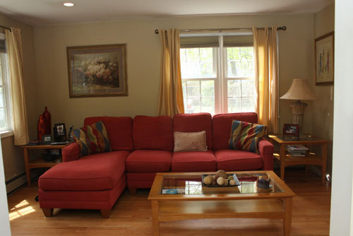
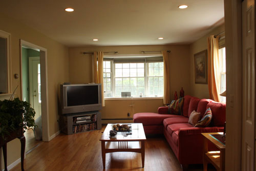
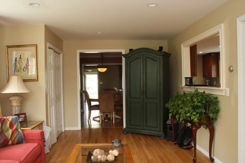
And here’s the custom mood board we whipped up to help bring in some classic-meets-modern polish (check out more details on Abbey’s mood board right here):

And now for the lovely after photos. Of course some big items like the red sectional and the armoire didn’t change. And the wall color just went a bit deeper and wheatier (we suggested Benjamin Moore’s Westminster Gold 200 for the luxe and “crisp” finish we knew it would add). But we think the smaller furnishing and accessory updates (like the rug, coffee table, media cabinet, side tables, lamps, pillows, curtains, and desk that we dug up) really chic-ed up the room. Plus there’s added function too now that Abbey has gained a workstation along with some serious style.
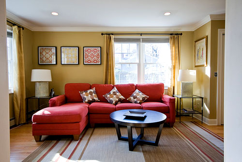
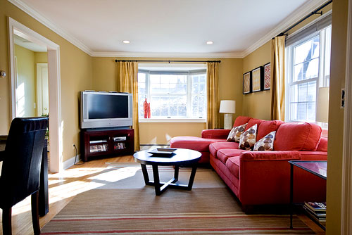
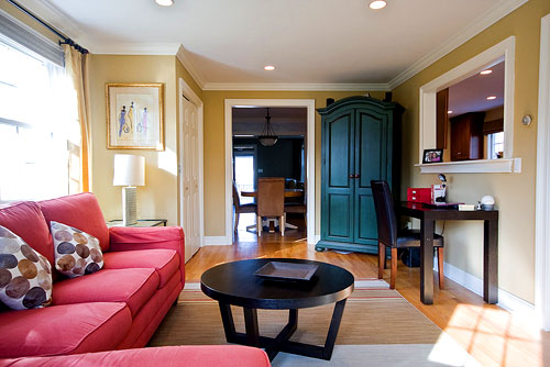
Hooray for mood board after pics! Didn’t Abbey do a fantastic job? It’s amazing how the red sectional truly shines in the after photos. It suddenly looks like it was meant to be and really pops thanks to the richer wall color and the red stripes in the rug (instead of just blending in with the lighter walls and the rugless floor in the before shots). And the crown molding really is the icing on the cake. Thanks so much for the pics Abbey! We just love when people send us after photos… and we especially love to hear that a room is more comfortable and inviting for those living there. That’s what it’s all about!
But enough chit-chat. Let’s play the what’s-your-favorite-part game. We’re torn between the wheaty walls, that striped rug and those sculptural lamps on either side of the sofa. Decisions, decisions! And that art is delicious too…
Update: We sadly can no longer find the time to take on client commissioned mood boards (we now whip up general inspiration boards instead) but if we ever reinstate them we’ll make a big announcement!

Lauren says
I noticed that in the after pictures the curtains are now floor length. Are there baseboard heaters underneath the windows? I always thought that you weren’t supposed to have curtains hanging over the heaters as it can be a fire hazard.
YoungHouseLove says
Hey Lauren,
You’re right about that! Floor length curtains can definitely be a sticky situation when you’re dealing with baseboard heating. Researching lined fabrics that are heat-safe and keeping them from resting directly on the heaters (by using rods that are mounted a few inches away from the wall to keep fabric from pooling directly on the heaters) are a few ways to keep things cooler. But ultimately we recommend taking as many precautions as possible (safety first!) and going with what works for you in your home. Some newer baseboard heating systems are fabric safe (meaning they somehow disperse heat in a way that’s less of a fire hazard even when drapes are nearby) so perhaps that explains Abbey’s set up. Hope it helps!
xo,
s
Brittany says
I love the idea of using fresh fruit as ornaments. I live in Florida, so the whole citrus theme would work great for us :) Even though its mid december, it was a warm day of 83 today!!
Dan says
I’m glad it works for you. I’m just not a fan of the sectional color. But, it’s not about me, it’s about you! Congrats on your after pics!
micah says
It looks awesome!! I love the rug, the C&B art and the wall color. Perfection!
Amanda says
That new crown molding and the wall color are fantastic! I really love the three new pieces of framed art on the left as well. What a great job!
Renee Smith says
The art change on the wall above the couch is AWESOME! It really draws you in; even insofar as it mimics the lines of the throw pillows… nice. I dig it!
Dana says
Great transformation! The paint definitely gave you the most bang for your buck… the color really ‘fits’ now. My faves are the table lamps.
Lindsay says
The crown molding is really the icing on the cake! Great room!
Paula Grace says
Oooo, much lighter and brighter. Makes the room appear much larger. Great job!
Viv says
My favourite part is the yummy sofa colour. I know it was there before, but the art and the throw cushions fixed it. The whole room looks so much better.
Ann says
There are lots of nice changes but what “popped” for me was the color of the sofa in the new art above the sofa.
And a request: is it possible to post the pictures with the before and afters right after one another? It makes it much easier to look at the changes. Thanks!
YoungHouseLove says
Hey Ann,
Good question! We have experimented a lot with how we present before and afters (after all they’re one of our favorite things!) and we’ve found that the above format works best for us. Although it makes sense that you would compare the same angle from before and after right in a row, we find that people get confused about which one is the after and which one is the before when you alternate like that (ex: before, after, before, after, before, after is more confusing than before, before, before, after, after, after) and we’re left fielding a lot of questions about which is which and a lot of requests to group the befores and then present the afters… so that’s what we’ve done for the past year or so! Plus in many instances we don’t get before and afters from exactly the same angle so it makes it even less clear to compare them that way. Hope that explains why we do what we do!
xo,
s
Rebekah says
The room looks a million times better. I’m just wondering though, why isn’t the TV stand centered on the tiny wall to the left of it? It look kind of awkward angled like that.
YoungHouseLove says
Hey Rebekah,
It’s an angled TV stand that’s meant to fit into corners. You can check it by following the link to the original mood board in the post above. Hope it helps!
xo,
s
Laure says
The room looks great!!! Where is the artwork from? Was it DIY or are they prints that were purchased and framed???
YoungHouseLove says
Hey Laure,
If you check out Abbey’s letter above you’ll see a link to the art from another mood board that we whipped up (it’s from Crate & Barrel). Hope it helps!
xo,
s
kat says
Love the new colour! What’s the colour in the adjoining hallway? I love the combo!
YoungHouseLove says
Hey Kat,
Good question! Hopefully Abby can swing back through and answer it for ya.
xo,
s
Marine Corps Bride says
I love the new baseboards! They much such a huge difference and the look they provide is more classic, high-end and finished. I hate my builder baseboards and can’t wait to update too!
Rose says
A few changes in accessories made a BIG difference. i love the new look!
Bridget B. says
wow! this looks great!
Kristin @ Domestic Ease says
I absolutely LOVE it!! I think the crown moulding and baseboards make a huge impact and give the room a finished look. Great job!!
amyks says
Amazing…the rug just grounds the space and the art C & B art work just makes the sofa sing! What a great makeover. Love it!
raf says
Great job on the room! Like everyone else, I really like the look of crown mouldings, which we currently don’t have. But but our house only has 8 1/2 feet ceilings. Won’t crown mouldings “shorten” the walls and make the ceiling look like it’s lower?
Regarding base mouldings, we have 6-inch base mouldings which are currently painted the same color as the wall. This helps conceal our large, old baseboard radiators, which are about 12-inch tall and also painted the same color as the wall. Should we paint the base mouldings white? If so, should we also paint the radiators white?
YoungHouseLove says
Hey Raf,
Good question! It’s total personal preference, so to crown or not to crown is all about which look you like. We guess it could be argued that crown molding slightly “shortens” the wall but we only have 8ft ceilings and added crown molding which actually seems to draw the eye up and raise the ceiling so to speak. We love the look! It creates a crisp clean architectural frame around a room that formerly just had wall paint meeting ceiling paint in an uneventful way. But it’s really your call! Just look at Abbey’s photos and see if you think the after images make the room appear shorter to you and go from there. As for your base moldings and radiators, that’s also personal preference, but we think going crisp white with both of them would work and leaving them the same color as the walls would also work. It’s all about what look you like, so sussing out if you gravitate towards crisp clean lines that make the wall color pop, or more of a monochromatic layered look with less of an emphasis on the architecture is the name of the game. Hope it helps!
xo,
s
Lori B. says
I love the round coffee table! Just what my husband and I have been looking for. How can we find out where Abbey bought it?
I’m not sure how I stumbled upon your blog, but I LOVE it! Thanks for keeping us creatively inspired.
Lori B.
YoungHouseLove says
Hey Lori B,
That’s actually a coffee table from West Elm that we’ve recommended in a few other mood boards, so luckily we can answer that question for ya. Here’s the link for ya. Hope it helps!
xo,
s
heather s. says
Great job! The rug and wall art really tie the couch into the room so it doesn’t stick out. Love the crown molding as well.
Shelley @ Green Eggs & Hamlet says
Abbey, 500 points for you for posting after pics! My favorite parts are the new wall color and the crown molding. The room looks gorgeous and inviting, great work.
Dennis Bullock says
The after is fantastic guys!
Natalie says
The wall color is beautiful! I really like the art…do we know where it is from?
YoungHouseLove says
Hey Natalie,
If you read Abbey’s letter in the beginning of the post, there’s a link to where she found the art in one of our other mood boards (it’s from Crate & Barrel). Hope it helps!
xo,
s
pixen says
looks fresher and better but a few hints:
those crate and barrel prints are hung too high! a dead giveaway of house by decorating newbies. lower them by about 6″ and it will look better.
move the rug so the sofa is all the way on it. it looks weird to have one part off the rug and all that extra rug on the other side.
Ben Moore says
We love the color on the walls…but then again we are kind of partial to paint. :) Great job on this beautiful room. Congratulations!
Erica says
WOW!!!!!! I love the color on the walls, that really made the couch and all the other furniture pop, so pretty! And the rug really brings everything together so nicely. Fabulous job on this Abbey, John and Sherry! The room looks like its out of a magazine!
Question – Did Abbey go with the color you recommended (Benjamin Moore’s Westminster Gold 200)? Or did she opt for something else? I LOVE the color!
YoungHouseLove says
Hey Erica,
Yup that’s BM’s Westminster Gold on the walls. Doesn’t it look great? Hope it helps!
xo,
s
Peggy says
How about painting the ceiling the Westminster Gold? It would make the NEW crown moulding POP and warm the room even more!
Rebecca says
Hi Sherry,
I was wondering if you’d be able to help me out with some more info on your console table and media stand. I see that they’re from Target but I’ve searched Target’s website and can’t seem to find the match. (They’re both dark brown, yes?) Would you happen to know what name/style they are? Thank you so much, I appreciate your help!
YoungHouseLove says
Hey Rebecca,
It’s very possible that the exact same style is no longer available for either one, but you might want to try searching “Hudson” and “Manhattan” because I seem to remember those names (although I might be off, just a guess). Anything with clean lines and dark brown coloring will probably come closest to matching the look of ours (yup, ours are both dark brown and have rectangular lines as opposed to curvy legs and flourishes). Hope it helps!
xo,
s
Bromeliad says
Wow. It really pops now.
Sarah says
any idea where abbey’s red couch is from? I love it!
YoungHouseLove says
Hey Sarah,
We have no idea, but here’s hoping Abbey drops in and answers that question for you!
xo,
s
Nikki says
Great job of making that off-center window look balanced! I love the room.
KOS! (Keep On S'myelin!) says
Love the room!
Does anyone happen to know where the black metal/glass end tables came from?
YoungHouseLove says
Hey KOS!
Abbey mentioned that those were snagged on clearance from Crate & Barrel. Hope it helps!
xo,
s
jill says
Love the room! Any idea where she found the framed geometric prints? Love the pops of red and yellow.
YoungHouseLove says
They’re from Crate & Barrel. You can actually click a link in her letter where she references them for more info about them. Hope it helps!
xo,
s
Beth says
Hey Youngsters!
Just looking over this makeover and it looks fabulous! I also have a red couch and am currently shopping for a paint color for my living room. Do you know if Abby ended up using Westminister Gold or if she went with something else? Just wondering…this blog is awesome as always – thanks for all your hard work!
YoungHouseLove says
Yup, that’s good ol’ Westminster Gold. Hope it helps!
xo,
s
katie says
I love the rug! Is there anyway to find out where it was from? Thanks!
YoungHouseLove says
Just follow the link under the mood board in this post for that info. Hope it helps!
xo,
s
Charmie says
Oh my Goodness. I just came across this and that paint is perfect – I’m so bummed though, ’cause I live in the UK and have browsed website after website, but nothing comes close to that colour. Arrghh!!! *cries* Love how the red couch and pictures bring the room together!