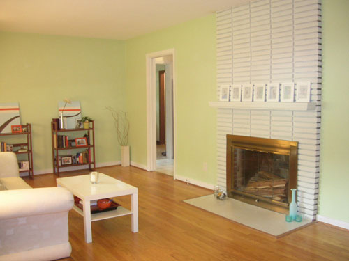
It’s amazing how dragging a table and chairs into one side of our underutilized living room and adding a light fixture centered above it was all it took to create an instant dining area that everyone thinks has always been there. Here’s our sad little living room right after we moved in (we had no idea what to do with such a long narrow space- and no money to upgrade our hand-me-down furniture):
Here’s the same space now with a fully functional dining area right off of the kitchen (we widened the doorway for even more flow and openness during our kitchen remodel):
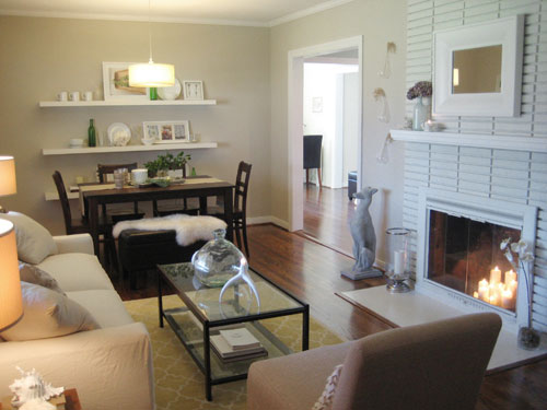
Getting the pendant lamp (which we picked up from CB2 for $49) wired to hang above the table by a professional electrician only cost a hundred dollars, which is a small price to pay for a brand new eating space that works perfectly for “open living” lovers like us. And since we conveniently placed our dining area right off of our kitchen, it’s easy to serve and set the table thanks to the close proximity. Our modest dining space has been such a hit that it was even featured in Do It Yourself magazine and the Australian edition of Better Homes & Gardens. And it’s literally just a table at the end of a long living room!
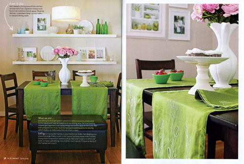
Of course the three inexpensive floating shelves from Ikea add architecture and personality (especially since we use them to display dishes and bottles which seem appropriate and fun in a dining area). And because many people ask us for details about the shelf-hanging process, here’s how it all went down. First we grabbed metal anchors to fit the screws that came with the Ikea shelves from Lowe’s (making sure they were made to support a good amount of weight) and then just centered each shelf on the wall with 17″ between each one. Installing the anchors is a snap, you just predrill holes into the wall (slightly smaller than the anchors) and tap the anchors into the holes with a hammer until they’re flush with the wall. That’s all it takes for the screw to grab the anchor and stay put for good. Almost three years later ours are still going strong with lots of weight on them.
Oh and the spacing between each shelf is important if you have specific items in mind that you’d like to display, for example if you want to show off a grouping of frames or a collection of vases be sure to space the shelves with adequate room between them for the items that you want to stick on each one (nothing would stink more than trying to lean your photos on each shelf and finding out that they don’t quite fit).
We also had a bit of fun with our table and decided to switch out two of the wooden chairs for a padded leather storage bench instead. It really broke up all the wood, gave us another concealed spot to stash stuff, and John and I actually sit and eat dinner on it together every night. It’s cushy and sort of romantic to share a “booth” in your own home. Plus one of the best things about it is that it can be used while we’re entertaining in the living room as well, since people can sit on it facing the couch just as easily as they can face the table.
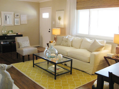
So that’s how three cheap-o floating shelves from Ikea, a bench, a table, and a pendant light came together in an under utilized corner of our living room to create a cozy and convenient eating space right off of the kitchen.
Oh and we also got a third bedroom and a wall of extra cabinetry in the kitchen out of the deal. We converted our old unused dining room (which already had a closet)…
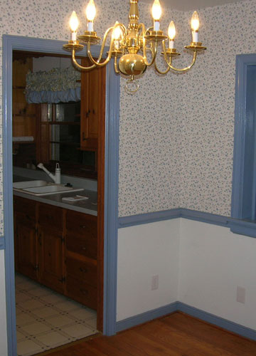
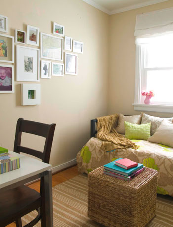
…into a third bedroom:
And in closing off the doorway that led to the old dining room from the kitchen (see it here on the right)…
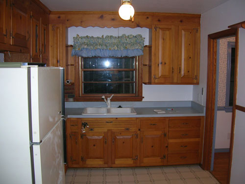
… we earned a lot more counter and cabinet space in one fell swoop:
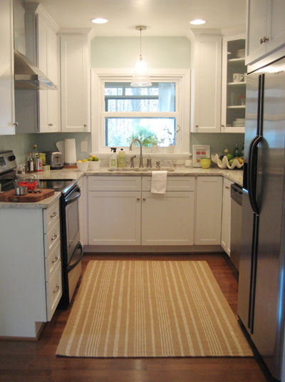
Gotta love a little shift in the way you use your home that leads to so many other perks along the way! So what about you guys. Have you converted a bedroom into a library or sewing room to suit your needs? Have you created a master suite in an old unused attic? Any plans to repurpose or reconfigure the way a room functions in your home? Tell us all about it.

Laurie says
Wow, I had no idea you converted a dining room into another bedroom…good move! Your kitchen is so much better for it :) Since there was already a closet, makes me think previous owners converted a bedroom to a dining room ;)
We added a bedroom in our home about 5 years ago. We had a loft, 8×11, 3 bedrooms and 3 kids. We needed one more bedroom, the poor middle child was begging for it. We broke into the closet in the adjoining bedroom and stole space from there for a closet for the new bedroom, added walls and a door, and BAM! instant bedroom. Its the smallest room in the house but my son loves his space. I should find the pics and blog about it….
Kim L. says
I love the look of your house! And I love how you arrange and decorate your shelves, tables, etc. I would love to do more of that, but I talk myself out of it when I think about all the cleaning and dusting of all those little decor items!! How to do keep everything clean and dust free?
YoungHouseLove says
Hey Kim,
Good question. I like to clean as I go (a little each day as opposed to a major cleaning session every once in a while) and I like using Swiffer Dusters (they’re meant to be attached to a Swiffer, but I use them with my hand to dust surfaces like the open shelves, coffee table, fireplace mantels, etc). They have this static-y cling that basically makes dust stick to them (no dusting spray necessary) and I just lift things up with one hand and swipe under them with the other and can basically dust the whole house with one or two in less than 20 minutes (I listen to my ipod as I go, so it feels more like dancing and less like cleaning). It really isn’t that terrible and it’s so nice to see the things we love on display so it’s well worth the effort! Hope it helps.
xo,
s
Amanda says
Your old dining room light is the exact same one I have in my dinning room… I hate it just a little. The brass is so ugly to me.
Anywho, we made the “parlor” for the master bedroom in to a computer/business space. I think the “parlor” may have been a nursery at one point, but it’s perfect for loads of shelves, a couple computers, and a server. The closet is handy for storing the ugly stuff while the pretty stuff is on the shelves.
Next up is turning an upstairs hallcloset into a laundry room. I hate trucking my dirty duds down two flights of stairs to the basement
YoungHouseLove says
Hey Amanda,
We actually spray painted that old brass chandelier white before converting the room and it was much more pleasing to look at. It’s a quick project (just remove the light and spray prime it with white Kilz in a can and follow that with a thin even coat of white spray paint- we also switched out the bulbs for more Domino-esque round clear ones). Here’s a visual of the finished product for you (which we sold in our garage sale and made a pretty penny off of). Hope it helps! Good luck with that laundry room transformation…
xo,
s
Amanda says
OOhhh that doesn’t even look like the same lamp. We were going to spray paint it already, but I didn’t know light bulbs came in that shape. I’ll have to go buy some now too. We were planning on putting something decorative around the white part of the lamp (the faux candle) but I kind of like the way it looks in all one color too. Hmmm decisions decisions.
Jenny @ Words On Wendhurst says
I love a formal dining room, but in your house it definitely made sense to do what you did. Plus, another bedroom adds so much value to a house. Great job!
Kathryn says
Would it be funny to have a dining room, and a “breakfast area” in a smallish rancher? The previous owners of our home made the third bedroom into a dining room, which we don’t use too much, but hope to in the future. Our living room is large and L shaped, with a portion not used for anything in particular. Could we put a “breakfast nook” there without it looking strange? I’ve always loved the loveseat w/ table and chairs look.
As always, love all your ideas!
YoungHouseLove says
Hey Kathryn,
I think anything that will encourage you to better use your living room is a great addition to your space… and we think you should totally go for a breakfast nook! It sounds cozy and inviting and it’s an easy way to put an unused corner to work for your family. Good luck!
xo,
s
Carla says
It’s actually really nice to see that you went through your own “design dilemmas” too! Your home is simply beautiful!
Consultant Calamities says
We took out a 4th bedroom (we only have 1 child, aren’t having any more) and made it into an office/scrapbook room.
We have a cape. When you walk into the front door, there is a living room on the left. To the right, there used to be a wall where that bedroom was. We knocked down that wall to make the open space office/scrap room. So now the front of the house is open alllllll the way across. Nice and light and airy!
We also changed the stairway from a dark, carpeted nightmare to a wooden, open and bright stairway. Looks awesome! :-)
yansy says
Your home is such an inspiration. I never get tired of looking at it.
Missy says
I absolutely love the awesome transformations you guys have done! I do have a kinda off the wall question though (no pun intended). Where do you get all your white picture frames? I have looked everywhere and can’t find any in white…
YoungHouseLove says
Ikea and Target are our go-to places for white picture frames. Most of them are actually from Ikea since they’re super cheap. We practically buy them in bulk!
xo,
s
Lauren says
Thanks for the tip on hanging the Ikea shelves. I bought only one yesterday to make sure if worked with the space. I’m going back for the other 2 soon!
Emily says
What are the measurements of the room–if you don’t mind sharing.
We have a long, narrow living room and are about to cut open a doorway on one side (where one does not exist) for a second point of entry to our kitchen. We are considering creating a small dining space on one side.
I want to know if I am working with the same size space as yours though I suspect my space is not as long. Thanks!
Jaclyn says
Sherry, Do you know the dimensions of your living/dining room? Thanks!
erin says
the living room in the home we just bought is 23×13 and the sellers had it staged as a living/dining room which i liked and we are going to do the same thing. i want to place a pendant over the dining table to anchor that space like you guys did but i’m unsure about what to do for overhead lighting in the rest of the space. it has a cathedral ceiling, and they had a ceiling fan hanging in the center of the room. i can’t decide if we want to go with a more updated ceiling fan centered over our seating arrangement, or go with track lighting. i don’t want it to be too busy- but the room doesn’t get too much natural light. any tips?
melissa @ blog.den-designstudio says
Great post. I love to see others create their home and spaces by really looking at how they use them and making changes to suite the new functions.
I designed and remodeled my parents’ kitchen for them about 7 years ago and we moved a staircase to create space on a wall for the pantry, fridge, oven, and desk that wouldn’t have worked before. By doing that we also lost a closet in the “guest room” off the kitchen and family room. Now we just refer to that room as the office, which my dad has since claimed as his. It was okay to essentially lose a bedroom and gain an office since there are still 3 more bedrooms, with large closets in the house.
http://www.flickr.com/photos/melissanocero/sets/72157602304856240/
You can see how tiny the original kitchen was in the last few photos. No longer worked for a home that had grown by 2 bedrooms, 2 baths and a family room over the years.
Barbara says
I converted my dining room into an office. We have a pretty big eat in kitchen and didn’t need another table footsteps away so we happily coverted it into an office.
Kristi W. says
I was just thinking to myself that I wished you would show more transitional pictures of your home remodeling/decorating. I love the house gallery, but it’s also really helpful to see how things have evolved. Very cool. More posts like these, please. :)
Rachael says
I love your yellow rug in the living room…. where did you find it?
YoungHouseLove says
Rachael- The rug is from Pottery Barn but is no longer available through them- maybe try ebay? You can also check out a room by room source list for everything in our house by visiting our House Tour page and clicking the tour link at the top of the page. Happy hunting…
Erin- We actually only have the pendant light in the living/dining room and rely on table lamps in the living area for ambiance and light. It’s nice not to have anything hanging down to shift the focus from the pendant lamp and compete with it in a relatively small multitasking room. Hope it helps!
Emily & Jaclyn- The living/dining room is 12′ x 22′. Loooong and skinnnny, but it really works for us now!
Liz says
My hubby and I have never wanted a formal living room, so we added french doors and built-in shelving to the formal living room in our new house and turned it into his office! (He works from home). We’re also using the fourth bedroom in our house as my “craft room.” It’s awesome! I know that it’s going to turn into a kid’s room or play room one day, so I’m enjoying it while it lasts!! :)
Jill Stigs says
Fantastic use of space. Great to see the interim pics too. Your “latest” style is so gorgeous. Where ever did you get the inspiration to go light and airy? Also it looks like a rectangle table now but a square in the old dining room……….did you get a new table or just pop in a leaf?
YoungHouseLove says
Hey Jill,
Hmm, there’s no telling where I got the light and airy urge. I always like a clean-lined white sofa so maybe it started there? Of course breezy white curtains instantly soften a room so they definitely added to the aesthetic, and we picked up white frames from the get-go, so they also keep things light and bright.
As for the dining table, the first one in the formal dining room was actually made with the same white pedestal base that now lives in the corner of the sunroom for meals alfresco (we found it at a thrift store and initially added a big square top and painted it back for the dining room but later upgraded to a new table from Target for the dining area and retooled it with a round top and painted it white for the sunroom). We’re all about recycling!
xo,
s
Candace says
I love this so much better than the formal dining room. I am thinking about converting our living room into a dining/living combo room too. Sherry, I have a question for you…where do you keep your tv?
YoungHouseLove says
Hey Candace,
Our TV is in the den, which you can see in our house tour. Hope it helps!
xo,
s
Amy says
hey Sherry, i noticed you painted your fireplace cover from brass to white, can you just paint the white paint directly over the brass or what?
Thanks
YoungHouseLove says
Hey Amy,
We actually just used white paint right over the metal fireplace doors (paint usually sticks pretty well to metal, you’ll just need two thin coats- and beware of drips!). If you’ll be using your fireplace often though (we have a gas one in the den that we use far more frequently) you’ll probably want to get heat resistant spray paint instead of using regular paint for more durability that lasts with each fire you make. Hope it helps!
xo,
s
Ann says
We recently moved into a smaller 1920’s bungalow with an itty bitty closet in the master bedroom. The retired couple who sold us the house had moved the washer and dryer from the basement to what is supposed to be the 5th bedroom, which is next to ours. We rearranged it so that it is now our walk-in closet with oodles of places to hang clothes, put shoes, etc. It’s really convenient to have the washer and dryer in there too.
Kristy says
I think a person’s home should work for the way they live. If that means nixing a dining room altogether (something my husband and I did) then so be it. Our home works for the way we live and I think that’s the key to homeownership success. We do not do a lot of entertaining because we live in a separate state from most family. When we do entertain we do so on our screend in patio and we have plenty of seating there. Living in Florida, this works so well for us.
I do think adding a bedroom and still having dining space is great for re-sell. However, I opted to have a fullscale library and forgo the inside dining area altogether because that works for the way we live.
Becky says
I love all the pictures of your home. So beautiful! Thanks for all the inspiration. =) My husband and I are currently building our first home. Do you have any pointers when working with a blank canvas?
YoungHouseLove says
Hey Becky,
Good question! I think one of the hardest things about building a house instead of living in a home and renovating it is that you have to figure out how you’ll use the home before you’re in it. John and I lived with our house as is (didn’t change the layout or anything) for almost a year until we were confident that we wanted a bedroom more than a formal dining room and that we liked the idea of an open living room with a dining room on the end.
Since you’re building new, our biggest tip would be to sit down for hours, maybe even days and talk about how you’ll really use your house. Not how you’d like to use it (you might have lofty dreams of entertaining for 50 but be realistic!), but how you’ll really use it on a day to day basis. Take into consideration things like you children or pet’s habits (will you want a mud room to keep their things organized?) and your own lifestyle (will you want a computer counter in the kitchen with a chair and room for a laptop since you often cook and surf the web at the same time?).
Asking yourself how your house can work the hardest for you and your lifestyle before you finish building or renovating can really make all the difference in the world. For example, if you do laundry five days a week, creating a spacious laundry room with a few bells and whistles can make your house into your dream home. Hope it helps! Happy building…
xoxo,
s
Kelly B says
I love this idea! We just bought our first house, and it has no place to put a table, so we are thinking of doing something like this with the living room. I actually just saw this same picture on The Nest!!!
Thanks for the inspiration!
Megan says
We have done something similar over at The Southern Nest. Our living room was too big just to make it a living room, so we added a table and built-in seat to make it an all-purpose room. Check it out: http://thesouthernnest.blogspot.com/2009/06/command-center.html
Meredith says
Sherry,
I love reading your blog! I just noticed the window in your old kitchen, my husband and I have those same windows in our house. Did you replace the windows in your house or somehow remove the smaller piece of wood at the 1/4 and 3/4 points on the window? We have painted ours but would love to give them a more updated look like yours! Thank you for any help!
YoungHouseLove says
Hey Meredith,
We actually replaced all of the windows in our house with Energy Star Low-E ones since they keep our house a lot cooler in the summer and warmer in the winter (plus they’re a write-off!). Hope it helps!
xo,
s
KatieK says
I love how you accessorize. you have lots of fun things but it doesn’t look cluttered.
Jenn says
We are currently moving into a house that has an fitness room off the family room in the basement. It doesn’t have a window so we can’t convert it to another bedroom. Our current idea is to convert it into a playroom/toy storage area. We have a toddler and a baby on the way so I’m sure the toy situation will explode overnight. This way I can throw all the toys into a room, close the door and watch a movie in the family without tripping over toys. I have to say, I’m excited about the prospect.
Janet says
Hi there,
A friend recently pointed me to your blog and I’ve been an ardent follower ever since. You guys are my DIY heroes! I also used to live in Richmond (my mom is still there…shout out to the West End!), so it’s a nice connection to what was once home.
Anyhoo, I was just wondering if you could provide a rundown for how you went about widening the doorway between your living room and kitchen? This is something I’m considering for the entryway from our dining room to kitchen. It seems like a simple enough DIY project, but I’ve never done any kind of major renovation work so any useful tips would be much welcomed!
Thanks and keep up the great work!
YoungHouseLove says
Hey Janet,
We actually had a handyman help us with the widening since there were wires in the wall (our light switch had to be moved over, etc). Knowing if the wall is weight-bearing is also suuuuuper important so I’d definitely do a bit of research and call in an expert if need be (before taking a sledgehammer to the wall)! Hope it helps…
xo,
s
Tiffany says
Hi there! This post came at a perfect time, as I was “digging” through your old posts this weekend trying to find the ones with your dining / living room white shelves! I love these and have decided to do in our house. I just featured you on our blog this morning. I saw that you purchased these from Lowe’s but they are Ikea? Is that correct? If so, great news, as we have no Ikea here in Denver but I would love to pick these up today!! Thanks guys for your AWESOME work and creative ideas.
YoungHouseLove says
Hey Tiffany,
Sorry for the confusion! The shelves are from Ikea and we purchased them from there. The good news is that I believe you can order them on ikea.com (just search for Lack shelf and be sure to order the longer ones) and have them shipped right to your door. Hope it helps!
xo,
s
Jane says
Great post! In my one-bedroom condo that I rented I moved my dining room to the end of my long living room so that I could use the dining room as an office. I thought I was crazy for doing that – but I guess it’s not so weird after all! Thanks for the great inspiration.
uvagrad says
What length did you choose for the Lack shelves?
Thanks!
YoungHouseLove says
I believe there are only two lengths and we went for the longer ones in white- maybe around 72 inches? Hope it helps!
xo,
s
KatyW says
Yola Sherry, John & little Burger,
I really love the dining space you guys created. I think the widened doorway really makes the space. It’s amazing how something that simple (although, maybe not simple in the renovating? I don’t know) makes such a BIG difference.
It transforms the space from kind of ho-hum to very chic.
I love it!!
And thank you for the Lack shelf tutorial. I need all the help I can get. Yesterday a friend asked if she could borrow some pliers, and I arrived at her home w/ wire cutters. : )
So, in case you were wondering, no need to “dumb down” your instructions for this gentle reader. Au contraire, mon fraire. :-)
Have a lovely day! It’s another beach day out there today here in NoVa….
XOXO
Katy
Jan says
Great makeovers! Can you please tell me the name of the wall paint in yur third bedroom? It isk such a nice, soft beige. Thanks.
YoungHouseLove says
Hey Jan,
That’s Glidden’s Water Chestnut. You can find a room by room paint color breakdown right here (available through our FAQ page). Hope it helps!
xo,
s
Sally says
I LOVE your coffee table, and I noticed on your house tour that you got them from Target. Of course, they are no longer available (I did notice the side tables though). I also looked on ebay with no luck (but I am not very good at navigating through all of that). Where else would you suggest I look that would have something similar at an economical price? Or do you think I could just use to side tables?
YoungHouseLove says
Hey Sally,
I think you may have been looking at the line that said “table and chairs: Target.” The coffee table is actually a thrift store find (and it’s credited that way on the Source List) but you can find something extremely similar (but a bit pricier) over on potterybarn.com (it’s metal and glass and looks almost identical). Hope it helps!
xo,
s
Hillary says
Sherry & John –
I absolutely love the Yellow area rug in your living room. It isn’t on your sourcing page, and I was just wondering if you have any idea where you got it? Thanks!
Hillary
YoungHouseLove says
Hey Hillary,
You might have missed it on our sourcing page but it’s the Moorish Rug from Pottery Barn (no longer available through them but maybe on ebay?). Hope it helps!
xo,
s
Jay says
i cant believe what a difference it made in your kitchen!! My house right now has a really awkward layout where our livingroom is essentially a hallway – its a bit awk. but closing off the doorway is a great idea!
Amber says
I’m looking for a drum shade pendant for above our DR table. I loved this one (http://www.overstock.com/Home-Garden/Metal-Leaf-Hanging-Light/3488813/product.html) from Overstock, but for $49, I’m not sure I could beat the value of the plain jane white one you have from CB2. Do you have any complaints about it?
Also, none of the pictures on the CB2 website show the top of it where it meets the ceiling. Is that part metal? Round? We’d have to cover up the hole from the existing brass and glass fixture, so I’m also wondering about the diameter of that part.
Any help is appreciated. ;-)
YoungHouseLove says
Hey Amber,
We still love our pendant. It’s chic and polished and the price was right! It also has a great texture to the fabric which isn’t as obvious in the picture- it looks nicer in person if that makes sense. As for the ceiling medallion, the pendant from CB2 actually arrives as a plug-in light, but you can easily convert it by clipping it to expose the inner wires which can be easily attached to a ceiling fixture box (we checked with them first and they confirmed it’s how they convert theirs at the store, so we did it ourselves and it was no biggie- just be sure to figure out how low you want it to hang and then cut it). Since it arrives as a plug-in fixture, it doesn’t come with a ceiling medallion or fixture box cover but they sell a bunch of them at Home Depot or Lowe’s so you can pick whichever one tickles your fancy. We picked up a basic stainless steel one and love the look. Hope it helps!
xo,
s
Bre says
Hi again,
Thank you for the paint advice you just gave me in the other section. I was putzing around and realized that you also needed to put a dining area in your living room just as I had mentioned in my previous question. Putting a light above the area to help it look seperate is a wonderful idea. This site is incredibly helpful!!!!
YoungHouseLove says
Thanks Bre! So glad you found us. We’re making a big change this weekend so be sure to check back later today or tomorrow to be sure that you can still easily keep up with our adventures in home improvement!
xo,
s
Brooke Young says
I felt completely lost and stumbled upon your website. These pictures give me hope for our new home, which is in need of some desperate renovation. I will set up our new dining room and lounge like yours. I absolutely love all of your ideas. Thankyou for the inspiration.
Anne says
I have kept several clippings from various magazines and then I stumbled upon your blog and realized most of them are from your house! Absolutely crazy.
I am thinking about implementing the floating shelves like you have, but I am concerned about people backing up into them from the table. Does the bottom shelf closest to the floor help with that?
Lastly, do you have any suggestions for securing some lighter glass objects that would be a devastating loss if someone knocked them over?
Keep up the amazing work!
Anne
YoungHouseLove says
Hey Anne,
So glad you found your way to our site! As for our floating shelves, we placed the table far enough away from them so that when people scoot out their chairs (even extra far) they still are a good distance away from the shelving to avoid any accident. To date we have yet to have one person bump into them accidentally (knock on wood!). We do think that the bottom shelf helps with that since they don’t feel as much like shelves jutting out into the room since they’re practically a wall of shelving so they’re more like built-ins, which are easier to avoid.
For securing some lighter objects, we recommend that gummy stuff that college kids use to stick posters to the wall (I believe it’s called sticky-tak?). We use a hunk of that in front of dishes that are leaning against the wall (and cover it with a bowl in front of them that’s also stuck to the shelf with it) to keep everything in place. We’ve also heard there’s stronger stuff that’s still removable (we believe they use it on the West Coast to secure objects that could break in an earthquake) so that’s definitely something you might want to google (although we don’t know what that stuff is called). Hope it helps!
xo,
s
Brooke says
Hi! Hope you are having a great day! We (my husband and I) were contemplating the CB2 light you have. We had been looking and then on your last Email answer post, it clicked that you had the exact same one! We are debating it because the amount of light that it gives off. We have vaulted ceilings, and are worried that the wattage is too low. It looks great in your room, so I wondered what you thought about putting it in a room with vaulted ceilings? The room is probably about 18 x 12 and I believe the ceilings are 18 feet at the tallest point (I haven’t gone up there to measure yet…) There is also a ceiling fan with lights in the same space, over the living room. The living and dining room are one great room.
Thanks in advance!
YoungHouseLove says
Hey Brooke,
We say go for it! It actually gives off a good amount of soft light (which is nice because you don’t want something that burns your eyes when you look at it). Our advice would be to avoid CFLs (which we use, but we’ve noticed that they seem dimmer and give off a bit less light) and instead choose traditional bulbs for just that pendant to allow for maximum light. Hope it helps!
xo,
s
Val says
Is it wrong to pair dark dining chairs with a painted white table? I often see the “white chair/dark table” combo, but seldom the other way around. Thoughts? Commentary? And if you were going to do it, would it be dark wood chairs or black painted chairs?
Closing on our first home soon and so many things to think about…
YoungHouseLove says
We love a painted white table with deep rich wood chairs or black ones. You can’t go wrong with either combo. Good luck!
xo,
s
Elle says
Hi again Sherry & John,
Since I am an avid reader/adorer of all things YHL, I have seen pretty much all the pics of your home that you have managed to cram into the blog. And every time I see these pics, I swoon over how organized and neat your home is- so very unlike my own home. One thing in particular annoys me: office clutter! Cords, cables and wires lettin’ it all hang out is NOT my idea of organization or attractiveness. How do you guys make your cords/wires/cables more organized and neat? Must I resort to actually having to tie each wire and cord individually? There must be another way! Right? Please?
YoungHouseLove says
Hey Elle,
We’re crazy. We’ll just get that out there before we get to answering your question. But here it goes. We’re such freaks about things looking clean and orderly that the two white cardboard Ikea boxes that you see stacked to the left of our computer on our desk actually house our cable modem and our external hard drive. We punched a bunch of holes around the top, back and sides of the boxes for ventilation (you don’t want anything to overheat!) and cut out notches in the back of each box for the cords to escape so we could easily plug things in under the desk so no one’s the wiser that our “storage boxes” actually store a lot more than paper and files! In over three years of using this method with our cable modem (and about a year with our external hard drive) we’ve never had an issue with overheating or malfunctioning (although we do occasionally lift off the tops to check on things and air things out, etc). I know that sounds crazy, but it works for us. And we have a leather ottoman under our desk with the printer on it (which gloriously hides all the cords that plug in behind it). Here’s a post with a photo of our desk at the end to hopefully demonstrate the whole system for you. We actually think there’s a whole post in this explanation so say tuned for the extended version in the coming weeks! Oh and places like The Container Store and even Room & Board sell cord wranglers that help you snake them down the legs of desks and keep everything looking great so that also might come in handy!
xo,
s
Elle says
Oh, how I love these complete strangers that live in Virginia named Sherry and John. They have such fabulous ideas!
My husband thinks I’m going insane because I talk about you guys as if I know you. Me—>”Well, Sherry and John said…” or “That is not what Sherry or John would do”. He just nods his head and smiles. He’s probably thinking about having me committed. But hey, if I do get put in the loony bin, at least I’ll have some fab decor ideas under my belt to spruce up my padded cell :)
jamie says
I’m thinking about copying your shelf idea for our dining room–how much space did you leave between the chairs and the wall? Also…do you think it would look funny to only do two shelves? We have a pub dining table and I’m not sure if it would look funny to have a shelf so low AND I’m pretty sure my one year old would try to pull everything off!
YoungHouseLove says
Hey Jamie,
Two shelves would look great too, just start them a bit higher and space them out a bit more so they feel balanced on the wall (the best way to do this is to recruit someone to hold them up while you step back and find the perfect placement). As for how far they are from our chairs/table, the front of the shelf is 24″ from the table so the chairs have ample room to be pulled out (although it’s a tight squeeze to walk around the table that way with people in the chairs so we go around the other side which has more room). Hope it helps!
xo,
s