Some aspects of this kitchen remodel are certainly less exciting than others – especially when compared to having just opened the wall up. But alas, these things must be done. Including a few that we wanted to accomplish before the countertop guy came to template for our new counters (that’s something we want done accurately, after all).
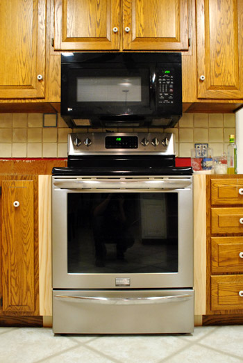
First on our list of little things was filling the gaps next to our stove.
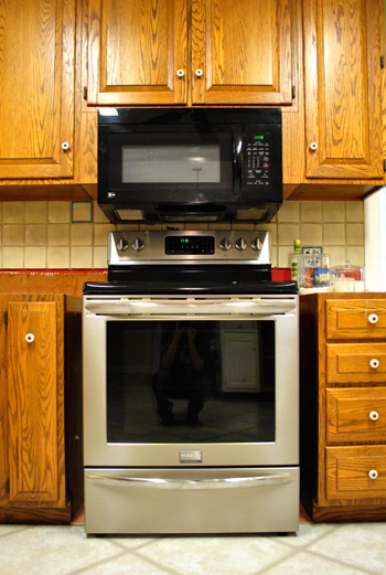
The base cabinet that we removed was 36″ wide, but the stove is only about 30″ leaving a little under 3″ of nothingness on either side. Since you can’t squeeze much function into two and 3/4ths inches (almost every pull-out drawer was 3″ or more), we decided just to put in filler pieces of wood. Oh and for anyone wondering why we didn’t scoot the stove to one side and add a wider pull out drawer, if we didn’t leave the stove centered the hood would be off-center, which would mean widening the ceiling hole (= drama). Plus none of the thin slide out drawers had doors that looked like our existing ones anyway, so it was just not worth the money/trouble. And although we thought about some sort of ornate leg or braided detail, we ultimately decided that we wanted other things like the wall of penny tile backsplash to be the star (along with items on our floating shelves), so two thin and basic filler pieces of wood were our final pick.
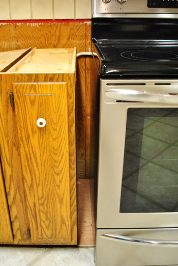
I grabbed a few pine “project boards” at Lowe’s, cut them to size, and drilled some pilot holes with my Kreg jig before screwing them carefully into place.
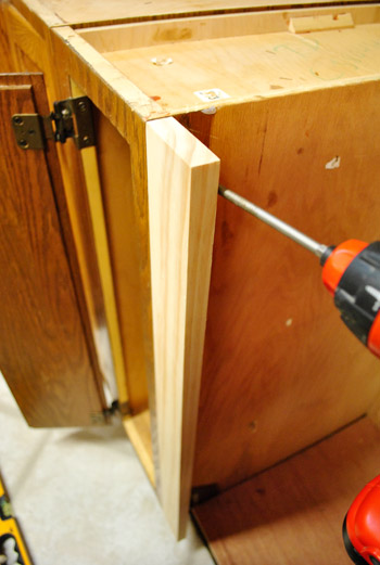
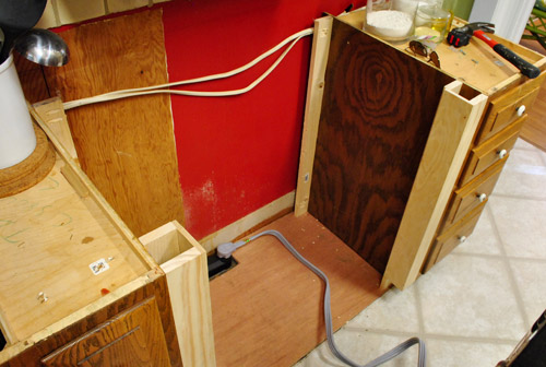
Obviously we needed the fillers at the front to visually fill the gap, but we also decided to put one at the back in case the counter guy needed it for support:
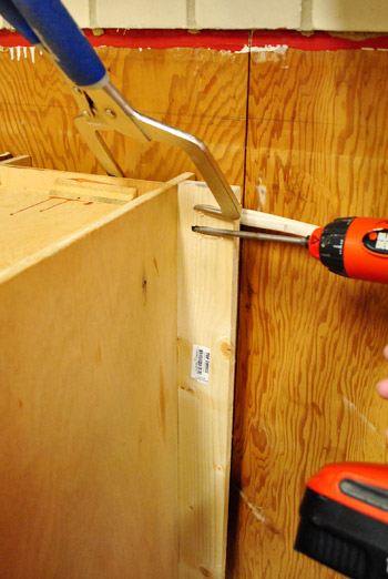
In total, each side had three separate filler pieces. We probably could’ve gotten away with two, but it’s not like the boards were breaking the bank (I spent about $11 total on this entire project – which is at least $100 cheaper than some sort of pull out dealie).
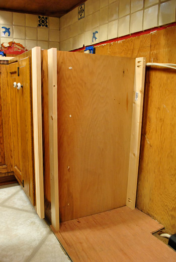
Here are both sides done (ready for the stove to slide back into place):
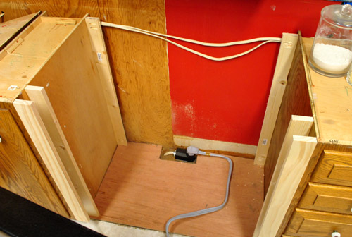
Not bad, eh? Once the counters are on and the cabinets are primed and painted no one will even notice them. Especially since many of the other base cabinets in our kitchen already have fillers in the 2.5″ range.
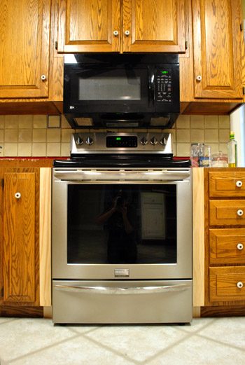
Then we stepped a little closer and put on our Picky Pants and we saw that there was still a noticeable gap. Guess we’ve gotta go buy a bigger stove…
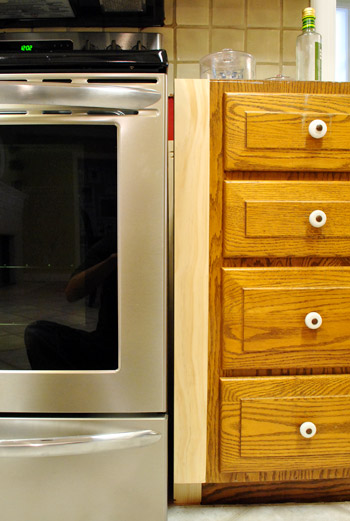
Kidding. Obviously I just needed to add one more sliver of filler wood. The gap was just over 1/4 of an inch, and I knew we could do better. So I headed back out to Lowe’s a grabbed a couple of these.
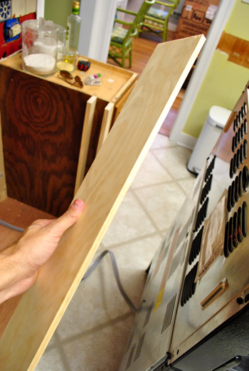
It’s a 3/8″ thick project board that fit perfectly into my slightly-too-big gap, thank goodness (though they added $4 to my total budget, now breaking the bank at $15). So I nailed those two suckers in place, being super sensitive to keeping them flush with my other filler piece along the front.
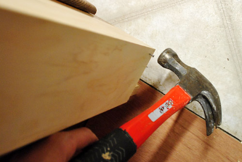
Here’s what they looked like on both sides. I didn’t bother putting them any further than the first two panels since they were strictly aesthetic.
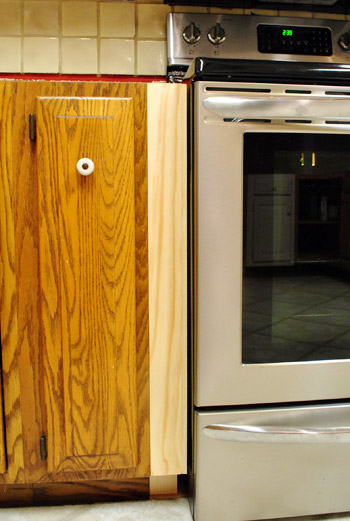
Then we just slid the stove back in. MUCH better. I know it’s hard to tell in the pic below, but trust us that it’s just about as snug as we’d ever want it (any closer it would be hard to get the stove in and out). Oh and once we demo the tile from behind the stove it’ll be able to push back against the wall a bit more for a more flush look. And once we add the toe kick across the front of all the cabinets the bottom will be seamless too.
So with that done…
… our next little task was over on the peninsula.
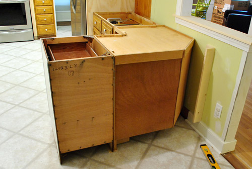
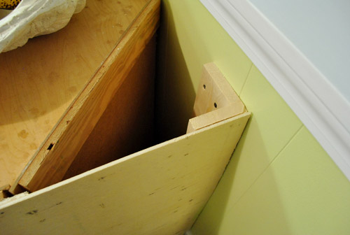
Since we don’t want the guy templating the counters to think we want an angled corner or anything, we wanted to attach a flat panel on the back of the entire peninsula. It’s something we’d have to do eventually, so why not tackle it while we wait for counters? You can see in the photo above that I had already attached a little corner piece to anchor the panel against the half wall. Here it is a little closer:
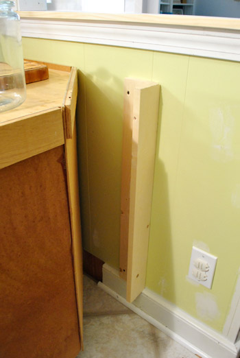
It’s basically just two scrap pieces of wood that I screwed together at a 90-degree angle using my jig. Then I screwed it into the wall so that the flat edge would be flush with the back of the cabinets. Then I was ready to attach my plywood panel.
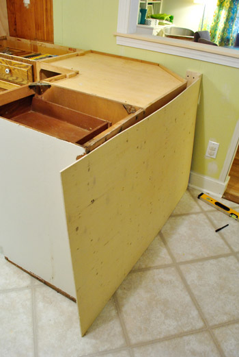
I actually bought this piece of wood back when I got the plywood for our refrigerator built-in so I could transport it in my rented Lowe’s truck (how’s that for thinking ahead!). It’s just a thin piece of “utility plywood” that the Lowe’s guy recommended. It was a whopping $9. They had cut it to size for me in the wood cutting area, but because we had later switched from a 21″ end cabinet to an 18″ end cabinet I had 3″ of overhang that I had to cut off with my jigsaw.
So here it is all cut and nailed into place:
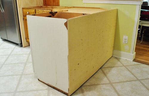
Not very exciting looking, we know. Eventually we’ll be adding trim – baseboards, corner pieces and maybe even a three paneled board and batten look. Not sure yet. Oh, and it will of course get painted to match the cabinets. But for now it accomplishes the goal of squaring off that corner for the countertop measuring festivities (it’ll have a 12″ overhang of Corian on two sides to accommodate four stools).
Can you sort of start to see how it’s coming together? Of course the chairs are placeholder and we hope to get some lighter looking stools (maybe made of acrylic for a nice airy feeling).
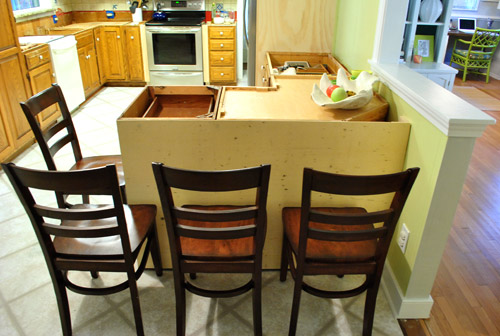
Oh, and do you notice the other thing that we did in the picture above? I’ll give you a hint. It starts with a “p” and ends with “aint touch ups.”
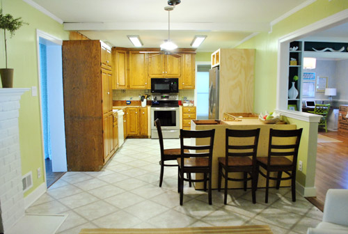
Obviously paint was not a critical step for the counter templating process, but it was more for our sanity (and we had it all on hand so it was free). There’s still lots to be painted (um, hello cabinets – but those have to wait until we get our counters in to avoid dings). So we got busy painting the raw trim, drywall, and paneling leftover from the pantry/fridge shuffle and wall opening. It really does make our exceedingly unfinished kitchen look a smidge less unfinished.
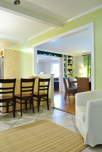
You’ll notice that we opted to paint the inside edge of the half wall light grey like the dining room. We figured it’d be weird to carry the grellow that’s on the kitchen paneling over since the side of the half-wall is drywall (like the light gray dining room). The soft grey is much more subtle and almost looks white like the rest of the door jamb, so it works nicely.
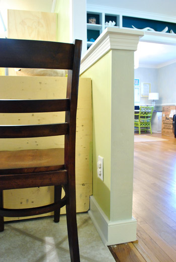
Oh and don’t mind the drip on the “temporary threshold.” That’s actually just a piece of paneling that we had leftover from the wall opening project that we cut down, flipped painted-side-down, and nailed in to bridge the gap that was created by removing the wall. It’ll eventually get covered with cork and we’ll add a very small threshold to join the cork to the original hardwood (just like we did in our first house where the original hardwoods met the new ones that we added to half of the house).
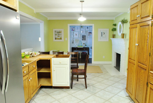
Now here are a bunch of “after painting” pictures of the kitchen and dining room (since it’s the closest thing we’ll have to a polished after for at least a few months). But ignore the two oddly placed floor lamps in the dining room (we can’t wait to get a big chandelier for over the dining table) along with the new microwave box sitting near the built ins (the new dishwasher box is hanging out in the office until install time).
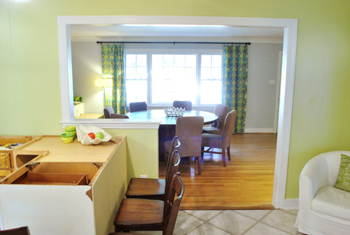
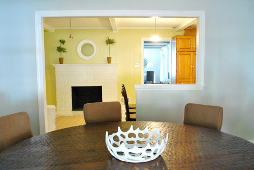
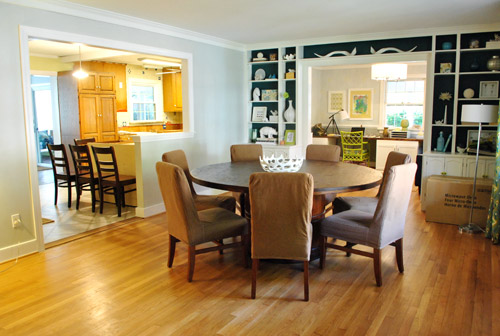
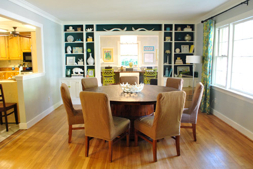
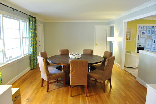
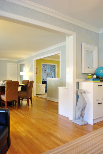
Oh, and although it’s not the most glamorous angle, a few folks requested a view from the living room, so here it is. We love that we can see the giant picture window from the back of the house. Widening this doorway would definitely be a nice change, but having widened a former-exterior brick wall in our first house we know it’s a messy and not necessarily easy job (this used to be the back of our house before they added an addition, which means it’s hugely load bearing and could be a big ol’ can of worms). So for now it’s on our “maybe someday list.” Although sometimes we think we’ll appreciate the privacy in the living room since it’s not a big wide-open straight shot from the front window to the back of the house.
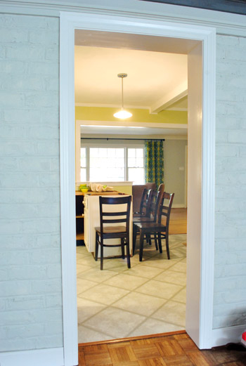
Wow, that was a lot of pictures for a post about little things like filling gaps around the stove, nailing a panel to the peninsula, and doing some paint touch ups. I counted an even 30 photos. Guess we’ve been a bit trigger happy with the camera lately. Must have something to do with that glorious new doorway of ours. And yes, we still walk into the kitchen and grin at it like fools.
What little updates or small progress have you made on projects around your house? Any last minute tasks that you’re trying to bang out before this weekend or Thanksgiving?
Psst- We announced this week’s giveaway winner. Click here to see if it’s you.

Ashley says
Know what I think? I think you guys should bury a little time capsule in the empty triangle space at the corner of the peninsula. I’m remembering a time when you guys were working on your first house and you ran across a bunch of old receipts (or something?) from several decades before (is that right?). How cool would it be for someone to find that one day?!?
YoungHouseLove says
Totally doing it!
xo,
s
Julie D says
Question about the floors.. I thought you guys were putting down cork flooring. Do you not have to pull out the cabinets to install that flooring or will it be laid down around the cabinets?
YoungHouseLove says
Feel free to scroll back for that info (it’s a common question today!). Hope it helps!
xo,
s
Ab says
My favorite pic is the one from y’alls office…the angle from the newly opened wall is the same as the angle of the built in bookcases in the dining room. Gotta love subtle symmetry (or at least I love it!). I also can’t wait to see if y’all do acrylic stools…I loooove the “ghost” look!
Jessica says
When you guys get fancy new stools are you planning to stick with 4? I’m dealing with a similar breakfast bar area, and can’t decide whether 3 or 4 stools suits me better. I like the aesthetics of three, but I’m afraid the seating will look a little bare, but the 4 in your pics actually look a little tight to me… thoughts?
YoungHouseLove says
We’re thinking four, just so we can grow into it (since we’re already 3 now!). The four in our pics look tight but once the 12″ overhang is added on two sides there should be a lot more room (and our chairs are dark and chunky so they look a lot larger than something white or acrylic would).
xo,
s
Katie says
Oh man, I can’t believe you passed up an opportunity to have a blog post titled “All the SMALL Things”! Blink 182 reference, anyone? No? Just me? Ok, I’ll just go hide in my dork corner over here…. ;) Seriously, great job so far on the redo, I’m enjoying watching transformation. You guys have so much patience! Can’t wait to see more progress and of course the finished product.
YoungHouseLove says
I know- don’t know how John missed that one!
xo,
s
Lena says
That’s actually what I thought they were referring too lol. Like a play on the words. Since I read the title the song has been stuck in my head!
karen says
good work guys!!
Sandy says
I love all the views from different angles of the rest of the house that you can see through your new doorway. It really ties the whole house together. I also really like that you can see the fireplace from the dining room. It is amazing how that opening just makes the house make more sense. I’m sure you guys are just loving it!!!
jbhat says
I love the progress. It’s looking so good in there already. I adore the idea of acrylic stools for your P-for-Peninsula (they are on my own wishlist as well for my own Private Island). I’m also wishing Santa could bring you new dining room chairs. Maybe some nice simple white ones with chrome legs? Just a thought–ignnore me if you are still loving the slipcovered dining chair deals of the century. : )
jbhat
YoungHouseLove says
I think we like the idea of plushy upholstered parsons chairs in the dining room with more modern and streamlined acrylic or white metal stools at the peninsula (just so there’s not too much upholstery or too much sleekness). We have talked about dyeing the slipcovers in the living room a deep plum color someday! Just focused on the kitchen first!
xo,
s
Mandy says
no! the dining chairs are adorable and look so comfy!
I like them just as they are, brown is good, but I think a deep plum will be greater!
For the stools I really think acrylic maybe is not the best choice cause get marked really easy, I can’t explain clearly in english sorry, like when John stressed the wood you know? acrylic get stress marks (??) really easy and they loose their glamour and shine, and I believe in a place like a kitchen with lot of use and little Clara.. just saying cause I’ve a acrylic chair (with arms) in my bedroom – and they are already marked and a bedroom chair is not used as much as a kitchen stool (and I have 2 kids)..
I think something like this http://www.overstock.com/Home-Garden/White-Metal-Counter-Stools-Set-of-2/5954039/product.html would match beautifully :D
I already said that but Im looooving the kitchen redo \o/
kisses on little Clara :)
YoungHouseLove says
Haha- those are one of my open tabs (meaning they’re also on the list)! Haha. Love them!
xo
s
Mandy says
and just one more thing I had this idea just now :)
tile the little wall from the peninsula.. the tile you choose is pretty and will be great to clean little marks from foot and everything..
ok, now I’ll stop with the comment flood :)
YoungHouseLove says
Haha, definitely something to think about! Semi-gloss paint is easy to wipe down (it’s what we used in our first kitchen and have on the paneling and will put on the cabinets too) so hopefully either one will work!
xo,
s
Christie says
I was curious about that little angle, so liked seeing the details of that finish work.
Tim says
Why did you put the plywood on the back of the peninsula after you put the trim on the half wall. Would be much easier to 45 the trim and continue on the bottom of the peninsula and around. Just being picky. Im a trim Nazi!
YoungHouseLove says
Haha- we just did things in the wrong order but it wasn’t too bad!
xo,
s
Natalie C says
Your Kitchen is looking great, love the new space but as the daughter of a kitchen designer I have to ask;
With the microwave above the oven/hob – are you not concerned about the about of steam, splashed sauces and splattery grease from the hob hitting the microwave? and steam/smoke filling the room? Did you consider placing the microwave to one side and installing an extractor fan?
Sorry if this has been covered, I’m English I don’t know if extractor fans are a ‘normal’ kitchen appliance in the States – most British homes have them..
YoungHouseLove says
Oh yes, that’s not staying! We’re hanging a to-code range hood (with a fan) with backsplash tile to the ceiling and floating shelves! Should be so much fun and such a great upgrade!
xo,
s
Lisa in Seattle says
I can’t get enough of that sightline from the office through the dining room through the kitchen to the gallery wall! Also, thanks for the pic from the dining room through the kitchen to the living room. I couldn’t find that room with GPS and a compass, but there it is! Did you really used to have to go through the office to get there?
I am making the opposite of progress (regress?) on our big painting project. After swatches #16-18 didn’t work out, I’m back to #12. A tanker truck full of Decorators White is starting to sound appealing.
YoungHouseLove says
Haha- yes! Totally had to walk through the office! Or go into the frame hallway and then turn into the kitchen. So much more functional now! And good luck with all those swatches! You’ll totally land on the right one in the end!
xo,
s
Meghan says
I’m guessing isn’t really what you’re looking for, but I just came across it so I figured I’d post it for you: acrylic chairs from Chiavari on sale for $40 each:
http://www.bestchiavarichairs.com/le-l-7f-cry-resin-gg.html
YoungHouseLove says
Wow- that’s an awesome price! I think they’re a little ornate (and we need counter-height as opposed to table height) but they definitely get the ol’ wheels turning! Thanks for sharing!
xo,
s
kelly says
I think when you are done with the kitchen remodel you guys should think about getting the house reassesed. It might be really interesting to see how much the perceived value has gone up and you could even compare that with how much you have put into the house.
I know you won’t be done, but I think you have made such dramatic transformations that it could be really interesting at this point, especially talking about the process of getting a house assessed.
YoungHouseLove says
That would be fun! We’ll have to see how much it would be (haha, we’re cheap, so if it’s $300 we’d pass).
xo,
s
Tiffany says
Wow! I’m always so excited to check your blog each morning…and I’m never disappointed! The wall opening has really made a huge difference, well done. Thanks for the inspiration. A few years down the track we may inherit a 100+ year old home on an Australian farm (a big old farm house), so will certainly be referring to you guys for tips, tricks and ideas. Thanks :)
Peg says
What a difference taking a wall down can make….I love all the angles you shot. The new look opens up your house so much…..it must feel like a whole new house in some respects. Loving the colors from room to room, the updated office the round dining room table the view of the fireplace….very warm and inviting. Anxious to see the rest of the kitchen project come together….I LOVE a white kitchen!
stacey erin says
The wall opening. looks. AMAZING! Like it’s always been there!
Beth says
Wow, this is looking so great. Love all of the seating/serving options you have – your house is going to be so open for entertaining!
Also, a thank you for all of the Richmond, VA love as I’m getting ready to move out there in two weeks. Found your blog the week before I was offered the position and already know that I can count on Lowe’s/Home Depot to be really helpful and have some great communities to take advantage of. Yea, RVA!
YoungHouseLove says
Aw, welcome to RVA Beth! You’ll love it here!
xo,
s
Jill says
It’s looking great! When did you get a new dog statue? Have you always had that one? I LOVE IT!
Also, can you direct me to a post about your dining room table? I get really good glimpses of it in certain shots and I’m trying to figure out if you built it yourselves, because it’s awesome. If not, can you tell me where you purchased it? Thanks!
YoungHouseLove says
Yes, I’ve had that guy for a few years now (he’s a concrete greyhound) but was so sad when his “brother” met an unfortunate end (he was white and ceramic). John actually surprised me with the concrete one on V-day about three years ago from a local garden center! He’s meant for outside but I love him inside!
As for the table, here’s the story on that: https://www.younghouselove.com/2011/02/table-talk/
xo,
s
Lisa says
I am loving the way your kitchen is coming together. I was a bit skeptical of how the opening would look with the pennisula there, but I’m really liking it. It has a casual, we’re a family sort of look. I could see people hanging out at the pen while someone is cooking dinner in the kitchen. Can’t wait to see more.
Dani says
This may be strange, but I would love if you had a post that outlined the (power and other useful) tools you own. As a photographer, we often ask “what’s in your bag,” and I would love to know what’s in your [DIY tool] bag that you find super useful.
YoungHouseLove says
Thanks for the request! We’re thinking of doing a “holiday gift list for DIYers” post about all the tools and DIY stuff we have around that we use the most. So anyone who will be asking for DIY stuff for the holidays might find it helpful!
xo,
s
Lena says
I think it’s looking really great. I missed a couple posts so I’m still trying to work my way back to the wall being opened up.
Just the paint touchups alone have made a HUGE difference! Lookin good.
It’s also funny to look at these pictures, of a home I’ve never been in and try to think “Ok, so that door goes to that room but that room connects to that hallway, and where is this room coming from over here…?” lol it’s like a puzzle!
Laura says
Love this project! And I love that you guys are sharing all the details and lots of pictures. Keep it up!! Thanks!
Mary says
Have you considered rounding the corner on your corian countertop on you new bar area? We have a 12 inch overhang on our large island area and bumped our hips on the corner for 15 years before we finally replaced the squared off formica with a rounded corner on our Corian. Best decision we ever made!
YoungHouseLove says
Oh yes, those corners will all be gently rounded! Wanted to prevent as many bruises as possible! Haha.
xo,
s
Amy says
I am often a lurker around here but hardly comment. I had to comment this time because my first thought when I saw these pictures is how I can just envision you having family and friends over enjoying this space. Opening that wall up = perfect space for entertaining guests. It already looks so much more inviting! We are in the middle of completely remodeling a 1920s house and ‘inviting’ is exactly what I’m hoping to accomplish. (by the way – we decided to go with cork floors in our kitchen after I read your post about them and I couldn’t be happier!). Can’t wait to see how your whole kitchen turns out!
YoungHouseLove says
Wahoo! So glad to hear that you’re loving your cork. Can’t wait to start living with ours!
xo,
s
Anna says
We moved two months before our daughter was born and now that she is 5 months I’m finally working on putting stuff on our walls. Our picture wall WILL get done this weekend! I’m so determined! Even ordered art from fab.com!
YoungHouseLove says
Wahoo! You can do it! Happy hanging!
xo,
s
Ikl says
The chair covers have seriously been bothering me in the last few kitchen posts…not fitting smooth, they are too baggy at the top backs, and cheapen the house…considering what perfectionists you are regarding small gaps, etc, i would certainly think these would bother you. They are looking like dorm room jersey knit sheets, no offense.
YoungHouseLove says
They definitely look different in person than in photos, but someday we’d love to overdye them a dark plum color (they almost look like suede in person, so we’d love to work with them and see where we end up). Ya never know though!
xo,
s
Jennifer says
Not sure if anyone has mentioned this, or if you guys have noticed it yourselves, but…when you look at your wonderful new opening from the dining room side, it looks like a giant P for Petersik! (Or at least it does to me, haha.)
Just thought I’d share my fun little observation, and keep on blogging because I love reading it!
YoungHouseLove says
Haha, we’ve heard that a lot today. Too funny! Also that it’s a subliminal 7 from the other side!
xo,
s
Ilana says
I love the dining room chairs. I think the brown really grounds this, and adds warmth!
Hilary says
It’s chuggin along! Yeahhh buddy!
vicky says
You guys are my inspiration! Last year I painted my cabinets and maybe this year we’ll have the $ for the countertop… Anyways I love all the renovations you guys are doing, but I have to come out and say it- every time I see your round dining room table I keep thinking it should be rectangular… It looks beautiful anyway, but I’m wondering how you strategize in figuring out what size furniture to put in your space – do you photograph it first before going out to stores? Do you draw on the floor? Do you do renderings? Keep up the fabulous work!
YoungHouseLove says
Great question! We’ve always wanted a round table and thought the room really needed curves (since the built-ins, rectangular picture window, and even the new doorway to the kitchen are full of right angles). It’s definitely just a personal preference thing though! We figured a square, rectangular, or round table could all work since the room is a decent size (we measured to be sure that our table would fit before buying it of course). We ultimately worried that a long rectangular table might not fill the width of the space and could emphasize the long-ness of it (while the curves of a round table would break things up and make it feel less bowling-alley-ish). My mom has always loved round tables so maybe I inherited it from her! Haha. And John’s obsessed with making a huge cozy lazy susan for the middle of the table that we can fill with food and spices and have a huge gathering.
xo,
s
Terri says
Did you guys notice that the new opening looks like the letter P?
YoungHouseLove says
Haha- it’s our little subliminal monogram!
xo,
s
Kristen says
I totally didn’t notice this until seeing everything painted, but the opening looks like a giant “P” from the dining room! what a way to incorporate your monogram to the new house! <3
Kristen says
Haha nevermind, guess Terri beat me to it ;)
grace Nielsen says
Wow – I LOVE how it is all coming together!! You guys are amazing! I especially love that you break it down and share with us every step along the way – instead of just a dramatic BEFORE and AFTER. I really enjoy AND appreciate photos and commentary of every facet of “the miracle makeover.” It’s gonna be so FABULOUS!! Happy Thanks-giving to all of you!!
Paula says
I don’t know why, but I am dying to know if this project was done at 12:02 noon or 12:02 midnight… Also I love that your stove and microwave clocks match – I hate when the clocks in our house all read slightly different times and I have to reset them.
YoungHouseLove says
Haha, thankfully most of it was a noon project while Clara napped (some finishing stuff was done at night once Clara was in bed).
xo,
s
Brandan WH says
Amazing work. You make me tired just reading your blog! Feel like I need to get up and build, paint, make something ;0
Lauren says
It looks fantastic – congrats on your progress!! Random question…do you recall where you purchased the greyhound satue? My mother rescues them from the tracks and she would LOVE that!
Thanks!
Lauren
YoungHouseLove says
We found him at a local garden center (they’re meant for outside in a garden or at the end of a driveway but I loved the idea of bringing him inside).
xo,
s
J.D. says
Are you guys aware that the cut-out between your kitchen and dining room (when viewed from the dining room) looks like the letter “P”? As in Petersik? As in pretty cool!
YoungHouseLove says
Haha, yeah! It’s our subliminal family monogram.
xo,
s
Diana says
Sherry,
We are knee-deep in a kitchen remodel ourselves – 2 months in, granite installed yesterday! Woot! I have painted our 1990’s oak cabinents a beautiful, glossy Creamy White by Olympic. We also have that vast expanse of paneling on our pennisula and we want to add molding to jazz it up a bit, like you mentioned for your own kitchen. I have a couple of inspiration pics pinned, but wondering if you have any to share?
Diana
YoungHouseLove says
Something simple like this is what we like: http://pinterest.com/pin/227994799855234341/ I think I have others pinned on Pinterest too!
xo,
s
Suni (Sunny) says
Did I just see the big white dog that got broken a few months back guarding the office door!? Okay – maybe I missed something about his miraculous recovery. Has he resurected?
YoungHouseLove says
That’s my concrete greyhound from three years ago. His ceramic brother is still resting in pieces, sadly.
xo,
s
Laura says
I love following your progress. Reminds me of when we did ours 6 years ago. So much so I did a blog post!
http://laurmelashouse.blogspot.com/2011/11/little-reminiscing.html
Hope you enjoy! Can’t wait to see yours all done.
Have fun.
Laura
YoungHouseLove says
Fun! Love the update.
xo,
s
Jo says
The day I am secretly waiting to see is when you change out the knobs on your cabinets. Ever since you pointed out the “eyes” they drive me crazy and I can’t imagine how you’ve lived with them for so long.
YoungHouseLove says
Haha, I can’t wait either!
xo,
s
Mari says
I realize you have finalized your kitchen plans, had the half wall built, and (I think) you have by now had your counter tops measured and ordered. However, I was wondering if you ever considered switching the location of the former stove-top cabinet and the free ReStore one.
I think this would have accomplished a few things: First, it would have pushed the peninsula up further to tighten the work triangle, given you more space for the reading nook in front of the fireplace, and given you a more direct line of circulation to your living room. Second, it would have helped to extend the peninsula–even with the counter top overhang you mention, it seems too abbreviated for the space. And third, I think it might have not required you building the pony wall. I know these are your design decisions (and you often say to each his own), but even with you finishing painting the pony wall I think it was a design mistake. A fuller opening, in my opinion, would have looked a lot better (less ’80s–sorry!), and if part of the corner cabinet was still visible you could have finished it in a bead board to make it look like a piece of furniture.
Did you play around with the configuration of the peninsula, even more than you let on in your posts? Did you have all the cabinets purchased/obtained before you decided on exact measurements for the opening with your contractor?
YoungHouseLove says
Oh yes, we definitely considered a ton of options before picking our final layout! If we pushed the peninsula back towards the stove wall, there wouldn’t be enough flow to pass into the space (we intentionally elongated things on the fridge wall so there was room for the peninsula to butt out beyond the pantry, otherwise it would have almost met the pantry instead of extending beyond it, and there would have only been around 25″ of walking space instead of the 40+” that we gained by moving it). The peninsula will also have a full 3’x 5′ countertop, which is as big as the dining table that used to be in there, so it shouldn’t look small at all! Hope that makes sense. Can’t wait to see it come together!
xo,
s
Jenn L. says
I love everything you do! I’ve been following for awhile and never comment but today I will! When I was a kid our dining room had a half wall like your new opening does. It never bothered us…but then again, sometimes it seemed a little awkward to my parenst. So my father put in a interior column and it really made such an elegant statement.
Have you thought about something like that? I don’t want to say it looks bad, because trust me it is beautiful! Much better than my crappy condo! But every time I see an updated picture of the half wall I see the missing column from my old house! LOL :)
Something like this: http://www.cambridgecrownandtrim.ca/Pillars.aspx (not spam, I just found something I was trying to explain on Google Images).
YoungHouseLove says
I had those in my house growing up too! They’re beautiful but we’re not sure if it might be too tradition or take away from some of the other focal points we’ll be adding! But we love that we can always add one down the line- thanks so much for the suggestion!
xo,
s
Natalie.C says
SOOOOO glad to hear it – sorry for my scan reading – I’m sure you had mentioned the hob/extractor before.. The thought of your newly renovated kitchen under a fine mist of cooking grease had me distressed!!
YoungHouseLove says
Haha, no worries! We can’t wait to have more room for big stew pots!
xo,
s
Christine B says
The cheap plywood you used to back your cabinets is simialr to the cheap plywood we used to give our guest bathroom a accent wall. My hubby seriously just stained some cheap plyqood and used liquid nails and small nails to attach it. It probably gets the most compliments in our house. It is amazing what the things you can do with wood! http://form2form.wordpress.com/tour-our-nest/
YoungHouseLove says
So cool!
xo,
s
Lori McKee says
I love the view from the dining room into the kitchen! I was skeptical about the half wall, but the way the opening frames the fireplace is perfect. I am sure someone said it better in an earlier post, but I just wanted to tell you that I have now bought into the design – you guys are geniuses!
Dianne says
Love it! The view from your office looking at the new cutout…well…it’s a big letter P hole :) Perfect!
Hollie @ I'm Busy Procrastinating says
I went back to work recently and am sooo behind on all my blog reading, and especially my blog writing! But today I finally had a chance to pop over and check out your kitchen progress. The opening to the dining room looks great! I admire that you two have such vision, and the willingness to give things a shot!