When Ania sent us her delicious after photos (thanks to this mood board that we whipped up for her last month) we couldn’t wait to share the eye candy! We know you guys love a good before and after, and Ania did a faaaabulous job! Here’s her letter:
Here are a few after pictures that I took for you! Needless to say, we LOVE our new living and dining room area. I can’t believe I ever had doubts about the bentwood chairs or the media stand. They are honestly my favorite items that we purchased. We L-O-V-E everything. From the frame collage to the chandelier to the sofa table… everything! Thank you soooooo much for the design advice. It feels like a completely transformed space and we love to spend time here. Amazing! You two truly have a gift. You will definitely be hearing from me again. Oh man do I have some more ugly rooms for you! Best, Ania
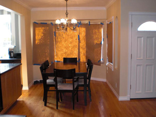
Just to refresh your memory, here are the before photos of the space:
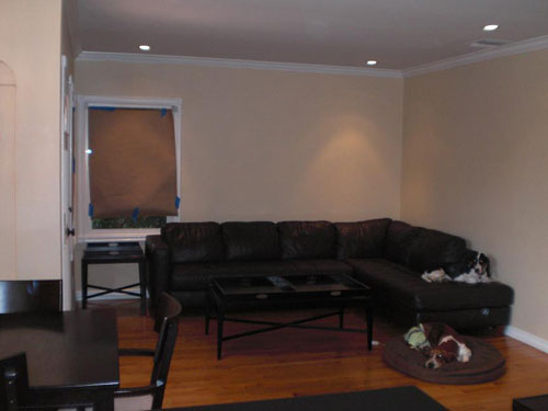
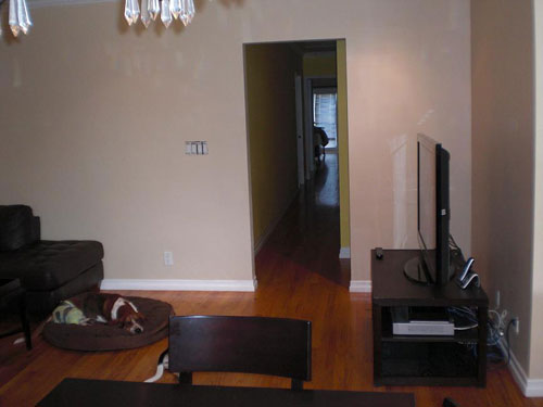
Ania wanted a few new furnishings that felt less boxy and matchy-matchy to create a space with beachy, modern and glamorous touches. Here’s the mood board we whipped up to help add polish and breezy style to her living & dining room (find more details here):

But enough stalling. We know you’re all about the afters. So here ya go:
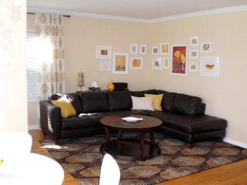
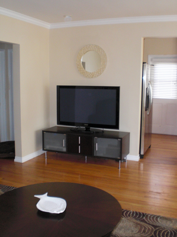
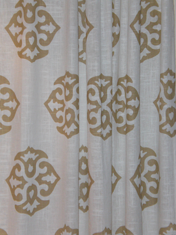
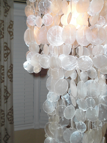
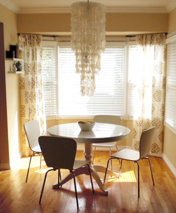
Didn’t Ania do an amazing job? What’s your favorite part? We’re torn between the super fun medallion curtains and the new white pedestal table with the capiz chandy overhead. That entire breakfast nook just leaves us breathless. I mean we knew that her space had fantastic potential but it’s still unbelievable to see it all spruced up and polished looking. No more paper on the windows!
And didn’t she totally rock that charming L-shaped wall of frames that we described? We love that she took the ball and ran with it. It’s even better than we imagined! Plus it only took her a month to get back to us with after photos which is truly unbelievable. Let’s shower Ania with praise for being so wonderful and sending us her eye-pleasing after pics. And here’s hoping more Design Dilemma after photos will be landing in our inbox very soon…
Update: We sadly can no longer find the time to take on client commissioned mood boards (we now whip up general inspiration boards instead) but if we ever reinstate them we’ll make a big announcement!

Mariah Fraser says
Wow, Ania! This looks amazing! And Sherry and John- You totally nailed this mood board; it looks perfect in their home! Beautiful!
Shifra says
Oh, wow. Amazing!! I love love love the breakfast nook with the giant capiz chandelier. It looks even better than I imagined, great job! (and thanks for sending in after pics!)
prettythings says
I LOVE the breakfast nook – looks so restful and cheery. Perfectly pulled together!
Sara says
Looks great, thanks for sending after pictures Ania!
Tiffany T. says
Great Transformation!
Carla says
So delightfully warm and inviting! Such awesome ideas that have beautifully implemented.
I’ve had a window epiphany after seeing these photos. The struggle I’ve faced over what to do with our bay windows has been ridiculous. Struggle no more! I’m so doing this!
Kristen says
AMAZING!!!!
Amanda says
Oh wow. The breakfast nook is so beautiful! I think the curtains are my favorite thing. Although those chairs are a close second! And the chandelier is too! And the rug in the living room! Can I come over for breakfast??
Kate says
Love the breakfast nook! All of those elements just pull together so well. I really love the drama of the big chandelier – gorgeous!
Kimberly says
Ania, it look’s so good! Thank you SO much for sending in the after pictures! It is just torture not to see Sherry and John’s great moodboards brought to life. Enjoy your gorgeous space!
Amy says
Hmmm, overall beautiful of course, but I am not sure if I like the rug…does anyone else think its just too dark? I think there isn’t enough contrast between the sofa and the rug for me. I don’t know, maybe its just me, but everything else seems so light and airy.
YoungHouseLove says
Hey Amy,
We intentionally went for a graphic rug with some brown tones in it to work with the existing leather sofa so it didn’t feel like the heavy dark elephant in the room- does that make sense? We just wanted something else with mocha tones to work with the sofa so it wasn’t too jarringly dark in a room full of light and airy. Hope it helps!
xo,
s
Patricia says
Your rooms look fantastic. I had my doubts about the leather sectional in this new design but it looks great with the rug. Isn’t it wonderful to use what you have in a new a creative way?
Erin @ Domestic Adventure says
Amazing work, Ania, with some amazing advice! The space looks so comfortable and welcoming. I am really envious of how confidently you did the frame collage–it came out great!
calliope says
I think that this is the best “after” transformation that you have posted so far. I really liked the fact that they strictly followed all of your choices and selections. That made the moodboard really “alive”, if you know what I mean.
Well done Ania! what a great room to live into!
Well done youngsters!
Julie says
Wow – this is a fabulous “after.” What a great job implementing Sherry’s mood board – it honestly looks even better than I’d suspected when I saw the board, read the post, and pictured it all in my mind. What a fabulous area of your house…I would love to hang out there if it were mine!
And seriously, Ania, thanks for the “after” pictures. It is so fun to see the mood boards actually come to life!
And for all of you who are loving those chairs, ones just like them (if not the same ones?) are on sale at Target this week…2 for $55. What a steal!
Kim S says
Wow, great job! I’m in love with those curtains. My walls are almost exactly this color and I also have white wood blinds, so this is giving me a really good visual of what I could do with my living room!
Melissa says
Everything is my favorite part! haha I especially like the lamp, curtains, and breakfast nook! wonderful job to everybody!! =)
Kelly H says
The whole thing looks great… but the dining area… looks especially awesome. Love Everything!
Janis from Scotland says
Sorry everyone – I kinda agree with Amy in thinking the rug is too dark – I would have gone for a plain cream or tan rug in there.
Just my own personal taste.
Meredith says
It all looks beautiful, but I am LOVING that first picture of the breakfast nook. It completely reminds me of something I would have seen in Domino (RIP) :)
Elisa says
The breakfast nook looks like it came from a magazine. Love, love, love it. It’s perfect. The whole house is a just-right mix of beachy, modern & glamorous, just like you said. You guys nailed this one. And I agree about the rug/couch issue – without the rug the couch would’ve been out of place, but with it, it’s all cohesive and makes perfect sense.
Courtney says
Great job! I really love the curtains and think they would look fabulous in our bedroom which my fiance and I are currently making over into an exotic retreat. We are considering purchasing this comforter set (http://www2.jcpenney.com/jcp/X6E.aspx?DeptID=59474&CatID=69151&GrpTyp=ENS&ItemID=15d4500&attrtype=&attrvalue=&CMID=59474|59481&Fltr=&Srt=&QL=F&IND=1&cmVirtualCat=&CmCatId=59474|59481|69151)and I worry if the curtains would be too much. More neutral comforter maybe? The walls are going to be a neutral color and the furniture is dark wood.
YoungHouseLove says
Hey Courtney,
Yeah, those curtains are pretty graphic so pairing them with that bedding might be a bit much, but something more subdued (either comforter or curtains) will still make for an exotic space full of texture and interest. Hope it helps!
xo,
s
Jill Stigs says
Holy Moly! It looks fabulous……..you 2 are very talented and thanks to Ania for seeing it thru (and giving us the eye candy to prove it) so quickly! Top rate!
LauraC says
Per-fect. I really like the rug and think it helps pull things together! THANKS Ania for the pictures!!!!
Laura says
I LOVE the dining area vignette! I’m saving it for my personal file…
Beki says
Wow! The breakfast nook is completely magazine-worthy. And I actually thought the sectional had gotten smaller—it’s in proportion now and I think the rug and art do it. I also like how the round shapes in the rug are repeated in the coffee table. Congratulations!
Courtney, I think it will look very sophisticated to mix the patterns of the West Elm curtains and Penney comforter, and add depth and interest to your neutral walls and dark wood. Go for it!
Megan says
The chandelier is stunning!!!! Everything looks fantastic. Great job!
Jessica says
I love it! I can’t find the paint colour in the mood board though. Help :)
Melissa says
Amazing! Doesn’t even look like the same place. The whole breakfast nook is my favorite.
Jen Z. says
Gorgeous! Ania did a great job pulling your mood board together. Now the space looks so inviting. Thanks for the eye candy Aina.
Barbara says
Amazing transformation! I love the pops of yellow and the frames.
Lisa S. says
I love what their new rooms!! Beautiful job. I also love their Basset Hounds. I have one like their black and white one.
Katie says
I literally gasped out loud! This looks so fantastic. LOVE the way the breakfast area turned out!
Janet says
Great look! love the rug and the curtains.
Deb says
LOVE it, great job putting all the ideas that they gave you into fruition Ania! I love the rug in the room too, gives the room interest and lovely texture. I think a plain rug wouldn’t make the room have the “wow factor” that it does now. Overall-Awesome!
Meghan says
I feel like the mirror over the TV is just too small. Or maybe because it almost matches the wall color it just doesn’t look proportional. Everything else is lovely. Good job!
Julie says
Simply stunning! I mean I like your furniture in the before pictures and wondered how different it would really look with a similar wall color and new curtains, but HOLY MOLY! I had no idea it would transform into such a sophisticated place. Well done to all!
Olga says
Thanks for the pics, this looks aaaaaweeeesome. When can I move in? =D jk. but seriously..
Miranda says
Hmm…Sorry, guys. I like the rug (though not sure with the couch?), the coffee table and the photo collage. It’s just my opinion (unpopular, I’m sure), but the room actually seems very mismatchy to me with some elements being very homey and some rather eccentric.
sabrina says
I love it! it looks great with not very many “major” changes you know?
the curtains are by far my fav! i just sent my hubby an email asking if I could get them!
Caitlin @ That House On The Corner says
Great job on everyone’s part! It looks straight out of a design magazine! I love how quickly she got everything done as well! Way awesome!
Jacquelin Hicks says
Beautiful! The chandelier is so glamorous!
Laura says
Love the breakfast nook but it all looks great!
heather s. says
Looks great! The breakfast nook is by far my favorite room of the two. I love the curtains but I agree with a couple of others that the rug isn’t working for me. There are plenty of other rugs that have some chocolate brown in them that aren’t so dark and heavy looking that would have worked great with the couch.
Erin says
Wow, that chandelier is so dramatic!
Ilana says
The mood board was executed beautifully. It is a lovely place to call home.
Maha G says
i love how the round table enhances the architectural detail of the bay window. that breakfast nook is so great! i gotta get one of those round capiz mirrors, hotness!
tricia says
Absolutely gorgeous!
Suzanne says
Wow!! Thanks so much for sharing your after photos Ania. You did an amazing job of pulling all of the mood board ideas together and it looks beautiful!!
Theresa says
Another out loud gasp-er here…
This is a fantastic design and implementation.
The curtains look wonderful.