When Ania sent us her delicious after photos (thanks to this mood board that we whipped up for her last month) we couldn’t wait to share the eye candy! We know you guys love a good before and after, and Ania did a faaaabulous job! Here’s her letter:
Here are a few after pictures that I took for you! Needless to say, we LOVE our new living and dining room area. I can’t believe I ever had doubts about the bentwood chairs or the media stand. They are honestly my favorite items that we purchased. We L-O-V-E everything. From the frame collage to the chandelier to the sofa table… everything! Thank you soooooo much for the design advice. It feels like a completely transformed space and we love to spend time here. Amazing! You two truly have a gift. You will definitely be hearing from me again. Oh man do I have some more ugly rooms for you! Best, Ania
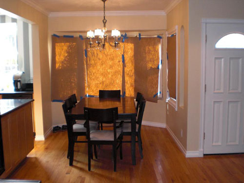
Just to refresh your memory, here are the before photos of the space:
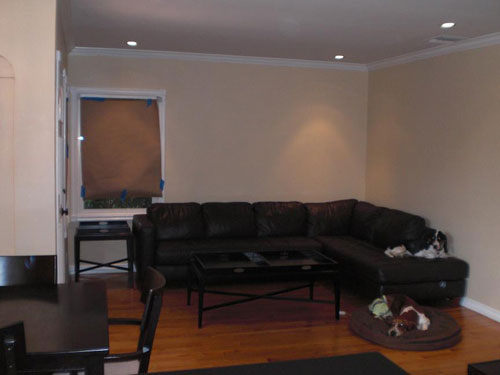
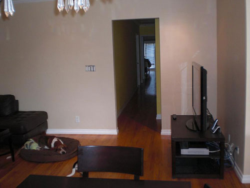
Ania wanted a few new furnishings that felt less boxy and matchy-matchy to create a space with beachy, modern and glamorous touches. Here’s the mood board we whipped up to help add polish and breezy style to her living & dining room (find more details here):

But enough stalling. We know you’re all about the afters. So here ya go:
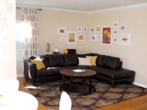
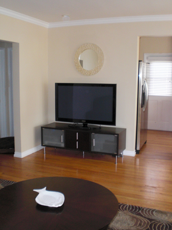
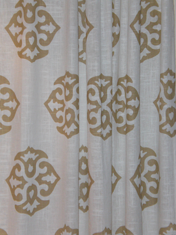
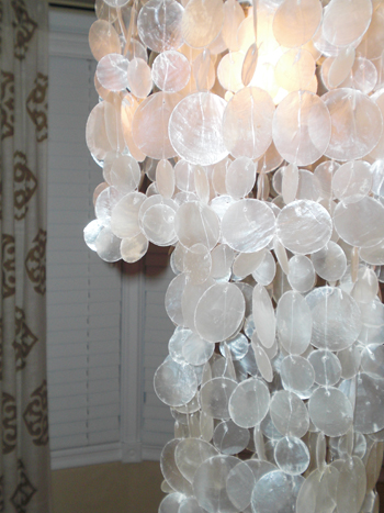
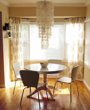
Didn’t Ania do an amazing job? What’s your favorite part? We’re torn between the super fun medallion curtains and the new white pedestal table with the capiz chandy overhead. That entire breakfast nook just leaves us breathless. I mean we knew that her space had fantastic potential but it’s still unbelievable to see it all spruced up and polished looking. No more paper on the windows!
And didn’t she totally rock that charming L-shaped wall of frames that we described? We love that she took the ball and ran with it. It’s even better than we imagined! Plus it only took her a month to get back to us with after photos which is truly unbelievable. Let’s shower Ania with praise for being so wonderful and sending us her eye-pleasing after pics. And here’s hoping more Design Dilemma after photos will be landing in our inbox very soon…
Update: We sadly can no longer find the time to take on client commissioned mood boards (we now whip up general inspiration boards instead) but if we ever reinstate them we’ll make a big announcement!

Joshua says
Oh how I love the Chandelier and the curtains…but it wouldn’t be a home without the two doggies :D
doahleigh says
FLOR ME!
Hmm, what makes me happy? So many things, but today I’ll say the sun. With winter and grey skies approaching rapidly, today’s sunny blue sky weather makes me very happy. Even though it’s kinda cold.
prettythings says
@Amy: Hmmm, overall beautiful of course, but I am not sure if I like the rug…does anyone else think its just too dark? I think there isn’t enough contrast between the sofa and the rug for me. I don’t know, maybe its just me, but everything else seems so light and airy.
I’m in the opposite camp – I think the rug is fine, but the frames and curtains are too light. I think the white is jarring against the deeper colors … would have liked to see richer reds and less yellow and white.
Letty says
It came out so nice! The breakfast nook really is very inviting and cozy. I think a jute rug of the kind you guys are always recommending would be a nice addition in there! Great job!!
Sharon says
TOTALLY AMAZING!!! … I love it all … but especially the eating nook. Good mix of table/chairs/chandelier.
Beautiful.
Megan says
I really like the mix of wood tones and white–this is how my house is (oak cabinets, white trim and darker wood furniture). I love the mood board and results for making it all come together! Thanks for the after pics.
Amber @ 2 Nuts in a Shell says
“Holy crap,” was literally the phrase out of my mouth. I can’t believe the change!
Ashley says
WOW! I am completely in love with this room makeover! The color scheme, textures and graphics blend wonderfully!
The only thing I would do to adjust the room, is to move the rug off of the wall and let the hardwood floor border it on both sides. Otherwise, MAJOR KUDOS!
Fran says
What a pretty transformation! The dining nook is my fave!
Natalie says
Oh wow! You guys gave them some great advice, and they did fabulous job implementing it! The dining room is my absolute fav :)
Angie says
Amazing job! I love the curtains and the dining area is fabulous!
Fran says
I had to chime in one more time after I read the posts…prettythings commented that something wasn’t jiving just right…maybe the rug, curtains, white frames?
If the wall color was taken to a deeper level (nothing too dark, just a mid-tone) it would be scrumptious. I can imagine one of BM’s historical golds in here.
CarMaj says
UMM WOW! This is an amazing transformation! Everything looks so beautiful, warm and inviting. The chandy and the curtains look stunning here – GREAT JOB!!
Jill says
Picking my jaw up off the floor… GORGEOUS! Great work on both parts! Now I am scheming how to get that light in my house… stat!
Katrina says
The space NOW looks amazing! I’m in love with the chandlier…yummy!! I also dig the curtains and everything – it just works
Rhiannon says
I am in love with how dramatic the chandelier is! i would have been scared to go that large… but its perfect!
Kelly says
I have never ever seen a room featured before (on any site) that I both liked and could see myself living in. This is SO liveable but GORGEOUS!!!!
Ania says
Thank you for the kind words everyone :) It’s amazing that we were able to pull this off in our awkwardly shaped living and dining space. I’d love to pull the rug from the wall but it would render our front door inoperable.
I was wondering if anyone had any ideas to spruce up my accessories a bit? I’m not in love with what I did sans Sherry & John’s help…like the accessories I threw on the sofa table. Maybe a textured table runner and a potted plant would do the trick? Another thing I put up on my own are the little shelves on the left wall in the breakfast nook. They don’t really work for me but I’m at a loss on how to accessorize the area. It’s hard to tell in the picture but there is about 3 feet of space behind the pedestal table. Would it be strange to have a rug under the pedestal table? It would come close to hitting the living room rug.
Bridget says
Great job to both parties! The advice givers and the advice takers! Gorgeous!!!
MARISA says
AWESOME MAKEOVER!!! I HAVE A QUESTION: WHAT DID SHE USE TO HANG THE CURTAINS IN THE BAY WINDOW? I HAVE A SIMILIAR BAY WINDOW THAT IS BARE RIGHT NOW AND LOVE THE LOOK! LOOKING FORWARD TO THE ANSWER, THANKS.
Miki says
I love, love, love the way you hung the frames above the sofa! Kudos on a fantastic makeover.
Katy Campbell says
I think my favorite part is the chandelier over the table….gorgeous and it makes such a statement!
Tracie@ Gurtler + Home says
That looks great! I am wondering where they got all of the pictures that they hung over their sectional. I would love to get a collection of those hanging in my living room.
YoungHouseLove says
Hey Marisa and Tracie,
Ania already popped in once, so here’s hoping she stops back in to answer those questions about the pictures and the hanging devices that she used for the bay window! So glad everyone is digging the amazing room that Ania put together (in record time no less!).
xo,
s
marissa says
Beautiful job! I love seeing how white frames can look so nice over a dark couch. Really fantastic makeover!
cshteynberg says
This looks wonderful! I especially like the airy curtains and the pops of yellow. Although I might be in the minority on this–I think the artwork, even in a large group, looks way too small for the furniture and for the wall. Maybe some bigger, bolder art would look better there?
Also, @Ania: I think you’re right that the pedestal table could use a rug under it so it doesn’t “float” as much. I also think that one of the problems with the shelves is that they’re too high–almost near the tops of the curtains. I always try and hang everything lower than I think it will need to be–at eye-level or slightly lower. Apartment Therapy has a nice post that goes into detail.
Laurie Jones says
Soooo loving that chandelier! It makes the whole room!
megan says
amazing transformation! congrats all the way around. that chandelier is divine!
Ania says
For the bay window, I used standard cafe rods from Target. We had about 2 inches of wall above the window casing so it was tricky. I am still thinking about swapping it with a curtain wire (http://www.ikea.com/us/en/catalog/products/60075295) that hangs from the top of the nook along the entire bay window. Give it a more modern touch.
As for the pictures, one of them was purchased from allposters.com as you see on the mood board. The rest were things I had laying around or made. I used different types of fabric, decorative paper (like from the paper source), and made a few “art pieces” with wine corks, cork board, etc. I’m not so sure that bigger, bolder art pieces would work in my space. It is pretty small. One thought I had though was to lower the frames a smidge on the longer wall. I feel like I hit the nail on the head with the back wall with my placement but it’s *just* off on the longer wall.
I agree that the shelves are too high. I would have lowered them by now but I’m unsure of whether I even like them there or not. They’re kind of bland. I first put up a symmetrical set of 4 frames in that space but it wasn’t working for me. I’m not really sure what would work best there.
YoungHouseLove says
Hey Ania,
Thanks so much for chiming in with those answers! You’re the best and we LOVE LOVE LOVE your totally transformed space. And it seems like a lot of readers are angling for a breakfast invitation as well…
xo,
Sherry
kelly@TearingUpHouses says
love the drapes and lampshade in the dining area. very lux.
kelly
Nichole says
I love it! Especially the curtains. Thanks for sharing.
Alicia says
First I’d like to say “THANK YOU” Ania for sending those after pics…we all know what a rarity that is. I really like the bold choices (rug and chandlier) that Sherry and John made…that breakfast nook looks like it should be in a magazine. But, if I had to change something I would have matted the picture they suggested and put it in a larger matte gold frame (I like large dramatic art pieces) As for accessorizing behind your sofa, maybe 2 or 3 large floating shelves in white. Just my 2 cents! Enjoy your room.
Ann says
I am really loving the new rooms. I think the eating area looks much more roomy with the white table and chairs and the gorge chandy, and I really like the new curtains. The whole area just reflects light. I like living area too, with the pillows and the rug, and the mirror above the tv. I love it when they buy everything YHL suggests! Yay!
Kasey at Thrifty Little Blog says
Great job turing that room around! I love how the new feel of the dining area.
@Ania- For the accessories, I think the thing that struck me was that they were a little off scale for the space. Instead of several small items, maybe just put a few larger items or one unified collection? I think your plant idea would look great if you used a collection of three with all matching white planters.
susan says
This is so beautiful!!! That chandelier rocks the dining room, big time. And I love the touches of yellow! Yellow is my favorite color.
And talk about almost instant gratification! Yay for Ania! I can’t tell you how many of your rooms I am still dying to see come to life.
Susan says
One last thing. Though I am not a professional in any way, I think that something is needed in the dining area to help anchor the table. I’d suggest a rug, but I don’t know which rug :O( Sorry. And maybe remove the two shelves in the dining area and, instead, find some pretty plates to hang either there or above the window area in that long rectangular space.
Magchunk says
This looks great. Love the wall color, curtains, and pictures above the sofa best. The couch no longer looks like a deep black hole and doesn’t dominate the space. And the whole room feels so much lighter and happier.
Joanne says
The breakfast nook is AMAZING, especially with that gorgeous sunlight streaming in. That one is going in my inspiration folder (and I don’t even usually like chandeliers…).
I actually love the shelves there, too – they’re small, but they give the space a gentle touch of antisymmetry. I think it adds interest without stealing attention from that gorgeous chandelier/table combo.
Charise says
Oooh, I love, love, LOVE the dining area! I’m also a big fan of the collage of photo frames – we’ve done something similar in a few places in our condo!
prettythings says
Ania, I have a similar space (in the breakfast nook) and hung half-moon copper planters (paint any color you like) and planted them with pathos for color and interest in my little space – a good alternative to prints and shelves, and an easy pop of color.
I also agree a jute or other textured rug would look great under the table.
And the shelving idea behind the sectional? GREAT idea. Ania can change up her accessories seasonally and use non-wall ‘art’ as wall art.
I do love that rug… wish I had a room for it in my house!
Josh says
While the rooms obviously look better now, the two sets of pictures show how sunlight improves the look of a room. Let’s let the improvements stand on their own and not some subliminal trickery, shall we?
YoungHouseLove says
Hey Josh,
We just publish the before and afters that people send our way! No trickery here, just sharing the eye candy. A lot of times when people purchase a mood board they quickly snap before photos for us that evening and I guess in this case Ania shot her afters during the day (maybe on a weekend?) when she competed everything. We never “coach” people about how to shoot their afters (or their befores for that matter)- they always just show up in our inbox to surprise us. And we’re so glad they do. Hope that explains it!
xo,
s
Jennifer F says
Very nice, and I think you have a great start. I think adding some colorful accessories is a great idea, especially some more substantial things like a rug under the pedestal table – maybe a red one, or a pattern with many colors. I continually find inspiration in this “crash” that John and Sherry did a while ago -https://www.younghouselove.com/2008/10/house-crashing-a-brilliant-bungalow/ – and I can see how the inspiration might help you on your way as you gather things that make you happy. Remember, a home isn’t for a magazine, but is for you to live in and should be filled with what you love!
prettythings says
One more idea for that little space in the breakfast nook – how about those floating Ikea shelves? They’re little, inexpensive and easy to install. You can arrange a pretty water vase and water glasses, small plants, even a small selection of books. I’d love to read a good book with a cuppa in that room!
And what is it with the lack of books?! I never see books displayed in homes anymore (insert sad sigh)! Please don’t tell me I’m in the minority here – I’ve got shelved books in every room and I never, ever arrange them by color! ;)
Chelsey says
What a stunning transformation! The breakfast nook is fabulous and I am completely in love with that chandy. Gorgeous!!
celia says
Wow, how beautiful!!!!
Really like the change even wasn’t that bad before pictures… Love the look of the table with chairs and the curtains. What a nice meal it can be a pleasure to be there!
Love the house and hope they’ll enjoy so much next Christmas time!!! Would love to see pics with all the holidays adornments!
Congratulations!
nicki says
Love the curtains. I have similar bay windows in my kitchen area. Sherry, you may remember me, I asked you for help :). These bay windows have always bugged me! Do the curtains only cover the 2 windows? May have to try this myself!!!
YoungHouseLove says
Hey Nicki,
Of course I remember you! So good to hear from you again. The curtains do appear to cover two windows but this method can be adopted for as many as you’d like- just flank each window with a panel and keep repeating that method until all of your windows are softened up and lovely. Hope it helps!
xo,
s
Jacci says
Wow – you all really rocked that dining space!
Jacci
Jennae @ Green Your Decor says
I have always loved these medallion curtains, and they look fabulous in that nook! But I am drooling over that capiz shell chandelier. Gimme, gimme, gimme!
Jenna says
WOW!! The breakfast nook…stunning! Great job!
Danielle@NewlywedsParadise says
Holy Cow! I was going to get those same chairs after Christmas! How cute are those! The room is looking great! Isn’t is awesome to see your suggestions put together?
Holly says
This is amazing!!! Great job! I love the fact that they choose everything you suggested and ended up loving it…. and my favorite part is the dining area – LOVE those curtains :)
Maybe this will inspire a few more of your clients to send in those after pic’s!