So our built-in wall-to-wall desk already made some good progress this week with the painting and making-taller of our cabinets. But something was missing.
Yes, remember the view from before?
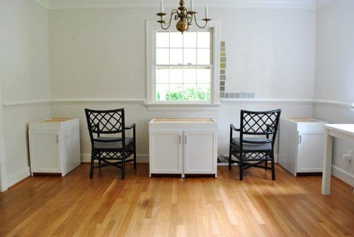
Yes, we were devoid a counter (aka, the desk top). John and I were actually quite indecisive about what to do when it came to that part. And whatever we did, we needed about thirteen feet of it (a length that we learned most kitchen counter suppliers wouldn’t even deliver since 12 feet was usually the max before you ended up with a seam). At first we considered ordering a legit kitchen counter top (maybe butcher block, maybe silestone, maybe this from Ikea – although they would all have a seam). I think after having saved so much with our $6 cabinets we thought that maybe the top could be our splurge.
But, then again, we’re not very good splurgers. Also, I was leaning towards something white (to keep things light, and to tie into the top of the nearby built-ins in the dining room) but John was Mr. Hesitant about white overload (and worried that the white tone of the counter could clash with the white of the cabinet). I know, it’s shocking to hear a guy worry about clashing white tones (especially when he usually can’t tell one white paint chip from another) but he can own it. In short, we were stuck.
But after seeing this DIY-ed desk that Aubrey and Lindsay built, John won we both realized that wood was the way to go.
We’ve always loved the combo of white and deep wood (we did something similar but flipped when it came to refinishing Clara’s dresser), so why not? And rather than “matching” a white counter to the tops of the built-ins in the dining room, we thought referencing the rich wood tabletop in there could really look great.
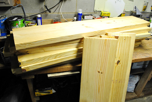
So with the “rich wood finish” decision made, we tracked down our materials. We wanted something thicker than the 3/4″ console table top (just to stay proportionate with the four chunky cabinets below and the thirteen foot length), so we picked up some 2 x 10″ untreated framing lumber. It was as thick as one of those jumbo cutting boards and I walked around the store talking lovingly to it, which was completely embarrassing but I could. not. help. it.
While there we had the guy at Home Depot cut a bunch of eight foot pieces in half so we could fit them in the car (it would also make maneuvering them at home much easier). And this is the most exciting thing. Total cost: $27.30. Yup, it came to less than a dollar a square foot (which is a heckova lot cheaper than most other countertop options, even butcher block or laminate from Ikea).
So with everything home, we did a rough layout on the floor of our basement workshop to figure out which pieces had the nicest edges (for the front lip) and which ones should be hidden in the back. We didn’t have 13 feet of floor space to work with, hence the overlapped look.
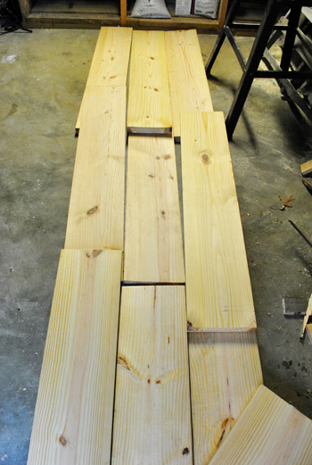
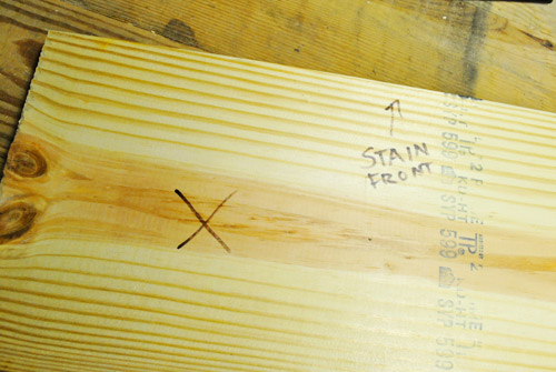
Since I was going to do the staining, John helped me label the back of each piece with clear directions so I didn’t end up staining the wrong side. The X meant “don’t stain this side” and STAIN FRONT meant, well, “stain the front edge” since it would show on the outer boards if it was a front board.
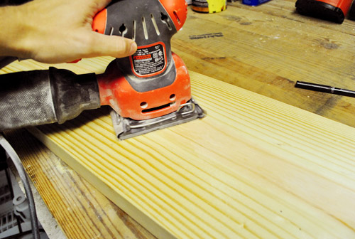
John’s duty (besides cutting a few end pieces to size) was sanding (since I still had memories of my vibrating hand from sanding the cabinets in the priming step of the process). John used the same cheerful little mouse sander to go over each piece thoroughly with some coarse 60 grit sandpaper first (to smooth out any big imperfections) and then went over things again with some finer 150 grit paper afterwards – just to give it an even smoother finish.
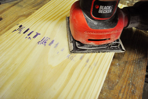
One potential challenge with lumber like this is the prints and stamps that come on them. We ended up using only the sides without marks, but if that weren’t the case we could’ve just used some extra sanding elbow grease to buff out the ink. But thankfully the other sides were just fine.
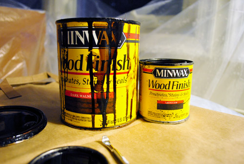
With everything sanded, we brought the boards into the sealed-off sunroom so I could stain them. We decided to use stain we already had on hand (leftover from the console project, actually I think it was from another project before that one) and ultimately decided to use the dark walnut and not mix in any of the ebony this time. Although we had done a combo of the two for the console, we weren’t really going for that same weathered / distressed look. Instead, we were trying emulate the deep, rich finish of our dining table.
So as usual, I brushed on a coat of the stain with a paintbrush (and a mysterious gloved hand)…
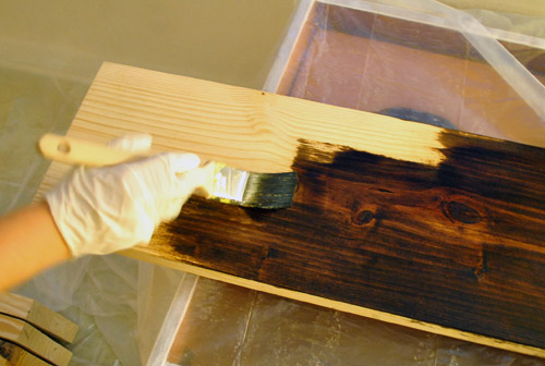
…and then wiped it off with a rag after letting it soak in a for about a minute.
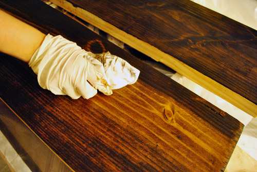
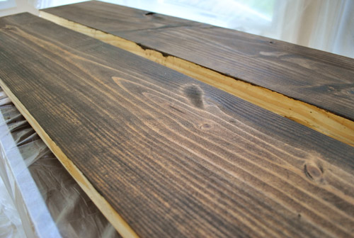
Once they dried overnight, we were left with these beauts (I did the staining at night and shot these after photos in the morning, hence the different look/undertones – you’ll see the actual finished look later in the post though).
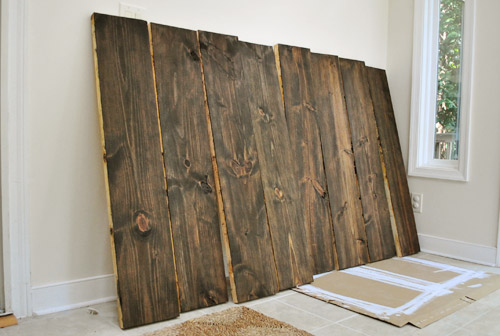
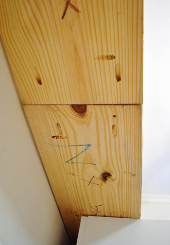
John’s original plan for building the counter was to recreate his process for the console top, just on a larger scale. That meant using his beloved Kreg jig to screw the boards into one another side-by-side so they became larger sections that he could then piece together on top of the base cabinets. But after going to town with his jig on a few boards, he realized these heftier boards weren’t gonna jive with that plan – especially when he had a seam straddling two cabinets. You can’t tell from this picture, but this set up was a bit wobbly. And a wobbly desktop (or something uneven that made our laptops wobbly) wasn’t the goal.
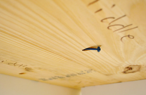
So he adjusted his approach to focus on screwing the boards to the cabinets first, and then to each other wherever necessary (for added support). It wasn’t a bad alternative, it just meant a lot more cramming his body into the base cabinets to drill screws up into the bottom of the counter planks while I leaned on things to keep them in place from above.
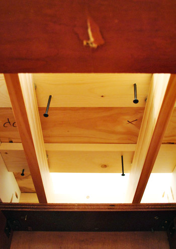
True to form, wherever he could, John used his pre-drilled pocket holes to secure the pieces to one another for added strength (did I mention the man loves his jig?).
Perhaps our favorite discovery of the day was realizing that our camera tripod could double as a great jack-substitute to keep the boards level while John screwed them together (this was a lot more precise than me standing there and trying to hold them at a consistent height). They make a good counter-building team, John and his trusty tripod.
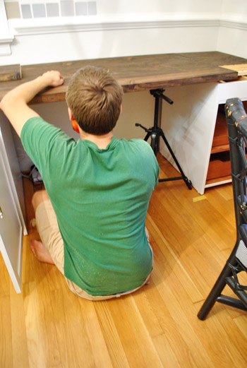
The brevity at which I’m recounting this process makes it seem like it was fast and easy. It wasn’t. You know we like to keep it real, so the counter install (not counting a few hours of sanding/staining) took us the better part of an evening – maybe around four hours? And it was relatively exhausting, especially to poor John who was doing the bulk of the lifting and contorting himself into the base cabinets to drill. The most frustrating part was realizing that our boards, like most, weren’t all perfectly straight. So we had to do our best to counteract/deal with the whole slightly warped thing (once we screwed them down/together in a few places they seemed to level out, but it took some finessing to make sure the tops stayed level as we went).
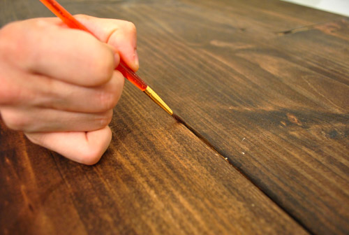
But eventually it got done. Though it did teach us a lesson in staining: be sure to stain about a centimeter over each edge, even if you don’t think it’ll be visible, since some of the tiny cracks between where the boards met revealed slivers of unstained wood. Luckily it was nothing a little stain touch-up with a small brush couldn’t fix (I dabbed it in there and then wiped the seam with a rag to blend it).
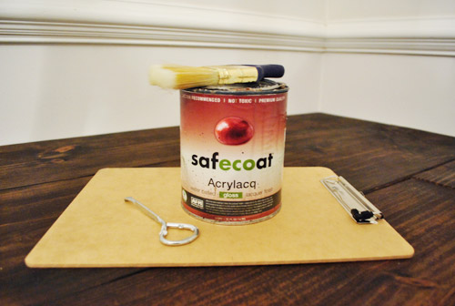
With the touch-ups dry, I later added three thin coats of our favorite non-toxic low-VOC poly alternative (Safecoat Acrlacq). This is the can that we originally bought for our bathroom vanity project over a year and a half ago and it’s still going strong (we use it for almost everything).
The Safecoat seal will not only protect the finish and add lots of long-tern durability, but it also gives the wood a richer glossy look – just like our nearby dining table.
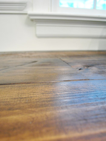
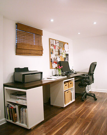
Once we’d given the whole thing 24 hours to dry, it was time to take her for a spin. This is what our new desktop looked like empty…
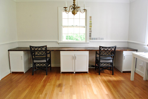
…and here she is with some “styling” (come on, do you know me at all? I love to put a bunch of stuff on newly completed projects – just to help us get a sense of what it might look like when it’s in use). Of course everything was just shoved there in four minutes so it’s safe to say that nothing is permanent and I obviously want some larger art to actually hang on the wall (which we still have to paint, hence the swatches) and a bunch of other things will likely change/evolve as we actually get into using our new desk.
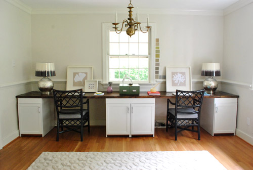
And yes, I borrowed the lamps from the console table in the living room and added some fun shades that I spotted at Target (they still have the wrapping on them, which is why they’re so shiny). But eventually we’ll have to grab two more lamp bases for in here (where we might keep the two-toned shades – we’ll see).
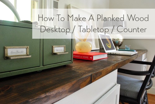
We’re so happy with how the office looks from the dining room. The wood top ties right into the wood table and doesn’t look weird with the white topped built-ins in the foreground. Whew.
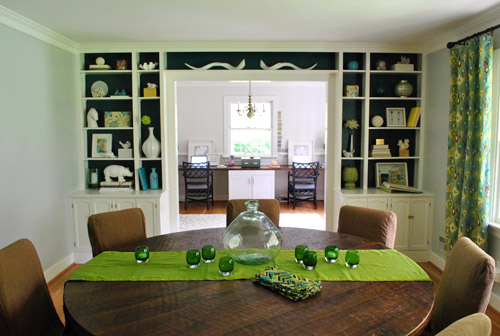
And the chunky wood top is such a rich counterpart to the white cabinets, we really couldn’t be happier. Oh and see that vintage green library box (found for $4 at a thrift store a while back)? That’s our new drawer system for pens, pencils, tape, and scissors – so the file cabinets are full of larger things (like the shredder, some storage boxes, etc). So far it’s all really functional- so I owe you a photo of the insides of those cabinets once we’re more settled in.
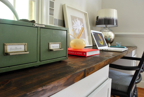
Oh and as for writing things down atop a wood plank counter, there are a few seams, but they’re four feet apart and the boards are nice and thick. We also generally use notebooks and notepads anyway, so getting bumps and lines when we write isn’t an issue. In fact in the square foot of counter space to the right of each of our laptops there’s not a single seam cutting through – so any pad or piece of paper could be written on easily without any seam-conflicts. Which is a nice accident because we just laid the boards in a staggered zig-zag pattern and they happened to fall without any seams to the right of our computers. Holla.
Overall, the current setup (although the “styling” is ever so un-permanent)…

… is definitely an update from the old office setup (you can read more about the floor-planning process here). Only now do we realize how cramped that desk really was:
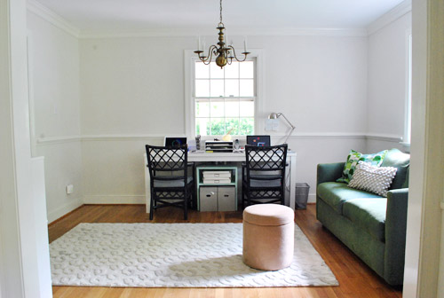
Of course we’re not 100% done with things. We still want to put some sort of molding around the bottom and sides of the cabs to give them a more built-in look. Plus we’re still not sure if we’re gonna stick with the shiny silver hardware finish that came with the cabinets (of course I’ve thought about ORB, but don’t know if that’ll look too matchy with the black glass pulls on the file cabinet nearby- I’ll keep you posted though). Even with those little things still on the to-do list, our budget’s looking pretty darn good for the ol’ wall to wall built-in desk project:
- Cabinets (from Habitat For Humanity ReStore): $6.30
- Kilz Clean Start No-VOC Primer$0 (leftover from painting the kitchen paneling, but it would be around $20 to buy for those wondering)
- Electric sander & sandpaper: $0 (already owned, but would be around $25 to buy)
- Benjamin Moore Advance paint (in Decorators White, satin): $40 (thanks to 10% off haggling/begging)
- Pre-primed & unprimed wood to build up cabinets (from Home Depot): $51
- Framing lumber for counter (from Home Depot): $27.30
- Stain & poly for top: $0 (already owned, but would be about $8 and $20 respectively if you didn’t have any)
- TOTAL: $124.60
We’re psyched, especially since a white laminate counter from Ikea that would span the 13′ length would be around $125 on its own (not counting any cabinetry, paint, etc). But of course just like any upgrade, our new desk is making the rest of the room look terrible. Haha. We need wall paint. And window treatments. And to actually update the chipped navy chairs that we grabbed for $35 a while back. And art. And a chair for the corner. And a lighting upgrade. And about a million other things. But thinking about everything at once gives me hives. One step at a time is the mantra these days.
Has anyone else out there gone with a wood topped something (be it a desk, dresser, kitchen counter, etc)? Do you do things backwards (like build a desk before you paint the walls)? Do you find it hard to resist stroking and talking lovingly to lumber at the home improvement center? I gotta get a handle on that.
Psst- To follow our desk makeove from the beginning, here’s the post about office floor planning, the post about finding our $6 cabinets, the one about other places we looked, the post about sanding and priming the cabinets, and the post about painting and building up the cabinets before adding the countertop.

Oona says
It’s great! I think the dark top looks amazing through the dining room entry and it ties together the wood tones you’ve got going everywhere else. I really love those lampshades too! I may have to go snag a pair, even though I don’t even have enough room for all my lamps in my new house. Boo.
I LOVE the symmetry through the wide DR doorway!
Cait @ Hernando House says
That looks great! Glad I’m not the only one who feels the need to style things immediately after finishing.
Latoya says
Man I love this desk! You both did a great job:)
beckie says
LOVE, LOVE, LOVE it!! Great job and cant believe how cheap it was to get that nice looking of a desk :) Keep up the good work and great posts S and J!
Liz H. Nunez says
I love it!! Congratulations. I have a quick question, are you going to put casters on your chairs?
YoungHouseLove says
I’m not sure but I don’t think so. We’ve used them at this height for the past 8 months or so and really think it’s perfect for the desk height. And I worry Clara will just want to spin/push us around all day if we’re on wheels. Haha.
xo,
s
John@OurHomeFromScratch says
Nice!! Love the thick egde and the dark stain. Plus it will look imperfect due to the softwood and thru general use. You’ll probably need to repoly it every few years to keep it up. Two thumbs up!
YoungHouseLove says
Yeah, I figure I’ll just repoly things every few years if they need it, just to keep it protected and shiiiiiny. Haha.
xo,
s
gina says
Love how it turned out! You guys really inspire me! Also, I love the lamp shades! where are they from?
YoungHouseLove says
They’re from Target. Still haven’t even unwrapped them- hence the shiny plastic. Haha.
xo,
s
Blerona says
OMG i Love! i can’t wait to get my own home, your blog will be my go to source for styling my home! So talented!!!
http://www.fashiontres.com
Amanda @ Our Humble A{Bowe}d says
I too love the contrast between the white cabinets and the dark wooden desk top. I think it’s great that you were able to make something, and it looks great. We had a problem finding something long enough when we built my office desk, too. That’s part of the reason we have the lower marble desk top with the higher wooden counter. http://ourhumbleabowed.wordpress.com/2011/05/18/a-finished-office/ The height allowed us to have three different pieces, eliminating the long piece.
YoungHouseLove says
That office looks so great Amanda!
xo,
s
Gina @ Running to the Kitchen says
I love how it came out, looks great! The view from the dining room looking in really makes it look like the space is coming together!
K says
As someone who works from home occasionally, I’m crazy jealous. It is so lovely!
Devon @ Green House, Good Life says
Love it! Maybe apple green will finally make an appearance on the chairs?
YoungHouseLove says
Ya never know…
xo,
s
Emily says
Another vote for apple green desk chairs! I had the same thought right when I saw the “after” picture. I think it would look especially amazing from the dining room, pulling in some color from the (amaaaaazing) curtains.
Jess @ Little House. Big Heart. says
It looks great! Definitely a place I’d want to work. Now I just need a job that lets me work from home.
What are you going to do with the chandelier? It seems a little… out of place.
YoungHouseLove says
Oh yeah that sucker is outta here (it hangs so low we hit our heads on it). Or we’ll spray it/make it over. Not sure yet. This room used to be a dining room so it’s a leftover. Haha.
xo,
s
Meredith says
I might be going crazy, but I think $6.30 + $50+ $41 + $27.30=$124.60, AKA $10 cheaper than you have shown. Whatever it cost, it looks great!
YoungHouseLove says
Oh man, you’re right! Math = not my strong suit. Off to fix that.
xo,
s
Kristen @ Popcorn on the Stove says
I love the counter – it looks amazing! And I can’t believe how little it cost you guys. Wow!
pam says
LOVE LOVE LOVE it!!! :) You guys rock! When I watch “budget” design shows I’m always thinking “YHL could do such a better job with that budget” LOL Great job!! I am in loooove with this desk :)
Staci @ My Friend Staci says
I always think that too!!
JennyB says
I think that all the time, too! I also think YHL can do it better AND it looks more expensive:)
Erin J says
I love, love, love the desk. I couldn’t have imagined it looking any more perfect for that space and your home. You guys have incredible vision.
You know… you could ORB that light fixture in 5 minutes and it would be a huge improvement until you decide what you want in the room. :) Ya know, from one ORB-loving girl to another.
YoungHouseLove says
Haha, I’ve thought about that. And considered a few other colors/tweaks to change that baby up. We’ll have to see where we end up!
xo,
s
Lori Wojciechowski says
You should spray the light fixture apple green :)
YoungHouseLove says
Definitely another possibility!
xo,
s
Claudia says
LOVE LOVE LOVE it – it turned out wonderful and I love the contrast in colors!
Jenn says
Fabulous, just fabulous. Your blog is the perfect start to my day, filling me with ideas that have a realistic budget. You two ROCK!
annabelvita says
Oh my gosh I love it ! Such a beautiful colour stain and the two-tone look is awesome in that room. Good stuff. We briefly had a wood topped desk (http://annabelvita.com/desk-jockey), but never used it so traded it in for more dresser space (in our teeny flat storage trumps unused desk space, sadly).
Kate says
I really like it! I’ve always been a fan of the “dark top, white bottom” look on furniture. Have you officially moved the sofa out of that room? I don’t see it in there, but maybe I just missed that update.
YoungHouseLove says
Yes, it’s sitting in the dining room. Haha. We’ll have to find a better spot for her (him?) soon.
xo,
s
Shauna says
I love you guys!! what an amazing desk..
Beverley says
Isn’t it amazing what a bit of styling can do for a room?! I’ll admit that I wasn’t totally loving the desk at first, but adding some desk items/art makes it look great. I especially love how it looks from the dining room table. Great job!
Rachel says
Loving the contrast and particularly how it “views” from the dining room. To complete the look of built-ins have you considered floating shelves above the desk on either side of the window?
YoungHouseLove says
Yup, that’s definitely one idea we’re bouncing around. We figure it should be something we love to look at since we work a lot – so we’re not sure if a shelf or art or art on a shelf or something else entirely will make us smile the most.
xo,
s
Shannon says
Looks great. One problem: my husband might kill me. I want to do this so bad now! I work from home and my office furniture doesn’t really fit in my new office!
Allyn says
I love a big piece of wood (that’s what she said). Seriously though, would love some butcher block countertops one of these days.
oh, and the hubs said he got the ORB to paint a ceramic owl he has yet ro find, knowing my love of birds.
Love him!
Kelly says
I’m inspired! That looks fantastic! I’m always impressed with your DIY projects and refer to your site frequently for inspiration and tips. I have been staring at my thrift store pedestal dining room table for over a year now. It desparately needs a makeover. The top is a stained blonde wood which I was hoping to refinish (either stain or paint) for a darker richer look. Would you recommend the same poly? I have young kids and the table does double duty for arts and crafts.
YoungHouseLove says
Yes, it’s the only stuff I use! I love that it’s non-toxic (especially good for a dining table!) and it’s thin and easy to work with!
xo,
s
Usha says
Is the Minwax stain non toxic and/or low VOC too? Or is it rather fumey?
YoungHouseLove says
Minwax is oil-based, so it’s high VOC and toxic. That’s why I prefer to do that stuff in the sealed sunroom and let it cure a bit. Once it’s sealed with the Safecoat stuff it lessens the offgassing so it’s ok inside again!
xo,
s
Alisa says
LOVE it! You can’t go wrong with the white/dark wood combo.
Erika says
This reminds me so much of the desk my mom made several years ago with some white bookcases and a door as the top. I love it! (And I totally agree that the stained wood was the better choice!)
Nicole says
Love the desk! And it’s giving me major ideas for my husband’s new office. Any chance you could give us an overhead shot of the counter? I curious to see how you staggered the boards and how it looks above. Great work you two!
YoungHouseLove says
We’ll have to try to take some overhead shots of it for future update posts. Maybe once we settle on what will actually stay on the desk and get lamps, etc.
xo,
s
Jesse says
I’m also curious how you staggered the boards for the 13′ length! I was thinking, was it 5′, 5′, 3′? then the other rows, 4′,4′,5′? So that each board hits the cabinets in at least 2 spots?
So curious!
YoungHouseLove says
You can actually see how we did it here in this post (we highlighted the joints): https://www.younghouselove.com/2011/09/a-little-weekend-officepainting/
xo,
s
Sara says
I love the way this desk came together! As always, you two are so creative! I also love that you already have the new Design*Sponge at Home book that just recently hit stores – I need to get myself a copy of that ASAP!
On another note, last night I put together a smaller version of Karl (sofa + chaise lounge) after being absolutely inspired by your love of it. It’s only been a day, but we couldn’t be happier! Thanks for the inspiration!
YoungHouseLove says
Aw, enjoy your Karl! And the Design*Sponge book is awesome! So inspiring.
xo,
s
Sara says
The desk / office space is awesome! And the view from dining room to office flows really nicely.
Samantha says
Looks wonderful!
The pulls definitely need to be darker- would more of the little black glass pulls not be a possibility?
YoungHouseLove says
I really love the idea of those but just worry it’s too matchy-matchy. Not sure where we’ll end up, but I’ll keep you posted!
xo,
s
threadbndr says
I actually think the ORB on the handles is the way to go. It will tie into so many other pieces in your home and keep the ‘dark handles’ thing going in the office without matching the glass handles on the file cabinet exactly. The difference in materials and size will keep it from looking “matchy” IMHO.
YoungHouseLove says
Thanks Threadbndr! We’re definitely considering it!
xo,
s
Catherine says
It is absolutely gorgeous! I’m curious about how movable the desk is. Will it be completely “built-in” with the moldings added or will it be able to be carefully slid out if you wanted to paint behind it or sand the floors?
YoungHouseLove says
We think the bases will be moveable and the top will be slide-out-able, although it won’t be a ten minute process so we won’t do it very often (maybe just to paint or possibly to refinish the floors someday).
xo,
s
Cara D says
I love it with the wood top. Looks great!
Jamie R says
This looks great! Have you thought about adding a fake “front” to the extended space above the doors? It may just be the photos, but they look like they’re just kind of stuck on there. How far does the lip of the top stick out? Seems like the kind of thing that would bother my OCDness but different strokes. It really does look amazing though.
YoungHouseLove says
We did think about adding fake drawer fronts but actually don’t mind things without them. If it bothers us we can pop those on though! As for the top lip, we did a half-inch overhang and really like how it looks.
xo,
s
Melissa @ HOUSEography says
Looks really great. I love how the wood tones really tie in with the dining room table. A great price for the overall effect. Definitely getting ahead of things, but if you do the banquette in the kitchen, maybe the top of that should also be a similar treatment… Again, WAAAAY ahead of things! Can’t wait to see what color you paint it!! Is it possible to pull it away from the wall at all to paint? Doesn’t look like you attached it directly to the wall.
YoungHouseLove says
Haha- it’s definitely something to think above- we love the dark wood thing these days! As for sliding it out, yup it can come forward to paint and then be pushed back.
xo,
s
Shannon says
I love it!
Jennifer says
It’s so beautiful! So, when you paint will you do the whole room or just above the chair rail?
YoungHouseLove says
Whole room I think. Not 100% sure though…
xo,
s
Diane@InMyOwnStyle says
The desk came out great and is so much better looking than a standard desk. Now, I think Clara needs a little mini version so you all can have your own chair and desk space :) I love how it looks through the doorway pass through “view” from the dining room – very nice!
My best- Diane
YoungHouseLove says
Haha, we thought about how to work Clara in and think that a big chair for reading (and for Burger to hang out on) might complete the room for now. Then later when she’s more into desk stuff (she doesn’t really sit on chairs or color yet) we might make a mini work area for her too – although we’re debating adding that to the living room or sunroom or playroom instead.
xo,
s
Lindsey says
Looks really great! I bet it will be a nice place to sit and work. One question though… Can you move the whole unit when it comes time to paint the walls? Or will John have to fold up like a pretzel again to get in behind the desk? Can’t wait to see what else you do to the room!
YoungHouseLove says
The counter can be slid forward pretty easily, so we can paint the back wall and will just have to tape off the sides or use a small brush.
xo,
s
Adriane Wacker says
Looks awesome without spending too much moolaa. I saw those lamp shades at Target, and I have to say I love them in the space, although you could do a pop of color for the lamp ( say orange?) just a thought! Great Job!
YoungHouseLove says
Yeah, I’m not sure if they’ll stay since so much of the room is undone (we don’t even know what wall color or window treatments we’ll use) but I do love the idea of a pop of orange!
xo,
s
Blythe says
I think this is one of the best things you’ve done yet! Just gorgeous… and what an incredible deal!
Holly@Loveoflifeblog says
great job- looks amazing! I love the depth and warmth teh dark wood stain brings to the room. Provides a good balance I think. Well done!
Melanie says
Looks great. You did the counter top I was hoping you would choose. :p Hmm… I’m thinking, depending on the art you hand, some taller lamps would look really nice in there to add to the sense of height since you have such strong horizontal lines going on with the built ins. Of course, I know it will be well-styled by you two.
YoungHouseLove says
Yeah, I’d love some taller lamps since these are just borrowed from the living room. Here’s hoping we find something perfect! And cheap. Haha.
xo,
s
heather aka moreygirl says
That looks so good! I am definitely going to use this idea in the future…oh, who am I kidding? I generally stop by your blog just to see what to do next:)
Melanie @ Mailbox Journey says
Love the wood top!
Kristen says
Wow you guys, you did an awesome job with this as usual!
I’ve also just had a head-smacking moment…our house has a built-in desk (very similar to yours now, actually) and the builders just painted the top white (which of course does not quite match the cabinets underneath). It’s always bothered me (for the past 6 years!) and duh, why didn’t I think I replacing it (it’s not the right thickness anyway) with stained wood with poly over it?!
You guys are just so awesome (and inspiring)! I’ll be adding that to our list of things to change in our office! :-)
Julia @ Chris loves Julia says
This is so timely! Chris and I have been figuring out how to diy a big corner desk in our in-progress office/guest room. Now I just have to figure out how to make what you made….in L-shaped form. :)
Robin @ Our Semi Organic Life says
How do you get the poly coat so clean and smooth? We’ve used similar ones and always get tons of bubbles each coat. Maybe its the brush we’re using? Do you have to sand between coats?
YoungHouseLove says
It’s the poly. I am obsessed with it Robin. You’ll love it! I think you can only order it online in most places, but it’s so nice and thin and not bubbly at all. I apply it with a regular old brush and give it some drying time between coats. No bubbles!
xo,
s