Here’s a little behind the scenes Friday bid-ness. Remember us saying how we recently debated how to best share our house hunting experience while still respecting the privacy of the sellers’ homes we were critiquing? And how we finally opted to share only a doctored image of the exterior, like this one below?

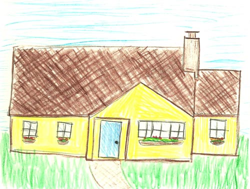
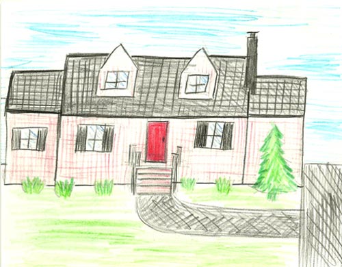
Well, we actually came to that solution only after this sad first attempt to disguise each home occurred:

I love my wife. And I think she’s very talented. Really. Especially with her cute drawings of our home’s floor plan and our lot (both of which came out really well). Which is why it wasn’t easy to look her in the eye and tell her that I didn’t think her crooked colored-pencil “interpretations” were, uh, the way to go.
Luckily for me, Sherry took one more look at them and cracked up. Then we turned to our trusty friend (you may know him as Photoshop) for the job. Oh and we used the Paint Daubs filter to work our blur magic. As for how it all went so terribly wrong, Sherry blames Danielle Staub (she was catching up on some Real Housewives reruns while getting her colored pencil on). That beeyotch ruins everything.
So that’s our little behind the scenes Friday outtake for you. Have any of you had to resort to Plan B after Plan A was an epic fail?


Ami @ beyondpeasandcarrots says
hahaha aww I like your drawings Sherry.
Katie says
Hahaha, thank you for the Friday laugh! So cute :)
Shreya says
That really put a smile on my face :)
I think Sherry’s illustrations are actually pretty true to life and since protecting the privacy of the owners was an objective – they definitely achieved that!
Sara says
LOL! Danielle DOES ruin everything…although Sherry’s drawings are a lot nicer than mine would be:)
Allison says
Awwww poor Sherry! But I agree … I don’t think the pictures would have done the houses that you went to see justice. :)
jbhat says
At first I was thinking that your little Clara is very advanced for her age.
jbhat
YoungHouseLove says
Haha, I know, right?!
xo,
s
lizkayl says
I think Sherry’s drawings are perfectly fine- I can match each house from the drawing with no problems. It’s definitely something I would have done.
The only difference is the blurred photos gave us an idea of the condition of the house and the age. Colored pencils don’t quite convey the nuances needed.
Oh well! Maybe next time.
samantha says
Plan A was to make a perfect, 2 layer pineapple upside down cake for Easter. The 1st layer came out beautiful, the second layer, thanks to my lack of convection oven knowledge, was still batter inside. However, I didn’t know this until I flipped it onto the first layer. After having a short break down (sitting on the kitchen floor crying like a 3 year old), I succeeded in scooping up the majority of the batter off, and covering up the mess in toasted coconut and pansies. It was still delicious and actually ended up quite pretty.
brandt @ New House on the Blog says
jbhat wins the comment of the day.
Though I must say, the drawings aren’t half bad. And aside from the crookedness, the lines look pretty straight. +1 to you, Sherry!
Beth@Just{Heart}It says
I just posted about that exact thing on my blog this morning!
And BTW, I know you’re going to miss your backyard. Does it make it even harder knowing you’ll not be free to go back to where you got married? I dunno – I got married in a church and I’ve never been back there (13 years ago), so maybe not.
YoungHouseLove says
Hey Beth,
Yeah, that’s kind of what we figure. Most people never get back to their wedding spot, and we’ve had the opportunity to enjoy it every day for the past three years so we consider ourselves lucky just to have had that time with it.
xo,
s
Rebecca @ the lil house that could says
This is awesome. I love to doodle with colored pencils and shared one of my planning doodles on my blog…. which now makes me cringe. I think the colored pencil sketches look better in person. Right?
At least your houses are consistently angled! :)
Snickrsnack Katie says
UGH when I read that title and saw a picture of a house, I thought you were going to say that you had to go back to the drawing board with finding a house. I figured something fell through. YOU SCARED ME! :)
LOL, well I love Sherry’s little drawings.
Barbara says
There’s a little lack of perspective, but I must admit the details are very accurate!
I discovered Real Housewives through your blog, I think I’m going to look for some episodes on the web. Ah, being Italian and not knowing Teresa Giudice is such an shame.. :))
Laura says
Bahahaha! Sherry, you’re cute! I like your drawings even if they are crooked.
Nicolette {Momnivore's Dilemma} says
I think your solution is fantastic…you all also could just shoot extreme close-ups of areas of those homes as well.
Our Plan A was to flip our “estate” in 2 years (we bought before the bubble)…and now 7 years later, Plan B is underway…with 2 kids in an 1100 sq foot two bedroom with a layout from the Donna Reed era.
I think the boys sharing a room is hilarious though. Even if we score a bigger home (the estate may go on the market soon)…I think I will still bunk the boys.
And bedroom 3 will be my mom cave…
Sherry- I think you have mad skills with drawing. Hey, I am an expert; I used to teach K-8 art in Chicago Public Schools…
Mike @HA says
How much would you charge to draw our house?
YoungHouseLove says
Hahaha. Very funny.
xo,
s
Laurel-Dawn McBurney says
This post is too funny! I love the slightly “off” house drawings- they’re sweet! I have definitely had an epic fail with my DIY drapes in my living room. I find it’s even MORE embarrassing when you are a blogger… haha- Check out my fail, as well as my better solution, Plan B.
http://abodelove.blogspot.com/2010/09/im-just-not-that-into-you.html
Thanks for sharing! Happy Friday!
Jessica says
I dont hate em! I like the photoshopped pictures better, but I wouldn’t have been disappointed with those drawings!
Angela says
Hilarious! I can just imagine John trying to break the news to Sherry. Thanks for sharing!
P.S. Can I just tell you how happy I am you got rid of the polls EVERY Friday. I like these type of posts much better.
Teresa@Where In the World? says
Feel no shame Sherry. Your crosshatching is top drawer. I have to use graph paper. And then I still get it wrong.
Though if you take as long as I do, the photo shop approach was more realistic depending on how many houses you guys would have ended up featuring!
I cannot imagine trying to draw the huge gray house.
Patti says
You crack me up! I’m sitting here laughing…not only at Sherry’s attempts…but “bid-ness”! (my son, in a COLLEGE application listed his father’s occupation as “business man” so we started making fun saying dad’s a “bid-ness man” … i guess ya had to be there) anyway, and the beeyotch Danielle. Nice try Sherry!
anna says
Whahaha… By the way, you scared me when I read “Back To The Drawing Board”, I thought the deal on the new house had fallen through or something. Luckily it was about these cute drawings ;-)
Mindy says
This is coming from art teacher. Your drawings are great! So cute = )
xo
Mindy
https://fisilis.wordpress.com
Elisa says
I so prefer Sherry’s drawings!! :)
Cait @ Hernando House says
I like them! That would have been fun, but I guess maybe the Photoshop versions do give slightly more detail about the style of the house.
molly says
Oh my God. Hilarious. Am I the only one who thinks you should have taken this route instead? It’s much more colorful and entertaining :)
Hannah says
I’m with @Snickrsnack Katie, when I saw the title of the post and a blurry photograph, I assumed the worst! So I was glad to see there was no bad news in this post.
I probably would have posted an image of each house taken from google street view, that way you’re not giving away any more than is already out there.
Carey says
Oh, I love this post….on so many levels. Funnies post EVER. :)
Nikki @ thelovelyresidence.blogspot.com says
Danielle Staubs makes me a little crazy too, but I can’t get enough of her.
liz @ bon temps beignet says
Lmao at the Danielle comment. I love love love to hate that beeyotch.
Sara says
Oh my goodness…this post is hilarious! I love it. I think you should have gone with Sherry’s drawings, they’re good!
Jackie says
You guys are too cute.
malibou says
I appreciate discretion.
I love how it looks like the pine tree is gettin’ one mad groove on.
Amy N. says
The Real Housewives reference made me laugh out loud :)
Rose says
Although the Photoshopped pics look a little nicer than Sherry’s drawings (sorry!) I think that the colored pencil pics were the way to go for privacy. I can see way too much of the houses when they’re just a little blurry. But someone pointed out that Google Maps already shows this stuff anyway, so I guess there’s not much left to privacy anymore anyway.
Lauren says
Haha, adorable! It’s definitely better than anything I could have drawn. I’m so excited for you guys to move and start renovating your new place!
sonya says
Sherry, I have to tell you that I was at Homegoods the other day and they had some pretty awesome white ceramic-looking reindeer in the Christmas decor! I feel like this sounds a little creepy since I don’t know you personally, but I thought “I know of someone who would go bananas over those!” Haha! They were actually made of iron I think but coated in glossy white so I thought they were ceramic at first glance. They were easy to spot in a sea of gaudy and glittery deer they had on display!
YoungHouseLove says
Mmmm, sounds like something I would love to add to my collection…
xo,
s
Nichole@40daysof says
I love that you are both such good sports. Way to take one for the blog, Sherry!
http://40daysof.wordpress.com/2010/11/12/hamburger-pie/
Laura B. says
Good to see NYU’s art program isn’t tough to get into! ;). KIDDING. I am sure you are very talented!
YoungHouseLove says
Haha, I guess colored pencils just aren’t my medium!
xoxo,
s
p.s. I actually went to FIT, a SUNY art school in Manhattan (Chelsea) and got my BFA in advertising there (after taking two years of Fine Art training)- but many people assume I went to NYU though! Either way these drawings do not do my education proud- that’s for sure! Haha.
Keri says
I think you should have posted both! The blurred version AND Sherry’s drawing. At least the drawing doesn’t make me feel like I need glasses lol
PS: I was really hoping we would get to see more pics of the new house this Friday but I understand the whole waiting thing. *sigh*
Brittany says
I love these drawings. So cute :)
amy says
S,
FIT as in Fashion Institute of Technology?
amy
YoungHouseLove says
Yup, that’s the one!
xo,
s
amy says
thats cool, my sister went there many moons ago.
a
Tiffany says
Good luck on your house hunting!
XOXO,
http://outfitidentifier.com/
Erin @ Two Story Cottage says
Those drawings are so something I would have done. :) Fun though. We actually commissioned a painting of our first house. I found the artist online (really reasonable) and she did an amazing little canvas rendering based on a picture. Something to think about with the holiday season coming up! I always get a lot of comments on it. We plan to get one done for each house we live in.
Jessica says
So.. I know there were blurred photos of the houses you checked out, but was there ever a blurred photo of the one you guys are buying or is this a COMPLETE surprise? Oh I cant wait!
YoungHouseLove says
Yup, here’s that exciting post. We actually unblurred that pic at the bottom. We’re crazy like that!
xo,
s
Jules says
If this post reflects what you guys were talking about a while back when you described wanting to loosen up with your posting and have more fun…me likey. :)
Lonely Wife Project says
It would have been HILARIOUS if you posted those! I love them.
Vonda says
OMG, I just snorted at your last line (before the question) AT WORK. Y’all are funny. Happy Weekend!
Kirstie says
Actually, I think you could have gone with the drawings – they convey what each house looked like and have the all important personal touch!