For all those wondering when the heck we’ll tackle that kitchen banquette idea that we mentioned a few weeks ago (here and here), well… probably never. Cue the frowny face emoticons.
Here’s the deal. After getting lots of positive feedback on the idea a few weeks ago (over 1,400 comments total!), Sherry and I were certain your collective enthusiasm would push us from “we think this is a good idea” to “this is definitely a good idea.” And it nearly did. But parts of us still questioned the whole commitment-factor when it came to actually doing it (we definitely described it as a half baked idea when we shared it). We worried if it’d really be the most practical solution (would it be a pain to scoot in and out of?) and if it’d really make the most of the space (we couldn’t figure out the right balance of big-enough seats while still maintaining flow around it to keep it from feeling cramped).
So one evening we decided there was a reason that we were stuck in Hesitation City: it just wasn’t The One. So we did what we always do when we get stuck. We went back to the drawing board to see if we could come up with something else that we ended up liking better. We made a few quick sketches of the floorplan, asked ourselves “what are we not thinking of???” and just started sketching ideas – no matter how good or bad our guts told us they were. Kinda like those DON’T THINK, JUST DRAW exercises that they teach you to access your subconscious or something. Of course some of them completely blocked the doorway to the dining room (fail!) and nearly all of them were completely out of scale (so things were too big or too far over) but it definitely got the ol’ wheels turning again…
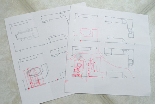
We tried returning to some version of table in the middle (top left) and even modification to the banquette (top right, bottom left). But somewhere in that mess we had one of those “Ah-ha moments” that ol’ what’s-her-name used to talk about on the TV (this is a joke for my Oprah-loving wife). So allow us to introduce the banquette’s successor: the peninsula! Cue the confused emoticons.
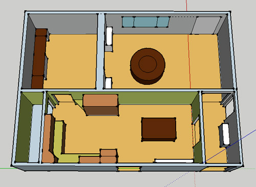
Let’s explain. First, here’s our CURRENT floating-table-in-the-kitchen-and-larger-table-in-the-dining-room arrangement (courtesy of my rough Google Sketch-Up drawing):
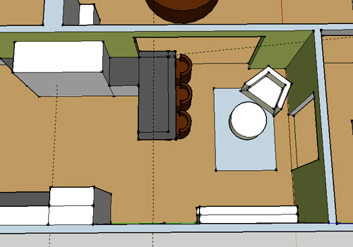
Now for the doorway opened, cabinets painted, counters replaced, floor slightly discolored (not intentionally) and (of course) peninsula’d version:
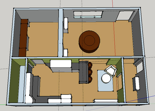
Woo hoo. Before we go any further, we should warn you: we’re 100% sold. The above depiction of it is probably not going to make a believer out of everyone, but from taping it out in the space and moving around it “in person” for a while we giddily came to the following conclusion: it’s The One! So no worries if it’s not your jam or you love Mr. Banquette (he was a lovable guy – and there are always gonna be people who would do things differently if this were their house) but we’re definitely going for it. And we can’t wait to get started.
As for why we didn’t come up with the peninsula idea sooner, we were so stuck on the fact that a peninsula coming off of the cabinetry that we already have would actually hit (or come very very close to hitting) the fridge on the other side of the room. So it wasn’t until we came up with the idea of adding a base cabinet to the right of the cabinetry that we already have to space the peninsula further away (a smidge towards the fireplace) for better flow and even more counter space.
Speaking of counter space, when it comes to executing this whole thing, we’re basically planning to add some base cabinetry (and counters) near the opening itself to create a counter-height peninsula. Which accomplishes a lot, actually:
- It adds additional work surface & cabinet storage to the kitchen side of the room (so it’s easy-access)
- It helps extend and better define the kitchen space without blocking flow or feeling too heavy
- It creates a casual eating space, keeping it distinct from the dining room table, which is just steps away for larger groups and more formal gatherings
- We can most likely seat four people at the peninsula (it’s flexible, so ignore the three chunky chairs shown)
- It can be used as a buffet to set out food (or to seat additional guests) when we have parties
- It can be used for homework, laptop browsing, and general hanging out by the kiddo(s) as they grow
- It even makes sense of our very off-center fireplace by creating a small casual living space that we’ll use as a little “chill corner” of sorts (the peninsula doesn’t block the fireplace, which our banquette friend did from most angles)
That last perk (centering the fireplace) was a nice surprise, since it’s something we’ve struggled with a lot (it’s just in such an odd place, practically shoved in the corner of the room). But you can see from this virtual view through the future doorway how it almost makes the fireplace placement seem intentional (picture it with a nice round mirror above it to balance that doorway next to it). Oh happy day.
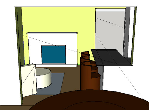
We just love that we’ll get to see the fireplace from the dining room (it won’t be blocked by a heavy banquette) and if overflow guests sit at the peninsula, they won’t have their backs to the people seated in the dining room (which would have happened with the banquette).
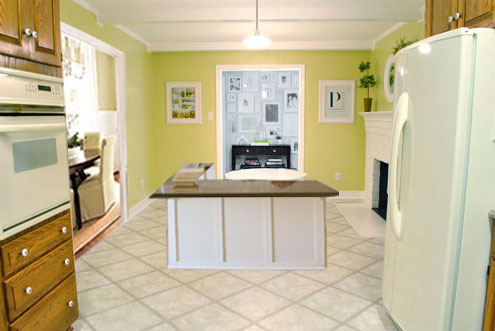
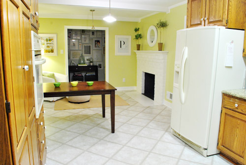
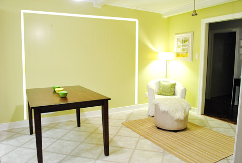
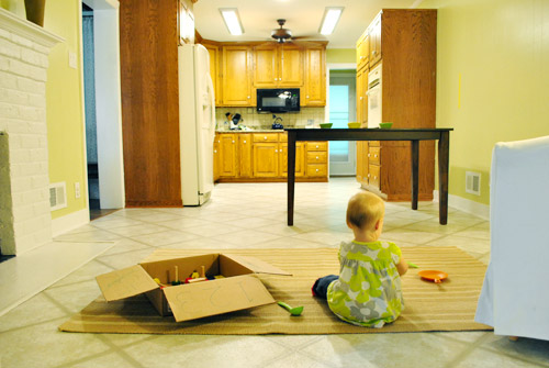
For those who don’t do well with renderings (or are still scratching your heads), here are some pics we snapped to give you a better idea of how it’ll work in the real world. We moved some existing furniture around to mimic the placement (the table represents the peninsula) and have lived with it for the last week-ish to make sure it actually makes sense. Placements aren’t totally exact, but pretty darn close to what we’re thinking. Here’s the view from the laundry room. Ignore the broken pendant light in the far back (it finally crapped out on us). Instead look, there’s that fireplace nicely framed!
We also traced out the future opening (again, not exact) to show how that’ll work too. We’re thinking there will be a little half-wall (i.e. knee wall) where the peninsula meets the open doorway…
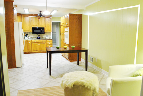
… like we showed in this rendering:

We considered a narrower doorway (where the peninsula doesn’t hang over into the opening) but we think this wider version makes it feel much more open and lets in more light, so it’s the current winner. And of course as previously mentioned, we love how balanced the fireplace and doorway look through the cutout.
Admittedly it took us a little while to figure out what to do with the space in front of the fireplace. It was our biggest hurdle in getting on board with this idea, actually. But after we brought in a placeholder chair, ottoman, rug, and light we realized it was actually completely awesome. There have been approximately 14 hours of reading-with-Clara from that chair in the last week or so. We’re even toying with the addition of some sort of tall built-in bookshelf behind the chair to balance the tall cabinets on the other side of the doorway. Not sure yet, but we’ll keep you posted.
We’ve already discovered it’s a great spot for Clara to play while we’re getting stuff done in the kitchen (since we can’t see her if she’s in the living room, but it’s easy enough to peek over the peninsula to check on her if she’s in the kitchen on the rug).
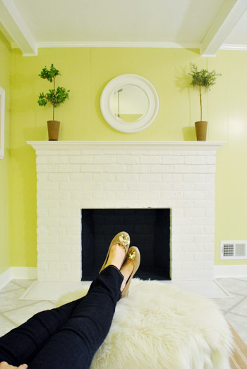
Sherry’s already making plans for how she’ll relax in front of a fire (we’re contemplating one of those convincing modern-looking electric inserts that Candice Olsen uses – possibly even a double sided one if we can eventually open the back of the fireplace into the living room as planned).
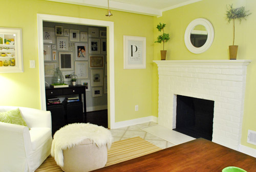
Meanwhile I’m dreaming of a little TV mounted above the mantle so I can watch the news during our morning breakfast routine (Sherry is rolling her eyes as I type this- so we’ll have to see where we land on that). Either way, can you tell we’re getting more than a little excited about this set up? Yup, it’s The One.
The peninsula will also give us 3-ish base cabinets worth of deep functional storage, unlike the largely decorative storage (open 12″ bookshelves) that the banquette would’ve provided. Plus a nice wide 3′ x 5.5′ work surface for prep, serving, eating, and homework is FAR more functional than what we would’ve gained from a distant island or a narrow banquette located a lot further away. And we’re probably gonna use the new counterspace as an excuse to change the countertops in the whole kitchen. We’ve never loved our existing granite color (it has a few pitted/stained parts too), so it seems silly to actually buy more for the new peninsula (we’ve debated a mismatched look, which we like for an island, but for a peninsula it seems like it would look most like it has “always been there” with the same counter to keep things seamless). Of course we plan to craigslist the existing granite and put that money towards whatever we’ll use for the new material (not gonna lie, we’re already talking about DIYing concrete counters).
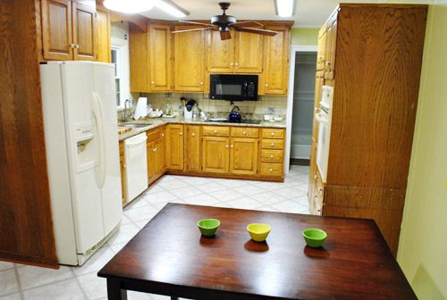
Oh and for anyone debating a peninsula, we’ve learned that the pros recommend 42″ of walking space between the peninsula and whatever’s on the other side (in our case it’s the fridge, which we hope will sink back a foot or so when we replace it with something that’s counter-depth). So that’s how we arrived at our peninsula length.
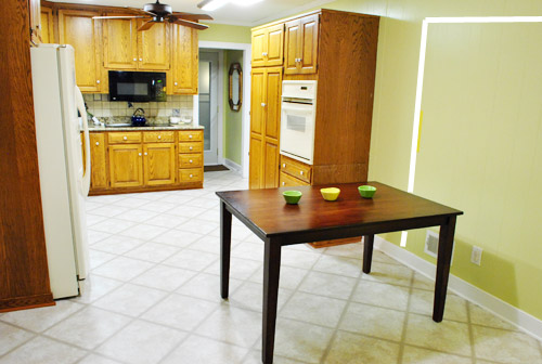
In fact, flow through the room is almost better because there’s one straight pathway through the room, whereas the old table (and the once planned banquette) made us walk in a slight circle. Hoorah for ten less steps a day. Haha.

So now that we’re unequivocally sold and geeky-excited about our new plan, it’s just going to come down to working out the logistics. Namely how to find/build perfectly-sized cabinets that match our old ones without breaking the bank. And finally hire a licensed contractor and get the permits needed to bust out that load bearing wall of ours. But that’s a story for another post. Another ten posts, probably…
Update: You can check out the new “cozy corner” behind the future peninsula in action (on video!) over on Young House Life.
Another update: Lots of people are sweetly suggesting some sort of bookcase or built-in feature on the side of the cabinets that face the dining room (instead of a knee-wall) but we’re unsure if that’ll be too much since there are already built-ins in the dining room that are just a few feet away. We’ll keep you posted as we go though! Who knows where we’ll end up…
Psst: Tomorrow I’m going to post my thoughts on trying Google Sketch-Up for the first time (and how it compares to two other 3D rendering tools I’ve used). So stay tuned for that if you’ve got any questions about how I made the 3D graphics for this post.

Kristen @ Popcorn on the Stove says
Truth be told, I’m glad you guys aren’t doing the banquette! I like this layout much better (I’m a big fan of peninsulas/islands). I think this new layout will make the kitchen more friendly when you entertain guests. I can’t wait to watch this as it happens!!
Cait @ Hernando House says
I’m with Kristen on being glad you aren’t doing the banquette! I think I’m partial to peninsulas because my grandparents had one in their kitchen.
Can’t wait to see this unfold!
RBC says
Yep, didn’t want to be negative when you guys were on the banquette-bandwagon, but I really hated it. This is 100% better! Love!
Mary@The Good Life says
I totally agree with Kristen (I usually do…huh) I LOVED the banquette in theory, but it was definitely a huge floating, blockish structure. Also, I love that you are extending the peninsula into the doorway, because I think it will make people in the dining room feel more connected with those in the kitchen (cause you know at big family dinner things you can never seem to keep anyyone out of the kitchen) LOVE IT!
Tracy says
Ditto! I didn’t like the idea of the banquette facing away from the kitchen. This is going to be awesome. Can’t wait to see it.
Sarah says
Ah-Mazing. Agree with all this that the banquette idea wasn’t my fav. This looks so much better!
Aimee says
I’m with Kristen as well! I didn’t like the banquette – seemed to big and to occlusive (can you use that word related to DIY/home improvement, I think it is a medical term)…lets just say blocking and playing “king of the corner/keep-away (the corner from life surrounding it)”. Love that you can use it as a buffet or whatever. So versatile.
Rachel Witthaus says
Thank goodness I’m not the only one! I think this option will definitely make the kitchen feel ‘finished’ as opposed to an open area with cabinets lining the walls. It gives clear walkways and an eat-in breakfast bar that is really versatile. I also love that it joins the area to the dining room (like a servery area) and one can never have enough kitchen cupboards!
Carol says
Love this version!! I never was sold on the banquette. Can’t wait to see the finished results.
Brittnee says
Second comment! Woo! I actually love the penisula better. Will it be sticking out in the doorway of the dining room?
Brittnee says
NVMD I see where it will be a small wall in the doorway. I like it though. so much more functional! You guys are so creative.
YoungHouseLove says
It’ll be flush with the dining room wall, (check out that rendering peering through the future doorway from google sketchup). Hope it helps!
xo,
s
annabelvita says
Looks awesome! I spotted this layout in your day in the life post and guessed this might be what you were thinking. It looked so natural in that pic (and the fireplace looked right at home). Should be awesome!
We had a penisula growing up and I loved kneeling on a stool on the opposite side of the counter when baking with my mum. It’ll be great for that when Clara is a smidge older.
Plus, great excuse to get new countertops.
Will you have any overhang for seating on the kitchen side or are you thinking just one side of stools? Have you asked your designer friend what she thinks?
YoungHouseLove says
We’re not sure about the overhang (thinking it might just be on the one side, but also toy with a slight overhang on the side so we can stick Clara’s highchair/big girl chair there). Haven’t talked to Nancy yet but can’t wait to show her where things have evolved! She’s awesome when it comes to planning out the base cabinet layout and all that so we can’t wait to get her take!
xo,
s
Lauren says
Ok I must be really tired today because I totally just read that last sentence as “we can’t wait to get her to the lake” and I was like “oh must just be a new Sherry saying, like instead of let’s get her on board – let’s get her to the lake”
And then I read it again and felt like an idiot.
Really really loving the peninsula idea though. We have the same sort of thing in our kitchen and my husband is constantly sitting at it to check his fantasy football teams and talk to me while I cook dinner.
YoungHouseLove says
Hahahah, too funny!
xo,
s
Lauren says
Ok I must be really tired today because I totally just read that last sentence as “we can’t wait to get her to the lake” and I was like “oh must just be a new Sherry saying, like instead of let’s get her on board – let’s get her to the lake”
And then I read it again and felt absolutley ridiculous.
Really really loving the peninsula idea though. We have the same sort of thing in our kitchen and my husband is constantly sitting at it to check his fantasy football teams and talk to me while I cook dinner.
YoungHouseLove says
Haha, too funny.
xo,
s
heather @ like a cup of tea says
Bwahahah I saw what this post was about and had a feeling someone would probably write “penis”ula at some point. *slow clap*. i was browsing comments for more on the concrete counter top mentioned (which is number one on my list of choices for our home too, a long with recycled glass) and I saw the comment and had to laugh.
And of course point it out, because I’m that person.
Just keepin’ it classy.
No big deal.
YoungHouseLove says
Haha- way to keep it classy Heather! Too funny.
xo,
s
Lauren says
Ahhhh sorry for the double post. And for spelling absolutely wrong. I’m clearly having an off day…
YoungHouseLove says
No worries at all!
xo,
s
Jenny says
When I read about the “new countertops” I was shocked since I know those are granite countertops in there now. I am not sold on getting rid of those! Those are pretty much top of the line when it comes to countertops, although solid surface are nice….
Jenn says
love love LOVE this!!! i liked the banquette but was never completely sold either. the minute i saw the first drawing of the new plan, i thought it was GREAT!!!! sooo excited to see it all done :)
kelly says
I LOVE it!
You guys came up with a great solution, can’t wait to see how it turns out!
Brigid says
LOVE this idea! It looks so much more intentional to have it connected with the kitchen while still taking advantage of the cozy little area in front of the fireplace – I can’t wait to see how it all plays out! Congrats on finding something you love 100%!
Ericka says
Awesome, awesome, awesome! I wasn’t sold on the banquette idea either (although I LOVE banquettes). This idea seems to work for your space so much better!
Chrestomanci says
Definitely better. Now I’ve read that it suddenly seems like the obvious thing to do. That’s got to = great idea…
VA says
I would never in a million years have thought to put a sweet little armchair in a kitchen. You guys blow my mind with the way you think outside the box and create truly multipurpose spaces with great style!
silvia says
I’m very happy you reconsidered, I live this versione so much better. Great solution!
Jessica W says
I love this idea! I think it will look fabulous!
Meaghan says
Wonderful idea, guys! I was never a huge fan of the banquette but I LOVE peninsulas. Can’t wait to see that you come up with for countertops.
Jenn M. says
love it and very clever indeed! cant wait to see the final result.
ps: reading your blog post in the mornings for some reason, makes my coffee and toast breakfast more interesting :)
YoungHouseLove says
Aw thanks Jenn. So sweet of you to say.
xo,
s
Sara T. says
Love the peninsula idea, how cozy! I second Jenn M.; your blog is my first wake-up-with-coffee destination at work in the morning … especially when I’m feeling grumpy!
Sherry, have you and John thought about bustin’ out the other doorways in the kitchen to make it feel even more open — i.e., widening the narrower doorway into the living room and the side doorway into the picture gallery hallway? Seems like the brick on the other side of the fireplace might make that more of a hassle for the living room doorway, but I wondered if you’d considered it or looked into the technical challenges.
YoungHouseLove says
We would love to do that! That wall is thick and full of brick (it’s the old exterior of the house before the addition) so we’re afraid it might be one of those expensive can of worms- so we’re going to play it by ear! Maybe it’s a down the line change we can make!
xo,
s
Sara T. says
Also, look what your living room curtains inspired!
http://www.urbanoutfitters.com/urban/catalog/productdetail.jsp?id=17995671&color=045&itemdescription=true&navAction=jump&search=true&isProduct=true&parentid=A_FURN_FURNITURE_CHAIR
YoungHouseLove says
Haha- isn’t that so funny? Love it! Although I’m not sure our curtains had anything to do with it (haha).
xo,
s
Jess says
I bought that chair a while back without realizing the connection. It was backordered so it just arrived this weekend. I opened it and thought “holy crap, I bought the YHL curtains.” Going back into your archives confirmed this – I was actually moderately embarrassed like when you wear the same dress as the cool girl in school a week after she wears it.
YoungHouseLove says
Haha, no it’s awesome! I love that chair!
xo,
s
Bridget says
I was so sold on the banquette idea and was sad when i first read you werent doing it….BUT this is sooo much better!! The chair is such a cute unexpected idea but fits perfectly with the fireplace! Awesome job guys and I cant wait to see it finished….
erin says
Banquet, schmanquet. More important, where’d you get the ballet shoes? :)
YoungHouseLove says
Payless! Twelve bucks! Haha. I’m so cheap. And I’m like a magpie- if it sparkles, I’m down.
xo,
s
Lori Wojciechowski says
I was going to ask the same thing!! Off to Payless this weekend.
Amanda @ Our Humble A{Bowe}d says
I liked the idea of the banquette, but I think this is a great solution, too. You’ll still get seating space AND more cabinet/counter space. You might be able to find someone to custom build cabinet doors as close as possible to your current cabinets. How do you plan to handle the counters? Just order a slab of the same granite?
Also, I can totally relate to being hesitant about kitchen planning. For the past five years, we’ve tweaked our plans for our kitchen remodel. Here’s our initial drawing for the changes: http://ourhumbleabowed.wordpress.com/2011/09/08/kitchen-drawings-and-ideas/ I’m so glad we’ve waited, because what we have planned is The One. :)
YoungHouseLove says
Check out the paragraph above the third-to-last photo for the counter info (sorry, long post!). Loved reading about your kitchen evolution!
xo,
s
Hannah says
Hm…looks an awful lot like where you guys were eating lunch in your day-in-the-life post from your blogiversary! I thought that you might be planning this, but your furniture never seems to stay put for long I wasn’t sure.
My parent’s house has a peninsula, and they’re awesome! We use it all the time for homework, buffets, etc. And it came in handy growing up on Sundays when my dad would make me and my brothers pancakes. I’m sure you’ll love yours!
YoungHouseLove says
Haha, yes we’ve been living with it a while to make sure we were totally on board! So glad to hear so many of you are on Team Peninsula with us! Yay!
xo,
s
Linde says
I love it!!!!!!!
My one question is the quantity of stools, only room for 3?
So if the family expanded, someone would have to stand to eat breakfast, or you’d have to eat in the dining room for every meal?
YoungHouseLove says
That’s just silly google sketchup! We think we should be able to fit four stools or chairs (John sort of built those stools out of shapes- very strage- haha) and we figure we can walk five steps to the adjoined dining table if we’re more than four. I think we’ll probably use the counter for more casual things like snacks and things as the kid(s) get older and sit down at the table in the dining room for dinners.
xo,
s
Gabbi says
In our kitchen reno we are doing something sort of similar. We are getting rid of this retro restaurant booth that was in the kitchen to create more flow, and we are putting a bar height counter on the outside to create casual seating. That will be right next to our dining table area…so if we just want casual seating, we can use the bar, or if we are going to have a family dinner or lots of guests, we can use the dining table. Love it…good luck!!!
Elyssa says
I love this!
And Linde – in my family of 6, we have a peninsula with only 3 stools. It could probably fit four, but for some reason when we moved in my parents on bought 3. I don’t know why, but it works. It’s perfect for homework, school/work day breakfasts (which we never all did at the same time) or just sitting down to have a quick snack. It’s also really nice that someone can sit in the kitchen/keep you company when you’re cooking.
If we have more people we just move to the kitchen table. And if we’re using the kitchen table the peninsula makes a perfect serve-yourself buffet station!
YoungHouseLove says
That sounds so nice!
xo,
s
Devon @ Green House, Good Life says
Have you test-driven four chairs? In 5.5 feet, that seems awfully squishy. (BTW, not sure if your drawing just looks off-scale or if it’s my eyes or what, but you probably want a 16″ overhang to accommodate chairs/stools.)
YoungHouseLove says
We think it’s flexible because we’re thinking of making the side of the peninsula an overhang too (for the fourth chair to live there) – hope that makes sense! We’ve had Clara’s high chair there for a while and we like the eye contact we get instead of sitting next to her.
xo,
s
Jen says
I second Devon on the deeper overhang. I completed a new island with seating a few months back and I’m so thankful I went with a 16 inch overhang instead of the standard 11-12″. As a fellow tall person, I can verify that John will really appreciate not banging his knees on the cabinet underneath like he would with a shorter overhang.
And I love the peninsula idea! The knee wall really sold me – it helps it flow so well into the dining room.
YoungHouseLove says
Thanks for the tip Jen!
xo,
s
Jaime says
Love the new layout!! It seems so functional.
It’s nice to have 24″ of counter per stool. You can squish this up a bit if needed but it’s a good guideline to start with if you don’t want to be crowded.
You can put a stool on the end as well but remember that they will need room in front of them for a plate which would take away space from the person they are sitting beside if it’s already squished.
I don’t know what your measurements are so this may be no problem and you’ve probably already tested your space for stools with your existing chairs. Just wanted to throw it out there!
Devon @ Green House, Good Life says
Just wanted to edit what I said yesterday — my overhang isn’t 16″, the whole bar is 16″ deep (including the part on top of the half-wall). There’s actually about 10.5″ of overhang (versus just 6 inches on the side of the bar that isn’t set up for stools). But since we still haven’t gotten stools, Jen probably knows better than I what size overhang actually works best.
Elizabeth says
LOVE IT!
And this is soooo weird because I was thinking about that banquette as I was driving to work today, no lie. The only option I came up with was to make it not an “L”, but to have it be more like an island with a bench seat on the side near the fireplace with two comfy chairs at each end of the table.
Your solution is MUCH better since the seating at the peninsula will keep people seated there facing the activity in the kitchen…as it should be!
Maureen @ This (Kinda) Old House says
I love it! From the sketch with the view looking down I wasn’t sure about it. But, with the virtual view through dining room into the space, you could really appreciate it more. I love the flow you will be creating!
suzie dyer says
This layout is MUCH better. I love the seating area in front of the fireplace. Also, I vote for concrete counter tops. I have had them for 11 years and LOVE them!!!
YoungHouseLove says
Yay- so good to hear!
xo,
s
Kelly says
My hubby and I DIYed concrete counters at our old house, and I LOVED them so much!!!! I would definitely recommend that as an option.
YoungHouseLove says
Thanks Kelly!
xo,
s
Angela says
Oh thank goodness! I did not like Mr. Banquette…at all. But didn’t want to be a Negative Nancy in you previous post. It didn’t sound like you were going to go for it anyways! Loooove this design! Great job! Can’t wait!
Walnut says
Ditto with Angela. The banquette didn’t add “function” counter space. It was too far away. The peninsula, however, will be seriously functional. I recently finished a major kitchen reno and adding functional counter space (via a peninsula and moving my sink) has been the best decision EVER.
Dorinda says
Sorry guys, this idea is really bad. Good luck with it though!
YoungHouseLove says
Haha, thanks!
xo,
s
Sami says
Oh my goodness…you can’t just say it’s terrible and leave it at that. My Dad never let me say I didn’t like something without giving a reason why. If you think it’s bad – why? – Functionally bad or Aesthetically bad. I feel like John and Sherry are always open to constructive criticism and sometimes it helps them realize potential problems they may not have thought of.
I just think if you’re going to say something negative at least back it up with reason.
p.s. I think it’s great – no explanation needed haha
Jill says
I bet John & Sherry will make a believer outta you! :)
Emily Z says
Dorinda’s response and the response that follows made me laugh. I tell my third graders all the time that they can’t say they dislike something unless they can put it into words why they dislike it.
So when I read Dorinda’s response I got all teacher-y in my head. Sometimes in person the filter gets turned off and I find myself reminding other adults to use “please” and “thank you” when I’m out in public. Boyfriend gets a bit embarrassed.
Sue says
Makes perfect sense to me. I really like how anyone sitting at the peninsula won’t be far from the action in the dining room. Nice job!
Leslie Ann says
I liked the banquette space because it seemed to take advantage of the fireplace, but I’m loving this setup even more, for that very reason! It almost makes me think of those little “chill corners” in panera bread or starbucks, where they have little armchairs sitting next to a fireplace, apart from the tables. I love it better than the banquet, since the banquet was just duplicating tables space, and you guys already have plenty of that in the dining room!
Jess @ Little House. Big Heart. says
Oh yeah. Liking this waaaay more! I wasn’t really feeling the banquette, but I love the idea of the place for Clara to play, additional work surface (you can never have enough), and the way the fireplace finally feels centered! Awesome idea!
ALittleBite says
I wasn’t a big fan of the banquette idea (for your kitchen) so I think I like this so much better. And if you finally DIY concrete counters – that’d be even more awesome cause I could learn from you guys!!!
GretchenF says
I liked the banquette, but this looks awesome, too. We have a peninsula in our kitchen and like someone else said, my 5 year old lives there. She helps me bake, she reads and colors, and she’s part of the action even though she is safely away from the knives and hot stove. It’s really great for how we live.
Leslie Ann says
I liked the banquette space because it seemed to take advantage of the fireplace, but I’m loving this setup even more, for that very reason! It almost makes me think of those little “chill corners” in panera bread or starbucks, where they have little armchairs sitting next to a fireplace, apart from the tables. I love it better than the banquet, since the banquet was just duplicating tables space, and you guys already have plenty of that in the dining room!
….AND now I’m thinking of your house being as cool as panera bread… lol.
Jill says
mmm panera… someone has mentioned that place twice now in the comments… and now I want some broccoli cheese soup and a bacon turkey bravo! STAT! who is with me?
YoungHouseLove says
I love their french onion soup with a greek salad. MMmmmm.
xo,
s
Jess @ Little House. Big Heart. says
OH man. That is definitely going to be lunch out on Friday.
Jill says
MMMmmMmmmmm… I could really use a large iced green tea to get be through the rest of the afternoon! Oh Panera, why must you be 20 minutes away?
Lee says
Love the new plan. It makes much better use of your space and the flow will be great. One quibble? Electric fireplace insert. Hate ’em. I know Candice uses them and I hate them when she uses them.
Melissa says
Love it!
But fess up – there was a post last week I believe that showed the IKEA chair in the kitchen so I think that was when you hatched this plan! Maybe? Maybe?
YoungHouseLove says
Haha, yup in the day in the life post we were already trying this on for size! Wanted to live with the layout for a while to see how we liked it before making any big declarations. Haha.
xo,
s
suzanne says
Haha! I caught that too. Love the new plan! I like banquettes (built one into our kitchen), but wasn’t totally feeling it in your location because it sort of closed off the kitchen. I have a peninsula as well (with no seating) and just love it! I’m sure you’ll love the flow of your new space!
Gem says
I love it! I was okay with the banquette idea (and heck, I wouldn’t be the one who’d have to live with it anyway) but this seems to flow much better and joins the spaces together, rather than separating them. I originally wondered why you weren’t having a smaller doorway so that the peninsula wasn’t visible from the dining room, but reading through your reasons it makes much more sense (to say nothing of the elbow room issues which would emerge if you did keep part of the wall there.)
One thing though: didn’t you remove a cabinet from there? Are you kicking yourselves for doing that now? ;)
YoungHouseLove says
That was actually a desk (it was all open on the bottom) so we’d definitely want cabinetry and want to replace the counters anyway… so it seemed to work out!
xo,
s
Christina says
I was never a banquette fan only because it seemed to just be plopped there, no flow. But this seems to connect things well and give you useful counter space actually in the kitchen!! Plus the little fireplace corner is just so cozy I am going to invite myself over for winter nights and dinners! (ddddon’t worry… Live in Austin,, TX :)) Great choice!
Allison says
L-O-V-E it!!!!
Carli says
Love it!!! Great solution. Way to stick it out during planning until you both landed on an idea you loved! Can’t wait to see it come together (although your staging is surprisingly effective in helping me imagine what it will look like when finish :) Well done!
amymargaretc says
Love it! Who doesn’t love a breakfast bar? I love when people hang out in the kitchen during parties and there’s a place to put your fanny!
Also, have you guys checked out “Up All Night”? Maya Rudolph has a very Oprah-ish character. It’s rocky (2 episodes in), but quite hilarious.
YoungHouseLove says
We tried to watch the first episode but it lost me! Might have to go back to it though, the cast is awesome!
xo,
s
Devon @ Green House, Good Life says
Funny you mention a counter-depth refrigerator. They’re way more expensive (when we were picking out our appliances, I heard a salesguy telling another customer that it makes no sense to pay more for less space, and I agreed at the time…) BUT after throwing out more old food from our regular-depth refrigerator the other day — it’s definitely “out of sight, out of mind” with us — I realized a cabinet-depth one would probably pay for itself through better visibility/use of food. You guys are probably a lot better about that than we are, but it’s a point in favor of counter-depth. Good plan all around. I like where you’re going. : )
E says
The banquette was a cool idea, but seemed too small/cramped to really work. I think that the penninsula idea is better…maybe because we grew up with one at my house.
But instead of feeling like it’s outdated, I feel like it’s a good choice for a young family because we used that area (referred to in our house as the bar) for homework while my mom fixed dinner. And also lots of conversations about school, activities, life, whatever. Perfect spot to learn spelling words and nibble on parts of dinner while spending quality time with the parents. Also a great easy clean-up space for family cooking or art projects. It’s totally “the one.”
Amber says
I love this idea so much more! The banquette felt too separate from the kitchen. I think the penninsula is a much better use of the space. Can’t wait to see how it turns out!!
Lindsay says
THANK GOODNESS!! I hated Mr. Banquette but felt bad saying so. I love Ms. Peninsula!! She is fabulous! The new layout is perfect for your fireplace reading nook. Love it!
Emily-Kate says
You two never fail to amaze me! I love, love, love this idea. The fireplace will look perfect and I can just see Sherry chilling with her legs up, a good book in her hands and a fire blazing…bring on the cold winter nights. When are ye planning to break down the wall and begin the process?
YoungHouseLove says
We’re working on permits and contractors now (actually have been getting estimates for the past month). It’s taking forever! But it’ll all be worth it I think!
xo,
s
janie says
I am a big peninsula girl. I wonder, though, if those chairs at the peninsula are going to be a PITMFA for traffic flow? You’ve got lots more years of kids too young to push them back in, and if they’re out they’ll block the flow between eating area and living area. And, word of advice, make sure that outer corner is really rounded. Ours is laminate, so the maximum roundness still looks pretty square.
My personal favorite was the one where the door to the dining room lined up with the door to the living room and you had a big pocket of space in front of the fireplace. But I think if I owned your house I’d block the door leading to the hallway, put the peninsula in and have really usable space there, for a love seat or small desk for homework or something.
Penny says
I LOVE the idea about blocking the door to the hallway, I think it would change the whole feel of that section of the room. I don’t even care so much about the usable space, as I do about having that “walkway” between the kitchen and the hallway. I think it would feel so much more cozier if that was a wall instead of a doorway. Sherry could even hang up more of her pictures on that wall, so she wouldn’t miss the gallery that she sees now!
And I do love the peninsula, I think it will look great!
YoungHouseLove says
But then from the hallway side that would be a dark alley! We’re just crazy for open living! Haha.
xo,
s
Debby says
I like the peninsula idea, it will give you much needed counter space and a casual eating area. But, there seems to be so many doors/openings at that end of the room. What about taking out the wall between the kitchen and the hall? When I was looking at your 3D pictures it seems like it might not be load bearing and it just chops up the space. With that wall out, you would have more space around the fireplace area and would still have access to the back of the house.
YoungHouseLove says
Always another possibility! We’ll have to see where we end up!
xo,
s
eva says
I love the new idea for the kitchen. I think it is a better use of your space and will make your home a great place to be for parties.
I found a DIY way on Apartment Therapy that would make use of a mirror and a tv for over your fireplace. :) The Seura brand ones that I’ve seen in the store are fantastic but pricy.
http://www.apartmenttherapy.com/sf/home-tech/how-to-make-your-own-dual-purpose-tvmirror-017037
YoungHouseLove says
Oh yeah I saw one of those on Candice Olsen and loved it! So fancy!
xo,
s
Christin says
Love it! Really – I think it’ll work great with your layout. I personally like it better than the banquette for this particular space. But what’s most important is that YOU guys love it and that’s the biggest part since you’re going to live with it. I think it’s going to look awesome when it’s all said and done. Good luck getting started!! Can’t wait to see all the progress and before and afters.
Holly H says
I love it! It’s almost too bad though that your pantry is where it is. Otherwise if it were my kitchen i’d be tempted to have only base cabinets along that wall (with some open shelving perhaps) so that sitting at the peninsula everything would be nice and open. Boo pantry!!
Tanya from Dans le Townhouse says
Its smart to trust your instincts. And your new plan sounds like it will keep a nice flow. The banquette might have felt “restaurant-y” floating in the middle like that.
But I see only three chairs on the breakfast bar? Might you not need a fourth in the future?
Good luck!!
YoungHouseLove says
Yes, John just drew those chairs in Google Sketchup (using circles and stuff, hah) so they’re weird and bulky. In real life we think we can fit four. And for more than that we’ll just use the dining table!
xo,
s
Blythe says
OMG…I LOVE THIS! Did I mention I love this? And, it’s exactly what I’m going to do with my kitchen makeover. Thank you SO MUCH for the idea. I’ve been trying to wrap my brain around where to put a peninsula/island. Lucky me, I already have the opening you have to create.
I am so very very excited for me (I mean you). :)
Penny says
I love the “cozy corner”!! Having that almost turns part of your kitchen into a keeping room. Can’t wait to see what y’all decide on for countertops. Whatever it is will be awesome, although not as awesome as my awesome beat-up falling-apart 30-year-old chipped pink laminate countertops. You know you want them.
Gina @ Running to the Kitchen says
I liked the banquette but, this is SO MUCH BETTER! Definitely “the one!” Can’t wait to see you guys execute this. :)
Andrea says
I didn’t comment before on the banquette idea, simply because I wasn’t sold (though I knew if you decided to go with it, you guys would rock it!). I’m glad you’ve decided on a good alternative :)