For all those wondering when the heck we’ll tackle that kitchen banquette idea that we mentioned a few weeks ago (here and here), well… probably never. Cue the frowny face emoticons.
Here’s the deal. After getting lots of positive feedback on the idea a few weeks ago (over 1,400 comments total!), Sherry and I were certain your collective enthusiasm would push us from “we think this is a good idea” to “this is definitely a good idea.” And it nearly did. But parts of us still questioned the whole commitment-factor when it came to actually doing it (we definitely described it as a half baked idea when we shared it). We worried if it’d really be the most practical solution (would it be a pain to scoot in and out of?) and if it’d really make the most of the space (we couldn’t figure out the right balance of big-enough seats while still maintaining flow around it to keep it from feeling cramped).
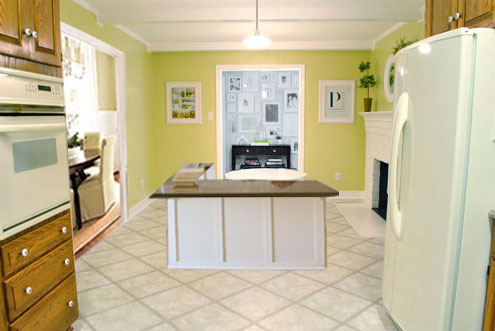
So one evening we decided there was a reason that we were stuck in Hesitation City: it just wasn’t The One. So we did what we always do when we get stuck. We went back to the drawing board to see if we could come up with something else that we ended up liking better. We made a few quick sketches of the floorplan, asked ourselves “what are we not thinking of???” and just started sketching ideas – no matter how good or bad our guts told us they were. Kinda like those DON’T THINK, JUST DRAW exercises that they teach you to access your subconscious or something. Of course some of them completely blocked the doorway to the dining room (fail!) and nearly all of them were completely out of scale (so things were too big or too far over) but it definitely got the ol’ wheels turning again…
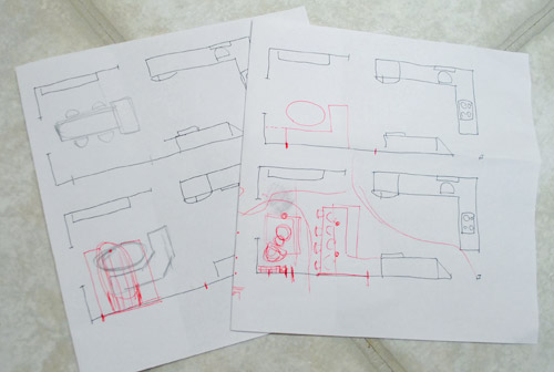
We tried returning to some version of table in the middle (top left) and even modification to the banquette (top right, bottom left). But somewhere in that mess we had one of those “Ah-ha moments” that ol’ what’s-her-name used to talk about on the TV (this is a joke for my Oprah-loving wife). So allow us to introduce the banquette’s successor: the peninsula! Cue the confused emoticons.
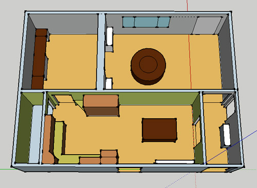
Let’s explain. First, here’s our CURRENT floating-table-in-the-kitchen-and-larger-table-in-the-dining-room arrangement (courtesy of my rough Google Sketch-Up drawing):
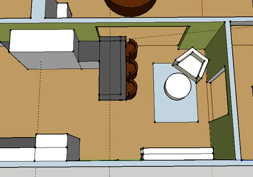
Now for the doorway opened, cabinets painted, counters replaced, floor slightly discolored (not intentionally) and (of course) peninsula’d version:
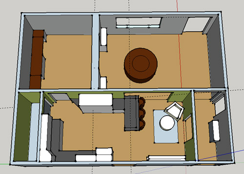
Woo hoo. Before we go any further, we should warn you: we’re 100% sold. The above depiction of it is probably not going to make a believer out of everyone, but from taping it out in the space and moving around it “in person” for a while we giddily came to the following conclusion: it’s The One! So no worries if it’s not your jam or you love Mr. Banquette (he was a lovable guy – and there are always gonna be people who would do things differently if this were their house) but we’re definitely going for it. And we can’t wait to get started.
As for why we didn’t come up with the peninsula idea sooner, we were so stuck on the fact that a peninsula coming off of the cabinetry that we already have would actually hit (or come very very close to hitting) the fridge on the other side of the room. So it wasn’t until we came up with the idea of adding a base cabinet to the right of the cabinetry that we already have to space the peninsula further away (a smidge towards the fireplace) for better flow and even more counter space.
Speaking of counter space, when it comes to executing this whole thing, we’re basically planning to add some base cabinetry (and counters) near the opening itself to create a counter-height peninsula. Which accomplishes a lot, actually:
- It adds additional work surface & cabinet storage to the kitchen side of the room (so it’s easy-access)
- It helps extend and better define the kitchen space without blocking flow or feeling too heavy
- It creates a casual eating space, keeping it distinct from the dining room table, which is just steps away for larger groups and more formal gatherings
- We can most likely seat four people at the peninsula (it’s flexible, so ignore the three chunky chairs shown)
- It can be used as a buffet to set out food (or to seat additional guests) when we have parties
- It can be used for homework, laptop browsing, and general hanging out by the kiddo(s) as they grow
- It even makes sense of our very off-center fireplace by creating a small casual living space that we’ll use as a little “chill corner” of sorts (the peninsula doesn’t block the fireplace, which our banquette friend did from most angles)
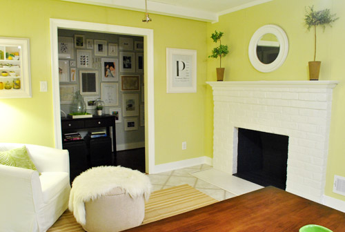
That last perk (centering the fireplace) was a nice surprise, since it’s something we’ve struggled with a lot (it’s just in such an odd place, practically shoved in the corner of the room). But you can see from this virtual view through the future doorway how it almost makes the fireplace placement seem intentional (picture it with a nice round mirror above it to balance that doorway next to it). Oh happy day.
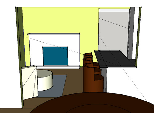
We just love that we’ll get to see the fireplace from the dining room (it won’t be blocked by a heavy banquette) and if overflow guests sit at the peninsula, they won’t have their backs to the people seated in the dining room (which would have happened with the banquette).
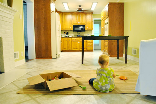
For those who don’t do well with renderings (or are still scratching your heads), here are some pics we snapped to give you a better idea of how it’ll work in the real world. We moved some existing furniture around to mimic the placement (the table represents the peninsula) and have lived with it for the last week-ish to make sure it actually makes sense. Placements aren’t totally exact, but pretty darn close to what we’re thinking. Here’s the view from the laundry room. Ignore the broken pendant light in the far back (it finally crapped out on us). Instead look, there’s that fireplace nicely framed!
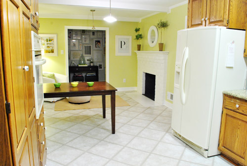
We also traced out the future opening (again, not exact) to show how that’ll work too. We’re thinking there will be a little half-wall (i.e. knee wall) where the peninsula meets the open doorway…
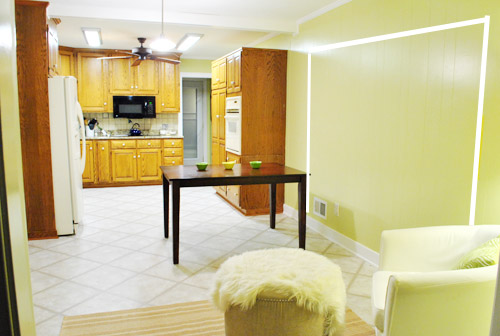
… like we showed in this rendering:

We considered a narrower doorway (where the peninsula doesn’t hang over into the opening) but we think this wider version makes it feel much more open and lets in more light, so it’s the current winner. And of course as previously mentioned, we love how balanced the fireplace and doorway look through the cutout.
Admittedly it took us a little while to figure out what to do with the space in front of the fireplace. It was our biggest hurdle in getting on board with this idea, actually. But after we brought in a placeholder chair, ottoman, rug, and light we realized it was actually completely awesome. There have been approximately 14 hours of reading-with-Clara from that chair in the last week or so. We’re even toying with the addition of some sort of tall built-in bookshelf behind the chair to balance the tall cabinets on the other side of the doorway. Not sure yet, but we’ll keep you posted.
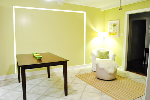
We’ve already discovered it’s a great spot for Clara to play while we’re getting stuff done in the kitchen (since we can’t see her if she’s in the living room, but it’s easy enough to peek over the peninsula to check on her if she’s in the kitchen on the rug).
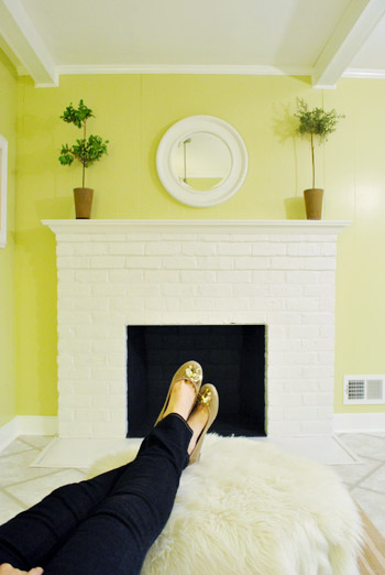
Sherry’s already making plans for how she’ll relax in front of a fire (we’re contemplating one of those convincing modern-looking electric inserts that Candice Olsen uses – possibly even a double sided one if we can eventually open the back of the fireplace into the living room as planned).
Meanwhile I’m dreaming of a little TV mounted above the mantle so I can watch the news during our morning breakfast routine (Sherry is rolling her eyes as I type this- so we’ll have to see where we land on that). Either way, can you tell we’re getting more than a little excited about this set up? Yup, it’s The One.
The peninsula will also give us 3-ish base cabinets worth of deep functional storage, unlike the largely decorative storage (open 12″ bookshelves) that the banquette would’ve provided. Plus a nice wide 3′ x 5.5′ work surface for prep, serving, eating, and homework is FAR more functional than what we would’ve gained from a distant island or a narrow banquette located a lot further away. And we’re probably gonna use the new counterspace as an excuse to change the countertops in the whole kitchen. We’ve never loved our existing granite color (it has a few pitted/stained parts too), so it seems silly to actually buy more for the new peninsula (we’ve debated a mismatched look, which we like for an island, but for a peninsula it seems like it would look most like it has “always been there” with the same counter to keep things seamless). Of course we plan to craigslist the existing granite and put that money towards whatever we’ll use for the new material (not gonna lie, we’re already talking about DIYing concrete counters).
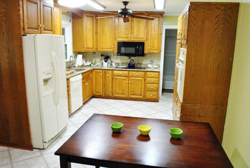
Oh and for anyone debating a peninsula, we’ve learned that the pros recommend 42″ of walking space between the peninsula and whatever’s on the other side (in our case it’s the fridge, which we hope will sink back a foot or so when we replace it with something that’s counter-depth). So that’s how we arrived at our peninsula length.
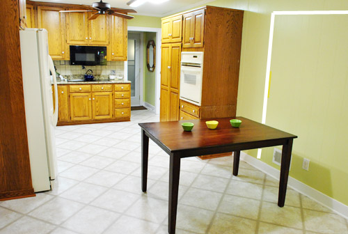
In fact, flow through the room is almost better because there’s one straight pathway through the room, whereas the old table (and the once planned banquette) made us walk in a slight circle. Hoorah for ten less steps a day. Haha.

So now that we’re unequivocally sold and geeky-excited about our new plan, it’s just going to come down to working out the logistics. Namely how to find/build perfectly-sized cabinets that match our old ones without breaking the bank. And finally hire a licensed contractor and get the permits needed to bust out that load bearing wall of ours. But that’s a story for another post. Another ten posts, probably…
Update: You can check out the new “cozy corner” behind the future peninsula in action (on video!) over on Young House Life.
Another update: Lots of people are sweetly suggesting some sort of bookcase or built-in feature on the side of the cabinets that face the dining room (instead of a knee-wall) but we’re unsure if that’ll be too much since there are already built-ins in the dining room that are just a few feet away. We’ll keep you posted as we go though! Who knows where we’ll end up…
Psst: Tomorrow I’m going to post my thoughts on trying Google Sketch-Up for the first time (and how it compares to two other 3D rendering tools I’ve used). So stay tuned for that if you’ve got any questions about how I made the 3D graphics for this post.

GreenInOC says
Looks great! Keep on trusting your intuition – it does you good.
I’m curious if the peninsula is open on the two long sides? Just curious for everyday meals it would seem kinds of unfriendly to sit in one long row! You may have answered this already in one of the other kazillion comments but I’m too lazy to paint a patch on my own wall, I definitely too lazy to search.
Concrete countertops, channeling Ms. Zoe – “I Die”!!
YoungHouseLove says
We’re thinking about having an overhang on the back and side of the peninsula, so Clara can be in her highchair on the end and John or I can be casually feeding her from the side. For big family dinners I think we’ll sit at the dining table, so the peninsula might be more for things like homework and snacks (which will be nice if folks face the kitchen area, and also would avoid the issue of stools blocking access to the cabinets form the kitchen side). Hope that makes sense!
xo,
s
GreenInOC says
Since you specifically asked me (not!), I’m going to pipe up (!!!) and say go for the overhang.
When you have everyday meals with your kiddos (one, two or three more in your future?!) and everyone’s out of their highchairs, you’ll need a less formal place to eat your dinner every night together and talk about your days and how everyone is doing. It seems like that kind of bonding with physical closeness and eye contact will be lost all lining up on one side.
Having that extra space on the peninsula for big family dinners will be lovely too!
Because I am space conscious I can’t help but think of “hidden” space. I would so add extra countertop to 3 sides of the peninsula that could be folded away (under not down) with hinges. I actually have a table that does this is you ever want pictures.
YoungHouseLove says
Woah- that’s fancy! Fun idea!
xo,
s
decoratica says
Sherry, thanks for the answer! It sounds great!
I was thinking of getting rid of the peninsula, but yeah,two tables one next to the other doesn’t look like a better plan… :)
I was just thinking that it’s a small nook… I have seen many times couches in old house kitchens, but this time, though interesting, I think you don’t have enough room to get the look (just my insight) … And you will eventually open the fireplace to the living room anyway, no?
XO
YoungHouseLove says
Yup, we hope to open the other side of the fireplace to the living room and add a double sided insert! We have just really enjoyed having that casual corner with the rug for Clara to play on and all that!
xo,
s
Jenn says
I wasn’t diggin’ the banquette, and looking at the first sketch of the peninsula, I wasn’t sure. Seeing it from the side though, I love it! Extra bonus with being able to see Clara play while you cook. Good call.
Meg says
I loved the banquette idea, but this new peninsula idea sounds like a winner also. And, most importantly, you guys love it. Glad to hear you’ve found “the One”!
Lisa says
I love it!!! Have you thought of adding shelves under the side of the cabinet that meets the dining room wall? Cabinet space under corners is usually wasted anyway…
YoungHouseLove says
We did think about that but wondered if it would be too much since there are those built-ins in the dining room about three feet away. We’ll have to see as we go along!
xo,
s
Jenni says
Yay, peninsula’s definitely the one! So excited for you guys. This makes way more sense than the banquette, function and flow-wise. Also, great tip to just keep drawing/writing ideas when something doesn’t seem to ‘fit’ or sit well.
Jane says
Greetings from London. Love this new idea! Although I do also love banquettes, this is a much better use of the space and it will allow the dining room, kitchen and living room to have a much more “connected” feel and flow.
Our flat has definitely got more beautiful since I started reading YHL. I’m always getting inspired from your photos and “how-to”s to improve on our ugly bits. So keep up the great work! Looking forward to seeing the new kitchen!
Jane
Erin Deric says
Will send later since I’m at work and didn’t bring kitchen photos with me. Shot :)
YoungHouseLove says
Thanks!
xo,
s
Val says
That is fantastic–while I liked the banquette idea in theory, this makes so much more sense because it solves the problem I always saw–not enough counter space. And this actually makes you kitchen seem much larger and definitely more functional, so congrats!
Those sketch programs are pretty vital, aren’t they? When I was house hunting, even though I consider myself someone who can envision a space, I thought the house I was considering was too small because of the staging set-up. When I used a much simpler but similar program, I saw that all of my furniture would work just fine, and now I live there.
YoungHouseLove says
So smart! Love that tip for house hunting!
xo,
s
julia says
I like it! I’m actually a little sad you aren’t keeping the granite. I have the same granite and I was excited to see how you would make it look better with a new backsplash, cabinet color, flooring etc. I don’t think I can replace my granite so now I’m not going to get any ideas on what to do with it… but I’m still excited to see how your kitchen comes out!
YoungHouseLove says
Wait! Here’s what was going to be our inspiration if we kept the granite (thanks to Pinterest of course): http://pinterest.com/pin/27175888/
We loved the idea of white cabinets and subway tile and stainless appliances. Hope it helps!
xo,
s
Erin says
I LOVE the view from the dining room, and see why this is The One in both function and aesthetics. Score one more for stream-of-consciousness brainstorming!
You mentioned both a morning-news TV and a mirror as candidates for over the fireplace–do you know how those TV-mirror kits work IRL? We fear gravity too much to wall-mount our main (and only) TV, but if we ever did the mirror trick seems like a great way to camouflage the screen when it’s off, and bounce more light too.
YoungHouseLove says
Haha, that would be awesome! Gravity is scary though! Maybe we can rig something up someday…
xo,
s
Jennifer says
I love it! It feels like it will feel so much cozier than the banquette would have. I love the planned use of the space, especially reading in front of the fire. Kitchens seem to be the heart of the home, and that’s what you’ve caputured with this plan. I cannot wait to see it all done. You’re starting tomorrow, right?!? ;)
YoungHouseLove says
I wish! Still working on estimates and permits! But we’re so excited!
xo,
s
Jen @ The Decor Scene says
wow I really love the your first idea, but I LOVE this one much more. You are going to love that extra counter space. We put in an island in our kitchen and it was the best thing we did. We host Christmas at our house and that is where all the food is put out. It works sooooo well. And of course all that extra storage. We even have a trash bin inside one of the island base cabinets…love it. I can’t wait to watch your kitchen unfold. Very exciting. :)
Jen H says
This idea is so much more open! I like!
Natalie says
I’m a banquette lover in general, but I totally agree it didn’t work in your particular kitchen :( but I love the pennisula! Love the little reading chair! I think it’s perfect!
BrassyDel says
I liked the banquette, and when I first saw the sketch-up I thought… they’re blocking the doorway? AS AN IMPROVEMENT?! But I gotta say, I’m definitely looking forward to your post on Google Sketch-Up because seeing it all drawn out has me SOLD! I love, love, love the penninsula and cozy fireplace nook thang y’all got going on. Not that it matters if I didn’t like it, but I do. I love it. I can’t wait to see it!
Sarah @ Redhead in Ruffled Flats says
SOOOOOO excited!!! I was never sold on the banquette because I thought it seemed disconnected, kind of awkward to use since it faced away from the rest of the kitchen, and it didn’t add any workspace and not very much storage. I think this is the perfect idea! I was hesitant at first when I saw it going into the doorway, but since you are creating a half wall on the dining room side, it looks seamless and meant to be. The corner of the peninsula on he dining room side could be a great place to decorate with. You could put a little three tier fruit basket or something. Who knows – that’s a little further down the road. I really love the little sitting area as well! Plus, I bet you could add a little folding table there if you had a big party and needed more seating for everyone to eat, which the banquette didn’t allow for.
I can’t wait to see more progress on his solution! Doesn’t it feel good to know you found “the one”?
Laura says
I l.o.v.e. the peninsula plan! (sounds like something that needed to be ratified by the colonies) Last year we knocked out the wall between our kitchen and dining room and replaced it with a peninsula – best decision ever!! It has been great for food for parties, MUCH more counter space, and gave us 3 more cabinets and drawers! Pictures here: http://paisleynpolkadots.blogspot.com/2010/11/ta-da.html
Best of luck as you start this newest project!!
YoungHouseLove says
Wow- what a makeover! That turned out so awesome!
xo,
s
maribel says
As you type the post are you thinking out loud…or do you just type away. I was curious when you mentioned about the t.v. and Sherry rolling her eyes…just curious.
YoungHouseLove says
One of is usually watching Clara while the other person writes posts but then in the evening we might read it aloud (or have the other person proof it just to see what they think) and when I read that John mentioned the TV I totally rolled my eyes at him. Haha. He said “what??” and I said “you had to throw the TV in there?” haha – and then he must have ducked back into the post and added that. Because right before I posted it this morning I noticed that addition. Haha.
xo,
s
joyjoy says
I love islands, but I wasn’t sold on one with your layout. The banquette I liked better, but this peninsula? I can totally see how it’s THE ONE for your space. When I saw your hand drawings, I actually thought “Hey, that bottom right one looks like a good idea…” :-) I’m having a harder time imagining the bit that looks like it’ll peek through from your dining room when you open up that wall, so I can’t wait to see how that turns out!
Ellen says
I love it! At first I wondered if that cozy corner would really get used, but after you said it has already been used a ton with the temporary set-up I was sold! AND my eyes lit up when you mentioned DIY concrete counters!!! Puh-lease do that, so I can try it in my kitchen too!
James says
Thanks you guys for some great inspiration, after reading this post and looking at the mock-ups I realized that my entire condo could almost fit in your kitchen (12’X23′ not including my 5×3 kitchen). I feel like I get to take your ideas and use a shrink ray for stuff that will work in my place, next up for me is my kitchen to, wish me luck!
YoungHouseLove says
Haha- lots of luck! There are definitely benefits to small cozy rooms too! And they’re easier on the budget! Haha. Have fun!
xo,
s
Liz says
Whoa, I totally suggested something similar in your banquette post, but you told me you didn’t want more seating and you didn’t need anymore counter space or storage! Why the change of heart? Anyway, love the new layout way more than the banquette!
YoungHouseLove says
As we mentioned in this post we couldn’t make sense of the idea of a peninsula since if it came off of our existing cabinets it would block everything off and essentially run into the fridge (which wasn’t worth the potential extra seating/storage/counter space since it just didn’t work with our floor plan). After going back to the drawing board and sketching things out we finally came up with the idea to add that base cabinet to scooch the peninsula out further to open things up and make it work. Also we change our minds all the time! Haha. Our blog is just one big mind-changing-mistake-making adventure! Haha. We love the whole trial & error, learn as you go method!
xo
s
Liz says
Yeah, when we remodeled our kitchen, I had over 30 different layouts, and I was sold on every single one of them at some point. But I didn’t have to go through changing my mind with the world watching, just my patient husband!
alison says
Brilliant! I love it!
It’s probably not your taste, but I’d totally put the Eames La Chaise in the little nook. I have neither the money nor the right spot in my place :(
http://hivemodern.com/pages/products.php?sid=225
YoungHouseLove says
Aw cute! He looks like a little bird.
xo,
s
Heather says
LOVE this idea so much more than the banquette! I grew up with a peninsula and loved it. I’m currently working on trying to get one into my kitchen now, as I really, really, really miss that extremely functional counterspace. Good luck and can’t wait to read/see more about it! I’m hoping it helps me with my plans too!
Meredith @ La Buena Vida says
The banquette is a cool idea, but I think I definitely like this one better. I think the little mini-family room as part of the dining room/kitchen is a great idea, and a really practical solution for a family with a young kiddo! I also LOVE the idea of a bookshelf in that corner!
Also, I know the idea of a TV above the fireplace isn’t the coolest from a design perspective, but from a mom-of-a-toddler-who-likes-to-cook perspective, it would be awesome to be able to pop in a movie for Lizzy while I’m getting dinner ready and be able to keep an eye on her at the same time. I’m totally jealous of that idea!
Melanie says
Wow, lots of comments, so sorry if this has been suggested!
Regarding possible counter overhang on the short side of the peninsula… I have a peninsula and the counter on the short side is actually rounded out slightly over the base cabinet. So there’s probably about 4″ of overhang. I really like it because it’s one less corner to worry about because of my daughter. And, it also hides the very useful electrical outlet we have there.
Also I’m definitely rooting for you guys to tackle DIY concrete countertops :) I would love concrete and my husband and I are going to gut our kitchen sometime this year.
YoungHouseLove says
Great tip! We’d love to see pics!
xo,
s
Ann Marie says
Thanks for the update! It’s awesome. Concrete counters = yes. I’ve pinned some amazing ones lately. And I join Sherry in her mantle-hung-tv eyeroll, BUT I have seen some mirrors that go over tvs to disguise them when they’re not in use. Keep it in mind as a tactic when you’re trying to convince her. ;-)
michelle says
funny you mention candice o. because the placement and flow look like one of her kitchens. can’t wait to see it all done!!! love it!!!
Kayla says
I love where your headed with it. AND you guys totally need to get this chair to go in the little nook in the kitchen! It would totally help tie the formal dining room and kitchen together. Right?
http://www.urbanoutfitters.com/urban/catalog/productdetail.jsp?id=17995671&color=045&itemdescription=true&navAction=jump&search=true&isProduct=true&parentid=A_FURN_FURNITURE
YoungHouseLove says
Haha- too funny!
xo,
s
Jen says
We downsized a year ago…and I LOVE our new place…but I miss the penninsula in our old kitchen. It was probably the single most used (and multi-purposed) place in the entire house! Enjoy, you’re going to LOVE it!
Jennifer says
First off, I have to say I read your blog everyday all the way from Tulsa, OK and I never comment but had to today. Hey that rhymes! Woot woot! Second, LOVE this idea much, much better!! The flow, the chair in front of the fireplace, yep, love it. Third, ya’ll, this is YOUR house! You don’t have to explain to us what you like vs what we like. I’m so happy you’re doing what you want and love. It’s a great plan and the best things that are meant to be always work themselves out one way or another dontcha think? That’s it, I’m going back to just reading, no more soap box!
Sarah @ w30 says
Hey, Tulsa! I’m in OKC! :)
rhonda says
I love this idea! I have to say I wasn’t a banquette fan, but never said anything…just figured you can make anything look good! What I did want to comment on is how much we loved our counter space when our kids were smaller..helping to make cookies, decorating cakes, doing homework while we prepared meals…lots of good quality family time. Can’t wait for you to get started!!!
partyofsix says
This is a really good plan! Have you thought about a) switching out your range top for a slide-oven (to save space), and b) removing the oven cabinet, and c) putting the fridge in it’s place over there? I think the fridge sticks out way too much where it is, and they are ungodly expensive to get a (less functional) counter depth. You could create a pantry/built-in faux hutch where the fridge is (which would be way nicer to look at from the dining room angle), and if you move your very nice fridge over to where the pantry is now, it really would make the kitchen open up and give you even better sight lines. I bet you could get cabinets and even the range you need by stalking the re-stores so it wouldn’t necessarily be a costly changeup. What do you think?
partyofsix says
sorry, I meant replace your two piece range and oven combo, with the typical all-in one slide-in oven/range (combo)…
YoungHouseLove says
We actually have thought about shifting all of those things! Haha. Unfortunately it would be expensive to move the stove (since we’d need to vent the cooktop in a new place and go through the ceiling, etc) and building a pantry where the fridge was would involve more cabinetry purchases (beyond the cabs for the peninsula). We’ve actually found some clearanced counter-depth fridges that would allow us to keep the configuration and only spend about what we’d spend on regular not counter-depth ones (there are some great sales going on these days- maybe because newer models are coming in?). Of course nothing’s set in stone, so things could definitely shift – we’ll keep you posted as we go!
xo,
s
partyofsix says
Yeah got a reply! (insert happy face!). What I was thinking was that the slide-in-oven-range would go exactly where your current range top is, under the microwave. (So no new venting needed). If you do the fridge-pantry switcheroo, then maybe you can repurpose the cabinet that currently holds your range. It looks like you might be able separate the top and bottom off your current oven cabinet and reuse those too (for either part of the penisula or to fill the space where the fridge was). Since a slide in oven/range is typically about 30″ wide, if there is a little extra space, it’s easy to frame in an open shelf on either side (for cooking trays, or a thin pullout one to hold lids?).
To cut down on purchasing extra upper cabinets when you remove the existing pantry&oven, put in open shelves that run to the end of the wall to the peninsula from the right of the fridge (or the pantry if you keep the pantry and fridge where they are and just remove the separate oven) .
Sorry for the ramblings! The biggest concern (of mine)in switching the pantry/fridge was that you would need to plumb in a water line for where the new fridge would go for your icemaker, etc. I think whatever y’all do it will look great.
YoungHouseLove says
Ah yes we thought of that too! The base cabinet under the cooktop is 36″ though (not 30″ like standard slide in ranges that are within our budget) so we can’t seem to make it work without trim pieces that we think would look weird and off next to all the other base cabinets. Hope that makes sense!
xo,
s
heather @ like a cup of tea says
aaahahahahaha I love how loonnggg this post was simply because of the goal post the other day. I for one love the idea *so much* better than the banquet. I like that it extends past the door opening, and how you have the wall figured out. To use a Sherry phrase, the seating area is completely “my jam” (that must be like me saying something is totally my cup of tea), because it’s absolutely fabulous. I’m a huge fan of seating areas like that and am planning one for our house too.
Bee tee dubs – I cringed when the TV was mentioned before I read Sherry had too haha. There are two places I (very personally) don’t like TV’s (and don’t care if anyone else has them there, I’m not that person) – Kitchens and Bedrooms. I like to focus on my food and focus on my…sleeping (don’t be dirty).
Stacy says
I LOVE this new layout!!! I liked the banquette concept in theory, but for your space, I was thinking…”Meh, I dunno..it breaks up the space too much….”
This idea is perfect. It makes everything looks spacious and roomy. I love the idea of the “chill corner.” It’s totally true that it gives your fireplace in the kitchen some purpose! Can’t wait to see it all done!
Jenny says
I just saw on Hgtv a host DIYed a mirror/tv combo. I think it was on “The High Low Project”….so fancy
Moriya says
I admire the thought process you guys share with us, and you could really sell me on anything. The banquet was an awesome idea, but like you said, did feel slightly awkward. I think you really nailed it with this solution. It’s going to make your kitchen feel really put together. You guys are brilliant!
Rachel says
THIS IS FANTASTIC!!! I love it! It’s so perfect for your space…and how adorable is the chair and ottoman in front of the fireplace!?
I can’t wait to see this one come to life!
Julie says
I didn’t like the banquette but also didn’t think you’d really do it. I like this overall idea here a lot better. The thing I think needs improving is that knee wall. There’s got to be alternatives to leaving it totally open (and having a funny shaped opening from the dining room plus seeing barstools from an ugly angle from the dining table) and leaving it totally closed with less light than you want. I’m sure you’ll think of something. The effort to accomodate the fridge location leaves me thinking that if you gave yourself more wiggle room (e.g. to remove or move some existing stuff), you might see some nice possible tweaks to this plan. I can’t wait to see how this works out. It’s really a nice sized space.
Wiley Benson says
love this!!! it is so much more you!! can’t wait to see how it all goes down!
Lindsay says
It probably goes without saying (you guys are such research-before-you-buy people!) but make sure you’re really sold on the counter depth fridge before you size your peninsula, ok? I was COMPLETELY convinced that we should get a counter depth one (even though they’re more expensive for some reason – what the what?). In the end though, it turned out that they just weren’t for me. We ended up buying one that sticks out about 3 inches – bigger than counter depth, but not the standard depth, and I’m SO GLAD. A few inches is a bunch to chop out of a pass-through though, so be careful! :)
And I LOVE this idea, by the way.
Kristi W. says
I love it! Love it. Great solution. I also like your idea of adding a book shelf in the reading nook area.
Mackenzie says
LOVE IT! Love it! Love it! This layout seems much more relaxed, family/visitor friendly & totally your style. And what’s a home if not something that works with your life?!
P.S. I want to live in that cozy corner! A sitting room/play area in a kitchen…nothin bettuh!
Charlotte | Living Well on the Cheap says
OMG I LOVE it! Y’all are so smart. I have a little seating area near my kitchen/dining area and find it delightful. I brought in a bookshelf, a craigslist sofa with a dropcloth slipcover, and a thrift store coffee table that I painted mustard yellow.
I think having a little gathering area like that right off the kitchen is called a keeping room. I love it!
Nicole says
Wayyyy cool! The Google sketch didn’t really make sense to me, but seeing the furniture (even though it’s not the exact pieces that will be used) moved around and the taping around the wall really helped!
I totally see it and think it’ll look grand!
Good luck!
Dawn says
I AM SO HAPPY FOR YOU!! Sorry for the yelling, but I about jumped out of my work chair when I read you were not going with the banquette. I personally disliked the banquette from the begining; however, I stayed positive for you because that is what you liked at the moment. But, I love this layout much better and I think the peninsula will add a much more relaxed family vibe. I can’t wait for the updates!
Marla says
Banquets are awesome, but I was wondering if it would really work in that space. Love your new plan. Makes so much more sense to have a little comfy sitting area in front of a fire place. Way to go!
Theresa says
Ohmigosh, I love it! So much more than the banquette (which I kinda thought was an odd placement, but didn’t say anything because I figured if you guys were gonna do it, it was gonna be awesome). So glad — this is so much better!
Amy E. says
at first glance i was skeptical, but when you explained a few things the whole idea sounds inspired! go you! i hope it’s everything you want it to be and hope the negative comments are minimal.