For all those wondering when the heck we’ll tackle that kitchen banquette idea that we mentioned a few weeks ago (here and here), well… probably never. Cue the frowny face emoticons.
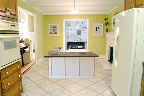
Here’s the deal. After getting lots of positive feedback on the idea a few weeks ago (over 1,400 comments total!), Sherry and I were certain your collective enthusiasm would push us from “we think this is a good idea” to “this is definitely a good idea.” And it nearly did. But parts of us still questioned the whole commitment-factor when it came to actually doing it (we definitely described it as a half baked idea when we shared it). We worried if it’d really be the most practical solution (would it be a pain to scoot in and out of?) and if it’d really make the most of the space (we couldn’t figure out the right balance of big-enough seats while still maintaining flow around it to keep it from feeling cramped).
So one evening we decided there was a reason that we were stuck in Hesitation City: it just wasn’t The One. So we did what we always do when we get stuck. We went back to the drawing board to see if we could come up with something else that we ended up liking better. We made a few quick sketches of the floorplan, asked ourselves “what are we not thinking of???” and just started sketching ideas – no matter how good or bad our guts told us they were. Kinda like those DON’T THINK, JUST DRAW exercises that they teach you to access your subconscious or something. Of course some of them completely blocked the doorway to the dining room (fail!) and nearly all of them were completely out of scale (so things were too big or too far over) but it definitely got the ol’ wheels turning again…
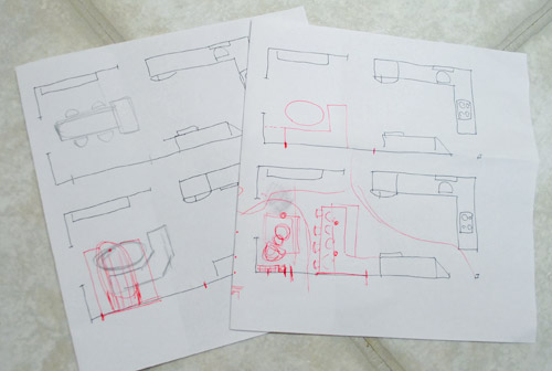
We tried returning to some version of table in the middle (top left) and even modification to the banquette (top right, bottom left). But somewhere in that mess we had one of those “Ah-ha moments” that ol’ what’s-her-name used to talk about on the TV (this is a joke for my Oprah-loving wife). So allow us to introduce the banquette’s successor: the peninsula! Cue the confused emoticons.
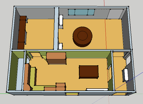
Let’s explain. First, here’s our CURRENT floating-table-in-the-kitchen-and-larger-table-in-the-dining-room arrangement (courtesy of my rough Google Sketch-Up drawing):
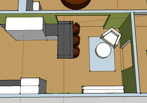
Now for the doorway opened, cabinets painted, counters replaced, floor slightly discolored (not intentionally) and (of course) peninsula’d version:
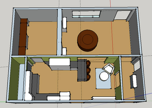
Woo hoo. Before we go any further, we should warn you: we’re 100% sold. The above depiction of it is probably not going to make a believer out of everyone, but from taping it out in the space and moving around it “in person” for a while we giddily came to the following conclusion: it’s The One! So no worries if it’s not your jam or you love Mr. Banquette (he was a lovable guy – and there are always gonna be people who would do things differently if this were their house) but we’re definitely going for it. And we can’t wait to get started.
As for why we didn’t come up with the peninsula idea sooner, we were so stuck on the fact that a peninsula coming off of the cabinetry that we already have would actually hit (or come very very close to hitting) the fridge on the other side of the room. So it wasn’t until we came up with the idea of adding a base cabinet to the right of the cabinetry that we already have to space the peninsula further away (a smidge towards the fireplace) for better flow and even more counter space.
Speaking of counter space, when it comes to executing this whole thing, we’re basically planning to add some base cabinetry (and counters) near the opening itself to create a counter-height peninsula. Which accomplishes a lot, actually:
- It adds additional work surface & cabinet storage to the kitchen side of the room (so it’s easy-access)
- It helps extend and better define the kitchen space without blocking flow or feeling too heavy
- It creates a casual eating space, keeping it distinct from the dining room table, which is just steps away for larger groups and more formal gatherings
- We can most likely seat four people at the peninsula (it’s flexible, so ignore the three chunky chairs shown)
- It can be used as a buffet to set out food (or to seat additional guests) when we have parties
- It can be used for homework, laptop browsing, and general hanging out by the kiddo(s) as they grow
- It even makes sense of our very off-center fireplace by creating a small casual living space that we’ll use as a little “chill corner” of sorts (the peninsula doesn’t block the fireplace, which our banquette friend did from most angles)
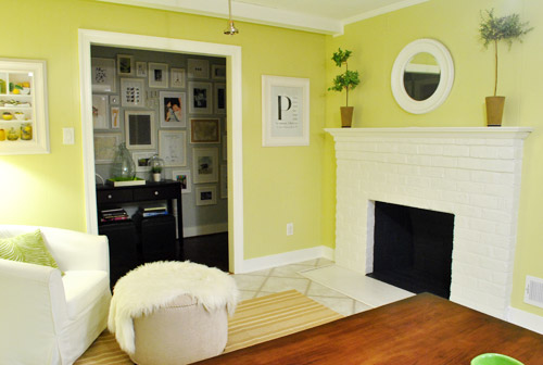
That last perk (centering the fireplace) was a nice surprise, since it’s something we’ve struggled with a lot (it’s just in such an odd place, practically shoved in the corner of the room). But you can see from this virtual view through the future doorway how it almost makes the fireplace placement seem intentional (picture it with a nice round mirror above it to balance that doorway next to it). Oh happy day.
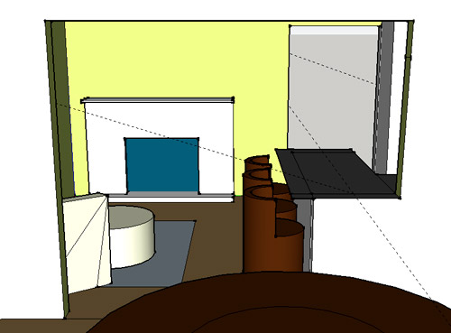
We just love that we’ll get to see the fireplace from the dining room (it won’t be blocked by a heavy banquette) and if overflow guests sit at the peninsula, they won’t have their backs to the people seated in the dining room (which would have happened with the banquette).
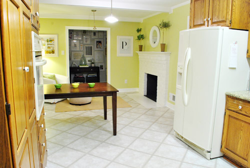
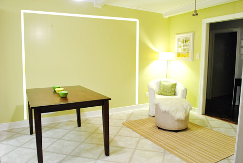
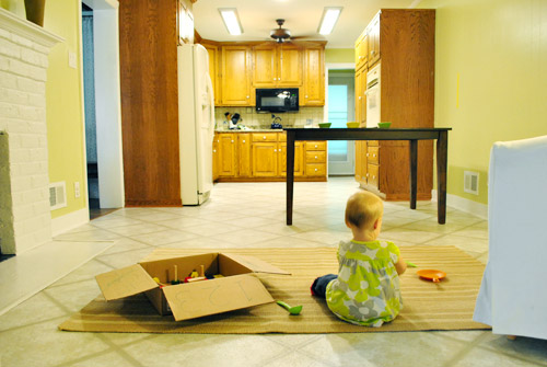
For those who don’t do well with renderings (or are still scratching your heads), here are some pics we snapped to give you a better idea of how it’ll work in the real world. We moved some existing furniture around to mimic the placement (the table represents the peninsula) and have lived with it for the last week-ish to make sure it actually makes sense. Placements aren’t totally exact, but pretty darn close to what we’re thinking. Here’s the view from the laundry room. Ignore the broken pendant light in the far back (it finally crapped out on us). Instead look, there’s that fireplace nicely framed!
We also traced out the future opening (again, not exact) to show how that’ll work too. We’re thinking there will be a little half-wall (i.e. knee wall) where the peninsula meets the open doorway…
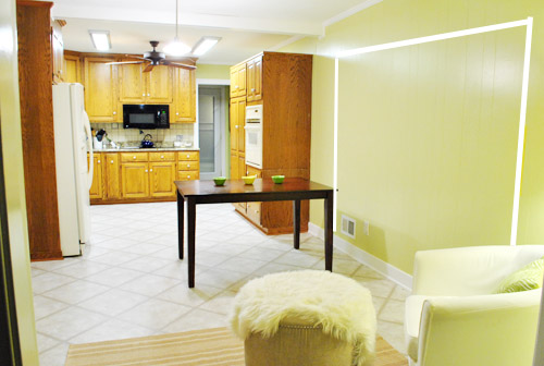
… like we showed in this rendering:

We considered a narrower doorway (where the peninsula doesn’t hang over into the opening) but we think this wider version makes it feel much more open and lets in more light, so it’s the current winner. And of course as previously mentioned, we love how balanced the fireplace and doorway look through the cutout.
Admittedly it took us a little while to figure out what to do with the space in front of the fireplace. It was our biggest hurdle in getting on board with this idea, actually. But after we brought in a placeholder chair, ottoman, rug, and light we realized it was actually completely awesome. There have been approximately 14 hours of reading-with-Clara from that chair in the last week or so. We’re even toying with the addition of some sort of tall built-in bookshelf behind the chair to balance the tall cabinets on the other side of the doorway. Not sure yet, but we’ll keep you posted.
We’ve already discovered it’s a great spot for Clara to play while we’re getting stuff done in the kitchen (since we can’t see her if she’s in the living room, but it’s easy enough to peek over the peninsula to check on her if she’s in the kitchen on the rug).
Sherry’s already making plans for how she’ll relax in front of a fire (we’re contemplating one of those convincing modern-looking electric inserts that Candice Olsen uses – possibly even a double sided one if we can eventually open the back of the fireplace into the living room as planned).
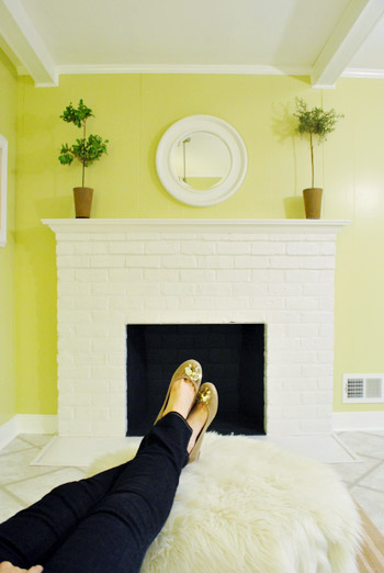
Meanwhile I’m dreaming of a little TV mounted above the mantle so I can watch the news during our morning breakfast routine (Sherry is rolling her eyes as I type this- so we’ll have to see where we land on that). Either way, can you tell we’re getting more than a little excited about this set up? Yup, it’s The One.
The peninsula will also give us 3-ish base cabinets worth of deep functional storage, unlike the largely decorative storage (open 12″ bookshelves) that the banquette would’ve provided. Plus a nice wide 3′ x 5.5′ work surface for prep, serving, eating, and homework is FAR more functional than what we would’ve gained from a distant island or a narrow banquette located a lot further away. And we’re probably gonna use the new counterspace as an excuse to change the countertops in the whole kitchen. We’ve never loved our existing granite color (it has a few pitted/stained parts too), so it seems silly to actually buy more for the new peninsula (we’ve debated a mismatched look, which we like for an island, but for a peninsula it seems like it would look most like it has “always been there” with the same counter to keep things seamless). Of course we plan to craigslist the existing granite and put that money towards whatever we’ll use for the new material (not gonna lie, we’re already talking about DIYing concrete counters).
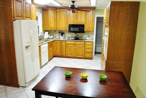
Oh and for anyone debating a peninsula, we’ve learned that the pros recommend 42″ of walking space between the peninsula and whatever’s on the other side (in our case it’s the fridge, which we hope will sink back a foot or so when we replace it with something that’s counter-depth). So that’s how we arrived at our peninsula length.
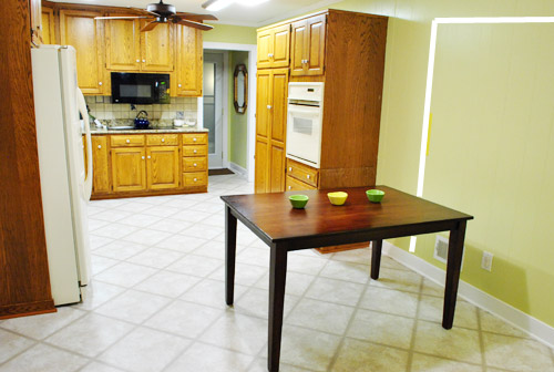
In fact, flow through the room is almost better because there’s one straight pathway through the room, whereas the old table (and the once planned banquette) made us walk in a slight circle. Hoorah for ten less steps a day. Haha.

So now that we’re unequivocally sold and geeky-excited about our new plan, it’s just going to come down to working out the logistics. Namely how to find/build perfectly-sized cabinets that match our old ones without breaking the bank. And finally hire a licensed contractor and get the permits needed to bust out that load bearing wall of ours. But that’s a story for another post. Another ten posts, probably…
Update: You can check out the new “cozy corner” behind the future peninsula in action (on video!) over on Young House Life.
Another update: Lots of people are sweetly suggesting some sort of bookcase or built-in feature on the side of the cabinets that face the dining room (instead of a knee-wall) but we’re unsure if that’ll be too much since there are already built-ins in the dining room that are just a few feet away. We’ll keep you posted as we go though! Who knows where we’ll end up…
Psst: Tomorrow I’m going to post my thoughts on trying Google Sketch-Up for the first time (and how it compares to two other 3D rendering tools I’ve used). So stay tuned for that if you’ve got any questions about how I made the 3D graphics for this post.

Anna says
Proof that you should always play until you feel it’s perfect! I’m having similar kitchen woes, but simply refuse to make a move until I’m sold on an idea. Good for you guys sticking it out! The plan looks GREAT. :)
Zach says
I’m looking forward to seeing what you decide regarding the concrete countertop. My wife and I want to DIY some for our kitchen but are honestly a little intimidated.
April was in CT now CA says
I have no idea why this makes me so happy, it isn’t even my house nor something I’ll ever see in person, but I absolutely hated that banquette and I lurrrrrve the peninsula. Go team peninsula!!! The banquette idea sorta made me twitchy. LOL
Rebecca Foxworth says
So…is Clara destined to be an only child? Or will she be relegated to eat in another room when you have another child? Or will the baby not be allowed to sit with you? Or will John have to stand? I’m confused by space for only three chairs in the kitchen. I like it TONS better than the banquette idea, but I think for a young family looking to not be a family of three forever, I think it’s a bit short-sighted.
YoungHouseLove says
Oh no we want more kiddos! There’s most likely going to be room for four chairs (it’s just a rendering, so John built those awkward chairs with shapes, haha). We might add an overhang to the side of the peninsula too, so a chair could be tucked in there too. Hopefully it’ll be flexible enough for four chairs and we’ll probably all eat real meals at the nearby dining table (we picture the peninsula more for casual things like homework and snacks and stuff).
xo,
s
Gaidig says
Ok, this reply is really for John, but there are libraries of pre-made furniture available for Sketch-Up that you can download for free, so no need to make up chairs from random shapes. It’s called the 3D warehouse. Here’s a link to the IKEA furniture, which I think you guys would find helpful, with all the furniture you have from there:
http://sketchup.google.com/3dwarehouse/details?mid=bee32c9224a679d733265192c32e6f1c&prevstart=0
YoungHouseLove says
Thanks! I had no idea what the heck I was doing!
-John
Katie McIntyre says
LOVE LOVE LOVE
I am rooting for the DIY concrete counters too!
Abby says
I think this is a much better idea than the banquette–for all the reasons you listed!! Especially for viewing and centering the fireplace, which is now made the center of things instead of an exclusive spot–much more open in every sense of the word. Nice Work!
Dan says
I did this same thing in my kitchen reno and absolutely love it. We spend more time at the island that we do at the formal table. I added a traditional cabinet plus a wine fridge under the countertop. Just an idea!
Tammy O says
Hi John and Sherry, I LOVE this solution! I wasn’t a fan of the banquette — it just seemed so big and boxy and the whole sliding-in-and-out-of-a-booth thing would be kind of a pain I think.
You guys are really creative in your problem solving — you inspire me to keep working on our very awkward living room layout! Can’t wait to watch this project evolve!
EJ says
Love love love the idea – didn’t want to be a Negative Nelly about the banquet – but this is such a better plan in MHO :) I had a friend DIY concrete counters and they were amazing but they def. needed layering – such as great tile for her back-splash and a warm hardwood floor so that the concrete didn’t seem cold/prison like. Good luck, I can’t wait to see the progress.
Kelly H. says
Brilliant!!! When you first mentioned the banquette, I immediately thought, “No! Why block the view of the fireplace from the dining room?” This is way better. Now I’m excited for you – and a little jealous!
Laura @ Trendy Savvy says
I absolutely love it, especially for the way your new plan utilizes the fireplace. Sounds perfect!
sarah b says
i love this! it gives you: more kitchen storage and counter space, counter seating, and a hang-out/relax zone near the fireplace. a truly multifunctional space!
we have an island in our current house and i hate it – whatever i need is always on the “other” side. our last house had a peninsula and i loved it! i’m hoping someday we can change out the island for a peninsula. (i’ve never had a banquette so i have no opinions there.)
can’t wait to see how it all progresses!
Michelle says
What a great plan! I’m glad you listened to that feeling in your gut. I was wondering if you guys are going to be re-doing the tiled floor in hardwood? At first I was puzzling over the idea of a cozy fireplace nook with a tile floor, but then I thought maybe you’re re-doing it?
YoungHouseLove says
We hope there’s hardwood under there but aren’t sure until we dig! Haha. But we’re definitely redoing it with something either way…
xo,
s
Theresa says
Love it. Give a much better flow. You might want to round off the corners nearest the fridge. Little ones will try to squeeze behind adults and no sharp corners are always appreciated. Got for it!
YoungHouseLove says
Great tip! Thanks!
xo,
s
elaine K says
Love it! It will be so nice when you are baking cookies and when Clara does her homework. Plus, having a play area that you can keep an eye on her while you cook will be very valuable. Might be a good place for a play kitchen, too.
Michelle Ramsey says
I like this idea so much better!! It looks more cohesive and flows much better. My sister has a couple of chairs and an ottoman in her kitchen and she loves it. When I visit her it is my favorite place to sit. I LOVE your blog and I look forward to reading about all of your new projects. Thank you for all the time and effort you put into it!!
Michelle
Chelsea says
I love it! I’d been skeptical of the banquette, but figured you’d make it work, but I think this looks great! Can’t wait to see the progress.
Anne says
Love love LOVE this new idea, I think it will flow BEAUTIFULLY! love the look of concrete countertops but please do a lot of research (as I’m sure you will)- they can be very brittle and crack rather easily… just FYI:) good luck with the renovation!!
YoungHouseLove says
Thanks for the tip! We’ve heard from some folks who have and love their concrete (someone said they’ve had theirs for 11 years!!) so that’s always nice to hear! We’ll definitely have to look into the pros and cons more as we go though! We’ll keep you posted!
xo,
s
heather @ like a cup of tea says
If they are done right they shouldn’t be brittle and crack. That can be a sign the concrete wasn’t mixed right and/or the load wasn’t calculated properly (in the case of an overhang persay).
Robin @our semi organic life says
Are concrete counters… Cold? Like to the touch? We had slate like tile counters growing up and I hated how cold they felt. Little kids always have arms, legs and bodies touching counters more than adults who usually just touch with their hands. Just a thought to those who have them.
YoungHouseLove says
Anyone know? I imagine it would be like granite or other stone? Not sure though!
xo,
s
Liz says
@Robin: We have concrete counters and no, they’re not cold. I just touched them before responding! I’m sure they’re colder than a formica or laminate, but they’re actually a little warmer than the marble we have elsewhere. I think concrete absorbs heat pretty well.
YoungHouseLove says
Hmm, so interesting! I love that they’re warmer than marble. Who knew?!
xo,
s
Jill says
I. LOVE. IT! I was sold on the banquette idea…but I’m now even more sold on the peninsula idea! And I love, love, LOVE the little play space for Clara on the other end of the kitchen…having a little guy who is only one day older than Clara, I can relate that having them in the same room while working really makes things aLOT easier! Can’t WAIT until you start this project!!
Shiri says
LOVE LOVE LOVE it!!! I was not a fan of the banquette, but figured I’d keep my negative opinion to myself after seeing how many people were digging it. I have a peninsula in my kitchen and it is the BEST workspace because there’s nothing hovering overhead. Great job guys!
Jenn says
I LOVE this!! It’s so perfect for your space. Brilliant!
I don’t comment here much but I adore your blog. You guys are funny, creative, inspiring and awesome!
Amy says
I love this idea. I am not a huge fan of banquettes unless they can be tucked away. I like how the removed wall will allow you to see the fireplace. Love your fireplace, I wish I had one.
oneida says
i love love love this idea! i wish we could have a cozy nook like that in our kitchen (we have a galley kitchen, so that’s NEVER happening lol but maybe when we move again). and that peninsula IS perfect for parties. whenever we have people over or go to other people’s houses, it’s always so crowded with trying to get food from the kitchen table or wherever since there is no place to serve.
Kelly-Jo says
Love the peninsula idea guys! Fight for the tv over the fireplace John. It is really nice to watch/listen to the news while sipping coffee in the morning. Just make sure you get a wall mount that will allow the tv to swing out so that the person doing meal prep and enjoy as well. :)
Alicia Sherman says
I *really* hope you guys decide to do concrete counter tops! I have been envisioning our future home complete with concrete counter tops… and would LOVE to see how you guys make it work! Do you think (if you decide to) you would stain them or leave them as is? I love me a good rustic red concrete counter top!
YoungHouseLove says
I think we’d leave them as-is since we’re having a love affair with gray these days. Haha.
xo,
s
Alicia Sherman says
Grey would fit your house beautifully!
MaryBe says
I liked the idea of the banquette, and I didn’t like the peninsula idea at all, until I got down to the bottom of the post and saw the ‘real life’ photos, with the table representing it. Then it clicked! Love it!
Liz says
Oh, and we have concrete countertops on our perimeter cabinets in our kitchen and we LOVE them! (We DID NOT DIY them, our contractor made them). We’ve had them about a year and a half so I can’t say how they wear over the long run, but so far so good. Even the guy who installed the carrara marble for our kitchen island was impressed by them. Ours are gray and personally I think they look really timeless. Not too industrial, but not too “perfect” like quartz or something. Looks really good with our carrara. I think our contractor used Cheng concrete products.
YoungHouseLove says
Love hearing that!
xo,
s
elle C. says
This looks like a wonderful plan! I can just imagine how nice that comfy chair nook will be around the holidays when it’s story-time around the fire while cookies bake in the oven. As a mom with two kids, I’ve always thought how nice it would be to just have some open space in the kitchen where the kids can work on messy science projects, or having a spot where a child-size table would fit for my girls to pretend to cook with flour and dried beans without being underfoot while I’m doing ACTUAL cooking. What a versatile space that can be for you guys as well as having great flow for the house. And the peninsula looks like it will be a really helpful workstation. This will work a lot better than the banquette, but you guys actually inspired me to put a banquette into our breakfast area. Hooray for inspiration – wherever it leads you!
Maureen @ This (Kinda) Old House says
It’s funny to me how many comments this whole banquette thing has gotten. LOL So controversial. :)
Mikal says
I may have missed it, but will your penninsula be counter height? We have ours counter height and it is awesome. You will love it for family gatherings too because you can use it as a nice big buffet area. We only have two chairs at ours and it’s fine (we are a family of 5). If we want to fit us all, we just sit at our dining table. Nice work!
YoungHouseLove says
Yes! We like that height the best too!
xo,
s
Michele G says
I think this is a great layout idea. However, I would caution you against changing to a counter-depth fridge. When we built our new home 3 years ago, that’s what the architect and cabinet maker designed our kitchen for (without any input from us) leaving us with no choice but to go counter depth. But we HATE the counter-depth fridge. It is TINY. Annoyingly TINY. Stupid TINY. So tiny that we now have to keep most of our food in a 2nd fridge in the garage, which seems completely crappy after we spent so much money on a new house and new kitchen. Seriously go look at them at an appliance store and make sure you’re happy with the interior space before you commit to a counter depth fridge.
YoungHouseLove says
Thanks for the tip! We actually discovered that the fridge we currently have is much smaller than most counter depth ones, so I guess we’re just used to it! Haha. We looked at some counter depth fridges already and couldn’t see a difference! Then we came home and measured ours and realized it just bumps out about an inch or two further but is actually shorter and less wide! So we won’t be giving up any space at all. Haha.
xo,
s
Julia @ Chris loves Julia says
We just got a counter-depth fridge and LOVE it. It frees up so much space in our kitchen. Well, really just a few inches, but it feels so much more open.
http://chrislovesjulia.blogspot.com/2011/08/santa-came-this-morning.html
YoungHouseLove says
Thanks for the tip Julia!
xo,
s
Liz says
We have a counter-depth fridge and think the space inside is fine. Maybe it just depends on the model. Aesthetically it’s totally worth it for us anyway.
YoungHouseLove says
Yeah, I definitely think it’s one of those personal preference things!
xo,
s
Colleen P. says
Oh it’s lovely! I didn’t even see the original banquette post, but having looked at it, I think you have made a better choice. I would be in that corner chair ALL. THE. TIME. I’m actually plotting and scheming now to see where I could put my big comfy chair in the kitchen so that I can plan menus, grocery shopping lists, peruse cookbooks, etc. in comfort! I think all kitchens should have a cozy corner!
I love it that you can see and hear the fireplace in the dining room and that you made the doorway nice and wide-people sitting at the peninsula will not have to lean back to talk to those in the dining room, it’s a very conversation friendly arrangement altogether.
I’m so glad that you decided to put more thought into it, I guess sometimes you just have to let things rest for a while before it all works itself out in the mind.
Meg G says
Hi! I was Not a banquette fan and like your new idea better. The only thing that seems “off” to me is that the peninsula in in the doorway between the kitchen and dining room. Can you either 1 – move the peninsula back so that the edge where the stool will sit is behind the door frame? or 2 – narrow the doorway so that the peninsula still stays behind the door frame? From your floorplans, it does not seem to flow as well. Probably seeing it in person would be different but I just thought I would share my opinion…isn’t that the beauty of blogging???
And everytime I have to type peninsula, I have to backspace and retype. Not one of my favorite words. HA!
Meg
YoungHouseLove says
Oh yes, the doorway is extremely flexible and definitely still something we’re refining! The next step is to keep working on the permits for the doorway and try to construct the peninsula so we can stand there and decide how wide we want things and how much of an overhang we’d like!
xo,
s
Jennifer says
LOVE it, DIG it, Can’t wait for it!! Cheers for taking your time and talking/sketching in through!!
Michelle says
I was a fan of the banquette plan, but once you explained it all this works much better!
Have you ever thought about getting a small tv that attaches to the bottom of an upper cabinet? It folds up when you’re not using it. My parents have one and they love it. Something tells me John might not win and get it over the fireplace!
YoungHouseLove says
That sounds nice! We might have to look into that as a compromise. Although John’s the chef so maybe he deserves a TV since he’s always the one in there working away! Haha.
xo,
s
Sarah @ w30 says
Love it, love it, love it, love it, love it, love it, love it, love it, love it, and, oh yeah, love it! ;)
Rose says
I love the new layout and I think it really reinforces that you need to live in your space and open yourself to other ideas to figure out what is really the best reno for you. If you hadn’t asked Nancy…she wouldn’t have suggested the banquet…and you wouldn’t have realized that while that isn’t right for you neither was the original idea you thought you loved.
YoungHouseLove says
Amen! We still completely credit Nancy to getting us where we are today! Without her we’d probably have a big honking island that’s too far from the kitchen and off-centered on the fireplace. Haha.
xo,
s
Gretchen says
Totally great idea, but for my two cents there is an issue with the chair. Right now, it looks like it couldn’t get along with other living room furniture, so it was sent to live in the kitchen. The bookcase you mentioned may ground it more. Perhaps there would even be a place for a small chair friend elsewhere?
YoungHouseLove says
Oh yeah that chair is definitely a placeholder- we’re hoping to land one something that feels like it tucks right in and look a lot more grounded and at home!
xo,
s
Ellen says
I LOVE THIS!
It just seems SO much more functional. I particularly love the little seating area in the kitchen and in front of the fireplace and the fact that the new peninsula can be used as a buffet.
Jen says
All I can say is WHEW! I was not really a huge fan of the whole banquette idea (of course I’d never actually make a comment about that!) but I LOVE the peninsula plan! So much more open, better layout and use of space, etc. Kudos to the two of you for figuring out an awesome solution. I can’t wait to watch the progress unfold!
Susan says
I love banquettes, in fact your inspiration picture with the banquette backed up to a peninsula totally solved a design dilemma for us. That being said, I didn’t love the floating one you guys were thinking of for your space, I think your new plan makes a lot more sense both functionally and aesthetically. It’s going to look awesome.
Karla says
Bravo, Bravo, Bravo!
I am glad that I wasn’t the only one with the feeling that the banquette wasn’t right.
‘The One’ is a keeper. Love it. when you know, you know!
Bravo!
LARY says
WOW! I love this layout way more! I never said anything about the banquette because I figured if I don’t have anything nice to say I won’t say it. At the end of the day is your house! We are just your lucky cyber visitors :) Can’t wait to see that wall come down too!
Penny says
Great decision! I was never a fan of the banquette idea because it was such an oddly shaped boat floating in the way of everything in the breakfast area. I think the peninsula is a great plan. However, the way it hangs over into the future opening into the dining room kind of bothers me, but I defer to the experts! (I’m sure you’ve drawn it out many times and walked through the space virtually)
Monica says
Love it! I have always wanted a comfy chair in the kitchen area! Also, I think the cozy corner area will be a great place for a cute little kid-sized table and chairs (used for snacks with little pals and drawing and coloring etc).
Sarah says
LOVE IT!
I currently have a breakfast bar in my flat (I rent, so I wasn’t given a choice!). It wasn’t my ideal kitchen layout, but having lived with it for three months, I’m completely sold. Mine is slightly below the normal height for a breakfast bar, so I managed to snag super-cheap (because they were incorrectly marketed as taller than they actually were) bar chairs for an amazing £5 each (about $7.80?!). I like the open plan feel to it, and it never gets in the way of cooking like a big table and chairs would.
Plus I adore the comfy corner.. I keep telling the B/F that we’re going to have to have one of those in our future house (I’m a big cook, so I spend loads of time in the kitchen)!
I’m excited to see all your plans unfold now :)
Shannon says
Hey – this is totally unrelated, but this made me think of you guys and your painting:
http://damnyouautocorrect.com/12744/top-5-funniest-autocorrected-color-names/
YoungHouseLove says
Hahahaha- hilarious!
xo,
s
LANA BROOKS says
Opening up the wall is a great idea, the flow looks so much bigger and better. The one drawback that you mentioned about banquettes, that of having to “slide” into and being trapped in the middle, is the main reason I did not do it in my own kitchen, much as I love the idea of them. And the added counter space is a bonus. Love, love, love the chair in the corner by the fireplace. I had the same thing in my previous home and loved it. You daughter will have fond memories of that little corner. I would most definitely add bookshelves.
Beth says
I love your plans! We have a sitting area (with a fireplace) right off of our kitchen too, and we use it ALL the time. I just learned that some people here in VA (we’re in NoVA) call it a keeping room, which makes me smile for some reason. It’s the best spot for a cup of tea or coffee in the morning, and it’s a great spot for visitors to relax while you’re finishing the last minute details for dinner.
YoungHouseLove says
That’s cute!!
xo,
s
Melissa says
I wasn’t a fan of your banquette idea. I thought it made your kitchen look too choppy. Love this idea though. Glad you made the old switcheroo!