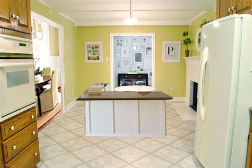
For all those wondering when the heck we’ll tackle that kitchen banquette idea that we mentioned a few weeks ago (here and here), well… probably never. Cue the frowny face emoticons.
Here’s the deal. After getting lots of positive feedback on the idea a few weeks ago (over 1,400 comments total!), Sherry and I were certain your collective enthusiasm would push us from “we think this is a good idea” to “this is definitely a good idea.” And it nearly did. But parts of us still questioned the whole commitment-factor when it came to actually doing it (we definitely described it as a half baked idea when we shared it). We worried if it’d really be the most practical solution (would it be a pain to scoot in and out of?) and if it’d really make the most of the space (we couldn’t figure out the right balance of big-enough seats while still maintaining flow around it to keep it from feeling cramped).
So one evening we decided there was a reason that we were stuck in Hesitation City: it just wasn’t The One. So we did what we always do when we get stuck. We went back to the drawing board to see if we could come up with something else that we ended up liking better. We made a few quick sketches of the floorplan, asked ourselves “what are we not thinking of???” and just started sketching ideas – no matter how good or bad our guts told us they were. Kinda like those DON’T THINK, JUST DRAW exercises that they teach you to access your subconscious or something. Of course some of them completely blocked the doorway to the dining room (fail!) and nearly all of them were completely out of scale (so things were too big or too far over) but it definitely got the ol’ wheels turning again…
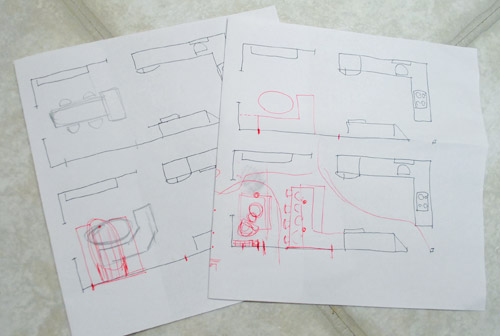
We tried returning to some version of table in the middle (top left) and even modification to the banquette (top right, bottom left). But somewhere in that mess we had one of those “Ah-ha moments” that ol’ what’s-her-name used to talk about on the TV (this is a joke for my Oprah-loving wife). So allow us to introduce the banquette’s successor: the peninsula! Cue the confused emoticons.
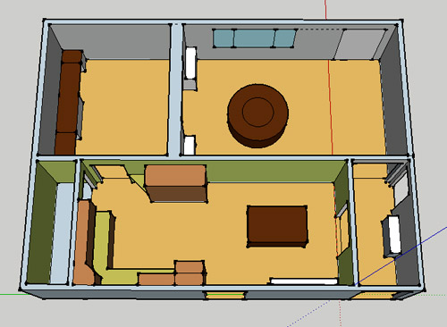
Let’s explain. First, here’s our CURRENT floating-table-in-the-kitchen-and-larger-table-in-the-dining-room arrangement (courtesy of my rough Google Sketch-Up drawing):
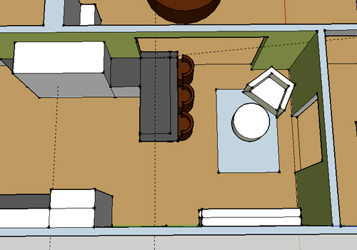
Now for the doorway opened, cabinets painted, counters replaced, floor slightly discolored (not intentionally) and (of course) peninsula’d version:
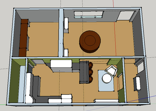
Woo hoo. Before we go any further, we should warn you: we’re 100% sold. The above depiction of it is probably not going to make a believer out of everyone, but from taping it out in the space and moving around it “in person” for a while we giddily came to the following conclusion: it’s The One! So no worries if it’s not your jam or you love Mr. Banquette (he was a lovable guy – and there are always gonna be people who would do things differently if this were their house) but we’re definitely going for it. And we can’t wait to get started.
As for why we didn’t come up with the peninsula idea sooner, we were so stuck on the fact that a peninsula coming off of the cabinetry that we already have would actually hit (or come very very close to hitting) the fridge on the other side of the room. So it wasn’t until we came up with the idea of adding a base cabinet to the right of the cabinetry that we already have to space the peninsula further away (a smidge towards the fireplace) for better flow and even more counter space.
Speaking of counter space, when it comes to executing this whole thing, we’re basically planning to add some base cabinetry (and counters) near the opening itself to create a counter-height peninsula. Which accomplishes a lot, actually:
- It adds additional work surface & cabinet storage to the kitchen side of the room (so it’s easy-access)
- It helps extend and better define the kitchen space without blocking flow or feeling too heavy
- It creates a casual eating space, keeping it distinct from the dining room table, which is just steps away for larger groups and more formal gatherings
- We can most likely seat four people at the peninsula (it’s flexible, so ignore the three chunky chairs shown)
- It can be used as a buffet to set out food (or to seat additional guests) when we have parties
- It can be used for homework, laptop browsing, and general hanging out by the kiddo(s) as they grow
- It even makes sense of our very off-center fireplace by creating a small casual living space that we’ll use as a little “chill corner” of sorts (the peninsula doesn’t block the fireplace, which our banquette friend did from most angles)
That last perk (centering the fireplace) was a nice surprise, since it’s something we’ve struggled with a lot (it’s just in such an odd place, practically shoved in the corner of the room). But you can see from this virtual view through the future doorway how it almost makes the fireplace placement seem intentional (picture it with a nice round mirror above it to balance that doorway next to it). Oh happy day.
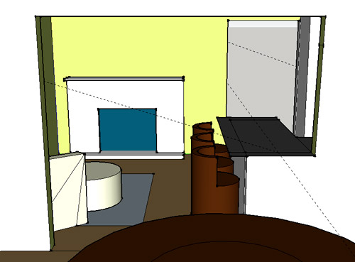
We just love that we’ll get to see the fireplace from the dining room (it won’t be blocked by a heavy banquette) and if overflow guests sit at the peninsula, they won’t have their backs to the people seated in the dining room (which would have happened with the banquette).
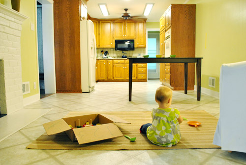
For those who don’t do well with renderings (or are still scratching your heads), here are some pics we snapped to give you a better idea of how it’ll work in the real world. We moved some existing furniture around to mimic the placement (the table represents the peninsula) and have lived with it for the last week-ish to make sure it actually makes sense. Placements aren’t totally exact, but pretty darn close to what we’re thinking. Here’s the view from the laundry room. Ignore the broken pendant light in the far back (it finally crapped out on us). Instead look, there’s that fireplace nicely framed!
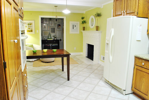
We also traced out the future opening (again, not exact) to show how that’ll work too. We’re thinking there will be a little half-wall (i.e. knee wall) where the peninsula meets the open doorway…
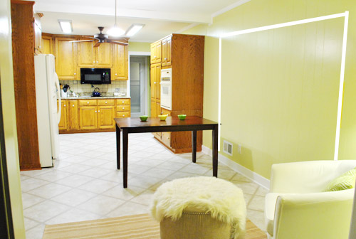
… like we showed in this rendering:

We considered a narrower doorway (where the peninsula doesn’t hang over into the opening) but we think this wider version makes it feel much more open and lets in more light, so it’s the current winner. And of course as previously mentioned, we love how balanced the fireplace and doorway look through the cutout.
Admittedly it took us a little while to figure out what to do with the space in front of the fireplace. It was our biggest hurdle in getting on board with this idea, actually. But after we brought in a placeholder chair, ottoman, rug, and light we realized it was actually completely awesome. There have been approximately 14 hours of reading-with-Clara from that chair in the last week or so. We’re even toying with the addition of some sort of tall built-in bookshelf behind the chair to balance the tall cabinets on the other side of the doorway. Not sure yet, but we’ll keep you posted.
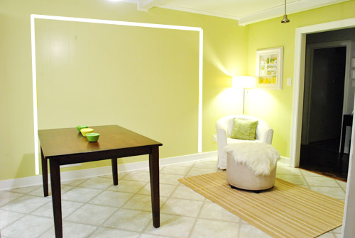
We’ve already discovered it’s a great spot for Clara to play while we’re getting stuff done in the kitchen (since we can’t see her if she’s in the living room, but it’s easy enough to peek over the peninsula to check on her if she’s in the kitchen on the rug).
Sherry’s already making plans for how she’ll relax in front of a fire (we’re contemplating one of those convincing modern-looking electric inserts that Candice Olsen uses – possibly even a double sided one if we can eventually open the back of the fireplace into the living room as planned).
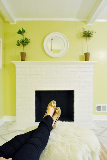
Meanwhile I’m dreaming of a little TV mounted above the mantle so I can watch the news during our morning breakfast routine (Sherry is rolling her eyes as I type this- so we’ll have to see where we land on that). Either way, can you tell we’re getting more than a little excited about this set up? Yup, it’s The One.
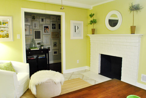
The peninsula will also give us 3-ish base cabinets worth of deep functional storage, unlike the largely decorative storage (open 12″ bookshelves) that the banquette would’ve provided. Plus a nice wide 3′ x 5.5′ work surface for prep, serving, eating, and homework is FAR more functional than what we would’ve gained from a distant island or a narrow banquette located a lot further away. And we’re probably gonna use the new counterspace as an excuse to change the countertops in the whole kitchen. We’ve never loved our existing granite color (it has a few pitted/stained parts too), so it seems silly to actually buy more for the new peninsula (we’ve debated a mismatched look, which we like for an island, but for a peninsula it seems like it would look most like it has “always been there” with the same counter to keep things seamless). Of course we plan to craigslist the existing granite and put that money towards whatever we’ll use for the new material (not gonna lie, we’re already talking about DIYing concrete counters).
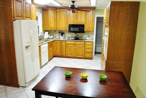
Oh and for anyone debating a peninsula, we’ve learned that the pros recommend 42″ of walking space between the peninsula and whatever’s on the other side (in our case it’s the fridge, which we hope will sink back a foot or so when we replace it with something that’s counter-depth). So that’s how we arrived at our peninsula length.
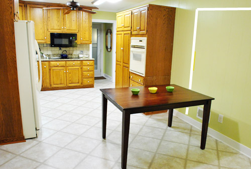
In fact, flow through the room is almost better because there’s one straight pathway through the room, whereas the old table (and the once planned banquette) made us walk in a slight circle. Hoorah for ten less steps a day. Haha.

So now that we’re unequivocally sold and geeky-excited about our new plan, it’s just going to come down to working out the logistics. Namely how to find/build perfectly-sized cabinets that match our old ones without breaking the bank. And finally hire a licensed contractor and get the permits needed to bust out that load bearing wall of ours. But that’s a story for another post. Another ten posts, probably…
Update: You can check out the new “cozy corner” behind the future peninsula in action (on video!) over on Young House Life.
Another update: Lots of people are sweetly suggesting some sort of bookcase or built-in feature on the side of the cabinets that face the dining room (instead of a knee-wall) but we’re unsure if that’ll be too much since there are already built-ins in the dining room that are just a few feet away. We’ll keep you posted as we go though! Who knows where we’ll end up…
Psst: Tomorrow I’m going to post my thoughts on trying Google Sketch-Up for the first time (and how it compares to two other 3D rendering tools I’ve used). So stay tuned for that if you’ve got any questions about how I made the 3D graphics for this post.

Yulia says
Love this idea! Sorry if you’ve answered this already, but will you be able to reuse the cabinet that you removed? Would it fit into the space right before the peninsula?
YoungHouseLove says
That was actually a desk (not a base cabinet) so we’d need to get a cabinet in there to make more sense of things and add storage. Sad, huh? Haha.
xo,
s
Gaidig says
This is clearly going to work so much better for you guys. I think the flow is much better because the banquette seemed random in the middle of the room. I love the cozy chair idea, too. Here’s some corner shelving inspiration:
http://pinterest.com/pin/80454164/
YoungHouseLove says
Love it! Pinned!!!
xo,
s
Jennifer says
Yay! Looks great. I’ve commented on your ideas for this many times over the past few months, and I think you finally hit the nail on the head with this one! One suggestion I was thinking is that you could put some shelving in the knee wall that faces the dining room. Not sure if you need more nooks to clean, but could add a little interest to that space, so it doesn’t look like just leftover space? Just an idea! But overall, I’m digging it!
YoungHouseLove says
Thanks! This seems to be a very common suggestion! I think I’ll update the post with what we’re thinking about that (see other comments both above and below this one for that info). Hope it helps!
xo,
s
Amber Ludwinek says
Love Love Love this. Good work on coming up with a solution that will work for your family for years to come.
tracy says
This is way better! Leave it to you guys to always come up with an even better solution. As a suggestion, you might consider putting little cubbies into the side of the peninsula that faces the dining room. My husband did that to our island when he built the cabinets and it’s where I keep cookbooks. Here’s a picture from when we were still in the building process so you can get a better idea of what I’m talking about: http://www.flickr.com/photos/34894435@N06/3289963007/
The cabinets are painted white and I painted the insides of the cubbies green to match the other accents in our kitchen. I really love them, but it is hard to keep our 14 month old out of them – he likes to put things in there and then take them out! :)
YoungHouseLove says
Very cute! We’re not sure if something facing the dining room would be too much with the built-ins just a few feet away, but we’ll have to just see how it goes!
xo,
s
Jenny says
This seems like a silly question, but when you take out a wall, is there flooring underneath? I’m thinking not, but then how do you rectify that- esp if the two rooms have different flooring.
Also- love how your idea evolved without making any expensive “mis-steps”. I admire the way you guys fully think through your ideas.
YoungHouseLove says
We’ll have to add some oak to try to match the hardwoods that exist in the dining room and then a threshold to lead into the kitchen to fill that gap. It’s kind of hard to picture, but we’ll keep you posted as we go!
xo,
s
Mallory says
I wasn’t sold with you breaking it to us at first, but after I read through the entire post I am COMPLETELY sold! I LOVE the idea! I think the chair in the corner in front of the fireplace will end up being such a great little nook!
I’m now envious!
Emily says
Love it! It’s a very similar layout to our kitchen which we completely renovated ourselves a few years ago: http://emskyrooney.blogspot.com/2008/05/kitchen-renovation.html
YoungHouseLove says
Love it! What an upgrade!
xo,
s
Laurie says
It’s fantastic! I was never completely sold on the banquette though I had full faith if anyone could pull it off you guys could! This just fits the bill perfectly and makes your kitchen seem balanced!!
Great work!
Brieanne Fazio says
I LOOOOOVE everything about this new idea! Can’t wait to see how it turns out! :)
Jessica says
SUCH a great idea! It seems so win-win!
We have a similar space in our kitchen (an island, actually) and it makes the PERFECT buffet; I don’t know how we ever entertained without it!
Love the reading nook. :) Hoping you DIY those countertops!
Naomi says
Great idea! So glad you guys found something that makes you giddy :)
Not that it matters but I totally love it more than the banquette idea.
Ofelia says
I like the kitchen island idea very much, it seems work it very well cause is near the triangle-cooking zone, and the cozy corner is amazing!
Karla says
I love love love this plan!! You know, that little nook where the chair is would also be a cute place for a new little Clara kitchen set! :)
heather @ like a cup of tea says
One more comment on counters. Have you ever heard of Paperstone? It’s 100% Post-Consumer recycled paper mixed with a petrol free resin. It’s super durable, waterproof and eco-friendly. It’s a certified product with LEED points attributable to it (not that you’re going for LEED for Homes). It’s an interesting product and worth looking into just as another option.
YoungHouseLove says
Wow- sounds awesome! I’ve heard about it a little but we’ll have to look into it further. Thanks!
xo,
s
Kelly says
I’m on Team Penisula!! Glad you guys found The One!!! Can’t wait to see it materialize. :)
Briel K. says
I can’t remember but I was probably pro-banquet. However it didn’t really fit well in your space so I’m glad you came up with something that works better! I like this idea and am excited to see your kitchen evolve with all the changes! When are you going to paint those cabinets!? haha
YoungHouseLove says
Can’t wait! Just have to work out other stuff (new counters and appliances) so we don’t scratch up our newly painted cabinets. Haha.
xo,
s
Briel K. says
Makes sense! I’m just impatient! :)
Alexson says
I’m 100% sold, too! I always daydream about knocking out upper halves of walls to open my galley kitchen. Good job, kids!
julia says
I already commented once, but I wanted to add that I love the idea of a little seating area in the kitchen. Our den and kitchen are one room, and I LOVE having a place for the kids (two boys ages 3 and 6 mths) to play while I cook/clean/make coffee etc. I think two little ones can easily hang out now on a nice big 5×8 rug. I think you might want to consider some toy storage somewhere in there. They will need something to play with! That is the hardest thing to figure out for me – the den is always overflowing with toys and its hard to fit everything in cute baskets. We’ve now got the baby swing, bouncy seat, jumperoo, plus tons of trucks and other stuff lined up along one wall plus baskets for smaller things like books. Can’t wait to see how you figure out the toy thing in your house (especially when there are 2 or more kiddos!).
YoungHouseLove says
Great tip! We’ll definitely have to think about places to stash stuff like that!
xo,
s
Megan says
Love the peninsula idea. We knocked down a wall and added a peninsula with display shelving on the dining room side and a bookshelf on the end and we love it. Jealous of the “Candice Olson Fireplace”. I always love the ones she rocks out. Should be gorgeous.
Erin says
So glad you’re not doing the banquette! I didn’t really like that concept, this one is MUCH better!!
And I’m TOTALLY voting for the concrete counters!! I’ve seen a couple online and they look AMAZING, especially with white cabinetry!! Can’t wait to see what you decide on.
Michele says
This layout is sooooo much better than your original idea. And I have to say that I’m totally on board with the concrete counters. I want to do the same with pieces of crushed wine bottes inbedded in the concrete.
I am sad you’re going to cut thru your wood paneling – your paint job inspired me to paint over my wood paneling (so, so much of it….so much…)!!!
Maggie Rose says
Wasn’t sold at the beginning of the post, but was by the end! The banquette idea was cute but with all the walkways and the fireplace I think it just isn’t the right kitchen for that solution. This is great though.
Will the seating be regular chair height or bar-stool height?
YoungHouseLove says
It’s be counter height (probably stools with low backs, but not as high as bar stools).
xo,
s
Melissa says
You guys are incredibly creative and did a fantastic job brainstorming a much better idea for the space. Everything about this idea makes so much sense. I can’t wait to see it take shape!
Erin says
Love the peninsula idea. I also think it will work better for your family in the long run. It is nice to have the kiddo sitting there eating or drawing while you are working in the kitchen. Much less cut off than if they were at a banquet with their back to you.
SK Bryan says
Love this idea so much better. It is so smart to live with your ideas for awhile. We have been in our house for a little over a year & I have been making my own design boards all year. I would have made color mistakes galore had I started right after moving in. Love the rug and play area so you can see Clara from kitchen. You will use that space a lot more with the reading area. I like the idea of some type of shelving behing the chair. Bet Pinterst has great ideas. Good luck.
Jen H. says
YES. This is it! It’ll be great. I was about to suggest something for the end of the peninsula that will face the dining room too, but you’ve already addressed that in your update. However, I was just going to suggest you finish it with a panelled look to match the cabinet fronts, rather than any sort of storage. Might look nicer than just a drywalled knee wall.
Oh, and one last tip – high counters and stools can be kinda scary with little kids, so my humble suggestion would be to keep it at proper counter height, and no higher (bar height is higher, I think).
Cute shoes, Sherry! :)
YoungHouseLove says
The paneled cabinet instead of drywall is actually something John and I were just discussing! It’s definitely a possibility! As for the height we’re definitely sold on counter height (not bar height) for the same kiddo-safe reasoning!
xo,
s
kimb says
The Banquette was a neat idea but this works so much better with your lives. it also provides a nice oval racetrack for clara and future kiddies and burger,LOL.
liz says
love love love it!!! so excited that you scratched the banquette idea – i was too afraid to comment on that post :) cannot wait for you to start on the kitchen redo. have you been getting much feedback on the concrete counter top idea? i’ve been curious how people like them in reality.
YoungHouseLove says
It seems like a ton of folks are dying for us to do it so they can see how it goes! And a bunch of folks with concrete have weighed in and love them (one person has had hers for 11 years and is very happy!).
xo,
s
Ashley says
ooooo…. i loooooooove it! something felt a little itchy about the banquette idea. like a tag in my shirt. didn’t hate it, but this new plan is bonkers [in a bingo sort of way].
Jill Browning says
Yay for peninsulas!! We have one in our kitchen and love it (although we call it a “bar”; easier to say…). We have our dishwasher under ours, but the countertop still hangs over enough to allow for barstool seating. Can’t wait to see how it turns out! (And “BOOOO!” to all the haters ;))
Brittney says
Our home was an office building, so the “kitchen” was a mini fridge and sink. I was hell bent on an island because I could see me working in the kitchen while my kids did homework right there with me. People told me I was nuts, but it worked out and is a real centerpiece of our home now. You will never regret counter space!
My aunt and uncle have a small tv hidden behind a mirror above their fireplace. The mirror is attached with hinges screwed into a wooden box they made around the tv to bring the mirror out the depth of the television. They just swing open the mirror and pull the tv out on one of those swivel mounts. Might be something to think about!
Audrey H. says
Yay for concrete countertops! I really want to do diy them someday so I am sooo excited that’s what you guys are (thinking of) doing!
Faith says
Gotta say I think this is brilliant (like “duh”) and a better solution than the banquette. So excited you’ve found the right answer for your home and your lifestyle.
missy says
we have an easy chair and play space (complete with kitchen table turned into fort!) in our kitchen and we love it. hope you get as much use out of it as we do!
YoungHouseLove says
LOVE THE IDEA OF A FORT! Hahah. What a fun kitchen! Maybe we can figure out how to add a temporary fort function to ours. Haha.
xo,
s
Carrie says
I’ve scanned the comments, but haven’t seen this answered yet…Are you guys thinking about gray base cabinets and white uppers. I think that’d be AMAZING!
YoungHouseLove says
We’re just suckers for an all white cabinet situation! But with backsplash tile and other lighting and flooring and accessories it hopefully won’t be boring! We love the two-tone look in other kitchens but since we have tall cabinets like the pantry and the wood around the fireplace it’s not as easy to do upper a different color than the lowers!
xo,
s
Carrie says
Sorry, I just saw what looked like gray base cabinets in the sketch and may imagination ran away!
YoungHouseLove says
Haha no worries! That would be really fun too!
xo,
s
Brittney Colyer says
LOVE! Practical, space friendly, stylish…love :)
Holly says
Hi guys,
Your cabinet peninsula idea immediately reminded me of Sarah’s House (season 2, the Mid-Century House one) where she used the Ikea cabinets with doors facing the outside so they would have all that additional storage.
Looks like you can still see it on HGTV.com, under full episodes.
As always I’m sure this will turn out SPECTACULAR, can’t wait!
YoungHouseLove says
Thanks! We’ll have to check that out!
xo,
s
Beth M. says
Great idea! Can’t wait to see pics along the way. Love love love your site! With 3 kids and a ton of work I should/ need to be doing, I check it waaaay too often. :)
Becca says
yay! I was also never on the “banquet bandwagon”- my best friend has one and getting her 4 kids (all boys) in and out is a pain in the ass. I love that you’ll have a sweet, quiet little spot by the fire!
Stephanie N says
I don’t read your comments, but I am sure I am not the only one that wasn’t sold on the banquette. It looked weird. This way looks much more normal and functional. And prettier. :)
Dawn says
You guys are genius!! Love it! :)
Marilu Luna says
I’m so glad that you guys decided not to do the banquette. It was like an elephant in the room with no place to go. I love the concept and the layout and nicely it will work with your daily routines. Great choice!
Emily says
Although I didn’t dislike the banquette idea, this makes SO much more sense of the space. The flow looks great! And I LOVE the chair in the kitchen. Definitely makes for a comfy and cozy reading corner in front of the fire place! :)
Fallon says
Love, Love, LOVE. Brilliant idea, totally “you” – I can’t wait to watch this come together! The kitchen remodel was my favorite thing in your old house (with the bathroom being a close second) – so I am natually dying for this one to start!
Trish says
You two are so clever…what a great idea. You will get so much use out of that space for so many different activities. We had a sitting area just like you are proposing by your fireplace in a section of our kitchen in our old house. I just loved sitting there…I used it all the time! This is much better use of your space I think…just sayin!
jen says
Gotta admit, I wasn’t loving the banquette idea and so no comment. But this? This is skads better. Just sayin’.
Elizabeth says
Love it! I think it looks really great and fits the space well.
Also, my aunt had a great idea for hiding her TV. They hung it up on the wall (sunken in a bit) and covered it with a 2 way mirror framed out to look like an actual mirror. When the TV is on you can see it perfectly and when it is off you would have no idea it is there.
YoungHouseLove says
Pretty!!
xo,
s
rach says
I was not a fan of the banquette…THIS SOLUTION IS PERFECT! I love that it will help blend the kitchen in with the dining room, and be overall a much better use of the space. It’s a very natural looking solution for the room as it is with the fireplace and such. Way to go.
Lauren @ Circle G Designs says
I completely support your decision to go banquet-less. I think the flow through the space will be much better the way you’ve decided to go. And kudos, John, for trying your hand at Google SketchUp! I hope you’ve discovered all of the furniture in Google’s 3D warehouse. Next time you need a chair or a stool, it’s a great place to find detailed pieces (more detail = professional looking results). I took several pieces out of the warehouse to do these renderings for a freelance project:
http://circlegdesigns.wordpress.com/2011/08/21/completed-bedroom-makeover/
Oh and btw, you can get rid of those pesky floating dashed lines by either selecting and deleting them or going to “View” and deselecting “Hidden Geometry.” Looking forward to your post tomorrow!
YoungHouseLove says
Just learned about that warehouse – so cool! And thanks for the guide tip. Still figuring this whole thing out. Haha.
-John