For all those wondering when the heck we’ll tackle that kitchen banquette idea that we mentioned a few weeks ago (here and here), well… probably never. Cue the frowny face emoticons.
Here’s the deal. After getting lots of positive feedback on the idea a few weeks ago (over 1,400 comments total!), Sherry and I were certain your collective enthusiasm would push us from “we think this is a good idea” to “this is definitely a good idea.” And it nearly did. But parts of us still questioned the whole commitment-factor when it came to actually doing it (we definitely described it as a half baked idea when we shared it). We worried if it’d really be the most practical solution (would it be a pain to scoot in and out of?) and if it’d really make the most of the space (we couldn’t figure out the right balance of big-enough seats while still maintaining flow around it to keep it from feeling cramped).
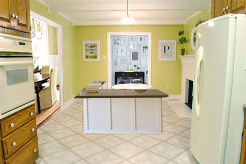
So one evening we decided there was a reason that we were stuck in Hesitation City: it just wasn’t The One. So we did what we always do when we get stuck. We went back to the drawing board to see if we could come up with something else that we ended up liking better. We made a few quick sketches of the floorplan, asked ourselves “what are we not thinking of???” and just started sketching ideas – no matter how good or bad our guts told us they were. Kinda like those DON’T THINK, JUST DRAW exercises that they teach you to access your subconscious or something. Of course some of them completely blocked the doorway to the dining room (fail!) and nearly all of them were completely out of scale (so things were too big or too far over) but it definitely got the ol’ wheels turning again…
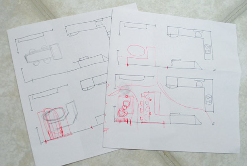
We tried returning to some version of table in the middle (top left) and even modification to the banquette (top right, bottom left). But somewhere in that mess we had one of those “Ah-ha moments” that ol’ what’s-her-name used to talk about on the TV (this is a joke for my Oprah-loving wife). So allow us to introduce the banquette’s successor: the peninsula! Cue the confused emoticons.
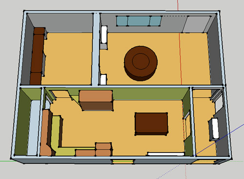
Let’s explain. First, here’s our CURRENT floating-table-in-the-kitchen-and-larger-table-in-the-dining-room arrangement (courtesy of my rough Google Sketch-Up drawing):
Now for the doorway opened, cabinets painted, counters replaced, floor slightly discolored (not intentionally) and (of course) peninsula’d version:
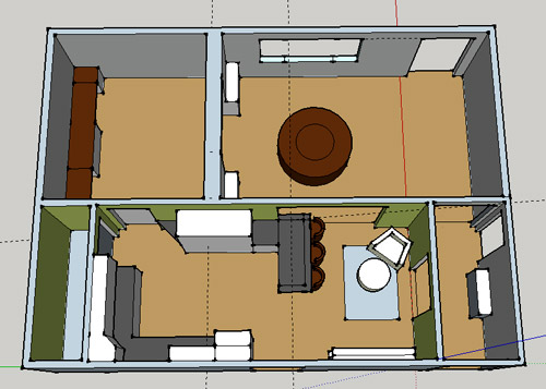
Woo hoo. Before we go any further, we should warn you: we’re 100% sold. The above depiction of it is probably not going to make a believer out of everyone, but from taping it out in the space and moving around it “in person” for a while we giddily came to the following conclusion: it’s The One! So no worries if it’s not your jam or you love Mr. Banquette (he was a lovable guy – and there are always gonna be people who would do things differently if this were their house) but we’re definitely going for it. And we can’t wait to get started.
As for why we didn’t come up with the peninsula idea sooner, we were so stuck on the fact that a peninsula coming off of the cabinetry that we already have would actually hit (or come very very close to hitting) the fridge on the other side of the room. So it wasn’t until we came up with the idea of adding a base cabinet to the right of the cabinetry that we already have to space the peninsula further away (a smidge towards the fireplace) for better flow and even more counter space.
Speaking of counter space, when it comes to executing this whole thing, we’re basically planning to add some base cabinetry (and counters) near the opening itself to create a counter-height peninsula. Which accomplishes a lot, actually:
- It adds additional work surface & cabinet storage to the kitchen side of the room (so it’s easy-access)
- It helps extend and better define the kitchen space without blocking flow or feeling too heavy
- It creates a casual eating space, keeping it distinct from the dining room table, which is just steps away for larger groups and more formal gatherings
- We can most likely seat four people at the peninsula (it’s flexible, so ignore the three chunky chairs shown)
- It can be used as a buffet to set out food (or to seat additional guests) when we have parties
- It can be used for homework, laptop browsing, and general hanging out by the kiddo(s) as they grow
- It even makes sense of our very off-center fireplace by creating a small casual living space that we’ll use as a little “chill corner” of sorts (the peninsula doesn’t block the fireplace, which our banquette friend did from most angles)
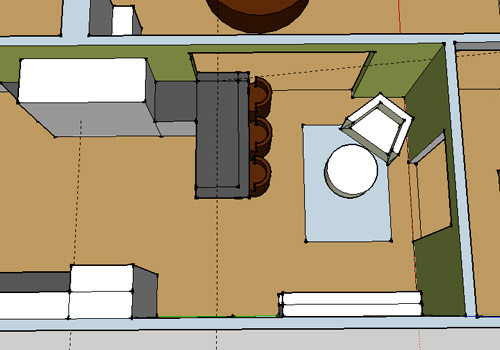
That last perk (centering the fireplace) was a nice surprise, since it’s something we’ve struggled with a lot (it’s just in such an odd place, practically shoved in the corner of the room). But you can see from this virtual view through the future doorway how it almost makes the fireplace placement seem intentional (picture it with a nice round mirror above it to balance that doorway next to it). Oh happy day.
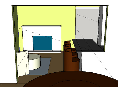
We just love that we’ll get to see the fireplace from the dining room (it won’t be blocked by a heavy banquette) and if overflow guests sit at the peninsula, they won’t have their backs to the people seated in the dining room (which would have happened with the banquette).
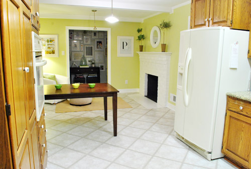
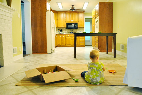
For those who don’t do well with renderings (or are still scratching your heads), here are some pics we snapped to give you a better idea of how it’ll work in the real world. We moved some existing furniture around to mimic the placement (the table represents the peninsula) and have lived with it for the last week-ish to make sure it actually makes sense. Placements aren’t totally exact, but pretty darn close to what we’re thinking. Here’s the view from the laundry room. Ignore the broken pendant light in the far back (it finally crapped out on us). Instead look, there’s that fireplace nicely framed!
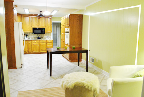
We also traced out the future opening (again, not exact) to show how that’ll work too. We’re thinking there will be a little half-wall (i.e. knee wall) where the peninsula meets the open doorway…
… like we showed in this rendering:

We considered a narrower doorway (where the peninsula doesn’t hang over into the opening) but we think this wider version makes it feel much more open and lets in more light, so it’s the current winner. And of course as previously mentioned, we love how balanced the fireplace and doorway look through the cutout.
Admittedly it took us a little while to figure out what to do with the space in front of the fireplace. It was our biggest hurdle in getting on board with this idea, actually. But after we brought in a placeholder chair, ottoman, rug, and light we realized it was actually completely awesome. There have been approximately 14 hours of reading-with-Clara from that chair in the last week or so. We’re even toying with the addition of some sort of tall built-in bookshelf behind the chair to balance the tall cabinets on the other side of the doorway. Not sure yet, but we’ll keep you posted.
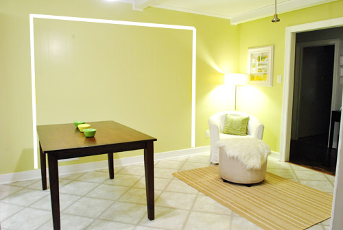
We’ve already discovered it’s a great spot for Clara to play while we’re getting stuff done in the kitchen (since we can’t see her if she’s in the living room, but it’s easy enough to peek over the peninsula to check on her if she’s in the kitchen on the rug).
Sherry’s already making plans for how she’ll relax in front of a fire (we’re contemplating one of those convincing modern-looking electric inserts that Candice Olsen uses – possibly even a double sided one if we can eventually open the back of the fireplace into the living room as planned).
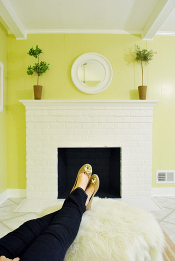
Meanwhile I’m dreaming of a little TV mounted above the mantle so I can watch the news during our morning breakfast routine (Sherry is rolling her eyes as I type this- so we’ll have to see where we land on that). Either way, can you tell we’re getting more than a little excited about this set up? Yup, it’s The One.
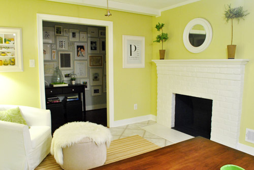
The peninsula will also give us 3-ish base cabinets worth of deep functional storage, unlike the largely decorative storage (open 12″ bookshelves) that the banquette would’ve provided. Plus a nice wide 3′ x 5.5′ work surface for prep, serving, eating, and homework is FAR more functional than what we would’ve gained from a distant island or a narrow banquette located a lot further away. And we’re probably gonna use the new counterspace as an excuse to change the countertops in the whole kitchen. We’ve never loved our existing granite color (it has a few pitted/stained parts too), so it seems silly to actually buy more for the new peninsula (we’ve debated a mismatched look, which we like for an island, but for a peninsula it seems like it would look most like it has “always been there” with the same counter to keep things seamless). Of course we plan to craigslist the existing granite and put that money towards whatever we’ll use for the new material (not gonna lie, we’re already talking about DIYing concrete counters).
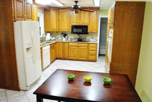
Oh and for anyone debating a peninsula, we’ve learned that the pros recommend 42″ of walking space between the peninsula and whatever’s on the other side (in our case it’s the fridge, which we hope will sink back a foot or so when we replace it with something that’s counter-depth). So that’s how we arrived at our peninsula length.
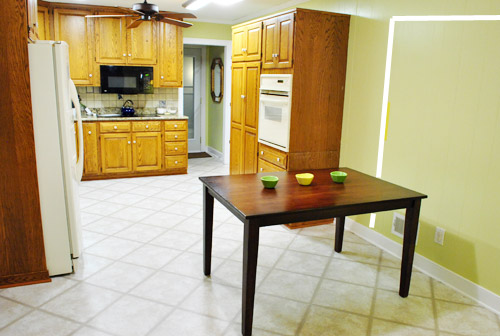
In fact, flow through the room is almost better because there’s one straight pathway through the room, whereas the old table (and the once planned banquette) made us walk in a slight circle. Hoorah for ten less steps a day. Haha.

So now that we’re unequivocally sold and geeky-excited about our new plan, it’s just going to come down to working out the logistics. Namely how to find/build perfectly-sized cabinets that match our old ones without breaking the bank. And finally hire a licensed contractor and get the permits needed to bust out that load bearing wall of ours. But that’s a story for another post. Another ten posts, probably…
Update: You can check out the new “cozy corner” behind the future peninsula in action (on video!) over on Young House Life.
Another update: Lots of people are sweetly suggesting some sort of bookcase or built-in feature on the side of the cabinets that face the dining room (instead of a knee-wall) but we’re unsure if that’ll be too much since there are already built-ins in the dining room that are just a few feet away. We’ll keep you posted as we go though! Who knows where we’ll end up…
Psst: Tomorrow I’m going to post my thoughts on trying Google Sketch-Up for the first time (and how it compares to two other 3D rendering tools I’ve used). So stay tuned for that if you’ve got any questions about how I made the 3D graphics for this post.

Bethany says
Just for some moral support… you guys can totally DIY concrete countertops! My brother makes those for a living, and I’m convinced you could figure out a way to do it yourself.
Love those creative brains of yours!
Jyl says
Bravo, Petersiks! I like this one waaaay better. I had an inkling that you were testing out this idea from the photo in your “Day in the Life” post with the whole family at the table. Thanks for making me feel like a super sleuth ;) Isn’t it the best feeling when the right idea hits you?
Allison says
The difference between like and love: I like the banquette, but I love the peninsula! I would die for a kitchen with the potential for either!
(Sidenote: 10 Thing I Hate About You, anyone? “I like my Sketchers, but I love my Prada backpack”…)
Reenie says
LOVE it. This makes much more sense =)
While I’m not a fan of TV’s over the fireplace….I totally love my lil 15″ flat screen that sits on my counter. I don’t miss any of my shows with it in there ;)
nina says
omg, if you guys DIY concrete counters I promise to love you forever. They are so awesome but intimidating, I’d love a step-by-step.
Amy says
play space plus hang out space right off the kitchen where you can keep an eye on your kids and get some work done is super smart in my book. I saw some home photos in a mag a long time ago where a lady put a cool wicker sofa right off her kitchen with a storage/play area where her kids could hang out, always loved the idea and this is a little reminiscent.
BethanyB says
LOVE this idea! So much better then the banquet one. I’m so happy you both found something so good looking. AND… The fire place will look great when winder get together happen (think warm cozy fire with Christmas decor all around and warm snuggles chair to sit in). So awesome!
Rachael says
I don’t comment very often, and especially on the banquette idea as I HATED it!
The peninsula is a great idea. We had one in our last house and it was perfect for my 4 children to snack at, do homework at and I would lean the other side and chat to them. I can’t fit one in at all in our new house, so we’re having to go for an island instead.
Emily says
Great decision! Wasn’t sold on that banquette thingy anyhow. I love your new cozy nook!
BethanyB says
this makes me want to scream “take that baby to the market”! :P
YoungHouseLove says
Bwahahahaha. And carry her home!
xo,
s
Charlotte says
Love the idea, but as someone from the Southern Hemisphere I’m not digging the name “Peninsula” …. in my world it’s a “Breakfast Bar”
Sorry if someone else had already mentioned that I’m too lazy to read your 957 comments :-)
YoungHouseLove says
Haha, never heard of that! Love it though.
xo,
s
Lea says
I’ve lived in California, US most my life, and also refer to it as a breakfast bar. Never heard peninsula used to describe it until now.
Either way, love it!
Robin @ Our Semi Organic Life says
that’s what I’d call it too!
Kim says
That’s what we call it on the west coast. I thought you guys were just being fancy!
Lindsay says
Hi there. I think this is a fabulous solution for your space (armchair/fireplace combo in any kitchen is always going to be a winner) and it really shows the power of brainstorming! One thought I did have when reading through though was that our peninsula (directly opposite drawers that open towards the end of the bar) has only 37 inches clearance between the two sides yet feels very comfortable as a walk through space. So you might consider extending the bar a little farther giving you more room along the length. If you think that a standard door frame is only 34 inches, then perhaps you don’t need quite as much as 42 inches from your fridge – especially since the fridge is not opening directly onto the bar. Alternatively (or also) you could include a small overhang on the short end of the peninsula to allow another optional stool space there, giving the flexibility to use three sides for seating. It would round it out nicely as a social space. I’m a fanatical rearranger of furniture btw, so I always like to have as much flexibility as possible :) Good luck – can’t wait to see the finished room!
YoungHouseLove says
Thanks so much Lindsay! We were thinking about creating an overhang edge on that short side too (for Clara’s highchair or just another stool for added flexibility). Love it!
xo,
s
Mel Heth says
Awe yeay! The peninsula is totally going to be “the kids’ table” when you guys entertain. I love it!
Julia says
That peninsula sure looked scary in the above view. The dead-on view showed how awesome it would look. (whew) Because you know, this is my house and I have a right to my opinion lol. Thanks for dealing with so many opinions/comments! You’re my role models for dealing with criticism.
Laura says
mmmmm love it. I’m sold. (Because I’m sure that makes a huge difference in your decision making process.)
JZB says
Hi. Not commenting on the banquette. I am sure that you saw the YHL shout out by Tori Spelling on her EdiTORIAl by Tori Spelling blog. I love her and she loves you! I just had to write in case you guys didn’t see it.
YoungHouseLove says
Isn’t that crazytown???!!!!????!!! So amazed.
xo,
s
sarahbclark! says
fantastic idea! i love it and it definitely balances the space. i’ve caught the vision!
toni from says
I am surprised that I am saying this, much less thinking this, but I love the new layout idea so much more than the banquet. The reading chair looks so comfortable, and a great place to relax at the end of the day or to watch Clara from. Congrats on taking your time, and doing what is right for you.
I also think this is a good idea for you guys because you may decide to move again. You love remodeling and eventually you will finish, or overall finish this house, and may decide you need to or want to move to continue the blog. The peninsula would be better for resale.
eileen marie says
Great solution. Btw, your home is becoming more “you” (guys) every time I see another photo! I just wanted to mention that when we recently replaced our fridge (old one died -boo), we could not find a standard (stainless) counter-depth fridge, so you may have to account for the fridge jutting out into your space a bit. Just thought you might want to know, as I adjust and quit ramming into ours (and bruising my shins now that the freezer door pulls open instead of sliding)!
YoungHouseLove says
Oh man! Thanks for the warning! We actually found a few that we like (it’s hard to find a good fit height-wise though) but there must be sales going on or something! Hope they stay that way until we can figure out the height!
xo,
s
Emily says
Not that you need my approval…. but I LOVE this plan! :) Isn’t it soooo exciting when you finally find “the one”?? We are saving up to remodel our kitchen (hopefully the beginning of next year) and I came up with plan after plan in the whole “hey, maybe we should change up the kitchen” stage. And now that I’ve finally found the PERFECT layout I am going crazy waiting to start the remodel!! Have fun! I’m so excited to see the process and the final product!!
Courtney says
I absolutely love this idea!!! I was not a fan of the banquette idea, it seemed to be too far away and blocked everything off, this peninsula is a great way to keep things open. Also, some of my best memories from my parents house (which I lived in for 18 years) are from sitting at the peninsula chairs! LOVE LOVE LOVE! Good work!
Nicole Hyatt says
I like this much better…was never a fan of the other plan!
Melissa says
Is the wall between the kitchen and the hallway of frames load bearing? It looks like maybe it was added when the addition was put on. If so, the fireplace which seems smushed in the corner makes a little more sense. Have you thought of opening the kitchen completely into the hallway?
I like the peninsula idea. You guys do a great job helping us visualize what it will look like. I didn’t get it until I looked at your illustrations closely. But, I love it!
We have a fireplace in our eat in kitchen. I think originally the kitchen was a combined kitchen/family room area. At first I thought the fireplace was a little odd in the kitchen, but now I love it. It makes everything seem homier and cozier.
YoungHouseLove says
Nope, we don’t think that’s load bearing but worry if we open that up even further (while opening up the big doorway to the dining room) the kitchen might feel too open to everything (it already opens to the office and living room and hallway, so adding the dining room one and going wider with the side hall might be scary- haha). You never know where we’ll end up though!
xo,
s
Heather says
So, as for the issue about the TV above the fireplace. I’m all for a TV, but I also get the idea of appearance. If you just planned on a smaller, flat-screen TV could you find a way to cover it up when it’s not in use? For example…if you had a round-mirror, recessed medicine cabinet with removable shelves, could you ‘hide’ the TV in there and then just swing the mirror out of the way when you wanted to watch it? This would also give a nice place to hide your cable cords. Not even sure if this is possible, but I sometimes wonder about this possibility for my kitchen/dining room area, too!
YoungHouseLove says
That would definitely be a fun possibility!
xo,
s
Ambierre says
We got a lot of flak in our kitchen reno for doing a peninsula instead of an island but I do not regret it one bit. It’s super functional, cozy, my kids love it, etc. Good luck with yours!
Beth Franklin says
Totally awesome. This will be amazing long term and really puts a modern spin on
Tanya says
This is about ten thousand times better! Exciting stuff.
Christi Davis says
LOVE the Google Sketchup renderings! They help give a great feel to what you had in mind! And I love the peninsula idea. Seems like a great fit for your home.
Shana Sammons says
Brilliant! Feeling it with you. Can’t wait to see!
Christi Davis says
P.S. Check out our blog for DIY’ing concrete countertops. We’re finishing up ours this week. Its been a long process but well worth it in cost and creativity.
YoungHouseLove says
Thanks so much!! Off to check yours out!
xo,
s
Roxanne M says
Genius Petersiks! Genius! You will get a LOT of use out of that peninsula, I’m sure.
Marla says
Awesome! I never comment but had to. We remodeled last year and added a peninsula. So nice to have that big expanse of counter space. We didn’t have room for an overhang and have only 3 stools. I bought a fold-up one at Walmart I keep in the closet and break it out when we need it-works great! We also have a fireplace and seating area and hubby has talked me into tv over the fireplace–another project!
Ami says
I wasn’t sold on the banquette idea either so I’m glad to see this new plan (but a little part of me was looking forward to seeing how the banquette actually worked out). When I was first looking at the new sketch up floor plan I was like “ummm… no” and then you posted that sketchup view of how it would look from the dining room and I totally fell in love. GREAT idea guys. I totally approve (and yes I’m sure you’re whole world hangs on my approval) but you just won over a new cheerleader!! GREAT plan!!
LauraC says
Uh, sorry to add to your 1000+ comments, but a couple weeks ago I found this great kitchen reno on a blog, and when you mentioned concrete countertops, wanted to share:
http://frugalfarmhousedesign.blogspot.com/2011/07/kitchen-details-info.html
I pinned some of those awesome kitchen shots! I think a post or two before the one I shared she goes into greater detail on how they made them. Anyway, good luck deciding!
YoungHouseLove says
Love it!! Thanks so much for sharing!
xo,
s
Cali says
LOVE LOVE LOVE it! I wasn’t super into the banquette because it just seemed like you were settling for it and this seems to perfect! It will def give you guys room to grow and give Clara a sweet spot to hang with her friends when shes older :-) can’t wait to see you go for it!
Melissa@HomeBaked says
Our kitchen layout is different, but we have an island with stools that serves the same dividing function as your peninsula, and it’s great. Kids eat breakfast there, do homework, Legos, art, help in the kitchen….We extended added a very gentle curve to the overhang, which seems to give a little more elbow room, and we regularly squeeze friends on extra stools on the ends, too. And we have a chair (with view of tv, rather than fireplace) on the non-kitchen workspace side of island, and it is always in use. Morning coffee, kids reading, visitors talking to the cook, watching tv while keeping an eye on dinner…
Which is all to say, you will put this layout to good use!
Judy Pray says
Sold. Love. You guys are so clever!
Julie says
Yes. This is rad. Well done! Also, this is my first (non-contest-entering) comment after 4 or 5 months of reading your blog almost daily. That is how awesome I think your new plans are :) Also, I’m on tenterhooks to read John’s 3D rendering review tomorrow because my husband and I just sketched out (on graph paper) our 5-year plan for remodeling the house and I can pretty much SEE it in my mind’s eye, but I’d still love to render it.
Stephanie says
I seriously LOVE this idea! I knew you would’ve pulled off the banquet, but this idea is just brilliant and exciting. And it makes the fireplace / reading area seem so cozy and almost like “bonus” space.
Anna See says
I absolutely love this solution. PERFECTION!
Katreena says
LOVE that plan! I was not on board for the banquette, but to each his own.
Your kitchen is just begging for a peninsula or island! I can’t wait to see the end result!
Mary says
The península is a far far better option than the banquette. Seriously, I never liked this guy… So big, so in the middle, a bit too much classic for your style… the peninsula match you a lot more!!! Congrats for this decision, I’m eager to see your kitchen remodel!
Carley says
I love this idea! I’ve seen a lot of older homes where we live, where they’ve opened up the kitchen and included a peninsula/breakfast bar space and it’s so incredibly functional. I’m all for replacing the countertops too. Especially if you’re going to give the cabinets a makeover.
Is updating the appliances down the road something you want to do as well? (sorry didn’t read through all 1000+ comments!)
I also love, love, love the sitting area. A friend of my parents did the same thing years ago with a peninsula/hang out area. Her kids are teenagers now, and they and their friends love hanging in the kitchen, doing homework. It has really grown with the family!
YoungHouseLove says
Oh yes- and the floor! And lighting! And a new backsplash! We’re basically just trying to work with the cabinets since they’re in good shape and most of them are in a good spot! But lots of other changes are on the agenda! Ahhh- so many decisions!
xo,
s
Katie L. says
Love that you used Sketchup! If I can offer a few tips!?
I noticed that you have the guides (dashed lines) on, you can choose to hide those if you want. Also, Sketchup always uses the “Architectural Style” as a default and you get those weird black bold corners. Play with the style menu and you can choose a style that will give you a nice clean look. You can also download pre-made models from the Google Warehouse (File>3D Warehouse>Get Models). Someone may have already created some bar stools (or any furniture) that you can load directly into your model! Hope this helps! Love the new layout!
YoungHouseLove says
Thanks so much for the tips Katie! Definitely still learning, but I love it so far.
-John
Stephanie says
Love this solution! We have a peninsula just like this and we use it ALL. THE. TIME. The kids love sitting there while I cook. They eat snacks there. I sit there with the lap top. You will love it. And it works perfectly with your space.
Also: you must have a TV over the fireplace. Sorry, Sherry. I was with you on the whole “which way to hang the ironing board” issue, but John wins this one.
Joy says
I love the new configuration. It looks cozy and warm plus it’s not overwhelmed with furniture. But, we had 2 under-the- counter refrigerators in our last house. Never again! We opted for a freezer on the bottom in our new house and found it’s much more functional than the under-the-counter. I just wondered if you’ve experienced the under-counter fridges before. We luckily had a regular refrigerator in our garage for overflow which we desperately needed.
YoungHouseLove says
Oh no, we don’t mean under the counter- we mean counter-depth (instead of being about 12″ deeper than the counters like most fridges). So it would just be a bit less deep but still tall (and possibly with french doors or a freezer-on-bottom configuration. Hope it helps!
xo,
s
Heather S says
I wasn’t sold on the ol’ banquette, but I thought I could get behind it. I have to say I absolutely LOVE the new thoughts on the counter/cabinet. This is fabulous! I love the cozy reading corner you’re setting up (everyone loves a comfy chair in the kitchen ~ AKA the Heart of the Home!) it makes the fireplace placement look like it was meant to be that way.
I love you how you both sit and “chew” on an idea until you know your 100% in love with it. :)
Sara B. says
SOOOO much better than the banquette! Love, Love, Love this guys.
Leigh says
For most of my son’s growing up years (although at 23, I am still calling these “the growing up years”), we had a comfy purple chair, lamp and side table in our kitchen area. He would actually sit there and talk to me while I cooked or did other kitchen-y things. I am all for anything that stimulates family conversation and togetherness, so I love the chair!
Crystal S says
Love it in a sing song voice!