For all those wondering when the heck we’ll tackle that kitchen banquette idea that we mentioned a few weeks ago (here and here), well… probably never. Cue the frowny face emoticons.
Here’s the deal. After getting lots of positive feedback on the idea a few weeks ago (over 1,400 comments total!), Sherry and I were certain your collective enthusiasm would push us from “we think this is a good idea” to “this is definitely a good idea.” And it nearly did. But parts of us still questioned the whole commitment-factor when it came to actually doing it (we definitely described it as a half baked idea when we shared it). We worried if it’d really be the most practical solution (would it be a pain to scoot in and out of?) and if it’d really make the most of the space (we couldn’t figure out the right balance of big-enough seats while still maintaining flow around it to keep it from feeling cramped).
So one evening we decided there was a reason that we were stuck in Hesitation City: it just wasn’t The One. So we did what we always do when we get stuck. We went back to the drawing board to see if we could come up with something else that we ended up liking better. We made a few quick sketches of the floorplan, asked ourselves “what are we not thinking of???” and just started sketching ideas – no matter how good or bad our guts told us they were. Kinda like those DON’T THINK, JUST DRAW exercises that they teach you to access your subconscious or something. Of course some of them completely blocked the doorway to the dining room (fail!) and nearly all of them were completely out of scale (so things were too big or too far over) but it definitely got the ol’ wheels turning again…
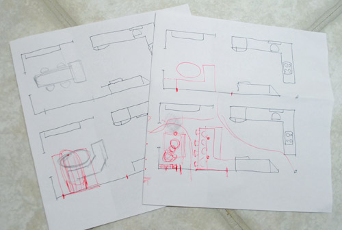
We tried returning to some version of table in the middle (top left) and even modification to the banquette (top right, bottom left). But somewhere in that mess we had one of those “Ah-ha moments” that ol’ what’s-her-name used to talk about on the TV (this is a joke for my Oprah-loving wife). So allow us to introduce the banquette’s successor: the peninsula! Cue the confused emoticons.
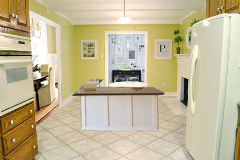
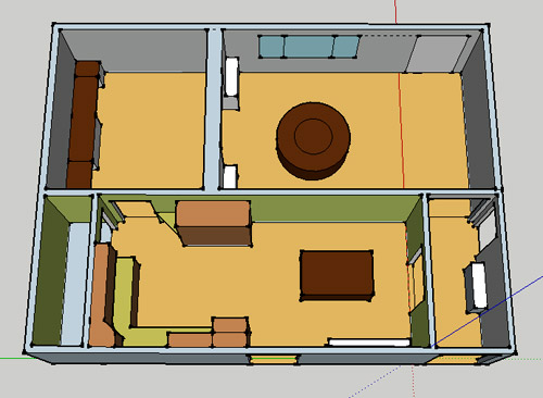
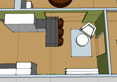
Let’s explain. First, here’s our CURRENT floating-table-in-the-kitchen-and-larger-table-in-the-dining-room arrangement (courtesy of my rough Google Sketch-Up drawing):
Now for the doorway opened, cabinets painted, counters replaced, floor slightly discolored (not intentionally) and (of course) peninsula’d version:
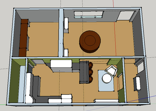
Woo hoo. Before we go any further, we should warn you: we’re 100% sold. The above depiction of it is probably not going to make a believer out of everyone, but from taping it out in the space and moving around it “in person” for a while we giddily came to the following conclusion: it’s The One! So no worries if it’s not your jam or you love Mr. Banquette (he was a lovable guy – and there are always gonna be people who would do things differently if this were their house) but we’re definitely going for it. And we can’t wait to get started.
As for why we didn’t come up with the peninsula idea sooner, we were so stuck on the fact that a peninsula coming off of the cabinetry that we already have would actually hit (or come very very close to hitting) the fridge on the other side of the room. So it wasn’t until we came up with the idea of adding a base cabinet to the right of the cabinetry that we already have to space the peninsula further away (a smidge towards the fireplace) for better flow and even more counter space.
Speaking of counter space, when it comes to executing this whole thing, we’re basically planning to add some base cabinetry (and counters) near the opening itself to create a counter-height peninsula. Which accomplishes a lot, actually:
- It adds additional work surface & cabinet storage to the kitchen side of the room (so it’s easy-access)
- It helps extend and better define the kitchen space without blocking flow or feeling too heavy
- It creates a casual eating space, keeping it distinct from the dining room table, which is just steps away for larger groups and more formal gatherings
- We can most likely seat four people at the peninsula (it’s flexible, so ignore the three chunky chairs shown)
- It can be used as a buffet to set out food (or to seat additional guests) when we have parties
- It can be used for homework, laptop browsing, and general hanging out by the kiddo(s) as they grow
- It even makes sense of our very off-center fireplace by creating a small casual living space that we’ll use as a little “chill corner” of sorts (the peninsula doesn’t block the fireplace, which our banquette friend did from most angles)
That last perk (centering the fireplace) was a nice surprise, since it’s something we’ve struggled with a lot (it’s just in such an odd place, practically shoved in the corner of the room). But you can see from this virtual view through the future doorway how it almost makes the fireplace placement seem intentional (picture it with a nice round mirror above it to balance that doorway next to it). Oh happy day.
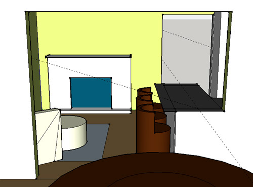
We just love that we’ll get to see the fireplace from the dining room (it won’t be blocked by a heavy banquette) and if overflow guests sit at the peninsula, they won’t have their backs to the people seated in the dining room (which would have happened with the banquette).
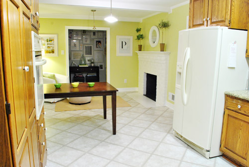
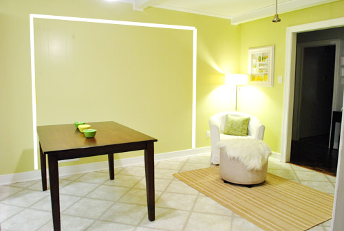
For those who don’t do well with renderings (or are still scratching your heads), here are some pics we snapped to give you a better idea of how it’ll work in the real world. We moved some existing furniture around to mimic the placement (the table represents the peninsula) and have lived with it for the last week-ish to make sure it actually makes sense. Placements aren’t totally exact, but pretty darn close to what we’re thinking. Here’s the view from the laundry room. Ignore the broken pendant light in the far back (it finally crapped out on us). Instead look, there’s that fireplace nicely framed!
We also traced out the future opening (again, not exact) to show how that’ll work too. We’re thinking there will be a little half-wall (i.e. knee wall) where the peninsula meets the open doorway…
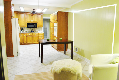
… like we showed in this rendering:

We considered a narrower doorway (where the peninsula doesn’t hang over into the opening) but we think this wider version makes it feel much more open and lets in more light, so it’s the current winner. And of course as previously mentioned, we love how balanced the fireplace and doorway look through the cutout.
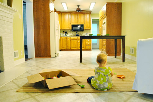
Admittedly it took us a little while to figure out what to do with the space in front of the fireplace. It was our biggest hurdle in getting on board with this idea, actually. But after we brought in a placeholder chair, ottoman, rug, and light we realized it was actually completely awesome. There have been approximately 14 hours of reading-with-Clara from that chair in the last week or so. We’re even toying with the addition of some sort of tall built-in bookshelf behind the chair to balance the tall cabinets on the other side of the doorway. Not sure yet, but we’ll keep you posted.
We’ve already discovered it’s a great spot for Clara to play while we’re getting stuff done in the kitchen (since we can’t see her if she’s in the living room, but it’s easy enough to peek over the peninsula to check on her if she’s in the kitchen on the rug).
Sherry’s already making plans for how she’ll relax in front of a fire (we’re contemplating one of those convincing modern-looking electric inserts that Candice Olsen uses – possibly even a double sided one if we can eventually open the back of the fireplace into the living room as planned).
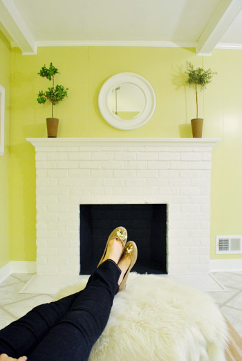
Meanwhile I’m dreaming of a little TV mounted above the mantle so I can watch the news during our morning breakfast routine (Sherry is rolling her eyes as I type this- so we’ll have to see where we land on that). Either way, can you tell we’re getting more than a little excited about this set up? Yup, it’s The One.
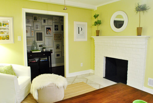
The peninsula will also give us 3-ish base cabinets worth of deep functional storage, unlike the largely decorative storage (open 12″ bookshelves) that the banquette would’ve provided. Plus a nice wide 3′ x 5.5′ work surface for prep, serving, eating, and homework is FAR more functional than what we would’ve gained from a distant island or a narrow banquette located a lot further away. And we’re probably gonna use the new counterspace as an excuse to change the countertops in the whole kitchen. We’ve never loved our existing granite color (it has a few pitted/stained parts too), so it seems silly to actually buy more for the new peninsula (we’ve debated a mismatched look, which we like for an island, but for a peninsula it seems like it would look most like it has “always been there” with the same counter to keep things seamless). Of course we plan to craigslist the existing granite and put that money towards whatever we’ll use for the new material (not gonna lie, we’re already talking about DIYing concrete counters).
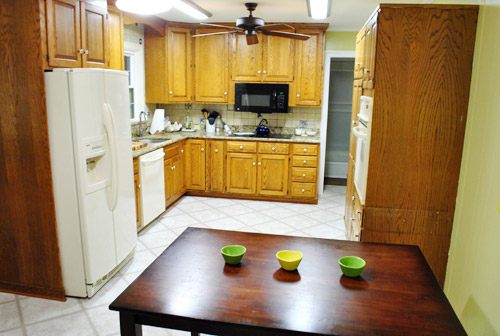
Oh and for anyone debating a peninsula, we’ve learned that the pros recommend 42″ of walking space between the peninsula and whatever’s on the other side (in our case it’s the fridge, which we hope will sink back a foot or so when we replace it with something that’s counter-depth). So that’s how we arrived at our peninsula length.
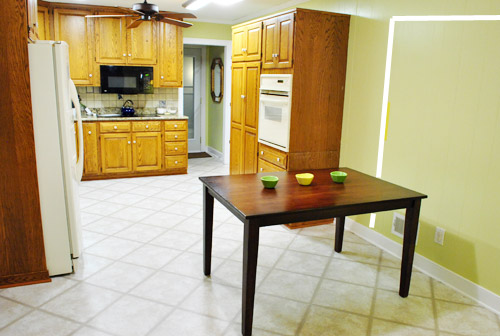
In fact, flow through the room is almost better because there’s one straight pathway through the room, whereas the old table (and the once planned banquette) made us walk in a slight circle. Hoorah for ten less steps a day. Haha.

So now that we’re unequivocally sold and geeky-excited about our new plan, it’s just going to come down to working out the logistics. Namely how to find/build perfectly-sized cabinets that match our old ones without breaking the bank. And finally hire a licensed contractor and get the permits needed to bust out that load bearing wall of ours. But that’s a story for another post. Another ten posts, probably…
Update: You can check out the new “cozy corner” behind the future peninsula in action (on video!) over on Young House Life.
Another update: Lots of people are sweetly suggesting some sort of bookcase or built-in feature on the side of the cabinets that face the dining room (instead of a knee-wall) but we’re unsure if that’ll be too much since there are already built-ins in the dining room that are just a few feet away. We’ll keep you posted as we go though! Who knows where we’ll end up…
Psst: Tomorrow I’m going to post my thoughts on trying Google Sketch-Up for the first time (and how it compares to two other 3D rendering tools I’ve used). So stay tuned for that if you’ve got any questions about how I made the 3D graphics for this post.

Sandra says
I wasn’t feeling it until I saw the “through the dining room door” sketchup view. Now, I’m diggin it.
I’m really looking forward to seeing this in real life! And I’m also really looking forward to the sketchup writeup; I’ve been meaning to check it out myself.
Robin O says
Bravo. Love it! Feels so much more natural than the banquet, like you’re not having to force it. Can’t wait to watch the process!
Kristy says
Ooooooh, I love it!
I like this idea sooo much better, and I can’t wait to see it finished!! Good idea, you two!!!
Sarah says
I love it! You guys can take anything that seem impossible and make it look like it was meant to be. Have you thought about rounding the countertop edge that would be in the kitchen?
YoungHouseLove says
Definitely something we’re considering!
-John
Anne Nickol says
Sherry and John,
You have JUST MADE your home! The layout is awesome and will serve your family SO WELL! That cozy spot by the fireplace is so welcoming, you have created a place for Clara and future children to play, and your will adore having a peninsula. So much time is spent in the kitchen, and your family will not only have a casual place for meals, but a wonderful spot to perch and talk to the cook, go through mail, do homework, use a laptop, have coffee, and lay out food for a party or dinner.
In our last house, we had a U shaped kitchen, which was directly across from our formal dining room, much like your set up. And although we had a sun room close by where we ate lunch and most dinners during the summer, we still longed for a spot to perch in the kitchen. So, I designed a peninsula add on that turned out wonderful! I loved it even more than I had envisioned. : )
I, too, added another base cabinet along the wall before making the turn for the peninsula. We had room for only two bar stools on the dining room side, but since it was just my husband and I then (empty nesters), it was enough. But it was also great for when our daughters came home and perched and talked to me while I was working in the kitchen or helped me with food prep. And it was also a great spot to place filled dinner plates before taking to the dining room table. And as you stated, a great place for sitting food or drinks for a dinner party. But in addition to your current plans, I also installed a small prep sink in that one cabinet base before the turn, which I am so, so glad I did! It was so great to have that extra prep space when someone else was helping me in the kitchen. Also, I designed the base of the peninsula so that after the turn, there was a place on the kitchen side of the peninsula for another bar stool. This gave me a wonderful spot to prep vegetables and fruit while sitting, with the sink right next to me. I included a garbage disposal in the sink. This could be a spot in your kitchen for someone to sit and converse with the lucky one in the chair by the fireplace. : )
My design gave me additional storage under the prep sink, knee room at the beginning of the peninsula for a stool, and storage at the end of the peninsula. My carpenter (you, John!), constructed a narrow wall to seperate the two seaters facing each other at the beginning of the peninsula. He installed base cabinets the rest of the way. Although this makes for a little less storage, the additional area to work is great. Sherry, think of you and Clara making cookies, play dough, or a salad together there, sitting facing each other. : )
Sorry for the long post, but I truly love the design you both have come up with and wanted to give you both a big thumbs up! Your design creates an area of your house where many wonderful family memories will be made. : ) And I also wanted to strongly encourage you to consider the addition of a prep sink and kitchen side stool on your peninsual for an additional (and comfortable) prep space and area for face to face interaction in your kitchen. : )
Once again, you our turning a house into a beautiful home!
Anne
Elizabeth says
I like this so much better than the banquette idea. Just a few thoughts. We have an island in the middle of our kitchen with counter height seating and it’s a hard height when the kids are really little- we have a 3 year old and an almost 2 year old. We have had a couple falls. Also, they can climb the chairs and access anything on the counters in in your case any cabinets above counters. Finally, we’ve had some nasty head bumps on the overhang. We solved some issues by putting a small, cute kid size table in the room in a corner that they can eat at- just temporarily until they get a little bigger. Just something to think about. I do love the look of the peninsula and I think it will be great long term!
Jennifer says
I’m so glad you chose the peninsula! When you suggested the banquette I kept thinking how great a peninsula would look. We recently extended our countertop on our island for bar seating. My kids love it! They have their snacks and breakfast there, plus they do their homework there after school. It’s also good when they want to “help” make cookies. I can bring it to them instead of moving a chair into the kitchen for them to stand on.
The only thing that makes me hesitate is the countertop overhang showing through the doorway. Kids have a tendency to run though the house and not watch where they are going. That could be a big ouch! I like the idea of having more light though. How about a half wall? You could always add a beam for architectural interest from the end of the half wall to the ceiling.
I can’t wait to see what you do! I know it will look great.
YoungHouseLove says
Yeah, we’re still working on where things will fall when it comes to that knee-wall and all that jazz! Not sure where we’ll end up but we’ll keep ya posted!
xo,
s
Jill says
I love the space it creates. It just feels….well, right. And cozy.
I love the way you guys think outside the box. Do you guys ever take on someone else’s problem areas of their house? Sounds like it would be popular, right? Because I have a problem sunroom/family room and a problem eating area in my 1940’s bungalow in Colorado. I really could use some help!
YoungHouseLove says
We actually used to do that (we called them Design Dilemmas) but once the bambino arrived we didn’t have any time to offer our services anymore. There are some fun sites like Ratemyspace.com where you can post pics and get advice- even on our Facebook page you can ask questions and see what folks think! Good luck!
xo,
s
Emily@ Tales of Fruit and Cake says
I would suggest an electric pellet stove insert, they are very green, tremendously easy to use and toasty and warm. My parents live in a ranch house near OC MD and they use their pellet almost exclusively to heat their home in the winter (2000 sq ft). It’s totally cozy and fuel is about 500 bucks!
I wish I could afford one for our basement/ playroom. It gets wicked cold in the winter!
sally says
Love this idea! I was never sold on the banquette.
Valerie says
I was shocked and appalled (yes, much too strong a word for a kitchen layout decision) when I first the beginning of this post. Why? I had been struggling to find a good eat-in dining set up for my own kitchen and your banquette idea was my “ah-ha!” moment! I purchased a premade “banquette off CL last week that was inspired by YHL, and then you change your minds…the nerve! ;) j/k Well, after reading the rest of this post I have to agree (like you asked me?) that your peninsula is even better (for your kitchen’s layout, not mine), so I’m happy you’ve found The One, and that you inspired me too, even if they are now different.
also, sorry to comment on a post w/ so many comments already, I feel guilty like I’ve added to your homework. :)
can’t wait to see how it turns out even if I can’t copy your banquette style anymore.
Lisa says
You are going to love it!!! Our lay out is very similiar with a peninsula seperating the kitchen from a small fireplace/den area. We totally LIVE in that small area more than any other!
Megan says
I’m so happy you aren’t doing it! I love the new design soooo much!!!
Meghan says
FOUND IT! http://kellymoorephotography.com/mooreblog/?p=7633
I’m sure you’ve had lots of suggestions since I posted hours ago…but i wanted to pass along anyway :)
YoungHouseLove says
Love that one! Thanks!
xo,
s
katelyn says
oh man, I knew this was going to be a good post when I saw the comment count! I love the idea and can’t wait to see it in action!
Jennifer L says
Oh do make a concrete countertop. I’ve seen a house in the flesh: complete concrete. Concrete floors. Concrete tub. Concrete fountain in the entry. Concrete counters, kitchen sink. Everything was polished and GORGEOUS, and surprisingly earthy (not cold!)
The husband of the couple worked with concrete and uses the home as a sales pitch. They used this book for the kitchen part: http://www.amazon.com/Concrete-Countertops-Design-Finishes-Kitchen/dp/1561584843/ref=sr_1_10?ie=UTF8&qid=1317252084&sr=8-10
YoungHouseLove says
Thanks so much! Off to check it out!
xo,
s
HeatherM says
It’s perfect! Hooray! We just completely remodeled our kitchen and added to the existing layout the same features: a peninsula, and tearing out the wall to the dining room.
I find it interesting that we came to such similar conclusions in our projects with such different thought processes. You guys took the “just draw” approach, which I really respect, because it requires a level of skill and creativity that I just don’t have.
I’m a VERY form-follows-function girl, so when I look at a potential space, it absolutely Must make sense with how we use our space on a day-to-day basis. I’ll be honest, I looked at your old design and thought “That totally does not work well for watching your kid(s) while you cook.” The banquette took away your sight-line across the room, and and I could picture little 2 & 3-yr olds hiding behind that couch and getting into all kinds of trouble: eating crayons, butting the heads of Lego men in noses and ears, etc, etc.
I started by making lists, because I am a list person. So I started with lists of all of the things I wanted to do regularly and use regularly in my future kitchen, and I made places for these things. Some of these things were that I wanted to be able to watch my (future) kids play while I cooked, and have their play space out of the cooking space and away from the oven. I made room for things like garbages, and the appliances I rarely use, and my baby and big crock pots, etc. I pictured myself doing group cooking activities and working on volcano science projects, and I knew I wanted a suface where my family could gather around together to do these things. And thus our peninsula was born.
Personally, I just love how well a peninsula integrates cooking space and living space. When I entertain, people always gather in the kitchen, but then it often gets waaay too crowded, and that gets annoying. A peninsula gives the kitchen dwellers who belong in the “peanut gallery” (b/c they are doing little if any hands-on cooking) their proper place.
Btw, my aunt did cement counters, and whenever you put a cold glass down on the counter, it leaves a permanent cement ring. Remember, you can DIY granite countertops too (w/ 24″x24″ tiles) – this is what we did, and it turned out great.
YoungHouseLove says
Ooh that sounds pretty! Thanks for tossing that idea into the pot!
xo,
s
Johanna says
If you got 1,400 posts on the other layout, then you expect to get 5,000 more cheering for this one. I think it makes perfect sense. And especially love the addition of a cozy reading area. I have always dreamed of having a little corner like that in my kitchen. Maybe with a bergere chair and little table where I can sip my coffee and read a book on lazy Sunday mornings (Bet sherry would loooove that!)
Kuddos to you for letting the juices flow and seeing what comes out of it. I know what it’s like to get stuck in one idea / concept and just having a nagging feeling that its just not right.
Oh, and I love GOOGLE SKETCHUP!!! So much so that I don’t event paint or move furniture until I “draw” it up to get an idea of what it will look like.
Would love to show you some of my sketchup drawings. Let me know, and I will email you a few.
Cheers to finally finding the one!!
Andy says
My old rancher from the early ’80’s had a cupboard that opened into the dining area under the bar while the rest of the cupboards opened into the kitchen. That way you could use the awkward inside corner/elbow part more easily. One Sarah’s House episode used upper cabinets on the floor facing out from under the bar. It was Season 2, the back-split. I seem to remember the uppers were butted up to the lowers. Any-hoo it’s on her hgtv website.
jbhat says
I hated the banquette plans (but didn’t say so; am too polite), but now am free to say that I LOVE THIS IDEA! It’s perfect in every way, and I cannot wait for you to knock down that wall and get started. It’s going to be just right. You guys are brilliant!
jhbhat omg, I’m so excited, I cannot even sign off right.
jbhat (there! yay!)
Trude says
Love this new idea! And I think the little half wall is great, because if you’re entertaining people like my parents do, half wind up in the kitchen anyways so this way those who are seated at the peninsula can chat with those at the dining table. :) Congrats on finding a solution you love! Also – if you guys plan on staying in this house for the foreseeable future, I’d recommend making sure that 42″ clearance is enough for a wheelchair. Since you’ve already got a one-story, it would make it even more wheelchair-friendly. Even if you never have one yourselves, if you do eventually sell it’ll be an extra bonus way to market the home!
Robin @ Our Semi Organic Life says
What about this? http://www.apartmenttherapy.com/chicago/kitchen/these-countertops-arent-made-from-wood-104430 concrete counters that look like wood! Crazy.
YoungHouseLove says
No way! Wow, that’s amazingly realistic!
xo,
s
Jennifer says
Love, love, love! We have a peninsula in our house and it is THE spot. We’re open plan, so our 12-seat dining table is literally on the other side of our kitchen counter (which is longer than the table) and we have three stools around our peninsula at the end of the counter. We sit there for 99% of our meals, the kids do their homework there, we paint there, etc, etc – our kitchen is definitely the heart of the home and I wouldn’t have it any other way. The only mistake I made was buying only three stools – I went with three for design purposes (you know, decorate in threes) and never thought about the fact we’re a family of four and you know, maybe we’d all like to sit together to eat! But unfortunately I bought them from PB in the States, moved them down to Australia and now can’t get another one of the same. So I’m debating the whole mix and match thing – get rid of one and buy two of a different kind. Luckily (or unluckily perhaps) my hubby works stupid long hours so during the week its just me and the two kids eating. When he’s around on the weekend, we sit “at the big table” as the kids would say. Can’t wait to see the final results!!!
Allison says
Have you thought about how you will treat the end of the bench facing the dining room table? Perhaps you could add some open shelves to tie in with those in your dining room where you can keep recipe books etc?
YoungHouseLove says
We weren’t sure if that would be too much since we have built-ins about a foot or two away in the dining room side. We’ll have to see where we end up!
xo,
s
Jenn says
Thank goodness. I hated that banquette idea but I also knew you had enough sense not to go with it. This is MUCH better.
Kim says
love y’all! I was an avid banquetteer (like musketeer?), but I think this fits the two of you and the house so much better.
Beth H. says
We opted out of a table in our kitchen since we already have a breakfast bar and the dining room is 5 steps away. (Two table within sight of each other seems pointless). Instead we have a cozy seating area too, with 2 chairs and a table and lamp. This area sees so much use! Whenever we have people over they always end up in the kitchen, so the extra seating is wonderful! Great choice!
Kari says
I thought the banquette was fantastic, but I love your peninsula idea, too! I’m so pleased for you that this is all coming together. Whoo hoo!!!
I apologize profusely if this has been addressed before, but I’m not reading over 1,000 comments (and since you pointed out to us last week how much time it takes for YOU to read/respond to the comments, feel free to ignore what I have to say!) In my heart of hearts I usually don’t like offering you guys suggestions for things, because I recognize that there are so many variables that I don’t understand about your lives–the way you inhabit your space, the goals you have for how long you plan to be there, etc. I figure you guys know best, and you have to live with it either way.
However, I’m having a mid-life crisis this week realizing how quickly my kids have gone from babies to teenagers (we’ve had some stuff happen around here) and it has totally shifted my perspective on living spaces. I love, love, love having a breakfast bar attached to my kitchen (fairly similar to what you’ve got planned), and where you have a chair I have a couch and 2 side chairs and our TV (obviously the space size is different). I love the chair and would only suggest that if there is a way you can seat 2 there, consider the possibility (I have no idea on how to accomplish this, not very helpful). Sooner than you think (sob!) Clara will not be sitting in your lap to read, and there may come a point when she has a friend over to chill, or Clara and a cousin/sibling might be hanging out together while you cook.
Thanks for a great blog!
YoungHouseLove says
Thanks for the tip Kari! I’d love a little chair and a half or a chaise to seat two people if they’re willing to snuggle! Haha.
xo,
s
Elle says
I must admit I was not sold on the banquette idea(but I thought if you guys loved it then it would work)…but this I LOVE!!! Amazing vision guys cant wait to see it come to life :)
PS TV idea = WIN!
mary says
I am so happy you went in another direction. I pulled the second table out of my kitchen and made it a sitting area. We have a small breakfast bar too. We use the space so much more than we did with a table in there. The kids use the sitting area as a play area. I think you will be very happy as this plan grows with your family.
Julie B says
Great choice, guys. I agree…the banquette seemed akward, I just didn’t want to poopoo on your ‘parade.’ The peninsula is a nice solution. (And I’m not just saying that because we did the same same in our kitchen. Not biased at all.)
{hooked on hickory} says
really like the penisula! great alternative…no one wants to be pushing there way out of a booth…not at home, atleast! i’m not 100% sold on a chair in front of the fireplace. have you considered a sette on casters with a small round pedestal table? just an idea! can’t wait to see what you do!
ashley over @
{hookedonhickory}
YoungHouseLove says
That could be really cute! All the stuff in the corner is just a placeholder!
xo,
s
Holly says
I didn’t read any of the comments so I apologize if this has been mentioned, but are you considering any shelves or chalkboard or some other decoration on the side of the cabinets that will face the diner that is closet to the dining room (they would be sitting directly in front of the side of the cabinet?). I think that would be a great place to put cookbooks, other decorative kitchen stuff.
Love the peninsula idea!
YoungHouseLove says
Definitely a possibility!
xo
s
Erin says
Loving this idea so much! :) I can feel the flow of the room much better this way. And the sitting area is wonderful – it would be a great way to have Clara nearby, but not completely in the mix of the kitchen when you’re busy. Excited to see the progress!
And…concrete counters?! Loving that idea! I’ve toyed with doing that for a bar countertop somewhere down the line. Looking forward to a tutorial on that! :)
Lindsay says
I love the peninsula idea! But I’m not sold on the half wall yet, I would probably opt for the narrower doorway but I’m sure it will look awesome. And I am all about the diy concrete counters, I’m planning my attack on them for my kitchen now. I found this great multi-post tutorial from the blog Imperfectly Polished http://imperfectlypolished.com/2011/07/06/diy-concrete-counters-prep-and-planning/
YoungHouseLove says
Love it!!
xo,
s
Angie says
I’ll be truthful – I’m a very recent reader, but have degrees in both interior design and architecture and do a SIGNIFICANT amount of complicated residential renovation design. I also teach the residential/kitchen&bath interior design studio at a major 4-year university. I see a lot of people who weren’t willing to tell you the banquette wasn’t their favorite idea from day one. Honesty is best, friends! :) SO…since I’m usually in a constructive question-asking mode with my students and clients, I’ll ask a few here, as well:
Where does the doorway by the fridge lead to? Is it possible that the fridge could move to the other side of the kitchen and have the peninsula come out from the wall on THAT side of the kitchen? The reason I ask is that it may help address the 42″ clearance issue from your fridge to the peninsula and would allow clear flow of space back and forth from the kitchen to the dining room if you decide to host dinner parties. Not suggesting there’s something super wrong with this scenario, mind you, but I’m a design teacher by nature and have to ask the question. “what happens if you do ________?”
If it needs to stay this way for economics of moving that much stuff around, instead of the knee-wall, perhaps consider making a way to access a cabinet/built-in door from the dining room side for things like chargers, place-mats, etc. Maybe there is a good solution for creating handy storage for the dining room essentials. 2 cents from the token design professional.
Also…bravo, first-time SketchUp users! If you’d like the next step in making your designs come to life virtually – check out all the rendering plug-ins by Podium, V-Ray, Kerkythea, and others. Always happy to help with constructive design-teacher tidbits! :)
YoungHouseLove says
Thanks for the tips! The fridge can’t move for money reasons but we’re definitely thinking about possibilities for the knee wall- should be fun to see where we end up!
xo,
s
Janet Gaupp says
LOVE this new configuration. Wasn’t a huge banquette fan, but knew you would make it work. If John REALLY wants that TV check out this solution, could make BOTH of you happy. http://framemytv.com/index.cfm?fuseaction=category.display&category_id=8
YoungHouseLove says
Ooh la la!!
xo
s
Holly says
… coming out of lurkdom to say I love this plan! … question: are you going to add some kind of wall,arched opening or something to the dining room… it just seems awkward for you to walk right into your dining room from the front door. *I think you need some sort of entry way? Just curious? :)*
YoungHouseLove says
We’re definitely planning to add some entryway definition down the line! Our last house was the same way (you walked into the dining room/living room) so we might be more used to the whole open living thing- but we like to define the entryway a bit!
xo,
s
Melissa @ A Place to Nest says
I have to agree- was not 100% on the banquette. Not that it is my house- :) But LOVE this. Makes much more sense of space and flow… look forward to the plans in motion. And secretly want you to do concrete so I can learn from the pros for my house one day :)
Jamie M says
LOVE it! I always was a little unsure of the banquette, but I am so excited about this!
caroline says
Oh well done – so glad you’ve decided to do this – the old idea was hugely impractical in my book. Its always hard to sort out an eat-in kitchen with so many door openings. Personally with the opening from the dining room I would (if practical and financially viable) consider blocking up the hall entry – you don’t need to go into the kitchen that way now and it would make it easier to furnish the fireplace side of the room without it looking unbalanced – because once you open the dining room side up you will have a doorway/opening on all 4 walls which is somewhat extreme.
Not sure if anyone has suggested this before (or if you’ve tossed it around as an idea yourselves).
Oh and definitely think about having the fireplace functional from both sides.
YoungHouseLove says
We just love the light that adds to the kitchen and hallway too much to close it off (the hallway would be a long dark alley without that nice 6′ opening). And the frame wall is the heart of the house (we love that we can see it from so many rooms). Haha. Yeah, we’re weird.
xo,
s
caroline says
Oh and I’d make the half wall a wine rack but then I’m probably more of a boozer than you guys are and my kids are older!
Jolene says
Banquettes are cosy but this works much better for your layout – well done!
And good luck with the concrete benchtop… we had great plans for DIY’ing one too, until we got this far with our kitchen renovation: http://duckeggblue.wordpress.com/2011/07/21/absolutely-floored
And that’s just a floor… which doesn’t require moving after it’s laid, or too much close inspection!
We were also advised that due to the weight of a concrete benchtop (countertop for you!) cabinets would need to be reinforced and therefore more expensive.
Can’t wait to see where you get to with the kitchen… good luck!
YoungHouseLove says
Thanks for the tip! Never thought about if the cabinets could stand the weight!
xo,
s
Meg Smith says
J & S, Love this! Great idea! Great flow! Have an acquaintance in Raleigh with two cozy seats and ottoman with built-ins (for cook books and such) and I have always loved that about her kitchen. Functional bar/serving area with coziness for older people, nursing, or whatever! Love it!
caroline says
Ok read the comments about cement countertops – hmm I quite like them but to be perfectly honest I don’t think they will suit this style of kitchen unless you drastically change your cupboard fronts (which I assume due to cost factors you are going to paint – maybe?) I think they will look too cottage-y for an industrial/Moroccan style of benchtop.
YoungHouseLove says
Definitely a good point! We’ll have to see where we end up with them! We definitely plan to bring in new lighting, flooring, backsplash, and appliances so we’ll have to see how it all evolves!
xo,
s
Carrie says
Love this idea! So functional!
As for the issue of kids bumping heads on the corner of the overhang (on the DR side) – we have an island with an overhang and because there are barstools pushed under it, the kids *can’t* walk that close or they’ll walk into the barstool. When they are tall enough to hit their head, they are old enough (usually) to not be acting like fools in the house anyway. And if they run into it, they’ll only do it once. ;)
Best of luck on the transformation!
YoungHouseLove says
Oh great point! Hopefully the stools will be nice “don’t run through these to get to the counter” reminders!
xo,
s
caroline says
Ok (sorry to be such a pain in the butt) – I hear your thoughts about the light in the hallway – what about gorgeous glass french-doors then? Doesn’t help with kitchen furniture placement but helps cosy the place up a bit and maintains the light for the hallway.
I think your hallway could like quite elegant with the detail.
Sorry I’m like a dog with a bone here aren’t I?
YoungHouseLove says
Haha, who knows where we’ll end up! For now we’re really excited to bring french doors in between the office and the dining room (just to close off the paperwork when we entertain) – but for some reason we love the hallway being open and easy access!
xo,
s
Allison says
We are in the middle of attempting concrete countertops right now. I read countless tutorials online and did all my research. We are both very handy people, but I’ve been surprised at how hard and frustrating this project has been. It all went smooth until we unmolded them and started sanding (not with diamond grit because we are cheap). Countless air holes(aka bug holes) were uncovered with the sander. Large and super tiny. Too many to patch one at a time. That is the stage we are at right now. Trying to patch the holes with cement slurry (which also happens to NOT match the color of the counters). I’m still not sure where we went wrong. Maybe our mix was too dry, but I know one section was extra soupy and it’s not any better. Maybe our vibrator wasn’t as good as we thought it was (that would be me with a mallet). So…we’ll see how it comes out.
YoungHouseLove says
Oh man, so sorry it’s rocky! Here’s hoping they’re gorgeous and worth it in the end!
xo,
s
KristinaM says
Love the open bookcase style but on the inside end facing the fire place. Kind of like Pioneer Woman’s open end for Le Creuset in the Lodge!
YoungHouseLove says
Cute! Another possibility for sure!
xo,
s
Rachel @ http://rachelrefurbished.blogspot.com says
Gaaah! I’m actually a little embarrassed at how giddy and excited I am for you all to get this project started. I LOOOOVE IT! And, I don’t use all caps and elongated words lightly. Will the island be counter height or bar height or table height? (Sorry if this has already been answered, I didn’t read through all the comments). Again, it’s perfect!
YoungHouseLove says
We’re going to go with counter height! Just to keep it consistent with the rest of the room and make it a nice east worktop (plus it’s nice not to have kiddos up too high- haha).
xo,
s