For all those wondering when the heck we’ll tackle that kitchen banquette idea that we mentioned a few weeks ago (here and here), well… probably never. Cue the frowny face emoticons.
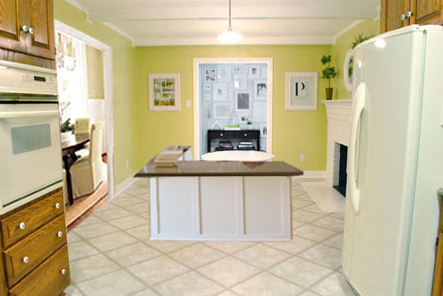
Here’s the deal. After getting lots of positive feedback on the idea a few weeks ago (over 1,400 comments total!), Sherry and I were certain your collective enthusiasm would push us from “we think this is a good idea” to “this is definitely a good idea.” And it nearly did. But parts of us still questioned the whole commitment-factor when it came to actually doing it (we definitely described it as a half baked idea when we shared it). We worried if it’d really be the most practical solution (would it be a pain to scoot in and out of?) and if it’d really make the most of the space (we couldn’t figure out the right balance of big-enough seats while still maintaining flow around it to keep it from feeling cramped).
So one evening we decided there was a reason that we were stuck in Hesitation City: it just wasn’t The One. So we did what we always do when we get stuck. We went back to the drawing board to see if we could come up with something else that we ended up liking better. We made a few quick sketches of the floorplan, asked ourselves “what are we not thinking of???” and just started sketching ideas – no matter how good or bad our guts told us they were. Kinda like those DON’T THINK, JUST DRAW exercises that they teach you to access your subconscious or something. Of course some of them completely blocked the doorway to the dining room (fail!) and nearly all of them were completely out of scale (so things were too big or too far over) but it definitely got the ol’ wheels turning again…
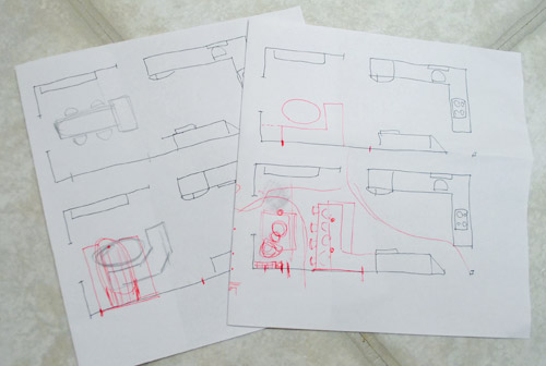
We tried returning to some version of table in the middle (top left) and even modification to the banquette (top right, bottom left). But somewhere in that mess we had one of those “Ah-ha moments” that ol’ what’s-her-name used to talk about on the TV (this is a joke for my Oprah-loving wife). So allow us to introduce the banquette’s successor: the peninsula! Cue the confused emoticons.
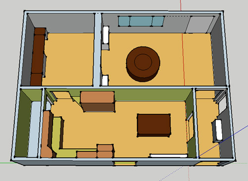
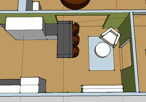
Let’s explain. First, here’s our CURRENT floating-table-in-the-kitchen-and-larger-table-in-the-dining-room arrangement (courtesy of my rough Google Sketch-Up drawing):
Now for the doorway opened, cabinets painted, counters replaced, floor slightly discolored (not intentionally) and (of course) peninsula’d version:
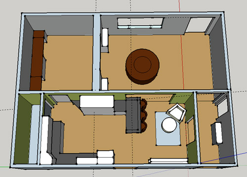
Woo hoo. Before we go any further, we should warn you: we’re 100% sold. The above depiction of it is probably not going to make a believer out of everyone, but from taping it out in the space and moving around it “in person” for a while we giddily came to the following conclusion: it’s The One! So no worries if it’s not your jam or you love Mr. Banquette (he was a lovable guy – and there are always gonna be people who would do things differently if this were their house) but we’re definitely going for it. And we can’t wait to get started.
As for why we didn’t come up with the peninsula idea sooner, we were so stuck on the fact that a peninsula coming off of the cabinetry that we already have would actually hit (or come very very close to hitting) the fridge on the other side of the room. So it wasn’t until we came up with the idea of adding a base cabinet to the right of the cabinetry that we already have to space the peninsula further away (a smidge towards the fireplace) for better flow and even more counter space.
Speaking of counter space, when it comes to executing this whole thing, we’re basically planning to add some base cabinetry (and counters) near the opening itself to create a counter-height peninsula. Which accomplishes a lot, actually:
- It adds additional work surface & cabinet storage to the kitchen side of the room (so it’s easy-access)
- It helps extend and better define the kitchen space without blocking flow or feeling too heavy
- It creates a casual eating space, keeping it distinct from the dining room table, which is just steps away for larger groups and more formal gatherings
- We can most likely seat four people at the peninsula (it’s flexible, so ignore the three chunky chairs shown)
- It can be used as a buffet to set out food (or to seat additional guests) when we have parties
- It can be used for homework, laptop browsing, and general hanging out by the kiddo(s) as they grow
- It even makes sense of our very off-center fireplace by creating a small casual living space that we’ll use as a little “chill corner” of sorts (the peninsula doesn’t block the fireplace, which our banquette friend did from most angles)
That last perk (centering the fireplace) was a nice surprise, since it’s something we’ve struggled with a lot (it’s just in such an odd place, practically shoved in the corner of the room). But you can see from this virtual view through the future doorway how it almost makes the fireplace placement seem intentional (picture it with a nice round mirror above it to balance that doorway next to it). Oh happy day.
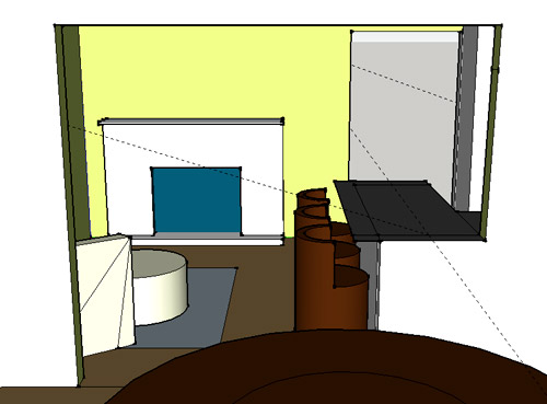
We just love that we’ll get to see the fireplace from the dining room (it won’t be blocked by a heavy banquette) and if overflow guests sit at the peninsula, they won’t have their backs to the people seated in the dining room (which would have happened with the banquette).
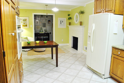
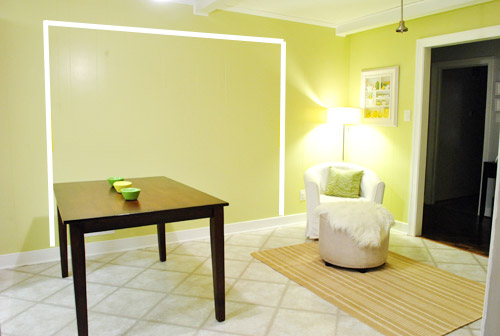
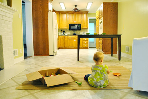
For those who don’t do well with renderings (or are still scratching your heads), here are some pics we snapped to give you a better idea of how it’ll work in the real world. We moved some existing furniture around to mimic the placement (the table represents the peninsula) and have lived with it for the last week-ish to make sure it actually makes sense. Placements aren’t totally exact, but pretty darn close to what we’re thinking. Here’s the view from the laundry room. Ignore the broken pendant light in the far back (it finally crapped out on us). Instead look, there’s that fireplace nicely framed!
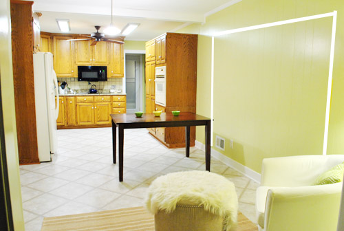
We also traced out the future opening (again, not exact) to show how that’ll work too. We’re thinking there will be a little half-wall (i.e. knee wall) where the peninsula meets the open doorway…
… like we showed in this rendering:

We considered a narrower doorway (where the peninsula doesn’t hang over into the opening) but we think this wider version makes it feel much more open and lets in more light, so it’s the current winner. And of course as previously mentioned, we love how balanced the fireplace and doorway look through the cutout.
Admittedly it took us a little while to figure out what to do with the space in front of the fireplace. It was our biggest hurdle in getting on board with this idea, actually. But after we brought in a placeholder chair, ottoman, rug, and light we realized it was actually completely awesome. There have been approximately 14 hours of reading-with-Clara from that chair in the last week or so. We’re even toying with the addition of some sort of tall built-in bookshelf behind the chair to balance the tall cabinets on the other side of the doorway. Not sure yet, but we’ll keep you posted.
We’ve already discovered it’s a great spot for Clara to play while we’re getting stuff done in the kitchen (since we can’t see her if she’s in the living room, but it’s easy enough to peek over the peninsula to check on her if she’s in the kitchen on the rug).
Sherry’s already making plans for how she’ll relax in front of a fire (we’re contemplating one of those convincing modern-looking electric inserts that Candice Olsen uses – possibly even a double sided one if we can eventually open the back of the fireplace into the living room as planned).
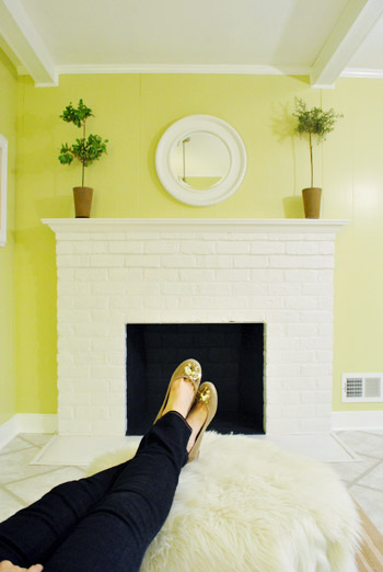
Meanwhile I’m dreaming of a little TV mounted above the mantle so I can watch the news during our morning breakfast routine (Sherry is rolling her eyes as I type this- so we’ll have to see where we land on that). Either way, can you tell we’re getting more than a little excited about this set up? Yup, it’s The One.
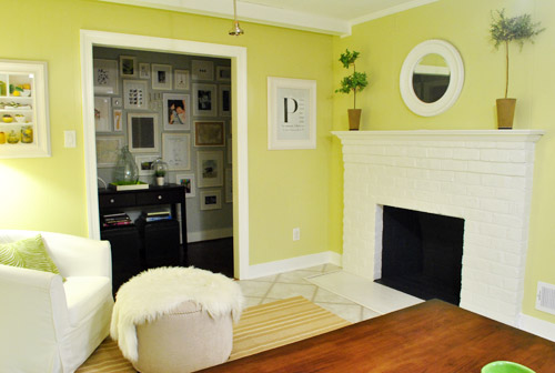
The peninsula will also give us 3-ish base cabinets worth of deep functional storage, unlike the largely decorative storage (open 12″ bookshelves) that the banquette would’ve provided. Plus a nice wide 3′ x 5.5′ work surface for prep, serving, eating, and homework is FAR more functional than what we would’ve gained from a distant island or a narrow banquette located a lot further away. And we’re probably gonna use the new counterspace as an excuse to change the countertops in the whole kitchen. We’ve never loved our existing granite color (it has a few pitted/stained parts too), so it seems silly to actually buy more for the new peninsula (we’ve debated a mismatched look, which we like for an island, but for a peninsula it seems like it would look most like it has “always been there” with the same counter to keep things seamless). Of course we plan to craigslist the existing granite and put that money towards whatever we’ll use for the new material (not gonna lie, we’re already talking about DIYing concrete counters).
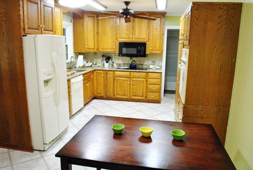
Oh and for anyone debating a peninsula, we’ve learned that the pros recommend 42″ of walking space between the peninsula and whatever’s on the other side (in our case it’s the fridge, which we hope will sink back a foot or so when we replace it with something that’s counter-depth). So that’s how we arrived at our peninsula length.
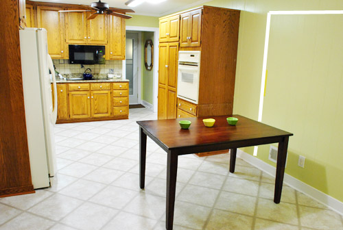
In fact, flow through the room is almost better because there’s one straight pathway through the room, whereas the old table (and the once planned banquette) made us walk in a slight circle. Hoorah for ten less steps a day. Haha.

So now that we’re unequivocally sold and geeky-excited about our new plan, it’s just going to come down to working out the logistics. Namely how to find/build perfectly-sized cabinets that match our old ones without breaking the bank. And finally hire a licensed contractor and get the permits needed to bust out that load bearing wall of ours. But that’s a story for another post. Another ten posts, probably…
Update: You can check out the new “cozy corner” behind the future peninsula in action (on video!) over on Young House Life.
Another update: Lots of people are sweetly suggesting some sort of bookcase or built-in feature on the side of the cabinets that face the dining room (instead of a knee-wall) but we’re unsure if that’ll be too much since there are already built-ins in the dining room that are just a few feet away. We’ll keep you posted as we go though! Who knows where we’ll end up…
Psst: Tomorrow I’m going to post my thoughts on trying Google Sketch-Up for the first time (and how it compares to two other 3D rendering tools I’ve used). So stay tuned for that if you’ve got any questions about how I made the 3D graphics for this post.

Karen says
It’s so weird, because in the renderings the peninsula looks a touch awkward, but then in the real life mock pics, it doesn’t look that way at all. And when you guys showed that space in front of the fireplace I immediately thought, “that’s where Clara’s gonna play so they can watch her.” I like being able to see the fireplace from the dining room, too. I’m sold. Can’t wait to see the new granite options!
Emily A. says
Totally brilliant idea! I always thought the banquette idea didn’t quite make sense and messed with the flow. Can’t wait to see what you guys do!
karen says
haha..love the ‘warning you gave us’.
this looks like a really good solution…especially for better flow. and i like how you’ll still be able to enjoy the wall o’frames too.
Ashley says
I feel bad leaving another comment after reading your recent post about how your days go down…and how much time you spend reading comments…I feel bad! but had to say that I love love love the peninsula idea! Can’t wait to see the process/transformation!!
YoungHouseLove says
Don’t feel bad! I love hearing from you guys!
xo,
s
Candice says
I love the banquette idea, but thought it would be kind of awkward to have everyone facing away from the kitchen, so I LOVE the peninsula so much more. I think it’s a great solution, and I’m excited to see the future posts on it!
Natalie says
I love this idea! All kitchens should be cozy gathering places with fireplaces and big cushy chairs! Good decision!
Rosemary says
TWO THUMBS UP.
I didn’t totally hate the banquette, but I couldn’t totally get behind it. It seemed…off. But this, I see. I get. I like.
angela says
so, you have a lot of comments already, and i rarely share, but just can’t help myself this evening. we built a custom home once-upon-a-time (4 moves ago… yeah we move a lot)and my favorite thing about it? you guessed it, the peninsula! our builder couldn’t believe we didn’t want an island. i loved the counter space… i could bake cookies/cook dinner while my kiddos (who were pretty little) could eat lunch at the counter. sigh.. oh how my miss my peninsula. great choice!
Jennifer says
I have been reading for the designs, but today my first thought was “Man! I love those flats!” :)
I’ll keep watching to see what you decide. About the kitchen, not your shoes.
YoungHouseLove says
Haha, aw thanks! Payless! $12!
xo,
s
Meredith says
SO. AWESOME.
haley says
SUGGESTION based on experience…love the penisula…..if you have the option to have a 12 inch overhang on the end of the peninsula where you can tuck a bar stool under (doesn’t have to have a back to it like the other stools)…I would suggest since it enables one person to face the others if you choose…much less lined up in a diner and adds a bit more coziness to the counter meal.
YoungHouseLove says
Thanks so much for the suggestion! We’re definitely debating that overhang over there- just because we’ve had Clara’ highchair there for the past week while living with it and really like it!
xo,
s
Heather Joy says
One huge favor . . . I know you are 100% sold on the new kitchen layout (and so am I) BUT if you do end up scooting back the penisula *even a smidge* please, pretty please, attach a link to that song “Back that thang up” to the post.
YoungHouseLove says
Bwahaha. Will do.
xo,
s
Eva Reynolds says
I like this plan better!!
Jen says
Love it, especially the centered fireplace.
About the cozy corner… you may want to consider a built-in L-shaped cushioned seat. I was just in a house that had this as a set up. Different configuration from yours, but basically they had: kitchen open to an eat-in sunroom, and tucked in a corner of the sunroom was a built-in corner seat with a small round coffee table in front. Very cozy- I could just picture curling up with a book and a cup of coffee on that seat. And for a family, I could definitely picture more use out of a seat than a small chair.
YoungHouseLove says
Definitely another cute idea!
xo,
s
Heather F. says
Cute idea!!!
Kate O says
Long time reader/lurker finally posting a comment. I was a huge fan of the banquet and am an even huger fan of this. (is huger a word?) Thought you might like this link that I came upon tonight (hence the de-lurkification)
http://www.thekitchn.com/thekitchn/kitchen-tours/cookbook-author-carla-snyders-warm-white-kitchen-kitchen-tour-156670?utm_source=feedburner&utm_medium=feed&utm_campaign=Feed%3A+apartmenttherapy%2Fthekitchn+%28The+Kitchn%29
My mom has a similar peninsula and it is the hub of the kitchen/house. We love it!
YoungHouseLove says
Insanely gorgeous!!!!!
xo,
s
Hanna says
Wow… what we can see of the dining room looks great too. Wish it could be house crashed!!
Christine says
What program are you using to mock up the kitchen? Is that sketch-up or something else? – Thanks!
YoungHouseLove says
Yup, that’s sketchup! More details on that tomorrow!
xo,
s
Meghan says
Great idea! I think all of these comments are just a testament to how important a kitchen is in a home. Even in my college apartments, it seems that everyone ends up gathering in the kitchen for conversation, food and drink. It’s good stuff.
Speaking of college, I’m so curious to see where the two of you spent your college years. No worries if you don’t want to share but I’m in higher education and am always down for a good college discussion.
YoungHouseLove says
I went to FIT in NYC (a design school that’s a part of SUNY) and John went to UVA (in Va, obviously – haha).
xo,
s
Kathy says
yes! This is very much “you”! So family friendly– and you’ll be glad you left the open floor space a few years from now when more kids and their friends are running through. :-)
CeCe Sieffert says
Long time reader, but first time commenting. (Started reading after Clara was born, before the move…. still reading even from China, where I’m living for 5 months).
I finally warmed up to the banquette idea (we have them in our family summer cabin and everyone loves them) but looking at the peninsula, I think you’ve made a great choice. We had a peninsula in our first house and it was perfect for buffets when friends are over. And it also keeps friends out of your way when you’re dashing about the kitchen doing last minute stuff, but lets them hover nearby so you don’t feel like you’re missing out on the party. Really the best of both worlds.
Excited about possible concrete counters. I have a client (used to be a landscape designer) who did them in her house and they were fantastic. Since then I’ve wanted to try it out, so I’ll learn from your experience – thanks!
Looking forward to reading more! Cheers from China!
Leigh Ann says
YOU’RE GONNA LOVE THE PENINSULA!
My mom’s house has one and throughout growing up (and even now) it was the center of our home. It was so easy for our family to gather on a daily basis (homework while making dinner), and for parties (extra seating, and frequently used buffet space). Seems like this is what you’re thinking, but I recommend a solid one-level peninsula. Lots of homes are being built with two-level ones these days, which hides any mess on the kitchen side, but significantly limits counter space. My mom’s one-level peninsula is still the go to site for any project that requires spreading out(cutting fabric, rolling cookie dough, etc!)
You’re just gonna love it! When I am house-hunting for a family home, a peninsula will be one of my top requests!
Carla says
I’d consult a kitchen designer at Lowe’s before making the big jump. It’s free and they might have some great suggestions to help more fully bring this new change together.
The design of the bar is important because of how exposed it’ll be to the front room. And it doesn’t matter that you have built-ins just around the corner. You created a long bank of built-ins in your office to mimick that design, so why not add a few more to help with the flow? Plus the exposed side of the cabinet over the bar would look really cute with smaller open shelving in white. Leaving it bare would look rather awkward.
But my favorite idea is to open up the entire front rooms of your house and nix that long narrow hallway. Tear down some walls, open things up so that the kitchen won’t feel so closed in (the large cutout helps, but it’s going to make your kitchen feel even more boxy and recessed), and throw a party!!
:)
YoungHouseLove says
Oh yes, we’re BFFs with Nancy and already have a call in to chat with her about stuff next week!
xo,
s
Kelly says
I was sold on the banquette – I thought it solved all your problems. But now it just seems like a “turn lemons into lemonade” solution. However, the peninsula is like a “turn lemons into lemon meringue pie”! I love how it separates your room into two clear zones and I’m sure you’ll love the added space where you have the chair. It already looks great! I love it!
Nikole says
I liked the banquette idea, but this is much better! The peninsula looks more integrated with the rest of the kitchen, and I love how you have space to add the relaxi-region by the fireplace. This may be a bit far off yet, but I am wondering if you have any ideas about the lighting? I see you have some *lovely* fluorescent lights in the main kitchen area. We have the same type of lighting in our outdated kitchen, and I’m struggling with what to do about the awful fluorescent lights!
YoungHouseLove says
Oh yes, we have new lighting and flooring and appliances and counters and backsplash and all that to deal with! Deets as we go for sure!
xo,
s
Laura D. says
Have to say I was never a fan of the banquette. I love the new design. Once you open up the wall between the kitchen and dining room you won’t need two dining tables in adjoining rooms. If you have a lot of people over you can dine at the dining table. If it’s just your family, you can eat at the bar. We built a bar and my kids live there. It’s there spot! Glad you put down the crack/banquette pipe and came to your senses. :)
sara says
I think the sketch up gives a great visual of how everything will work together. Can’t wait to read your overall thoughts on it tomorrow.
Belinda says
I was a Banquette Believer – but this is Peninsula Perfection! Can’t wait to see it get underway!
YoungHouseLove says
Haha, you’re cracking me up.
xo,
s
Lindsay says
WIN! I love it!
Sally @ Us+House=Home says
Love it, love it, love it! This will be just perfect. Can’t wait to see it come to life.
Nora says
What if, instead of having a wall oven, you get a regular oven/stove over where the stovetop is now? Then you could take out that block of oven/cabinets next to the pantry, put in some open shelving up top, a bit of countertop where the stove is, and the drawers underneath? Sure, you are losing a bit of cabinetry under the current stovetop, but you are gaining it under the peninsula, and this way the person seated at peninsula chair #3 won’t be staring at a block of cabinetry.
YoungHouseLove says
Alas, we would love that! Sadly the base cabinet is 36″ wide (so a standard 30″ range would have an awkward amount of space on each side which we could trim out but worry that it would look crazy). Definitely still thinking about little tweaks like that though! I bet things will definitely evolve as we go!
xo,
s
Melissa S. says
Love this idea – 3″ of trimmed out space on either side wouldn’t look any more awkward than that strange wall oven arrangement, IMO! I don’t know what it is about this kitchen, but I have often wondered if the previous owners were smoking crack when they put it together. Haha. Joking…. sort of. :P
YoungHouseLove says
Yeah, last night we talked about it more (every night we talk about what we can move, reuse, change, hahah) and we’re thinking that maybe we can actually do something smart with that space (squeeze in a 6″ vertical cabinet for pans or some sort of other tiny storage cabinet). Of course it might not be so easy to shift the vent over 6″ to accommodate the new stove placement so it’s all sort of a first thought idea. Details as we go for sure though!
xo,
s
LisaP says
A friend of mine just had a beautiful custom kitchen installed and they added a narrow slide out shelf on the side of their oven for spices. Very handy and could help fill an ackward space you might have if you decided to go this route.
YoungHouseLove says
That would be so pretty! Love that idea! We’re definitely still sort of letting lots of things percolate but we’ll keep you all posted as we make decisions and move along at our usual snail’s pace. Haha.
xo,
s
caroline says
Oi (said in my best accent) as an Australian reading this during the day I am aware of how late it is for you guys – so get your butts to bed. Now!
YoungHouseLove says
Haha- too funny. Is this my mom? Or mum as you Aussies say! Haha.
xo,
s
Anne says
Wasn’t sold on banquette–definitely sold on the peninsula! Wasn’t sure about half wall instead of a full wall, but the more I look at it–Everything is perfect! Totally the way to go. I have been seriously considering concrete countertops, and would LOVE to see them done properly!
Naomi says
I didn’t say anything (don’t like to leave negative comments) but I didn’t like the banquette idea either. I love the look of a banquette but the positioning in the space was awkward. HOWEVER…I’m soooo in love with the peninsula idea! I think it’s perfect!! And I think you will love having the sitting area in there. It seems people gravitate to the kitchen during parties anyway, now they’ll be able to sit! Cannot wait to see the finished product…next week right? haha just kidding
Shelley says
I don’t know if anyone already said this, but, cute shoes, Sherry! =)
YoungHouseLove says
Thanks! Payless! Twelve bucks. Haha.
xo,
s
Sharee A. says
Love the new proposed layout so much better! So comfy and cozy looking. More of an open feel. Seems like the banquette would cause a disrupted flow. Anxious to see how it all turns out. Carry on folks :-)
katie says
This is a MUCH better idea!! I’m SOLD too!
Petra says
I’m sold too! Much better layout for traffic.
I hope you do end up DiY concrete countertops. I’ve always wanted them for our kitchen and I’ll need some help from you ;-)
Callie says
I like it!! Like Andrea, I didn’t comment on the banquette because I wasn’t sold on it either…it felt like it would be too big for the space and ‘overshadow’ the fireplace. The more I think about the peninsula the better I like it! Perfect for multi-tasking, storage, including guest overflow from dining room, and enjoying your fireplace! I definitely think you should make a two-sided fireplace with a gas or electric insert – sooo wonderful during the winter and would make such a happy memory spot for young growing Petersiks :)
KarenH. says
Just a quick note from your middle of the night follower :)
I much prefer the peninsula idea over the banquette idea. And I like how you’ll modify the doorway–by keeping the top half from the counter up open, you can easily use that counter as a “kids’ table” for holiday meals, while still keeping them in sight of the grownups and part of the meal so they can be included in any conversation.
And visually it won’t look like the counter is blocking the doorway.
Looks like you got nearly as many posts for the solution as you did for the banquette originally. :)
Anna says
We totally have this kinda thing in our kitchen/playroom! We have a peninsula that is counter height (the whole thing). We have cabinets on both sides… We have 4 total. They’re super deep and AWESOME! We have the three in the kitchen, then where our dishwasher blocks where the last cabinet could be, we have one on the other side into our play room (we put our arts and crafts stuff in there!) There is also a drawer above the cabinet which I DONT recommend because the counter hangs over… and so you can’t really get anything in/out of the drawer (it was like that when we moved in). Ours is 82″x40″ with the 42″ between the counter and the other cabinets (which is plenty of room!) We also have two drop lights that hang down on the “prep” kitchen side of the counter.
Gwenalyn says
I love that idea! It looks so nice! I have a peninsula in my kitchen and it is so awesome! The rest of my kitchen leaves something to be desired, but I can’t complain about the peninsula! :)
http://randomrantingsofaramblingredhead.blogspot.com/2011/09/om-nom-nom.html
Pictures of it are at the bottom of the post. Ignore my ranting about the rest of the space! :p
YoungHouseLove says
Haha- I love it. “You are boring. Stop it.” Cracking up over here!
xo,
s
diana says
OK, I’m not soing to browse, skim or skid 17 pages of comments. I’ll ask directly. And I’m not waiting an answer, as everything is going to be revealed in due time.
Here it is: are you doing on purpose to have the peninsula in the doorway? In the sketching there seems to be an added floor cabinet on the wall where it used to be a little desk thing that you’ve teared, and in the pictures there’s only the existing pantry cabinets. Is it on purpose in the doorway? I’m not questioning your decisions, I just want to be sure I understand correctly.
Love the peninsula, I was planning one for my kitchen, and, thanks to you, now I have the 40″ bit of info. Really, it’s like an epiphany for that part of your kitchen.
YoungHouseLove says
Yup, we need that added cabinet where the desk used to be so the peninsula doesn’t cramp the kitchen and almost run into the fridge (blocking the flow). By adding that base cabinet where the desk used to be we’ll have added storage and counterspace and it’ll bump the peninsula a smidge towards the fireplace so the flow and layout is more open. Hope that makes sense!
xo,
s
diana says
It does, I understand, and thank you! John has to give you a package of 100 extra treats (massages, ice cream et all) for the saintly answering 1600+ comments AND stenciling the office. You’re an inspiration!
YoungHouseLove says
Haha- a massage and some ice cream does sound pretty good right now!
xo,
s
Weekend Escapist says
You guys are geniuses! plain and simple :) when I started reading, I was sad that you were not going with the banquette idea… being rather partial to them myself, but when I see the alternative… well I’ll be danged(sic not a word, just sounded correct :) ) . A peninsula eh? Fits perfectly and if I ever were to visit, John and I would be fighting for the corner chair with a nice little TV over the mantle ……
Kerstin says
Here is a tutorial from a german diy magazine for concrete countertops. I translated it with google translator and I hope its understandable (there are also step by step pictures):
http://translate.google.de/translate?sl=de&tl=en&js=n&prev=_t&hl=de&ie=UTF-8&layout=2&eotf=1&u=http%3A%2F%2Fheimwerkerlexikon.selbermachen.de%2Fkuechenarbeits-platten-a74&act=url
The difference to the normal diy concrete countertops is, that the use only a small layer of leveling compound on a special board with a metal frame. I checked it, and it is also available in the US: http://www.schluterkerdiboard.com/
The advantage of this tutorial is, that the countertops are not heavy and you could diy them in your kitchen.
Greetings, Kerstin
YoungHouseLove says
Thanks! So interesting!
xo,
s
AmyO says
Oh boy – I’ve officially fallen in love with your blog! Where have you been all my life!!! I stumbled onto it last week and have been a blog stalker ever since.
I’ve officially found my inspiration for sprucing up our home. Keep it up! :-)
BTW – I LOVE this latest idea you came up with for the kitchen SOOO much better than the other. Can’t wait to see it when it’s finished!
Molly says
I totally love this idea! I was definitely not sold on the backs-to-the-kitchen-banquette idea. My parents redid the kitchen of the house I grew up in and added this sort of wrap-around peninsula, counter space deal-e-o and it was where people gathered all the time. Then our big table was off to the side, so it was perfect. I love seeing how the peninsula is going to balance out the view of the fireplace. One question: have you guys ever thought about expanding the doorway from the kitchen into the living room at the same time you take out the wall from the kitchen to the dining room? I’m envisioning making the wall space even on either side of the fireplace. It might create even more open flowing space between your main rooms.
YoungHouseLove says
Unfortunately that was the original plan but we learned for structural reasons it would be extremely challenging (and suuuper expensive), but maybe down the line we can do that…
xo,
s
Bethie says
I love the new plan! The sitting area sounds awesome and concrete counters sound amazing!
Jill says
Why not just widen the doorway to the right of the fireplace like this: http://imgur.com/dJnUG ?
Then the fireplace wouldn’t look off-center and squished in the corner on that wall.
YoungHouseLove says
That was originally the plan but we learned that for structural reasons it would be extremely challenging (aka: $$$$$$$) so for now it’s not on the agenda. Maybe way down the road though…
xo,
s
Anna says
I’m so glad – I really didn’t like the banquette – far too clunky. The new idea is fab and more in keeping with the spacious feel elsewhere in the house. Bring it on!!
cindy says
We have a peninsula in our home and it really is neat for prep and guests…I had always wanted an island but to me this works better in our house. I find guests like to congregate there too.
Rachel says
Much better than the banquette. You’ll need a counter depth fridge to pull it off well though. I got one from Fridgidaire and it’s fabulous! Lowes had an excellent price on it back in May.
YoungHouseLove says
Yes, we’ve seen that one too and love it! Counter-depth is definitely on the list! More as we go!
xo,
s