For all those wondering when the heck we’ll tackle that kitchen banquette idea that we mentioned a few weeks ago (here and here), well… probably never. Cue the frowny face emoticons.
Here’s the deal. After getting lots of positive feedback on the idea a few weeks ago (over 1,400 comments total!), Sherry and I were certain your collective enthusiasm would push us from “we think this is a good idea” to “this is definitely a good idea.” And it nearly did. But parts of us still questioned the whole commitment-factor when it came to actually doing it (we definitely described it as a half baked idea when we shared it). We worried if it’d really be the most practical solution (would it be a pain to scoot in and out of?) and if it’d really make the most of the space (we couldn’t figure out the right balance of big-enough seats while still maintaining flow around it to keep it from feeling cramped).
So one evening we decided there was a reason that we were stuck in Hesitation City: it just wasn’t The One. So we did what we always do when we get stuck. We went back to the drawing board to see if we could come up with something else that we ended up liking better. We made a few quick sketches of the floorplan, asked ourselves “what are we not thinking of???” and just started sketching ideas – no matter how good or bad our guts told us they were. Kinda like those DON’T THINK, JUST DRAW exercises that they teach you to access your subconscious or something. Of course some of them completely blocked the doorway to the dining room (fail!) and nearly all of them were completely out of scale (so things were too big or too far over) but it definitely got the ol’ wheels turning again…
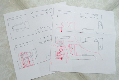
We tried returning to some version of table in the middle (top left) and even modification to the banquette (top right, bottom left). But somewhere in that mess we had one of those “Ah-ha moments” that ol’ what’s-her-name used to talk about on the TV (this is a joke for my Oprah-loving wife). So allow us to introduce the banquette’s successor: the peninsula! Cue the confused emoticons.
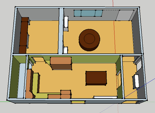
Let’s explain. First, here’s our CURRENT floating-table-in-the-kitchen-and-larger-table-in-the-dining-room arrangement (courtesy of my rough Google Sketch-Up drawing):
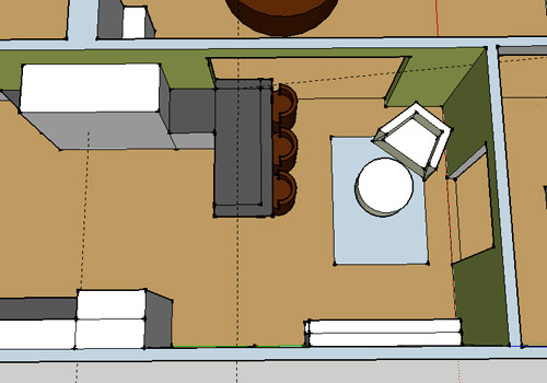
Now for the doorway opened, cabinets painted, counters replaced, floor slightly discolored (not intentionally) and (of course) peninsula’d version:
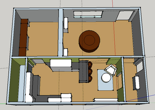
Woo hoo. Before we go any further, we should warn you: we’re 100% sold. The above depiction of it is probably not going to make a believer out of everyone, but from taping it out in the space and moving around it “in person” for a while we giddily came to the following conclusion: it’s The One! So no worries if it’s not your jam or you love Mr. Banquette (he was a lovable guy – and there are always gonna be people who would do things differently if this were their house) but we’re definitely going for it. And we can’t wait to get started.
As for why we didn’t come up with the peninsula idea sooner, we were so stuck on the fact that a peninsula coming off of the cabinetry that we already have would actually hit (or come very very close to hitting) the fridge on the other side of the room. So it wasn’t until we came up with the idea of adding a base cabinet to the right of the cabinetry that we already have to space the peninsula further away (a smidge towards the fireplace) for better flow and even more counter space.
Speaking of counter space, when it comes to executing this whole thing, we’re basically planning to add some base cabinetry (and counters) near the opening itself to create a counter-height peninsula. Which accomplishes a lot, actually:
- It adds additional work surface & cabinet storage to the kitchen side of the room (so it’s easy-access)
- It helps extend and better define the kitchen space without blocking flow or feeling too heavy
- It creates a casual eating space, keeping it distinct from the dining room table, which is just steps away for larger groups and more formal gatherings
- We can most likely seat four people at the peninsula (it’s flexible, so ignore the three chunky chairs shown)
- It can be used as a buffet to set out food (or to seat additional guests) when we have parties
- It can be used for homework, laptop browsing, and general hanging out by the kiddo(s) as they grow
- It even makes sense of our very off-center fireplace by creating a small casual living space that we’ll use as a little “chill corner” of sorts (the peninsula doesn’t block the fireplace, which our banquette friend did from most angles)
That last perk (centering the fireplace) was a nice surprise, since it’s something we’ve struggled with a lot (it’s just in such an odd place, practically shoved in the corner of the room). But you can see from this virtual view through the future doorway how it almost makes the fireplace placement seem intentional (picture it with a nice round mirror above it to balance that doorway next to it). Oh happy day.
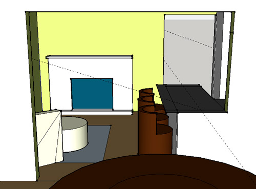
We just love that we’ll get to see the fireplace from the dining room (it won’t be blocked by a heavy banquette) and if overflow guests sit at the peninsula, they won’t have their backs to the people seated in the dining room (which would have happened with the banquette).
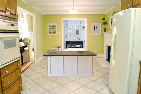
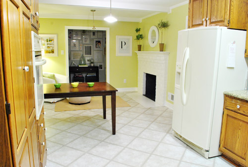
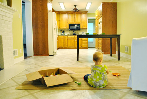
For those who don’t do well with renderings (or are still scratching your heads), here are some pics we snapped to give you a better idea of how it’ll work in the real world. We moved some existing furniture around to mimic the placement (the table represents the peninsula) and have lived with it for the last week-ish to make sure it actually makes sense. Placements aren’t totally exact, but pretty darn close to what we’re thinking. Here’s the view from the laundry room. Ignore the broken pendant light in the far back (it finally crapped out on us). Instead look, there’s that fireplace nicely framed!
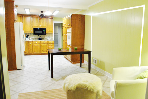
We also traced out the future opening (again, not exact) to show how that’ll work too. We’re thinking there will be a little half-wall (i.e. knee wall) where the peninsula meets the open doorway…
… like we showed in this rendering:

We considered a narrower doorway (where the peninsula doesn’t hang over into the opening) but we think this wider version makes it feel much more open and lets in more light, so it’s the current winner. And of course as previously mentioned, we love how balanced the fireplace and doorway look through the cutout.
Admittedly it took us a little while to figure out what to do with the space in front of the fireplace. It was our biggest hurdle in getting on board with this idea, actually. But after we brought in a placeholder chair, ottoman, rug, and light we realized it was actually completely awesome. There have been approximately 14 hours of reading-with-Clara from that chair in the last week or so. We’re even toying with the addition of some sort of tall built-in bookshelf behind the chair to balance the tall cabinets on the other side of the doorway. Not sure yet, but we’ll keep you posted.
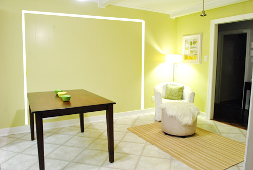
We’ve already discovered it’s a great spot for Clara to play while we’re getting stuff done in the kitchen (since we can’t see her if she’s in the living room, but it’s easy enough to peek over the peninsula to check on her if she’s in the kitchen on the rug).
Sherry’s already making plans for how she’ll relax in front of a fire (we’re contemplating one of those convincing modern-looking electric inserts that Candice Olsen uses – possibly even a double sided one if we can eventually open the back of the fireplace into the living room as planned).
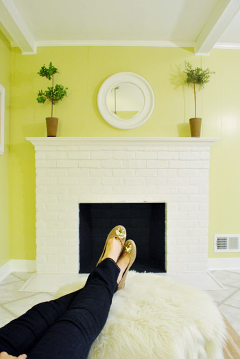
Meanwhile I’m dreaming of a little TV mounted above the mantle so I can watch the news during our morning breakfast routine (Sherry is rolling her eyes as I type this- so we’ll have to see where we land on that). Either way, can you tell we’re getting more than a little excited about this set up? Yup, it’s The One.
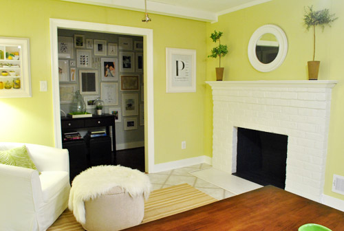
The peninsula will also give us 3-ish base cabinets worth of deep functional storage, unlike the largely decorative storage (open 12″ bookshelves) that the banquette would’ve provided. Plus a nice wide 3′ x 5.5′ work surface for prep, serving, eating, and homework is FAR more functional than what we would’ve gained from a distant island or a narrow banquette located a lot further away. And we’re probably gonna use the new counterspace as an excuse to change the countertops in the whole kitchen. We’ve never loved our existing granite color (it has a few pitted/stained parts too), so it seems silly to actually buy more for the new peninsula (we’ve debated a mismatched look, which we like for an island, but for a peninsula it seems like it would look most like it has “always been there” with the same counter to keep things seamless). Of course we plan to craigslist the existing granite and put that money towards whatever we’ll use for the new material (not gonna lie, we’re already talking about DIYing concrete counters).
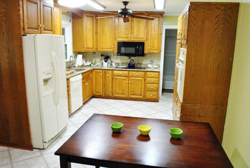
Oh and for anyone debating a peninsula, we’ve learned that the pros recommend 42″ of walking space between the peninsula and whatever’s on the other side (in our case it’s the fridge, which we hope will sink back a foot or so when we replace it with something that’s counter-depth). So that’s how we arrived at our peninsula length.
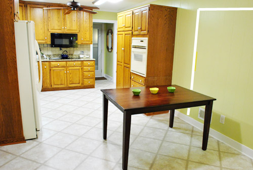
In fact, flow through the room is almost better because there’s one straight pathway through the room, whereas the old table (and the once planned banquette) made us walk in a slight circle. Hoorah for ten less steps a day. Haha.

So now that we’re unequivocally sold and geeky-excited about our new plan, it’s just going to come down to working out the logistics. Namely how to find/build perfectly-sized cabinets that match our old ones without breaking the bank. And finally hire a licensed contractor and get the permits needed to bust out that load bearing wall of ours. But that’s a story for another post. Another ten posts, probably…
Update: You can check out the new “cozy corner” behind the future peninsula in action (on video!) over on Young House Life.
Another update: Lots of people are sweetly suggesting some sort of bookcase or built-in feature on the side of the cabinets that face the dining room (instead of a knee-wall) but we’re unsure if that’ll be too much since there are already built-ins in the dining room that are just a few feet away. We’ll keep you posted as we go though! Who knows where we’ll end up…
Psst: Tomorrow I’m going to post my thoughts on trying Google Sketch-Up for the first time (and how it compares to two other 3D rendering tools I’ve used). So stay tuned for that if you’ve got any questions about how I made the 3D graphics for this post.

Cynthia says
Much better!!! You can even move the chairs, if needed, to use the space for party food, like you originally mentioned. AND now awkward hair in food or knocking off decorations. Perfect!
LifeByTheDrop says
love, Love, LOVE the peninsula! Form and function comes through once again! And it makes me happy to see that chair sitting in the corner, creating a cozy nook of kitchen happiness. You will find friends and family hanging out in this room all the time. No man will be an island in that kitchen!
Julie says
Okay, Okay, already, you sold me. It sounds great. But I’m still mad at you for not making a banquette, only because I really wanted to steal your plans and build one for myself! :-)
YoungHouseLove says
Haha, well head over to Pinterest! There are some awesome tutorials that are pinned where folks used the small upper cabinets that are meant to hang above refrigerators to make banquette seating! Good luck!
xo,
s
Erin Ohio says
This is a great idea for your space! When we knocked out the wall between our tiny kitchen and large dining room we did the same thing. We have three stools (with backs) under the tall (dining room side) and the extra counter space on the kitchen side is invaluable. The kids do there homework, eat snacks, play on our laptop and hangout with us while we make dinner and for parties we get rid of the stools & it becomes a buffet as the end of it leads right out the door (as yours will). Hint: we have a small flat screen tv that flips down from the bottom of the cabinets and turns around so we can watch/hear it while doing dishes & cooking or while sitting at the stools or dining room table – or in your case chill chair;)
reanna says
I sort of hate to make suggestions because I figure you have already thought of them and have your own reasons for not liking them. Having said that all I could think about when looking at the mock up of the knee wall was adding a chair rail/wainscoting. It would make the dining room look more “dining roomesque” and would be a really fun way to add some texture and relate the room to the adjacent office. Just an additional thought for how to make the knee wall look more intentional and organic without going built in crazy…
YoungHouseLove says
That could be a fun alternative too!
xo,
s
Susan says
I love it!! I did a peninsula in my kitchen when I renovated it, and it has worked out wonderfully! This will look amazing!!
Emily says
I think my home might be your home’s long-lost twin. I also have an odd crammed-in-the corner fireplace at the end of the room from our kitchen. I actually found your website as I’ve been trying to figure out how to redesign our kitchen/dining.
Here’s what we discovered as we’ve opened up walls (and it may be the case at your house too): the wall right next the the fireplace didn’t used to be there and there used to be a wall RIGHT next to the cooking area of the kitchen (making a tiny 9×10 or 10×10 room). I guess people really did used to like having the “utility” of the kitchen closed off from the rest of the house!
If you look at your layout and imagine the wall next to the fireplace not being there, it looks like the fireplace is actually centered between the edge of the kitchen and the wall with all the picture frames. Maybe that’s how yours used to be too.
Your plan is great, btw. We can’t do the same at ours because we have an inconveniently placed window.
Good luck!
YoungHouseLove says
Yes that’s exactly how it used to be laid out! We learned that from the previous owners. So funny that we’re house twins!
xo,
s
Elizabeth says
you guys always remind me to consider FUNCTION – and you decided on the best plan for function in your home; I think a lot of people get caught up in what the space was “made” for…and don’t consider how they could best use it!
heyruthie says
wow! i am doing almost the *exact* same thing in my house–which was renovated in the same way yours way (kitchen “expanded” with an addition off the back.) in reality, I like the “cozier” kitchen that the new penninsula is going to create–brining it back to more the size it was originally. i’m kind of in awe because this is nearly identical to the plan i’m about to work in my own home–but now i can “see” it in person with yours!!
how wide is your kitchen? (meaning, the shorter dimension.)
YoungHouseLove says
Love it! Another kitchen twin! Ours is about 11 feet wide (and 25′ long). Hope it helps!
xo,
s
heyruthie says
thank you, sherry! mine is similar, but *narrow!* at about 20×9…so my “penninsula” will be tiny! lol!
YoungHouseLove says
Love it! Good luck!
xo,
s
Jessica George says
I like your new idea, but I was wondering if you’d considered putting in a door on the pennisula side going into the dining room instead of a short wall. This would let you access that ‘dead’ space in the corner a lot easier. Unless you went for a corner door in the front, of course. Just an idea!
YoungHouseLove says
Another great possibility! Not sure yet where we’ll end up!
xo,
s
Kimberly says
I may be repeating what others have already said, but I love, love, love the peninsula idea! I also love the concrete countertop idea but that may be for a more selfish reason: I am also thinking of doing concrete countertops and I know that if you all do that and share your tutorial, I’ll be able to learn so much and be even more inspired!
(And I’m sure you’ll either find another use for that granite or donate it – ignore the people saying ‘boo hoo, don’t get rid of granite!’)
amanda n says
Love it. That big block of a banquette was making me uneasy.
Becky says
Not sure if this has been suggested yet but I think it would be cool if you recessed a little built-in bookcase into the side of the base cabinets where they show into the dining room…
Margaret says
Big fan of the new idea, it won’t seem as isolated as the banquette potentially could. I grew up in a house with this same set up and our 5-person family sat at the peninsula everyday for dinner (one person always camped out on the other side at a little butcher block board that pulled out from the cabinets). It’s where everyone always hangs out, for sure! They have a deep cabinet under the peninsula facing out on the far right side, it was a favorite place for my sister to hide as a toddler. :)
Sheena says
Love this idea so much more! I think I was meant for some place colder than San Diego.. I just have a such weakness for comfy zones near fireplaces & that little corner seat makes me so happy! Oh, and I’m starting to be amazed by how many seating areas you have going on.
Suvi says
I can’t wait to see DIY concrete counter tops!!! I like the peninsula, but I have NO doubt that you would have made any solution look amazing! That’s why home decor is a process and you are allowed to change your mind! Thank you for all the inspiration, and please keep staying budget friendly.
Jenna says
I love the peninsula idea for your home. We have one in our kitchen in between the kitchen and dining area. It is great counter space for prepping and entertaining. We like to set ours up buffet style for parties.
ell.uu says
PERFECT! I was not on Team Banquette but this is great! love the open flow and i imagine it will be super functional. I love the knee wall too so the person sitting closest to the dining room won’t feel as if they’re wedged in. open and inviting is the way to go. well done.
Kelly says
I just found your blog last week and I am finding so much inspiration thru it! Can I just say, oh my goodness I love this plan!! I’d be dancing around like a geek too after coming up with such a layout, lol. It really opens up the rooms and makes it so much more functional – that large doorway to the dining room really helps things flow better – much easier to go from the kitchen to the dining area than it is now – brilliant!
My husband & I have been in the process of drawing up house plans for the past year to build our first home, and my hubby has been teaching himself and using Sketch-up as well for our plans. The kitchen has been such a focus, and we’ve been debating what material to use for counters. DIY concrete counters has been in the running, so I couldn’t help but gasp with glee when I saw you guys are playing with the idea as well. Cabinets is a whole other story, as we’ve been getting several quotes and none of them are budget-friendly, so I’m very interested as well in seeing what you guys come up with for your additional cabinets.
El says
We’ve lived in several different homes with islands and peninsulas and hands down believe that peninsulas are the way to go with kids and dogs! Its (for us) a much more user real life friendly flow and feels more inclusive for our young family. We never feel like we’re trapped behind the island or trampling on a little one- four or two legged. Our extra space (like yours) is a play area/ homework center. Oh- Our peninusla is also known as “the trough.”
Robin says
I’m a recent follower of your blog–really enjoying it, thank you!
So my two cents: I think this is, for all the reasons you mention, so much better than the banquette. I love the cozy corner by the fireplace, and think the bar/peninsula will be much more functional.
The only thing I’m not a fan of is how the peninsula juts into the opened archway between the dining room and kitchen. It occurs to me that you could soften this by making a curved corner on the peninsula, on the side that faces the dining room. Perhaps with a little shelf, so that portion is decorative? A curved corner would flow much more nicely between the two rooms.
Anyway, thanks for the inspiration: we’ve just moved into a new home in Belgium, and my decorating downfall is that once I’ve been in a space for a while I cease to “see” it and it just stays in the semi-decorated, semi-furnished state it’s in now. So ongoing inspiration is important!
YoungHouseLove says
Always another fun possibility! Love it.
xo,
s
Mckenzie says
I have to tell you I usually love what you do but I wasn’t loving the banquette. I was thinking to myself when I read the original banquette post you should just make it a little sitting area but you took it to a whole other level I love love love your idea. And I promise the seating area will be the best decision you ever made we have large kitchen/dining room/den with an arm chair reading area in one corner and hands down that is where we do most of our living.
Martine Jennings says
Love, love, love all that you both do!! Look forward to hopefully seeing you do the concrete tops to inspire us!!
Kerry says
Okay, so there’s like 1319 comments already and I’m not going to read through them all to see if someone’s already suggested this, but have you thought about having the big of peninsula that faces the dining room (which you’re currently planning to cover with half-wall) be a cabinet open toward the dining room? You would be able to store host/hostess supplies (napkins, placemats, wine glasses, maybe a couple bottles of wine, etc) in an easy access location to where they’re needed! ALSO, it would deal with that corner cabinet thing that’s ALWAYS been a problem. No reaching your arm 18″ diagonally to grab the spring-form pan or whatever you store way in the depths of the corner cupboard! You’d have direct access.
Does that make sense? Should I try to explain it a different way?
YoungHouseLove says
Makes total sense! It’s definitely a possibility, we just already have built ins in the dining room for storing that stuff (and plan to add a buffet) so we might not need more. We’re just thinking that the opening with a bookcase on the edge of it might look like the doorway was made first and then a peninsula was awkwardly placed in front of it, instead of the knee wall making it look intentional and built in. Hope that makes sense! Still not sure where we’ll end up though!
xo,
s
Tiffany T. says
Smart! I would not have thought of that but I love it and think it’s perfect for you guys! Whoot whoot!
Tiffany T. says
I agree with you on the last comment Sherry but I also totally get where Kerry’s heads at. I also love that people are really putting a lot of thought into yalls place…neato!
YoungHouseLove says
Isn’t it awesome? So much fun with all the ideas swirling around in our heads and online! It’s funny how we can lay in bed and debate something and the next day someone can suggest the same thing online. It’s so funny! Folks are reading our mind!
xo,
s
Jenn says
FREAKING BRILLIANT! Love it!
Sonja says
Love it. I was not sold on the banquette idea for your kitchen, though I had hopes you two could pull it off. I think the peninsula is a fantastic idea. Nice job!
Tyler says
Just looking at the photos of your house. I don’t think your wall between the kitchen & dining room is a load bearing wall. Your roof is most likely be made of trusses (or if not it would be rafters) that span from your front exterior wall to the back wall of your kitchen (which looks like it was the back exterior wall of the original house). There may be some ceiling joists that sit on that wall that support your drywall ceiling, but that would be easy to support while you make the opening. Do some further investigation with whomever you hire to knock out the opening to confirm this either way. Hope this helps!
PS The peninsula plan is awesome, building one of those in my kitchen remodel as well.
YoungHouseLove says
Thanks Tyler! It’s definitely load bearing! We’ve had four contractors over and also must get permits for it! Boo. Wish it weren’t. Thanks for the tips though!
xo,
s
Amanda says
I love this! I was not a banquest supporter. I could see some built in shelves behind the lounge chair to make a reading nook.
Julia says
Can you take out the wall to the frame wall hallway to make the seating area in the kitchen bigger? You don’t really need a hallway if people can walk through the kitchen, right?
YoungHouseLove says
We thought about that but then the hallway would be a dark alley from the other side. We love how the frame gallery is the heart of the home (that wide light-filled hallway was one of the things that sold us on this house). From a practical standpoint, we also run out that door down the hall all the time to the bathroom/Clara’s room, so it would be annoying to run in a circle (out into the living room and back, or out into the dining room and back) instead of taking a direct route that’s already there.
xo,
s
Saple says
So glad you are not doing the Banquette.. I did not want to be the no no no girl but it was awkward… I am loving the new design
jessica w. says
I love this new idea a lot better,but that is because I love the minialistic design of huge open rooms, I feel like this will open on you main house and not show your kitchen to people coming in encase it is dirty,but still eludes to where it is. I love this new idea. I am not a fan of too many open book shelves since it makes places look cluttered, so I prefer the half wall idea,but this is your house, and whatever works best for you is perfect! Thanks for sharing!!!
Donita says
YAY for a WINNER!!! I love this plan, can’t wait to see it finished. When I read the title of this post, my mind INSTANTLY was the room with a cozy chair, ottoman and rug in front of the fireplace. LOVE IT!!!!!
abby says
Love this! Want to come design my kitchen now? :)
YoungHouseLove says
Sure! Be right over. Haha.
xo,
s
Maria says
You have a great knack for Sketchup! Looking forward to your post on it vs. other 3d tools though. I took a year strugling with Sketchup but now it is indespensible when I say “honey, how about this idea” (my husband starts twiching….) well, gotta go tweak some ideas for our master bath and kitchen remodel.
P.S. LOVE the new layout. What if you removed the wall into the hallway and just let the chair or loveseat float in the area in front of the fireplace? Unless it is a load bearing wall, of course.
YoungHouseLove says
Yup, it’s load bearing.
xo,
s
Nikki says
I really love so much of what you do … can’t wait to see the finished stencil project … beautiful!!! But … IMHO, I would choose neither the banquette nor the peninsula. I thought the banquette was a poor design because, to some degree, it would block off the view of the fireplace, not to mention waste space around it and be a fairly permanent fixture. I’m not super fond of the peninsula idea either. Having gone to all the trouble of opening up the wall to the formal dining room, it would seem a shame (and possibly a distraction) to partially close it in with the side of the peninsula. As your family grows will you want more room for seating in the kitchen area? Also … when eating meals with older kids(other than a quick breakfast), I do find it nice to be facing them and talking rather than sitting in a row beside each other. You may just choose to eat dinner most nights in the dining room. Just from personal experience … our kitchen and dining room were opened up in our home before we purchased it. I would not want to close it off in any way because it would restrict the number of people who could sit down and eat. With the open space, I can extend the table, add another table, etc. This probably wouldn’t be a problem for you guys because you do have a formal dining room to serve a larger crowd :-). Although I’m all for maximizing space, I think that you may be trying to accomplish too much in your kitchen area … I would make it either truly a kitchen/eating area or scrap the eating area altogether and make a cozy little gathering place in front of the fireplace. In your current design, can you only sit one person in front of the fire … do you have any more room or would it be too crowded? Like I said, just my two cents worth. If you’ve already thought of all these things (which you likely have)… sorry.
All the best in planning your new kitchen … it’s a huge undertaking and I don’t want to be discouraging in any way but just point out a few things I’ve learned along the way :-). In the end … I do know that whatever you do, it will be perfect for you both and the needs of your family.
YoungHouseLove says
Thanks for the thoughts! We didn’t explain it well in this post but we’ll have seating for four at the peninsula (and it won’t all face the same direction, one chair can tuck into the short side so there’s eye contact). We picture using the peninsula for casual things like homework and snacks and will eat real meals like dinner in the dining room since that table can accommodate lots of people and platters and it’s just five steps away from the kitchen. So we just thought adding another table would be oddly redundant (like a banquet hall) so we like the contrast of flexible casual seating for four at the peninsula! It’s definitely one of those personal preference things though!
xo,
s
Sara says
When we redid our kitchen we turned the studs behind the fridge to recess the fridge in the wall. We had limited space and this alternative allowed us to easily walk through the kitchen. This might save you from having to get a counter depth fridge. Good Luck with the new project. I’m glad you decided not to do the banquet. I wasn’t a fan.
YoungHouseLove says
Wow, that’s a really smart idea!
xo,
s
kalibrooke says
Yep, that’s The One.
Reva says
I’m totally sold. I never really got the banquet idea — this is so much better, perfect, really!
esther aka craftyvox says
OH I love this idea!!
Lindsey says
I hate it! J/K!!!
I am a sucker for a banquette, but that’s partly because I love chill spaces in kitchens. So the peninsula + chill corner is a great compromise! Can’t wait to see the awesomeness you always deliver. And props to you for knowing and owning your preferences!
Chris says
We did our kitchen 2 years ago, moved the dining area, added and island and have a cozy sitting area in front of the fireplace and we absolutely love it. I think this is totally the way to go!
Kristin C says
Started a new job this week, so I’m just now catching up on my YHL fix. Just want to say I LOVE. LOVE. LOVE this plan! The overall flow, open-ness and look-like-it-was-always-there-ness is gonna rock! Plus,especially love the reading/ hang out nook. SO EXCITED to see the whole process!
Natalia says
I love this so much more! I don’t really like banquettes and thought the rendering you had earlier was very awkward!!! I love how you guys move your furniture around all the time so that you can actually “see” things!!! We do that too!
Erin says
Love it. We had two peninsulas in our old kitchen- it was a wonky old farmhouse- and we loved the layout! Perfect for entertaining or doing things like making Christmas cookies. Our new house has one that we detest, because it’s not a peninsula so much as a big “U” through the kitchen that blocks the path between everything. Picture walking from the inside of a U all the way around everytime you need to go to the pantry.. frustrating. But we have plans to take down half a wall and go back to a regular peninsula layout with our future kitchen reno. Sounds like you came upon the perfect plan for your house. Good luck!!
Pia says
Excellent idea! Cant wait. But then again. I really didnt like the whole banquette idea and commented on that… This is SOOO much better!
Have a small question. Totally unrealated. I am planning a baby boy bedroom and I ended up with too many colours! Blue, Orange, Brown, Red, White and Black. (Most colours from this lovely wallpaper http://www.tapetorama.se/display.php?item=24243&category=Wallpaper) If you had the choice. Which colour/coulours to remove?
Take care!
BR Pia
YoungHouseLove says
Maybe remove the red and black since all the other colors are in the paper and look so great? You probably could use them all in a room, just emphasize some more than others (more white, orange, blue, and brown for example) so the other pops of color (red and black) can layer in without feeling too chaotic. Hope it helps!
xo,
s
Pia says
You are right. I have to get rid of my lovely red round rug. Kill your darlings as someone said. Ill probably use it in an other room. The black tings will have to go white. Some fun DIY :-) Thanks for taking the time to answer! And Thanks for the step by step for spraypainting! Got to do that with a table. Weekend fun. Oh almost forgot. The cork floor. Lovely dark colour!
xo,
Pia
YoungHouseLove says
Good luck!!
xo,
s
Sarah R. says
I don’t know if someone said this already, but you should put a corner bookshelf behind the chair, like the one you recently pinned on Pinterest. :)
YoungHouseLove says
Might be why I pinned it…. haha! Love it.
xo,
s
Andrea says
I have a question about what will be under the peninsula… will it be open like the table you used as an example or will it be cabinets? Just wondering where your knees will go when you sit to eat there! We have shallow cabinets with an overhang to eat at on ours…
YoungHouseLove says
There will be a 12″ overhang when it comes to the countertop so chairs and legs can tuck under there.
xo,
s