For all those wondering when the heck we’ll tackle that kitchen banquette idea that we mentioned a few weeks ago (here and here), well… probably never. Cue the frowny face emoticons.
Here’s the deal. After getting lots of positive feedback on the idea a few weeks ago (over 1,400 comments total!), Sherry and I were certain your collective enthusiasm would push us from “we think this is a good idea” to “this is definitely a good idea.” And it nearly did. But parts of us still questioned the whole commitment-factor when it came to actually doing it (we definitely described it as a half baked idea when we shared it). We worried if it’d really be the most practical solution (would it be a pain to scoot in and out of?) and if it’d really make the most of the space (we couldn’t figure out the right balance of big-enough seats while still maintaining flow around it to keep it from feeling cramped).
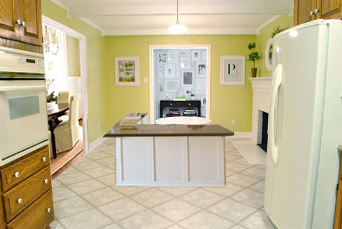
So one evening we decided there was a reason that we were stuck in Hesitation City: it just wasn’t The One. So we did what we always do when we get stuck. We went back to the drawing board to see if we could come up with something else that we ended up liking better. We made a few quick sketches of the floorplan, asked ourselves “what are we not thinking of???” and just started sketching ideas – no matter how good or bad our guts told us they were. Kinda like those DON’T THINK, JUST DRAW exercises that they teach you to access your subconscious or something. Of course some of them completely blocked the doorway to the dining room (fail!) and nearly all of them were completely out of scale (so things were too big or too far over) but it definitely got the ol’ wheels turning again…
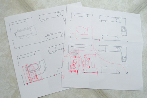
We tried returning to some version of table in the middle (top left) and even modification to the banquette (top right, bottom left). But somewhere in that mess we had one of those “Ah-ha moments” that ol’ what’s-her-name used to talk about on the TV (this is a joke for my Oprah-loving wife). So allow us to introduce the banquette’s successor: the peninsula! Cue the confused emoticons.
Let’s explain. First, here’s our CURRENT floating-table-in-the-kitchen-and-larger-table-in-the-dining-room arrangement (courtesy of my rough Google Sketch-Up drawing):
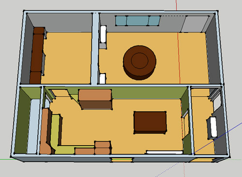
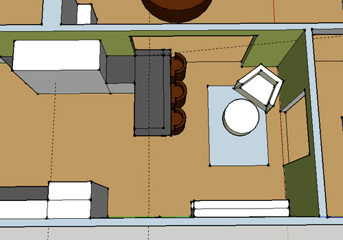
Now for the doorway opened, cabinets painted, counters replaced, floor slightly discolored (not intentionally) and (of course) peninsula’d version:
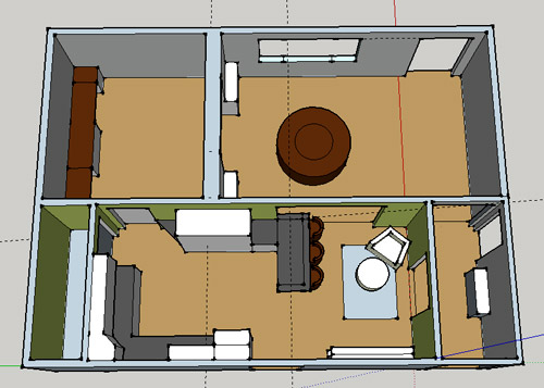
Woo hoo. Before we go any further, we should warn you: we’re 100% sold. The above depiction of it is probably not going to make a believer out of everyone, but from taping it out in the space and moving around it “in person” for a while we giddily came to the following conclusion: it’s The One! So no worries if it’s not your jam or you love Mr. Banquette (he was a lovable guy – and there are always gonna be people who would do things differently if this were their house) but we’re definitely going for it. And we can’t wait to get started.
As for why we didn’t come up with the peninsula idea sooner, we were so stuck on the fact that a peninsula coming off of the cabinetry that we already have would actually hit (or come very very close to hitting) the fridge on the other side of the room. So it wasn’t until we came up with the idea of adding a base cabinet to the right of the cabinetry that we already have to space the peninsula further away (a smidge towards the fireplace) for better flow and even more counter space.
Speaking of counter space, when it comes to executing this whole thing, we’re basically planning to add some base cabinetry (and counters) near the opening itself to create a counter-height peninsula. Which accomplishes a lot, actually:
- It adds additional work surface & cabinet storage to the kitchen side of the room (so it’s easy-access)
- It helps extend and better define the kitchen space without blocking flow or feeling too heavy
- It creates a casual eating space, keeping it distinct from the dining room table, which is just steps away for larger groups and more formal gatherings
- We can most likely seat four people at the peninsula (it’s flexible, so ignore the three chunky chairs shown)
- It can be used as a buffet to set out food (or to seat additional guests) when we have parties
- It can be used for homework, laptop browsing, and general hanging out by the kiddo(s) as they grow
- It even makes sense of our very off-center fireplace by creating a small casual living space that we’ll use as a little “chill corner” of sorts (the peninsula doesn’t block the fireplace, which our banquette friend did from most angles)
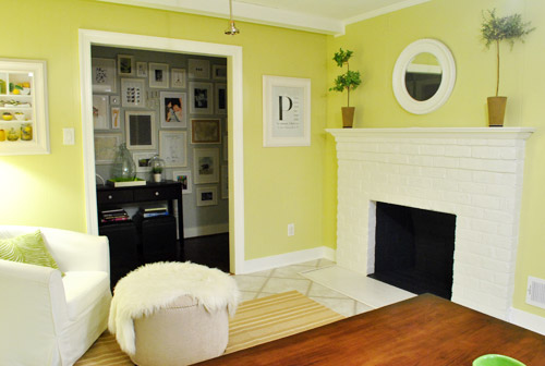
That last perk (centering the fireplace) was a nice surprise, since it’s something we’ve struggled with a lot (it’s just in such an odd place, practically shoved in the corner of the room). But you can see from this virtual view through the future doorway how it almost makes the fireplace placement seem intentional (picture it with a nice round mirror above it to balance that doorway next to it). Oh happy day.
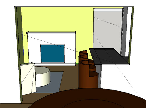
We just love that we’ll get to see the fireplace from the dining room (it won’t be blocked by a heavy banquette) and if overflow guests sit at the peninsula, they won’t have their backs to the people seated in the dining room (which would have happened with the banquette).
For those who don’t do well with renderings (or are still scratching your heads), here are some pics we snapped to give you a better idea of how it’ll work in the real world. We moved some existing furniture around to mimic the placement (the table represents the peninsula) and have lived with it for the last week-ish to make sure it actually makes sense. Placements aren’t totally exact, but pretty darn close to what we’re thinking. Here’s the view from the laundry room. Ignore the broken pendant light in the far back (it finally crapped out on us). Instead look, there’s that fireplace nicely framed!
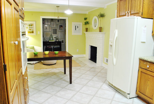
We also traced out the future opening (again, not exact) to show how that’ll work too. We’re thinking there will be a little half-wall (i.e. knee wall) where the peninsula meets the open doorway…
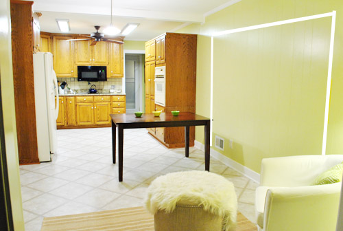
… like we showed in this rendering:

We considered a narrower doorway (where the peninsula doesn’t hang over into the opening) but we think this wider version makes it feel much more open and lets in more light, so it’s the current winner. And of course as previously mentioned, we love how balanced the fireplace and doorway look through the cutout.
Admittedly it took us a little while to figure out what to do with the space in front of the fireplace. It was our biggest hurdle in getting on board with this idea, actually. But after we brought in a placeholder chair, ottoman, rug, and light we realized it was actually completely awesome. There have been approximately 14 hours of reading-with-Clara from that chair in the last week or so. We’re even toying with the addition of some sort of tall built-in bookshelf behind the chair to balance the tall cabinets on the other side of the doorway. Not sure yet, but we’ll keep you posted.
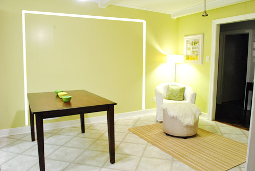
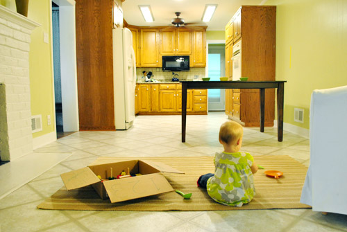
We’ve already discovered it’s a great spot for Clara to play while we’re getting stuff done in the kitchen (since we can’t see her if she’s in the living room, but it’s easy enough to peek over the peninsula to check on her if she’s in the kitchen on the rug).
Sherry’s already making plans for how she’ll relax in front of a fire (we’re contemplating one of those convincing modern-looking electric inserts that Candice Olsen uses – possibly even a double sided one if we can eventually open the back of the fireplace into the living room as planned).
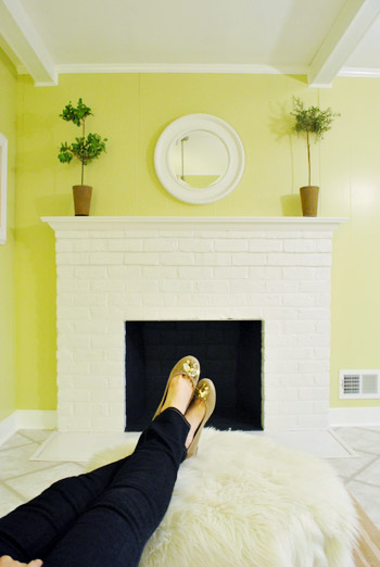
Meanwhile I’m dreaming of a little TV mounted above the mantle so I can watch the news during our morning breakfast routine (Sherry is rolling her eyes as I type this- so we’ll have to see where we land on that). Either way, can you tell we’re getting more than a little excited about this set up? Yup, it’s The One.
The peninsula will also give us 3-ish base cabinets worth of deep functional storage, unlike the largely decorative storage (open 12″ bookshelves) that the banquette would’ve provided. Plus a nice wide 3′ x 5.5′ work surface for prep, serving, eating, and homework is FAR more functional than what we would’ve gained from a distant island or a narrow banquette located a lot further away. And we’re probably gonna use the new counterspace as an excuse to change the countertops in the whole kitchen. We’ve never loved our existing granite color (it has a few pitted/stained parts too), so it seems silly to actually buy more for the new peninsula (we’ve debated a mismatched look, which we like for an island, but for a peninsula it seems like it would look most like it has “always been there” with the same counter to keep things seamless). Of course we plan to craigslist the existing granite and put that money towards whatever we’ll use for the new material (not gonna lie, we’re already talking about DIYing concrete counters).
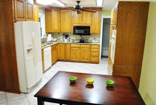
Oh and for anyone debating a peninsula, we’ve learned that the pros recommend 42″ of walking space between the peninsula and whatever’s on the other side (in our case it’s the fridge, which we hope will sink back a foot or so when we replace it with something that’s counter-depth). So that’s how we arrived at our peninsula length.
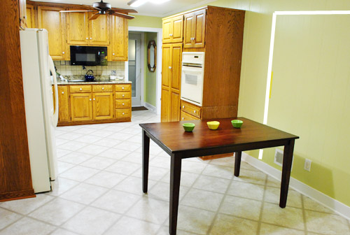
In fact, flow through the room is almost better because there’s one straight pathway through the room, whereas the old table (and the once planned banquette) made us walk in a slight circle. Hoorah for ten less steps a day. Haha.

So now that we’re unequivocally sold and geeky-excited about our new plan, it’s just going to come down to working out the logistics. Namely how to find/build perfectly-sized cabinets that match our old ones without breaking the bank. And finally hire a licensed contractor and get the permits needed to bust out that load bearing wall of ours. But that’s a story for another post. Another ten posts, probably…
Update: You can check out the new “cozy corner” behind the future peninsula in action (on video!) over on Young House Life.
Another update: Lots of people are sweetly suggesting some sort of bookcase or built-in feature on the side of the cabinets that face the dining room (instead of a knee-wall) but we’re unsure if that’ll be too much since there are already built-ins in the dining room that are just a few feet away. We’ll keep you posted as we go though! Who knows where we’ll end up…
Psst: Tomorrow I’m going to post my thoughts on trying Google Sketch-Up for the first time (and how it compares to two other 3D rendering tools I’ve used). So stay tuned for that if you’ve got any questions about how I made the 3D graphics for this post.

Kristin says
Woohoo!
Looks great, although I do love banquetes, you have to do something that actually works in the space you have. I especially love how the peninsula hangs over a bit into the doorway, looks very open and airy to me, and as the kitchen does not have a window to the outside you need every bit of light you can get.
Did you also think of using the peninsula as a standing desk if you don’t want to sit in front of your laptop all day, or is it the wrong height? They all talk about the benefits of standing desks lately.
By the way – be careful when selecting bar stools or whatever chairs you want to use for the peninsula. My parents bought bar stools which are completely instable (although they have three legs, which should provide better stability), they constantly topple over.
Have fun with the kitchen remodel!
YoungHouseLove says
Hmm, not sure if counter-height is the right height for a standing desk, but it’s definitely taller than our current desk! As for the bar stool stability tip, thanks! We went to a sushi restaurant in NYC with three legged stools and about ten people fell off of them in the 45 minutes we were there. Haha.
xo,
s
Aubree says
I think that is a great idea! I love that you’ll have buffet-style countertop space readily available, and not an oversized monster drawing all the attention to itself. I remember sitting at a peninsula having discussions with my mom as a teen, so there are fond memories with that kind of seating. I want it so bad I’m trying to figure out how to fit something like that in my miniature kitchen!
I just have one bit of feedback that you may discover later on… That ottoman may cause a bit of a problem with traffic patterns. I can see everyone in the house cutting corners to get from the back living room to the office, and that ottoman might become an annoyance to get around/jump over/bump shins on. Not sure how to fix it, as it is nice to kick your feet up before a fire, but there ya go.
Toodles!
YoungHouseLove says
Oh yeah that’s just placeholder stuff. We might go with just an armchair or even a chaise instead of the ottoman!
xo,
s
Aubree says
Great ideas! a Chaise in the Kitchen just sounds luxurious! (slipcovered, of course, for Clara’s Grape Jelly Hands, lol)
YoungHouseLove says
Hahah of course!
xo,
s
Stacy says
Good things come to those who wait! Your ability to make well thought out decisions is so encouraging and I can’t wait to see your reward. Whatever the exact details may be, it will be awesome!
Peggy says
Wel I have to admit that at first, I didn’t like this new idea (but I REALLY didn’t like the banquette!), but I like it better after reading your arguement. One thought- is there any chance you can remove the wall between the dining area and the hallway? It seems just a little tight between the peninsula seating and the lounge chair.
OK, just ONE more thought- I have a counter-depth side by side fridge that I LOVE (Frigidaire), but I would HATE it if it was my only fridge. I have an upright freezer and extra fridge just a few steps from the kitchen, in the mudroom. The counter-depth is great for ice and water in the door, and stuff I use a lot, but it’s very small. Just something you might want to consider. Carry on, younguns!
YoungHouseLove says
We’ve actually learned that our current fridge is about an inch away from being counter-depth (it’s very old, and apparently fridges have all gotten so much deeper and wider that we’ve been living with a smaller one just fine!). Haha, oh the perks of old outdated appliances! As for removing any more walls, we’re happy with the current plan but certainly know it can change along the way! We’ll keep ya posted!
xo,
s
Stephanie says
I think this is a much more functional layout than the banquette.
And that coutertop next to the oven will be really useful space for you.
LL says
Hi,
I’m new to comment-leaving, but not to your blog. Love it! What a creative solution to your kitchen situation. I’ll just raise one question: Do you think the knee wall might make the opening from the dining room look somehow misaligned? Could you instead do something fun/funky with the cabinet that would face outward – like painting it with chalkboard paint? Or blinging it out with trim? Just a thought. It was the only part of your sketch that made me go “err?”
YoungHouseLove says
Yeah, we’re not quite sure where we’ll go with that but after looking at the rendering (the “through the doorway one”) we seem ok with it for now. We’ll have to wait to see where we end up I guess!
xo,
s
abode love says
I personally think this is an AWESOME option. I love that you will gain more counter space. I think this will make your home even more fabulous. I also really love that the fireplace feels like it has a purpose on that wall with the idea of a chair facing in that direction. I can see it now… Clara sitting up at the bar doing her homework while Sherry is cooking… John, you could even get a pipe and smoke it while warming your feet by the fire- and of course, Burger could also warm his little feet. Awesome solution guys.
Anna says
I love your new design. I was never a fan of that old banquette idea. This new idea is awesome – you guys will have an awesome kitchen – Good Luck with the project :)!!!
Gabbi says
I absolutely LOVE this solution!!! I think you guys are going to be thrilled with the outcome. I can’t wait to see it come together!
Heather W says
Team Peninsula all the way!
Chrissie says
This does feel a LOT more open, I love that the space feels more flowy than before. Good thinking, 99!
Erin says
I like this idea much better, and I’m a HUGE proponent of banquettes in general (it was the best thing we did in our kitchen), but in your case I felt like it was wasting too much space. Plus, anything that gives you more counter space is a good thing, and this plan certainly does. The only thing I’m not sold on is that little half wall … but I suspect that will either seem like a really great idea or a really bad idea as the plan develops. And I wish there were some way to get more seating than just one chair in that little sitting area, but I suspect that may change too.
Can’t wait to see it come to fruition, whenever that is!
Mandy says
I was not a banquet fan either, so glad you decided to do this, because I think its perfect for the space! I really hope you do concrete counters, I think I want them in our next house and would love to see the process :)
Kyle says
I have to admit several things: when you first mentioned that you wanted an island, I was going to suggest a penninsula but I didn’t for some unknown reason. My parents have one and they love it. Second thing: at first sight I hated it. I thought that the penninsula jutting out into the soon-to-exist doorway would defeat the purpose of the huge doorway. Third: After reading the whole post, I.Love.It.
Well done.
Rebecca @ the lil house that could says
I love the penninsula idea. And I’m with John for team tv. I know it’s weird that I’m female and saying that, especially since I fought my husband on putting one in our office (he won). But he’s the primary cooker so when I get home from work I like to detox with bad tv but still be near him :)
YoungHouseLove says
Yeah I guess I should give John’s idea some consideration since he’s the cook in the family…
xo,
s
Cait @ Hernando House says
Maybe you could add a tv somewhere other than over the fireplace. Something like one of those ones that flips down from under a counter?
YoungHouseLove says
Definitely another option!
xo,
s
Amy @ this DIY life says
My husband (the electronic engineer) advises against putting a tv over the fireplace if you’re actually going to use the fireplace. Him: “Electronics and heat don’t mix Amy.” Me: “But it’s prettier there.”
Love the Caribou Coffee nook created by the peninsula. The rug, the fireplace, the chair makes me think of sitting in Caribou with a campfire mocha. Ahhhh, maybe that’s what our dining room needs.
YoungHouseLove says
Ooh good tip about TV + heat. We’ll definitely have to think about that for sure!
xo,
s
Chrissie says
This does feel a LOT more open, I love that the space feels more flowy than before. Good thinking, 99! Or should that be 86, since John posted this?
YoungHouseLove says
Haha, 86 it is.
-John
Ade@fortheloveofpainting says
I think you have to do what will be functional for your family. With the dining room so close, I think the bar idea is great! The only thing I don’t like about having a table or banquette in the middle, is that when you walk in the front door, you see two tables!
Pip says
Fare thee well banqutte! Love the peninsula and your renderings cleared up any doubts I had (potential cluttering up of the new doorway – not a prob afterall!). I’m so pleased for you guys – when you know, you know!
Kay says
Such a better idea! I too didnt want to be negative about the banquette, but wow guys this idea rocks big time. The banqette just lookes as though it would’ve been an obstruction in the middle there and totally interrupt the flow.
Sarah says
What is that framed piece that balances out the Big P? On the wall next to the door leading to the Hall-of-Frames? It looks super cute but I can’t quite make it out!
YoungHouseLove says
That’s a photo print from allposters.com of shelves with food stuff on them (a lemon, a jar of olive oil, a sprig of thyme, etc).
xo,
s
Missy G. says
Y’all are so sneaky. Just remembered that the table was pushed over for the peninsula test phase during your day in the life post. Ha! Did anyone pick up on that last week?
YoungHouseLove says
Haha, some folks are commenting today to say “I knew it!!!” – you guys don’t miss anything!
xo,
s
Jen says
haha, I noticed the table there last week and all I thought was, “Wow, that’s a really weird place for their table.” But it’s the perfect place for the peninsula ;)
Megan says
Awesome! I love how you guys are always thinking and planning and making certain you are sure before you do something! It is such a good lesson for someone like me (SO impulsive).
Lindsey d. says
For easy matching cabinets, buy instock bases and have a pro cabinet maker make doors that match your existing ones.
I love cozy kitchens with chairs and couches!
YoungHouseLove says
Thanks for the tip Lindsey!
xo,
s
Flavia says
It’s so great to see how versatile you guys are and how you ALWAYS find a great solution and best fit for every little project you tackle. I’m also all for this new layout idea. BTW, just did a post on my blog about how one of your house crashing posts inspired me to do my apartment entryway. Here it is: http://luluabroad.com/2011/09/28/entryway-completed/
and thanks for the inspiration
YoungHouseLove says
LOVE it! So much fun!
xo,
s
megs & bacon says
Oh thank goodness….
Steph @ BirdHouse says
So glad you came up with this idea! I was one of the few who wasn’t really on board for the banquette in this space (though I love them to pieces). One reader had recommended a peninsula in that location and I thought it was a great idea, but I wasn’t thinking about the fridge issue. With that problem solved, I think you’ve got yourself a winner! So exciting!
YoungHouseLove says
Yes, we really couldn’t “see” how a peninsula could work at all until we extended the counter area so it didn’t interfere with the fridge and block everything off. So glad we did that weird sketching exercise, it really got our wheels turning!
xo,
s
Terry says
Looks super! A counter at which Clara can do homework will be a wonderful thing (speaking from experience)…
Patsy says
I love this plan! My very favorite part is how it makes sense of the fireplace placement being a bit off-center, it looks totally planned,now, to have the fireplace now centered on the cozy sitting area. I can future little Petersiks hanging out all over in that fireplace area!
Allyn says
I totally get it. A banquette is a huge design commitment. Of course, this is coming from someone with commitment issues who spent two months trying to find the perfect grey duvet cover for our room, mainly so I could switch out the throw pillows whenever I wanted for a new look. Which is better than my old “buy all new bedding and pillows every year” habit. Sigh.
We totally tape things out on our walls to get a feel for them too. Right now there’s the outline of a low bench on the wall of my living room. Where it’s been for at least a week and will remain for who knows how long until I decide it’s right.
Like I said, commitment issues.
Julia @ Chris loves Julia says
Smart cookies.
Julie @ There and Back Again says
This looks like such a cool idea! I love how you talk about your future kids hanging out there – it’s cool that you’re both so forward-thinking and really sweet that you’re so sure and excited about your family! Good luck with BOTH of those projects :)
Lauren says
I’m almost convinced (and I know it doesn’t really matter if I am convinced or not–it’s only important that the two of you (and Clara and Burger) are convinced). The only thing holding me back is that I want the little sitting area in front of the fireplace to be a little more cohesive with the rest of the space. I like the idea of some built-in shelving and maybe even some storage that resembles the cabinetry in the kitchen. Would love to see a rendering of what you guys had in mind (hint, hint).
All in all, I love seeing how you guys thought this out.
Also, my new house has a peninsula and I have thought about eliminating it because it seems that islands are so much more “in.” But I love all the pros you listed about peninsulas and I think in my space a peninsula just makes the most sense. Thanks for thinking it thru for me :)
Carrie f says
Love it!!! I liked the banquett too but I agree this works better for your kitchen/needs and the extra countertop space will be amazing. I am also slightly obsessed with concrete countertops so I love that idea, they are so beautiful! Good luck with everything and glad you now love the plan, that is the most important thing!
– carrie (and Finn of course, he loves the blog already (-; )
P.S. We find out about Richmond this week!
YoungHouseLove says
So exciting! Keep us posted!
xo,
s
Maegan says
I love this idea much more than the Banquette, but I could see you guys pulling off either. My brother-in-law made concrete counter tops for his kitchen and they are AWESOME! I am in love with concrete counter-tops, so I would LOVE to see you guys do it if thats what you decide. Can’t wait wait to see the progress as you go!
Maggie says
GAH!! I’m so excited you’ve come up with this other idea. I simply could not comment on the banquette post because I was just not sold on it but this one rocks my socks! Yay!!
Lindsay says
I’m so glad you decided against the banquette! The peninsula idea is much more functional and I thought the banquette broke up the space in a bad way. This flows well. Can’t wait to see it happen! (and even more excited for the wall to come down!!!)
Kelly says
I totally LOVE the penninsula idea. My parents have a similar set-up in their new house, and it is GREAT for entertaining, especially for when food prep is going on – everyone can still hang out without feeling in the way!
On another note, would you mind sharing about the photo hanging over the chair in your little fireplace nook? The colors in it look great!
YoungHouseLove says
That’s a poster from allposters.com a few years back. It’s a photograph of shelves with food stuff on them (olive oil, a lemon, a sprig of thyme, etc). Hope it helps!
xo,
s
Jen says
Is this it?
http://www.allposters.com/-sp/Provence-Posters_i2036279_.htm
YoungHouseLove says
Yes, isn’t it pretty?! You know I love lemons…
xo,
s
Karen L. says
Love, love, love this creative design! It’ll be so cozy for you all, including the cutie-pie Clara. That corner where the chair is to be seems just right for a future corner bookcase and combo bench to me….maybe a thought too? You could add more storage in the base for toys, puzzles,etc. Congrats on the new design—-I had felt that you’d regret the earlier boxed-in feeling of the banquette. We’d had one similar in design when our kids were little and it was always a hassle when we had kid’s friends over and everyone needed to scoot out when someone needed to get up. Can’t wait to see it and kuddoes to your inspiration for the space!
YoungHouseLove says
Oh yeah that could be cute too!
xo,
s
Stacy says
Whew! I was hating the banquette idea and hoping you guys would come to your senses! We have an island/peninsula and LOVE it! It is perfect for casual breakfast, lunch, snacks and sometime even dinner. Plus, my kids do there homework there and sit there to talk to me while I’m cooking. It is a great time to catch up on their day, that back-facing banquette wouldn’t allow that.
I also second the vote for a TV in the kitchen, maybe not above the mantle though. We have a small 13 inch flat screen that is tucked away on the counter under cabinets….to say I love it would be an understatement. It makes cooking so much more enjoyable when no one is sitting at the island talking to me. And I do enjoy eating breakfast watching the news. Keep up the fight John!
Carol N. says
We have a peninsula and I have some advice. Put doors on both sides so you can get to everything easily. Especially in the corner near the dining room opening. We did that and it makes the space so much easier to use and get into. On the side facing into the kitchen, 3 doors and on the side facing the fireplace, 4 doors so you can easily get into that corner area. And if you are going to paint the cabinets all white, you should be able to find some doors and cabinets close enough in style to where no one would be able to tell the difference.
p.s. Chaise in the corner instead of a chair and ottoman!
YoungHouseLove says
Thanks for the tips! And yes, haha, while sitting in my corner chair I have demanded everything from a chaise to a throne while reading to Clara. Haha.
xo,
s
Heather C says
This is awesome. Great work guys. Keep those “just draw!” sessions coming!
Brenna says
Love it, love it, love it! I was never sold on the banquette idea, but I’ve learned to trust you guys, even when I don’t get it. I am, however, fully on board with the peninsula and can’t wait to see it in progress. Congrats on a great idea!
Andrea says
LOVE this idea! I have a peninsula dividing my kitchen area from my family room and I love it. We only have two stools at the counter, but that is the place where my 2 boys do their homework and eat snacks after school. I can work on dinner in the kitchen while overseeing things. It’s funny that you called it a penisula because that’s what we always call it, but we’ve always been “word nerds”!
Traci says
I love the new plans! And I will be very jealous of the concrete counter-tops! Will they be as easy to clean as granite or are you worried about food falling in any cracks?
Cant wait to see what it all looks like in the end!
YoungHouseLove says
We’re still in the very early stages of planning but have heard from folks with concrete counters who love them!
xo,
s
Stephanie says
Perfect!!!
Dianne says
OMG what an AWESOME idea!!!!! honestly, i was never on the “banquette band wagon”. We have a pennisula and LOVE IT.
I am totally with John on installing a TV above the fireplace. Our kitchen doesn’t open to the living/family roomn so I can’t see the TV while i am cooking (or sometimes I just like a little noise while cooking). so my husband installed one over the fireplace. We do however have a rule, no tv during meal time. It works perfectly.
Keep up the GREAT job!!!
Dianne
Danielle says
I really love this idea! I think it makes perfect sense, and I love the view of it from the future dining room when that wall gets knocked out. This is much better than the banquette idea! I can’t wait to follow your progress.
Wom-mom Ethne says
I’m sold too. Great idea. A couple thoughts: when the kiddo(s) are older (or even now), you will want to eat around the table together every night. It’s a must in our house. So long as you’re cool with eating around the formal dinner table every night and not a less formal one in the kitchen, no prob. Another thought: for that addl. cabinet next to the wall oven, could you use one of the cabinets you couldn’t use from the office desk (you have 2 leftover, right)?
YoungHouseLove says
Yup, we’re thinking the peninsula can be for snacks and homework and casual breakfasts and mail opening and things like dinner can be in the dining room since it’s only five steps away.
xo,
s
Liz says
Hooray! I hated the banquette idea, but you have to live with it. This is much better!
Caffeinated says
I love it, and i’m sold! I was not completely sold on the banquette idea, and thought it looked a little small and awkward in the middle of the room. This is a much better use of space, and it allows Clara to play in the same room as you cook. Not sure about how the peninsula will look sticking out into the doorway (the rendering actually looks okay), but can’t wait to see the results.