For all those wondering when the heck we’ll tackle that kitchen banquette idea that we mentioned a few weeks ago (here and here), well… probably never. Cue the frowny face emoticons.
Here’s the deal. After getting lots of positive feedback on the idea a few weeks ago (over 1,400 comments total!), Sherry and I were certain your collective enthusiasm would push us from “we think this is a good idea” to “this is definitely a good idea.” And it nearly did. But parts of us still questioned the whole commitment-factor when it came to actually doing it (we definitely described it as a half baked idea when we shared it). We worried if it’d really be the most practical solution (would it be a pain to scoot in and out of?) and if it’d really make the most of the space (we couldn’t figure out the right balance of big-enough seats while still maintaining flow around it to keep it from feeling cramped).
So one evening we decided there was a reason that we were stuck in Hesitation City: it just wasn’t The One. So we did what we always do when we get stuck. We went back to the drawing board to see if we could come up with something else that we ended up liking better. We made a few quick sketches of the floorplan, asked ourselves “what are we not thinking of???” and just started sketching ideas – no matter how good or bad our guts told us they were. Kinda like those DON’T THINK, JUST DRAW exercises that they teach you to access your subconscious or something. Of course some of them completely blocked the doorway to the dining room (fail!) and nearly all of them were completely out of scale (so things were too big or too far over) but it definitely got the ol’ wheels turning again…
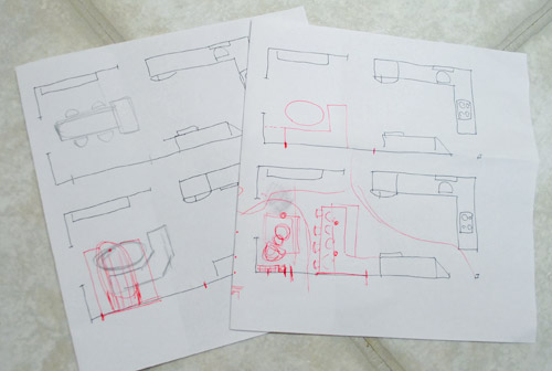
We tried returning to some version of table in the middle (top left) and even modification to the banquette (top right, bottom left). But somewhere in that mess we had one of those “Ah-ha moments” that ol’ what’s-her-name used to talk about on the TV (this is a joke for my Oprah-loving wife). So allow us to introduce the banquette’s successor: the peninsula! Cue the confused emoticons.
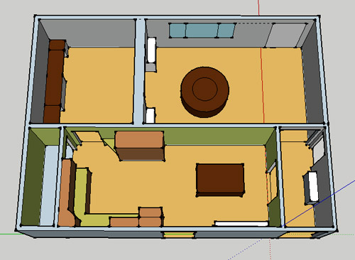
Let’s explain. First, here’s our CURRENT floating-table-in-the-kitchen-and-larger-table-in-the-dining-room arrangement (courtesy of my rough Google Sketch-Up drawing):
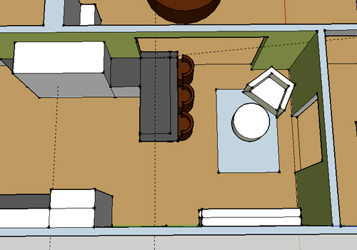
Now for the doorway opened, cabinets painted, counters replaced, floor slightly discolored (not intentionally) and (of course) peninsula’d version:
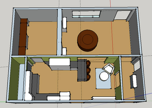
Woo hoo. Before we go any further, we should warn you: we’re 100% sold. The above depiction of it is probably not going to make a believer out of everyone, but from taping it out in the space and moving around it “in person” for a while we giddily came to the following conclusion: it’s The One! So no worries if it’s not your jam or you love Mr. Banquette (he was a lovable guy – and there are always gonna be people who would do things differently if this were their house) but we’re definitely going for it. And we can’t wait to get started.
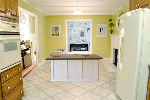
As for why we didn’t come up with the peninsula idea sooner, we were so stuck on the fact that a peninsula coming off of the cabinetry that we already have would actually hit (or come very very close to hitting) the fridge on the other side of the room. So it wasn’t until we came up with the idea of adding a base cabinet to the right of the cabinetry that we already have to space the peninsula further away (a smidge towards the fireplace) for better flow and even more counter space.
Speaking of counter space, when it comes to executing this whole thing, we’re basically planning to add some base cabinetry (and counters) near the opening itself to create a counter-height peninsula. Which accomplishes a lot, actually:
- It adds additional work surface & cabinet storage to the kitchen side of the room (so it’s easy-access)
- It helps extend and better define the kitchen space without blocking flow or feeling too heavy
- It creates a casual eating space, keeping it distinct from the dining room table, which is just steps away for larger groups and more formal gatherings
- We can most likely seat four people at the peninsula (it’s flexible, so ignore the three chunky chairs shown)
- It can be used as a buffet to set out food (or to seat additional guests) when we have parties
- It can be used for homework, laptop browsing, and general hanging out by the kiddo(s) as they grow
- It even makes sense of our very off-center fireplace by creating a small casual living space that we’ll use as a little “chill corner” of sorts (the peninsula doesn’t block the fireplace, which our banquette friend did from most angles)
That last perk (centering the fireplace) was a nice surprise, since it’s something we’ve struggled with a lot (it’s just in such an odd place, practically shoved in the corner of the room). But you can see from this virtual view through the future doorway how it almost makes the fireplace placement seem intentional (picture it with a nice round mirror above it to balance that doorway next to it). Oh happy day.
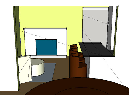
We just love that we’ll get to see the fireplace from the dining room (it won’t be blocked by a heavy banquette) and if overflow guests sit at the peninsula, they won’t have their backs to the people seated in the dining room (which would have happened with the banquette).
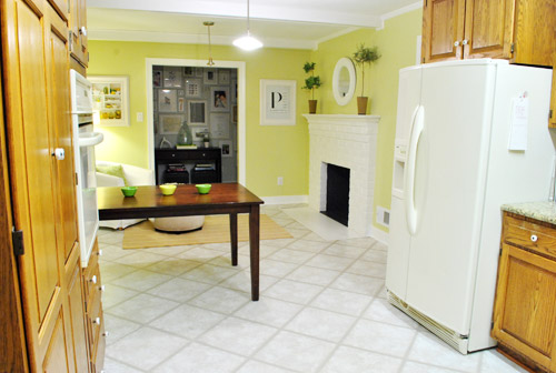
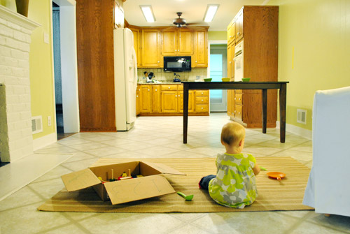
For those who don’t do well with renderings (or are still scratching your heads), here are some pics we snapped to give you a better idea of how it’ll work in the real world. We moved some existing furniture around to mimic the placement (the table represents the peninsula) and have lived with it for the last week-ish to make sure it actually makes sense. Placements aren’t totally exact, but pretty darn close to what we’re thinking. Here’s the view from the laundry room. Ignore the broken pendant light in the far back (it finally crapped out on us). Instead look, there’s that fireplace nicely framed!
We also traced out the future opening (again, not exact) to show how that’ll work too. We’re thinking there will be a little half-wall (i.e. knee wall) where the peninsula meets the open doorway…
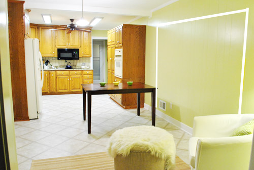
… like we showed in this rendering:

We considered a narrower doorway (where the peninsula doesn’t hang over into the opening) but we think this wider version makes it feel much more open and lets in more light, so it’s the current winner. And of course as previously mentioned, we love how balanced the fireplace and doorway look through the cutout.
Admittedly it took us a little while to figure out what to do with the space in front of the fireplace. It was our biggest hurdle in getting on board with this idea, actually. But after we brought in a placeholder chair, ottoman, rug, and light we realized it was actually completely awesome. There have been approximately 14 hours of reading-with-Clara from that chair in the last week or so. We’re even toying with the addition of some sort of tall built-in bookshelf behind the chair to balance the tall cabinets on the other side of the doorway. Not sure yet, but we’ll keep you posted.
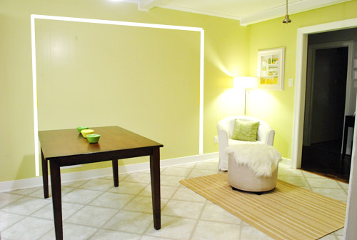
We’ve already discovered it’s a great spot for Clara to play while we’re getting stuff done in the kitchen (since we can’t see her if she’s in the living room, but it’s easy enough to peek over the peninsula to check on her if she’s in the kitchen on the rug).
Sherry’s already making plans for how she’ll relax in front of a fire (we’re contemplating one of those convincing modern-looking electric inserts that Candice Olsen uses – possibly even a double sided one if we can eventually open the back of the fireplace into the living room as planned).
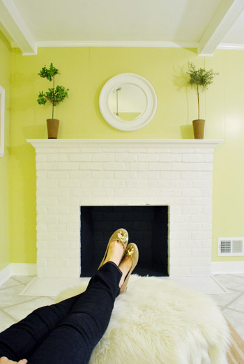
Meanwhile I’m dreaming of a little TV mounted above the mantle so I can watch the news during our morning breakfast routine (Sherry is rolling her eyes as I type this- so we’ll have to see where we land on that). Either way, can you tell we’re getting more than a little excited about this set up? Yup, it’s The One.
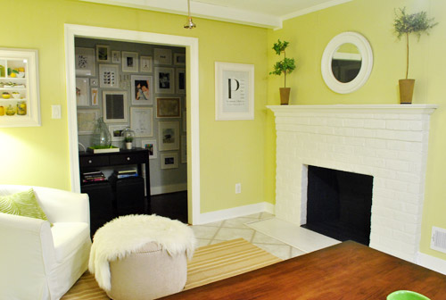
The peninsula will also give us 3-ish base cabinets worth of deep functional storage, unlike the largely decorative storage (open 12″ bookshelves) that the banquette would’ve provided. Plus a nice wide 3′ x 5.5′ work surface for prep, serving, eating, and homework is FAR more functional than what we would’ve gained from a distant island or a narrow banquette located a lot further away. And we’re probably gonna use the new counterspace as an excuse to change the countertops in the whole kitchen. We’ve never loved our existing granite color (it has a few pitted/stained parts too), so it seems silly to actually buy more for the new peninsula (we’ve debated a mismatched look, which we like for an island, but for a peninsula it seems like it would look most like it has “always been there” with the same counter to keep things seamless). Of course we plan to craigslist the existing granite and put that money towards whatever we’ll use for the new material (not gonna lie, we’re already talking about DIYing concrete counters).
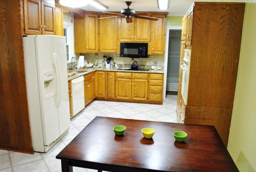
Oh and for anyone debating a peninsula, we’ve learned that the pros recommend 42″ of walking space between the peninsula and whatever’s on the other side (in our case it’s the fridge, which we hope will sink back a foot or so when we replace it with something that’s counter-depth). So that’s how we arrived at our peninsula length.
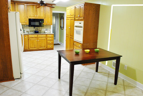
In fact, flow through the room is almost better because there’s one straight pathway through the room, whereas the old table (and the once planned banquette) made us walk in a slight circle. Hoorah for ten less steps a day. Haha.

So now that we’re unequivocally sold and geeky-excited about our new plan, it’s just going to come down to working out the logistics. Namely how to find/build perfectly-sized cabinets that match our old ones without breaking the bank. And finally hire a licensed contractor and get the permits needed to bust out that load bearing wall of ours. But that’s a story for another post. Another ten posts, probably…
Update: You can check out the new “cozy corner” behind the future peninsula in action (on video!) over on Young House Life.
Another update: Lots of people are sweetly suggesting some sort of bookcase or built-in feature on the side of the cabinets that face the dining room (instead of a knee-wall) but we’re unsure if that’ll be too much since there are already built-ins in the dining room that are just a few feet away. We’ll keep you posted as we go though! Who knows where we’ll end up…
Psst: Tomorrow I’m going to post my thoughts on trying Google Sketch-Up for the first time (and how it compares to two other 3D rendering tools I’ve used). So stay tuned for that if you’ve got any questions about how I made the 3D graphics for this post.

beth in dc says
I’m so relieved! I just couldn’t get behind the banquette idea. But this way you’ll have casual seating in the kitchen area, ample access to the dining room AND a cozy place to sit in front of the fire. I see many chilly evenings of Clara on your lap having cocoa and reading a bedtime story. Definitely the way to go.
Kathy says
MUCH better idea! I hate banquettes/booths whatever you want to call them. They give this restaurant-y un-homey feel. They’re bulky, costly and inflexible. It’s not natural for people to sit in such a stationary seat. People like to scoot back, forward, etc. and the booth doesn’t work for varied tastes and sizes of people. I know a couple friends and family members who have had these and they always turned into the “last resort” kitchen seating when the normal chairs were taken. I think they are good in theory but don’t work in reality.
Plus as time goes on it is much easier to change up a table/chair or stool combo than change much about those. I am really glad you are not doing it. I think for everyone who has a full dining room, just having a bar kind of set up in the kitchen is a great idea. I think it is tough to figure out exactly how to make the best use of a fireplace in a kitchen, but you are doing a great job with it!
Maggie S. says
J&S,
I think the peninsula is great, and I definitely think it will work as well for y’all as it does for us.
My kitchen has a similar layout to yours (with the peninsula) and it has always been a great gathering spot whether my hubby is hanging out while I’m cooking dinner (we have a down draft in our peninsula) or when we had 20+ over for a couples shower this past spring and used it as the buffet.
The news and football are pretty important in our house, so we have a small flat screen closest to the wall side of the peninsula that also helps not miss a play while grabbing a snack.
I look forward to watching the play by play on your kitchen makeover!
meghan says
Looks GREAT! I love this idea…seems to flow so nicely together! And the DIY concrete counter? LOVE. I came across an awesome how-to on another blog a few weeks ago…perhaps I tagged it on my pinterest….hmmm….I’ll do some searching!
tanyad says
Great idea! Why didn’t any of us think of this before? As soon as I saw the first sketch I said to myself “ahh, of course!”
P.S Can I just quietly say I’m so glad the granite counters are going. Though it would have been really interesting to see how you guys worked with it if you had kept it!
sara says
Not my house but soo glad you changed your minds on the Banquette, that was just too wierd looking for my taste, love the new idea, functional and more stylish, great place for kiddos to do homework or for guests to sip on wine while you cook dinner. cant way to see the finished area!
Keish says
I am so glad you aren’t doing the banquette, I thought it would be a pain to walk around. Love the new idea! And what is it with men and TVs?? My husband wants one in our kitchen area too! :)
Nat @ Style-ING w/ Children says
love it!! seriously. So much better than the original idea. I was not a fan of it from the start :)
katie v. says
Please do DIY concrete countertops! Not only would it look amazing in your kitchen (be a fraction of the cost of granite, and hold up really well), but I really want to do that in my kitchen & could use your take on it :)
Becky says
You’re right, I’m not liking this choice but to each his own! I hope it works out nicely.
Jason says
Well, as sad as I am to see “the islandette” go away… I really like this peninsula.
And I think having a small den/keeping room area is really going to be great. My mom uses what was her dining room behind her kitchen peninsula as a sitting area most times with love seat and a couple of rockers and she loves it. She moved her dining table through the doorway into the adjoining living room to make a dining area in there sort of like you did in your old house. She can always switch it back and forth, but being able to sit there while people are in the kitchen is always nice and I know you’ll like it.
Also, if you have a BIG party you can place a table in front of the fireplace and have a whole bunch more seating and everyone will still be close together between the DR, Peninsula and that table. Seeing the fireplace now from basically 3 rooms is a major plus as well!!
LaTonya says
Wonderful, wonderful, wonderful! And I love the Google Sketchup pictures. I’m a fan of graphic representations and this totally helped visualize the final result. My husband made fun of me when I designed our wedding invitations using Microsoft Visio. He also laughed when I used Visio to show him furniture placement options for our apartment. He’s definitely not enthusiastic as I am with home improvements, but I’m hoping I can talk him into a few things.
I can’t wait for demo time. That should be interesting (Flashing back to the bathroom demo)!
andrea says
um….HELLO!!! So much better!
I was not really sold on the whole banquet!
Beau says
Nice, I like this better than the banquette (just like everyone else apparently). Do you think it will be potentially awkward to have the peninsula hang out into the doorway…I guess its just hard to picture how that would look.
Either way I think you guys are onto something great. Im currently trying to figure out a layout for my long and skinny kitchen to try and include a peninsula or island as well…got an open space between the long and skinny kitchen and long as skinny dining room where it seems everyone always hangs out.
YoungHouseLove says
After looking at the rendering from the side (through the future doorway) it has helped us picture it and we’re thinking it won’t look awkward – but it definitely could evolve as we go!
xo,
s
Stefani @ Try to Enjoy says
Great! I like the new idea a lot. I always get so excited about your plans for your house and I can’t wait to see this kitchen makeover happen!
In my opinion it might be nice if you could somehow manage seating for 2 in the little seating area versus the single chair plus otoman… just so that 2 people could enjoy time together there. But I realize it’s a tight space so maybe having the one chair will work fine.
Christina says
I love it! We also had a peninsula growing up and it was really functional for breakfasts, guests, coffee in the mornings, homework, buffets, etc. The flow looks great (much better than Mr. Banquette, in my opinion). Yes!! Can’t wait to see how it all turns out!
P.S. So glad you both decided to replace those counters! I mean no offense to the previous owners, but I think something different will work better for this space. Good luck!!
Christina says
So, after I posted my first comment, I read another reader’s comment asking if it might still look like two tables from the entryway. I know it’s something you two were wanting to avoid in the beginning, and I wonder if maybe making the peninsula at bar height would take care of that issue. Pardon if you already answered this in another comment. But I know they can make bar height countertops that a “skinnier” than a regular counter, so you still have a full counter behind/below on the side of the kitchen. Does that make sense? Anyway, I was thinking about this while driving to work this morning and thought I might post this in case you two were a bit concerned about it looking like an additional table only a few feet from the main dining table. It might cause some functionality issues with a highchair, but given that kids are only in high chairs for a short amount of time compared to the amount of time you hope to stay in this house, I thought I would throw this out there. Cheers and good luck!
YoungHouseLove says
Thanks for the tip! We actually think counter height is a lot more functional for us (with smaller kiddos and stuff it’s nice to have them a little closer to the ground) but we’ll have to see where we end up! We’re not worried about a peninsula looking like two tables though! It’s going to have counters on it and connect to the kitchen, so we think it’ll definitely be nice and defined from the dining table.
xo,
s
Christina says
I can definitely see your point. I would hate to see Clara or another little one falling off a high stool, or having that stool tip over.
Wherever you end up, I think this plan is going to be great! Best of luck!
Jules says
I like it. Will the base match the rest of the counter tops? The one quality I loved about the banquette was the potential contrast in counter tops and cabinets. Will that affect still be achieved some how? From the sounds of it all the counter tops will coordinate.
YoungHouseLove says
I think the cabinet bases and counters will all match (just for a seamless look), but we’re not sure yet. We’re definitely planning to do something interesting when it comes to the upper cabinets above the cooktop, so we hope to bring in some different looks that way!
xo,
s
jessica says
Not gonna lie, I wasn’t a huge fan of the banquette. I was wondering why you weren’t considering a peninsula, which seems to make so much more sense to me. I think this is a great plan…can’t wait to see it happen!
Meagan says
i loved the concept of the banquette, but could never get my head around it in the space you have. i am totally feeling this though. its a much more natural solution for your kitchen. and even if you can only fit 3 stools thats totally ok. my mom only has 3 stools for her kitchen island…and it totally works. we hardly ever eat in there at the same time, and when we do we all go sit at the table. and the corner sitting area is going to be perfect when your kids get older and they want to hang out and talk to you in the kitchen. and same for the stools facing the kitchen…way better for homework while yall work in the kitchen. so basically im 150% on board with this idea. love love love it! (oh and go for concrete counters…id love to see how yall would do that!!!)
Alicia says
Wow! I love it! I can’t wait to see how it turns out!
Shannah says
I like this idea a lot!!! (Though ultimately my like/dislike doesn’t matter two hoots.)
What I actually wanted to say is congrats on finding a design that you both are truly happy with. It’s important that you love the design solution and that it works for how your family works. Working at an architecture firm I’ve learned that while form is important (good design/good look/gorgeous photos), function has a tremendous impact on overall satisfaction and joy.
So…YAY!!
Kelsey S. says
I have to admit I loved the banquette idea and still am not totally sold on this one (I think it’s the peninsula jutting into the wide doorway that throws me off). But if you guys have lived with it for a week and feel confident about it then I’m sure it will be great! I can’t wait to see how it turns out!
Becky says
I LOVE this idea!!! I think it looks awesome. Can’t wait to see it all unfold! :)
KinMD says
I really like the look– so much more open than the banquette look!
I wanted to put in my two cents about counter overhang. I think having an overhang on two perpendicular sides (the side with the stools and the side opposite the dining room)would really add functionality. We have this in our current kitchen and use it daily. We store all of the stools on the long ‘stool side’ but when my husband and I sit down to eat we swing one around so that we’re sitting at right angles to one another. This is so much cozier, and we can make eye contact more easily while talking over dinner. But since all the stools live on the one long side there’s no interruption to the flow in the kitchen unless we’re actually sitting. Not sure that I explained this well but works great for us!
YoungHouseLove says
Thanks so much for the tip! We’re definitely toying with the idea of making an overhang on two sides (we have Clara’s highchair on the side of the table these days and like that layout a lot!).
xo,
s
Brettany says
Love the peninsula. I have to admit, I wasn’t totally sold on Mr. Banquette either. I have to admit I got kind of giddy when I saw you used sketchup for your renderings – I suggested it back in the banquette post, I’m sure I’m not the only one that did but still, made my nerdy architect side beam with pride. Looks like you’ve definitely gotten the basics down and can’t wait to read your review of it tomorrow!
YoungHouseLove says
Aw thanks so much for the suggestion Brettany! We just couldn’t get past the issue of a peninsula next to the cabinetry that we had (it would run right into the fridge and boxing things off) but suddenly doing those sketches helped us come up with the idea of adding a base cabinet to bump the peninsula a bit further away (towards the fireplace side of the room) so it was more open! Yay peninsulas!
xo,
s
Sam @ The Junk House says
OK, I’m sold on the idea! You can never go wrong with more counter space and storage in the kitchen.
Jennah says
I like this muuuuch better. I think it’s more timeless than a banquette and also more functional. What program did you use for your renderings?
YoungHouseLove says
That’s Google Sketchup! John’s writing up a post about it for tomorrow (comparing it to other room-planning software and all that jazz).
xo,
s
rachael says
I love this! I wasn’t really sold on the banquette idea but it is your house, do whatever suits your needs right? But I have been toying with a peninsula idea for a while so this is exactly the thing I needed to make it make sense in my head! Plus a little visual for the husband never hurt anyone. :)
gemma@thesweetestdigs says
eeeek I love it!!!! Sooo much better. I can absolutely see the practicality of it, and it just looks great with your fireplace.
Can’t wait to watch the progress! We’re in the “idea collecting” phase for our kitchen reno (still saving our pennies), so it’ll be great to get some tips from you two.
Libby says
Well done! Also, thanks for the great idea of taping it out/using furniture and living with it for a few days to be sure. “Measure Twice, Cut Once,” right?? :)
Sarah in Indiana says
Cool that you found a solution you’re totally sold on. I love that feeling when you’ve solved a problem you’ve been puzzling over. I was skeptical about out the peninsula jutting into the doorway until I saw the dining room view. That sold me. Especially since you say you can fit 4 seats. That will make it much more functional for the long term. Can’t wait to see it come to life!
erin says
I LOVE THIS IDEA!!!! It seems so obvious now…. totally meant to be. Now I’m anxious to see what you decide on for countertops!!
Beth says
Amazeballs!
Seriously – best idea ever! Can’t wait to watch the progress unfold :)
Melanie says
Love this! Definitely worth the wait to find The One. We too just nixed our banquette in the new house design :(. But it was the right thing to do to gain an 8 foot island. Can’t wait to see the progress.
Natalie says
I am SOOO glad you decided against the banquette. It just chopped up the space too much. I recently renovated my brother house, and we took out a wall and added a peninsula so that people could eat in the kitchen. BEST thing we ever did, and you’re right, it doubles as entertaining (buffet) space. LOVE IT!
Here’s the kitchen we did:
http://foreverthehostess.blogspot.com/2011/05/kitchen-reveal.html
YoungHouseLove says
Love it!! So pretty!
xo,
s
Niki says
I love the peninsula. I wasn’t a fan of the banquette but since it’s not my house I didn’t say that I didn’t like it.
As for the possible concrete countertops…I LOVE them and have discussed them with my husband and dad. Just talk to someone (an engineer possibly) about doing this. Apparently in many homes, the floor has to be “beefed” up before it can carry the weight of concrete counters. Just wanted to throw that out there. Wouldn’t want you to wake up to the sound of your cabinets and counters crashing through to your basement. Good luck working through everything.
YoungHouseLove says
Wow- thanks so much for the tip! We assumed since we had granite we were ok with the weight, but adding the peninsula would add some weight for sure so we’ll have to look into that!
xo,
s
LaTonya says
Speaking a mirror or TV over the fireplace, Candice Olsen also uses those TVs-in-a-mirror things. I bet that’s expensive though. It’s an option, so when the TV is off, it just looks like a mirror.
YoungHouseLove says
Oh yeah those are awesome!
xo,
s
Brooke says
I love it! Excellent idea! It just “makes sense” to me. And I feel bad that you guys feel compelled to have to justify your own taste. I guess that’s whast happens when you have a very popular blog, but nobody else has to live in your house but you – so I say, do what feels right to YOU. That said, I’m still a BIG fan of this arrangement! :)
Kim says
This is great! I know you don’t want to close up the wall to the hallway, but it looks like there is another one nearby that goes to the living room. With the wide doorway to the dining room, you would have plenty of flow, and with the wall closed, you could get a small sectional or sofa where the chair is now. My sister in law had a small sectional in a similar kind of corner in their kitchen, and it was THE hang out spot for family and friends! I think it was one of the most used parts of their house. It would be so useful, because more than one person could cosy up to the fireplace. When you have more than one child, you can all read there. Just a thought!
YoungHouseLove says
Yup, but from the hallway side it would be dark and alley-ish if we closed that off (we love that it’s open to the kitchen so when we walk down the hall we can see who’s in the kitchen, and from the kitchen we love looking at the frame wall- it’s like the heart of the house).
xo,
s
Liz says
Love it! There was a peninsula in my kitchen growing up, and I spent countless hours sitting there chatting with my mom while she cooked dinner. It is one of my absolute favorite memories and made us much closer. Design really can bring people together, and I think you’ll be so happy with this plan! Great creative thinking!
Sarah says
I love that sentiment Liz! We have a peninsula in my Mom’s house (there’s five of us) and even though we have a huge farmhouse table, most times when we all get together (we’re all in college or out working now) we’re all huddled around the two-stool peninsula catching up. There is just something about that space where you can watch/talk to the person cooking and still be sitting down.
Amy says
Brilliant! I love it, and think your thought process is spot on. Now, will you have enough room at the peninsula for more than 3 chairs in the (likely) event you become a family of 4 (or more)?
Beth says
Concrete countertops are amazing! We have a similar lay-out, but with our table right behind the peninsula. Let me tell you, I do EVERYTHING for prep on that peninsula whether it’s laying out dishes, chopping with a great view of the fireplace or perusing last-second recipes on my laptop. As you mentioned, it serves as an awesome buffet, but is also a really great bar area – we have cocktail/wine glasses hanging from above the peninsula which look super festive with dimmed kitchen lights. Great choice for keeping an eye on little miss Clara, too. All around impressive!
Kim says
Great idea, I think this floorplan will be perfect for you. My sister had concrete countertops and I loved them. Very cool. One question… have you considered widening the doorway from the kitchen to the family room? I think the more open the better these days and it is another way to solve your issue of the fireplace being off-center. Just a thought. Can’t wait to see the new plan in action!
YoungHouseLove says
Yes, that’s a big thick brick wall (it used to be the back of the house before the addition) so it might not be worth the trouble. Not sure how much it would cost- haha!
xo,
s
Robin says
Love, love, love it! This post makes me want to try Google Sketch even though I really have nothing to sketch!
Barb says
OMG!!! There is a God!! I was so excited to see this solution to the kitchen. So much better than the banquettes that is so out dated!!! Maybe they are back in style and I am clueless….but not for long and I think you would regret it in the long run!
I love, love, love the new plans and am so on board with it.
Bravo to whomever suggested it. You get the “kudos” of the day!
Bring it on soon!
Rachel says
I love it! Congrats on finding “The One”! Really looking forward to the Google Sketch-Up post. I hope you’ll include an explanation about all those funny dashed lines.
YoungHouseLove says
Not sure I address those lines in that post, so I’ll address it here instead! Those are just the guide lines that Google adds. It gives you them in 3 dimensions (on the X, Y and Z axis) so they seem to constantly be cutting through my drawing.
-John
Bethany S says
I SOO love this floorplan. Everything about it.
Robin @ our semi organic life says
Love it! Always go with your gut! Does this plan make taking out that small desk/countertop next to the oven pointless?
YoungHouseLove says
Haha, sort of. At least we didn’t remove a cabinet! Since it was a desk we wouldn’t have used it anyway, so it eventually would have needed to be demoed out (and then we’d have some paint touch ups to do, so at least we did it before painting the paneling).
xo,
s
Lenore says
Yay! I love that. My mother’s kitchen has a peninsula, and it’s perfect. It’s a great space for cooking and baking, works beautifully as a buffet for more formal dinners. Plus, I have so many great memories of sitting/standing at the peninsula, watching my mother cook. It was perfect when she’d let me help, I could stir or cut veggies from one side of the peninsula without getting in my mother’s way in the body of the kitchen. In short, it’s a great idea!
Sarah says
I didn’t “get” the peninsula idea at first, but with the view from the dining room it made a lot more sense. I think it is great that you’ll have more storage/counter space in the immediate kitchen area. So yeah, I’m totally on Team Peninsula! (Which makes sense since I’m from Michigan. Peninsula for life!)