For all those wondering when the heck we’ll tackle that kitchen banquette idea that we mentioned a few weeks ago (here and here), well… probably never. Cue the frowny face emoticons.
Here’s the deal. After getting lots of positive feedback on the idea a few weeks ago (over 1,400 comments total!), Sherry and I were certain your collective enthusiasm would push us from “we think this is a good idea” to “this is definitely a good idea.” And it nearly did. But parts of us still questioned the whole commitment-factor when it came to actually doing it (we definitely described it as a half baked idea when we shared it). We worried if it’d really be the most practical solution (would it be a pain to scoot in and out of?) and if it’d really make the most of the space (we couldn’t figure out the right balance of big-enough seats while still maintaining flow around it to keep it from feeling cramped).
So one evening we decided there was a reason that we were stuck in Hesitation City: it just wasn’t The One. So we did what we always do when we get stuck. We went back to the drawing board to see if we could come up with something else that we ended up liking better. We made a few quick sketches of the floorplan, asked ourselves “what are we not thinking of???” and just started sketching ideas – no matter how good or bad our guts told us they were. Kinda like those DON’T THINK, JUST DRAW exercises that they teach you to access your subconscious or something. Of course some of them completely blocked the doorway to the dining room (fail!) and nearly all of them were completely out of scale (so things were too big or too far over) but it definitely got the ol’ wheels turning again…
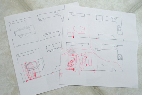
We tried returning to some version of table in the middle (top left) and even modification to the banquette (top right, bottom left). But somewhere in that mess we had one of those “Ah-ha moments” that ol’ what’s-her-name used to talk about on the TV (this is a joke for my Oprah-loving wife). So allow us to introduce the banquette’s successor: the peninsula! Cue the confused emoticons.
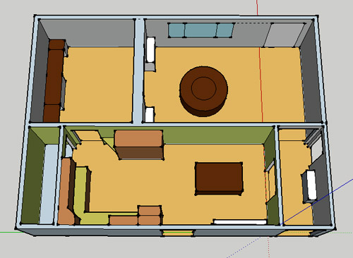
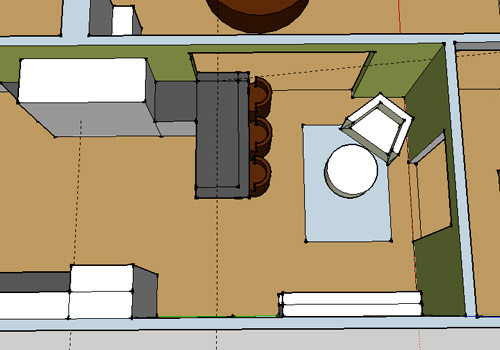
Let’s explain. First, here’s our CURRENT floating-table-in-the-kitchen-and-larger-table-in-the-dining-room arrangement (courtesy of my rough Google Sketch-Up drawing):
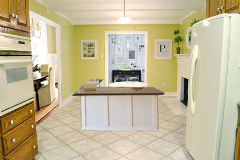
Now for the doorway opened, cabinets painted, counters replaced, floor slightly discolored (not intentionally) and (of course) peninsula’d version:
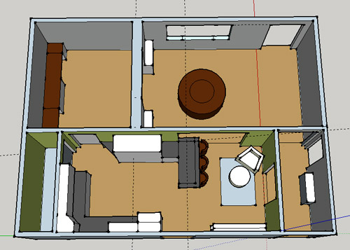
Woo hoo. Before we go any further, we should warn you: we’re 100% sold. The above depiction of it is probably not going to make a believer out of everyone, but from taping it out in the space and moving around it “in person” for a while we giddily came to the following conclusion: it’s The One! So no worries if it’s not your jam or you love Mr. Banquette (he was a lovable guy – and there are always gonna be people who would do things differently if this were their house) but we’re definitely going for it. And we can’t wait to get started.
As for why we didn’t come up with the peninsula idea sooner, we were so stuck on the fact that a peninsula coming off of the cabinetry that we already have would actually hit (or come very very close to hitting) the fridge on the other side of the room. So it wasn’t until we came up with the idea of adding a base cabinet to the right of the cabinetry that we already have to space the peninsula further away (a smidge towards the fireplace) for better flow and even more counter space.
Speaking of counter space, when it comes to executing this whole thing, we’re basically planning to add some base cabinetry (and counters) near the opening itself to create a counter-height peninsula. Which accomplishes a lot, actually:
- It adds additional work surface & cabinet storage to the kitchen side of the room (so it’s easy-access)
- It helps extend and better define the kitchen space without blocking flow or feeling too heavy
- It creates a casual eating space, keeping it distinct from the dining room table, which is just steps away for larger groups and more formal gatherings
- We can most likely seat four people at the peninsula (it’s flexible, so ignore the three chunky chairs shown)
- It can be used as a buffet to set out food (or to seat additional guests) when we have parties
- It can be used for homework, laptop browsing, and general hanging out by the kiddo(s) as they grow
- It even makes sense of our very off-center fireplace by creating a small casual living space that we’ll use as a little “chill corner” of sorts (the peninsula doesn’t block the fireplace, which our banquette friend did from most angles)
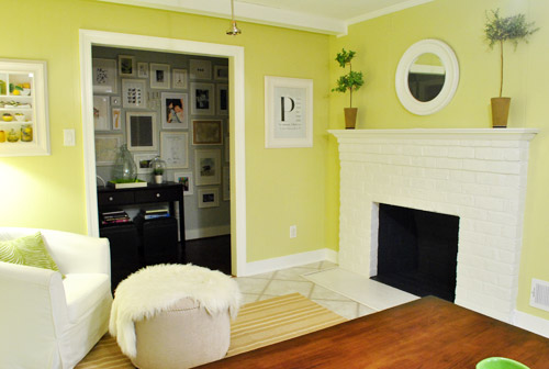
That last perk (centering the fireplace) was a nice surprise, since it’s something we’ve struggled with a lot (it’s just in such an odd place, practically shoved in the corner of the room). But you can see from this virtual view through the future doorway how it almost makes the fireplace placement seem intentional (picture it with a nice round mirror above it to balance that doorway next to it). Oh happy day.
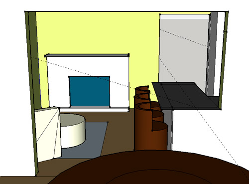
We just love that we’ll get to see the fireplace from the dining room (it won’t be blocked by a heavy banquette) and if overflow guests sit at the peninsula, they won’t have their backs to the people seated in the dining room (which would have happened with the banquette).
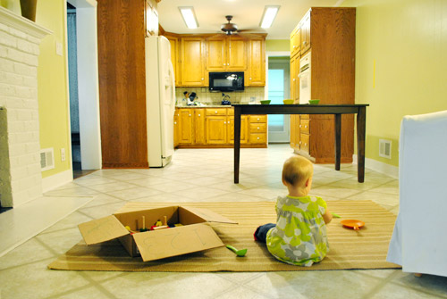
For those who don’t do well with renderings (or are still scratching your heads), here are some pics we snapped to give you a better idea of how it’ll work in the real world. We moved some existing furniture around to mimic the placement (the table represents the peninsula) and have lived with it for the last week-ish to make sure it actually makes sense. Placements aren’t totally exact, but pretty darn close to what we’re thinking. Here’s the view from the laundry room. Ignore the broken pendant light in the far back (it finally crapped out on us). Instead look, there’s that fireplace nicely framed!
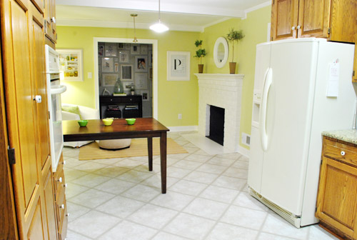
We also traced out the future opening (again, not exact) to show how that’ll work too. We’re thinking there will be a little half-wall (i.e. knee wall) where the peninsula meets the open doorway…
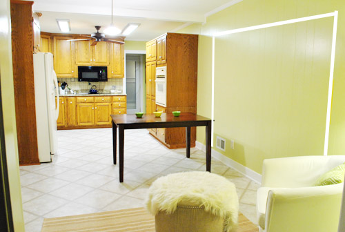
… like we showed in this rendering:

We considered a narrower doorway (where the peninsula doesn’t hang over into the opening) but we think this wider version makes it feel much more open and lets in more light, so it’s the current winner. And of course as previously mentioned, we love how balanced the fireplace and doorway look through the cutout.
Admittedly it took us a little while to figure out what to do with the space in front of the fireplace. It was our biggest hurdle in getting on board with this idea, actually. But after we brought in a placeholder chair, ottoman, rug, and light we realized it was actually completely awesome. There have been approximately 14 hours of reading-with-Clara from that chair in the last week or so. We’re even toying with the addition of some sort of tall built-in bookshelf behind the chair to balance the tall cabinets on the other side of the doorway. Not sure yet, but we’ll keep you posted.
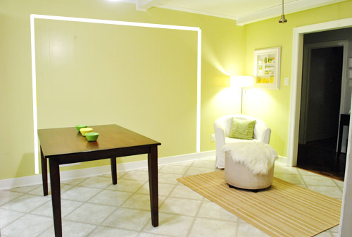
We’ve already discovered it’s a great spot for Clara to play while we’re getting stuff done in the kitchen (since we can’t see her if she’s in the living room, but it’s easy enough to peek over the peninsula to check on her if she’s in the kitchen on the rug).
Sherry’s already making plans for how she’ll relax in front of a fire (we’re contemplating one of those convincing modern-looking electric inserts that Candice Olsen uses – possibly even a double sided one if we can eventually open the back of the fireplace into the living room as planned).
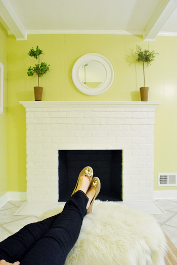
Meanwhile I’m dreaming of a little TV mounted above the mantle so I can watch the news during our morning breakfast routine (Sherry is rolling her eyes as I type this- so we’ll have to see where we land on that). Either way, can you tell we’re getting more than a little excited about this set up? Yup, it’s The One.
The peninsula will also give us 3-ish base cabinets worth of deep functional storage, unlike the largely decorative storage (open 12″ bookshelves) that the banquette would’ve provided. Plus a nice wide 3′ x 5.5′ work surface for prep, serving, eating, and homework is FAR more functional than what we would’ve gained from a distant island or a narrow banquette located a lot further away. And we’re probably gonna use the new counterspace as an excuse to change the countertops in the whole kitchen. We’ve never loved our existing granite color (it has a few pitted/stained parts too), so it seems silly to actually buy more for the new peninsula (we’ve debated a mismatched look, which we like for an island, but for a peninsula it seems like it would look most like it has “always been there” with the same counter to keep things seamless). Of course we plan to craigslist the existing granite and put that money towards whatever we’ll use for the new material (not gonna lie, we’re already talking about DIYing concrete counters).
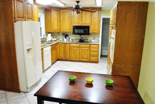
Oh and for anyone debating a peninsula, we’ve learned that the pros recommend 42″ of walking space between the peninsula and whatever’s on the other side (in our case it’s the fridge, which we hope will sink back a foot or so when we replace it with something that’s counter-depth). So that’s how we arrived at our peninsula length.
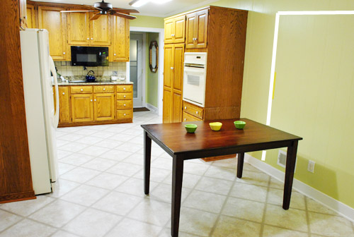
In fact, flow through the room is almost better because there’s one straight pathway through the room, whereas the old table (and the once planned banquette) made us walk in a slight circle. Hoorah for ten less steps a day. Haha.

So now that we’re unequivocally sold and geeky-excited about our new plan, it’s just going to come down to working out the logistics. Namely how to find/build perfectly-sized cabinets that match our old ones without breaking the bank. And finally hire a licensed contractor and get the permits needed to bust out that load bearing wall of ours. But that’s a story for another post. Another ten posts, probably…
Update: You can check out the new “cozy corner” behind the future peninsula in action (on video!) over on Young House Life.
Another update: Lots of people are sweetly suggesting some sort of bookcase or built-in feature on the side of the cabinets that face the dining room (instead of a knee-wall) but we’re unsure if that’ll be too much since there are already built-ins in the dining room that are just a few feet away. We’ll keep you posted as we go though! Who knows where we’ll end up…
Psst: Tomorrow I’m going to post my thoughts on trying Google Sketch-Up for the first time (and how it compares to two other 3D rendering tools I’ve used). So stay tuned for that if you’ve got any questions about how I made the 3D graphics for this post.

Ashley says
I. LOVE. THIS. It makes the whole area make sense.
Mary says
I think NOT putting in the banquette is a wise idea. Have you thought about walling up the opening between the kitchen and the hall to make more cozy fireside chatting room? You’d still have two entries to the kitchen.
YoungHouseLove says
Yup, we’re just against that idea because the hallway is so nice because it opens to the kitchen (it would feel like a dark alley without that opening from the hallway side).
xo,
s
Amber, Blonde & Balanced says
I don’t know ANYTHING about home design, but I LOVE THIS! Awesome idea. Can’t wait to see it come to life. And also, my husband and I are gearing up to buy our first house and we’ll personally fly you out to help us design it. Probably not a paying gig … but we’ll cook for you? haha. Anyways, love it!!
YoungHouseLove says
Haha, we do like to eat…
Good luck with everything!
xo,
s
Miramax says
Very nice. Instead of a half wall, maybe you can add a shallow base cabinet facing the dining room? Good luck! :-)
YoungHouseLove says
Always another possibility!
xo,
s
Nora says
I’m sold! Good luck and we’ll have a moment of silence for Mr. Banquette…can’t say I was too attached anyway. Viva Mr. Peninsula!!
Coley Arnold says
This will be so nice and open up conversation in your kitchen/dining room. I love the idea of a place Clara can hang out when you guys are cooking. My kids play in the living room while I am cooking and I can’t see them at all. I feel like I just run back and forth the whole time I am cooking! (which doesn’t happen too often ha!) I can’t wait to see it all done!
Rachel Tatem says
It’s a great solution! Looks great
Jenny says
Good for you, y’all are the ones that have to live with it so you should be the ones that love the solution. Personally I was not the biggest fan of the banquet but LOVE this solution. Great job yet again! Can’t wait to see this one come to life!
.ivy says
YES. Brilliant. I love it. Can’t wait to see the real thing!
Amber says
I love the layout…we have a peninsula and LOVE it! And now for a word regarding the 3D sketches that helped to visualize what it would look like. It was very helpful, but I was highly distracted. I kept thinking about what a great layout your house is going to be for the game of “tag” once you knock out that dining room wall. You will be able to make all kinds of circles through the house going in different rooms… rarely meeting the dreaded dead-end that always spells trouble in the game of tag…
… and yes I have four kids, so tag on the brain is just part of my crazy life!
Rachel says
Oooo! I love it I love it I love it! Brilliant!
I love sitting areas in kitchens. Its where everyone congregates anyway, now they’ll have some space without being in the cooks way.
Plus, can’t you just see Clara and her little cousins sitting at the peninsula at big family dinners?
Kami Buchanan says
Awesome! I absolutely love it! I like the casual seating in the kitchen and eating family meals 5 steps away. I wasn’t sold on the banquette either. I mostly love how you two really think everything out and discuss it together. I would love to be in on those meetings and drawings. I can’t wait to see you start working on it!
PS: I’ve been a blog stalker for a long time. This is my first comment. Not sure why I chose this topic to comment on (and couldn’t find the words to say) but this kitchen makes me happy! LOVE ya’ll!
Casey says
What an exciting post! I was on board with the banquette (and sad in first reading the post title) because it seemed like it was going to be a challenge and I was looking forward to how you would pull it off. However this new design does seem like your One, and now I can’t wait to see how that somewhat-challenging sitting corner evolves!
Sara @The Fat Hydrangea says
Love it! It makes the kitchen look SO much bigger and less cramped then the last design! We are going to do a peninsula in our kitchen too… and knock out a wall… Actually, when you guys are done with your kitchen, why don’t you come and do mine? ;)
Lisa says
Have you heard of engineered granite countertops? They slip over your existing counters. Instead of ripping everything out, it looks pretty painless.
I’m not sure how much they cost, but I saw them on an HGTV episode the other day.
http://www.granitetransformations.com/
YoungHouseLove says
Woah- never heard of them. Thanks!
xo,
s
Emily says
My parents used them in both the kitchen and a half-bath in their house and they look great – and it was a pretty painless process.
Kris says
Hot damn! That is AWESOME!!! LOVE LOVE LOVE IT!!!
Meredith says
Wahooo! Good for you two! I think this is an excellent idea, I can’t wait to see it come together. I especially love how the flow is much more natural and you have space for a lounge area in front of the fireplace. It doesn’t get much better than that :)
Caroline says
I like this so much better than either the island by the fireplace or the banquette. Good job taking your time and figuring out what you really wanted!
schmei says
I love it! Our new apartment has a peninsula, and I just love how it makes it easy to socialize with whoever is cooking without being all up in their business. And it makes everything feel nice and open. And it gives you more storage space. And on and on… great idea! Can’t wait to see it come together.
Ali says
You guys are two smart cookies! Take THAT baby to market. I love it. I didn’t like the banquette idea. It didn’t seem “John and Sherry” to me. It didn’t seem to fit in with the modern/clean line vibe you guys have. I generally see them as kind of “country,” though I know using more modern materials and cleaner lines could change that. Just wasn’t right!
YoungHouseLove says
BWAHAHAHA. Take that baby to the market. Awesome.
xo,
s
Dusa says
Add me to the ‘not a banquette’ fan list, and add me twice to the ‘pennisula love’ list. But I’m all for demo-ing more the dividing wall to make the pennisula more ‘free-standing’. And could I use the ‘single quote’ function more?
*facepalm*
YoungHouseLove says
Haha, yay single quote! I use parenthesis like they’re going out of style.
xo,
s
.ivy says
Oh, a side question. (And my apologies if you’ve mentioned this before…) How did you determine whether or not that wall you’re going to open up was load-bearing? We’ve got a similar “cut off from the house” kitchen that we’ve considered opening up. For ours, we’d be taking the wall out floor-to-ceiling, not just creating an opening.
YoungHouseLove says
We knew because it’s the only middle wall running horizontally down our house, so the roof and everything has to rest on it since it’s in the middle and it goes in the same direction as the roof (generally speaking which ever way hardwood floors run, walls running that same way are load bearing). Hope that makes sense!
xo,
s
Adrienne says
Having grown up on a peninsula within a peninsula (Leelanau, MI…sorry, Michigan humor) I have to say I am a FAN. This is going to be great, I can already picture it! Also, concrete countertops are the stuff of my dreams. :)
Ashlee says
I’m a big fan of this new plan. I didn’t love the banquette at all, so this is great! Glad you waited it out.
Jill says
Love this! It will be nice to have the overflow for guests. Plus, if you’re working in the kitchen while entertaining, the open space lets you mingle (but the mess in the kitchen is kind of hidden). BTW, I grew up in a house w/a peninsula. It seated only two (my brother and I). That is where my brother and I ate every breakfast before school and lunches during the summer. We did our homework on that counter before dinner. It was a very special place!
Laura W says
I love it! I wasn’t a fan of the banquette either, it cut too much of the room off. Can’t wait to see the final project!
Serina says
Awesome! I was sketchy about the island or even banquet being so far from the kitchen, so I’m sooo glad to see you guys came up with a plan that works!!! My first thoughts on the counter hanging out a little in front of the new doorway was that you guys could hinge that part so it drops and won’t pose any possible hip or toddling head injuries, but if you go with cement that probably wouldn’t work. LOVE THIS!!!
Katrina says
I found the banquette idea intriguing, but was also nagged by the blocked off / isolated feeling that it gave. I think the peninsula is much more flexible, open, and attractive. I love that you can see the fireplace from everywhere! Good thing you just drew and drew and drew until inspiration hit! Great job, youngsters!
Nikki says
I love this idea! If you are replacing countertops you could opt for a range/stove combination instead of the separate wall mount oven and range. That could give you a stretch of continuous counter on the wall next to your laundry room too (or you could put it where the range is now and maybe that would make the cabinet-matching process easier on the new peninsula?)
I wasn’t sold until I was how your table is marking the space nicely and I love the knee wall idea…the rendering really helped for that! WHEN ARE THE CONTRACTORS COMING??? I’m so excited you guys found a plan…that’s half the battle!
YoungHouseLove says
Haha, thanks for all the ideas Nikki! As for when the contractors are coming- it might be a while! We’re still getting estimates and dealing with permits! Boo! So slow. But we can’t wait!
xo,
s
Amy says
Love the peninsula idea much better than the banquette. The added countetop and storage space is a better use of the area, but the I think you will see that this arrangement will make this the hub of activity for the entire family. There is nothing better than having hubby and the kids together in the kitchen in the evenings. I also vote that John gets his TV but you get whatever throne you desire.
YoungHouseLove says
Haha- totally a fair compromise.
xo,
s
Jen M says
Love it! Really hoping you do concrete counter tops and show the step by step. I would love to try it and need a nudge.
Rosalyn says
LOVE, LOVE IT!!! I wasn’t completely sold on the banquette, as it looked out of place. The bar/peninula/counter fits perfect! I also love the little chair to lounge in – Kudos!
Lindsey says
PERFECT. So easy to imagine Clara sitting at the counter doing homework while Sherry sits in the chair with a baby, quizzing Clara on spelling words, helping with HW questions, etc….
Kristen says
Love this idea! What about a corner bookshelf behind the chair? Clara’s books/toys could go on the lower kid-level shelves and be visibly hidden by the chair. The upper shelves give you some fun decor space. You could total DIY them with some old shutters or a door.
Ps- You guys were in my dream last night. (I promise I’m not a creeper)
YoungHouseLove says
That could be really fun too!
xo,
s
Kristen says
I love this solution!! The banquette seemed like an interesting idea but just not quite right for your space. I think the peninsula will work out so much better. And yay for new counter tops!
Amy says
I LOVE THIS IDEA!!!! I can’t wait to see the work in progress shots as well as the highly anticipated finished shot! :)
I love that yall are making your house your HOME. :)
Annie says
Because it matters what I think ;) … I am totally on board with this idea. We had a casual sitting area off of our last kitchen and it was my favorite spot in the house! Yay for brainstorms!
Jen M says
Love it! Just looking back on the pics you posted and got to thinking, would you ever consider removing the big wall of cabinets where the stove is, and installing counter height cabinets, where you can install the stove, and you could have the peninsula coming off of that. You’d be gaining extra cabinets in the peninsula (to offset the removal of the other cabinets) and also a lot more counter space. I think it would really make your kitchen look larger. I know I’ll love anything you guys do though!!
YoungHouseLove says
Yeah, we chatted about that a bit but thought it might look side heavy with the big tall fridge on the other side- plus we’d lose the swing out pantry that we love (counter height cabs might make storing food under there kind of frustrating). Great thought though!
xo,
s
Amanda says
I like this much much better than the banquette, for your house. It’ll be perfect for being able to interact with the dining room table for entertaining as you’ve already stated.
But I do love a banquette. It just has to work right.
Andrea says
Just wondering if you’ve considered extending the opening all the way to your tall pantry/cabinet? It would open up the kitchen even more, let even more light in, and maybe make the peninsula seem more (what’s the word?) ……. intentional? Not that it doesn’t already seem intentional…. maybe this way might make it seem even more-so?
Also, if you extend the opening, a person standing INSIDE the peninsula would be better able to see what’s going on in the dining room.
YoungHouseLove says
We’re definitely flexible on the actual opening side. I think we’re going to partially build the peninsula and then use that to judge where we think the opening should be!
xo,
s
Lindsay C says
This is, imho, the best option! I can’t wait to watch it come together. I really love that the whole family can be together even if one is making dinner, another is on the computer, and someone else wants to read a book. Brilliant solution Petersiks!
Sheila says
I like your new idea! But one word based on my experience… a counter depth fridge isn’t that much more shallow than a standard. Just a few inches. But the perception to the eye is so much better. So I don’t think you’ll gain a lot of additional space in the walkway into the kitchen. I think it’s totally worth it from the visual perspective though.
YoungHouseLove says
Thanks for the tip Sheila!
xo,
s
Beano Wagner says
I think this is soo much better! I was always confused with how the banquette would look (from the dining room or hallway doors), and this just makes sense. It would have always had it’s “back” to someone, and this is much more open. With this new plan, have you guys thought about what type of chairs might sit at the peninsula?
YoungHouseLove says
Not at all sure, but definitely nothing as chunky as the ones in J’s drawing (he made them with a series of awkward shapes, haha).
xo,
s
Chelsea in Richmond says
LOVE this WAY better! I was not a fan of the banquette idea so I didn’t make a comment. Seems from the comments above, that I wasn’t alone :-) Our mamas must have raised all of us not to say anything if you can’t say anything nice LOL.
I was concerned about it sticking out into the new entryway so thank you for posting the sketch viewing it from the dining room. That helped me visualize the whole thing. Looks great! Can’t wait to see the progress made on this project!
sanam says
thanks for sharing the entire planning process. it’s nice to know that we’re not the only ones who labor over decisions and sometimes go right back to the drawing board!
this looks like a great way to enjoy the fireplace and create a more functional eating/prep/work area.
Sugar Cookie says
Yup, I love this too. I was going to suggest a counter-depth refrigerator to help with space, and then as I read more of the post, you ended up mentioning one. We bought one when we moved into our new place last year and love it! Can’t wait to see more of the kitchen as you are able to move forward with the changes.
Kelsey D. says
LOVE it!! I was totally on the banquette bandwagon, but this is an absolute perfect use of this space! Not to mention it gives me a little street cred in my family! :) We are currently finalizing plans on our new house to be built next spring and we have a peninsula bar that seats four and a corner fireplace in the “breakfast nook”. I have said from the beginning I wanted a big comfy chair instead of another table and my family and friends have thought I was crazy..so thanks to you I can now say call me crazy, but YHL is doing it too!! :)
[email protected] says
I MUCH prefer the peninsula- it just functions much better (more storage and counter space), which is something buyers are always looking for (in case you are thinking of eventual resale). The banquette just didn’t seem cohesive. Can’t wait to see the end result!
Amanda says
Don’t forget that one of your goals was to be more secure in your decisions! You will sound more secure if you don’t mention how people might disagree and that you are 100% sold. It sounded like you were telling people they weren’t allowed to post that they liked the old plan better…
YoungHouseLove says
Thanks Amanda! Part of being secure in our bloghood is sharing our conviction and saying things like “we’re 100% sold” when we are. You know, instead of being wishy-washy and saying things like “we’re really not sure how we like this but we’ll just see how it goes” when we’re really set on something. We basically just blog completely transparently. When we’re not sure about something we’ll describe it as “half baked” or a “brain dump” and when we’re sold on something we might say so and call it “the one!” – just so readers know where we are on stuff. People definitely will tell us when they don’t like something regardless of how much we emphasize that we love it. Haha. But that’s what makes the world go round! To each his own.
xo,
s
Nette @ This Dusty House says
I was not one of those banquette fans, but I LOVE this idea. Because I didn’t grow up with a formal dining room, I’ve never understood the draw to having *two* tables and *two* eating areas, but counter level bars somehow make complete sense for a second, informal eating area.
Just one word of warning: get comfortable counter level bar stools. We’ve currently making do with full height, simple, wooden bar stools until we can find counter level comfy ones we like, and after 15 minutes or so sitting on them, they are just not comfortable.