For all those wondering when the heck we’ll tackle that kitchen banquette idea that we mentioned a few weeks ago (here and here), well… probably never. Cue the frowny face emoticons.
Here’s the deal. After getting lots of positive feedback on the idea a few weeks ago (over 1,400 comments total!), Sherry and I were certain your collective enthusiasm would push us from “we think this is a good idea” to “this is definitely a good idea.” And it nearly did. But parts of us still questioned the whole commitment-factor when it came to actually doing it (we definitely described it as a half baked idea when we shared it). We worried if it’d really be the most practical solution (would it be a pain to scoot in and out of?) and if it’d really make the most of the space (we couldn’t figure out the right balance of big-enough seats while still maintaining flow around it to keep it from feeling cramped).
So one evening we decided there was a reason that we were stuck in Hesitation City: it just wasn’t The One. So we did what we always do when we get stuck. We went back to the drawing board to see if we could come up with something else that we ended up liking better. We made a few quick sketches of the floorplan, asked ourselves “what are we not thinking of???” and just started sketching ideas – no matter how good or bad our guts told us they were. Kinda like those DON’T THINK, JUST DRAW exercises that they teach you to access your subconscious or something. Of course some of them completely blocked the doorway to the dining room (fail!) and nearly all of them were completely out of scale (so things were too big or too far over) but it definitely got the ol’ wheels turning again…
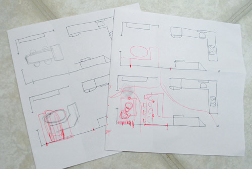
We tried returning to some version of table in the middle (top left) and even modification to the banquette (top right, bottom left). But somewhere in that mess we had one of those “Ah-ha moments” that ol’ what’s-her-name used to talk about on the TV (this is a joke for my Oprah-loving wife). So allow us to introduce the banquette’s successor: the peninsula! Cue the confused emoticons.
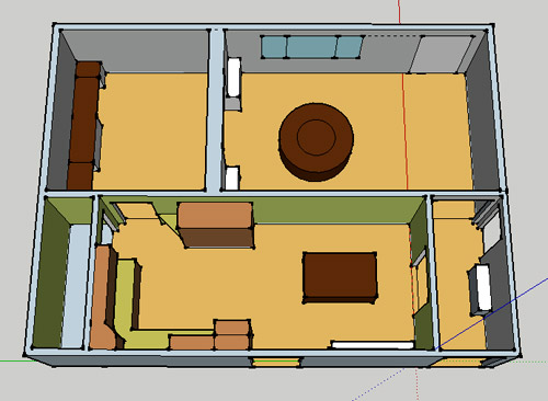
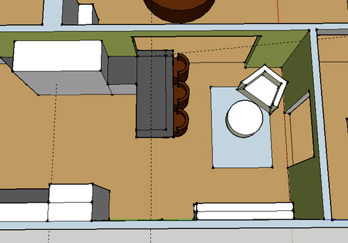
Let’s explain. First, here’s our CURRENT floating-table-in-the-kitchen-and-larger-table-in-the-dining-room arrangement (courtesy of my rough Google Sketch-Up drawing):
Now for the doorway opened, cabinets painted, counters replaced, floor slightly discolored (not intentionally) and (of course) peninsula’d version:
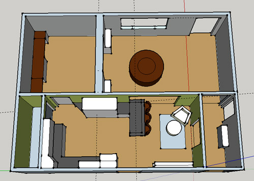
Woo hoo. Before we go any further, we should warn you: we’re 100% sold. The above depiction of it is probably not going to make a believer out of everyone, but from taping it out in the space and moving around it “in person” for a while we giddily came to the following conclusion: it’s The One! So no worries if it’s not your jam or you love Mr. Banquette (he was a lovable guy – and there are always gonna be people who would do things differently if this were their house) but we’re definitely going for it. And we can’t wait to get started.
As for why we didn’t come up with the peninsula idea sooner, we were so stuck on the fact that a peninsula coming off of the cabinetry that we already have would actually hit (or come very very close to hitting) the fridge on the other side of the room. So it wasn’t until we came up with the idea of adding a base cabinet to the right of the cabinetry that we already have to space the peninsula further away (a smidge towards the fireplace) for better flow and even more counter space.
Speaking of counter space, when it comes to executing this whole thing, we’re basically planning to add some base cabinetry (and counters) near the opening itself to create a counter-height peninsula. Which accomplishes a lot, actually:
- It adds additional work surface & cabinet storage to the kitchen side of the room (so it’s easy-access)
- It helps extend and better define the kitchen space without blocking flow or feeling too heavy
- It creates a casual eating space, keeping it distinct from the dining room table, which is just steps away for larger groups and more formal gatherings
- We can most likely seat four people at the peninsula (it’s flexible, so ignore the three chunky chairs shown)
- It can be used as a buffet to set out food (or to seat additional guests) when we have parties
- It can be used for homework, laptop browsing, and general hanging out by the kiddo(s) as they grow
- It even makes sense of our very off-center fireplace by creating a small casual living space that we’ll use as a little “chill corner” of sorts (the peninsula doesn’t block the fireplace, which our banquette friend did from most angles)
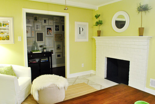
That last perk (centering the fireplace) was a nice surprise, since it’s something we’ve struggled with a lot (it’s just in such an odd place, practically shoved in the corner of the room). But you can see from this virtual view through the future doorway how it almost makes the fireplace placement seem intentional (picture it with a nice round mirror above it to balance that doorway next to it). Oh happy day.
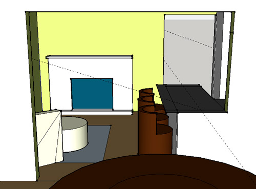
We just love that we’ll get to see the fireplace from the dining room (it won’t be blocked by a heavy banquette) and if overflow guests sit at the peninsula, they won’t have their backs to the people seated in the dining room (which would have happened with the banquette).
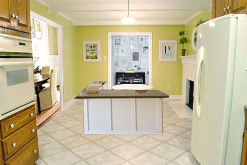
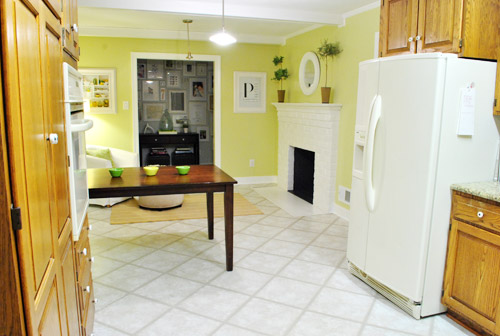
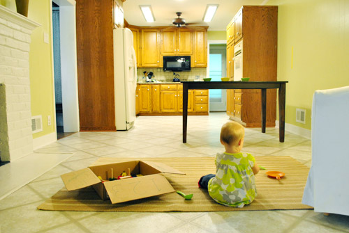
For those who don’t do well with renderings (or are still scratching your heads), here are some pics we snapped to give you a better idea of how it’ll work in the real world. We moved some existing furniture around to mimic the placement (the table represents the peninsula) and have lived with it for the last week-ish to make sure it actually makes sense. Placements aren’t totally exact, but pretty darn close to what we’re thinking. Here’s the view from the laundry room. Ignore the broken pendant light in the far back (it finally crapped out on us). Instead look, there’s that fireplace nicely framed!
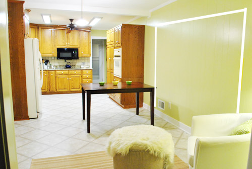
We also traced out the future opening (again, not exact) to show how that’ll work too. We’re thinking there will be a little half-wall (i.e. knee wall) where the peninsula meets the open doorway…
… like we showed in this rendering:

We considered a narrower doorway (where the peninsula doesn’t hang over into the opening) but we think this wider version makes it feel much more open and lets in more light, so it’s the current winner. And of course as previously mentioned, we love how balanced the fireplace and doorway look through the cutout.
Admittedly it took us a little while to figure out what to do with the space in front of the fireplace. It was our biggest hurdle in getting on board with this idea, actually. But after we brought in a placeholder chair, ottoman, rug, and light we realized it was actually completely awesome. There have been approximately 14 hours of reading-with-Clara from that chair in the last week or so. We’re even toying with the addition of some sort of tall built-in bookshelf behind the chair to balance the tall cabinets on the other side of the doorway. Not sure yet, but we’ll keep you posted.
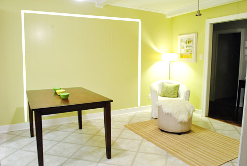
We’ve already discovered it’s a great spot for Clara to play while we’re getting stuff done in the kitchen (since we can’t see her if she’s in the living room, but it’s easy enough to peek over the peninsula to check on her if she’s in the kitchen on the rug).
Sherry’s already making plans for how she’ll relax in front of a fire (we’re contemplating one of those convincing modern-looking electric inserts that Candice Olsen uses – possibly even a double sided one if we can eventually open the back of the fireplace into the living room as planned).
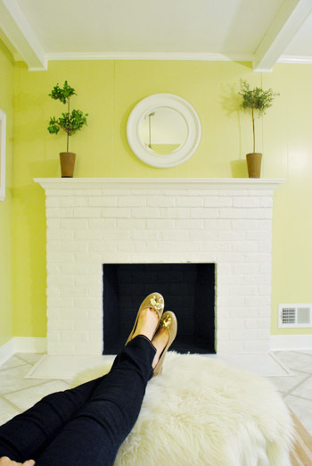
Meanwhile I’m dreaming of a little TV mounted above the mantle so I can watch the news during our morning breakfast routine (Sherry is rolling her eyes as I type this- so we’ll have to see where we land on that). Either way, can you tell we’re getting more than a little excited about this set up? Yup, it’s The One.
The peninsula will also give us 3-ish base cabinets worth of deep functional storage, unlike the largely decorative storage (open 12″ bookshelves) that the banquette would’ve provided. Plus a nice wide 3′ x 5.5′ work surface for prep, serving, eating, and homework is FAR more functional than what we would’ve gained from a distant island or a narrow banquette located a lot further away. And we’re probably gonna use the new counterspace as an excuse to change the countertops in the whole kitchen. We’ve never loved our existing granite color (it has a few pitted/stained parts too), so it seems silly to actually buy more for the new peninsula (we’ve debated a mismatched look, which we like for an island, but for a peninsula it seems like it would look most like it has “always been there” with the same counter to keep things seamless). Of course we plan to craigslist the existing granite and put that money towards whatever we’ll use for the new material (not gonna lie, we’re already talking about DIYing concrete counters).
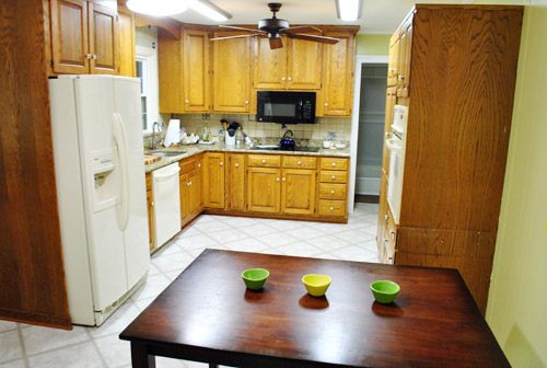
Oh and for anyone debating a peninsula, we’ve learned that the pros recommend 42″ of walking space between the peninsula and whatever’s on the other side (in our case it’s the fridge, which we hope will sink back a foot or so when we replace it with something that’s counter-depth). So that’s how we arrived at our peninsula length.
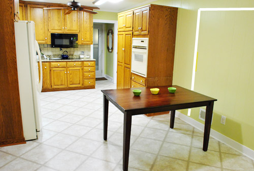
In fact, flow through the room is almost better because there’s one straight pathway through the room, whereas the old table (and the once planned banquette) made us walk in a slight circle. Hoorah for ten less steps a day. Haha.

So now that we’re unequivocally sold and geeky-excited about our new plan, it’s just going to come down to working out the logistics. Namely how to find/build perfectly-sized cabinets that match our old ones without breaking the bank. And finally hire a licensed contractor and get the permits needed to bust out that load bearing wall of ours. But that’s a story for another post. Another ten posts, probably…
Update: You can check out the new “cozy corner” behind the future peninsula in action (on video!) over on Young House Life.
Another update: Lots of people are sweetly suggesting some sort of bookcase or built-in feature on the side of the cabinets that face the dining room (instead of a knee-wall) but we’re unsure if that’ll be too much since there are already built-ins in the dining room that are just a few feet away. We’ll keep you posted as we go though! Who knows where we’ll end up…
Psst: Tomorrow I’m going to post my thoughts on trying Google Sketch-Up for the first time (and how it compares to two other 3D rendering tools I’ve used). So stay tuned for that if you’ve got any questions about how I made the 3D graphics for this post.

Celia says
This looks so cozy! I wasn’t sure how it would look with the peninsula sticking out into the wide opening from the dining room, but the 3D pic you made sold me on it. It connects the dining room and kitchen so much more. Thanks for sharing your process in how you came up with the banquette idea, decided not to do it, and came up with another great idea!
Suzanne says
This is an awesome idea. I love the chair in front of the fireplace–so cozy. I never was sold on the banquette but I’m 100% in love with this.
Nichole@40daysof says
Sold! I was concerned about the banquet, even though it was a neat idea. Love this! Not that any of our opinions matter, since it’s your house. :)
Valerie says
LOVE THIS! It works in every way! I would also love to see it with DIY concrete counters! …for 2 reasons: 1) It would look fantastic, and 2) I would love to learn from the process so I can work up the courage to do it myself!
Amanda says
Looks great! If you make the cabinets, did you think about making a little bookcase/storage area in the part that faces the dining room to tie in with all of the built-ins? Kinda like what you have going on in the console…
YoungHouseLove says
We thought about that but weren’t sure if it would be too much (since the built ins are about 3 feet away- so we didn’t want to cramp their style). Haha, not sure where we’ll end up though!
xo,
s
Kate says
This is going to be awesome. My folks’ house has a pennisula and it is the center of the house, literally where everything happens. It is relatively small (there are four stools) but people congregate around it no matter the size. The new plan also satisfies my brother’s belief that all kitchens should have a couch/lounge spot in them.
Love it!!
Tom M says
Yup, good choice. Not that it’s a concern, but the peninsula would likely have better resale value too.
Jenn says
Looks great! I never liked the banquette idea, so just stayed quiet on that one. :) This makes the space feel much more cohesive and I think will also be more functional. My parents have a sort of peninsula in their kitchen, and it’s great.
Donna says
I think it looks great! I wish I had the patience to really work through different ideas like the two of you do. I always think of something and then jump right ahead. This posts will remind me to look at all the options first! Love it!
Ivette says
I love the new peninsula idea! I was really never sold on the banquette so I am glad you found something that you love. The little area in front of the fireplace will make the kitchen feel cozy, this is great.
cate says
Yeah, I never personally liked the floating banquette either, but figured if anybody could pull something off it was going to be you guys :) Like the new layout much, much better!!
Katy says
I like this idea! One suggestion/thought – from the dining room view, I wanted there to be a vertical post (like a 4×4 maybe, painted of course) running up from the corner of the counter to the ceiling. It would kind of divide the open space into a “door” and a “window,” if that makes any sense – instead of one oddly shaped opening. Don’t know why this popped in my head, maybe it makes no sense in real life. ;-) Can’t wait to see how it turns out!
YoungHouseLove says
Definitely another possibility!
xo,
s
Ann says
L.O.V.E. :) Fantastic idea!!! :)
Amanda J. says
Yes, this. This is good. I approve (because you were totally looking for my approval, right?).
I do think the knee wall seems a bit odd, but will probably work itself out through the building process. I guess I should say that the imaginary knee wall in my mind looks weird. Maybe incorporating some open shelving into the end of the counter – looking in from the dining room – would make it look more intentional?
Ah, who cares. I’m happy you’ve made a decision and hope it works out!
YoungHouseLove says
Haha, that’s definitely a possibility! We do have the built-ins in the dining room about three feet away from that knee wall, so we think it might be nice to keep it simple instead of going built-in crazy, but we’re not set on anything just yet. We’ll keep ya posted!
xo,
s
Saleha says
That banquette-post was the first one I stopped reading after the first paragraph. This looks awesome though! And I love how your enthusiasm just oozes out of my screen. Love it!
Kim says
FANTASTIC!!!! I too struggled with the banquette but figured you guys would pull it off. This is ten times better (especially when you mentioned getting a fridge that was more recessed.)
r8chel says
I was never a fan of the banquette idea, but I definitely like this idea! We have a peninsula and love it! It’s a great space to set out appetizers or a buffet, do homework, work on projects that need a large counter space, etc.
Also, John – instead of a TV in the kitchen, you might want to consider the Slingbox. It’s a device you connect to your TV that allows you to watch your own TV (live, recorded, on demand, whatever) from your phone or laptop. So you could watch the news on your iPhone while you’re eating breakfast or making dinner… or watch/listen to a recorded show on the way to IKEA. It’s pretty slick. (It’s not free, but it’s a one-time expense, not an ongoing monthly expense.)
YoungHouseLove says
Oooh, thanks for the suggestion. I’ll check it out. Only potential issue that I’m usually checking email while making breakfast, so the computer’s already in use. But maybe it’s a good reminder to not multitask so much!
-John
r8chel says
If you’re using a laptop, you can have the video docked to the side of your screen so it’s still visible while you check email and respond to all of our comments. :) It’s perfect for multitaskers. You can catch up on your favorite shows anywhere you want — not just in the living room, and not just at home! I actually don’t watch much TV, but my husband uses the Slingbox all the time and loves it.
The free desktop software is called SlingPlayer 2.0 for Windows — http://support.slingbox.com/go/windows-download-desktop-us.
But keep in mind that the Slingbox isn’t another TV. If someone is watching TV, you can’t watch something else via the Slingbox. BUT… if someone else has the TV remote, you CAN change the channel with the on-screen SlingRemote. Haha.
YoungHouseLove says
Sweet. Glad to know I’ve also identified my go-to person for all Slingbox questions. :)
-John
Celia says
I wont lie, I wasn’t 100% sold on the banquette idea, but trusted you guys would make it look awesome (because you always do…). I think the peninsula is a great idea!!
Carolyn says
I have to say, I was TOTALLY on board with the banquette idea…. But this is SO much better! I love, love, love it. My husband and I are relocating so we’re always looking at houses for unique spaces that are also functional. And this peninsula idea is a perfect example of why I often find myself saying, “What would John and Sherry do with this space?” You crazy kids are inspring :-)
Jill says
Love, love, love it!!! This concept is more open and flows with the rest of your home.
Whitney Dupuis says
It’s going look great! Though I am sure anything you chose would have been fabulous, this seems to be the most versatile (and obviously the most loved) option. I like the idea of Clara having a place to do “homework” even now! Besides, who wouldn’t want to have a seating/play area so everyone can be together while dinner is being whipped up. Good job guys!
Now, when are you coming to Pensacola to help me with my house? :)
kristiina says
i like this sooo much better! (and i think potential buyers will, too)
Joanne F says
What works for your family is the best idea. Using existing furniture to test it out is the way to go. IMHO it looks great!
Signed, Former banquette fan!
Laura says
I think you should go for the concrete countertop. We had been researching them forever and ended up following the steps the folks at the Moore Blog used (which I’m 99% sure was referred from your website) and had great success with a pantry countertop and our daughter’s bathroom countertop. It would be soooo you!
kyla says
YYYEEEESSSSSS!!!!
So happy you guys ended up here! I’ll admit I wondered if you wer toying with the idea after I saw the table moved int he “day in the life” post last week. You will LOVE this layout. Can’t wait.
Megan says
Have you seen this DIY concrete countertops post?
http://kellymoorephotography.com/mooreblog/?p=7633
I love how the cheery cabinets look next to the industrial looking countertops. And for $300!?!? I’m so jealous.
YoungHouseLove says
Yes- we actually linked to that a while back when we house crashed her. Love it!!
xo,
s
Jen C says
I love it!!! Can I make a suggestion? Have the cabinets of the peninsula open towards the stools instead of the kitchen. That way you won’t have a blind corner to deal with. It will also be cheaper as a standard base cabinet is not as expensive as a corner cabinet.
I did it that way in my kitchen and it was one of my favorite decisions.
Here’s an example in my kitchen showing the side with the stools/cabinet openings:
http://jencaputo.typepad.com/.a/6a00d834523b6069e20128756d89a6970c-pi
And here’s the backside facing the kitchen:
http://jencaputo.typepad.com/.a/6a00d834523b6069e20128756d8a20970c-pi
If we hadn’t done it that way, we’d have had to deal with a blind corner cabinet which is a nightmare to store stuff in.
Also, make sure you ask for an electrical outlet on the peninsula, I use that one more than any other plug in my kitchen!
(The full renovation, which you posted on YHL before, is here: http://jencaputo.typepad.com/jen_caputo/2009/11/kitchen-renovation-final-reveal-before-afters.html)
YoungHouseLove says
Thanks for the tip! Yours look great!!
xo,
s
thresha says
I love love LOVE your new idea!!! I wasn’t too sure about a baguette for that space to begin with. And please do the concrete countertops….i’ve been thinking about that myself since I seen them on kelly moore’s blog.
Lorilyn says
I did like the banquette idea, but now that I see this idea, I hate the banquette idea! I think it’s a great use of the space you have, and especially nice because of the added countertop and cabinet space you’ll get. I mean, who has ever uttered the words, “Whoa, we have way too much countertop space and cabinet storage in our kitchen”, it’s like pigs flying, it just doesn’t happen.
Good luck with the load bearing wall stuff, we did that back in June to take out the wall between our kitchen and family room to make it a great room, and ended up putting in a 20 ft, 400 lb beam! I still don’t know how my husband and his friend got that into our house. I’m guessing magic. Strangely enough, it ended up being the fastest part of our kitchen remodel.
Luckily his dad’s a carpenter, so we were able to do all the installation ourselves. They got temperorary walls built, the old wall down, and the beam up in one day with my husband and two guys over 60. This still boggles my mind. Looks like some exciting times in the P household are heading your way, can’t wait to follow along!
Cara D says
I like this much better than the banquette idea. Plus the breakfast bar will give you more useable countertop surface and still leave an open feel. Love the cozy chair too. I think this layout will definately work well for you. Can’t wait to see it completed!
New England Girl says
Love this–way better!! I was not a banquette fan but I am so excited for you guys about this. I have a peninsula with bar seating behind it and it’s awesome because it keeps people who want to just hang out out of the way of the cooks!
And Sherry, much as I love that you read and approve every comment, you are spending way too much time on it, poor thing! Your site is getting too big for this…hire an intern! :)
Meghann says
Ok I know I commented on the banquette and how I thought it would work for you guys… but I never was 100% sold. However…. I LOVE THIS IDEA!!!! It looks like it fits into your home 100% better then the banquette plan. So happy you guys love it
Kristy Sorensen says
I love this. We have a peninsula in our kitchen that is very similar to what you are thinking – and it is SO functional. You will love the extra counter space!
Madeline says
I LOVE IT! and being a nerdy librarian, I also LOVE the idea of a bookshelf in the kitchen!
Kathleen says
We have a peninsula in our new house and I LOVE it. It is perfect for my two little ones to eat their snacks, play with their legos, draw, etc. I love being able to do food prep right across from them on the other side so they can see me cooking and we can chat while they do their thing. It is also great for guests and makes the kitchen so much more friendly.
Janice says
Bwahaha – and here I was emailing you banquette photos last night! I was never sold on the idea, for all the reasons you mentioned, but hey, I was ready to support you! Ha! Crazy blog stalker.
I love this idea. Plus, I am thrilled you’ll be ditching the existing counters. Never liked them!
I have a similar set up with a comfy chair, and it is really great. It’s wonderful to have a comfy spot for someone to sit while the cook works so they can chat or just be close by, and it’s a great place to sip morning coffee. As your little bean gets bigger, you will love it more and more.
Dawn says
We have a peninsula in our kitchen with our family room on one side and kitchen (obviously) on the other. People walk into our house, and plop down on the stools we have (always get stools with backs – so much more comfortable). It’s a great gathering place, and perfect to set out snacks for guests, especially kids (they can grab a handful and run off). Great plan!
Brittany says
Love it! Great idea that I didn’t see coming, but totally adds more functional space, while maintaining a good flow to the room. :) Can’t wait to see you guys start this project!
Carolyn says
P.S. What is the little smiley face on the bottom right hand corner of your site for? I’ve always been so curious!
YoungHouseLove says
That’s actually our stat tracking software (we love that he’s friendly!).
xo,
s
K (Barking Babymama) says
LOVE! This is perfect in every way – I caught myself wishing this was my kitchen! :) The place for Clara to play while you’re in the kitchen is the best thing ever – I have a 2-year-old and an 8-week-old, and I would LOVE to a play area to make dinner-prep-time much more peaceful.
Ashlie says
This may have been mentioned already (but I’m not reading all of those comments like you have to :) ) BUT- a simple thought, for the half wall that butts out, you could make that a small built in shelving unit under the counter space (the part that’s visible from the other room) so that it won’t look like a ‘bump out’ that was forced and be more intentional/decorative. Just a thought. And Love the idea. Barstools are always a plus. Everyone congregates in the kitchen. Always.
YoungHouseLove says
Thanks for the idea! With the nearby built-ins in the dining room we’re not sure if another built in feature a few feet away would be too much, but we’re definitely open to the possibility!
xo,
s
TD says
Love the peninsula idea! So much more space and practical too! But exciting part is the corner by the fireplace…it is so cozy and perfect. I love sitting in the kitchen to keep the cook company.
Erin says
Love this idea. Only word of advice – make sure the corners of your peninsula are as round as you can get them.
We had a peninsula when I was growing up and I can’t count the number of times that I managed to injure myself on a sharp corner. :(
Honestly, I go home and still manage to jab myself with the corner of that peninsula carrying stuff back and forth!
YoungHouseLove says
Thanks for the tip!
xo,
s
Diane says
I love it..not that that matters!! LOL However, I did want to stress to you guys that since you are opening up a load bearing wall AND you have an older house, make sure your contractor consults with a structural engineer, who comes out and actually looks at it. I am speaking from experience when I say that too! You do NOT want to go back and WISH you had made your contractor get a consult. Also, the little bit of extra money is way worth the peace of mind!
YoungHouseLove says
Oh yes we meed permits and engineers and all that jazz! That’s why it’s taking forever! Haha.
xo,
s
ashlie says
I loved the banquette, but love this too! Sarah Richardson would be proud – I remember an episode of Sarah 101 where she sang the praises of a peninsula in situations where nothing else will quite work – a peninsula usually will!
Jess G says
Holy cow, if you guys ever stop blogging, can you become designers so I can pay you to redesign my house? Thanx lol
Rachel says
YES! I love it. It’s going to look fantastic. I can’t wait to see it!
Natalie says
I have a super comfy chair in my kitchen and I love it! Over time it has turned into my snack and good book reading spot. Now I am wishing I had a fireplace to go with it!
Amanda says
I love how excited you guys sound about this – and think the little nook by the fireplace will be such a nice addition!
Colleen says
This is a much better layout! I admit I’m rooting for you to do concrete countertops so we can gain the courage to do them ourselves. We keep debating concrete vs. granite, DIY vs. professional, and we just can’t make up our minds.
One thing I am unsure about with concrete countertops is resale value. Whatever we install will last far beyond the few more years we are likely to stay in our home. We’d obviously add some dye or glass stones or something to the concrete, but if we did them ourselves it’s not like we could achieve an ultra-fancy look (and we couldn’t afford a professional ultra-fancy job, either). They’d still be a little modern and industrial. The rest of our house is pretty timeless and classic, so granite just seems like it could have more universal appeal to potential buyers some day. What do others think–is concrete too “trendy”?
YoungHouseLove says
We heard from lots of concrete loving folks (someone had them for 11 years and still loved them) so they sort of seem timeless by that regard. Haha. I think any countertop choices are highly personal (some folks hate granite or quartz) so concrete probably wouldn’t be any more polarizing than that, and definitely is an upgrade from laminate!
xo,
s