For all those wondering when the heck we’ll tackle that kitchen banquette idea that we mentioned a few weeks ago (here and here), well… probably never. Cue the frowny face emoticons.
Here’s the deal. After getting lots of positive feedback on the idea a few weeks ago (over 1,400 comments total!), Sherry and I were certain your collective enthusiasm would push us from “we think this is a good idea” to “this is definitely a good idea.” And it nearly did. But parts of us still questioned the whole commitment-factor when it came to actually doing it (we definitely described it as a half baked idea when we shared it). We worried if it’d really be the most practical solution (would it be a pain to scoot in and out of?) and if it’d really make the most of the space (we couldn’t figure out the right balance of big-enough seats while still maintaining flow around it to keep it from feeling cramped).
So one evening we decided there was a reason that we were stuck in Hesitation City: it just wasn’t The One. So we did what we always do when we get stuck. We went back to the drawing board to see if we could come up with something else that we ended up liking better. We made a few quick sketches of the floorplan, asked ourselves “what are we not thinking of???” and just started sketching ideas – no matter how good or bad our guts told us they were. Kinda like those DON’T THINK, JUST DRAW exercises that they teach you to access your subconscious or something. Of course some of them completely blocked the doorway to the dining room (fail!) and nearly all of them were completely out of scale (so things were too big or too far over) but it definitely got the ol’ wheels turning again…
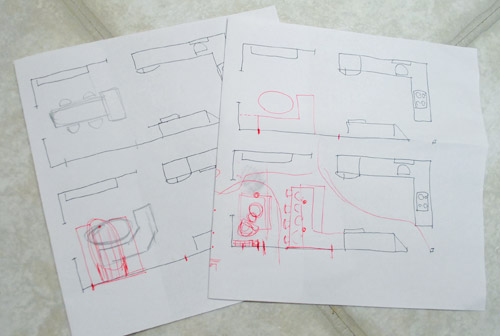
We tried returning to some version of table in the middle (top left) and even modification to the banquette (top right, bottom left). But somewhere in that mess we had one of those “Ah-ha moments” that ol’ what’s-her-name used to talk about on the TV (this is a joke for my Oprah-loving wife). So allow us to introduce the banquette’s successor: the peninsula! Cue the confused emoticons.
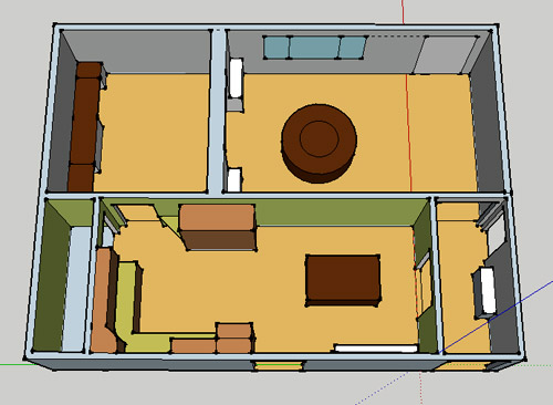
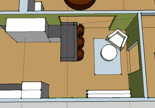
Let’s explain. First, here’s our CURRENT floating-table-in-the-kitchen-and-larger-table-in-the-dining-room arrangement (courtesy of my rough Google Sketch-Up drawing):
Now for the doorway opened, cabinets painted, counters replaced, floor slightly discolored (not intentionally) and (of course) peninsula’d version:
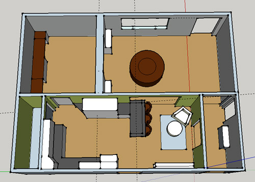
Woo hoo. Before we go any further, we should warn you: we’re 100% sold. The above depiction of it is probably not going to make a believer out of everyone, but from taping it out in the space and moving around it “in person” for a while we giddily came to the following conclusion: it’s The One! So no worries if it’s not your jam or you love Mr. Banquette (he was a lovable guy – and there are always gonna be people who would do things differently if this were their house) but we’re definitely going for it. And we can’t wait to get started.
As for why we didn’t come up with the peninsula idea sooner, we were so stuck on the fact that a peninsula coming off of the cabinetry that we already have would actually hit (or come very very close to hitting) the fridge on the other side of the room. So it wasn’t until we came up with the idea of adding a base cabinet to the right of the cabinetry that we already have to space the peninsula further away (a smidge towards the fireplace) for better flow and even more counter space.
Speaking of counter space, when it comes to executing this whole thing, we’re basically planning to add some base cabinetry (and counters) near the opening itself to create a counter-height peninsula. Which accomplishes a lot, actually:
- It adds additional work surface & cabinet storage to the kitchen side of the room (so it’s easy-access)
- It helps extend and better define the kitchen space without blocking flow or feeling too heavy
- It creates a casual eating space, keeping it distinct from the dining room table, which is just steps away for larger groups and more formal gatherings
- We can most likely seat four people at the peninsula (it’s flexible, so ignore the three chunky chairs shown)
- It can be used as a buffet to set out food (or to seat additional guests) when we have parties
- It can be used for homework, laptop browsing, and general hanging out by the kiddo(s) as they grow
- It even makes sense of our very off-center fireplace by creating a small casual living space that we’ll use as a little “chill corner” of sorts (the peninsula doesn’t block the fireplace, which our banquette friend did from most angles)
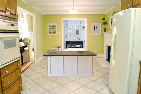
That last perk (centering the fireplace) was a nice surprise, since it’s something we’ve struggled with a lot (it’s just in such an odd place, practically shoved in the corner of the room). But you can see from this virtual view through the future doorway how it almost makes the fireplace placement seem intentional (picture it with a nice round mirror above it to balance that doorway next to it). Oh happy day.
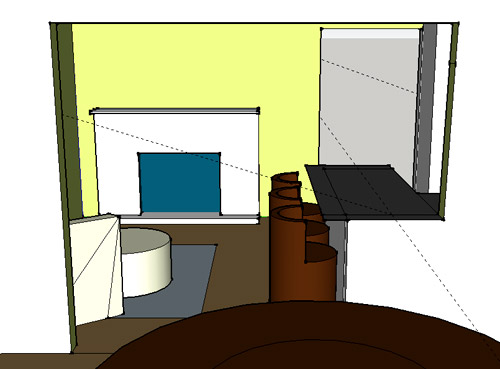
We just love that we’ll get to see the fireplace from the dining room (it won’t be blocked by a heavy banquette) and if overflow guests sit at the peninsula, they won’t have their backs to the people seated in the dining room (which would have happened with the banquette).
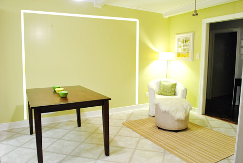
For those who don’t do well with renderings (or are still scratching your heads), here are some pics we snapped to give you a better idea of how it’ll work in the real world. We moved some existing furniture around to mimic the placement (the table represents the peninsula) and have lived with it for the last week-ish to make sure it actually makes sense. Placements aren’t totally exact, but pretty darn close to what we’re thinking. Here’s the view from the laundry room. Ignore the broken pendant light in the far back (it finally crapped out on us). Instead look, there’s that fireplace nicely framed!
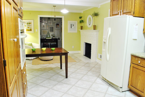
We also traced out the future opening (again, not exact) to show how that’ll work too. We’re thinking there will be a little half-wall (i.e. knee wall) where the peninsula meets the open doorway…
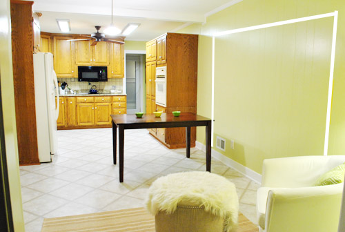
… like we showed in this rendering:

We considered a narrower doorway (where the peninsula doesn’t hang over into the opening) but we think this wider version makes it feel much more open and lets in more light, so it’s the current winner. And of course as previously mentioned, we love how balanced the fireplace and doorway look through the cutout.
Admittedly it took us a little while to figure out what to do with the space in front of the fireplace. It was our biggest hurdle in getting on board with this idea, actually. But after we brought in a placeholder chair, ottoman, rug, and light we realized it was actually completely awesome. There have been approximately 14 hours of reading-with-Clara from that chair in the last week or so. We’re even toying with the addition of some sort of tall built-in bookshelf behind the chair to balance the tall cabinets on the other side of the doorway. Not sure yet, but we’ll keep you posted.
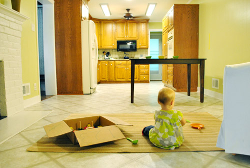
We’ve already discovered it’s a great spot for Clara to play while we’re getting stuff done in the kitchen (since we can’t see her if she’s in the living room, but it’s easy enough to peek over the peninsula to check on her if she’s in the kitchen on the rug).
Sherry’s already making plans for how she’ll relax in front of a fire (we’re contemplating one of those convincing modern-looking electric inserts that Candice Olsen uses – possibly even a double sided one if we can eventually open the back of the fireplace into the living room as planned).
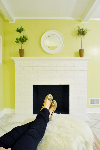
Meanwhile I’m dreaming of a little TV mounted above the mantle so I can watch the news during our morning breakfast routine (Sherry is rolling her eyes as I type this- so we’ll have to see where we land on that). Either way, can you tell we’re getting more than a little excited about this set up? Yup, it’s The One.
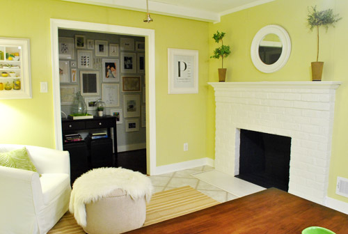
The peninsula will also give us 3-ish base cabinets worth of deep functional storage, unlike the largely decorative storage (open 12″ bookshelves) that the banquette would’ve provided. Plus a nice wide 3′ x 5.5′ work surface for prep, serving, eating, and homework is FAR more functional than what we would’ve gained from a distant island or a narrow banquette located a lot further away. And we’re probably gonna use the new counterspace as an excuse to change the countertops in the whole kitchen. We’ve never loved our existing granite color (it has a few pitted/stained parts too), so it seems silly to actually buy more for the new peninsula (we’ve debated a mismatched look, which we like for an island, but for a peninsula it seems like it would look most like it has “always been there” with the same counter to keep things seamless). Of course we plan to craigslist the existing granite and put that money towards whatever we’ll use for the new material (not gonna lie, we’re already talking about DIYing concrete counters).
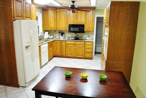
Oh and for anyone debating a peninsula, we’ve learned that the pros recommend 42″ of walking space between the peninsula and whatever’s on the other side (in our case it’s the fridge, which we hope will sink back a foot or so when we replace it with something that’s counter-depth). So that’s how we arrived at our peninsula length.
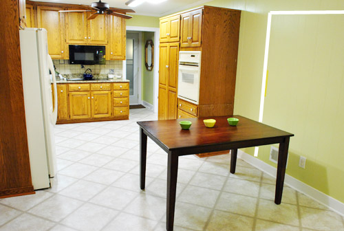
In fact, flow through the room is almost better because there’s one straight pathway through the room, whereas the old table (and the once planned banquette) made us walk in a slight circle. Hoorah for ten less steps a day. Haha.

So now that we’re unequivocally sold and geeky-excited about our new plan, it’s just going to come down to working out the logistics. Namely how to find/build perfectly-sized cabinets that match our old ones without breaking the bank. And finally hire a licensed contractor and get the permits needed to bust out that load bearing wall of ours. But that’s a story for another post. Another ten posts, probably…
Update: You can check out the new “cozy corner” behind the future peninsula in action (on video!) over on Young House Life.
Another update: Lots of people are sweetly suggesting some sort of bookcase or built-in feature on the side of the cabinets that face the dining room (instead of a knee-wall) but we’re unsure if that’ll be too much since there are already built-ins in the dining room that are just a few feet away. We’ll keep you posted as we go though! Who knows where we’ll end up…
Psst: Tomorrow I’m going to post my thoughts on trying Google Sketch-Up for the first time (and how it compares to two other 3D rendering tools I’ve used). So stay tuned for that if you’ve got any questions about how I made the 3D graphics for this post.

Amylynn says
Taking a break from 2 years of lurking to say “it’s good guys. You did good.” Bit smiles for you.
And my two cents about tv? Just get a flip down mounted tv/radio/DVD player for under your cabinet, closer to your prep areas. Then, you can still watch the news while cooking, without the tv monopolizing family time. We went tv-less in the kitchen seating area a few years ago, and couldn’t be happier. Neighbors and friends think it’s strange, but we enjoy having the tv away (though we can still watch the game while we cook if we need to).
YoungHouseLove says
Ooh that’s a fun idea!
xo,
s
Karla says
Yes this!! My sister has one of these and loves it! She watches Christmas movies while baking Christmas goodies. I’m jealous :)
Karla says
My sister has one of these and she loves it. She watches Christmas movies while baking Christmas goodies, I’m jealous! :)
Karla says
totally not sure why mine posted twice.
YoungHouseLove says
Haha- no worries!
xo,
s
Cheryl says
The little seating nook had me at hello. I have a thing for nooks.
It seems kind of quirky but you are absolutely right. It is way more functional and suitable for how you want your home to operate! I would have never thought of it but I’m glad you did. I’ll be able to keep it filed away for when we (finally) buy a house. You’ve shown me how awesome fixing up an older home can be. Thanks for the constant inspiration!
Monique says
I was not sold on Mr. Banquette either… and like most of the other comments I’ve peeked at, I also love this one, and it is definitely “the one”!
Jenn Prather says
LOVE this so much! Didnt ever really think the banquette fit well, but I knew you guys would eventually come up with whatever was perfect for yall!! I think this fits so nicely!!!
Lauren says
I love that I can feel your excitement in this post! It makes me so excited, too!
Rhonda says
Nicely done! I was skeptical of the look from the dining room but your rendering has me sold! It’s so much fun when you find THE solution.
Cindy says
Peninsulas are the way to go. We love ours! We did a complete remodel on our kitchen 4 years ago. It was the best money we have ever spent. Our peninsula is very similar to your sketch but we have a 5 1/2″ step up on the eating side of the counter.I love this because our kitchen looks directly into the dineing room so if the kitchen is a mess you can’t see it when sitting at the dining room table.I also love that while I’m making dinner my girls can work on their homework at the pininsula the step up creates a nice bufffer between what I’m cooking getting all over their homework. We also gained so much more counterapce and storage then if we had gone with an Island.
I love your new kitchen ideas!!!
Veronika says
Wow! I was a huge banquet fan! But I’m completely sold on this one! Genius! So exciting!!! Can’t wait!
Lissa says
LOVE it! Good job mulling it over and coming up with an even better solution.
Breanne Doucette says
I like this idea SO much better!! I really wasn’t sold on the whole banquette idea, I thought it would totally block the fireplace from the dining room and look oddly out place just floating in the middle of the room, but the cozy chair in the corner, and still being able to eat in the kitchen (less formal) is perfect! We have a great island in our kitchen, and we use it for everything. It is the central hub, and my 2yr. olds favorite place to sit! Can’t wait to see how it comes out :)
Carrie says
Yelp- “the one”. Looking forward to seeing the progress!
Allison says
Oh, booyah! The new layout seems to make so much more sense than the other one. And the word “banquette” just sounds really old fashioned and country – but “peninsula” can be turned into a much funnier word with the removal of just a few letters. I think of these things because I am mentally a 12 year old boy. So sorry.
Party on, Peninsula.
Gracie says
You guys never cease to amaze me! I don’t think I would have ever come up with that idea! I think it will be better than the banquet too! My only question – in the drawing it looks like the doorway is no longer lining up with the window in the dining room. Is that just the drawing not being drawn to scale or did y’all decide to shift the doorway?
Also, I really like the drawing with the view from the dining room looking at the fireplace. I think that will be nice!
YoungHouseLove says
It effectively still does (the drawing is a little skewed) but it’s not 100% perfect. We figure that no one will stand outside on the porch and make sure it all lines up to the centimeter, but it should be within about 6″ on each side, give or take a little. So in person when you come to the front door (which doesn’t give you a straight shooter view anyway) it’ll look very aligned, and those sitting at the table will have the same general effect!
xo,
s
Stephanie says
I am glad this is the new layout. I have to say that my parents had a small kitchen with an island and a small attatched family. They added on a room since it was that back of the house and creating a dining room/large family room. When we expanded the kitchen they were trying to fit in the island as well and we went with the penninsula to give more space. An added bonus is that it keeps guests out of the kitchen action when you are cooking up a storm on Thanksgiving! They can me on the other side enjoying the fire and chatting with you.I am glad you guys arnt putting too much seating on the other side because it has great flow the way you have it set up.
I will point out one thing that I think might be problematic….the placement of the breakfast bar. Its seems very in-the-middle-of-the-walkway! I am sure you thought about this detail and that when you taped it off in person it worked well.
Good Luck!
Sandi says
Great idea!! Feeling this much more than the banquette.
Tell John to check out Google’s 3D warehouse for free downloads. There may be some chairs you like better to try on for size. I’m an architect that had to teach myself sketchup, too. It can be quirky, but it’s great for quick visualization. Right-click, make component is my number one tip!
Paulina J! says
Once again, you guys never cease to amaze. And then you wonder why you have such a huge following. I’m Team Peninsula for sure. I’ve been playing around with ideas for my office and my initial ideas, while dreamy, were not practical at all. Myabe one day I can be featured in your Reader Redesign ;)
tia says
oh i love this much more than the banquette! so much more :) great job, guys!
Lisa @ Life is Crazy Beautiful says
Love it! Gives you a hearth room…always wanted one of those.
Jane says
It does look like this set up flows better. My only suggestion (if I may) is to get a double-seating chair. There are a couple who are not so bulky like a loveseat but can actually sit 2. It’s such a pretty spot in the house, by the fireplace, and it would be a shame if only one person can sit there at a time. AND, I’m sure you would love to be sitting next to each other, cozy, reading a book for Clara on your laps :-)
YoungHouseLove says
Oh yeah- a chair and a half would be so cozy!
xo,
s
Hanna says
Its very inspiring to see you guys be so open about changing and really seeing what works for YOU instead of trying to imitate a picture out of a magazine down to the last detail.
I emailed you earlier (although I’m sure you get approx. 39483948 emails), but if you want to check out my room redo (a while back you told me to post my after pics)…well here they are!!
http://conquestsandcatastrophes.blogspot.com/
YoungHouseLove says
Love it! So pretty!
xo,
s
Michelle says
I was never a fan of the banquette but sort of figured it must be something that works out better in real life… BTW, those slimmer refrigerators are muy expensivo from what I’ve seen, and you get less space. We kicked that around for a while and decided that we’d just deal with the poke-out normal fridge.
Happy kitchening!
Sarah B says
As a gal who does some amateur architectural rendering at her job, I’m stoked for tomorrow’s post! I’ve been using Sketch Up for 6 or 7 years… since before Google bought it and think it’s a really great tool and easy for the average user to learn.
ps… Your measurement lines are showing tee hee. Sorta like you didn’t realize your pants were tucked into the back of your socks. You can just delete them or turn them off under the Styles menu. Same with your model axes lines.
YoungHouseLove says
Ohhh, that’s what those are! Yeah, clearly still getting used to the software as you can tell…
-John
Sarah says
I love the coziness of banquettes tucked into a nook of sorts, so I was definitely on the fence about a floating banquette. I love love love the peninsula, but mostly the casual living space that was created, and how it will allow the fireplace to really shine! Maybe when the house was originally constructed there was a peninsula, which might make the fireplace placement make sense? There’s got to be a reason for it being there!
One question, though — the fireplace seems to be oddly tall to me, which makes your ceilings look low. Am I imagining this?
YoungHouseLove says
Hmm, never thought about it. In the last house we had a super tall mantel in the den (much higher than this one) and a less tall one in the living room. I guess this one is in between? Haha.
xo,
s
Elisa says
MUCH better. I’ve been reading for about a year and never comment bc heck, there’s a lot of comments that sum up what I’m usually thinking “love it – go for it – oooo that’s pretty.” I couldn’t resist this time to give my two thumbs up. I love how it incorporates/draws in the dinning room with the eating peninsula & doesn’t leave it just two totally seperate-feeling eating areas. Phew, glad ya’ll figured it out bc I was hoping the banquette seating wouldn’t stick but didn’t know what to suggest.
Rebecca says
Love it. Very creative solution. (And I’m always a fan of “living room” spaces in unexpected spots!)
Kim Adams says
Love this idea. What about, instead of a half wall by the peninsula you leave it open and put drawers or shelves in the side of the peninsula that opens to the dining room. That way it ties into the dining room and is functional for storing napkins, runners and other dining room things.
YoungHouseLove says
We’re not sure about that since we have the built-ins in the dining room (only about three feet away) so we worry it’ll look too busy- but we’ll have to see where we end up!
xo,
s
Lesley says
Yay! I like a banquette as much as the next gal, but I must confess I was still hoping for the island/peninsula route as I think it’s SO much more functional for a family. And, well, you guys and your ingenious accidental-on-purpose design approach are inspiring!
Sandy says
Loving it waaaaay more than the banquette. Maybe because I’m not a fan of banquettes … look nice, but not practical. PIA to get in and out. Being that you guys have quite a bit of storage already, will be working with the cabinets you have, and removing the current granite, (just a suggestion) how about getting a free range stove as you had in your previous home, removing the wall oven along with that whole cabinet and moving penninsula in towards pantry a little. You have so much storage already and will gain more anyway with cabinets under the penninsula. Gives you more opening of wall if wanted and no need for knee hi wall.
Adri says
I LOVE it, you guys! And I was never on board with the banquette idea (actually thought you were a bit crazy for considering it – it would have totally destroyed any flow the room had). This peninsula idea is awesome though and I’m glad you thought of it! Can’t wait to see how it all turns out :)
Jenny says
This idea seems so perfect, and like the kitchen will be more of a hangout space. The beauty of the banquette was that it was a hangout space, which was why it was so appealing, but this is 100 times better. The comfy chair and rug for hanging and playing, and the working, seating area for kitchen goings on – which can actually face the hang out chair! perfect!
Brooke says
You guys are so brilliant! And I was one who was on board for the banquet. Can’t wait to see it all finished!
Sara says
I do like this idea a lot more, though I was interested to see how you guys would make the banquette work. I think it’s a little weird to have an armchair in the kitchen, but I think it will make more sense when you have the peninsula.
I do have a question though; I know that sketchup only shows a portion of your house, but it seems to me that the hallway next to the kitchen is kind of a waste of space. Have you guys considered getting rid of that altogether? (Would that even be possible?)
YoungHouseLove says
We love that hallway since it’s sort of the heart of the house (it connects to all the bedrooms but ours and the hall bath that all of our guests use). And of course it’s home of the frame gallery which we love to look at from nearly every adjoined room (the dining room, kitchen, living room, etc). That light-filled extra-wide hallway is actually one of the things that sold us on this house! Haha.
xo
s
Sara says
I do love what you’ve done with it. Just from a purely functional perspective it doesn’t make sense to me. But, I’m a function over form kind of person by nature. :)
Amber says
Wow!! I love this new design! It just flows so much better than the banquette idea. You know what I never liked about the banquette? The people at the table would have had their backs to the kitchen which meant you’d have to talk over your shoulder to someone who was in the kitchen cooking. This new design just works!! Much better flow! Love, love, love it!
Wintry Mix says
From looking at the first sketch-up, this new pennisula idea seemed totally ridonkulous to me….but by the end of the post, you’d won me over. I think it’s the fireplace and cozy seating corner that it creates that I love the most.
Nicole Y. says
My friends have a peninsula and it works very well for all the ways you guys want to use it i.e buffet table, snacks, hanging out, smaller dinners. When people visit they sit down right there and everyone just hangs out while others are watching tv in the family adjacent to there… sorry this is a possible vote for John’s tv idea. :)
YoungHouseLove says
Haha, it sounds like he’s winning by a lot!
xo,
s
Amy says
That corner with the chair is screaming for a tastefully done play kitchen instead.
YoungHouseLove says
Oh yeah that could be fun too!
xo,
s
elaine says
genius! Great work guys. Can’t wait to see this come to fruition.
Kristen aka K Leigh Ford says
LOVE LOVE LOVE! And it very much makes sense! Can’t wait to see the end result!
Aeme says
I love the new layout! I think you should do a built-in bookcase that wraps around (and above) the door to your hallway. Lots of storage for your new seating nook. Good luck with the reno!
YoungHouseLove says
That could be fun too!
xo,
s
Robin @ our semi organic life says
ooh what about a bookshelf or just plain shelf above the opening to the dining room on the kitchen side of the wall? If you left a foot or so just below the ceiling?
YoungHouseLove says
Definitely another possibility! Fun!
xo,
s
Melissa T. says
I wasn’t a fan of the banquette (love them, but didn’t think it would look right for you guys), and I actually thought you should do EXACTLY what you just mapped out (down to the chair), but figured you had already thought about that and didn’t like it, so I didn’t comment. Needless to say, I’m loving the idea and can’t wait to see it happen!
YoungHouseLove says
Haha love it! You had much better vision than we did!
xo,
s
Missymiss says
Check out the Tyler Florence kitchen he designed for House Beautiful. He included a sitting area with bookshelves in the corner of the space that I thought was interesting and sounds like it is similar to what you are thinking of doing.
YoungHouseLove says
Thanks! Off to check it out!
xo,
s
Krystle @ ColorTransformedFamily says
I did like the banquette ideaa but I think this works much better. I would love to have a place in my kitchen for reading. The pennisula will also be nice especially as Clara grows. I loved spending time in the kitchen with my mom.
Robin @ our semi organic life says
Something I personally wouldn’t love (well not sure about) is the fact that coming in through your front door (which I realize you don’t use that often) you’ll be able to see in straight to the refrigerator and sink area of the kitchen once the wall is gone. I’d prefer that a little more hidden. Not that I actually DO, but in dream kitchen world. Think that’ll be a problem for ya?
YoungHouseLove says
In our last house you could see into the kitchen (the sink, stove, hood) pretty much from the front door too after we opened that doorway waay up. I think we’re just suckers for an open layout so we don’t mind!
xo,
s
Alli says
Maybe use the ikea akurum cabinets with deep drawers for the peninsula? You could paint the rest of your existing cabinets to match. I’ve done it in my house and I think it would get the yhl seal of approval.
Chrystal says
Genius! Its funny how long it takes sometimes to see whats been staring you in the face all along. love the idea of the reading area near the kitchen! We opened up between our kitchen and living area when we bought our ranch and I love it so much, except I can’t see the kids playing in the LR on the rug. (ours is a L layout with the kitchen in the bottom short part of the L) What a great idea!
BrookeJ says
Fantastic new plan. I think you will love having this as a buffet area for when you have get togethers, it very naturally leads right to your dining table. I really miss my island from my old house–it is really nice having a big unobstructed counter top area for baking and what not. Can’t wait for you to get started!
christy says
Yay! I was secretly hoping that another fellow would come along and snag you guys away from Mr. Banquette! I mean, of course I would have supported you either way because who am I to pry in love affairs? I’m just glad he was a passing fling!
I love this idea! I think it makes perfect sense of the space! I can’t wait to see how it all unfolds!
Elaine says
I love love love it!
kaylan says
I’ve thought a few times as you’ve brought up this project – “why don’t they just make a peninsula?” My parent’s kitchen has a huge peninsula counter and it is on my must have/must be able to install in any house we buy. It was the gathering point for family and activities. You can sit down and talk to the person whose cooking, it’s big enough to spread out projects as you’re working, it’s functional when you’re baking and need a lot of prep space… in my world it’s the be all, end all to the kitchen. I think you will LOVE it. Can’t wait to see it actually come to fruition!
Elizabeth says
I’m not a fan of the banquette for many reasons, so I ‘m glad you guys are going this route!! The visual looking through the new opening will be so nice, and I love the idea of a comfy chair in front of the fireplace to read cookbooks or have a cup of coffee. I’m super excited to see your kitchen renovation:)