Ok, now we’re cooking with gas! Maybe I shouldn’t use that expression for a bathroom reno… ANYWAY… we’ve made lots of progress since partially demo-ing the room last week (more on that here), and wanted to share our final floorpan with you (IT’S SUCH A GIANT IMPROVEMENT!) and our final tile picks (along with a few other things we debated, why we chose what we chose, etc).
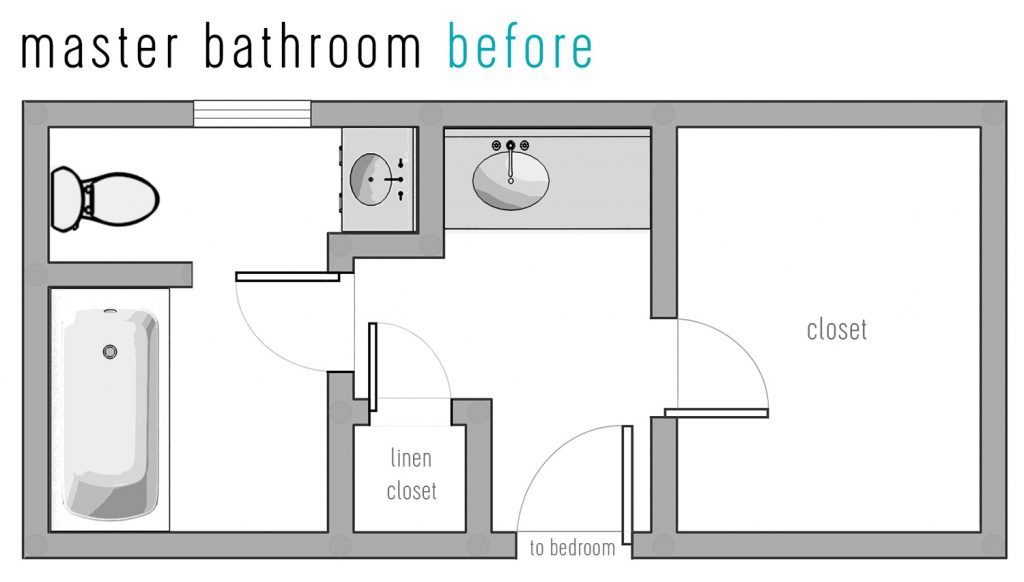
So here’s the old bathroom layout. Yes we lived with it like this for over six years. Yes, it was A LOT of doors (the one leading from the hall to our bedroom is right behind where the tub is below – so there were five in a ten step radius or so). And the only natural light in the entire space basically was stopped by a bunch of walls and doors, so it made it as far as the toilet and maybe the tub on a good day and that was it. It was so dark and cave-like and closed off in here:
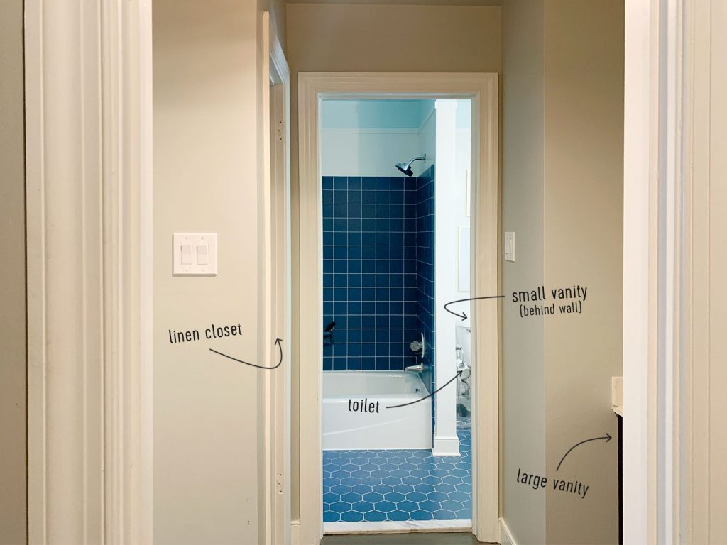
Just to refresh your memory, here’s a photo of the bathroom as it looked before last week’s demo session (you can watch a full video of how weird the space was right here too if you wanna be thorough). This photo was taken by John as he was standing in the doorway of the closet and looking back towards the tub (you can refer to the room sketch above to get your bearings a little more).
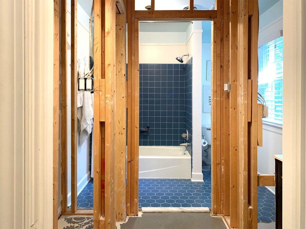
And here’s the room after our little demo session last week, when we took down all the walls that were blocking the view and the light to have a view of the space that’s a bit more uninterrupted while we planned our next moves (like what goes where, what sized vanity and tub would fit, etc). It was already looking SO MUCH MORE OPEN. I’m sorry for all the caps lock in this post, but bathroom renovations GET ME GOING.
Ok but back to the floor plan, remember this was the original layout for reference:

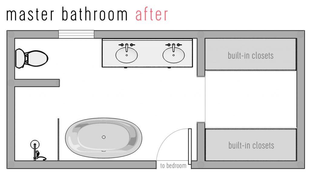
And after approximately 5,379 different plans and drawings and taping things out on the floor over and over again (and meeting with our plumber & electrician in person to make sure our ideas were actually physically doable and not prohibitively expensive), this is where we ended up:
As for the general inspiration and feeling that we’d love to get from the space, we’re hoping for soft layered tones and textures – and classic finishes feel really good to us (and seem like they’d fit so nicely into our house). Our bathroom has been dark and dated and boxed off for so long it’s going to be so nice to have an open, light & airy space to enjoy.
But back to laying out the room for a second. I mentioned that we considered around a million different room layout options & I’m not kidding. Pretty much if you can think of another option we considered it. More windows in the bathroom? We definitely thought about that! In the end we wanted to use that wall space for the mirror & lights over the vanity – and the single window we have provides tons of light now that the walls are down! Plus adding another window to the bathroom would look weirdly unbalanced from the exterior of the house since it would be too close to the existing bathroom window to match the other exterior window spacing back there. That’s just one example of the mental gymnastics we did for every aspect of this room. But I’m never one to stop at one example…

We also heavily considered stealing space from the bedroom or the closet. We mapped out so many versions of that and it always felt silly and over-wrought, and once the walls came down and we realized how big this space is as it is (around 8 x 13′ feet!) we realized we didn’t need a single inch more – in fact we can fit a 72″ double vanity, which is one of the largest ones they make! Plus I get a freestanding tub (a big deep one that I can fully submerge myself in – instead of my knees and entire chest being out – imagine how nice that will be?!) along with a nice walk in shower! We have room to spare just as this layout is.
We also thought about adding access to the closet from the bedroom instead of through the bathroom, but it’s really nice to shower & walk right into the closet to get dressed instead of popping back into the bedroom and back into the closet, and since we could make the bathroom layout exactly what we wanted and keep that closet doorway (while widening and centering it!), we are so happy with things as they are in the plan above. We think it’s going to be stunning and it’ll feel more open with them both connected with a nice wide doorway (so light can flow through the entire space) instead of making them into two smaller rooms on their own.
It was also really helpful to talk to our plumber and electrician to figure out what’s really possible. For example, where the ductwork runs in the shared wall between the bedroom and bathroom means a pocket door won’t work, which is just fine with us because we love the idea of a frosted french door.
And after proclaiming that I wanted a big frosted double french door on the podcast, I realized that in practice it would be annoying to have to shut two doors behind you every time you go to the bathroom (sure you can leave one shut at all times and just enter and exit through the other one, but that misses the point because I thought it would be lovely to see both of them thrown open from the bedroom). Thankfully I think a single frosted door will be gorgeous. Light will flow in and out, and it’ll be easy to just shut one door behind us. Score.
We also heavily considered squeezing in a water closet but after removing all these walls we just didn’t want to add any back in. Sure the toilet might be more private behind a door, but the entire bathroom has a door that we can shut for privacy & we’ve never had a water closet and prefer the open feeling light-filled space more than having a tiny toilet room. I know what I’m saying might make you want to cup my face in your hands and whisper to me that I should trust you, and that I would in fact love a water closet, but we have deeply thought this through (6+ years of planning this reno in our heads – ha!). I fully respect that some people out there might love ’em & even believe they couldn’t exist without them, but we all want different things from our bathrooms and having a soaking tub and a gorgeous walk-in shower was a much nicer way for us to “spend” that space, while keeping everything open and light filled, so we’re thrilled. Also we don’t give a hoot about resale, this bathroom is for us to use & love for a nice long time ;)
Oh and I was completely sure that we wanted to add a window to the closet literally as recently as last week, but when we mapped out where it would have to be in order to make sense and look balanced from the outside of the house, it would have looked insane in the closet (picture it crammed into a corner with the trim literally touching the corner of the closet) and a few people told me they have windows in their closet and it fades their black clothes (THE HORROR!). So we realized that a big light-filled bathroom is our dream, especially with a nice wide & centered door that leads to the closet, and assuming we have some nice closet lighting and lots of functional storage in there, it’ll make us happier than a weird window crammed into the corner that feels like it’s just in the way and in the wrong spot.
Closets like this are giving me so much inspo (we’re planning to use a combo of Ikea wardrobes and drawers and systems + wood/trim to build things in and make them look more custom).
As we mentioned on the podcast this week, now that the layout has become crystal clear to us, we finally felt confident enough to order some of the bigger items for the room – like the tub, the toilet, and the double vanity (we’re probably going to paint it a soft gray-green like the bathroom inspiration picture a few photos back).
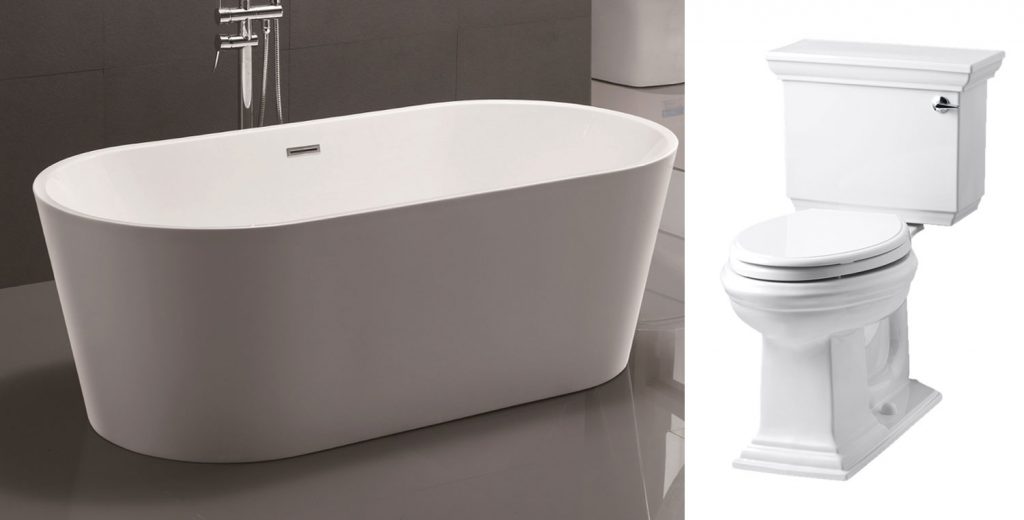
And the toilet is the same one that we’ve had for years in our downstairs powder room. We love how nice it looks (it’s like a toilet with upgraded porcelain molding!) and it feels pretty great to finally be upgrading another one in our house (the only one left to upgrade will be the hall bath – and we’re coming for that room next!).
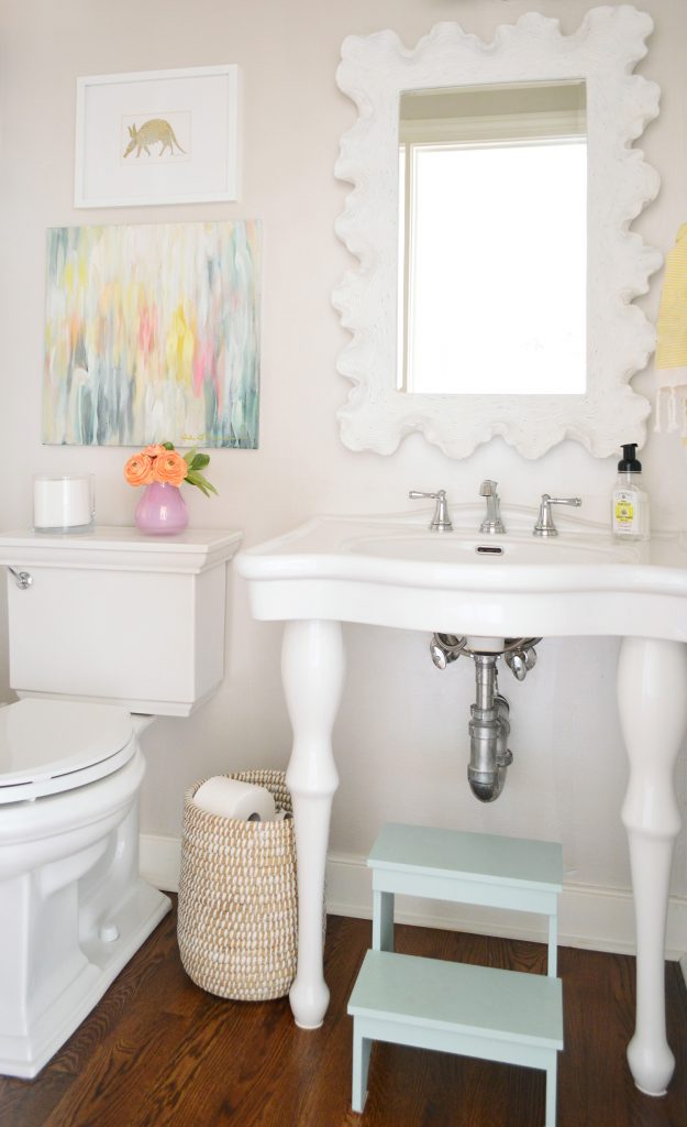
Ok, and back to the tile picks I mentioned! We’re so excited to have finally made a decision (we have looked at more tile in the last week or so than I think ever in our lives). Remember we shared inspiration images in last podcast’s show notes when we were talking about our bathroom plans?
Well, we knew we loved a classic tile choice in an interesting and less expected arrangement (like the ones above) so we started to mess around with different patterns on the computer to see what we liked. These were things we made when we were trying to plan the shower wall pattern by the way, and these are all proportions that happen when you’re using 2 x 8″ tiles (the length to width ratio of the tile changes the shapes they make):
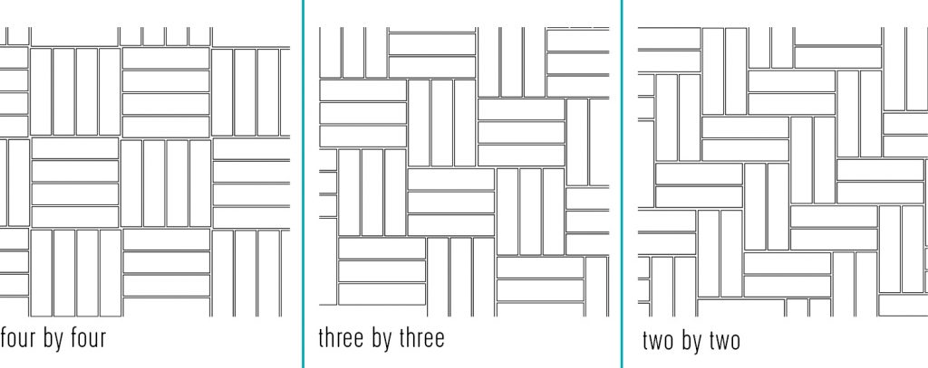
After mapping out the three sketches above, and looking at tons of inspiration images (like our two tile inso photos) we decided that we liked the look of “two by two” best. Why? We thought the “four by four” and “three by three” were awesome as well, they just felt like squares (and sort of parquet-ish since we both lived in NYC if you get that reference) and we both gravitated towards the stair-stepped look of the top right tile layout for the shower walls the most since it was more dynamic to us (it felt less like squares someone shuffled around in different directions, if that makes sense). But again, we loved them all! We just had to pick a favorite!
At this point, we felt really smug that we had mapped everything out and reached a decision… and then we realized that a lot of the 2 x 8″ tile was extremely expensive (or sold out, or harder to find in the quantity we needed) so it felt like we were back to square one (pun not intended). But then we took a trip to Home Depot, The Tile Shop, and Floor & Decor to break out of our tile-block and just look at what we could find in person (it’s easy to fall into a computer worm hole, so head to the store if you can to break that curse).
Anyway, at our third stop, Floor & Decor, we actually found something we LOVED (except for that crazy dark spot in that one tile below). Always buy more tile than you need so you can pull out those random weird tiles for a more well planned and congruent look. Especially with natural stone, there are just outliers, so it’s smart to use them under a vanity for example – or not at all if you have enough to pluck them out and not use them.
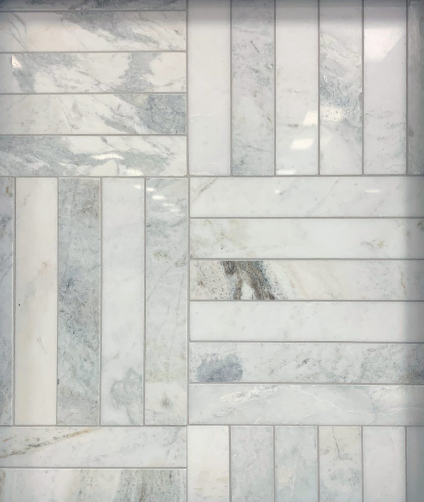
It was 2 x 12″ tile, which is different than 2 x 8, but we realized when we laid it out on the floor and played around with layouts that it would make that dynamic stair-stepped pattern, it would just take a 3 x 3 arrangement instead of a 2 x 2 one. And WE LOVED IT!

Laying tiles out right on the floor of wherever you find them can clarify so much! This is kind of an awful shot – there’s plastic covering the tiles, hence the glare, and they won’t be laid in this angle, they’ll be done in the stair stepped pattern above, but you get the idea (also they look nothing like they do in real life online, which is annoying, so I’m glad we looked in person!).
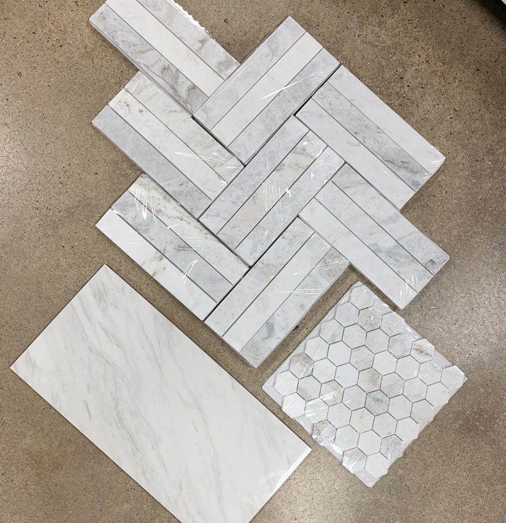
We decided that marble hex tiles in the same material by the same brand would coordinate and add some more tone on tone texture for the shower floor, so you also see those in the shot above. And that large tile is the floor tile that we picked to layer in there too.
When it came to finding the floor tile, we actually STRUCK GOLD (caps lock again, sorry not sorry) at Home Depot because we found this lovely marble looking tile that is giant and $2.49 a square foot and just so gorgeous (we brought it with us to Floor & Decor, hence having it to lay on the floor in the photo above). I’ve seen a lot of marble-look polished porcelain floor tiles that look stamped on and fake or just not the right tone (too warm or too cold or not different enough from each other so they looked cloned) and this tile is none of that!
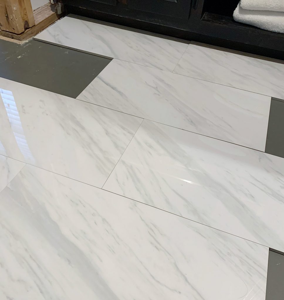
For the price you can’t beat this anywhere (trust me, we looked – ha!) and even if this was $10 a square foot I’d probably pay it because we fell in love. So it sure is lucky that it’s crazy affordable, especially because it’ll balance out our shower choices which were pricier. We’re also extra excited about using this floor for the entire room (both the closet and the bathroom) because they have always been chopped up (part tile, and part formerly-carpet-turned-painted-subfloor). So having them all be the same flooring after all these years is going to feel so good and so much more seamless. Here I am playing around with it on the floor upstairs. It’s going to be STUNNING. I’m verklempt.
For anyone who wants to see some other tile we considered, we also liked this one (I think it’s this, also from Floor & Decor). It’s not as long of a proportion, but we truly loved it as well.
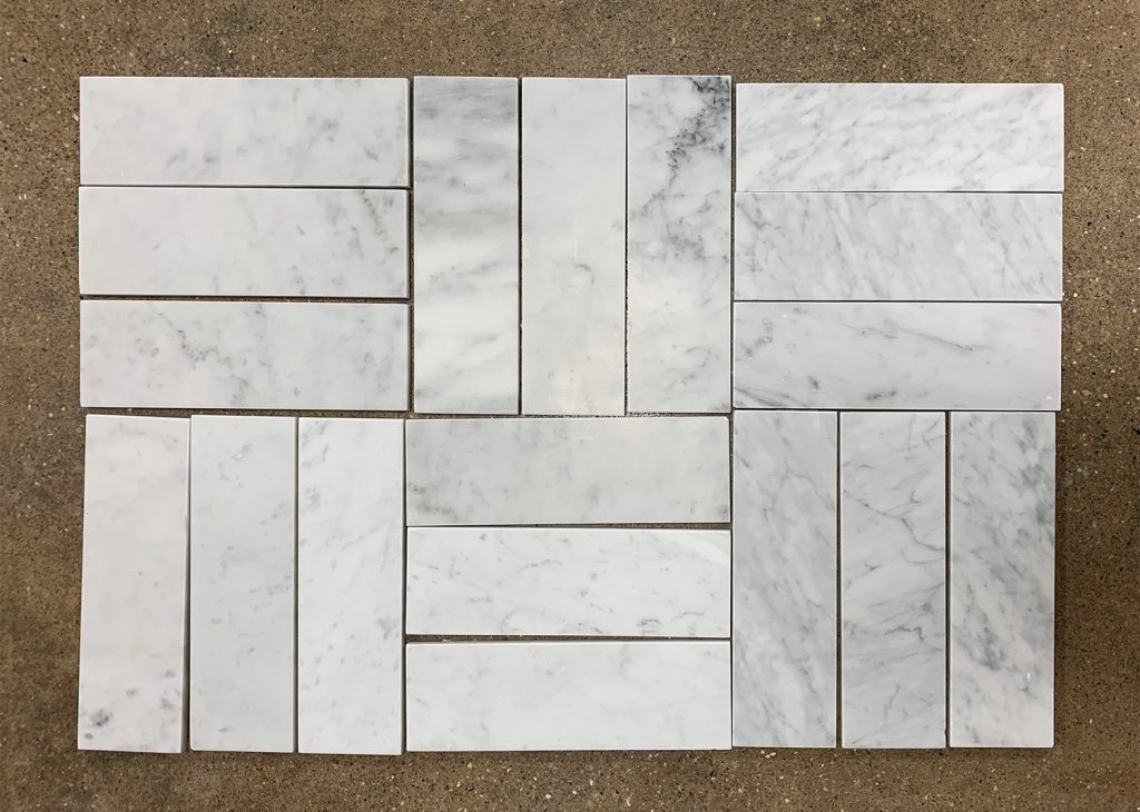
We also debated a chevron or herringbone floor laid with these tiles and then a brick-layer pattern of this in the shower. And a large marble hex floor with a chevron shower. We also loved the idea of a basketweave like this on the shower walls, and we even considered a color like this shiny deliciousness. Honestly we went round and round and probably could have done ten versions of this bathroom that we love, the final picks are just the ones we loved most of all and thought would look so dang good together, all layered into one room. Also this tile was GORGEOUS but the price was really high – but if someone else out there just needs like a dozen squares for a laundry room backsplash or something (remember how 13 tiles majorly upgraded our laundry room), it’s good. Send me a pic!
I also can’t wait to pick fun stuff like fixtures and faucets and even things like hardware and toilet paper holders and towel hooks. How good is this toilet paper holder? And this leather wrapped hardware on Etsy? And this lovely mirror (check out the name – ha!). I’m pretty much always in a hyper/euphoric state while planning this reno because we’ve waited so long to do this, and it feels like it’s going to be the room that dreams are made of! And also long hot baths.
As for what’s next, we’re fully demo-ing the room soon (the vanity is supposed to arrive next week and then we’ll have everything since the tub and the toilet already came – which thrills me to no end because we were originally told the vanity would take 4 weeks).
If all goes well in two weeks we should have it fully gutted and then the plumber has to shift some things around in the floor and we have to prep for tile, tile, and then probably do some work on the walls and some electrical updates and then it’ll be time to actually install the new things (MY TUBBBBBBB) which is very exciting indeed. My goal = to have my entire body submerged in my new tub (with the aid of some snorkel gear) by November 15th, which is John’s 38th birthday. Because there’s not a better birthday present than a snorkeling wife in your new but probably not fully done (but hopefully close) bathroom.
P.S. Don’t forget to read the first post about this bathroom reno to see a video tour and check out the exciting half-demo-ed pics. This room is going to be unrecognizable when it’s done.
*This post contains affiliate links*
