I’m someone who loves those detailed “what worked & what didn’t” posts where someone looks back on the choices they made and shares what didn’t work out as well as they hoped – and how they adjusted to make things work better for their family (more comfortable/more practical/more beautiful/etc). And since we furnished this house over two years ago – can you believe we did it in the fall of 2017?! – I thought it would be fun to share the changes we made since then in one big rundown post. So here we go.
The Front Porch
- The Change: New front porch swing
- The Reason: The old one was already rotting!
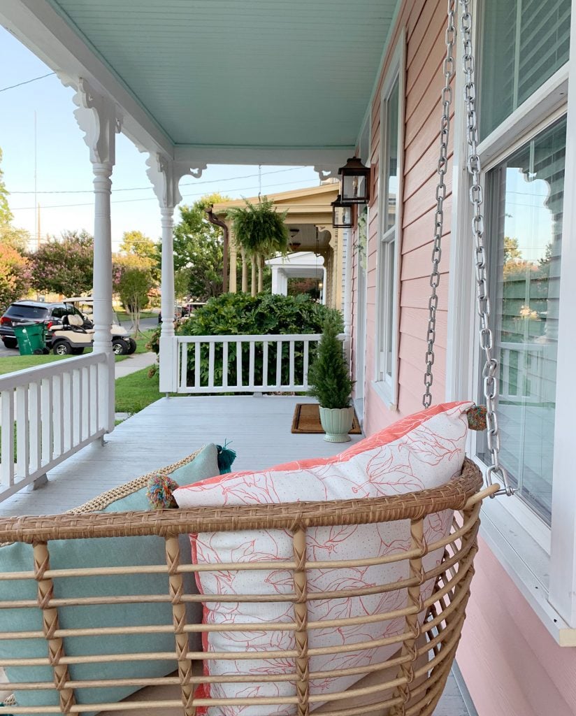
The original porch swing we hung out here was nice and simple (white like the trim, and the vertical pickets tied right into the railing), but it sadly wasn’t up to the job of withstanding the weather. After only about 18 months, the white paint was hopelessly split and mildewed in numerous places. Towards the end we would scrub it to make it usable, but it looked worse over time, and eventually no amount of scrubbing could get it clean… so nobody wanted to sit on it. Which is extremely sad because it’s the best seat in the house! The listing for it is no longer active, so maybe they pulled it off the market for exactly that reason: it just didn’t hold up.
At the start of the summer, we freecycled the old one and ordered this new wicker-looking porch swing (right now it’s 26% off!) that has been WONDERFUL for so many reasons. For starters, the construction is actually metal wrapped in a weatherproof rattan-like material, so over the last 6 months it has already proven to be more durable than the painted surface of the last one.
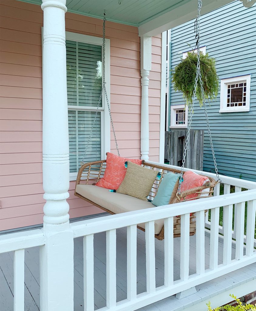
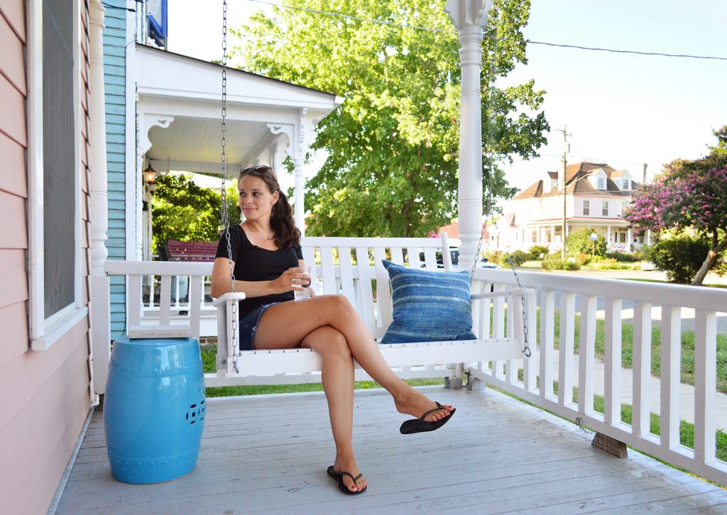
It turned out to be WAY more comfortable too. Not only is it padded (a butt cushion on a porch swing = such an upgrade from the hard wood one we used to have!), but at 65″ wide it’s also a full foot longer than our last one – meaning we can fit more people and both John & I can actually lay down on it. John does it with his knees bent on his side – literally he takes naps on it like that.
Our only tip is to remove the back cushions that come with it (they’re super thick and push you so far forward on the bench that it’s not as comfy as it could be if you had a deeper seat, which immediately happens when you pop them off). When we added a few smaller outdoor pillows to rest our backs on, we truly unlocked the full amazingness of this thing. Here’s hoping we have it for years & years to come!
The Foyer
- The Change: A new light & lots of paint, including on the hardware!
- The Reason: Lightening things up (it is a beach house after all…)
If you’ve been in the vicinity of my Instagram over the last month, you’ve seen me gush about our new foyer light. As soon as I laid eyes on this four light white beaded fixture (it’s marked down to $216 right now!), I knew it would add so much beachy lightness to our once heavier feeling foyer. In Cape Charles, it’s actually a town tradition to have a beaded chandelier like this glowing in the evening – we see so many hanging in foyers or front rooms when we go for evening walks (you can always see them from the street!). I was ridiculously excited to add one to our beach house to make it feel as warm & inviting as those houses we had admired around town.
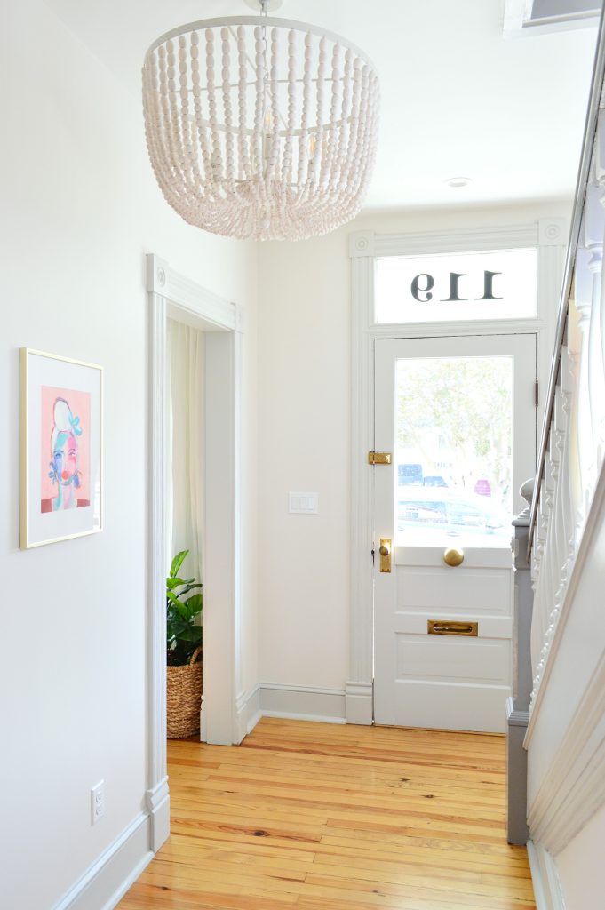
Oh but I always like to caution people that this foyer has a 9′ ceiling, so this big light works and people can easily walk under it, but if it was an 8′ ceiling, this smaller version would be the way to go. Unless you’re putting it over a bed or table, in which case people don’t have to walk under it, so I’d go for the big one!
This is what our foyer looked like a couple of years ago, when the renovation was first completed. I really really wanted a warm natural wood door and railing like the warm wood floors in here (I die for these 115 year old heart pine floors – we just clear sealed them and that’s it!). But sadly neither the door or the railings could be stripped back that far and clear sealed, which had been my original plan. The railing and the door were just not in good enough condition for that to work without making the deep cracks worse (trust me, I tried, both by hand and with electric sanders and stripping agents). So I used dark opaque wood stain, which is basically like dark brown paint (none of the original grain can come through, because that was the only way to hide the damage). I hoped it would have a wood-like look…
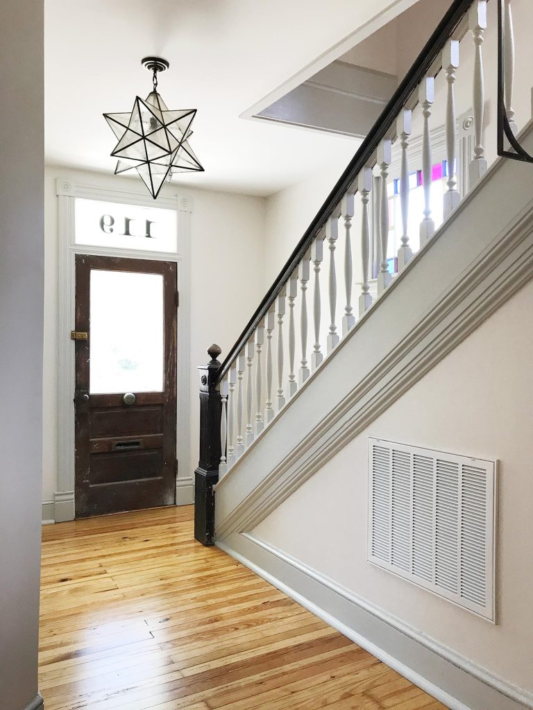
… but it felt… dark and heavy. Womp-womp. Topping things off with my beloved star pendant was nice because it tied into the dark stuff, but after a few years of living with it I wanted it to be bright and airy and beachy when we walked through the door.
In addition to painting the stair railing and the back of the door a lighter tone (not the same one – I still wanted the drama of a slightly darker railing than the balusters and trim), I also used Rub N ‘ Buff to restore some of the metal accents on the door. I had never used it before and It. Was. Amazing. As for the actual paint colors in here, the walls are White Heron, the trim and door are Stone Isle and the railing is Perpetual Gray (all by Sherwin Williams). You can see every paint color we used in the beach house here.
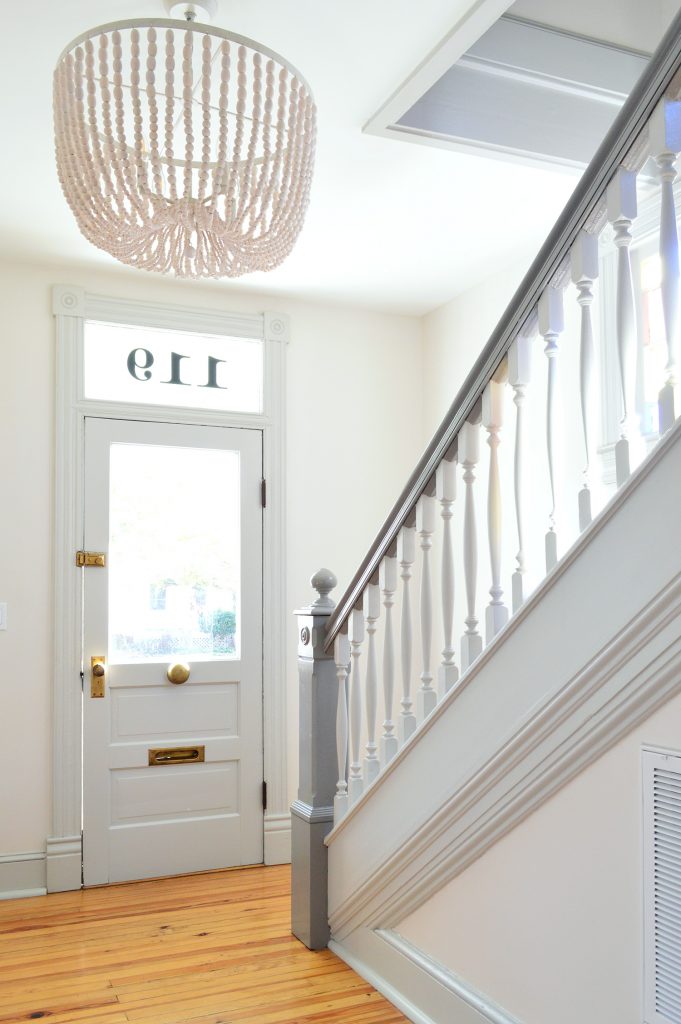
I’m thinking about writing a newsletter about it, because it took four mismatched and badly weathered/painted-over things on our original front door right back to their old brass glory! And yes, that round thing on the door is a built-in doorbell! IT’S SO CHARMING IT KILLS ME. I also like that by lightening things up, it allows the cool hardware and the graceful shape of the newel post to stand out, instead of such dark larger shapes stealing the focus (like the whole door & the entire railing). It finally feels like a beach house when we walk in the door to us. So so happy with this change.
The Living Room
- The Change: New chairs, new-ish coffee table, & a wall mounted TV
- The Reason: We had been meaning to get to that…
When we saw these pink chairs at Ikea, John and I basically said “we need these for the pink house” in unison. It was that easy. Which almost never happens. We had been looking for more comfy seating in here for years (we used to have our leftover hard-backed office chairs from our second house in there, but always planned to upgrade to something comfier and more fully upholstered down the line).
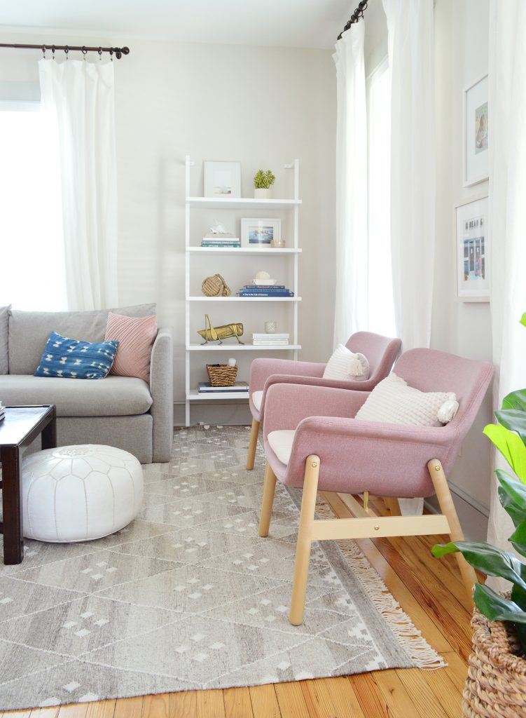
In fact the folks who follow us on Instagram might remember a series of IG Stories last year where we ordered various other pink upholstered chairs and they didn’t work at all (the back and arms of one were too high & looked crazy with the sofa, one was too low in general, etc). So yeah, long story short, when we saw these, we basically ran to the checkout with them.
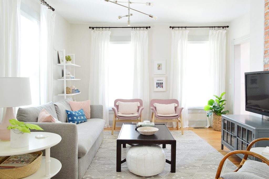
I’m happy to report these have proven to be significantly more loungey than the last chairs we had in here (which you can see in the photo below – they didn’t have fabric backs to recline on). And the diamond chairs below now live in the tiny office we made upstairs, where they’re more comfortable than the hard wood-seated chairs we used to have in there. So it was overall a great change for our backs and our butts and our eyes.
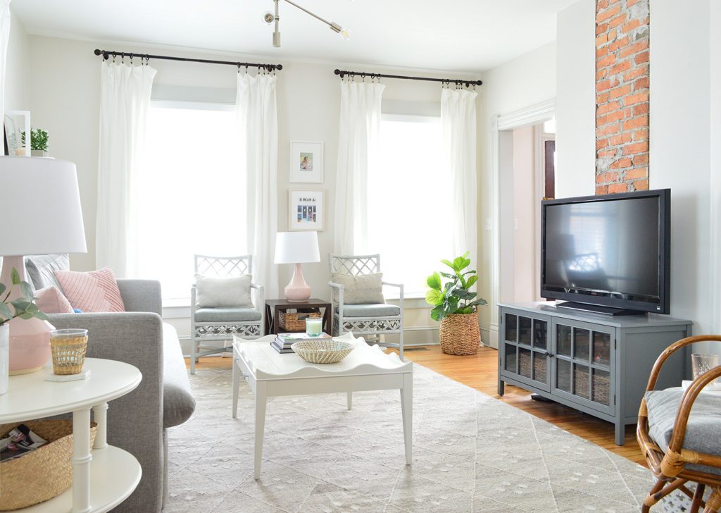
You’ll also notice a few other tweaks, like the TV on the wall (we finally mounted it!). We’ve noticed that a room usually feels more finished when we hang the TV on the wall (we also did it in our living room at home and in our bonus room upstairs). Here’s a link to the tutorial if you want to hang yours.
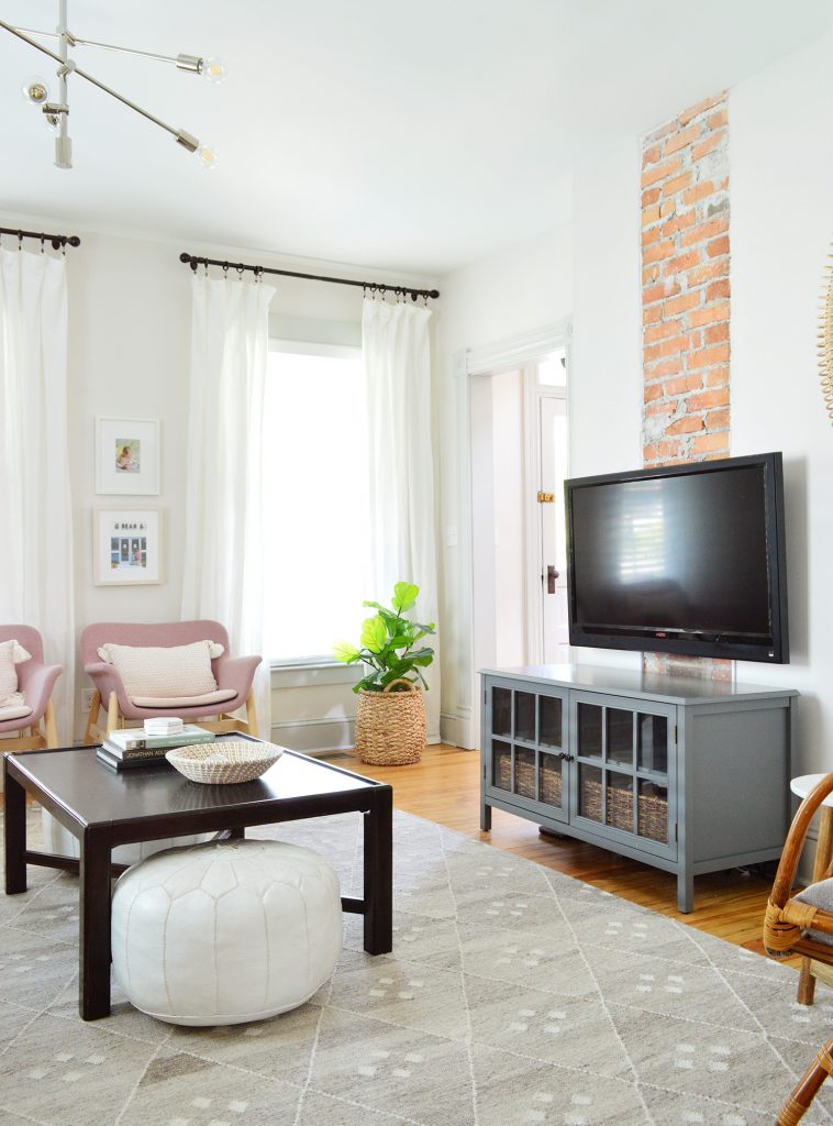
We also brought in a different coffee table. We’ve basically pulled a giant coffee table swap. The “new” darker table in here is actually the “temporary” coffee table we bought last Thanksgiving for our house in Richmond (literally, on Thanksgiving Day). Remember that $35 Facebook marketplace find? We got/made a new coffee table for our house in Richmond (post to come very soon!) so this one landed here, and the old white one from this living room has become a play table in our son’s room.
We still plan to do SOMETHING to the dark tabletop (the finish isn’t great) but for now it’s doing the trick. I keep thinking that tiling it with white marble tile would add so much more gleam and beachiness, and maybe the legs staying that dark ebony color will ground it and tie into the curtain rods and the dark TV. Or we could paint them gray to match the TV stand or go white like the round side table. I promise I’ll keep you posted!

The Kids’ Bunk Room
- The Change: Expanded storage & shelving
- The Reason: Adding even more function to this workhorse of a room
Our kids shared this bunk room all summer long (yes, two kids used this as their bedroom for three months straight) and we stored all of their clothes in this 4-cube organizer from Target. They each got two bins (one for regular clothes, one for PJs and bathing suits) and it worked surprisingly wonderfully. I know. It shocked me the most (I assumed one of them would want to eventually sleep in one of the two spare bedrooms, but the novelty of the bunks never wore off, and their summer clothes are small, so it was just fine!). Side note: if you’re looking for a tutorial about how we made these bunks, here’s that post for ya.
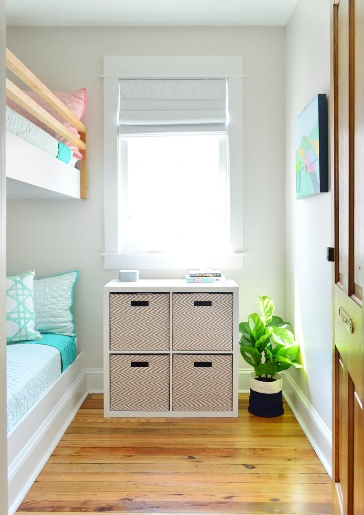
The desire for more storage & shelving actually wasn’t clothes-related at all, it was that the space lacked book and toy storage, which the kids also like to have in their room. So we made a few very affordable tweaks to take this room to the next level, organizationally speaking.
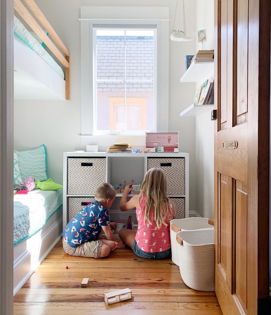
It was the very end of the summer when we realized that the 6-cube version of the 4-cubby organizer that we had bought for that space back in 2017 would fit in the room just fine! So we upgraded (for a whopping $59). Earning two bonus cubbies to wrangle toys has been game changing. I couldn’t find more of the chevron boxes, so we went with rope baskets instead, which actually look cute breaking up the pattern to me. And the larger storage system fits that space nicely without the bigger empty gaps on either side. So happy with this super cheap & easy change.
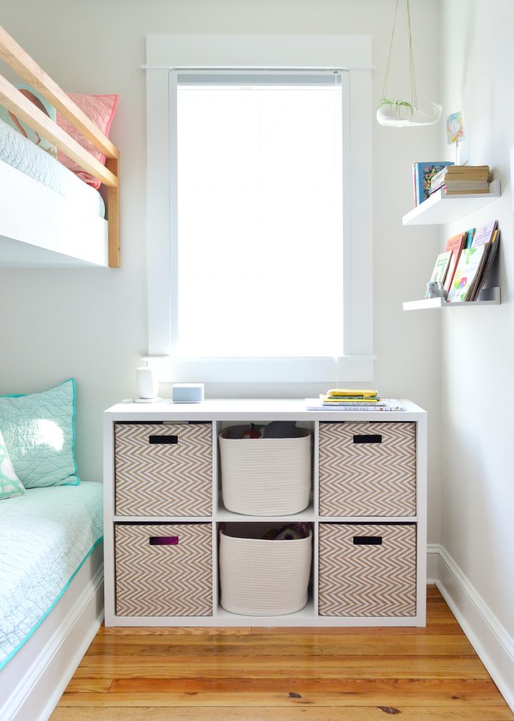
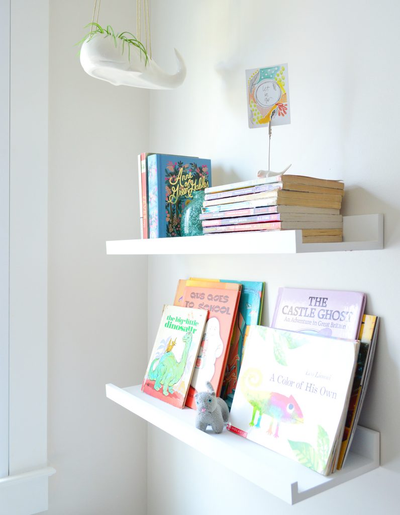
We also mounted two floating shelves to the wall (they don’t sell them in white anymore, but here they are in a wood finish), and moved the art so it hangs next to them instead of right where they are. Now the kids can stash tons of books there, and this was a zero dollar upgrade because these are the same small shelves that used to hang downstairs in the kitchen before we tiled the backsplash. Once we added the tile we liked it better without them down there, but I’m so glad we saved them under the bed because they’re super functional in the bunk room. Half the battle is just making a spot for things to be stored, and boom, cleanup = much more autopilot.
The other side effect of upgrading the cubbies was that it has been turned into a makeshift dollhouse/playhouse on more than one occasion. Gotta love those little creative minds that can literally find anywhere to play.
The Mudroom / Laundry Room
- The Change: More hook storage
- The Reason: You can NEVER HAVE TOO MANY HOOKS!
Have you heard our philosophy that a house can never have too many hooks? Oh you have? Allow me to say it again, because it’s crazy how many you need! We’ve learned it’s especially true in a beach house scenario where there are always a bunch of beach towels or a bathing suits to be hung up (it’s why the duplex mudrooms look like a hook convention). Back when we renovated this mudroom in 2017 we thought 6 hooks would be enough. Well, we were fools. So we moved the gold photos that you see below to another wall in here (the one just out of frame on the left next to the door in the shot below) and did another hook rail there.
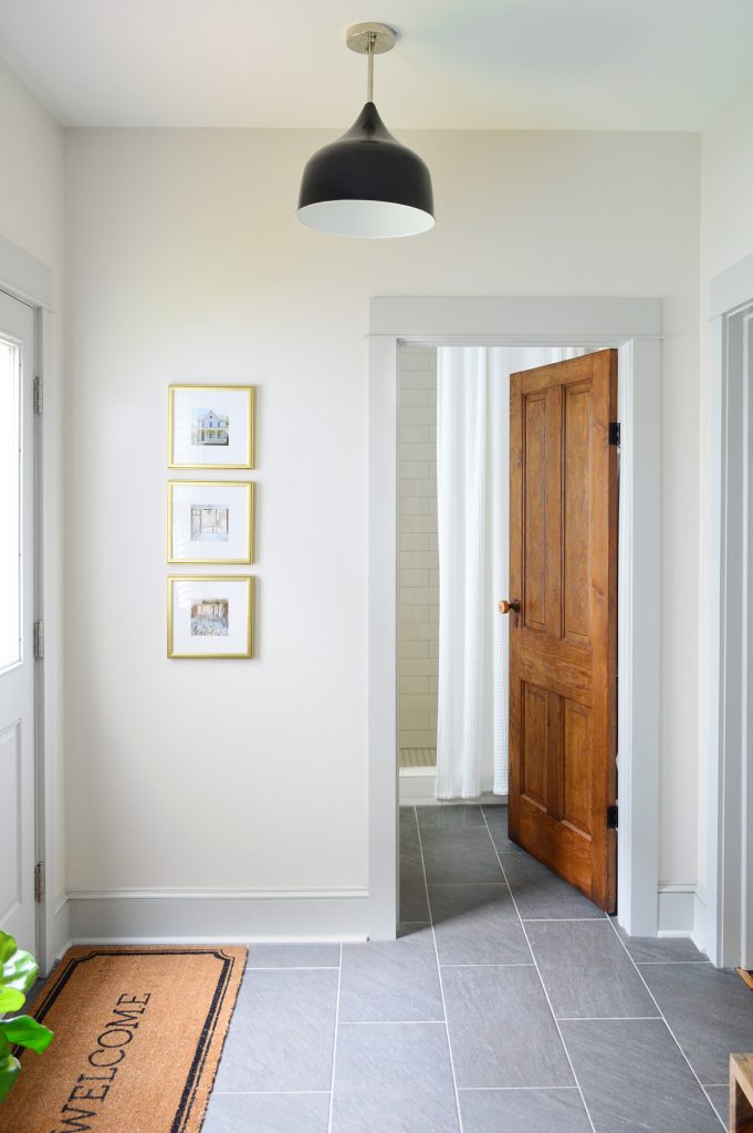
Earning 4 more towel hooks has been indispensable to this room’s function.
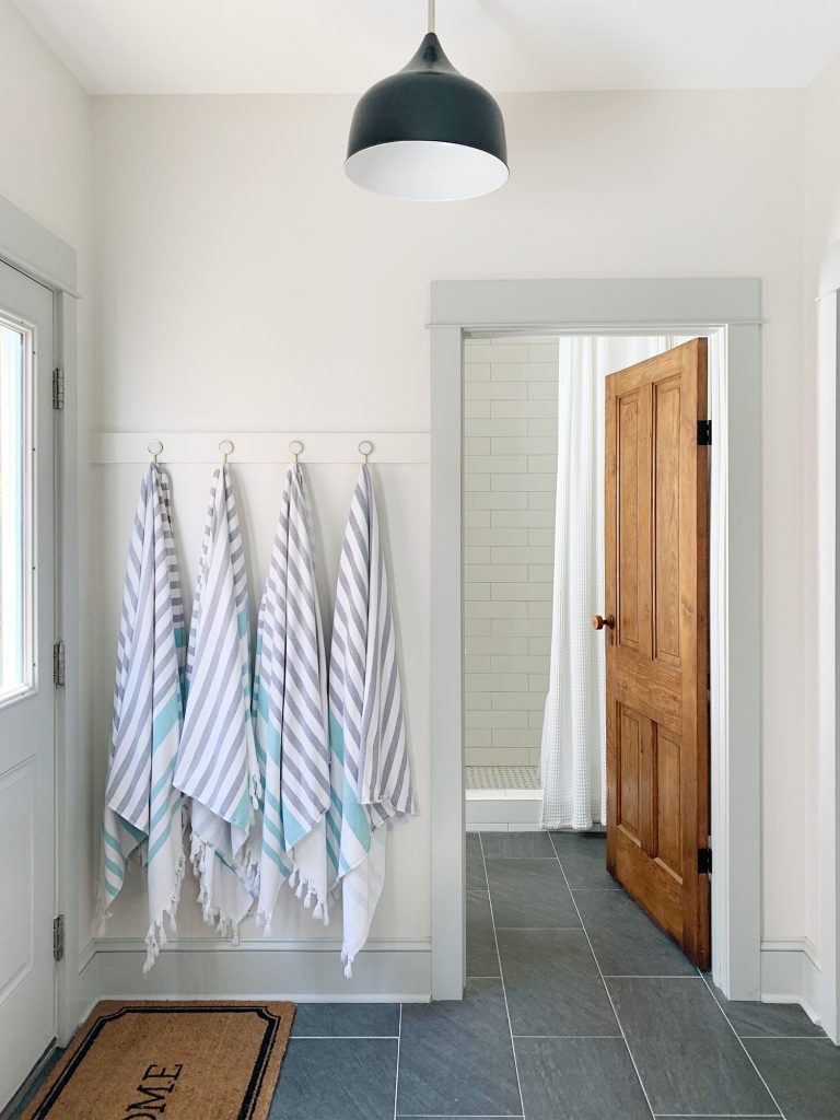
They’re also the most convenient hooks in the whole room suddenly because they’re not only right next to the side door (where we come in from the beach) but they also act as overflow hooks from the downstairs bathroom in case someone has a bath towel or a wet bathing suit they need to hang.
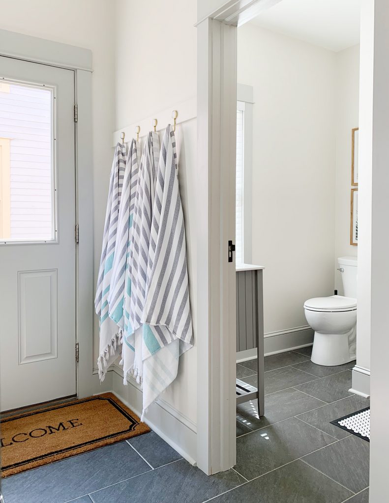
I love that this was another super affordable change (those are always the most satisfying, right?!) And if you want to learn how to make your own hook rail, here’s that tutorial for ya. They’re so strong you can hang a cooler full of beverages on them (ask me how I know).
The Pantry
- The Change: Around double the number of bins we started with
- The Reason: Much more efficient pantry storage
Since this summer was the first really extended amount of time we spent at the beach house, those three solid months heavily tested the efficiency of some of our systems – especially the kitchen and the pantry. We’ve actually got a post in the works about how the beach house kitchen is organized (with a video tour of each drawer – like the one we made of our own kitchen). But for now let’s focus on the simple but super helpful pantry changes we made.
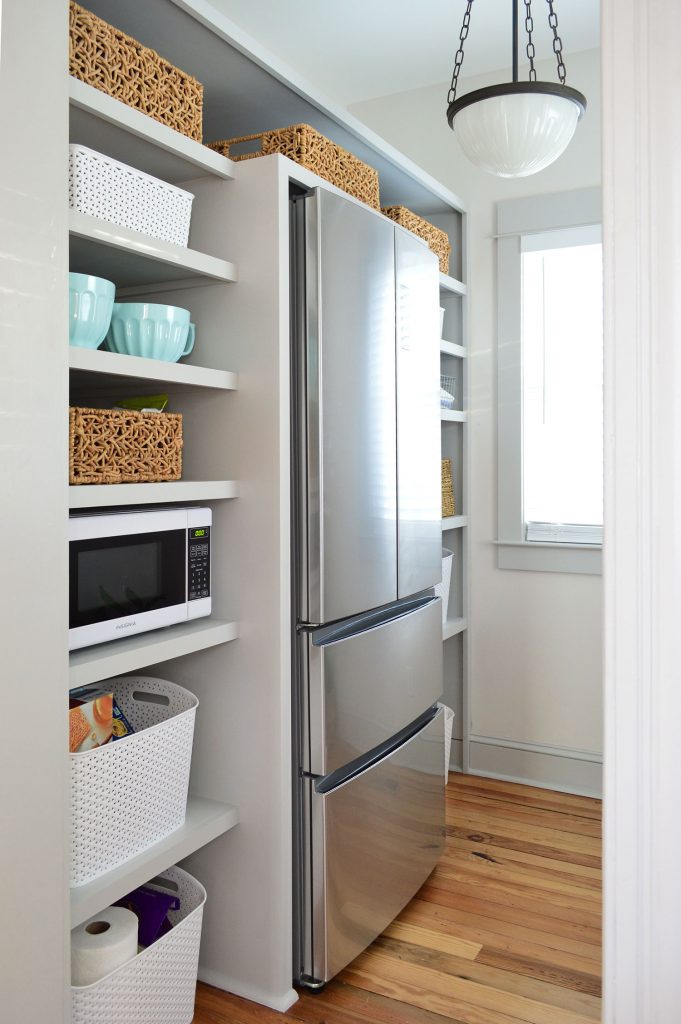
The photo above is from when we first finished it and the photo below is from this summer. The changes are subtle, but we basically packed in SO MANY more storage baskets. Notice how there’s only about one per shelf in the photo above? By grabbing some extras and rotating many of them sideways (so they’re deep instead of extra wide), we doubled the amount of baskets. Taking advantage of the shelf depth that we hadn’t used before was major (on the far side of the pantry each shelf that had one wide bin now hosts two of the same size, just by rotating them!).
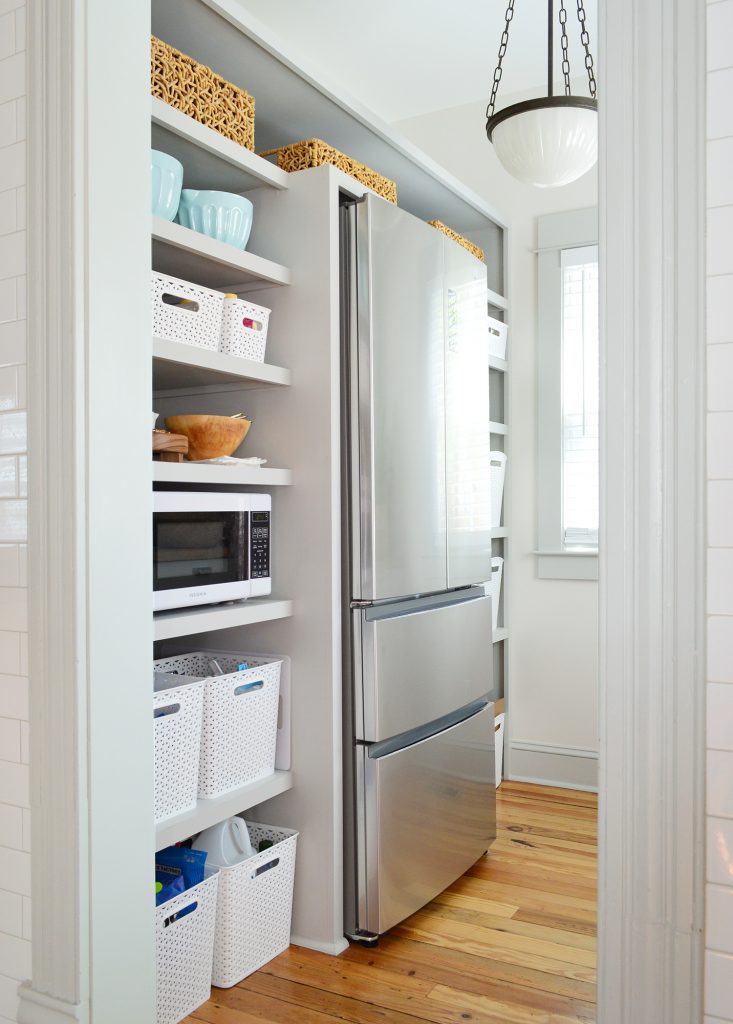
It’s a small adjustment, but it has been hugely impactful in the amount of stuff we can store. And on this closer side you can see that two bins fill even more space than the single wide one that sat there before did (there’s no longer as much space behind the bins or on either side). Plus having four of them in that bottom area helps to keep us more organized instead of two larger ones with various mismatched things inside (we use one for baking stuff, one for cereal, one for bags of chips, and one for cleaning supplies).
The Backyard Patio
- The Change: Rearranged the existing furniture
- The Reason: Keeping things dry & therefore more usable!
If you’re a subscriber to our email newsletter you may have already caught this update, but I couldn’t skip over it for this roundup because it’s one of our favorite adjustments. We shared our big backyard makeover back in June with the furniture arrangement that you see below.
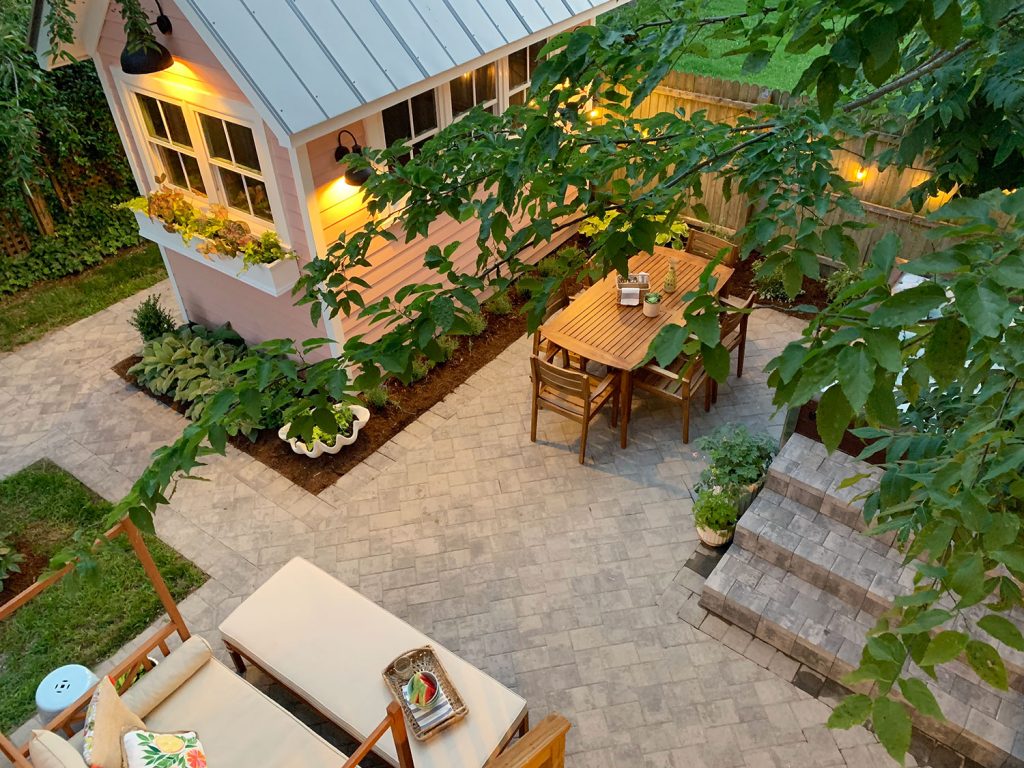
It looked great, but we found that the cushions on the outdoor daybed were constantly wet because of their placement under the eave of the house (dew dripping down in the morning wouldn’t dry until the sun traveled over the house and started shining back here around late afternoon). So sometime in August we decided to spend $0 and rearrange the furniture in a way that would make it all a lot more usable.
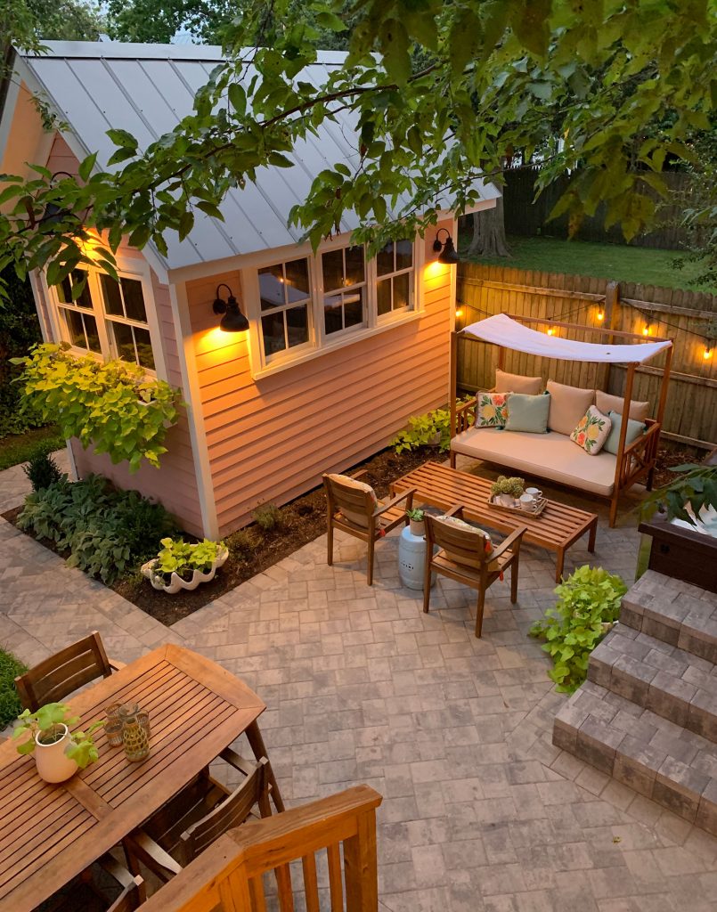
Simply swapping the dining table and the daybed kept the daybed dryer (and although the table gets dew on it, it dries more quickly because wood dries a lot faster than a cushion!). We also managed to create a conversation area that we never really had by stealing two of the dining chairs (they’re so easy to move back when we need seating for six) – and we ended up using this area a lot more for outdoor game nights as soon as we made the swap! Speaking of game night, taking the cushion off of the daybed’s bench make it more of a coffee table, so it became the perfect board game spot – and also came in handy when we had people over & wanted to sit & chat (the way the daybed was oriented before meant we would all basically be laying in the same direction – please picture that and laugh out loud like I just did).
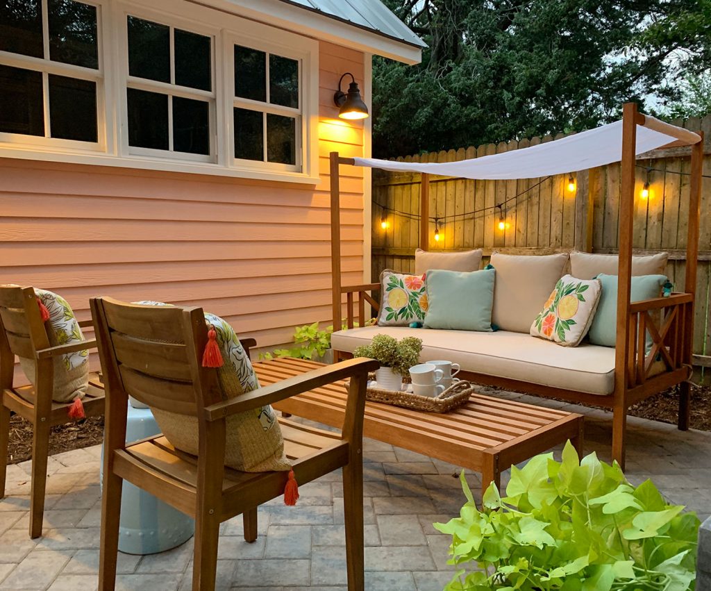
You can see the new layout (and the backyard layout as a whole) a lot better in this short video (wherein Burger is incapable of locating the source of my voice). I love the view of this tiny backyard from the second story window, so if nothing else, press play just to see how it all looks from above in 30 seconds.
And since people always ask this question around this time of year, here’s a shot from about a month ago of the backyard after we winterized it for the off season.
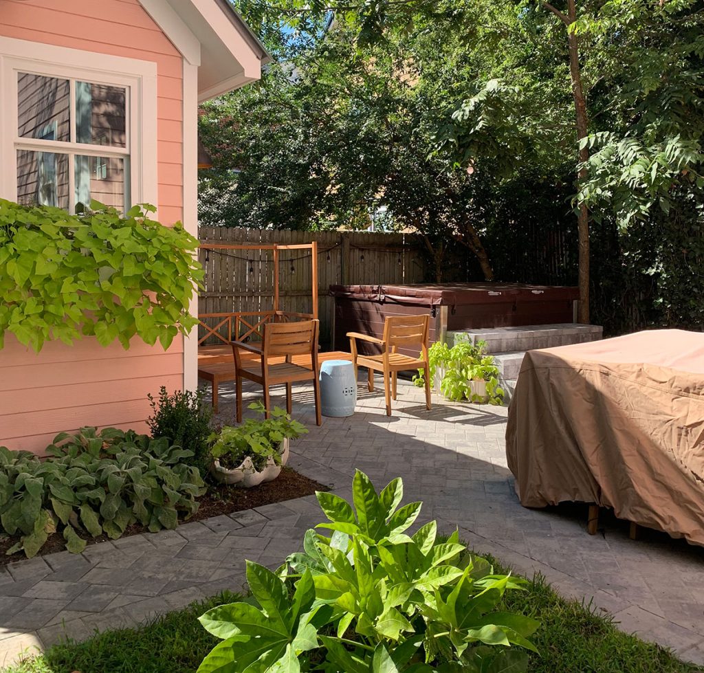
As for what we use, this is the exact cover that we have & love (we just cover the entire dining area with it and pull the corner ties to make it fitted so it won’t blow off). Then we put the sofa cushions in the shed, and voila: done.
I hope that was a fun look back for you guys. These “what-isn’t-working-so-we-changed-it updates are always my favorites when other bloggers do them because I feel like I get to learn from their mistakes without making them. So I hope we saved you some trouble somehow or sparked an idea to make your space work better for you. And remember… YOU CAN NEVER HAVE TOO MANY HOOKS.
P.S. If you want to know what paint color we used or where we got something that you saw in these photos, here’s a full source page for ya! And if you want to look at the before & after photos of this makeover (ALWAYS MY FAVORITE PART!) they’re all right here on this page for ya.
*This post contains affiliate links, so we may earn a small commission when you make a purchase through links on our site at no additional cost to you.
