We finally painted the guest room! And Burger, as you can see, is THRILLED.
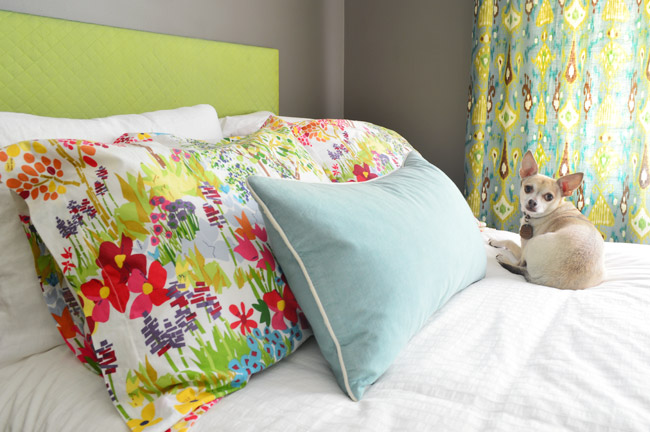
No more over-spray marks from door painting forming a lovely “accent wall” over the bed. Huzzah!
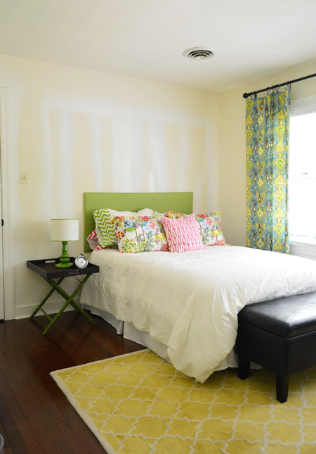
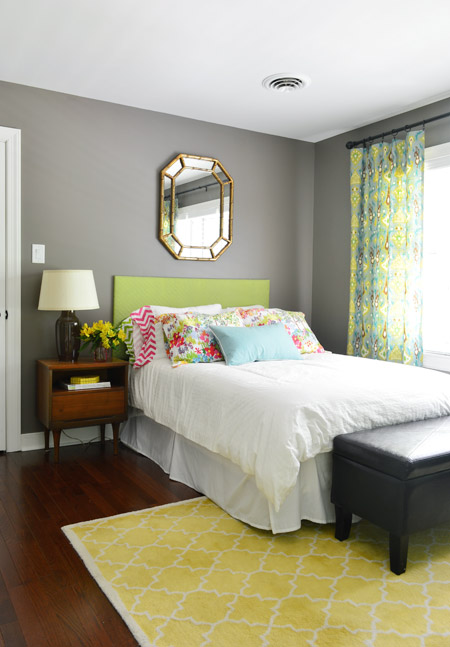
The color? Sparrow by Benjamin Moore. It’s a color we’ve loved for a while now (it was one of our whole-house-color-palette guesses from last year) and we thought the guest room was the perfect place to try it out since it gets a lot of natural light from that giant triple window along the back wall.
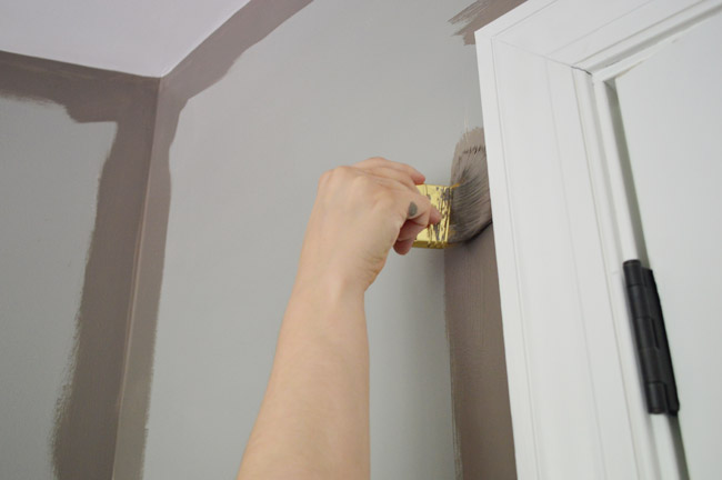
Since it’s a deep color we used a tinted primer first, and as usual I did the cutting in while John did the rolling. Oh and we painted the ceiling first (Simply White like the trim, but in a flat finish instead of semi-gloss) just because it’s nice to do that at the same time while the room is cleared for painting if you have the energy. Sparrow is more of a brown tone with gray undertones than a cool/flat gray color (you can see from the paint going on over the tinted primer that the primer definitely had a cooler/grayer tint going on).
With all the painting done, we decided we were over the blank walls in there, so we dug through our storage room for some frames and a mirror to complement the new paint job. A few old Ikea frames ended up in a grid over the chairs across from the bed.
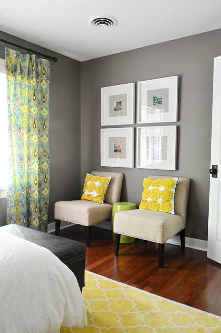
They used to hang over our sofa in the last house, and they contain a few of our favorite instagram photos with big linen-like fabric mats behind them for some texture.
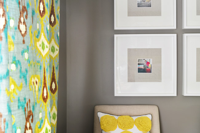
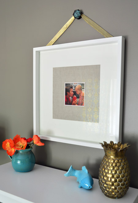
Over the bookcase to the left of the bed we went with another one of those Ikea frames, but we added one of our picture hanging knobs from Target along with some gold ribbon (to tie into the gold mirror we hung over the bed).
Here’s a panned out shot for you. The wall on the left looks weirdly yellow because sunlight is shining in and reflecting green from the trees, so the other photos are more accurate in terms of the color.
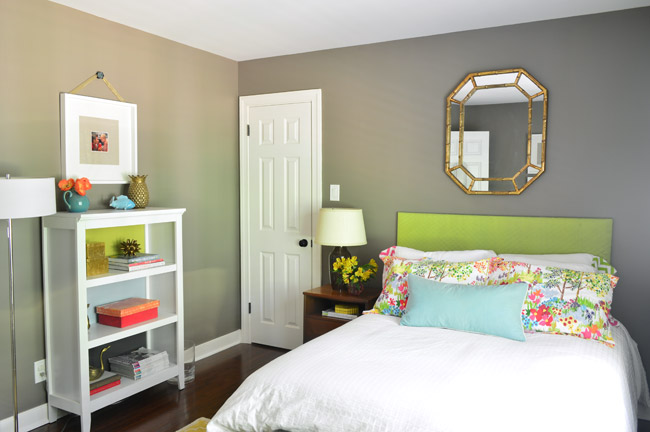
The gold mirror was an old yard sale find that used to hang in our last house’s laundry room, and when John held it up over the bed we both liked how it looked with the wall color. Originally we thought we might want to hang something on either side of it to fill things out (like some small candle sconces, ledges, or art) but there’s something simple and sweet about the gold mirror without a lot of other stuff going on.
We also switched out the luggage-tray-turned-side-table for something a little more substantial with a drawer for concealed storage and a cubby for a few books and magazines. We found two of these tables for $11 at a yard sale a few years back, and I’m glad to have a spot for this one again – especially since it meant we could add a nice big light that felt more to scale than the tiny one that used to sit on the luggage rack.
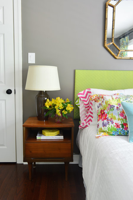
The flowers are just a grocery store bouquet leftover from Clara’s party (alstroemeria for the win, they tend to live for 3-4 weeks!).
We still have a few things on the to-do list in here, like adding crown molding, eventually updating the seating area to a sewing spot so the room gets more use, and making a new headboard (we’d love something more substantial – and maybe with an interesting shape). I’m sure we’ll also upgrade some of these working-with-what-we-have-items over time (like the art, the bedding, the rug, or the curtains) but for just a gallon of primer and paint and some stuff that was sitting around mocking us in the storage room we’re really happy with the new vibe.

The guest room is at the top of the stairs, so we both do that “ooh!” thing when we go upstairs now. It’s amazing how blind you can become to certain eyesores (like those over-spayed door marks) but when you finally take care of them it’s like a breath of fresh air.

What did you guys do this weekend? Anything fun? We had a nice balance of work and family time – and spent a lot of time being grateful for everything that Memorial Day stands for. Hope you had a happy one!
MORE PAINT COLORS WE LOVE
You can check out more of our favorite go-to paint colors by touring our homes in the menu at the top of our blog. We’ve also written these detailed deep-dive posts about our favorite paints:
- The 12 Best White Paint Colors
- Benjamin Moore Edgecomb Gray
- Benjamin Moore Simply White
- Sherwin-Williams Pure White
- Sherwin-Williams Extra White
Psst- Wanna know where we got something in our house? Just click on this button:


Belinda says
What size frames are those at ikea….? And do you make your own white matting? In ever seem to have luck at ikea and you guys always use their stuff…!!
YoungHouseLove says
These are Ribba frames (19 x 19″ in the white color). Here’s the link for ya (they come with those mats and I just added the fabric behind the photos): http://www.ikea.com/us/en/catalog/products/60078034/
xo
s
Sarah says
I love the new color and the new nightstand is great- garage sale score! What type of desk or table are you looking for?
YoungHouseLove says
Not sure yet! We think we could use the West Elm parsons desk that we have downstairs in here as a sewing spot if we don’t keep it in the office.
xo
s
Amy Maricle says
Hey Guys
Thanks for the daily dose of decor, puns, and creativity. I have followed you for a long time and so appreciate you guys.
I love the pops of color in this room and seeing where you re-used the dining room curtains.
Also, I’ve never commented before, so I will tell you how much I love the show house, especially the back patio. I think we will do something similar!
One thing I keep wondering is whether you might consider using a warmer neutral besides grey?
Thanks for always bringing a smile and a light point to my day!
Amy
YoungHouseLove says
Sure! Our first house had a lot of browns/tans and our second house had a lot of cool/light grays and here I think we’re in the middle (some grayer tones and some browner/taner ones). There’s chocolate brown on the floor of our bathroom sink nook, sand/tans in Teddy’s nursery, light tan in the foyer/upstairs hallway, and pink and red paint in Clara’s room (on the ceiling and on the raindrop wall).
xo
s
Heather @ Them Teaching Us says
As much as I like the door painting overspray, the new paint is awesome! ;) I really enjoy the framed Instagram pics as well. Though I remember them from the old house, I guess I never really paid that much attention to them? Thanks for highlighting them here because it gives me a great idea for Father’s Day.
P.S. I also have to mention that I like the slower pace of posting. I can keep up and don’t feel so bad for missing posts a lot. I realize it’s just the interwebz, but I truly enjoy reading this blog and following along. :)
YoungHouseLove says
Thanks Heather!
xo
s
Marie@The Interior Frugalista says
Oh wow, what a difference between before and after! I can’t believe how that color just ties everything in the room so nicely together. Very chic!
Autumn Beach says
Oooohhh…j’adore the Sparrow! Just love it. AND the whole room. Those nightstands?! What a FIND! And SO true about becoming blind to an eyesore, yet when you finally give it some love, it is SUCH a breath of fresh air. Oh. And that mirror is fabulous!
Mindy says
Love it! Your style is great.
Jess says
Hey guys! I love watching you work your magic on a room like this – it’s just awesome!
I have a question – it seems like you used only cool tones in the 2nd house but really warm colours in the 1st house. Now it seems like you might be more towards the warmer colours (I could be wrong though..) I was just wondering which you prefer, the warm colours or cool? I’m trying to decide on a colour palette for my TINY house and I love the first house, but also love the colours in house #2 but am worried about how they will look in a small house.
Thanks :)
YoungHouseLove says
I think this house feels like a mix of the last two, so in the first one there were some tans/browns, the second one had more crisp grays, and this one feels like it has a mix to us (some soft greiges that ride the line, some chocolates and pinks, and some cool blues). In other words, I think our current favorite color palette has a little of each.
xo
s
Shara says
LOVE the mix of bright colors you chose! So gorgeous with the Sparrow walls.
Seaweed & Raine says
Yum. Yum. Yum! Love it. A well lit room like that really pulls off a deep rich colour, doesn’t it? If you really think you need to change the linnen, well, ok. But I was actually going to ask you what it was and where you sourced it! LOL
Nice to see the tri-colour-backed cupboard from house #2’s play room working in with the new colours. Always loved it! :)
Sheree
Janelle @ Two Cups of Happy says
Love the richness of the colour. Question about having lots of pillows on the bed: where do you put them when you/your guests sleep? I’m trying to convince my man to let me have a stack of pillows because it’s so cozy.
YoungHouseLove says
We usually have a chair in a bedroom that we toss them on (we have one in the corner of our bedroom and two in here).
xo
s
This Little Blue Homestead says
Wow that room looks amazing! I love the grey and yellow, I have something very similar going on in my living room but the teal/aqua layered on top of it really makes a pop-must go to the fabric store for some more pillow fabric…
Jackie says
Hmm – I don’t like the way this guest room is put together. Having a mirror accessible is a minimum requirement – unless there’s one on the back of one of the doors? Maybe your “All you need is Love” sign would be better above the bed and the mirror can go above the bookshelf?
I like the idea of books in a guest room and access to outlets for charging phones but other than that – this room doesn’t seem particularly noteworthy as designated for a guest.
Perhaps you should put some of your hooks on the wall for hangers (do they hold the weight of hangers?) so that there is a spot for hanging clothes since the closet is occupied.
Just my thoughts. Best,
Jackie
YoungHouseLove says
Thanks Jackie! I mentioned (here) that I’m getting a full length mirror for the back of the closet door. When guests come we push the bags over in the closet so they can hang stuff on the bar (my mom uses it often) along with having two hooks on the back of the main door. So far it works, but you know we’ll keep you posted if we tweak things along the way :)
xo
s
Jackie says
Mirror on the closet door seems the most useful – definitely agree with you on that. I still think your white bumblebee hooks would look great up against those walls though.
You should put a blank journal in the room so that your guests can log their stays.
Best,
Jackie
YoungHouseLove says
Cute ideas!
xo
s
Leslie C says
Would love to see the view from the hallway!
YoungHouseLove says
Will have to take a photo for you to work into a future post!
xo
s
Kaija says
Looks great!
That floor lamp keeps reappearing… I have 2 of those that I got from Lowe’s for $5 each. They’re overdue for a makeover!
Cathy Ropiski says
This is a very welcoming guest room! Love the fresh colors against the great wall color you chose! Another awesome project! Thanks for sharing–you inspire me with every post!
Grace from The Big Reveal says
I have found myself commenting less since Teddy was born, because I hate to impose or make you have to approve one more comment. But, then, I remembered that interacting with readers is a huge part of why you do what you do.
I still have such mad respect for all you guys do. I keep revisiting the showhouse posts and sharing with everyone I know. You guys always amaze me with your “on a budget” ideas, and seeing what you could do with a “Hollah! budget” was awesome.
I love the guest room paint. It looks like such a happy, welcoming space! Can’t wait to see what you tackle next:)
YoungHouseLove says
Thanks so much Grace!
xo
s
Lea says
Congrats on your first finished room! (Since everything else is in a Phase right now, I think). Mirrors and whatnot are only minor updates, not overhauls, hence why I’m calling it done. Love the wall color! I’d personally use muted, earthy, desert colors for decorating if this were my room, but I love that this looks complete and tidy. Can’t wait to see what the finished dining room looks like. An adult dining space to entertain is such a Jane Austen dream of mine that my TINY SF apt is preventing me from doing.
Krystle @ Color Transformed Family says
I love the deep gray and the how it works so well with all the vibrant colors. Our weekend was spent working on odd and end projects around the house. It was fun knocking some of them out that we had been meaning to get to for months… okay over a year now.
Iryna says
So pretty! You guys are such an inspiration!
Shelly says
It’s great to see Burger! And, I love the new wall color. One small suggestion. Have you considered hanging the mirror over the bed horizontally? Just a thought. :)
YoungHouseLove says
Thanks Shelly! That was actually the first thing we tried, but it looked sort of squat and sideways to us so we liked it better vertically. Who knows what will happen once we beef up the headboard though!
xo
s
Emma says
Love Sparrow on the walls! I made a note onPinterest for the baby room. And I love how y’all use what you’ve got to decorate. We aren’t all able to furnish and decorate overnight! Thanks for encouraging the use whatcha got theory.
Mrs. LIAYF says
Wow – what a happy room!! I really love how the right paint color can pull everything together.
Your guests will feel so looooved!!
James Mason says
Love the grey wall!
Gemma says
Lovely colour YHL! Been reading your blog for years – pre Clara! And my fiancé and I have now just bought our first home- can’t wait to get DIY’ing. Do you have any painting tutorials? Really don’t want to get paint on our lovely base boards. Congratulations on the birth of Teddy!
YoungHouseLove says
We have a section on our Projects page (see that word under our header?) that’s all about painting. So there are some posts in there that hopefully will help. Good luck!
xo
s
Melissa D. says
I am looking for a paint color for my bedroom. I loved and tried the color you did in yours (Black Pepper), but it was too dark for the room. Would you say Sparrow is darker than Black Pepper? I love it both!
YoungHouseLove says
Yes, I think Sparrow is a smidge darker than Black Pepper (at least it reads that way in our lighting).
xo
s
Yalanda @ Laugh Anyway says
Wow! I love this! It looks great guys! I think my favorite part is the picture you hung using ribbon! It’s such a nice touch!
Anna G says
Love it!! A young but sophisticated look. Nice job guys!
chantelle says
love the warmer grey colour!!! love all the furniture and accessories too. You’ve inspired me to do my guest bedroom!! Would you have other hung the mirror over the bed horizontally instead of vertically?
YoungHouseLove says
We actually tried it horizontally over the bed first but it looked kind of squished and sideways to us, so we liked it better vertically.
xo
s
Sheena says
Quick question: Where did you get the cute little blue fish? I’d love one of those for my master bath.
Thanks, and I can’t wait to own my own home so I can finally use all the inspiration from you both!
YoungHouseLove says
That was from Target a few years back.
xo
s
Brittney says
This looks very similar to SW Dove Tail that we painted our office. I love it. We don’t have a BM near us, but I love SW paint.
Monnaie says
lovable interior designing and interior furnishing, like the bedding very much!
Kristin says
Yo, Sher-dog! I admittedly have not read through all of the comments, but if you happen to remember me when you decide you want to change out those curtains, I’d (almost) kill for them! I love the bold colors and the ikat pattern! Just a thought! :)
(I have fabric swatches that I’ve had since my three year old godson was born that I’ve never done anything with, so I’m not even going to pretend that I’d buy and sew my own curtains. ha!)
YoungHouseLove says
Thanks Kristin :)
xo
s
Addie says
Love the idea to use the drawer knobs as picture hangers! Such a neat touch.
inge says
Hello, great! Where did you purchase the curtains?
YoungHouseLove says
Those are made from fabric we got at a local place called U-Fab! Here’s that post for ya: https://www.younghouselove.com/2011/06/my-babies/
xo
s
Bethany @ Dwellings by DeVore says
Love the new color!
Susan says
I must have missed this post when we were on our first RV trip vacation. I LOVE how you mixed so many beloved items from other rooms to make this fresh looking guest room. The wall paint compliments the curtains and bed pillows so nicely!!!
The square pictures from your last living room look brand new hanging as they do in this room. It just shows when you like a style for one room you can re-mix it — in other rooms.
When we moved into our new house years ago, I took all the leftover items from our first house, that didn’t work in my new house, and used a ton of them to re-do my home office. It’s now one of my fav rooms because it has so many of my favorite items from the past. When my girlfriend came to see it she thought all my stuff was new (and she’s been to my house many times). Nothing was new of course, but it all looked fresh!
Great post!
YoungHouseLove says
Love that!
xo
s
Rachel says
Where do you recommend getting a bedskirt like that from? My duvet cover is an off white/cream. would you suggest getting a color to match or getting a white one?
YoungHouseLove says
I think matching your bedding sounds good, so I’d go with a cream/off white color. We got ours from Target a while back I think. You can also check Bed Bath & Beyond and HomeGoods.
xo
s
Gwen says
I know this is an old post, but I just painted my own bedroom this color (mostly because of this post, although it happens to be exactly what we were looking for) this weekend (first time room-painter) ant it was amazing! I couldn’t believe it covered out ugly beige (we are renting a shiny new apartment) so easily (mostly 1 coat), and it looks like SUCH an upgrade. I’m so excited about the room now :) Thanks for the inspiration!
YoungHouseLove says
Wahoo! That makes me so happy. Congrats on your “new” room!
xo
s