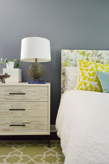
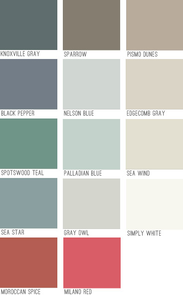
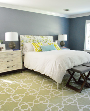
Since it’s a large room full of light furnishings and crisp white trim and doors, we thought it could handle something deeper than the soft blues, grays, tans, and browns in our palette above – especially since we love enveloping colors in the bedroom. Oh but of course we’re just getting started in here so ignore things like:
- the missing window treatments
- the art-less walls
- the bare ceiling (paint or even painted textured wallpaper like this might be fun eventually)
- the lack of a ceiling fixture (can’t wait to add one)
- the furniture placement (it’s just plopped down where it’s been since we moved, except for our new dresser – although that’s not in it’s final resting place either)
- those benches at the foot of the bed (we’d love to get a single bench, hopefully from a secondhand shop that we can reupholster)
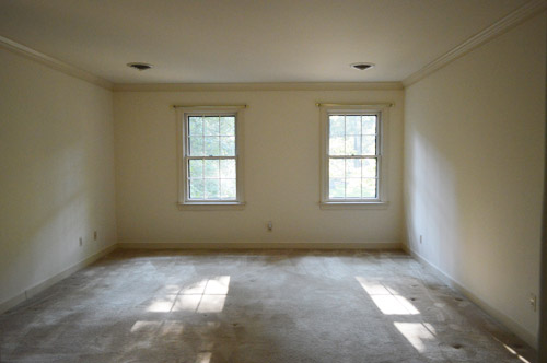
- the two off centered windows on the wall to the right of the bed (more on the plan for those in a minute)
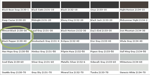
Black Pepper is definitely not as dark as a black tone would be, and actually has a lot of navy undertones but almost looks flatter and more faded. It feels really really sophisticated in person. Might be our favorite dark color to date. Here it is with a bunch of other swatches since that seems to help show undertones and values better online (somehow comparing it to nearby colors gives it context instead of just seeing that color in a vacuum).
To prep the room, we just pushed everything into the center of the room and covered it with a protective drop cloth. We have been painting with hardwood floors for ages, but if you’re worried about dripping on those you can cover those as well. We’ve found that when we wipe up a rogue drip right away it comes right up, and even if we miss it and it dries we can “pop” it up with our nail, so that helps.
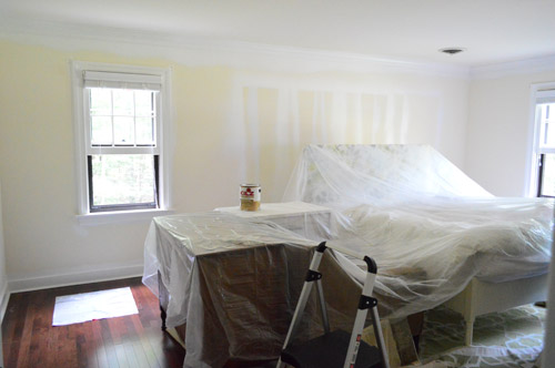
After prepping, we did one coat of tinted primer first, just to help us with coverage, cover those lines that were on the walls from spraying the doors before we installed our floors, and to make sure the color would look as true and rich as possible. We went for a no-VOC primer called Kilz Premium from Home Depot (they tinted it for us knowing we’d be painting with a dark blue-gray color). The primer definitely wasn’t as sophisticated looking in person as this photo (it looks less chalky and little-boy-room-ish here) but in person we couldn’t wait to get some paint over that primer.
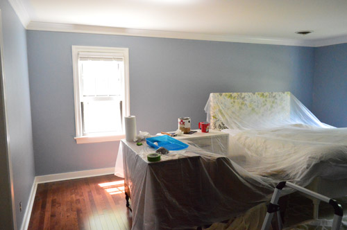
Here’s the difference in the tinted primer and the real color going on:
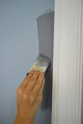
We only needed one coat of the Black Pepper (we used no-VOC Natura paint by Benjamin Moore) for full coverage, which is pretty rare for us since we usually need at least two but I’m sure the primer made the difference. Although the three twelve-paned glass windows in here took five coats applied by hand (two of primer and three of paint) along with a razor-scraping session at the end to clean them up, so this bedroom is a prime case of you win some, you lose some.
We went with an eggshell sheen which is nice for a deep color. It’s pretty matte looking which I think adds to the chic-ness of it. I like that it’s bold and that it’s a color, but not anything too crazy. It falls back and lets the headboard and the rugs and the pillows do their thing without feeling too meek or invisible. It sort of straddles the line between “dark neutral” and “still makes a statement” if that makes sense.

We came to that solution when we were thinking about how it’s a bummer that those two windows on the back wall aren’t centered – but we realized that if we added some built-ins along the wall with the bed on it, they suddenly would be centered and the whole room would have a lot more function and balance.
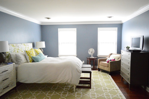
So that’s on the agenda down the line in here. In the meantime we’re just enjoying the moodier wall color and how it makes all of the crown and trim pop. It’s amazing how much of a difference some fresh flooring and paint can make. Even though we still have a big ol’ to-do list in here…
Anyone else making friends with a new paint color?

Reenie says
LOVE it!!
Brittney Everett says
I love it! I think the colour is great and really lets the accent colours in your room pop!
Arlyne C says
Your bedroom looks great! I am currently trying to nail down colors for my foyer, dining, living, kitchen which are all open and it’s quite a challenge. Do you paint your molding and ceilings the same white (except for the finish)?
YoungHouseLove says
We like the same white semi-gloss paint for all of the trim and doors throughout the house and that same color in flat on the ceiling in some areas (sometimes we use soft complementary tones like light blue or a half-tint of the wall color on other ceilings, but always in a flat finish). Hope it helps!
xo
s
Nicole says
HI!! what a beautiful color on the walls. We are finishing up a kitchen remodel. We painted the kitchen cabinets a grey color called Cathral Stone. It has a blue undertone. Very nice color. I love all that you have done to update your home!
Jane says
Looks amazing as always!! I may take a little inspiration from your color palette for a client’s dining room! I love the saucy names of the paints. But being from TN what is the name Knoxville gray about ;)? Never mind I probably already know!
YoungHouseLove says
Is it a moody town full of mystery? Haha! That would be my guess…
xo
s
nylonliving says
I love it! I was leaning towards Smokestack Grey in our master but it seemed a bit too grey (it’s next door on the colour chart to Black Pepper). I think I may have Black Pepper instead. It’s got the blue undertones I want.
Mel says
I adore the color you chose! It looks a lot like the color I had in my last apartment’s bedroom. I think that one was called Silver Clouds. The pics online look like a pale gray but in person it was more like a slate blue. It was a moody, relaxing color that went well with almost any color you put in the room.
Will we be seeing any posts soon about that house you two are designing? So so curious!
YoungHouseLove says
We can’t wait to update you guys on that! They still haven’t even cleared the lot or broken ground, but we’re getting closer to finalizing the floor plan and then we can start picking finishes so that will be so much fun!
xo
s
Jennifer says
Oh man, I LOVE the plans for the built ins with the window seat! Cannot wait to see you tackle that project :) Color is gorgeous, too!
Amy says
I painted our living room this weekend, including a wall of wood paneling and our brick fireplace. I went with Hazy Skies (Benjamin Moore) as a nice light neutral for the walls and white for the fireplace, but I’ve been thinking about going with something a little darker in our bedroom and this is great inspiration!
Emily says
I love this! We redid our master bedroom and our wall color was very similar to this. We loved it. We have now moved and soon will be moving into a new house and I can’t wait to decorate it and pick out new paint colors!
My master bedroom makeover http://lovepastatoolbelt.com/?p=1118
YoungHouseLove says
Love that color! It looks awesome Emily!
xo
s
Andrea says
Just wondering, do you guys not like pale yellows and creams? It seems you are always painting over light yellow walls! Light yellow walls and white trim are my favorite combination; are they dated now? Am I out of touch with the latest styles? :)
YoungHouseLove says
I love crisp white trim with creamy walls (we had that combo in our first house’s den and it was so cozy!). Here all the walls were sort of yellowed looking in person (kind of old and dingy looking up close, instead of crisp) and none of the trim was white, it was all either blue or mauve or a darker yellow than the walls, so that’s why it was on our list of things to paint :)
xo
s
Whitney Dupuis says
Beautiful color! I love it!
Barbara says
Dear Wish Granter:
Please have Sherry and John suddenly want to go to California and paint my living room. They do such great painting!
I’ll be ready for them when they get here.
Thank you,
Barbara
YoungHouseLove says
Haha! We’re on the way!
xo
s
Suzy from CA says
And while they’re in CA can they stop by and help me with mine, too?
Doesn’t hurt to wish and hope!
YoungHouseLove says
We’ll play Supermarket Sweep and run from house to house grabbing pillows and paint brushes. Haha!
xo
s
Kristin @ bliss-athome.com says
Love that color! Great in that space :) xo Kristin
Sassy Apple says
Love the bedroom color. Won’t lie, love it even more because it’s what I painted our bedroom last year. Ours reads a lot more navy than yours….but maybe it’s just the pics. Enjoy it, it’s a color that is striking but soothing at the same time. If that makes sense at all?
YoungHouseLove says
Totally makes sense! We feel exactly the same way. It’s not boring but it’s also not too crazy. It reads more navy at night for us, and faded and more gray-blue during the day I think.
xo
s
Kee says
How would building built-ins suddenly center the off-center windows? I’m not seeing it.
YoungHouseLove says
They’ll bump out of the wall on the left side across that whole wall (as you face those windows on the back) so the wall space between the window on the left and the built-ins will then be the same as the wall space between the window on the right and the corner. Sorry, hard to explain!
xo
s
Vanessa says
I didn’t get it at first either, but I realized that is because I thought the built-ins were going on the window wall. They are going on the wall your headboard is on now. Smart!
LauraC says
Looks nice in there Sherry!
YoungHouseLove says
Thanks LauraC!
xo
s
Leanne says
I love the color of your walls! Gray is my new favorite wall color but lets talk about your headboard. Where did the fabric on it come from or was it something that your purchased already made? I love that fabric and would like to get some.
Thanks, Leanne
YoungHouseLove says
Thanks Leanne! It’s actually fabric that we had leftover from a book project (a curtain panel that we made) so we repurposed it into a headboard. It’s called Gazebo Cloud by Braemore, which I think should come up if you google for it on fabric sites.
xo
s
Danielle says
I love the headboard! Did you all make it or buy it?
YoungHouseLove says
Thanks! We made it. Here’s that post for ya: https://www.younghouselove.com/2012/06/the-headboard-adventures-part-2/
xo
s
Jill says
Odd question: Does your paintbrush not have a handle? Or do you find it easier to paint with holding it that way? :)
YoungHouseLove says
I love short handled brushes (they give me a lot more control when I cut in and then I don’t have to tape off).
xo
s
Catherine says
I really don’t like dark colours normally but this colour is just gorgeous. With so much light in the room it looks fantastic! I love how your furniture and rug looks against it and can’t wait to see how the built ins look when you get them done. Sigh, I really need my own house to play around with… in the meantime, I am enjoying living vicariously through you!
YoungHouseLove says
Thanks Catherine! Good luck with yours!
xo
s
Erica says
I am planning on using black pepper on a piece of furniture in my living room. I absolutely think it is the perfect mix of gray and blue. I will have to share some pics when I am done.
YoungHouseLove says
We’d love to see the photos!
xo
s
Kara @ Mates2Renovate says
My husband is on me to start working on our Master Bedroom, and now I am loving the fresh clean look of your new space. Even with the dark walls it still seems so bright! nice job!
kim says
love the idea of built ins but also love the new nightstand…can’t decide which I’d like more! Maybe return that one and get the six door version for the wall opposite the bed?
YoungHouseLove says
We’d like to move our new dresser to the other side of the bedroom along with a chair and side table and a floor mirror, so we hope that fills that side of the wall up nicely.
xo
s
Brooke says
Love it – that grey is beautiful! i just painted my guest room a gorgeous dark blue (Blue Fjord by Olympic) yesterday and I am in LOVE with it.
Paula Vaughan says
Looks stunning, I cant wait to do my master bedroom too.
Heather W says
Love the new wall color!! It looks great with your rug and headboard. I spent the weekend following your ORB door knob upgrade and couldn’t be happier. The downstairs is done and moving on to the upstairs this week. I did have a question since Clara’s room seems to be staying the same with her decor which I love, are you planning on painting her room soon to finish it off…. It seems her room would be the easiest to tackle. Just curious… Love your blog!
YoungHouseLove says
Yes, we can’t wait to paint her room – it’s next! And we’re going to do her closet and the ceiling in there too!
xo
s
Rachel says
The new color is gorgeous! It’s deep yet subdued.
Yeserday I took our dining room from tangerine dream (a canteloupe orange) to vanilla brandy (a cream beige). The orange was fun for five years, then I realized it just clashed with the rest of our home’s color palate and was soo difficult to decorate around (not to mention who wants orange in photos of every family birthday celebration, etc.?)
Oh, and I finished painting an old Jenny Lind high chair pale pink (Rusoleum candy pink) for my 10-month-old. It’s just gorgeous!
Question: has anyone had trouble with Lowe’s mixing a Valspar color in an Olympic paint? I was only getting a 8 oz sample, but they just would not do it for me. It didn’t matter anyway, becase I planned (and did) purchase the full gallon at Sherwin Williams, where they were having a 30% off sale.
YoungHouseLove says
All of that painting sounds awesome, Rachel! Anyone have advice for her about the mixing paint thing at Lowe’s?
xo
s
Kathy says
Rachel, they won’t color match between the brands they sell, only outside brands.
Molly says
Yes! I had the same problem with Lowes’ paint department last month. I wanted a Valspar color in the higher-quality outdoor Olympic paint and they kept telling me they couldn’t do it. After I spoke with the manager, they finally agreed to, but boy did it take awhile to convince them.
I won’t be buying any more paint from Lowes – Home Depot has always had better customer service and paint in my opinion!
Anne says
I don’t know how you had time to paint your own house this weekend because Sherry spent the weekend whispering, “thin, even coats,” and “if the can is spraying, the hand is swaying,” in my ear. We painted our office (deep gray called Eagle Rock by Benjamin Moore), and put in new trim. I don’t know about you, but I’m sore!
YoungHouseLove says
Hahaha! I cloned myself since I enjoy whispering creepily so much. Congrats on the office paint-job!
xo
s
Angel says
The color is really nice but, all this post did is get me drooling for built-ins. I pretty much have an entire pinterest board set aside for built-ins alone, I cant wait to see yours materialize! To be honest, I always thought what you are describing would be nice in a kids room for toy storage / books & reading bench maybe. I would have never thought for a master but sounds cool.
Also, off topic (sorry) when do we get to see the floor plans for your model house? Holding my breath till then, I am so excited.
YoungHouseLove says
As soon as they’re approved (it’s sort of a long process, but we’re getting closer to that stamp of approval). Can’t wait to share them! Then the lot starts to get cleared and they can break ground on the house! Wahoo!
xo
s
Laurie says
I’m picking out the paint for my kitchen right now. It’s a bit of a challenge because it is quite a dark room (a lot of shade outside the window) so I think I want to avoid blues and grays and the cabinets have a lot of red in the finish so I think I need to avoid greens which leaves me with pale yellows. (I’m afraid a bright yellow with the reddish cabinet would look too McDonalds)
I’m agonizing a bit because I wanted more drama I think and it just isn’t the room for drama.
Kathy says
Laurie, if I may suggest, take a look at Sherwin Williams Pavillion Beige. I know, boring beige, but it’s not, it’s a very gray/beige color with lots of depth and movement. I have it in eggshell next to my cherry-ish cabinets (after trying several others) and just love it. Hope you don’t mind the suggestion!
Emily says
Perfect timing! I just started a hunt for a cool grayish color for our master. I’ve never heard of tinted primer… what are the benefits? How do they determine the tint? Thanks!
YoungHouseLove says
When you’re taking a room from very light to very dark or very dark to very light, primer helps – and when going dark tinted primer helps even more. It just gives you a base of that darker tone than white, so the color goes on with great coverage on top of it and feels rich and true. You can just tell them the color you’re using and they can look up the formula and tint the primer with that in mind (it’s usually not as dark, but not close to white, so it bridges the gap nicely).
xo
s
Jennifer I says
I’ve also been told it makes your color stay brighter longer!
YoungHouseLove says
Interesting!
xo
s
Jennfier says
I have just painted my living room Sherwin Williams Sea Salt! Love it! (stole it from the 2013 Blog Cabin :))
YoungHouseLove says
Sounds gorgeous! I’m in love with that color.
xo
s
K says
Great color! I find that dark blue/gray is the hardest shade to get just right. I was going for something like that in our bedroom and it just came out too blue. I might have to try again with something more like this!
Needle little Balance says
Oh yes a window bench would be lovely in this room! And in your office, too btw ;-) Bummer that there is heating below all our windows so I´m living the window bench dream through you :-)
Lisa E says
There are tutorials out there showing how to bring the vent forward so it’s vertical on the front of the bench. My hubby did it with a bathroom vanity when he put in a bathroom that used to be porch. See the following post at Pretty Handy Girl.
http://www.prettyhandygirl.com/2013/07/how-to-move-a-floor-register-in-a-window-seat.html
Gina says
Nice color, but I don’t think it goes with anything else in the room now. There’s just too much going on, too many colors/styles. The rug looks completely off, the bed and the bedding look underdone and sloppy, not one piece of furniture looks good with the new dresser, which is completely underwhelming as a night stand. I do think there is potential tho, the wall color is a nice starting point. The rest of the room needs to be made as sophisticated as the wall color.
Andrea J says
Love the wall color! Especially paired with the rug and headboard. :) Also, when I saw on that color chart that they have a “Seattle Grey” I thought, “Hey, it’s not always grey up here!!!” But then I looked out my window. They really got that shade spot-on. ;)
YoungHouseLove says
So funny!
xo
s
Kristina says
My husband and I just painted our home office yesterday and and we ripped out the old carpet to reveal the BEAUTIFUL hardwood floors underneath. We went with Behr’s Gentle Rain. We love it!
YoungHouseLove says
What an amazing discovery to find those hardwood floors! LUCKY LADY!
xo
s
Nancy says
Have you thought about how you will handle the recessed lights when you put in the built in? I have the same issue in my basement – the lights are centered now, but will be very close to my potential built in cabinet and I’m not sure how to handle it.
YoungHouseLove says
I think we’re considering sconces for bedside lamps, but we haven’t fully thought it through yet. Will keep you posted for sure though!
xo
s
Laura says
LOVE your color choice! It is just beautiful!
Kathy says
my friends and I were just talking about paint on Saturday night – specifically, my paint paralysis- so I said “I’m just going to paint everything the same as YHL, they always get it right!” I can’t even decide on a neautral so I think I’m going to use the same paint you have in the foyer, since it looks so nice!
YoungHouseLove says
Aw you’re so sweet Kathy! We definitely get that “ahhh, which one should we pick?!” feeling too, and it always helps to bring swatches home or even test pots of paint to get up some confidence when we’re second guessing ourselves!
xo
s
Diana says
I like the color and LOVE the idea of built ins. The neutrals are nice downstairs but it’s nice to see some more color too.
Megan Poletti says
Oh, it looks so wonderful. In my house I have a lot of light-aqua going on in several rooms of my house (here’s a reference: http://rentalrevival.com/home/2013/6/4/100-kitchen-revival) but you guys are putting thoughts in my mind about gray walls…. It’s so sophisticated!
I have a question for ya. Do you actually use Benjamin Moore paint, or do you always color match with different brands? I don’t think Mr. Moore is available in many retailers, so this is why I am wondering. One time I tried to ask the guy at the hardware store to color match and he looked at me like I had 10 heads. Are they supposed to know how to do that? Maybe I just found the new guy or something.
YoungHouseLove says
We used to color match to a bunch of other things (over the years we’ve tried Glidden, Olympic, Valspar, Behr, etc) and then readers kept saying “try BM! You’ll never go back!” – it truly is addicting stuff! Although we liked Glidden and Olympic a lot too, so those are our second favorites. But definitely at Lowe’s and HD they should know how to color match. Just give them the brand/color you want to match and they should have the formula in their computer for you.
xo
s
Megan Poletti says
Thanks! I really like Valspar (wasn’t too fond of Glidden when I tried it) and it tends to be in my budget… They just don’t have very many grays that I like. I’ll have to try the color match thing next time.
Linda says
If you go to the Benjamin Moore homepage, they have a retailer locator. However, they are not carried by the big box stores. That said, in my zip code within 8 miles there are 20 BM retailers, including several Ace Hardwares, that carry BM. I’m in the western suburbs of Chicago.
Honestly, once you’ve tried a paint like BM (or Sherwin Williams and a few others), you won’t go back. And, IMO, it’s difficult to get the real BM colors in another manufacturer’s paint. Just not the same quality of pignments. That said, you can be really happy with another paint brand, but many people do get totally spoiled with BM once they’ve tried it. I love their Aura line, myself.
Jayme @ Keeping Up With Myself says
I love this color! So romantic and moody!
But one question: What happened to the rug that used to be in your bedroom (at your last house)? I loved that rug. Is it too big for your new room?
YoungHouseLove says
That’s in the living room downstairs now since it was smaller (and the bedroom’s bigger in this house) so the switch made sense on moving day. Who knows where things will end up in the end though! I think we’re still doing that room-to-room shuffle!
xo
s
Tiffany says
Love the color that you chose for the bedroom!! I made friends with a new paint color this weekend. I painted my front door Bayside by BEHR and I’m absolutely in love. If my neighbors wouldn’t think I was weird, I would sit on my front lawn and just stare at it!
http://instagram.com/p/dzZx_vwDmf/#
YoungHouseLove says
Looks awesome Tiffany!
xo
s
Meg says
What about maybe adding storage to those built-in’s? Like these: http://megandmartinmen.blogspot.com/2013/01/ikea-pax-wardrobe-hack.html
YoungHouseLove says
That could be fun too!
xo
s
Katie says
Oh man, what a great transformation! Gorgeous color. I love using eggshell for deep colors like that; makes it feel so velvety.
I can’t wait to see how you guys handle the built-ins! Totally custom? Pimping out some Ikea bookcases? We want to do the same thing in our living room, I’ll be so interested to see your take!
Do you have any tips on how to handle off-center windows when built-ins aren’t an option?? For example, two adjacent walls in my square dining room have windows that are like 12-18″ off center, which is such an annoying distance….
YoungHouseLove says
Hmm, I would just try to add balance with the art on the wall. In our last house’s guest room there was one off centered window and hanging a big sunburst mirror on the other side of the wall seemed to balance it out.
xo
s
Arrica K says
We just finished a 72 sq feet addition to our existing laundry room and we are painting our walls Poolhouse by Sherwin Williams. It is a moody blue with gray undertones! WE LOVE IT and it goes great with the light gray tiles floors, Leonia Silver from Lowes, and the white Pure White Sherwin Williams, paint. Sometime next year we will put in cabinets and a dark countertop :)
Ashley @Girlyobsessions says
Love the new bedroom color! I just painted stripes in my foyer and up my stairs. I used Strong White by Farrow & Ball as the base and the stripes are Benjamin Moore Shoreline. Which is definitely the perfect gray to bridge the gap between a warm room and a cool room! Then I painted my bathroom Calluna by Farrow & Ball, which is a gorgeous muted lavender. In love!
Catherine at Beginning In The Middle Blog says
Love the color combo here! We’re thinking about doing something similar in our guest room :)