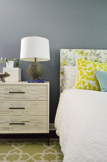
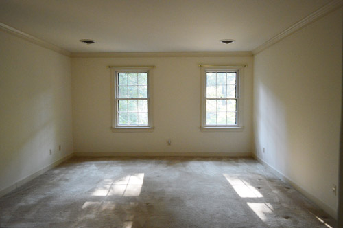
Since it’s a large room full of light furnishings and crisp white trim and doors, we thought it could handle something deeper than the soft blues, grays, tans, and browns in our palette above – especially since we love enveloping colors in the bedroom. Oh but of course we’re just getting started in here so ignore things like:
- the missing window treatments
- the art-less walls
- the bare ceiling (paint or even painted textured wallpaper like this might be fun eventually)
- the lack of a ceiling fixture (can’t wait to add one)
- the furniture placement (it’s just plopped down where it’s been since we moved, except for our new dresser – although that’s not in it’s final resting place either)
- those benches at the foot of the bed (we’d love to get a single bench, hopefully from a secondhand shop that we can reupholster)
- the two off centered windows on the wall to the right of the bed (more on the plan for those in a minute)
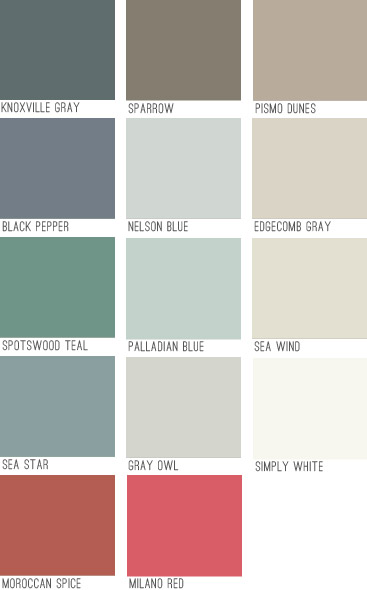
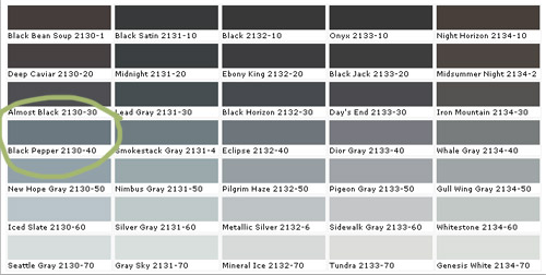
Black Pepper is definitely not as dark as a black tone would be, and actually has a lot of navy undertones but almost looks flatter and more faded. It feels really really sophisticated in person. Might be our favorite dark color to date. Here it is with a bunch of other swatches since that seems to help show undertones and values better online (somehow comparing it to nearby colors gives it context instead of just seeing that color in a vacuum).
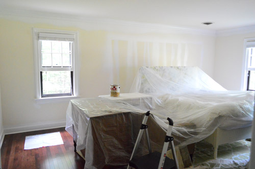
To prep the room, we just pushed everything into the center of the room and covered it with a protective drop cloth. We have been painting with hardwood floors for ages, but if you’re worried about dripping on those you can cover those as well. We’ve found that when we wipe up a rogue drip right away it comes right up, and even if we miss it and it dries we can “pop” it up with our nail, so that helps.
After prepping, we did one coat of tinted primer first, just to help us with coverage, cover those lines that were on the walls from spraying the doors before we installed our floors, and to make sure the color would look as true and rich as possible. We went for a no-VOC primer called Kilz Premium from Home Depot (they tinted it for us knowing we’d be painting with a dark blue-gray color). The primer definitely wasn’t as sophisticated looking in person as this photo (it looks less chalky and little-boy-room-ish here) but in person we couldn’t wait to get some paint over that primer.
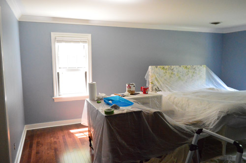
Here’s the difference in the tinted primer and the real color going on:
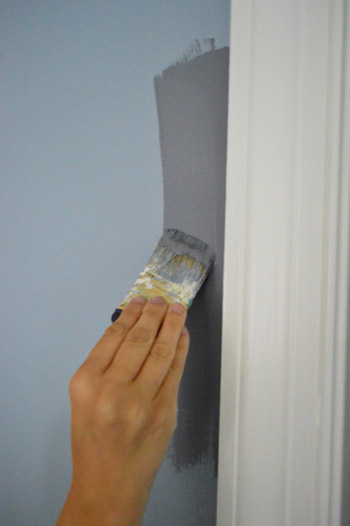
We only needed one coat of the Black Pepper (we used no-VOC Natura paint by Benjamin Moore) for full coverage, which is pretty rare for us since we usually need at least two but I’m sure the primer made the difference. Although the three twelve-paned glass windows in here took five coats applied by hand (two of primer and three of paint) along with a razor-scraping session at the end to clean them up, so this bedroom is a prime case of you win some, you lose some.
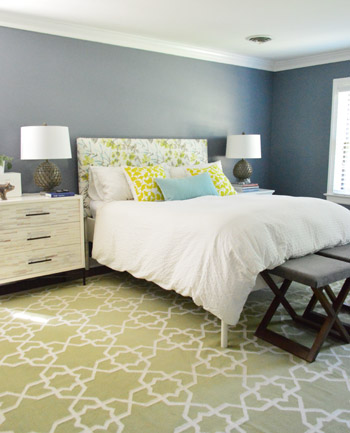
We went with an eggshell sheen which is nice for a deep color. It’s pretty matte looking which I think adds to the chic-ness of it. I like that it’s bold and that it’s a color, but not anything too crazy. It falls back and lets the headboard and the rugs and the pillows do their thing without feeling too meek or invisible. It sort of straddles the line between “dark neutral” and “still makes a statement” if that makes sense.
We came to that solution when we were thinking about how it’s a bummer that those two windows on the back wall aren’t centered – but we realized that if we added some built-ins along the wall with the bed on it, they suddenly would be centered and the whole room would have a lot more function and balance.
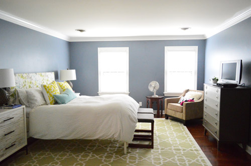
So that’s on the agenda down the line in here. In the meantime we’re just enjoying the moodier wall color and how it makes all of the crown and trim pop. It’s amazing how much of a difference some fresh flooring and paint can make. Even though we still have a big ol’ to-do list in here…
Anyone else making friends with a new paint color?

Leave a Reply