Break out the 3D glasses! Okay, not really. Put them away. This blog will not be coming to you in any additional dimensions today.
As you saw in our latest kitchen planning post yesterday, I finally bit the bullet and learned me some Google Sketch-Up (as many of you recommended) to help us plan our kitchen renovation. But having been a loyal user of Floorplanner.com in the past and having recently become acquainted with Ikea’s Kitchen Planner, I thought I’d give you my take on how these three 3D modeling tools stack up against each other… because there’s actually not a clear winner in my book. Each have pros, cons, and a different scenario where they might take the win.
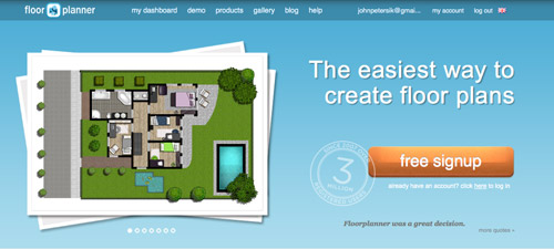
Floorplanner.com is what we’ve used to create just about every digital floor plan you’ve seen on our site (like this one), so we’ve got a soft spot for it. But when I gave it spin last week to render our new kitchen plans, here’s what I observed:
PROS:
- No software to download. It just loads in your browser.
- Easy & fast to use. I find the interface very user-friendly, so if you’ve got your room measurements handy you can have a simple whole house plan done in a matter of minutes.
- Good finish options. They have a lot of standard finishes, like flooring, with adjustable colors so you can bring more life to your drawing.
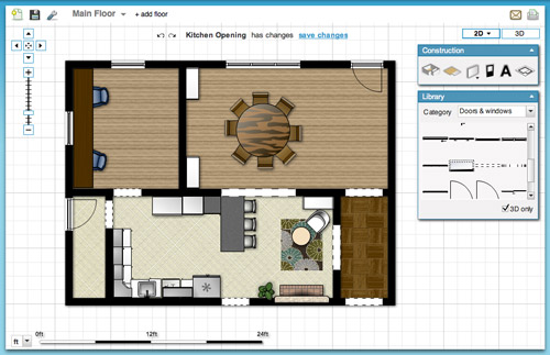
- Nice library of furniture. Floorplanner comes stocked with dozens of furniture options (chairs, tables, rugs, plants, appliances, etc) to help decorate your spaces. You won’t find perfect matches to your real life items, but you can usually find something similar.
- 2D or 3D: It lets you easily toggle between a 2D and 3D view.
CONS:
- Only kinda free. You can create one plan for free, but after that you may have to fork over some dough.
- Limited kitchen designs. Kitchens are probably one of the toughest rooms to design, so Floorplanner is quick to fall short when it comes to trying to precisely layout a kitchen (I could only find one type of base cabinet, for example).
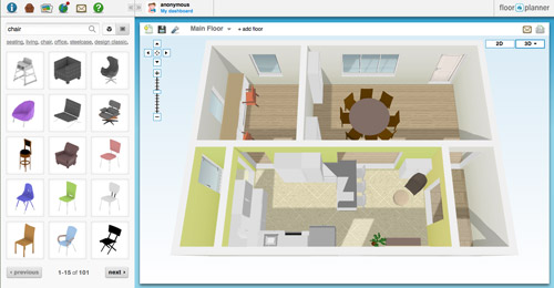
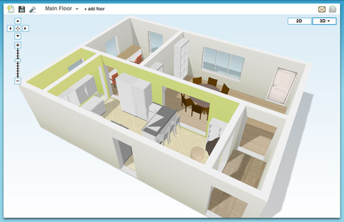
- So-so 3D rendering. I like the look of their 3D rendering, but it’s a bit clunky to navigate around and I had issues with things not showing properly (see below how my counter got wonky and my rug disappeared from the kitchen). Also, I found the only thing I could change in the 3D version were my wall colors, so I ended up working in 2D most of the time.
BEST USE: In my very humble inexpert opinion, Floorplanner is best if you’re short on time or technical skill and need to create a 2D floor plan (of one room or even your whole house). It’s also great for testing out furniture arrangements thanks to their library of stock furniture and the ease at which you can move things around in your virtual space.
On to the next one…
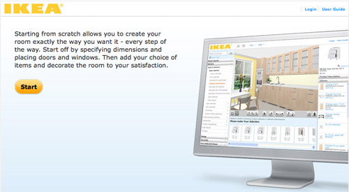
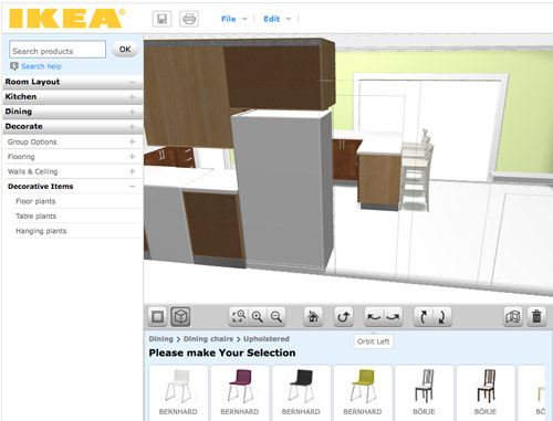
Ikea’s Kitchen Planner popped up on my radar when we were considering their cabinetry for our wall-to-wall office desk. Having had a good experience with that, it was actually the first place that I turned to when deciding to plan our kitchen’s new layout in 3D.
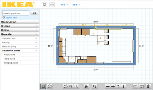
PROS:
- It’s free. There is some software to download, but once you do that you can access it anytime on their website using your free log-in.
- Allows multiple designs. I’ve saved three or four different files (aka different kitchen layout options) and so far I haven’t hit any “max projects limit” like I did on Floorplanner.
- Works with real life products. Ikea lets you design using real products from the catalog (and not just cabinets and counters, but chairs, tables, etc) so you know there’s some “reality” to your design when it comes to size/layout/planning. It even offers to print out a shopping list when you’re done. Convenient, but only if you’re getting everything at Ikea.
- Works with real life finishes too. Like above, you can pick from a range of cabinet sizes, front styles, drawer & shelf configurations, finishes, colors, hardware, etc to get a very customized look. Obviously it’s limited to Ikea’s real life finish options, but they’re pretty plentiful.
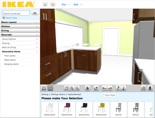
- A real-ish 3D rendering. Continuing the “real” theme, I thought Ikea’s 3D view was the most life-like of all of the three tools.
- 2D and 3D. Like Floorplanner, you can quickly toggle between these two views. However, Ikea’s version gives you equal editing capabilities in both options, so I found myself working mostly in 3D, which was nice.
CONS:
- It’s just kitchens. Unless I’m missing something, Ikea’s software only lets me create one room in my plan (which makes sense since it’s supposed to be just for planning your kitchen) but as someone who needed to see how things would look in the kitchen from the dining room (through a doorway) it fell short.
- It’s just Ikea. Since the cabinets and furnishings are only Ikea, you may have trouble finding pieces that suit you if Ikea-style isn’t your thing.
- Limited decorating options: I’d understand just being limited to Ikea furniture, but it’s also limited to only kitchen-appropriate Ikea items. So I wasn’t able to render a rug or an armchair to create a seating area near the fireplace. And why are “decorative items” limited to just plants? Can’t a brother get a fruit bowl?
BEST USE: Designing a kitchen (surprise!) especially if you plan to use Ikea products. But even if you don’t, a lot of their sizes are standard enough that you can get a good idea of what you might also be able to find elsewhere. Just don’t expect to “decorate” your virtual kitchen very much.

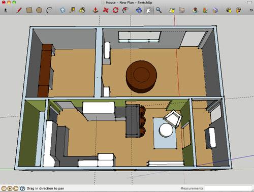
Google Sketch-Up is new to me as of a couple of weeks ago. I turned to it after being frustrated by Ikea thwarting my multi-room design (and after a bunch of you sang its praises). I’m still pretty new to it and feel like I haven’t unlocked all of what it can do (like apparently I can turn off the guides that you see in my screenshots below). Nevertheless, we’re becoming fast friends.
PROS:
- It’s free. Like lots of products in the Google-verse, it costs $0 to download.
- It’s offline. While some may see having to download software a “con,” I liked that I didn’t need to be connected to the Internet to use it or to access my files. You know, in case we have another Hurricane Irene.
- It’s precise. Google’s software feels much more “technical” than the other two, so I feel more confident that we can actually make cuts into our wall based on Sketch-Up measurements (with the help of a pro, permit, & architect of course).
- The possibilities seem endless. If you’ve got the time, skill, and patience it seems like you could render just about anything in Sketch-Up – rooms, furniture, buildings, cars, chihuahuas – so you won’t find yourself limited like the other two sites.
- Most functional 3D. Navigating through Google’s 3D rendering is the most intuitive and flexible, it seems. You can look above, below, through, and around every inch of your design quickly and easily. The rendering looks very much like a rendering, but that’s okay.
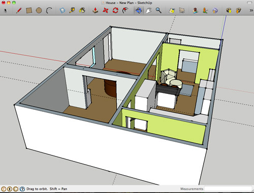
CONS:
- Talk about a learning curve. Being the most technical of the three, Sketch-Up has the steepest learning curve by far. I spent about 15 minutes watching Google’s tutorials before starting and still found myself struggling to hit my groove.
- No 2D: I find 3D hard to work in sometimes, so not being able to toggle to a simple 2D floor plan was something that I personally missed. The closest I’ve found in Sketch Up is the “Parallel Projection” camera viewed from the top.
- No built-in furniture library. Unlike the other two which have furniture options built into the software, with Google you have to download it separately from their warehouse (I didn’t know this until a few helpful commenters enlightened me on yesterday’s post, which is why every cabinet, fireplace, chair, and table was “drawn” by me for that sketch – which certainly didn’t help my rendering look any more lifelike). Oh well, live and learn.
- Somewhat inflexible. I found it difficult to make changes or tweaks along the way. If I wanted to shift my chair a bit, it took making sure all of the right edges and surfaces were selected (and none of the wrong ones) first. This took time and also gave me a lot of accidentally skewed walls and floors along the way. Did I mention I’m still learning? Update: just figured out how to group things/make components. So helpful.
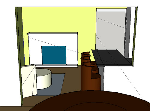
BEST USE: Anything 3D… as long as you’re willing to put in some time to learn it. It ended up being perfect for planning our doorway because I have the most flexibility to render the room AND I can trust the precision of the measurements. Now if only it didn’t take me so long to make changes…
So that’s how Sue John sees it. I haven’t spent more than a few hours with each program, so my comments aren’t based on weeks of research or anything. If you guys have had your own similar (or different!) experiences with these three tools (or others that I haven’t heard of yet) I’d love to hear your thoughts – and tips if you’ve got any.
Psst- We announced this week’s giveaway winner. Click here to see if it’s you.

Emily says
I found the learning curve with Sketchup was steep but fast – having done lots of 2D work in Illustrator, etc, I initially wanted to draw boxes by drawing all their planes (line by line), but once it clicks how to extrude things – WOW. It is also fabulous for designing woodworking projects. I made a Farmhouse Bed a la Knock Off Wood but had some concerns about the structural support, so I sketched up all my changes and emailed them back and forth with my dad (an experienced woodworker) until we came up with some edits (granted, my dad and I both have a tendency to over-engineer things, so we could probably hide under the bed in case of nuclear attack).
This site has some really great tips for woodworking, and a lot of little tweaks that you’ll see used incidentally, even if the projects themselves are more expert-level: http://www.finewoodworking.com/blog/design-click-build
YoungHouseLove says
Thanks!
xo,
s
Alisa D. says
“Can’t a brother get a fruit bowl?”…hee, hee.
Liz says
I used a program called Punch Pro. It’s pretty good, but has horrible furniture options. It’s not free, but it’s worth checking out.
YoungHouseLove says
Thanks for all the recommendations everyone!
xo,
s
James says
I’ve used a similar program from Bo Concepts they have their Furnish program but like Ikea it only uses their furniture. Although it was nice since my couch is from there and my bed is pretty standard size to get an idea of where to put things.
Mike says
This article was so helpful, thanks!
melody says
I was a huge fan of Mr. Banquette, but admittedly I think the peninsula is a more practical option. I’m really excited to see it. And I LOVE that little corner chair to relax in front of the fire. If only there was room for more seating. I would definitely be fighting for that seat! haha.
Lydia says
I’m an interior designer and use AutoCad on a daily basis and I have a huge mental block when it comes to SketchUp. I just can’t get it to work for me because I want to draw with it like I do in CAD. We use it all the time in my commercial architecture office, or should I say, the other guys use it. I’d much rather model in CAD or Revit. Someday, I’m going to have to sit down and work through this block. I mean, I’ve even taken a class on SketchUp. It shouldn’t be that hard.
Christine says
This was super timely – the hubs and I were just discussing using this tool to lay out our nursery!
And I *love* that you said “That’s how Sue sees it”. ;)
Sarah B says
I see others have given you the tip about making groups. Here’s another on that topic:
Groups are individual instances, but components can be re-used over and over again.
So when you make chairs, make the first one a component, then copy it around. Then if you need make changes to one, it changes them all (as opposed to groups that are unrelated).
We use the paid version of Sketch Up in my architecture office.
YoungHouseLove says
Great tip!
-John
Rachel Tatem says
I love the way you use the 3D images to help you think things through
Ashley says
Best quote of the entire post…
“So that’s how Sue(slash through) John sees it”
Ha
Abby says
the very best! i hope that john put up his hand in a “C” shape right after typing that one.
YoungHouseLove says
But of course!
-John
Lorilyn says
I tried learning some of sketch-up to design my dream kitchen back in the spring. I can second that with the learning curve. I finally gave up because my sink kept ending up floating in the middle of the kitchen and whenever I would try and change it, it would set off a disasterous chain of events.
Marie says
Hi John,
Loving the recent techy posts : ) I had an unrelated question – I remember a few weeks back you used a polling plugin which caused the site to crash. Do you remember which one it was and in your experience which polling plugin do feel is the best?
Thanks : )
YoungHouseLove says
It was WP Polls (a plug in that we have used a ton of times before with great luck). We love it but were just having such intense traffic (5000+ poll takers all weighing in at the same exact second) so our database couldn’t handle it. We’ve used it for other stuff with success though, so it’s still what we recommend!
-John
Marie says
Great, thanks John! Appreciate you taking the time to get back to me so quickly : )
Emily says
This post made my heart skip a beat – I LOVE SketchUp. In fact, I make a living modeling interiors and buildings for my office after learning the program in college and LOVE LOVE LOVE it. I totally get that there are other modeling/rendering programs out there, but ya can’t beat the ease and speed of a quick .skp model.
Check out http://s1201.photobucket.com/albums/bb342/emilyanne-heartoflife/Sketchup/ to see how many things the program can do . . . (we live in a big city near yall . . . you may recognize some of the buildings)
I just put our condo in Sketchup to see if the couch we wanted would fit. LIFESAVER :)
And PS: Unless something changed recently, I think you can use the Camera>Standard Views>Top (make sure you turn off the perspective) to get a floor plan view. Hope that helps!
YoungHouseLove says
So good to know. Thanks for all the tips guys.
-John
Rachel says
I work for a retirement community as a move coordinator and am always working on floor plans for our new residents! With Sketch Up (which makes me think of the Ketchup every time I read/type it), can you import a floor plan drawing that you have or does everything have to be done from the ground up?
YoungHouseLove says
Not sure. Anyone?
xo,
s
Laura says
If you have the CAD files you can import them with the Pro version of Sketchup.
With the free version, you can always import an image in most any format: jpg, psd, tif, etc. If you had the image of a floor plan, you could import it and size it up to the correct scale. To do that, take a dimension you know (like the front door being 3′-0″ wide) and use the ruler tool to make sure that dimension is correct in the imported image. Then you can trace over it to get the walls, and place 3d objects within the rooms.
The dimensions may not be 100% accurate, but if you are just playing with furniture arrangements, it may be easier than starting from scratch. This is one way of doing it, at least.
Jen @ The Decor Scene says
I’ve used floorplanner & tried sketchup once…I didn’t really have the time to play around and really figure out sketchup, so I just went back to floorplanner. Thanks for this post. It gives great pros & cons. Thanks for sharing.
Stacy says
And now there is a competition in my office to see who can work “Can’t a brother get a fruit bowl?!” into conversation with a non-YHL reader in such a way that it doesn’t raise an eyebrow.
Ah the things that make office work life a bit more bearable.
YoungHouseLove says
Bwahahaha. Contest (and comment) of the day!
xo,
s
jodi says
hahahaha. i haven’t even read the post yet, but that first line made laugh out loud. literally. i’m still giggling over here.
Laurin says
Hey Guys,
I’m a landscape designer, and use sketchup at work and home. I use it for everything- to build models of homes, outdoor spaces like patios, kitchens, fireplaces, etc… the possibilities are endless. Over a few years of piddling with it, I’ve learned so much, and love it. The tutorials available online are endless.
As a home-renovating do-it-myselfer, I’ve used a few other programs like the ones you’ve mentioned for inside stuff, and have found too many kinks in the programs for my liking. Keep using sketchup- it’s awesome! The more you learn it, the better it gets. Good luck!
Amber Ludwinek says
Best YHL quote ever “Can’t a brother get a fruit bowl”. Thanks for making a techie post still make me laugh.
Betsy says
Like I wasn’t loving the post enough already (even as a kid I used to get lost in my parents’ ‘consumer reports’. *didn’t realize until this moment how nerdy that was*), and then you say:
“can’t a brother get a fruit bowl?”
…am totally laughing out loud staring at my iPhone in Starbucks.
Britney says
DUDE. Sketchup is the best! I got my undergrad in architecture and Sketchup was my go-to 3D modeling program for all of my projects. It does take a little while to get used to moving around in 3D but trust me, it gets easier with time.
If I may make one suggestion, I would encourage you to learn and use the keyboard shortcuts. It makes switching between commands much faster
http://www.dummies.com/how-to/content/google-sketchup-7-for-dummies-cheat-sheet.html
Woo-hoo for Sketchup!
YoungHouseLove says
Thanks again for all the tips everyone!
-John
sandy says
…Paint your new island grey, or some other color differnet from your other cabinents. Give it chunky legs, make it look like an awesome old piece of furniture. Total eye candy when you walk in! (Okay, I clearly need to calm down, sorry.)
MJB says
Yes!! I was going to comment the same thing. I think that might be the way to tie the two rooms together (which is why you’re opening up the wall in the first place.)In the first round of comments, along with many others, I suggested shelves or a bookshelf on the dining room side of the peninsula. Can see why you don’t want more shelves, but last night I’m washing dishes and thinking, maybe if it looked more like a buffet instead of a cutout in a wall…
I can’t believe how much I’m obsessing on this. (I am normal. I have a life, despite evidence to the contrary.)
Whatever you do I’m sure it will be lovely. Just can’t get on board the knee-wall train yet…
YoungHouseLove says
Haha, love it! There are definitely lots of ways to go! Can’t wait to see where we end up!
xo,
s
suki says
my other option is asking a 3d artist [my boyfriend] to create the layout for me. lol. but then i think he gets sick of me over his shoulder telling him i want cabinets higher or lower or a different shade. ;)
YoungHouseLove says
Haha, nice alternative.
xo,
s
Lauren @ chezerbey says
Yay for SketchUp! We have used it throughout our remodel process and it’s been an invaluable tool. The accuracy is a bit freaky too (as seen in this rendering vs. real life comparison: http://chezerbey.com/2010/12/16/when-sketchup-imitates-life/).
My suggestions and tips have all already been mentioned (groups, components, layers, 3D warehouse, etc.), so I would just say the more you play around with it, the easier it gets. I’ve also used the program to develop a basic layout or shell of a space and then print out a view to sketch over and add my own “embellishments”. It’s a good way to get the look of a hand sketch w/o having to construct a perspective drawing. =)
YoungHouseLove says
Wow- I love how close that rendering is to the final result!
xo,
s
Cindy says
Crazy you should post this – I just asked Katie Bower by commenting on her blog what program she uses for her floor plans. She recommended floorplanner.com. Now I have a few more options to explore.
Kyle says
SketchUp had just come out when I was in architecture school and was yet to be owned by Google. We used it all the time to make our 3D models because the rendering took so much less time than the “real” architectural rendering programs.
I just used SketchUp to do a kitchen model for my parents. Like most other things in life, it just takes a little practice. And don’t ever ignore the benefits of the 3D warehouse.
Bri says
I’m a mechanical engineer and work in a 3D modeler all day long, so Sketch up feels the most comfortable for me. It’s a little more rudimentary than what I use at work, but it works amazingly well for a piece of free software (and the community is fantastic). I played with the IKEA tool when I started my kitchen remodel, but quickly realized that I needed more detail and used a friend’s copy of chief architect. Talk about a learning curve, but it’s an amazing piece of software.
Claire says
i have never heard of this, but it looks really helpful, especially when building a new home. if i were, i’d definitely go for it, despite the learning curve. i’d like to see something other than google and ikea though
Christine says
First of all- I was a big banquette fan, but you guys totally sold me on the peninsula. It is going to look great!
But the real reason I wanted to post today- We are thinking of painting the concrete floors in our sun room (I’ve already checked out your post on it of course), and so I just googled “paint concrete”… and on a random “cork flooring” website, they are using a picture of Sherry at the top of their article! Here is the link: http://www.cork-floorings.com/cement-floor-paint-2/
YoungHouseLove says
So weird!! Thanks for the tip.
xo,
s
Holly says
John- you can do 2d, but you have to play with it. I use sketch up for projects, Im an Architecture Student. Go to the Camera menu, change it to parallel projection, then in same menu, change your standard view. Just watch what you draw, make sure it lays where you want it.
PS Ive done a whole project in this program. Versus using AutoCAD and Revit.
Holly says
oops forgot to say put it to top view
YoungHouseLove says
Thanks for the tip.
-John
Sara says
I have been using floorplanner for years there are a couple ways around the limit to 1 plan
Have more than one login
of if you are looking at your floorplan in the edit mode and you click on the drop down labeled “main floor” and there is a duplicate option next to the name of the plan. Using this and making the 2nd floor a duplicate of my same floorplan which I can then edit and make a new variation I am up to 11 variations of my one floor house
Caroline says
Oh, stick with SketchUp! You’re doing so well! And you’re well into the learning curve, and it’s got so many more possibilities than the other tools you profiled – I think it’ll be worth it! Besides, I can’t wait to see all the beautiful floorplans you create after you master it :)
Charmaine says
You can get a top 2D view of sketchup. Go to camera, standard views & click on top. Although I wouldn’t recommend working in this view. & wait until you find out how to take a picture of a fabric you have in your house & turn it into a material texture in sketchup, it makes things look so much more real
YoungHouseLove says
Thanks again for all the tips guys! I’m learning so much.
-John
Charmaine says
I sent you so sketchup components of furniture because you said you weren’t satified with the very few you had access to (I sent them to your ‘submissions’ email & I’m leaving a message now becasue you probably check your messages more often than you do your emails). I hope they’re useful. They’re just a few that I have.
YoungHouseLove says
Thanks! Now that we have discovered the “warehouse” we’re loving it!
xo,
s
tarynkay says
The best part about learning Sketch-Up is that once you learn it, it can become a real design tool with which you can design ANYTHING. Whereas the others are pretty much one-trick ponies. So it’s sort of like how it is more versatile to learn to play an actual guitar rather than just become really excellent at Guitar Hero.
Emily says
Great review. My husband is awesome at Google sketchup (he even drew up plans for a pergola he designed in our backyard) and I am not at all.
Lauren in Detroit says
Any thought of taking down the corner wall in the kitchen that the side chair & ottoman back up to? Or is it load-bearing?
YoungHouseLove says
Yup, load bearing. I’d also lose my cozy corner. Haha.
xo,
s
Devon @ Green House, Good Life says
I like that little corner because (in addition to providing Sherry with extra coziness) it defines the entry. Of course, I don’t know what you guys are planning for the “defined entryway,” but I think that corner establishes the end of the entry, and without it, your eye would wander into the dining/kitchen/hall area as soon as you set foot in the house. (That’s exactly what my house is missing — a defined entryway…so I know what I’m talking about.)
YoungHouseLove says
Haha, yeah that’s a good point too!
xo,
s
Andrea says
For our recent kitchen gut/remodel, I used IKEA’s kitchen planner too, but just to play around with various layouts, not actually plan final components/measurements. I knew I probably wasn’t going to use IKEA cabinets, but I agree that they seemed pretty standard. I didn’t know about the other two options you reviewed above when we did that project – but for what I was doing, it worked great!
Nikki says
John,would you use SketchUp for a whole house? If so do you know if you can also provide roof/ceiling height to create elevations?
Thanks!
YoungHouseLove says
I would imagine you can, but it might take a while! Architects use it to design entire buildings so I believe it’s really helpful once you get past the learning curve!
xo,
s
Krystle @ ColorTransformedFamily says
I am a registered interior designer and have used SketchUp for years at work. I love it because it really helps the client (or your case blog reader) visualize your design. One thing I have noticed is that the basic program comes with no way to light your space. So if the ceiling needs to be shown for detailing purposes the room keeps getting darker and darker. You can purchase an add on package for it though. Nice job for your first SketchUp rendering!
YoungHouseLove says
So interesting! Thanks for the tip.
-John
Karin K says
“Can’t a brother get a fruit bowl?” HAHAHAHAH
I’m glad you are going this route – I could NOT wrap my head around the banquette concept, although I figured if anyone could pull it off, you two could.
Kim@Floraplant Design says
John, your tech savvy posts have been great over the last couple weeks… I thought it would be a good idea if you add a ‘page’ to your header for TECH info – I know I will be referencing them alot!I’m a landscape designer, so the first thing I did after reading this was download Google Sketchup..sayonara AutoCad..haahaa :)
YoungHouseLove says
Aw thanks! I have to say I definitely love talking about all things geeky- er, techy. I’m definitely still learning as I go though!
-John
Bboss says
Nice work! I like your side-by-side comparison. I use Sketchup a lot in my job. That “sticky geometry” in sketchup will drive you nuts! The group/component saved me from giving up on it. We use sketchup instead of AutoCAD Revit mainly because of the price ($3000 anyone?).
Maybe you can do the outside of your house too and put it into Google Earth!
Stephanie says
Ok – this is based on your stenciling post, but I wasn’t sure you’re still checking those comments – hope you don’t mind!
I noticed that you said you used a half strength version of Moonshine for the main part of the stencil. Is there a reason you didn’t use the next color down on the color swatch, Winter White? I want to use those two colors for a wide horizontal stripe in my nursery and my husband (a Sherwin Williams manager already mad that I picked a BM color – I told him it was tested by pros for a good gray and would save us tons of samples!!) says there isn’t enough contrast and it would be a waste of time. I just want a subtle tone on tone, but I do want you to be able to see the stripes!
What say the Petersiks?
YoungHouseLove says
The swatch we had didn’t have lighter or darker tones on it, just four medium grays in a row. So weird! But I totally would have slid down and used the lighter one if it was there (sounds like your swatch is perfect)!
xo,
s
Stephanie says
The first swatch I was looking at was that way too, but he had a fan deck (and actaully knows how to read the index and find the swatch), so he looked up the other one that shows the lighter and darker comrades.
Anyway, thanks! He was starting to make me nervous about it – that’s a lot of work if there is no contrast!
YoungHouseLove says
Smart! It’s going to look great!
xo,
s
Meredith says
This is great! Does anyone know if Sketch-Up is what they use on the show Property Brothers? They always have crazy accurate drawings of their plans.
BTW, loving the new kitchen design!
YoungHouseLove says
I think that might be CAD. Anyone know?
xo,
s
DJ says
Looks like Sketch up with a bunch of Photoshop added afterwards (textures, landscape) or transferred into one of many other rendering programs.
John & Sherry, a tip I use with sketch up is to build your 3d model and then export views to photoshop to add extras, finishes, chairs, etc. It adds a more realistic look to finished products. In sketch up you can also go to “Window” then “Styles” and change the line weights/colors for a different look. Its at least fun to play with. Great job with what you’ve already learned!
YoungHouseLove says
Thanks again so much for all the tips everyone!
-John
Meredith says
oh gosh, I just had the thought of you two doing mood boards with this tool! so. exciting.
Lindsey says
I tried using Google Sketch up once when I was re-doing my bedroom. Got way too frustrated and went back to graph paper, lol.
On an unrelated note, I thought you’d like to know that I was just scrolling through Google Reader and saw, on another blog I follow – http://www.latartinegourmande.com – a photo from the Hotel deLuxe – http://www.hoteldeluxeportland.com/ – in which is a pillow covered with the same fabric as your dining room curtains. :-D
YoungHouseLove says
Love it!!
xo,
s
heather says
I absolutely love how many architects/interior designers read this blog. I figured some did, but I love how many chimed in on this post and self identified! I’m on the other side of it (CM/GC) and I think it’s great. I always see the progress shots of buildings and the completed ones, but my favorite is seeing the renderings and then months or years later comparing the final photos :) It’s so helpful to have these renderings when we do proposals for new projects so we can show before and afters. Also thanks to them for the tips. It’s super helpful since I’ve wanted to try Sketchup!
Sarah @ Redhead in Ruffled Flats says
This is great and I will definitely use this guide when deciding what to do with our future first home. I’d probably start with floorplanner just because it seems simpler, and sometimes simpler is worth a little more money.
Love the Glee reference at the end! I hope you cupped your hand into a “c” while you typed it!
YoungHouseLove says
Oh yes. There was definitely hand cuppage going on.
-John