Break out the 3D glasses! Okay, not really. Put them away. This blog will not be coming to you in any additional dimensions today.
As you saw in our latest kitchen planning post yesterday, I finally bit the bullet and learned me some Google Sketch-Up (as many of you recommended) to help us plan our kitchen renovation. But having been a loyal user of Floorplanner.com in the past and having recently become acquainted with Ikea’s Kitchen Planner, I thought I’d give you my take on how these three 3D modeling tools stack up against each other… because there’s actually not a clear winner in my book. Each have pros, cons, and a different scenario where they might take the win.
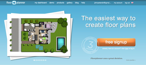
Floorplanner.com is what we’ve used to create just about every digital floor plan you’ve seen on our site (like this one), so we’ve got a soft spot for it. But when I gave it spin last week to render our new kitchen plans, here’s what I observed:
PROS:
- No software to download. It just loads in your browser.
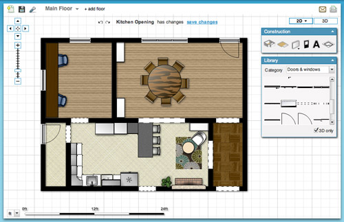
- Easy & fast to use. I find the interface very user-friendly, so if you’ve got your room measurements handy you can have a simple whole house plan done in a matter of minutes.
- Good finish options. They have a lot of standard finishes, like flooring, with adjustable colors so you can bring more life to your drawing.
- Nice library of furniture. Floorplanner comes stocked with dozens of furniture options (chairs, tables, rugs, plants, appliances, etc) to help decorate your spaces. You won’t find perfect matches to your real life items, but you can usually find something similar.
- 2D or 3D: It lets you easily toggle between a 2D and 3D view.
CONS:
- Only kinda free. You can create one plan for free, but after that you may have to fork over some dough.
- Limited kitchen designs. Kitchens are probably one of the toughest rooms to design, so Floorplanner is quick to fall short when it comes to trying to precisely layout a kitchen (I could only find one type of base cabinet, for example).
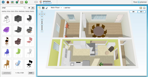
- So-so 3D rendering. I like the look of their 3D rendering, but it’s a bit clunky to navigate around and I had issues with things not showing properly (see below how my counter got wonky and my rug disappeared from the kitchen). Also, I found the only thing I could change in the 3D version were my wall colors, so I ended up working in 2D most of the time.
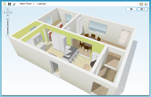
BEST USE: In my very humble inexpert opinion, Floorplanner is best if you’re short on time or technical skill and need to create a 2D floor plan (of one room or even your whole house). It’s also great for testing out furniture arrangements thanks to their library of stock furniture and the ease at which you can move things around in your virtual space.
On to the next one…
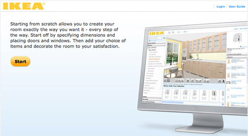
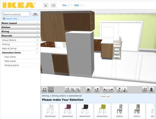
Ikea’s Kitchen Planner popped up on my radar when we were considering their cabinetry for our wall-to-wall office desk. Having had a good experience with that, it was actually the first place that I turned to when deciding to plan our kitchen’s new layout in 3D.
PROS:
- It’s free. There is some software to download, but once you do that you can access it anytime on their website using your free log-in.
- Allows multiple designs. I’ve saved three or four different files (aka different kitchen layout options) and so far I haven’t hit any “max projects limit” like I did on Floorplanner.
- Works with real life products. Ikea lets you design using real products from the catalog (and not just cabinets and counters, but chairs, tables, etc) so you know there’s some “reality” to your design when it comes to size/layout/planning. It even offers to print out a shopping list when you’re done. Convenient, but only if you’re getting everything at Ikea.
- Works with real life finishes too. Like above, you can pick from a range of cabinet sizes, front styles, drawer & shelf configurations, finishes, colors, hardware, etc to get a very customized look. Obviously it’s limited to Ikea’s real life finish options, but they’re pretty plentiful.
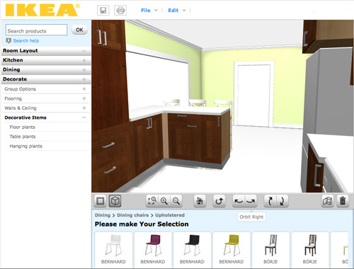
- A real-ish 3D rendering. Continuing the “real” theme, I thought Ikea’s 3D view was the most life-like of all of the three tools.
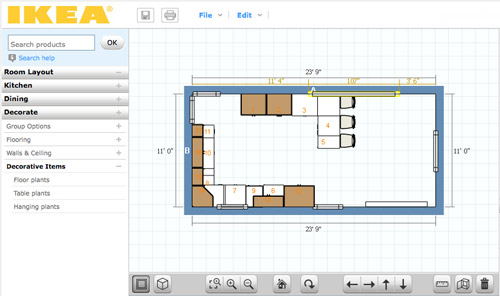
- 2D and 3D. Like Floorplanner, you can quickly toggle between these two views. However, Ikea’s version gives you equal editing capabilities in both options, so I found myself working mostly in 3D, which was nice.
CONS:
- It’s just kitchens. Unless I’m missing something, Ikea’s software only lets me create one room in my plan (which makes sense since it’s supposed to be just for planning your kitchen) but as someone who needed to see how things would look in the kitchen from the dining room (through a doorway) it fell short.
- It’s just Ikea. Since the cabinets and furnishings are only Ikea, you may have trouble finding pieces that suit you if Ikea-style isn’t your thing.
- Limited decorating options: I’d understand just being limited to Ikea furniture, but it’s also limited to only kitchen-appropriate Ikea items. So I wasn’t able to render a rug or an armchair to create a seating area near the fireplace. And why are “decorative items” limited to just plants? Can’t a brother get a fruit bowl?
BEST USE: Designing a kitchen (surprise!) especially if you plan to use Ikea products. But even if you don’t, a lot of their sizes are standard enough that you can get a good idea of what you might also be able to find elsewhere. Just don’t expect to “decorate” your virtual kitchen very much.

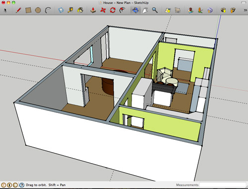
Google Sketch-Up is new to me as of a couple of weeks ago. I turned to it after being frustrated by Ikea thwarting my multi-room design (and after a bunch of you sang its praises). I’m still pretty new to it and feel like I haven’t unlocked all of what it can do (like apparently I can turn off the guides that you see in my screenshots below). Nevertheless, we’re becoming fast friends.
PROS:
- It’s free. Like lots of products in the Google-verse, it costs $0 to download.
- It’s offline. While some may see having to download software a “con,” I liked that I didn’t need to be connected to the Internet to use it or to access my files. You know, in case we have another Hurricane Irene.
- It’s precise. Google’s software feels much more “technical” than the other two, so I feel more confident that we can actually make cuts into our wall based on Sketch-Up measurements (with the help of a pro, permit, & architect of course).
- The possibilities seem endless. If you’ve got the time, skill, and patience it seems like you could render just about anything in Sketch-Up – rooms, furniture, buildings, cars, chihuahuas – so you won’t find yourself limited like the other two sites.
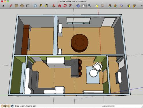
- Most functional 3D. Navigating through Google’s 3D rendering is the most intuitive and flexible, it seems. You can look above, below, through, and around every inch of your design quickly and easily. The rendering looks very much like a rendering, but that’s okay.
CONS:
- Talk about a learning curve. Being the most technical of the three, Sketch-Up has the steepest learning curve by far. I spent about 15 minutes watching Google’s tutorials before starting and still found myself struggling to hit my groove.
- No 2D: I find 3D hard to work in sometimes, so not being able to toggle to a simple 2D floor plan was something that I personally missed. The closest I’ve found in Sketch Up is the “Parallel Projection” camera viewed from the top.
- No built-in furniture library. Unlike the other two which have furniture options built into the software, with Google you have to download it separately from their warehouse (I didn’t know this until a few helpful commenters enlightened me on yesterday’s post, which is why every cabinet, fireplace, chair, and table was “drawn” by me for that sketch – which certainly didn’t help my rendering look any more lifelike). Oh well, live and learn.
- Somewhat inflexible. I found it difficult to make changes or tweaks along the way. If I wanted to shift my chair a bit, it took making sure all of the right edges and surfaces were selected (and none of the wrong ones) first. This took time and also gave me a lot of accidentally skewed walls and floors along the way. Did I mention I’m still learning? Update: just figured out how to group things/make components. So helpful.
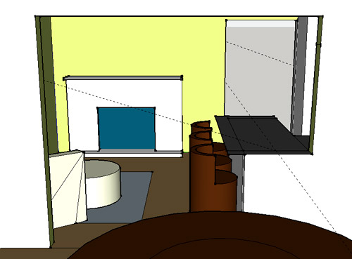
BEST USE: Anything 3D… as long as you’re willing to put in some time to learn it. It ended up being perfect for planning our doorway because I have the most flexibility to render the room AND I can trust the precision of the measurements. Now if only it didn’t take me so long to make changes…
So that’s how Sue John sees it. I haven’t spent more than a few hours with each program, so my comments aren’t based on weeks of research or anything. If you guys have had your own similar (or different!) experiences with these three tools (or others that I haven’t heard of yet) I’d love to hear your thoughts – and tips if you’ve got any.
Psst- We announced this week’s giveaway winner. Click here to see if it’s you.

Kerrie says
I am a little disappointed about no 3-D glasses. I have had the Harry Potter ones burrning a whole in my pocket – well drawer at home – since July waiting to be used again… However, this has been extremely helpful! Thanks so much for the insight. I can’t wait play around with these options myself.
Devon @ Green House, Good Life says
Yesterday I was on board with a cabinet, rather than a half wall, on the dining room side of the peninsula (probably not shelves that would get kicked by someone sitting on the side, but maybe a door or even drawers), but looking at the Ikea 3D view makes me think a half-wall would be better. Something about that view makes me worry that the opening will look like it was cut too big (or the cabinets were extended too far). Keeping the half wall a half wall will, I think, help the size of the opening vis a vis the position of the peninsula look intentional.
BTW, I do love how the opening-with-peninsula will join the kitchen and dining rooms. Seems like it will make family holidays like Thanksgiving feel cozier and let the cook feel more in the center of the action (instead of alone in the kitchen slaving away while everyone else has fun in the next room).
YoungHouseLove says
Yeah we keep going back and forth too! So hard to pin down! We’ll keep you guys posted when we get started and make firm plans!
xo,
s
Niki says
This is in reference to a comment I left on yesterday’s post. I had mentioned that sometimes the floors need to be beefed up for concrete counters…well…that’s b/c the counters I wanted (and therefore discussed with my husband and dad) were apx. 3 inches thick. I saw this on an episode of This Old House (my favorite show) and they had THICK/very heavy concrete counters. Something like that would need reinforcement on the floors–Probably not 1″ thick counters. Still might be worth it to discuss the weight before installing/making something.
YoungHouseLove says
Thanks for the tip!!
xo,
s
Carla says
Thank you for the reviews. My husband and I have been wanting to mock up a 3D version of our dream addition. I feel much better informed now.
Amanda Elliott says
I have tried the IKEA kitchen planner on my Mac several times and it always shuts down.I downloaded the planner made for the Mac, but I just can’t get it to work:( Did you have any problems with it? Of course, goes without saying- Love, Love, Love you guys!!!!
YoungHouseLove says
So sorry we didn’t have any!
xo,
s
Lauren L says
omg I LOVE the peninsula idea! It is such a better fit than the banquette. More sleek and fits right in. The banquette seemed awkward and big, but I was trusting y’alls decorating expertise and was just going to wait and see how it looked. Now that you’ve thought through it and shared with us your whole decision process, I’m glad to know that my feelings about the banquette were legitimate and I’m glad that you’ve found a solution to the kitchen!
Jessica Meidinger says
I use SketchUp at work all them time (as an interior designer) – and making things groups is the key. We also use the layers for walls, furniture, millwork, etc. so you can have multiple options in one model and turn layers off and on. We usually start with a floor plan imported from AutoCAD, but I wonder if you could import a plan from the floorplanner.com program. We do it that way and trace the floor plan to “pull up” the walls, since most of our projects start as plans. Good Luck, you will pick it up fast!
Stephanie says
Im an undergrad interior design student and we use SketchUp A LOT for our projects. Its seriously my best friend! You can actually make 2D floor plans and elevations if you go to Camera, change to Parallel Projections, and then go to Camera, Standard Views, and choose Top for a floor plan or any other direction for an elevation. Its still in 3D mode though, so make sure you dont orbit, just pan and zoom so it stays 2D if you’re trying to export the image or print it. :) you also have to print to scale if you want it a certain size. (sorry if this was already said) And like others said, being able to export back and forth form sketchup to CAD is amazing!
Stephanie says
I love that you compared all three! I’ve never heard of the other two but am a big SketchUp lover. I use it daily for work and it is far easier than other programs. I do love the pricey options but it sucks not being a student anymore and getting those things fo’ free. Anyway – if you want to play around with rendering plugins, Twilight has a free trial and is fairly easy to use. It’s great for getting actual finishes, reflections and for laying out your lighting plan – shadows, etc. Honestly, it is just fun to geek out and see what ‘realistic’ renderings you can do. Have fun! It looks great so far!
p.s. If you find a piece of furniture in the warehouse that isn’t exactly right (aka color) you can always explode the object and use the paint bucket tool to make it match your space. I do that all the time.
YoungHouseLove says
Great tips!
xo,
s
Katie says
“Can’t a brother get a fruit bowl?” Haha. Seriously made me laugh out loud…hilarious. By the way, LOVING the peninsula idea! Much better than the banquette :)
Kate (&Ben) says
Kudos to John on his Glee reference!!! Also, very helpful!
-K
Wom-mom Ethne says
Well, before you I’d never even heard of these floor-planning tools; Interesting.
Cal says
You leave me with so many inspirations everytime I check out your blog. This is amazing stuff here!
sara says
I love google sketchup, and spent a good hour watching tutorials. Using the warehouse may help with turning the furniture and stff too. (Although I just saw you found how to group them.)
erg says
in case it isn’t mentioned before now…you can add in components from the 3D warehouse inside the program (window>components>find the search box). toggle things on and off by putting them on layers (if you want to go between multiple options) and when you “render” (i.e. export jpg) turn off guidelines and axes! (view>guides/axes)
sketchup is awesome bc while it’s a steep learning curve, you can learn it all on your own. and the sketchup forum is really helpful for questions
Becca says
Hi! I love your blog! I read it every. single. day! And I just had to give a YAY GLEE!!! for the Sue Sylvester reference. So yay to finding out you are fellow Gleeks. I knew I liked you guys for a reason! :)
Becca says
Well, besides liking you for the obvious diy awesomeness reasons…. :)
Jen says
I just had a friend that angled her new kitchen island, every so slightly, and then rounded out the end of the island and put shelves on the end. (You would have to angle it slightly towards your fireplace) It opened her space up a bit more.
Erin says
I realize I am late to the party but I just want to say I like this new floor plan a lot.
Jessica says
I’m totally nerding out! I adore sketchup and have been using it academically and professionally for about 4 years.
My fun tip: Go to “Window” then “Styles” and then select from the drop down box. If you go to “edit” and “mix” you can create some of your own looks for renderings.
It’s not exactly a professional looking rendering, but it’s fun to play around with the different styles!
YoungHouseLove says
Fun!!!
xo,
s
Abby says
Hi! I love reading about all of your adventures. I’m a designer at a commercial architecture firm and I’m pretty familiar with Sketchup. I’m impressed you only had to watch a 15 minute tutorial! I will say if you want to get even more technical, you should check out REVIT. You have to pay for it, but I think you can get a free thirty day trial if you want to check it out.
YoungHouseLove says
Thanks for the recommendation! We’ll have to check it out.
-John
brianne says
Not trying to be snarky at all, but Revit is crazy complicated. I’ve been working as an architect for 5+ years, and it has taken everyone in our firm many weeks to get trained on it. I think its way too robust for most homeowners (I certainly wouldn’t use it for work at my house). Worth putzing around the trial, but when you say “its not free”, you’re talking 5k.
Melissa says
Gotta love those crazy “Sue’s Corner”s
Jen says
My fav kitchen planner is actually by a company here in Canada. Rona is like our version of Home Depot (although we have those too!), just smaller.
http://www.rona.ca/webapp/wcs/stores/servlet/rona/designer/kitchen.jsp?storeId=10001&jspStoreDir=rona&langId=-1
I just like the range of finishes and ‘extras’ you can add in, like clocks on the walls, and cookbooks on shelves, etc.
I should try the IKEA planner again. I found it kept getting wonky and crashing when I tried in the past.
Kristin says
http://thirdstory-ies.blogspot.com/2011/03/feels-rather-appropriate.html
Above link to some possibilities for getting a more realistic look. Groups and layer are your friends. When you get mor into it you can really have fun with the components, and even add a material swatch to something like a curtain. The living room above has a Duralee fabric that I imported.
Have fun. Sketchup’s addicting!
YoungHouseLove says
Gorgeous!
xo,
s
brianne says
Another quick FYI is that there are plugin programs to sketchup that can help you do more photorealistic renderings if you’re interested in that. One that we use at our architecture firm is called SU plugin. Not free but also not crazy expensive. There are totally ways to combat most of your “cons” including making components (you just double click on a group of objects – just make sure to make each one “unique” unless you want changes to be made to all like components through the model). Anyway, getting windy, but yes, there’s a ton to do with it.
brianne says
shoot, I meant to say “SU Podium”
YoungHouseLove says
Thanks so much for all the info guys! So interesting.
xo,
s
Danielle says
Hi John,
Thanks so much for this post! I was actually using Mark on Call for iPad to make the 2d floorplans. So easy, practically no learning curve and only 5/6$ but ultimately limited, I really wanted that 3d. I will be trying all the suggestions as we are getting the keys to our new house today, yeeh!
On another note, I’ve been reading your blog for a month or so now and really love it. I’m from the Netherlands, so you defenitely have some interest from far away. The only downside is, I have to wait until 23:00 to read both your posts of the day as it is about 7/8 later here. So no reading at work for me :(
Keep up the good work! Kind regards,
Danielle
Danielle says
Oh it’s more like six hours but still ;)
YoungHouseLove says
Haha, glad to have you either way!
xo,
s
Cate says
I can’t really comment on the other two programs, but Google Sketch works well for me. (I was the person who sent you that Google Sketch file of a house a week or so ago.)
It does take time to get into using well.. I’ve been using it on and off for 4 or so years…. and there’s a lot I haven’t mastered yet. But you get better at creating furniture and the like…
Jenn says
Not sure if this was mentioned or not (too many comments to read through) but…if you end up using a solid surface countertop in the kitchen and for the peninsula, it might be nice to return the countertop down to the floor. This would cover that knee wall and give it a modern feel.
Love your site! Good luck with it.
YoungHouseLove says
Oh that’s another idea I never thought of! So much fun to have so many things in the mix!
xo,
s
Carol says
I know it’s a little late to respond to this post, but I apparently have an original question this time (although I’m probably way off base!) My daughter was home from school when I was reading yesterday and laughed out loud at “Can’t a brother get a fruit bowl?” She rolled her eyes at me (just wait ’til Clara is 15) just knowing that whatever I was reading couldn’t possibly be that funny…until I told her, that is. I was trying to figure out why that line sounded familiar and she realized it sounded like the line “…and can I get a hot tub?” from the State Farm commercial. The actor who delivers that line is one of my sons’ good friends. So we need to know, are we way off base or were you consciously or sub-consciously referencing that line (or have absolutely no idea what we’re talking about??!!) She knew what I was talking about when I told her I read it on YHL because last weekend I was driving her and my husband nuts talking about your great blog when we were in RICHMOND for parents’ weekend (one of my sons just started college there.) Anyway, I’ve been reading the blog for about a year and absolutely lovvee it!! I used to be much more of a DIY’er out of necessity, but since I’ve aged, (waaaay more than your average reader, apparently…I didn’t respond to the poll since I don’t even have a facebook!) I attempt far fewer fun projects. Your inspiration has been terrific and even appears to be sparking some quality bonding time with my daughter…she is super creative and likes hearing some of your fun ideas. We’ll try to share if we successfully complete a project!
YoungHouseLove says
Haha, that’s too funny! John has been saying “can’t a brother get a ______” since the dawn of time (ok, probably college), so it’s just one of his catchphrases – but we definitely know that commercial. Too funny that you know that guy!
xo,
s
Kim says
I like the Ikea one, but I have Ikea Home Planner which lets you do any room, as well as the Kitchen Planner. Not sure if it’s only available to Australia (and it was a while ago that I downloaded it so maybe it’s not even available here any more). It has a heap more furniture (but not the full range) and is definitely more useable than the kitchen only version.
I love the new island idea – good luck with it all.
Katie says
We used google sketch-up to start our 3-D models in college before putting them into a rendering program! You can do some really intricate stuff with it but it is definitely frustrating at times! Also – putting your items into components and groups will make your file size smaller, which also makes it easier to move around in your model :)
YoungHouseLove says
Thanks Katie!
xo,
s
Nakisha says
Have you tried Autodesk Homestyler?
http://www.homestyler.com/
I love technology, but you are so right about the learning curve for rendering software.Yikes!
YoungHouseLove says
Thanks for the recommendation! We can’t wait to try it!
xo,
s
HeatherM says
Will you guys be putting one row of base cabinets under your peninsula, or two rows (aka cabinets that are back-to-back)? We did the latter, for increased storage but it also depends on how big you want to make the top of your peninsula.
Also, what are you going to do for flooring on the spot where your wall currently is? Will you be matching your existing flooring or putting in entirely new flooring. We currently have matching linoleum, but it looks pretty ugly, but we aren’t ready to tackle the entire floor just yet.
My MIL always calls these projects “if you give a mouse a cookie”. :)
YoungHouseLove says
We’re not completely sure yet. It’ll probably come down to budget and measurement constraints. As for the floor we’ll probably need to add a wood transition (but we’re going to try to stain it to match the oak in the dining room). And I love the “if you give a mouse a cookie” expression.
xo,
s
Amanda says
We just bought our first house and I was playing with our kitchen redesign in IKEA’s planner. I got really frustrated with the odd sizing of our kitchen and how their cabinets didn’t fit right. I found that Ferguson Showroom has a planner very similar to IKEA’s, but it moves a little better in 3D and they have a much larger selection of cabinets because they have a more semi-custom selection. I have found that it has many of the same cons as IKEA otherwise, like being only one room. But I thought it might be helpful.
YoungHouseLove says
Thanks for the tip!
xo
s
Karmen says
Have you ever looked into Shaderlight? It’s a photo-realistic rendering extension for SketchUp.
Just a thought!
YoungHouseLove says
Thanks for the rec!
xo,
s
Alex says
Google SketchUp and 2D views: Have you checked out the section plane tool? That might do what you’re looking for. You can cut a section, right click on it and choose “align view”. If you have questions, feel free to email me!
Heres a good video:
http://www.youtube.com/watch?v=aPW6EKMwmjA
And the Google help center article:
http://sketchup.google.com/support/bin/answer.py?answer=94995
YoungHouseLove says
Thanks so much!
xo,
s
Ashley says
I must say, my favorite line from this post was “Can’t a brother get a fruit bowl?” That literally made me laugh out loud! Hahaha!
Cristiana says
You guys should try The Sims for floor design plans! It’s amazing, really!
YoungHouseLove says
Now THAT would be fun!
xo,
s
Leanna says
SO glad to see the SketchUp on here! The best tip I have is that you could give any Architecture student (myself included, if I lived in your area) $20 or a home-cooked meal in exchange for an in-person lesson. Most of us actually could make a 3D model of Burger in SketchUp.
For more realistic models you can import pictures onto your models! Ex: draw the fireplace wall to scale, then import a picture of it as straight-on as you can find and place it on the wall. Then you can just draw a box around the fireplace or fridge and “push-pull” it out into the room. You should also definitely get the “follow-me” tool plugin, it’s my favorite.
A little technical note: what you’re doing in SketchUp isn’t actually “rendering” — you’re making models. A rendering converts a model into a more photo-realistic 2D image, and if you’re interested in this eventually I would definitely recommend Kerkythea.
YoungHouseLove says
Love it!! Thanks!
xo,
s
Meg says
I love everything you guys do… and I know you guys were talking about putting a bookshelf behind the chair.. which I love that idea… but my Uncle did this really cool thing in his living room which I think looked gorgeous.. and could “possibly” work for your kitchen…. the back wall in your kitchen.. the opening to your hallway.. would if you put post, and beams. This may be hard to explain, but here we go. He put large beams two flanking the entry way, and then had from where the physical wall is, he tore that down, and created open shelving about waist high, with two more beams on the other side, so where the corners of the wall meet. Does that make sense?? I noticed that the corner (where the chair would be kitty corner… or caddy corner) has a doorway that opens up into the hallway, so that would be tricky… or just continue the post and beam concept around the corner, to the new opening that you guys are planning on putting in anyway. He had about three shelves that stopped about waist high, and they were open, so he stacked books, and had decorative bowls + baskets, potential for some ceramic animal placement…. it really opens up a space, and they were nice big hefty beams that he painted white.. it just really framed out a nice opening, while still giving structure to a space.
I just imagine that it would really open up your kitchen.. let in more light.. really show off that hallway wall that you guys have worked so hard on, that I absolutely adore.
Anyway.. just a thought. I love what you guys are doing. I can not WAIT to see the kitchen finished.. I really think you guys are amazing.
YoungHouseLove says
That’s a really fun idea- sounds so open and pretty! We’ll definitely have to see where we end up with our budget and all that- but it really could be a fun little bonus. Maybe something we take on down the line if we can’t afford it now…
xo,
s
JEN C says
Yep, I’m commenting on a post that’s months old. I just wanted to say thanks for this post. We were trying to come up with a design for our patio, but I wanted to make a 3D model so I could make sure the furniture would fit. It suddenly dawned on me that YHL did a post about 3D design programs a while back, so I dug this up. There is a blog post on Google SketchUp that makes it sound like they are selling it to someone else, so I decided to try Floor Planner. I love it! Thanks so much!
YoungHouseLove says
Aw, so glad! Good luck with everything!
xo,
s
Ashly Coggins says
After reading your post a while back I started using Sketch up- but John was right, huge learning curve (and I work in 3D everyday at work!). I’m a perfectionist so I didn’t end up ever finishing my layout in sketch up because I wanted everything to be perfect and it was hard to tweak. But we recently bought a new house and I was looking for something to figure out a floor plan for our living room. I ran across a website called homestyler.com. It’s super quick to pick up- probably similar to John’s description of floorplanner. I figured out my layout in like five minutes! Now I can’t wait to design the rest of the house. It’s easy to switch things around and center objects in relation to others. And you could toggle back and forth between 3d and 2d easily. As always, LOVE the blog…and dying for the book!
YoungHouseLove says
Thanks for the tip!!
xo
s
Jenn says
Hey John! I use this program everyday- so if you ever have any issues or questions i’d love to help. A few quick tips, If you want the output image to look less…strict? And have more of an artistic flare, hit up the ‘styles’ tab and go to town. Also, you can put your components on ‘layers’ and turn these on and off to look at different senarios fast.
Hope that helps!
cheers!
Jenn
YoungHouseLove says
Thanks Jenn!
-John
Gino says
Have you tried Sweet Home 3D. You have to download it, so it takes hard drive space, and sometimes the Java interface gets weird; but it’s free, easy to use and the 3D renders are pretty decent.
YoungHouseLove says
Thanks for the tip!
xo
s
Jared says
Hi I was wondering if anyone used floorplanner to create plans for a whole structure? I am building a detached garage and want to draw out my plans in some online CAD program and am wondering if anyone has done this before. Floorplanner is great for the floor plan but it doesn’t do front side and rear elevations.