Alternate title: Breaking Out John’s Painting Belt
It was like old times. For those who don’t get the painting belt reference, check this out for further explanation. Anyway, as we mentioned yesterday, we painted Clara’s nursery. And instead of cloning the exact space that she enjoyed in our old house, we took the move as an opportunity to switch up the wall color. We figure since we’re working with the same furniture and even the same light fixture and curtains (since I was too sentimental to leave them behind) we thought a new wall color would make things feel a little fresher- like the room is subtly evolving over time as opposed to being totally reinvented (since many of the major pieces are staying the same) or a carbon copy of the last room (just because we’ve been there and done that).
When we were chatting about what colors we could do, we debated a few options: some shade of blue (but we thought it would be too much with the blue bedding, changing pad cover, capiz chandelier, and the blue in the curtain fabric), some shade of green (too similar to the past version), some shade of yellow (not present in the curtains or any other items already in the room so probably too random), some neutral color (too safe for a kids room, we wanted to have some fun), some shade of pink (hmm, but is that super girly? we’re scared). And guess what we went with?!

Since there were soft tones of pink in the curtains as well as in our DIY mobiles (that we have yet to hang) we thought it would fit in nicely – as long as we kept things on the subtle side so it didn’t get too bright and overwhelming. But we didn’t just want a soft ballet pink (or a baby pink like the swatch in the photo above). We wanted something with gray/lavender undertones. It’s hard to explain, so we’ll let the swatch cards do the talking:
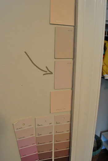
See how the one with the arrow towards it seems grayer and more lavender than the others? We thought it had a nice muddy sophistication and hoped that it wouldn’t look too pastel-ish and girly, since we’ve always loved that Clara’s room is full of greens and blues and other non-gender specific colors. Not to say that the room isn’t clearly a girl’s room now, but we just wanted the color to have a bit more dimension than just a soft pink. Plus you might remember this whole-house-color-scheme post, where the second swatch on the top row was a little bit pink, a little bit gray, and a little bit lavender. That was what we were going for.
And in person it really does look dimensional and full of subtle gray and lavender undertones! The color is from Benjamin Moore’s Affinity line and it’s called Proposal (sweet, right?) but you know we’re too cheap to get BM paint for the most part, so we had it color matched to Olympic’s No-VOC paint at Lowe’s (which now not only has no-VOCs in the base paint, it also has no-VOCs in the colorants that they add, so it’s perfect for a nursery). Thankfully, we love how it turned out. It’s a hard color to capture in photos though (the subtleties and varied undertones aren’t always super apparent) but we did our best. Here’s the room before:
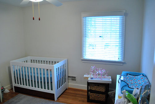
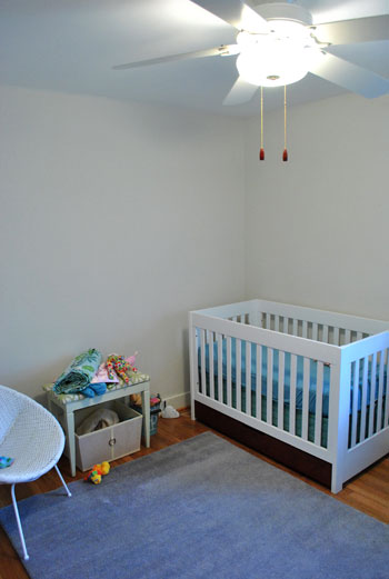
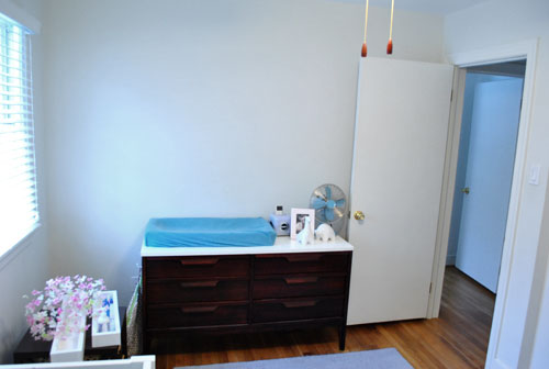
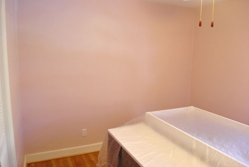
Here’s the room during painting (just so you can see our process, we pushed the big pieces into the center of the room and tossed a plastic tarp over them):
And here’s the room now:
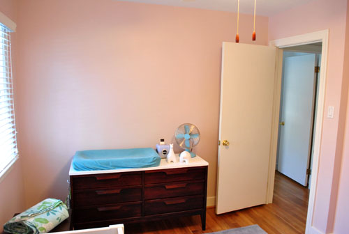
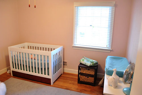
Of course it’ll look a lot more finished (and less pink-washed) when we hang the art, shelves, curtains, mobiles, etc. And when we switch out the ceiling fan for the blue capiz chandelier it’ll hopefully feel nice and complete for the beanette. And now for an obligatory look-how-cute-my-kid-is photo of Clara sleeping on her daddy. Is there anything sweeter?

But back to her freshly painted nursery. Her room was always the priority for us because we’d like her to feel settled and we want her room to always be a place where we can escape the chaos of the rest of the house (especially since most of it will be “in-progress” for a loooong time). So stay tuned for pics when we get our act together and hang everything up in there for a more finished look. Until then you can find us staring at about thirty swatches on the wall in the living room…

claire says
i love the soft color. it definitely will make for a great escape. and it’s absolutely adorable that the color is actually named baby pink :)
inspiringpretty.blogspot.com
Rachael @ Mrs. Adventure says
I love, love, love the pink!
Corie says
Yay! One room down!!! And I love the color, every girl should have a pink room! :)
Liz says
Her little pink cheeks match the walls. Too cute!
Oona says
The color is gorgeous! Good choice. It looks amazing with the white trim and wood floor.
Coutney says
Way to go! I am not a fan of all that pink girly stuff, but you hit the nail on the head with the grey/purple undertones. We also used Olympic paint in our bedroom…Ash Mist. It is very subtle and we were worried that maybe it wasn’t enough color, but we went with it in an effort to make everything “lighter” in this new home and hey, it looks great! We love it.
Yay for no vocs!
Kayakgirl73 says
Looking forward to seeing it done. I like how your showing that the same furniture and acessories can evolve to fit growing kids and different homes.
Rachel says
So precious!! And yes that Olympic no-VOC paint is pretty great.
Amy says
*Sigh* That last photo. Is there anything sweeter? My son just turned 1 and doesn’t sleep on either of us much now (unless he’s sick). I miss it.
Ashley S says
I like that you chose something not too girly. My husband and I have tried to avoid the “baby blue” in the same way for our son’s room. Do you think you would ever go for something less subtle, or are you planning to keep things toned down in Clara’s room? My husband and I wanted something fun and exciting for our nursery and guest room (as well as gender neutral, in case our next child is a girl). We went with Behr’s “Pepper Grass” for his room and “Bird of Paradise” for the guest room. I love how bright and cheery the colors are during the daytime, but somehow warm and inviting at night.
YoungHouseLove says
Hey Ashley,
We definitely would be open to something less subtle down the road (we’re pretty sure when Clara’s old enough to pick her own paint colors they might just blow us away- but we want her to have that “artistic freedom” to do something crazy if she wants to). Your colors sound gorgeous since they’re bold but not too dark at night- that’s totally the jackpot.
xo,
s
Cait @ Hernando House says
Very cute! Can’t wait to see it with the curtains and everything!
Rebecca @ the lil house that could says
I love that you completely changed the wall color this time around! I was secretly expecting a blue or green when you mentioned it yesterday. It’s almost a neutral pink (who knew there was such a thing!), so it can definitely grow with her with a little change of accessories!
candace @ thecandace.com says
WOW, you two got to work fast! The pink is fun – can’t wait to see it all pulled together!
Julie says
I love it! It looks so much warmer than the white!
Shannon says
Love it! It’s soft and sweet…and a little girly too! I love it!
Cassie says
Beautiful choice! Clara’s nursery looks at though it feels sweet and serene already. I have to say, I like it more that the last color scheme. Maybe a soft yellow on the ceiling?
Good luck with the living room!
Emily @ Merrypad says
Precious. Nice choice!
kelly says
Love it! It’s going to look so cute with the blues and greens! :)
Lisa says
Absolutely gorgeous (the room and the beanette). Good work! How is the unpacking coming? I’d love to see how things look 1 week after the initial “house full of boxes” photo post.
YoungHouseLove says
Hey Lisa,
We’re still getting things organized but we’re definitely planning a photo tour of the whole house as it looks these days. Stay tuned…
xo,
s
Ami @ beyondpeasandcarrots says
very sweet! Can’t wait to see it all pulled together… I bet it will look great with her homemade mobile!!
PS I love Clara’s pjs in that pic! Adorable.
r8chel says
Very nice! I tend to avoid pink, but Clara’s room looks so soft, sweet, and lovely. And as always, I’m impressed with how much warmer and cozier the room looks now that the walls aren’t a stark white.
Lesley says
love the color! the pic of Clara and John is just presh!! Congrats guys!
Lyndsay M says
I’m not usually a lover of pinks, but this is a beautiful color! Where did you get those larger paint samples that are in the top part of your doorway? I seem to always only be able to find the little ones you have below.
YoungHouseLove says
It just depends on the brand when it comes to swatch size- the bigger ones are Benjamin Moore swatches from the Affinity line and the Ralph Lauren line (while the ones with multiple squares per strip are also Benjamin Moore, but from the regular line). Hope it helps!
xo,
s
Melissa says
Looks great! Are you also planning to paint the ceiling this time?
YoungHouseLove says
We actually were going to paint the ceiling the same subtle color but on the ceiling it looked super dark (different planes can make paint a lot darker or lighter) so we opted not to. Perhaps in the future we’ll get a much lighter shade for the ceiling so it doesn’t look too dark. We also want to add crown molding down the line…
xo,
s
Michelle says
Cute room!
We recently used Olympic’s no-VOC paint and it seemed really “thin”, compared to the Sherwin Williams paints we have used in the past. It did cover in 2 coats but we definitely needed the second. Have you guys noticed this or did we just get a bad can? (We stirred it well, etc)
YoungHouseLove says
Hey Michelle,
Our old plaster walls always need two coats so we didn’t find it to be notably worse or better than the norm. Hope it helps!
xo,
s
Vicki says
I LOVE the color! It’s perfectly sweet. I am just always amazed (and a little freaked out) about how much more saturated colors look on the wall vs. on a swatch. It has caused us to repaint a LOT in our new house.
Reenie says
Oh my that pic…..too sweet. Love the color ~ can’t wait to see it all put together. :)
Sophie says
I can’t believe I guessed right yesterday! It looks super adorable, guys!
Sassy Mommy says
Love it! I understand your need to paint and move into things quickly. When we moved into our house we were so excited we unpacked all night. Then a month later when we found out I was preggers we started painting (me with mask of course) so everyone could feel settled- especially little man. Great job!
Laura says
I guessed the color was from Glidden due to the size and shape of the paint chip, but I was wrong.
Love the new color choice!
Can’t wait to see what colors you choose for the rest of the house.
suzanne says
I love the pink more than the green in her last nursery!!! I think your new home is off to a great start!! :)
Jennifer says
I was selfishly hoping you’d do anything BUT pink. We are planning a nersery now, but it’s staying gender-neutral, so pink probably wouldn’t be a good choice for us. Looks like we’ll stick with green!
I will be excited to see what it looks like all set up.
Lauren says
I love the pink! It’s definitely more girly, but not over the top. I know you said you don’t want to completely copy her old room, but are you going to recreate the asymmetrical art collage? I loved that in your old house!
YoungHouseLove says
Hey Lauren,
Oh yeah! We love that too much to pass it up!
xo,
s
Lindsey says
Very nice!! Can’t wait to see it again once you have the curtains hung!
Angi says
I think the pink is great with the blue accents. Great shade of pink…and I’m not a pink fan :)
Amanda says
It looks great … though I did like the greens/blues in the last nursery! But I love the grayish in the pink. And I can’t wait to see it with the curtains :)
Katrina says
Do I spy some cute “non-piggy” piggy banks on Clara’s dresser? Can you share where you found those? I love them!
YoungHouseLove says
Hey Katrina,
Those little ceramic animal beauties were gifts from my cousin (from Pottery Barn about 8 months back). Hope it helps!
xo,
s
Kristina says
That’s a brilliant shade of pink! I wanted to paint my little girl’s room a very subtle pink but I was vetoed by my husband. Sigh. We went with an avocado green. Which meant I was able to accent with much bolder shades of pink. So who won in the end?
Chelsea says
That is the best picture at the end :)
Rabbit says
LOVE that color! Very feminine, but not too girly…if that makes sense. More STRONG woman vs. girly girl.
Anywhoo, which direction do the windows in Clara’s room face? I’m doing a teeny little room over for crafty stuff, and want to have fun with color, but not have it be too crazy. I might check this out–but the room I have has one window, which faces north, and we all know northern light is cold. Thanks in advance!
YoungHouseLove says
Hey Rabbit,
Her room is north facing. Hope it helps!
xo,
s
brandt @ New House on the Blog says
Notice John grew his stubble out to offset the fact that he’s painting a pink room…a man’s man through and through!
Great job guys. I really do like the pink, especially for a little girl’s room. We’ve actually been through 3 different houses that have pink rooms, and they always go either way too bold, or way too light. Looks like you found a nice combination.
Amy says
quick question do you guys still have plaster walls then from your previous comment or were you talking about the old house’s walls?
YoungHouseLove says
Hey Amy,
Both houses have plaster walls (50’s/60’s ranches usually do, so we expected it). We’re actually used to them by now so it’s not a big deal.
xo,
s
Micha says
Hats off for daring to use pink as a wall color :o) It looks great but being a tomboy kind of gal myself and surrounded by men only (except for our menagery)I must admit I’m still madly in love with Clara’s old nursery color scheme. I know, shame on me :o)
Teisha says
Beautiful color!
Laura says
I love pink rooms! I am looking forward to seeing this room completely done because I love pink walls but I find it really difficult to do pink without it looking too cotton candy. I may copy your colour when I get around to stripping all the wallpaper in my daughter’s room!
Amanda says
Sorry to comment again.
I noticed you took down your “post card” shelves in the old office/everything-else-it-was, and was wondering if you were planning on using them again in this house?
YoungHouseLove says
Hey Amanda,
We’d love to use them again- just have to find the perfect place!
xo,
s
JenWoodhouse.com says
Love the subtlety! Not too girly! Yay! And pink and grey look so sweet together!
Clare says
The room looks great! And will look even better once all of the stuff that makes it “hers” is there!
And of course – she is precious!!
Amy says
I love a good project and since our home is finished and we’re not moving anytime soon I’ll have to live vicariously through you two! Great job on Clara’s room so far. We chose a blue-ish gray for our daughter’s room but we did a lot of pink in the accessories. Keep up the great work!
S says
I had no idea you could color-match BM paints to no-VOC options. That’s great to know! Also, I love the color…I bet the tones vary depending on the time of day.