As of 5:30pm yesterday, our second big Homearama Showhouse deadline was hit. Phew. The builder was throwing a preview party at the house so everything had to be done, cleaned, and ready to be shown off to a whole slew of people (realtors, prospective buyers, generous local companies who donated furnishings/accessories to this cause, etc). Heck, the weather even cooperated in the final seconds and gave us this nice photo op.
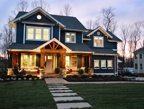
It was kinda weird yet exciting to have the place alive with people, music, and food. They brought in caterers to show off the kitchen/appliances, and Sherry and I pretty much gorged since we had been running around in hyper-drive all day. There were literally picture frames and window treatments being hung in the last few minutes, so it was one of those down-to-the-wire moments.

We were also able to begin snapping some “after” photos in a couple of the rooms (we figured they’d never look cleaner). And since we’re hopelessly impatient, here we sit at 11pm, sizing and uploading pictures so that we can share them with you right away. I blame all the cookies I downed at the party.
So here’s what we had time to photograph before the crowd rolled in: the study, the butler’s pantry, and the main bedroom. Get ready for lots of photos and lots of source links.
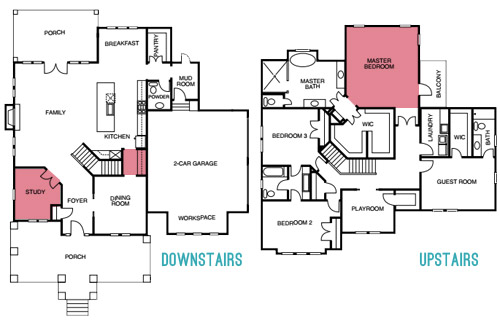
You’ve seen the office in various forms already, including this mood board, but here she is in her final state:
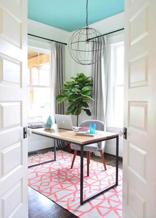
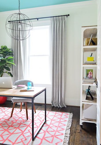
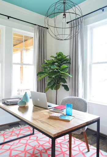
Here’s a shot with the double-doors pushed fully out of view. The rug and chair were donated by West Elm, the table is from a local furniture purveryor called Green Front Furniture (I think the manufacturer is called Barkman, but I don’t have a link), the light is from our Shades of Light collection, and the curtains were made by U-Fab, in this fabric (the curtain rods are from Lowe’s). The walls are Simply White and the ceiling is Skydive (both by Benjamin Moore).
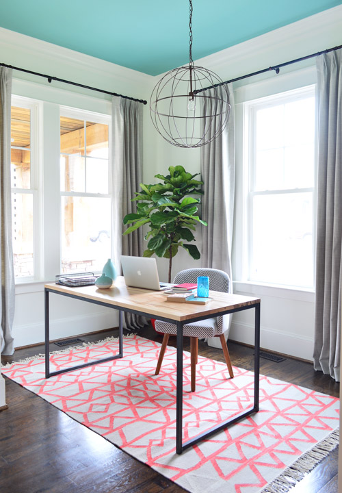
As we mentioned a while back, we wanted to stage a more feminine office than what we’re used to seeing in other showhouses (they usually feel sort of study-ish and masculine). So Sherry had a blast planning a little spot she’d love to call her own.
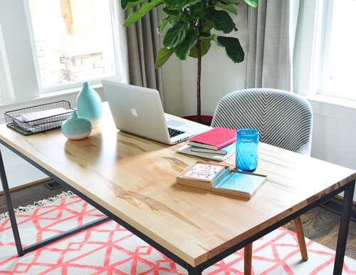
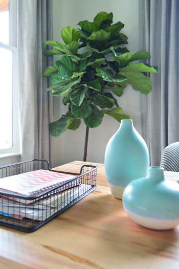
The metal tray and vases are from Target, and the big fiddle leaf fig is from a local nursery.
Tucked along the inside wall is a bit of open storage to help keep this fictional work-at-home mom organized. It’s this whitewashed wood & metal shelf from West Elm.
A theme with all of the shelves in this house is that they’re a little bit more bare than we’d probably keep them in our own home (read: we have more clutter), but for budget, time, and practicality reasons we went a bit lighter for the showhouse (two weeks to outfit nearly 25 spaces = mad dashes like whoa). So even if it’s not completely realistic, we tried to add a few office-y details (binders, boxes for file storage, a few frames, containers full of paperclips and rubber bands, etc) while keeping things from getting too busy.
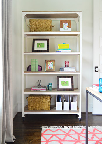
The shelves are mostly stocked with items from HomeGoods or Target, plus some magazines and books that we brought from home.
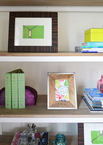
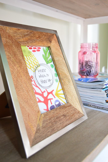
At a local craft fair this weekend we picked up some more of these motivational “wisdom cards” that we have scattered around our own house. This one says “know when to show up.”
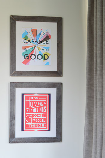
Speaking of motivational art, once the curtains were hung and that metal shelf came into the room we had less wall space to hang the two larger prints from Help Ink that we originally planned to put in here (we ordered large 24″ x 36″ prints) but they kindly sent along some smaller extras for us, which we were able to frame at the last second (literally minutes before we snapped these photos yesterday).
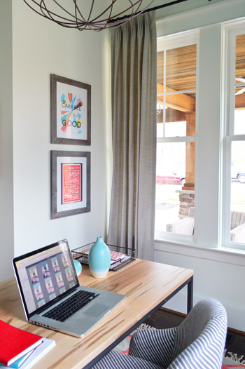
So yeah, the fictional gal who works in this study has pretty much zero excuse not to be motivated.
We were going to have the electrician add a floor outlet (for plugging in desk items, like the computer charger) based on our final furniture placement. But instead he’ll probably just do it for the eventual owner so it can be customized to their furniture layout, and not ours. Especially since a real laptop won’t be hanging out on that table for the show (we have a stack of notebooks that’ll be in its place most of the time).
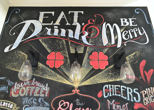
Now let’s slip through the butler’s pantry (i.e. the small hallway between the kitchen and dining room) which is nearly impossible to shoot since it’s so small, but is such a fun accent in person (it garnered a lot of attention during last night’s event, which was really fun to witness firsthand). We pictured it serving as a fun spot for a family to write out meals for the week, jot notes to each other, or even scribble up a drink menu for a party if they want to use the small space as a makeshift bar – but we wanted to set it up as a fun little coffee/wine station with a bolder look for the show.
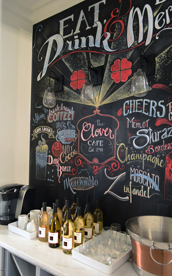
So we called up a local restaurant called Urban Farmhouse who is known for their chalkboard menus and signs (heck, we even Instagrammed one last summer). A few days later Li was there creating this masterpiece for us, all of which she hand lettered (any locals who want to hire her for signs and chalkboard art can email her at [email protected]).
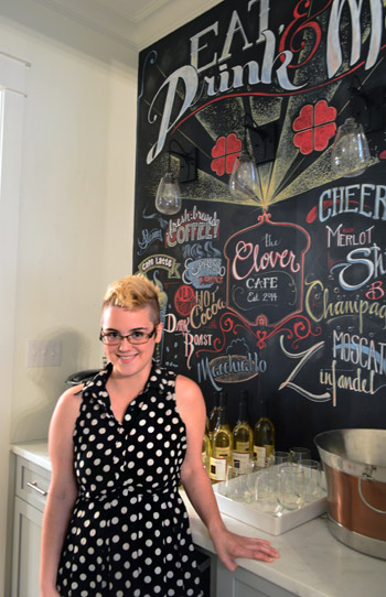
As Sherry mentioned yesterday, it’s all done in chalk marker (so it’s not dusty and can’t be smudged) but it can be erased with a magic eraser (or just painted over if the eventual owners don’t want it). But for the purposes of the show, it’s a fun surprise to cap off our little coffee/wine set-up in there. And it was awesome to see how many people were taking their photos in front of it for the party.
Let’s switch gears and check out the main bedroom.
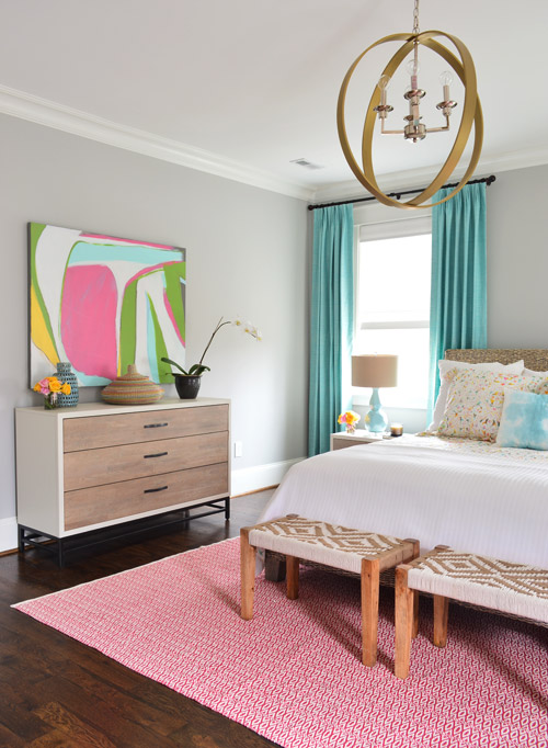
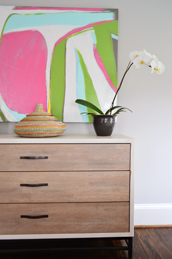
The funny thing about sharing the office and the bedroom in one post is that they both have a similar palette. The office’s jumping off point was the rug Sherry found along with that awesome Help Ink art, and in here we were inspired by that awesome painting that was donated for the duration of the show by Lesli Devito (all of her art is for sale by the way, and she’ll ship it anywhere in the US).
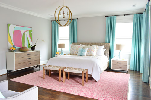
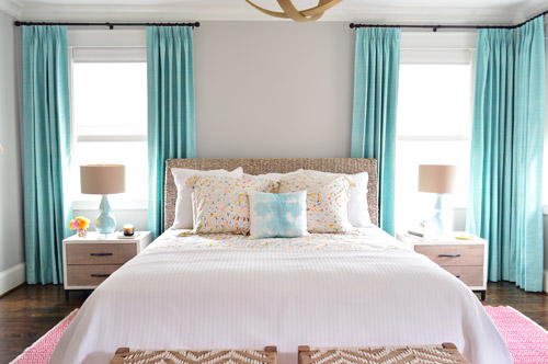
The king bed is a woven banana leaf frame from Green Front Furniture, which is also where the wood nightstands hail from, along with the dresser made by Universal. The curtains are the same fabric as the office ones, just in aqua (also made by U-Fab) and the walls are Stonington Gray by Benjmain Moore.
We haven’t found the perfect thing for over the bed, so that’s why it’s bare (we figure bare is better than hanging something we don’t like up there) but the camera was set on a low tripod, so when you walk through at eye height the light fixture hangs down into that spot and fills things in a little more, which is nice. Still wouldn’t mind finding something for that wall before the show though…
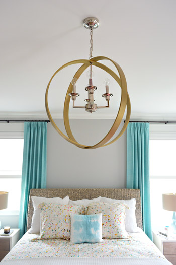
As you know, we’ve also experimented with mixing in some gold and brass accents throughout this house (we have two gold fixtures in the kitchen over the island, one in front of the fireplace in the living room, one in the hallway above the stairs, another one in here, and a few more peppered throughout). We didn’t want to use gold/brass exclusively (we fell for a few other silver and oil-rubbed-bronze lights – and even a few colorful/painted ones), so we just mixed in enough of each type to feel intentional, so no light fixture is the odd man out.
In cases like this one over the bed, it’s awesome that it’s paired with chrome, so the fixtures in the nearby bathroom (which are all chrome) feel related. This wood ring chandelier was donated by Shades of Light.
The rug is this Fair Isle 9×12′ donated by Dash & Albert and the bedside lamps are HomeGoods scores.
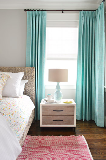
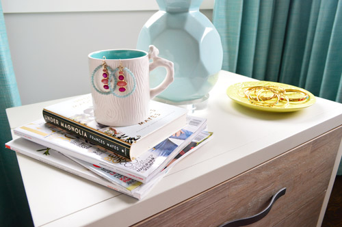
We kept the night tables simple, kinda like the cleaner version of what ours usually look like. Sherry picked up some inexpensive jewelry from World Market along with a simple mug and a plate (also from there) to casually hold the things that our imaginary lady takes off before bed.
As we mentioned yesterday, the bedding’s from Pine Cone Hill and we love how it relates to Lesli’s art.
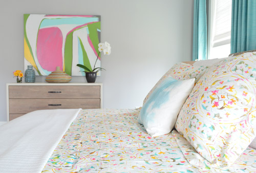
Our first instinct was to put more lamps on the dresser, but that made the room feel kinda lamp heavy (with two on the side tables already), so we went for plants and baskets.
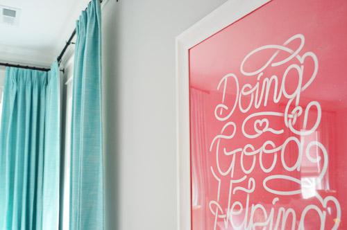
Two woven benches (clearanced down to $33 from Target) sit at the foot of the bed to round out the texture-heavy space (we love how they tie into the woven headboard). And you can see where one of our original Help Ink prints that we got for the office ended up since the color worked nicely in here. Oh the benefits of carrying a color scheme through more than one room…
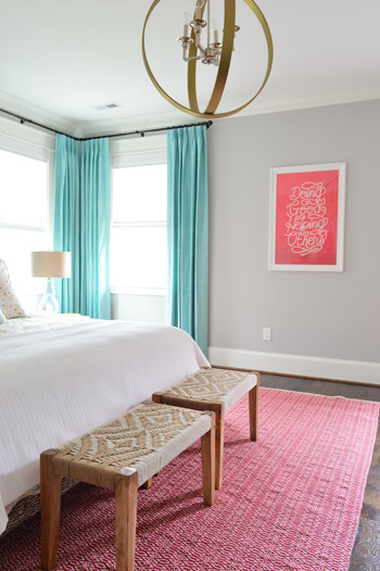
If we had the foresight, we probably would’ve ordered a version mounted on wood to tie into the wood furniture, but for now the simple white frame from JoAnn Fabrics does the job. There are definitely a ton of things we learned/would have done differently throughout this process, so we’re thinking about writing a post like that for you guys when this whole show is said and done. There’s a giant learning curve, so trial and error has really been our method along the way.
Across from the bed is where the feminine elements of the room get balanced out a bit, thanks to some gray nailhead chairs with blue pillows (all HomeGoods finds) and some gritty framed photography. The side table is from Target and the gold planter is from HomeGoods. In the background you can see a bit of the “atrium” as we’re calling it (with a Shades of Light driftwood fixture and West Elm brass-framed mirror).
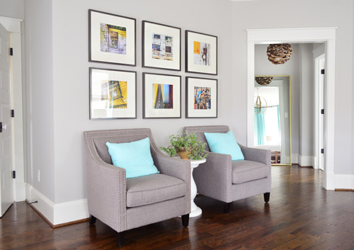
A local shop called Modern Artifacts was kind enough to lend us some artwork for the show, so at the last minute (i.e. yesterday afternoon) we picked up some of these yellow-hued urban photographs by Bill Dickinson. They relate to some of the yellow in Lesli’s artwork and hey, you get a little peek into the bathroom there.
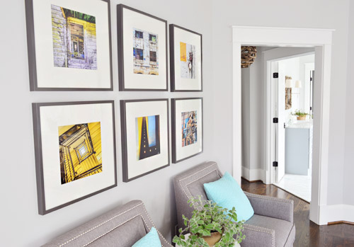
The party started before I could finish photographing the main bedroom’s en-suite bathroom, but we can’t wait to share that room with you guys (it’s one of our favorites). But this post is long enough anyway, so we hope to be back at least one more time this week with more after photos and sources.
Psst – Wanna see more showhouse info & photos? Click here for Our Full Showhouse Tour, which includes final pictures of every room, the floor plan, budget info, a video walk-through, and shoppable showhouse furniture & accessories.

Erin says
Love everything especially the chalkboard in the butler pantry and the beautiful curtains. Going to try the paint on the ceiling. Beautiful.
Meg says
It looks gorgeous — such a great job, you two! Very impressive, especially, considering we know everything else going on in your lives right now. :) And hey, I’m reading Under Magnolia by Frances Mayes right now! Really enjoying it so far. :)
Miranda says
I really like many of the spaces,the pieces and color schemes you landed on. A lot of the décor seems trendy or like it doesn’t have that “homey” staying power, though — kind of at odds with some of the classic, lasting, solid pieces of the house (the porch, the floors, built-ins, etc). Do you really love the items you chose — as in you’d choose them again for yourselves, or were many items chosen just to be different, to do something you wouldn’t normally do, and in the interest of time? I imagine that, grand as this is, working within a very limited budget and not having to “play for keeps” made these spaces far different than what you’d actually like for yourselves or than you’d do for someone on those room boards you used to do. I’d love a post about what you’d do for yourselves long-term compared to show house decisions.
YoungHouseLove says
That would be a fun post! We are truly very happy with a ton of things and there are things we still would tweak or change as John mentioned here (framing that red print in the bedroom with wood and adding something over the bed for example).
xo
s
John says
Looks great! Wondering how the front timbers would look painted white. Glad you added a back door off of the mudroom.
Mirena says
Fabulous, amazing. It’s just so you. Man can see your handwriting in every detail.
Good work!
Bravo!
Diana says
Um…I love all of it. If I had a lot more money and a desire to live in Richmond I would definitely be making an offer. So impressed you did this all with everything else you have going on, especially baby soon!!
Rose says
Please tell me your are doing a video tour of this house :-) LOVE it!
YoungHouseLove says
Can’t wait to!
xo
s
Judith says
Love everything you guys have done! I’ve been on the lookout for the right benches/ottoman for the end of my bed! I went right over to Target after seeing the benches you guys scored for the master bedroom! They are $110!? Bummer! :/
YoungHouseLove says
In stores they are all covered in clearance stickers! Hope that’s how you find them at your store too.
xo
s
Teresa @ wherelovemeetslife says
Wow, this house is turning out so beautifully! It really does ‘feel’ like your home. How much fun it must be to do this house..and I wonder how much of these elements(not items, but the ideas) will find their way into your current home? :)
Melody says
You guys. This is all so stunning. I’m loving this as well as the normal non-showhouse updates. But kudos. You’ve done an amazing job!
Juliet says
Maybe Li is using something different than what I’m used to, but, in my experience, chalk marker will wipe off with a damp cloth. No magic eraser required!
YoungHouseLove says
I think these markers are what she uses for her outside boards (which are rain proof) since we thought that would be nice and durable for the show :)
xo
s
Kari says
So, I never comment on blogs…ever :) But I have to break my no commenting streak to say this.is.AWESOME! What a huge project to undertake and it looks fabulous! Way to go!! I only wish I lived closer so I could come tour it in person :)
YoungHouseLove says
Thanks so much Kari!
xo
s
Stephanie says
I’m trying to find those nightstands! I NEED them! I tried looking for them on Green Front’s site but I can’t find anything. Help!
YoungHouseLove says
Anyone have more info for Stephanie? Wish we had more details!
xo
s
Caryn says
I don’t know where you live but I work for Boston Interiors (local to MA) and they sell them! They are from the Allston collection and you can find the dresser and a matching chest as well!
hollyloo says
they have some on joss & main!
https://www.jossandmain.com/Furniture-Finds-Spencer-Nightstand~UNI2955~E10319.html
Allen says
Just noticed the YHL hearts incorporated into the butler’s pantry art. Very nice!
YoungHouseLove says
Isn’t that cute? She did the best job. We named the house plan The Clover (all of the builder’s houses have plant/flower names and we thought it referenced our logo hearts as well as having the word “love” hiding in the middle).
xo
s
Deana says
It was so awesome meeting you, Sherry last night! We CANNOT wait to start building our Clover! Again, thank you so much for all your input, the house looked AMAZING!!
YoungHouseLove says
Thanks Deana! It was awesome to meet you last night! I was just telling John that I wished he had time to chat with you guys. Good luck with your Clover!
xo
s
Jennifer says
We have a picture our feet and our first child’s feet under a blanket hanging over our bed. Our son loves that photo and keeps pointing out which feet are Mommy’s, Papa’s and his. Fun photography like that could be something for your empty wall space.
Love all that you’ve done so far on this house and I’m eagerly awaiting the full tour but agree with some of the other readers! REST before your son arrives or have lots of help lined up ;-). Our first was so easy we underestimated how tired our second born would make us.
YoungHouseLove says
That’s a really sweet idea Jennifer!
xo
s
TanjaK says
Congratulations on the job well done! Absolutely wonderful and amazing what you’ve been able to achieve. I’m sure a lot more work has gone into this project than you’ve ever mentioned here. The house looks fantastic, everything from the interior to the details inside. Actually, it’s beautiful and really feels like home. I could move in right now (while there are still some leftovers from the party :) ).
YoungHouseLove says
Thanks so much Tanja!
-John
Commercial Renovations Edmonton says
Wow I love this style and most probably it looks like my home style because my father is engineer and doing work as a hobby. By the way love this one
Meg - Life of Meg says
This is so gorgeous! Great job on this house – when can I move in? ;)
Monique says
Hey there – gorgeous showhouse. Where is the organe/tan carpet in the living room from?
YoungHouseLove says
That was donated by West Elm.
xo
s
Andrea says
Love it! You guys did such a great job! I saw the benches (from the MB) in Target on clearance, and I remember thinking to myself,”That’s so Young House Love!” They were snapped up by the time I went back to look at them again!
Sam says
As Sherry mentioned yesterday, it’s all done in chalk marker (so it’s not dusty and can’t be smudged) but it can be erased with a magic eraser (or just painted over if the eventual owners don’t want it).
I thought yesterday’s post was written by John? I’m confused, what gives?
YoungHouseLove says
Sherry edited my post and added that in. She’s the proofreader of the family and often adds updates based on questions, both before something is published or afterwards while she’s on comment duty.
-John
Susan says
“As Sherry mentioned yesterday, it’s all done in chalk marker (so it’s not dusty and can’t be smudged)”
But John wrote the post yesterday?
YoungHouseLove says
Sherry edited my post and added that in. She’s the proofreader of the family and often adds updates based on questions, both before something is published or afterwards while she’s on comment duty.
-John
Summer says
I feel like you guys have created my dreamhouse. The outside is absolutely breathtaking and everything I want in a future home. I hope you guys are proud of yourselves! It’s so lovely! I can’t wait to see the rest!
Sheena Schleicher says
You guys!!!! Everything about this makes me smile! Beyond happy for your family & for the lucky family that gets to call this beauty “home!” :)
Wrenaria says
Beautiful job! Those aqua curtains are stunning. Love ’em.
Carter says
WOW! What an amazing accomplishment for yall! You should be so beyond proud of yourselves. Everything is beautiful.
I’d like to say, as a reader, this has been really fun to watch! I think this was a great choice for yall to try something a little different…you can do the decorating at a must faster pace than you’d want to/like to in your own home (while you think over decisions and save up your pennies). It was so exciting and different to see the result so fast and I would imagine that, while pretty stressful, it was probably exciting and different for yall. I love all your posts and this is no different! Thanks for sharing with us!
YoungHouseLove says
Thanks Carter! It has been an awesome learning experience for us.
-John
Sarah W. says
Wow…absolutely wonderful! You both did such an amazing job on this house!
Alexa says
How much does a house like this go for? any idea on price point?
YoungHouseLove says
The price seems to be evolving (it was initially in the 500s and now it’s in the 600s based on the prices of the rest of the houses in the show, the upgrades, and the appraisals).
xo
s
Teryn / Vintage Romance Style says
Love it! I love how clean and crisp it feels even with patterns and color. Oh how I love aqua!
Sassafras says
Just MARVIE – as always!!! Can’t wait to hear and see more of the rest.
How on earth are you two still upright???
If it were my house I would so seal that chalk-art!
Josephine says
Holy Smokes, Petersiks! What you folks have achieved here is staggering! I hope you are properly proud of yourselves, and that you get to have at least a hour’s peace before young Barnacle arrives.
So beautiful! High fives!
Liz says
Love love love!! Y’all did a wonderful job! So wish I was going to be in Richmond so I could go through the house. However, we too have baby 2 on the way, and if all goes as planned will be a few weeks old at that point :)
Waverly says
I absolutely love y’all’s taste and how you styled this home! I’ve saved this post for some future home ideas :)
Dawn says
Super late comment, but….
What strikes me most about the show house is how much the rooms look like rooms you’ve done in your own houses in terms of creativity, great design, etc. You had a (sort of) unlimited budget for the show house and a smaller (I assume) budget for your own house and yet the results are the same – fantastic.
To me, that is a sign of true talent. Not that I’m anyone to be bestowing true talent stickers on anyone…. :)
Becky Horst says
I’m dying that you got those TWO benches at the end of the bed for less than I paid for my one. Which it was on clearance but I still forked over $79 :(
YoungHouseLove says
Save your receipt in case your Target drops the price again because I think they’ll price adjust for you!
xo
s
Joanna says
That painting in the master bedroom is to die for! Love it all!
Dominique says
Just gorgeous! Wish I could move the whole place to my lot!
Steph Skardal says
Love love love that color palette. So totally going to steal that.
Bailey says
It was exhilarating to read this!! Everything looks amazing!
jbhat says
OMG! It’s all just so BEAUTIFUL!!!
jbhat
Annie says
I had a pretty stressful week and it is such a joy to sit and look at pictures of the culmination of all your hard work. Thanks, guys!
Christen says
LOVE everything, especially that master!! You should post the full house tour under the “house tour” tab at the top of your website since you designed everything. :) Can’t wait to see the rest!
YoungHouseLove says
We’d love to do that – along with a video tour!
xo
s
Lisa says
I love that you were able to stay true to regular folks as you created the show house and did so much of your shopping at Target, Home Goods, and World Market. You guys are so awesome. I am your newest fan. I wish I could just buy the house you created and live in it. But alas, I am in the San Francisco bay area.
Bren says
You guys… this is just awesome!!!
Rach says
Holy whoa.
You guys have been working so hard.
I can’t even believe all the work you’ve put into this, besides your own preparations for the baby on his way. I’m speechless. Sat here with my mouth open the whole time.
(It looks amazing too)
YoungHouseLove says
Thanks Rach, you’re so sweet!
xo
s
Julie says
I love the blue ceiling! And the chalkboard! Wonderful. Great work! Can’t wait to see the rest!
Eleni says
Seriously drooling over this house so far. Especially the light fixtures!!
Bear says
I love your blog because, like you, I’m not afraid to decorate with happy bright color and might have a bit of an obsession with whimsical animals. But had to post because I fell in love with the master bedroom painting and was lucky enough to be the first one to reach the artist so she’ll be mine! Congrats on a great job, so fun to see.
YoungHouseLove says
Congrats Bear, that’s awesome!
xo
s
Ellen says
Maybe an “&” sign above the bed?
If it was my bedroom I would add a yarn covered letter…
And maybe pick up one of the colors from the painting on the dresser or the rug?
It does look a bit empty at the moment, but I think a actual painting or frame would make it messy instead.
YoungHouseLove says
That’s a sweet idea!
xo
s