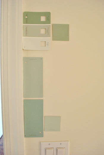
That’s the name of the new bedroom color. It doesn’t exactly roll off the tongue, but it does look pretty good rolled on the walls. We finally made a decision to go with the middle band on the Valspar swatch at the top of this photo (though we got it color matched to Olympic’s No-VOC paint in a satin finish). We liked that it was green and a bit more saturated than a color we’d choose for our last house.
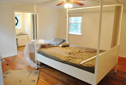
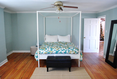
Here’s one last look at the room paint-less (and mostly furniture-less). Oh yeah and look at poor semi-disassembled Ed the Bed. We had to remove one slat on the top so that he could slide forward into the middle of the room without hitting the fan while we painted around him.
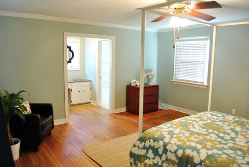
And thanks to the magic of the internet, here’s what the room looked like around five hours later after two coats of Sweet Caroline Club Carolina Inn Club Aqua (we never got the name right a single time that we tried to remember it) on the walls. Amazingly we only needed one gallon (we’re not used to rooms this big so we totally expected to run out and have to do that annoying go-back-to-get-more thing in the middle of the project).
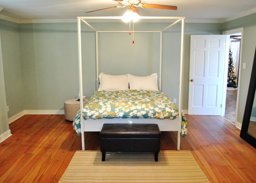
It’s definitely somewhat reminiscent of our last bedroom color (Glidden’s Gentle Tide) but it reads a good deal darker and greener in person, so it’s definitely a step towards our vision of a bolder color scheme when it comes to this house. We debated going a lot darker or brighter when it came to the walls, but ultimately decided that we didn’t want the wall color to be the star of this room. So keeping it somewhat subdued leaves room for colorful curtains, art, and even some painted secondhand furniture if we decide to go that route.
We actually hesitated before painting Carolina Country Club Inn Carolina Inn Club Aqua in the bathroom nook because we thought we might want to go darker, lighter, or bring some other accent idea in there (decorative wallpaper? a tone on tone stencil?).
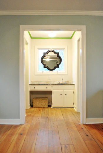
But since our goal has been to de-emphasize the bathroom-ness of this space and help to better connect it to the main room (so that it visually makes sense instead of sticking out like a sore thumb) we went for the cohesive look and used the same color on the walls in there. Good old Caroline County Aqua Carolina Inn Club Aqua. Oh but we used a semi-gloss finish for extra wipeability since it’s near a sink. Don’t mind the fact that it looks lighter in the pics (it doesn’t in real life- must just be the lighting).
And yes, we’re still talking about painting the mirror everything from gray to white. We go back and forth between leaving it and letting the room evolve a little more before doing a thing and whipping out the paint brush and getting ‘er done later today. Whatever we do, we’ll share pics when we do it.
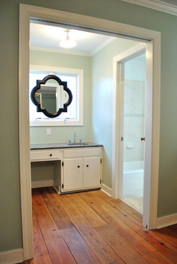
The color on the wall is also reading a bit light in these pics. We’d definitely describe it as something in the “mid-range” (not light but definitely not dark). You can see from the swatch in that top pic that it’s definitely not super subtle, but it’s also not ultra saturated. We actually really love that we landed in that middle-ground area. Everything from the crown molding to the trim and even Ed the Bed really pops, but it’s not too much that it would compete with bold curtains, art, and other stuff that we can’t wait to mix in. Oh and Ed’s poppage is a bit more evident in the first pic of the painted walls above though. Scroll scroll scroll.
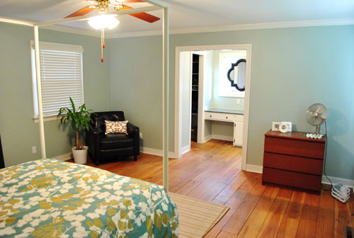
None of the furniture placement is permanent (heck some of the furniture itself may soon be replaced, like that old ikea dresser from our guest room above). But at least it’s starting to feel like a our bedroom. Sherry has this big idea to get two secondhand dressers that “go but don’t match” and refinish them (or paint them a bold color) and then place them on the walls on either side of the bathroom doorway for some nice balance – and some his & hers sock and pj storage. Then the chair will probably go live in the corner to the left of the bed as you face it.
Oh and speaking of going but not matching, we like how Cape Carolina Canaveral Carolina Inn Club Aqua picks up the color of the duvet nicely too, without being perfectly plucked directly from the fabric itself (which we think could have been waaaaaay too much).
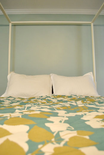
Actually, you can better see how saturated the walls are in this shot with the lights off (so it doesn’t read as yellow on camera). Oh and the walls/duvet look a bit more true to life here (see how they kind of work with each other without competing or looking too flat?).
And yes, that’s still our Christmas tree in the background. It’s on the list.
Anyway, it feels GREAT to have this room painted because it was a big leap towards making “the new house” feel like “our new house.” And consider us as having officially caught the painting bug. We’re thinking one of the big living spaces might be next. If only we could settle on a color…
Psst- We’re spilling one of our favorite money and space saving baby secrets over on BabyCenter. Oh yeah and there’s a video of Clara screaming over there too. Good times.

Suzie @ cupcake monkey says
It looks great!! You guys are fast! We have lived in our current home for years and I am still trying to decide on a color. Ha!
Sara says
hmm…I didn’t realize an Inn could also be called a Club, especially in the same title…that Caroline’s quite a rebel! :)
Looks fabulous guys!
YoungHouseLove says
Haha, I know right? That Caroline’s a real diva!
xo,
s
Meredith says
I think it is perfect! People are so often tempted to “pluck” a color straight from the inspiration piece (like your duvet) but this is so much better. Related but not matchy matchy. beautiful. And scrap the dressers and do built ins in your closet. Your closet looks the size of mine and we have some cheesy builti ins I would love to replace but they serve all our hanging clothes, undies, PJs and workout clothes needs. plus extra pantry storage.
Liane says
WOW! It looks absolutely amazing you guys!!! I’m so excited for you!
I’ve got reader fever!
Cait @ Hernando House says
The color looks great! I love greens and blues (and our house is proof of that).
Victoria C says
Wow the paint has really warmed the room up. Isn’t it amazing how much difference a coat of paint makes. Love it! But where do these paint companies get colour names from?
Amy B says
Love it! Love the color and now that I see it on the walls I think if you decide to paint the mirror I am in camp gray, maybe a silver-y gray.
I am so jealous of your floors. Everytime I see a picture of them I think about asking my husband if we can have wide plank floors instead of refinishing the ones we have now :)
Heather says
Pretty color! A great way to ease into bolder colors in your home.
Lisa says
I LOOOVE it, guys! I’m also drooling over those floors every time you to do a bedroom post. Nice job!
Sara says
I love your floors! I love everything about your house! I agree, you should def paint the mirror, right now it sticks out like a sore thumb. I looooooooooooove the grey idea!!! Now I want that mirror lol
Christin says
Beautiful color choice. :)
MissCaron says
LOOKS AMAZING. This is by far my favorite of the color choice/fabric choice/furniture choice combos you’ve done… Y’all are doing a great job stepping outside your comfort zone. Also, I loved the mis-wording in this post. Hilarious.
Marissa says
The color looks beautiful! How do you like Olympic Zero VOC paint? I’m about to paint my apartment with it since I’m pregnant and wanted to get something fume free.
YoungHouseLove says
Hey Marissa,
We love it! Same coverage as Behr or Glidden but no-VOCs (even in the colorants) which is more than any other Home Depot or Lowe’s paint can say!
xo,
s
Janette at The2Seasons says
Glad you are going bolder with the colors. We plan to do so also on our new and down-sized space.
Kristina says
I also wanted to comment on your floors. They are beautiful.
Rachel @ The Avid Appetite says
I am dying to get painting in our new home, but am just having trouble deciding on colors! I want to go bold but not too ‘of-the-moment’ in case we tire of it quickly. Love this color you chose!
Sara says
I love the color you chose! It’s very similar to the color we have in our MB. I really like how the duvet still pops too! Good choice!
Sherri says
I love it! I have the same duvet and would love to do a color, but not sure I can do that dark (trying to actually lighten the room, which is a bit smaller than yours. Maybe I’ll have to check out the lighter color on your swatch!
Maya says
I love it!! I’ll admit that I was in the “go more bold and different” camp at first, but this is so beautiful, and it looks great with Ed and with the comforter.
Btw, have you thought of pulling Ed out further from the wall? This sounds a little creepy but, ah, he has a really nice backside… ;)
YoungHouseLove says
Hey Maya,
We played around with that idea but the fan makes it impossible. Maybe when we change out the fixture…
xo,
s
Monica says
I love it! What a great colour! And I agree, I like that it isn’t TOO matchy-matchy with the duvet, but fits well with it!
Sarah (Sarah Learns) says
great color choice! it really does make the bed pop. what color curtains are you thinking? also, i vote for painting the mirror gray.
YoungHouseLove says
Hey Sarah,
Not sure yet! We’re trying to just take things step by step to keep them from getting overwhelming. We’ll share whatever we end up going for though! Stay tuned..
xo,
s
gemma@thesweetestdigs says
Beautiful colour choice! Looks great with the new duvet cover, Ed, and darker brown chair & stool. Nice work you two!
Britt says
The Carolina Inn is in Chapel Hill…
http://www.carolinainn.com/
Guess its named after Carolina blue?
Beth@Just{Heart}It says
Looks great! I love the idea of the dressers on either side of the doorway, and your chair will look great in that nook, which is screaming for a purpose, anyway.
Any thoughts on painting the ceiling this time around?
YoungHouseLove says
Hey Beth,
One step at a time girl! But yes. When we get there we’ll post about it…
xo,
s
Halley (Blunder Construction) says
The bedroom looks great painted. I like your color palette – very calming. I once read about colors and birthdays. Luckily, my boyfriend and I have similar colors associated with our birthday – pale green is supposed to be soothing for both of us.
kyla says
Have you thought about paiting or altering the vanity to match the mirror? The white matches the trim and makes it evident as a built in object..a darker color might make it distinctive as a “furniture” piece?
YoungHouseLove says
Hey Kyla,
Yup, we’ve tossed that around a few times. We’ll have to see where we end up!
xo,
s
rdf says
LOVE IT. That was my favourite colour on the swatches when you posted them and it has turned out fab. Well done! And for the record, if you go for painting the mirror I’m in the gold paint camp. :-)
Mona Alicia says
It looks great! I’m loving watching your house come together piece by piece, this is so much fun. It’s like watching HGTV, but better!
Harper says
This looks great, and I love how you decided to paint the bathroom the same color!
Tina says
I love the color! And I’m looking at my (dead) Christmas tree as I type this. Maybe today-we’ll see. Climbing into the freezing cold attic to get the storage bins does not sound appealing.
Chantel says
I think it looks amazing! Just gave the room so much life! I like the mirror the way it is, it goes with your large mirror in your room, and if your frames for other art you will eventually hang are black also I think it will look nice and pull the mirror into the room instead of the bathroom… like you where saying with the paint color!
Laura@JourneyChic says
Love the wall color! Despite being darker than what you’re used to, it definitely still seems calming.
My vote is to paint that fab mirror white. It would go a long way to making the bathroom-in-the-bedroom much more subtle. Because the counter is so dark, the dark mirror draws more attention to the sink area. Just my two cents!
maggie says
Did you do 1 coat of paint or 2?
YoungHouseLove says
Hey Maggie,
Always two!
xo,
s
Abby says
Love the idea of two second hand dressers painted a bold color!
Sarah K says
Wow, it looks amazing! Great job guys.
I must say, with the color on the walls the black frame of the mirror in the sink nook, is less stark. Looking forward to seeing this room evolve!
Sarah B says
Wow – I must say that color definitely makes everything in your room pop. I also love the fact that you painted the same color in the bathroom/sink area. Besides making Ed the bed stand out, I am loving the new emphasis on the floor. It’s beautiful!
Theresa says
Ooh La La.. I’m lovin’ it.
Meghan, UK says
That is a beautiful colour! You’re inspiring me to paint another room in my house (now I just have to persuade my other half!)
Lights.Camera.Jackson says
I love the color! It’s similar to the color we used in our bedroom. We just love aqua tones! It’s amazing how much paint can transform a space.
D says
Looks great and there’s a nice flow from the bedroom to the vanity area. I am FOR painting the mirror something less bam in your face, but I agree that you should let the room evolve a bit more before whipping out the brush. What if some other fun subtle color comes to mind!
Funnelcloud Rachel says
Really love this! To be honest, when you first posted the swatches the other day, I thought the choices might look too institutional/hospital green. But the color is gorgeous – looks relaxing and vacation-like!
Rebecca @ the lil house that could says
Looks great! I’m such a sucker for cool colors as well. I love a dreamy, refreshing bedroom.
I also love seeing your entire process this time around! I started reading even after Clara came along, so I’ve never seen you guys do a room from start to finish. I just thought your house just magically appeared to be pretty :)
Brittany says
I’m loving the room so far :) I think the dressers flanking the doorway is a great idea! Oh, and I love the mirror being black because it pops against the wall color and looks great with the granite.
liz @ bontempsbeignet says
I love it! When y’all mentioned going more green with the new paint scheme, I was worried it would be Mawmaw green. This is a weathered and worn sea glass green. Beautiful.
Chelsea says
I love the color.
What about going dark on the vanity of the sink? I like the way the dark mirror frame is picking up the stone on the top. Maybe that window frame could go dark as well.
Kiran says
Love how the wall and duvet colors, compliments each other :) I’m envious of the wood flooring! Had enough of carpet!
RC says
Looks great! Did you paint the sink area ceiling? Or is that the tape on the bottom of the crown moulding for the top of the walls? It’s hard to tell in the photo.
YoungHouseLove says
Hey RC,
That’s just frog tape. The ceiling is white in every part of the bedroom so far.
xo,
s
brandt @ New House on the Blog says
Sweet Caroline? A reference to one of the greatest songs ever made? You’ve won me over, Sherry!
I think that painting the bathroom the same color was a great choice. It looks really good, especially since it feels a part of the master suite. And the coloring of the duvet plus the paint color really makes it feel cozy and inviting, compared to basic white, which makes it feel like you need to get in and get out and not worry about living.
Ingrida says
It looks amazing!!! Love this color and it goes as my number one contender for whatever painting project we try to tackle next. I only wish we could move as fast as you guys, I’ll just blame our s l o w pace on my three adorable kiddos and jet setting hubby.
Heather says
I cannot wait to see what you do with the ceiling fan… I have the same one in my bedroom and i dislike the four lights… but short of replacing the fixture or fan, I have no idea what to do with it. I’ve gotten inspiration from so many other of your home projects, I can’t wait to see that one! The bedroom looks great!