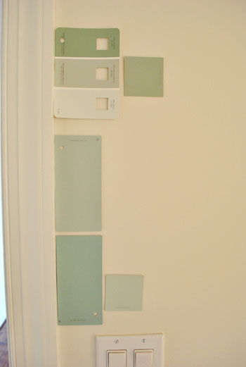
That’s the name of the new bedroom color. It doesn’t exactly roll off the tongue, but it does look pretty good rolled on the walls. We finally made a decision to go with the middle band on the Valspar swatch at the top of this photo (though we got it color matched to Olympic’s No-VOC paint in a satin finish). We liked that it was green and a bit more saturated than a color we’d choose for our last house.
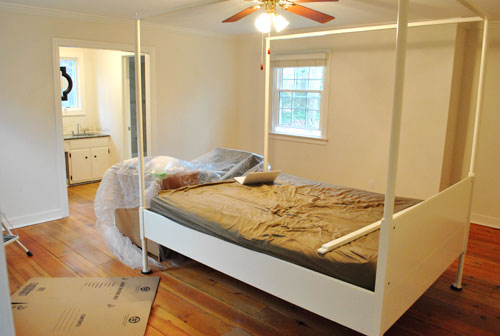
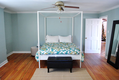
Here’s one last look at the room paint-less (and mostly furniture-less). Oh yeah and look at poor semi-disassembled Ed the Bed. We had to remove one slat on the top so that he could slide forward into the middle of the room without hitting the fan while we painted around him.
And thanks to the magic of the internet, here’s what the room looked like around five hours later after two coats of Sweet Caroline Club Carolina Inn Club Aqua (we never got the name right a single time that we tried to remember it) on the walls. Amazingly we only needed one gallon (we’re not used to rooms this big so we totally expected to run out and have to do that annoying go-back-to-get-more thing in the middle of the project).
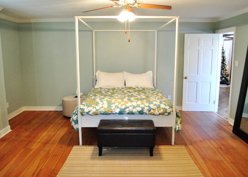
It’s definitely somewhat reminiscent of our last bedroom color (Glidden’s Gentle Tide) but it reads a good deal darker and greener in person, so it’s definitely a step towards our vision of a bolder color scheme when it comes to this house. We debated going a lot darker or brighter when it came to the walls, but ultimately decided that we didn’t want the wall color to be the star of this room. So keeping it somewhat subdued leaves room for colorful curtains, art, and even some painted secondhand furniture if we decide to go that route.
We actually hesitated before painting Carolina Country Club Inn Carolina Inn Club Aqua in the bathroom nook because we thought we might want to go darker, lighter, or bring some other accent idea in there (decorative wallpaper? a tone on tone stencil?).
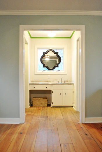
But since our goal has been to de-emphasize the bathroom-ness of this space and help to better connect it to the main room (so that it visually makes sense instead of sticking out like a sore thumb) we went for the cohesive look and used the same color on the walls in there. Good old Caroline County Aqua Carolina Inn Club Aqua. Oh but we used a semi-gloss finish for extra wipeability since it’s near a sink. Don’t mind the fact that it looks lighter in the pics (it doesn’t in real life- must just be the lighting).
And yes, we’re still talking about painting the mirror everything from gray to white. We go back and forth between leaving it and letting the room evolve a little more before doing a thing and whipping out the paint brush and getting ‘er done later today. Whatever we do, we’ll share pics when we do it.
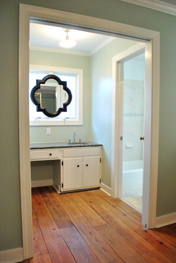
The color on the wall is also reading a bit light in these pics. We’d definitely describe it as something in the “mid-range” (not light but definitely not dark). You can see from the swatch in that top pic that it’s definitely not super subtle, but it’s also not ultra saturated. We actually really love that we landed in that middle-ground area. Everything from the crown molding to the trim and even Ed the Bed really pops, but it’s not too much that it would compete with bold curtains, art, and other stuff that we can’t wait to mix in. Oh and Ed’s poppage is a bit more evident in the first pic of the painted walls above though. Scroll scroll scroll.
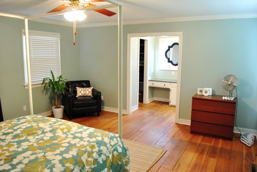
None of the furniture placement is permanent (heck some of the furniture itself may soon be replaced, like that old ikea dresser from our guest room above). But at least it’s starting to feel like a our bedroom. Sherry has this big idea to get two secondhand dressers that “go but don’t match” and refinish them (or paint them a bold color) and then place them on the walls on either side of the bathroom doorway for some nice balance – and some his & hers sock and pj storage. Then the chair will probably go live in the corner to the left of the bed as you face it.
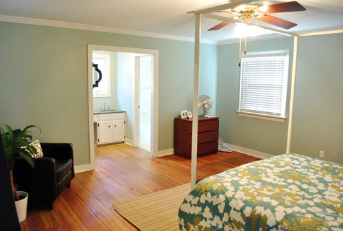
Oh and speaking of going but not matching, we like how Cape Carolina Canaveral Carolina Inn Club Aqua picks up the color of the duvet nicely too, without being perfectly plucked directly from the fabric itself (which we think could have been waaaaaay too much).
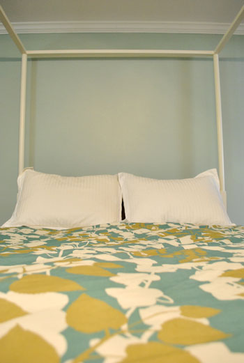
Actually, you can better see how saturated the walls are in this shot with the lights off (so it doesn’t read as yellow on camera). Oh and the walls/duvet look a bit more true to life here (see how they kind of work with each other without competing or looking too flat?).
And yes, that’s still our Christmas tree in the background. It’s on the list.
Anyway, it feels GREAT to have this room painted because it was a big leap towards making “the new house” feel like “our new house.” And consider us as having officially caught the painting bug. We’re thinking one of the big living spaces might be next. If only we could settle on a color…
Psst- We’re spilling one of our favorite money and space saving baby secrets over on BabyCenter. Oh yeah and there’s a video of Clara screaming over there too. Good times.

Gordana says
What a great color! Love that it is deep enough tone to make all the white pop, but it still gives a serene feel to the room. Just wondering, what color do you have in mind for his and hers dresser, should you go that route?
YoungHouseLove says
Hey Gordana,
No idea! We take things on day at a time around here.
xo,
s
Jennifer says
Great color choice!
In my experience, the more glossy the paint, the lighter it becomes (even if just slightly). This is more noticeable with darker colors. Just FYI to your readers.
Your rooms look great in that color.
Jami says
Hey, I’m just confused about the VOC free thing. Once you tint a VOC free paint with other tints… it’s no longer VOC. Essentially, VOC free paints are only that if they remain white. Am I missing something? Our home is still full of white walls and I’m clamoring to paint… but I can’t get around this issue.
YoungHouseLove says
Hey Jami,
That’s actually not true with Olympic Premium No-VOC paint. They’ve reformulated so even their colorants are 100% VOC free!
xo,
s
Chelsea says
I could NOT love that color more! It makes the floors look absolutely gorgeous. Great job!
Stephanie Phillips says
Yay! I’ve been waiting for this! Love it!
I do like the idea of the two dressers, but wonder if it would crowd your space? One thing (of many) that I’m trying to learn from y’all is NOT to overcrowd rooms with furniture. However, you know the space and what your needs are, so I’m sure you’ll choose wisely.
YoungHouseLove says
Hey Stephanie,
Nope this room is HUGE! It looks totally empty now. As in a 5 x 8 rug could not touch anything on the floor in front of the bed. Lots o’ space! Which is why we want to cozy it up and add function so it’s not too sparse!
xo,
s
jane says
beautiful!!! Now I’m kicking myself for not getting this same duvet cover! :( I’m going to be stalking ebay. Do you know the name of the cover so I can do a search?
YoungHouseLove says
Hey Jane,
I think it was called the Pressed Leaf Duvet. Hope it helps!
xo,
s
Annabelvita says
Wow, I love it. It looks more “yours” already! It makes everything pop beautifully, and I think the black mirror looks more part of the room already.
I love the sound of two different but related dressers either side of the nook. I personally would wallpaper the nook but understand that’s counter to trying to make it more part of the main room.
Are you still considering built ins in the alcove by your bed? Or were you never considering it and I just imagined it?!
YoungHouseLove says
Hey Annabelvita,
We’re still thinking about it. Just don’t want the lines of built-in shelving to complete the the lines of Ed The Bed!
xo,
s
Kelly says
I love the color! That’s the one that caught my eye when you first posted pics of the swatches, I just didn’t know it had such a rad name. I can’t wait to see your other paint choices – you’re inspiring me to suck it up and do it (when it comes to painting…it’s only been 2 years…)
Cathy says
Love how the room’s coming along! I didn’t even realize there was crown molding until you painted the room. The trim and bed definitely pop now.
Reenie says
LOVE LOVE LOVE it!!! I think dressers on either side will look great. :)
Gracie says
Love the color and the warmer hue goes really well with the dark color of the mirror. Yesterday I thought the mirror would look better painted a lighter color, now I am not sure. Whatever you decide will look great. It always does!
tia says
great color choice! i really love how it compliments your duvet cover. i so admire your ability to choose color wisely. i hem & haw when it comes to choosing paint colors (it took me two years to decide on a color for my bedroom) and always end up with something darker than i expected.
Melissa says
It looks beautiful… so soothing! Okay, and I know you’re up to your eyeballs in suggestions for that mirror, so I can’t believe I’m writing you with yet another one! Forgive me!!… but when I saw it in these pics, I just thought I’d throw this out there. What about some kind of swanky gold finish? I think one of your inspiration pics that you shared yesterday might have been gold, and I just thought it could be a cool way for it to look unique and yet not stand out tooooo much. Whatever.. you guys always figure out something amazing! :)
K says
Love the color. And the mirror has totally grown on me, especially with the new wall color. I don’t think you need to change it.
Gina says
I like the mirror black. It helps coordinate with the dark granite, but I am sure if you decide to paint it you will pick the perfect color.
Catherine says
It looks awesome!
And speaking of confusing color names, I was thinking about copying you guys and using BM Dragonfly in my parents’ guest bedroom. Except that after I identified it as such, I proceeded to call it “Firefly” (which doesn’t make any sense at all) for multiple emails. My mom was quite confused until we finally connected on the phone… Oops!
Anyways, point is you two have great taste for colors!
Keren says
Beautiful color! I noticed you said you chose a satin finish versus the flat that I think you used in your previous house. Can you share the reason for the change in finish? We’re hoping to paint our interior and our walls are less than perfect but we have kids and dogs. Flat is very appealing to hide all our walls imperfections but the lack of cleanability scares me. Does satin hide imperfections while being cleanable? Is this why you went with it?
YoungHouseLove says
Hey Keren,
We have learned from using satin in Clara’s last bedroom that it looks just like flat paint and is a smidge more wipe-able and scrubbable so we went for it. Looks great!
xo,
s
Irina@CanDoGal says
It looks very sophisticated and serene. I love it! I agree that the mirror looks a little intense right now, but I’m sure you have a bigger vision for that space. Right now, the mirror is the only thing in there, taking all the attention. So it makes sense not to paint it until the room takes shape. Maybe the mirror could borrow a color from the duvet?
Megan says
Love it! Can’t wait to see all the other painting projects you guys have up your sleeves- especially your dining room that you plan on painting grey. I am hoping to do my new living room/bedroom in a similar shade. I asked you guys about it a few days ago, but I’m back with another question! I plan to do a light grey/blue shade in the living room which connects to our bedroom via french doors. We also have french doors to enter the living room from the entrance of the apartment. I really want to paint these a dark color. maybe a dark grey? slate? My husband is not on board YET, but what do you guys think? I seem to remember a house crash or something with dark french doors…would this be a good idea? I’d love your opinion. Thanks!
YoungHouseLove says
Hey Megan,
We love the idea of slate gray doors! We have been toying with that idea for our house too- ever since seeing an inspiration image in House Beautiful which had the same thing going on! So pretty!
xo,
s
Katherine says
INCREDIBLE!!! Love it! Ed and the duvet look wonderful against the new wall color! I love the idea of finding different dressers and refinishing them. Good luck and can’t wait to see what you find.
Shannon says
Wow – it looks great. You guys are champs! I can’t believe all the painting you guys are able to get done with the little one around. I always find that challenging with my 19 month old. How long did it take? Way to go!
YoungHouseLove says
Hey Shannon,
It took about 5 hours with prepping, taping, cutting in, rolling, and two coats. Not bad considering the room is such a huge space for us (we thought it might take three days!).
xo,
s
Laura says
I used to work at the Carolina Inn when I was in college and it’s beautiful so how could you go wrong? Love it!
Megan says
LOVE it!
DJ says
I am so impressed at how much you have already accomplished in your new house! We’ve been in our house over 8 years, and at this rate, we’ll never get it decorated. We seem to do part of a room, get stuck, and then stop. Your posts inspire me! Oh, and I just saw that same mirror when I was in Lowes, and was considering it for the blank wall over our living room mantel, but was concerned that the black plastic would look cheap (though I do think it would awesome painted out white above your sink). Do you think it’s nice enough to leave it as is? Thanks!
YoungHouseLove says
Hey DJ,
Doesn’t look cheap at all! It’s sort of like a wrought iron metal-ish look. Not plastic-y or anything. Hope it helps!
xo,
s
Jessica says
Love it, it coordinates so nicely with the duvet!
And hey, if you ever decide to visit the Inn that is the namesake of your color choice, you won’t be sorry! Chapel Hill is the greatest college town in the south, and the Carolina Inn is divine!
Ali says
I’m a big fan of the Carolina Inn in Chapel Hill, NC (go Tar Heels!) – a beautiful place and definitely inspiring design-wise :) I think that’s where the name comes from!
http://www.preservationnation.org/about-us/partners/corporate-partners/valspar/paint.html
Jami says
The Olympic line is pretty deceiving, as the colorants are actually “Low VOC”. Thanks, though!
YoungHouseLove says
Hey Jami,
The good news is that’s not true anymore! Check out Lowe’s and you’ll see that the new pamphlet and signage for Olympic Premium paint (which is the no-VOC kind) says that the base paint and all added colorants are 100% no-VOC. Not low- none at all! They reformulated. Love it!!! Here’s a link to their site where you can read that ” Olympic Premium Interior Paint in any color is totally Zero VOC.” Hope it helps!
xo,
s
Kate says
I love this color. It looks really great!
robin/burlington,nc says
Love it! The room is really taking shape nicely.
Jen says
I love the color you selected and your room looks great! I really wish I had your color confidence when selecting wall colors. I’m having the worst time making up my mind with our kitchen and it’s been like that now for most of the rooms in our house, with more rooms to go still.
Barb says
BRILLIANT!!!
Don’t you just love to paint a room? I LOVE IT!!!! So gratifying and instant results. You are spot on with the color choice, makes everything POP and so beautiful.
I also agree about the thick planked floors… envious!
You two are the best. Keep up the good work!
Read you on a daily basis..minus the weekends. I know….you need to have a life too… :)
B.
Robin says
haha this makes me think of the real Carolina Inn by us! We were there not long ago for a wedding! It’s in Chapel Hill, NC! If if makes you feel better about forgetting the name – it’s really swanky and nice!
Hanna says
Looks really really great! Colorful yet peaceful all at once. :)
Pam says
Your bedroom is coming along beautifully, congratulations on such excellent choices already! Removing the backsplash in the bathroom was such a great decision … totally changed the way that area relates to the rest of the room.
If I may be so bold, I recommend you consider what the above poster recommended and not get dressers … or perhaps if you must, try to put them closer to the bed (in the nook opposite the door and/or where the big mirror is? And reserve the area between the bed and the bathroom for a sitting area and ‘play space’ for Clara. When you are getting ready, it would be great to have a safe comfortable spot for her to hang. Plus, all the other rooms in your house will be so open, you might like a peaceful, slightly removed, spot for yourselves as time goes by and your family grows. I’m much older, and my kids are bigger, but I’m telling you, the ‘peaceful’ grown-up bedroom is AWESOME! And I’m sure you guys would make it so classy and retreat like with your decorating choices.
Brooke Buckingham says
I just wanted to say that I love Sherry’s idea of getting a couple of non-matching dressers and painting them for either side of the bathroom entryway. I think that would look fabulous! My husband and I have “coordinating” dressers and I love the look!
Callie says
I love the color! I wonder if the name has anything to do with THE Carolina Inn on the campus of UNC Chapel Hill.
http://www.carolinainn.com/
It is a beautiful place – I actually had brunch there with my family when I graduated from UNC. Be sure to check out the photos on their site! You’ll love it.
Jessica says
Looks great you guys! I love it!
A couple of questions… (sorry, I’m just too curious)
Did you paint the bathroom the same color? It kind of looks like it in one of the pictures but it could just be the lighting.
Are you planning on painting the ceiling(s) a different color?
And this is a semi stupid/nosy question, but do you plan on having beside tables/night stands? I’m telling you, it’s too scary how much alike our master bedrooms are. (I’m the one with the sink nook in my room as well). The reason I ask is, my hubby has a table on his side of the bed (his side has more room) and I’m on the side of the bed nearest the door and I can tell from your pictures that there’s not much room for one there either. I’m trying to go for a balanced look but I’m not coming up with anything! I just wish he could do without a table!
YoungHouseLove says
Hey Jessica,
The bathroom is still with since it looks fresh with the white shower curtain- at least for now. As for the ceilings, someday- we’ll post about that when we get there. It’s one day at a time for us! And yes to two nighstands. Can’t wait for that day!
xo,
s
Crystal says
Love it! So excited to see your rooms get painted – they just look so much more…you! I also LOVE the color – anything blue/green/grey related is close to my heart! =)
Anyway, hope you decide on more colors soon – I’m sure all that white is getting to be a bit much! =)
Lisa says
Love it. Especially in that last shot, it really helps boost the other colours in the room like the floors and Ed looks particularly happy in his new fresh surroundings. Glad to hear the bathroom mirror is being considered for a paint job, the shape of it is fab but without anything to balance the black it’s looking a little dark but I know in your YHL awesomness it’ll all come together brilliantly.
Bonnie says
Love everything you’ve done so far with your house and love the color! I don’t know how paint companies come up with their names, but it may be a reference to the Carolina Inn, in Chapel Hill, NC: http://www.carolinainn.com/ They have several clubs that are a part of the Inn. It’s a beautiful place if you ever get the chance to visit!
Laura @ Starting Out Fit says
Love the colour choice!!
Jenne says
Don’t know if you’re taking votes on what to do with the mirror. I love the bold contrast of the black frame, but could see where it might be too much contrast….in that case, I would go with white to match the windowframes, so it looks like it was planned that way ;) LOVE the new house!
bridget b. says
i love that you guys’ tree is still out. makes me feel better about mine still being up! ;-)
Keeley says
We painted this weekend, too! Our tiny guest bedroom is now Grey Cashmere (Benjamin Moore, matched in Behr Premium). It reminds me of our Silver Sage (Behr Premium) bedroom. Actually, the color you chose looks like a cousin to the colors we chose in our bedrooms! I’m partial to the grey/green/blue tones.
Alisa says
How pretty! I was actually over on Valspar’s site last night trying to find a color for our bathroom and I had loved that color but didn’t think my husband would like it so I scratched it off my list. You may have changed my mind though.
It also made me feel way better seeing your Christmas tree still up. Ours was taken down a couple weeks ago, but I still have little Christmas decorations scattered throughout the house…
Ali says
What a GREAT job! It looks terrific! I LOVE the color you painted! You two hit a home run! Paint is so hard to pick…I’m impressed! :)
~ Ali
Mandy Ford says
What a lovely color! Definitely a huge improvement and makes the room so cozy but also fun and lively. And I like how you decided to continue the color into the sink area – the space is really starting to come together!
K (Barking Babymama) says
I’m so surprised you haven’t put up your capiz chandelier in place of the fan yet!! Do you have other plans?
YoungHouseLove says
Hey K,
We conveyed all of our light fixtures with the old house, so we don’t have that guy to put up (miss him though!). We’re excited to hunt down new things for the new house. Slowly but surely…
xo,
s
Melissa says
It looks amazing and like a whole new room. I think it was great to paint the bathroom the same as helps it blend in more. Tough call on painting the mirror.
Shelley says
Love the paint color! Have you thought about putting up french doors with maybe frosted glass to make that sink area even more separate from the bedroom? Just a thought!
YoungHouseLove says
Hey Shelley,
Yup- that would be awesome someday! Now we’re just working with what we have and saving our money for more necessary things. But someday… sure!
xo,
s