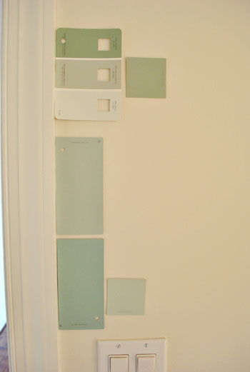
That’s the name of the new bedroom color. It doesn’t exactly roll off the tongue, but it does look pretty good rolled on the walls. We finally made a decision to go with the middle band on the Valspar swatch at the top of this photo (though we got it color matched to Olympic’s No-VOC paint in a satin finish). We liked that it was green and a bit more saturated than a color we’d choose for our last house.
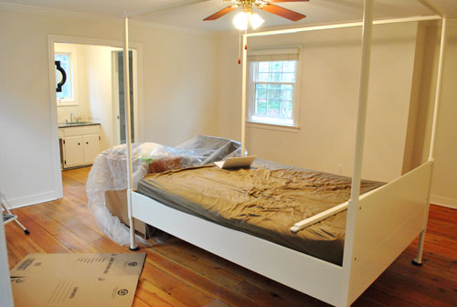
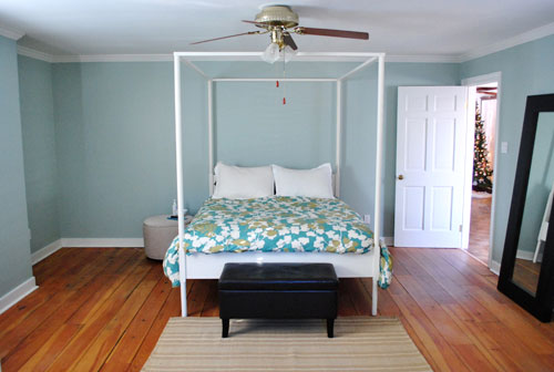
Here’s one last look at the room paint-less (and mostly furniture-less). Oh yeah and look at poor semi-disassembled Ed the Bed. We had to remove one slat on the top so that he could slide forward into the middle of the room without hitting the fan while we painted around him.
And thanks to the magic of the internet, here’s what the room looked like around five hours later after two coats of Sweet Caroline Club Carolina Inn Club Aqua (we never got the name right a single time that we tried to remember it) on the walls. Amazingly we only needed one gallon (we’re not used to rooms this big so we totally expected to run out and have to do that annoying go-back-to-get-more thing in the middle of the project).
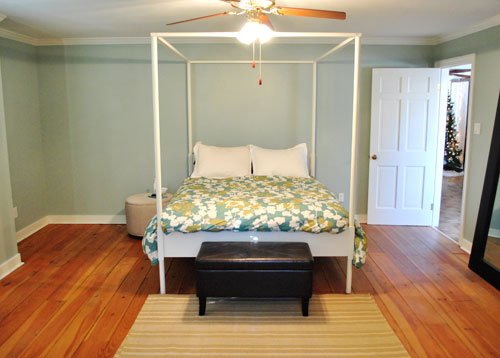
It’s definitely somewhat reminiscent of our last bedroom color (Glidden’s Gentle Tide) but it reads a good deal darker and greener in person, so it’s definitely a step towards our vision of a bolder color scheme when it comes to this house. We debated going a lot darker or brighter when it came to the walls, but ultimately decided that we didn’t want the wall color to be the star of this room. So keeping it somewhat subdued leaves room for colorful curtains, art, and even some painted secondhand furniture if we decide to go that route.
We actually hesitated before painting Carolina Country Club Inn Carolina Inn Club Aqua in the bathroom nook because we thought we might want to go darker, lighter, or bring some other accent idea in there (decorative wallpaper? a tone on tone stencil?).
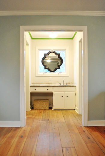
But since our goal has been to de-emphasize the bathroom-ness of this space and help to better connect it to the main room (so that it visually makes sense instead of sticking out like a sore thumb) we went for the cohesive look and used the same color on the walls in there. Good old Caroline County Aqua Carolina Inn Club Aqua. Oh but we used a semi-gloss finish for extra wipeability since it’s near a sink. Don’t mind the fact that it looks lighter in the pics (it doesn’t in real life- must just be the lighting).
And yes, we’re still talking about painting the mirror everything from gray to white. We go back and forth between leaving it and letting the room evolve a little more before doing a thing and whipping out the paint brush and getting ‘er done later today. Whatever we do, we’ll share pics when we do it.
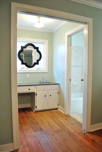
The color on the wall is also reading a bit light in these pics. We’d definitely describe it as something in the “mid-range” (not light but definitely not dark). You can see from the swatch in that top pic that it’s definitely not super subtle, but it’s also not ultra saturated. We actually really love that we landed in that middle-ground area. Everything from the crown molding to the trim and even Ed the Bed really pops, but it’s not too much that it would compete with bold curtains, art, and other stuff that we can’t wait to mix in. Oh and Ed’s poppage is a bit more evident in the first pic of the painted walls above though. Scroll scroll scroll.
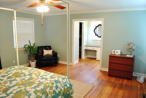
None of the furniture placement is permanent (heck some of the furniture itself may soon be replaced, like that old ikea dresser from our guest room above). But at least it’s starting to feel like a our bedroom. Sherry has this big idea to get two secondhand dressers that “go but don’t match” and refinish them (or paint them a bold color) and then place them on the walls on either side of the bathroom doorway for some nice balance – and some his & hers sock and pj storage. Then the chair will probably go live in the corner to the left of the bed as you face it.
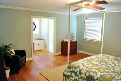
Oh and speaking of going but not matching, we like how Cape Carolina Canaveral Carolina Inn Club Aqua picks up the color of the duvet nicely too, without being perfectly plucked directly from the fabric itself (which we think could have been waaaaaay too much).
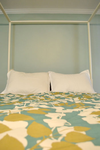
Actually, you can better see how saturated the walls are in this shot with the lights off (so it doesn’t read as yellow on camera). Oh and the walls/duvet look a bit more true to life here (see how they kind of work with each other without competing or looking too flat?).
And yes, that’s still our Christmas tree in the background. It’s on the list.
Anyway, it feels GREAT to have this room painted because it was a big leap towards making “the new house” feel like “our new house.” And consider us as having officially caught the painting bug. We’re thinking one of the big living spaces might be next. If only we could settle on a color…
Psst- We’re spilling one of our favorite money and space saving baby secrets over on BabyCenter. Oh yeah and there’s a video of Clara screaming over there too. Good times.

Megan says
I love how the color makes your wood floors pop! Great color!
John says
I hope the ceiling fan helped that paint dry :).
I like how good the floors look now with the new paint color, and the contrast of the dark frame on the bathroom mirror.
abriana says
LOVE IT!
Nicole says
Curious: You have mentioned in posts several times about “de-emphasizing” the bathroom counterness of the bathroom counter and thus the removal of the granite pieces, etc… Now that the walls are painted, I am wondering if painting the bathroom cabinet a color that would fade into its countertop would make it look like that piece of furniture look you are going for? I’m one to talk, I still have to paint the wainscoting in our hallway that was installed by my husband’s brother (a trim carpenter) LAST winter… LOL… Maybe since I am snowed in down here in Charlotte, I could do that after writing my mid-terms for my students… Happy Painting!!
YoungHouseLove says
Hey Nicole,
We’ve definitely considered painting the vanity to make it look more like a piece of furniture. Who knows where we’ll end up!
xo,
s
susan says
Who makes up the names for paints? Oh I know, the same people that name Opi nail polish. Love the new look and the bathroom the same color. Good job. susan
Future Mama says
So nice! A soothing bedroom color…
Much love,
Future Mama
http://expectingablessing.blogspot.com/
Cheryl Claudine says
I absolutely love that color!!! I have a thing for all shades of aqua, and C.I.C.A. is soooo perfect for a master bedroom. I just might have to use that colour myself when I finally buy my own place and have the freedom to paint. Till then, it’s rental beige for me…
CC
karen @ our slo house says
It looks beautiful — I love the color.
It looks similar to the color I had in my previous house; we had it throughout the main living areas. I was often asked if it was the Resoration Hardware “mint-y” color. (It wasn’t.)
And depending on the time of day, the color would change. Sometimes it was greener, sometimes it was greyer. (More grey… not the cheese.)
Lindsay @ A Walk in the Closet says
Your bedroom is coming together very nicely! Can’t wait to see the final product. I love the colors that you choose.
Marci says
Great color! I am so impressed that you guys could paint such a large room in 5 hours. We painted our family room which can’t be too much bigger than your bedroom a few weeks ago and it took at least double the time, if not more. The most difficult part was the taping. I know this sounds odd but we failed miserably and found it extremely difficult to line the tape up so perfectly so the paint didn’t spill onto the trim or vice verssa. We painted the walls and then the trim and the trim paint ended up back on the walls and we even did small strips to try and line it up evenly. Do you have a trick?
YoungHouseLove says
Hey Marci,
This brush is a lifesaver for us! We actually try not to tape whenever we can help it (I just freehand things around baseboards, windows, doors, and other trim). We do tape off the ceiling sometimes because I’m so short that it’s hard for me to be exact when I’m reaching a lot. Hope it helps! Oh and Frog Tape is so much better than blue painters tape in our experience!
xo,
s
laura says
I envy your ability to pick the right color/shade! I still look at the walls in my kitchen and wish I would have gone lighter…ugh.
Jaimie@AtHome says
Wow! it looks so good! I love the colour.
Helen says
GAH! So pretty!
Sammie says
The new color looks fabulous! Thank you for sharing. I enjoy reading your site. When my Fiance and I moved in together we needed a second dresser. I had already refinished a dresser that was a hand me down in a beautiful take on a china red stain. We searched till we found a similar but not matching dresser/chest for the guy on craigslist. It ended up being laminate so I was not able to stain it but we color matched the paint to the stain and went to town. They look great. I am waiting till I get some free time to build a headboard in the same color similar to one I saw featured on your site. Thanks for all the tips and tricks!
Deb says
I really like that wall color – its very fresh looking.
I’d paint the frame on the mirror white – and I’d also frost the bathroom windows to make it seem less window-y and more as part of the mirror without sacrificing the light.
Katie says
With the new color in the bathroom, I can really see what a difference it makes that you removed the backsplash! Wasn’t so convinced before, but clearly you guys have a better eye than I do!
Not that you asked, but personally I like the mirror black the way it is now… but then again we’ve just established that maybe I don’t have the best eye for this stuff ;)
Have fun — thanks for sharing all of your progress!
Rebecca says
OMG It’s amazing what color on the walls will do! It’s really coming together. So glad you decided to go with the same color in the vanity area. Can’t wait to see what you decide to do with the mirror…I would paint it, but that is just me. I’m sure whatever you decide it will be amazing.
Ashley says
Is that one of the Valspar Historic whatever colors? We just painted our nursery in one of those colors…Jekyll Grand Dining Sea Mist….and while I love the color, I don’t love the mouthful trying to get it out :)
Love the Carolina Inn Something and Whatever–so pretty!
YoungHouseLove says
Hey Ashley,
Yes! It has that little historic stamp on the top!
xo,
s
Jessica says
Its amazing what a little paint can do! You all have really transformed the room to look like a little oasis, very homey!
sarah @ perpetual blind date says
LOVE the color!!! Its very tranquil but adds the needed pop for Ed. Great choice you two!
Michelle says
Yay, I love the painting bug!!! Love the final color, it looks fantastic. I can’t can’t can’t wait to see what you paint next!
Renee says
Hi there! I love the colour you chose. Quick question: what are the dimensions of your room? We are tackling our bedroom next, and this colour mixed with the crown moulding makes the ceilings look tall!
YoungHouseLove says
Hey Renee,
It’s around 14 x 14′ (with standard 8′ ceilings).
xo,
s
elizabeth says
My DH did his PhD at UNC and we spent many a day at the Carolina Inn in Chapel Hill. Gorgeous old stately brick mansion with beautiful ancient oak trees. On Friday afternoons they host a family-friendly happy hour type event with free bluegrass on the lawn (and they have wine, beer, food if you want to buy…). Fantastic way to spend a Friday afternoon. He stayed at the Carolina Inn when he was still in the stage of checking out PhD programs.
So I love the name, even if it doesn’t roll off the tongue.
Looks great. I’d love to see a photoshop mockup of the mirror painted. Love the idea, not sure about the black. I don’t feel strongly, but am curious what it would look like in a different color or if you brought black in somewhere else?
Jenny says
I love the color, and the bedroom and vanity area look great. I have to say I love the black mirror. Because it is dark it really draws the eye, and because it is such a cool shape it really takes the whole room to another level; as in high-end design, if you know what I mean! And, as they say, every room needs a little black.
Abby says
Love the color you picked…Carolina What-not? ;] It seems like the perfect relaxing and fun color for a bedroom.
Oh, and don’t feel bad: our Christmas tree is still up, too. Our family doesn’t even have the excuse that we were moving over the holidays. I guess we’re just all extra cheery folk. :]
Sophia says
I’m loving this color! anyone know a similar Ben Moore color?
YoungHouseLove says
Hey Sophia,
You can get it color matched to BM paint if you’d like!
xo,
s
Amanda says
I love your bedroom! Also, I think I would weep for joy if I had that much space.
Nichole@40daysof says
I love it! That name really has some issues, though. I like the the Sweet Caroline one you came up with. :)
giveaway on my blog today!
http://40daysof.wordpress.com/2011/01/11/fat-tuesday-vol-ii/
Ashley says
Love, love, love it! Gorgeous.
Wondering: where did you get the beautiful bathroom mirrow?!? I have been looking for a couple of those for awhile now.
YoungHouseLove says
Hey Ashely,
Lowe’s! Check out yesterday’s post for more info. Hope it helps!
xo,
s
Brenda @Year 25 says
The color looks great. Can’t wait to see what you hang on those walls! : )
Jessica says
Loveeeeeee the color! :) Aqua/Teals/Greens are my favorites.
Tiffany says
Great choice. I like. What direction are you thinking for the livingroom?
YoungHouseLove says
Hey Tiffany,
Something light gray. Like the underside of a cloud. Getting closer…
xo,
s
HG says
Have you thought about painting the mirror the same color as the walls? (I’m terrible at this stuff though so it may be a bad suggestion ;) ).
YoungHouseLove says
Hey HG,
Pretty much any color for the mirror is possible. Except hot pink. John wouldn’t go for that…
xo,
s
A.C. says
Great color. Paint is amazing, it really makes all the difference!
Here’s an odd question, and I apologize if it’s been answered already but it’s been bugging me since you first introduced your new house: why does that section of wall bump out about 18 inches? As far as I can tell from the floorplan, that wall joins the back wall of the family room, so it’s not like it would have had to be oddly-shaped to match existing construction… maybe it forms a more interesting roof line that way?
YoungHouseLove says
Hey AC,
It’s so the back of the house (which has a cute little bump out with a peak) looks centered. Awkward from the inside but so cute from the outside!
xo,
s
Briana says
The color is absolutely gorgeous! And you can add me to the list of people who are totally jealous of your floors.
Do you know how to set the white balance on your camera? Setting it to tungsten or even auto will help get rid of the yellow color cast. You can even change the white balance on the computer after taking the photo in most photo editing programs.
YoungHouseLove says
Hey Briana,
We do in theory! Still learning how to work with it to get the best pics. We’re definitely not photographers by any means!
xo,
s
Gord says
Wow, this is the first time I realized how HUGE your bedroom is! Very nice … doing a great job … still addicted to seeing what you’re up to! :)
Melly says
It looks so good! It still amazes me how a coat of paint can transform a room.
Steph says
Love the color you chose!!!! I think tone on tone stencil would be great for the bathroom…and leave the mirror…it makes a nice statement. Whatever you decide I can’t wait to see the results!
Lindsay says
I’m a recent convert to the amazingness of Behr’s Premium Plus Ultra, which really does cover everything in one coat. Have you used this paint before, and how does the coverage of Olympic compare?
YoungHouseLove says
Hey Lindsay,
It definitely took two coats, but the no-VOC thing is paramount in our house, so that’s why we don’t mind doing two coats.
xo,
s
Maryanne says
I love the color! Now for the really fun part, I get to call my sister (like she did when you scored your new washer & dryer) and ask if she’s seen YHL yet and if she likes the color.
jmje says
I love it! I am in the process of painting my spare bedroom (mostly because I was inspired by this blog). Is there a tutorial on here anywhere about how to paint and tape so it doesn’t look sucky (which is how my painting tends to look)? I guess I can go ahead an search for it on here.
YoungHouseLove says
Hey Jmje,
We recommend Frog Tape (search that to find a post about using it in the old nursery) and a special edging brush (as mentioned on our Projects page under the Paint section in the post about cutting in). Hope it helps!
xo,
s
Sheila says
Wow. If this doesnt’ make everyone paint their bedroom immediately, I don’t know what will. Beautiful!
Tanya says
Holy wow you two are productive! The paint colour is gorgeous and it looks fantastic with your duvet.
~Tanya
dans-le-townhouse.blogspot.com
Sara says
This post is funny and very educational. I check back several times a day! Love how you guys let us into your thinking process! I see your floor mirror is black. What color is the big chair? What do you guys think of mixing black and dark brown in the same room? I’m always torn between the colors, so I have both in our house. Never quite sure what looks ok.
YoungHouseLove says
Hey Sara,
The floor mirror and chair are actually the same deep chocolate color (as is the bench and the mirror above the sink). We definitely don’t think things have to match, it just worked out that way. But black and chocolate can be layered for a nice effect, just keep enough of each tone in the room so one doesn’t look accidental and mismatched- like it’s the odd man out.
xo,
s
Christina says
I love it.. I think I may borrow that color for our second bedroom as 2 years after moving in- it still hasn’t been painted. I love, Love, LOVE it!
And don’t feel bad about the Christmas tree- ours is still up too, although it’s finally coming down tomorrow. My husband asked me last night if we were going to take it down or just put red hearts on it for Valentine’s Day…
Bianca says
Nice color! It looks really similar to Afternoon Shade by FreshAire which we picked for our bedroom. I just wished our bedroom was as big as yours…Ohhh what I could do with more space…
tarynkay says
Many Catholics keep going with Christmas until February 2, which is the Feast of the Presentation of Jesus at the Temple. So don’t feel bad about the tree- you’re just being traditional.
Nicole says
Looks beautiful! And I love that you used the same color in the bathroom. Great idea to use color to connect the space. Every time I open your blog I am AMAZED by the things you are doing with your new home. LOVE it!
Alina says
Wow, it looks great – I love the color, the new bathroom mirror, the bed – great job! I think the dresser idea is perfect, I can’t wait to see it. But honestly, do you ever throw clothes on that chair and leave them there for a few days? That’s what would happen in my house. You guys are so neat and clean, it probably stays clear. Thanks for the inspiration!
YoungHouseLove says
hey Alina,
Yes! It only looks clean because we cleared the room to paint!
xo,
s
Monica F says
I wouldn’t have chosen that color by the swatch, but seeing it actually on the walls and in the room it looks beautiful. I’m so jealous of your paint picking skills. =)