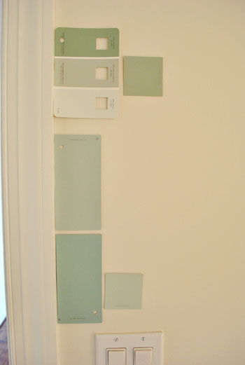
That’s the name of the new bedroom color. It doesn’t exactly roll off the tongue, but it does look pretty good rolled on the walls. We finally made a decision to go with the middle band on the Valspar swatch at the top of this photo (though we got it color matched to Olympic’s No-VOC paint in a satin finish). We liked that it was green and a bit more saturated than a color we’d choose for our last house.
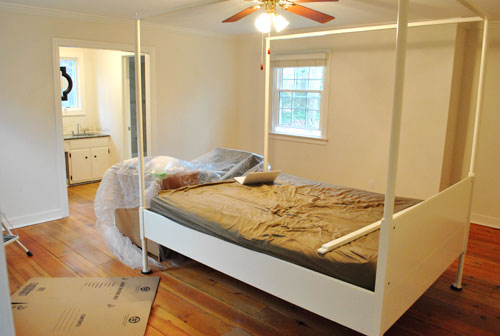
Here’s one last look at the room paint-less (and mostly furniture-less). Oh yeah and look at poor semi-disassembled Ed the Bed. We had to remove one slat on the top so that he could slide forward into the middle of the room without hitting the fan while we painted around him.
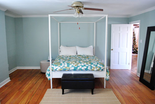
And thanks to the magic of the internet, here’s what the room looked like around five hours later after two coats of Sweet Caroline Club Carolina Inn Club Aqua (we never got the name right a single time that we tried to remember it) on the walls. Amazingly we only needed one gallon (we’re not used to rooms this big so we totally expected to run out and have to do that annoying go-back-to-get-more thing in the middle of the project).
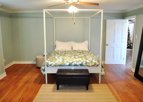
It’s definitely somewhat reminiscent of our last bedroom color (Glidden’s Gentle Tide) but it reads a good deal darker and greener in person, so it’s definitely a step towards our vision of a bolder color scheme when it comes to this house. We debated going a lot darker or brighter when it came to the walls, but ultimately decided that we didn’t want the wall color to be the star of this room. So keeping it somewhat subdued leaves room for colorful curtains, art, and even some painted secondhand furniture if we decide to go that route.
We actually hesitated before painting Carolina Country Club Inn Carolina Inn Club Aqua in the bathroom nook because we thought we might want to go darker, lighter, or bring some other accent idea in there (decorative wallpaper? a tone on tone stencil?).
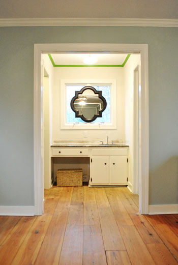
But since our goal has been to de-emphasize the bathroom-ness of this space and help to better connect it to the main room (so that it visually makes sense instead of sticking out like a sore thumb) we went for the cohesive look and used the same color on the walls in there. Good old Caroline County Aqua Carolina Inn Club Aqua. Oh but we used a semi-gloss finish for extra wipeability since it’s near a sink. Don’t mind the fact that it looks lighter in the pics (it doesn’t in real life- must just be the lighting).
And yes, we’re still talking about painting the mirror everything from gray to white. We go back and forth between leaving it and letting the room evolve a little more before doing a thing and whipping out the paint brush and getting ‘er done later today. Whatever we do, we’ll share pics when we do it.
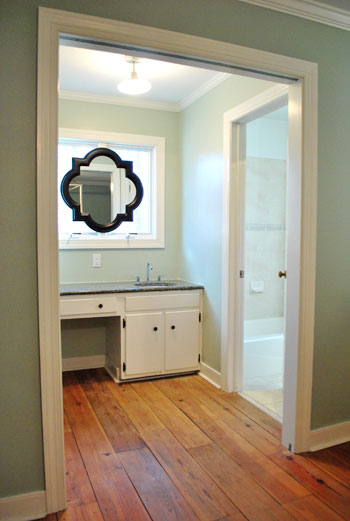
The color on the wall is also reading a bit light in these pics. We’d definitely describe it as something in the “mid-range” (not light but definitely not dark). You can see from the swatch in that top pic that it’s definitely not super subtle, but it’s also not ultra saturated. We actually really love that we landed in that middle-ground area. Everything from the crown molding to the trim and even Ed the Bed really pops, but it’s not too much that it would compete with bold curtains, art, and other stuff that we can’t wait to mix in. Oh and Ed’s poppage is a bit more evident in the first pic of the painted walls above though. Scroll scroll scroll.
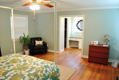
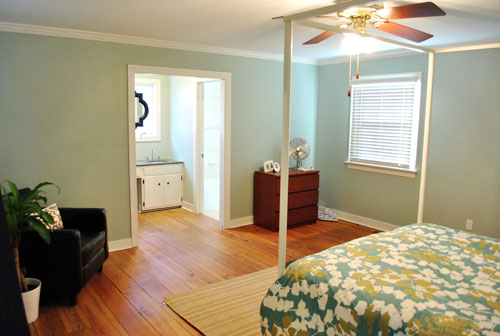
None of the furniture placement is permanent (heck some of the furniture itself may soon be replaced, like that old ikea dresser from our guest room above). But at least it’s starting to feel like a our bedroom. Sherry has this big idea to get two secondhand dressers that “go but don’t match” and refinish them (or paint them a bold color) and then place them on the walls on either side of the bathroom doorway for some nice balance – and some his & hers sock and pj storage. Then the chair will probably go live in the corner to the left of the bed as you face it.
Oh and speaking of going but not matching, we like how Cape Carolina Canaveral Carolina Inn Club Aqua picks up the color of the duvet nicely too, without being perfectly plucked directly from the fabric itself (which we think could have been waaaaaay too much).
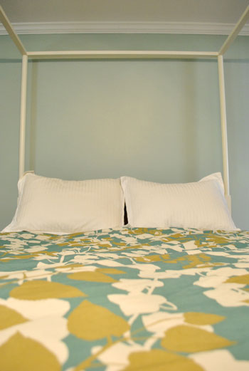
Actually, you can better see how saturated the walls are in this shot with the lights off (so it doesn’t read as yellow on camera). Oh and the walls/duvet look a bit more true to life here (see how they kind of work with each other without competing or looking too flat?).
And yes, that’s still our Christmas tree in the background. It’s on the list.
Anyway, it feels GREAT to have this room painted because it was a big leap towards making “the new house” feel like “our new house.” And consider us as having officially caught the painting bug. We’re thinking one of the big living spaces might be next. If only we could settle on a color…
Psst- We’re spilling one of our favorite money and space saving baby secrets over on BabyCenter. Oh yeah and there’s a video of Clara screaming over there too. Good times.

Lauren says
OMG I’ve been following your blogs for about 6 mos now. (Great sense of relief while at work BTW – so THANKS!) But today I clicked on your page and was soo excited to see this post. This past weekend I just painted our future nursery this EXACT same color. CRAZY! We too love it! It does look a different shade in different lights. But somehow it took us 3 days and 2 gallons to paint 2 coats on the walls, in the closet and all the trim. Can I ask how long do you guys wait between coats of paint? I was kinda surprised to see you finished the whole space in just 5 hours. Maybe we’re just slow painters : p
YoungHouseLove says
We only wait about 30 mins or so because by then we just start in on coat two where we started on coat one (which is definitely dry by then) and work our way around the room in the same exact order again. That way everything has equal drying time. Hope it helps!
xo,
s
carrie @ brick city love says
Very nice! This looks similar (albeit a bit more blue) to our bedroom color – BM’s Quiet Moments.
Steph @ Birdhouse Family says
Looks fabulous! It makes the bed and crown molding pop, complements the duvet, and really does make the washroom vanity seem less like a washroom vanity. Another vote for the mirror in white!
KarenC says
Wow… what a difference! Love that color. I’m looking for something very similar to re-do my bedroom so I’m making a not of that weird color name. LOL
Cherri Porter says
I think you should paint the mirror white to match the trim.
Jenn L says
Beautiful! I love your method for choosing a paint color! It beats painting a zillion stripes on the wall and then having to worry about covering them up later! =)
It looks 10x better on the walls then on the swatch — do you have any other tips for choosing a color? gut instinct? or maybe you try to pick a certain lightness/brightness? haha any tips would be greatly appreciated! <3
xoXOxo
Jenn @ Peas & Crayons
YoungHouseLove says
Hey Jenn,
I wish we had some silver bullet for picking paint but we just look at the swatches for a while in different lighting situations and mull about things for a while and then pull the trigger with crossed fingers. We have learned that we like colors that are muddy as opposed to pastel or clear and bright (since they read kind of easter-eggish to us).
xo,
s
Samantha says
I love the new color! Still unsure of how I feel about the mirror, but it’s definitely warming up on me.
What do you plan to use as his/her pj and sock storage? I’ve never been able to think of something suitable, resulting in piles of pj’s littered around the bedroom.
YoungHouseLove says
Hey Samantha,
John mentioned my his & hers dresser idea, so that’s what we’re thinking will work for socks & pjs. Until then we have piles too…
xo,
s
Patti says
Woohoo! Love this color and chuckled thru this entire post Carolina Country Club Cape Canaveral …
Ellen says
Love the color! and I love the humor about the name. Particularly funny for me because I went to Carolina, have stayed at the beloved Carolina Inn, and grew up in the same town as the Carolina Country Club. Can’t say I remember this color though – I love it!
Kathy Blake says
LOVE how your room is coming together. I kind of like the mirror black. It ties in with the chair, mirror against the wall, and the ottoman/bench at the end of your bed.
Sarah says
If it makes you feel any better, my tree is still up as well. We have a very large, open living/dining area with not-so-great lighting and at night the tree adds light and ambiance, so I am reluctant to remove it. Pretty sure our super is going to yell at us when we put it at the dumpsters on Feb 1, though, so that may be our weekend project…
Melisa says
This post just made my ice/snow filled day so much better! I love the color you picked. It’s beautiful and it really is a great contrast with the floors. I am really enjoying watching you’re new house evolve! Keep up the great work!
Jennifer says
We just painted our nursery a similar color. So….great choice! :-) (Ours was a Martha Stewart color b/c we had a GC to HD.)
Kara says
LOVE this color! We have a dark wood sleigh bed with a creamy white quilt & red & cream patchwork throw pillows on it. We’ve been thinking of going towards a very light grey, almost silver, for the walls but now I’m kinda leaning towards light blue… darn you, YHL! ;)
Jessica says
seriously. i have the painting bug ALL OVER the place…but we’re not ready. :( actually, i might end up going over the Lowe’s or Home Depot this weekend and picking out some colors so that when the hubby comes home from India we can pick a weekend room to do! And also–might end up looking on amazon for a longer shower curtain because our shower curtain rod drives me NUTS and I’m hoping to raise it in our main bathroom (and maybe even the one with just the shower stall)! Maybe that will fit into our February budget!
elizabeth Mackey says
The color already makes the room look modern and fresh. I really love how it goes with the duvet.
I think Sherry’s big idea for the dressers if a fantastic one. Something antique with interesting lines to it. Of course they should be painted something interesting as well :)
Felicity says
I’d love to hear your thoughts on ceiling fans. We had three of the same one (if yours has some weird caning on the paddles) and I removed two in favor of updated light fixtures. But there’s one left in the guest room and the husband has put his foot down and said he likes the ceiling fan(!?!) despite the fact that I already bought a drum pendant for the room. We made it through the summer with a table-top fan; how great is the ceiling fan? Is it a necessity?
YoungHouseLove says
Hey Felicity,
We like ceiling fans in a sunroom (and also had one in our last house’s den). In bedrooms we go with table fans (high quality ones have great air output these days). We have a nice fun aqua one in Clara’s room and a stainless steel one in our bedroom- so that ceiling fan is a gonner!
xo,
s
Roshni says
hahahha!! Just love your play of words with the Carolina Aqua um uh…whatever!!! The color looks so cool and peaceful…great color for a bedroom. Can’t wait for you to accessorize!
Anne says
Your bedroom wall color reminds me of the southern tradition of using “Carolina Blue” or similar very-white-sky-blues on the ceiling of the porch (especially in historic homes). Legend has it, the blue on the porch ceiling scared away ghosts! Other, more practical reasons, suggest that the sky illusion confuses bugs, causing them to keep on flying- away from the porch.
Abby R says
Haha, don’t feel bad, our tree is still up, too (ornaments are off, but we still haven’t dragged it out the door)!
PS The color looks great.
Sarah @ Comfort and Joy says
I like the cohesive look between the bathroom and bedroom. :) I’d love to see you kick it up a notch with some tone-on-tone stenciling in that area and a pop of color for the mirror. Perhaps picking up the greenish-yellow from the leaves on the comforter? :)
Sarah
Julie says
I love it! We’re looking to paint our nursery aqua/turqouise very soon. I’ll add this swatch to our list!
I do have a Q… are your walls smooth? A couple of times recently you’ve done a little demo work and then said you skim coat and sand it down. You’ve never mentioned having to re-texture. That’s the most frustrating part for me! Do houses in other parts of the country not have textured walls??? Thankss!
YoungHouseLove says
Hey Julie,
Nope, no textured walls here. Maybe try googling around for tips? Good luck!
xo,
s
Celestia says
For what it’s worth, my vote is to leave the mirror the way it is. I definitely think painting it white would make it blend too much. I like the current contrast.
Also- random question. I seem to remember you guys doing a baby registering post about what was worth it and what wasn’t or something like that, but I could have the wrong blog. If so, can you link to that post? A pregnant friend is freaking out about all the choices so I was looking for things to show her. Thanks! (And if I’m wrong, no worries!)
YoungHouseLove says
Hey Celestia,
Maybe this post and this post will help? Good luck!
xo,
s
Heather E Transue says
YHL – I LOVE that color. I love how you shared so many shots. I really, really, really LOVE the idea of getting two dressers (similar, but not completely matching) and flank the open door. That will offer great storage and give you more surface area to “cutsie” up with decor items! Well done!
Briel K. says
Everything is looking good! Nice color choice. :) I’m glad to read you will be getting rid of the ceiling fan since that’s a question I was going to ask. It just doesn’t mesh well with Ed the Bed! :)
Jessie says
That paint color is fantastic. So soothing! And it looks very nice with your new duvet.
Amanda says
That is my ALLTIME favorite color!! Great choice!
Handy Man, Crafty Woman says
Love the color! Wowza, that’s a big bedroom!!
yes, I think in this case, the ceiling fan needs to go; as it competes too much with “Ed the Bed”, lol.
Sara @ House Bella says
It looks wonderful! I’m feeling a little sad you didn’t go with a dark gray like your mood board – but heck, it’s your house and it looks awesome! I’ll eat my own words and paint one of my own rooms dark gray. :)
Karen O says
Oh please paint that mirror white – it’s screaming for attention and needs to learn to play nicely with others!
Carol says
Love the color. Here’s an easy way to remember the color of your bedroom:
http://www.carolinainn.com/
Annalea says
Oh, I like it! I never would have guessed that the chip would have looked like that in a full-on paint job, but maybe that’s a lighting issue with the photo of the chips. Then again, I have a hard time imagining the chip color spread over the whole room, and tend to choose colors that are too dark or saturated. (Luckily, I paint a something-or-other first, and hang it on the wall so I can see the color on a larger scale first.)
What kind of mental exercises do you use to help envision a paint color at room scale when looking at a paint chip? Do tell . . .
YoungHouseLove says
Hey Annalea,
We don’t really have a silver bullet trick for picking paint, but scroll back for more info on what works for us.
xo,
s
Leslie C. says
I love this color!!
In fact, its the exact same color that we painted our kitchen!!
The rest of our main living spaces are painted in grey tones, so I think it is a great pop of color for the heart of the home!
Lyndsey says
Love the paint!! Your room looks beautiful already. Dressers that “go” sound like a super idea. And your bed and duvet are really beautiful. Classy and sort of modern without being overly flower-ly.
Also, I kept laughing at all of your crossed out botches of the paint color name. Hilarious.
Lindsey says
Holy crap I love it!!! It looks amazing!
Sheryl J says
Love love love it! It’s like your building my dream bedroom. So jealous! That color is perfect for that bedding and the Ed bed just brings it all together… swoon!
Cassie says
Color choice looks great! I really feel like the sink area is looking waayyy better with the new wall color. Yesterday I thought the black mirror was really jarring. With paint on the walls, it’s looking so nice! I think leaving it black or maybe painting it a charcoal gray would be awesome.
Candi Rodgers says
Hey!
I love the color you picked out for the bed and bath. I also love that mirror. I have had my eye on it for about a year from Lowes, but I don’t have anywhere to put it! It fits perfectly. I think it would look great painted out the white of your window trim because it would all look like one piece, almost like a stained glass without the stain. Have you thought about frosting that window as you did your side door? I had a question about the master bathroom. The tree accent tile: if you wanted to keep the rest of your tile (because I think it looks great) I have heard you can use a Dremel tool to remove a broken tile. Had you thought about doing that and replacing it with a pretty mosaic band, possibly glass tile with a blue-green to pick up the wall color? Or were you planning/hoping to do something totally different in there one day?
YoungHouseLove says
Hey Candi,
Check out yesterday’s post for info about why we’re holding off on frosting that window for now. As for replacing some of the tile with a dremmel, that’s definitely something we’re thinking about down the line. Can’t wait!
xo,
s
Linda says
Love how it turned out! Will you be painting the ceiling, too, or leaving it white?
P.S. Don’t feel bad about the tree, ours it still up and we’ve also been working on it. :)
YoungHouseLove says
Hey Linda,
We plan to paint it eventually. We’ll post all about that when we get there…
xo,
s
Claudie says
I love that color! It looks fabulous with all of the white trim and the bed and it’s going to look excellent if you guys stain your floors darker as well.
When it comes to the mirror, I would hold off before painting it. I think once you figure out what color accessories you’re going to use in that room, it’ll be easier to choose the right color. I would say that keeping it black isn’t an option though since the contrast between it and the window is a bit much. If I were going to paint it right now though (without knowing about the accessory colors), I’d choose the wall color itself or the lightest band on the swatch you picked the color from. If you have any white in the same finish, you could always mix a little at a time of the wall color with the white until you get a hue that you like and you wouldn’t even have to go back to the store. Just mix really, really well! :)
carolinaheartstrings says
Love love love the color choice (and of course the name Carolina – from the North and South Carolina girls). I think it does wonderful things to the bed linens. Cannot wait to see all the accent colors you come up with.
Celestia says
Very helpful – thanks!
Crista says
Love the dresser idea. What about painting either the bedroom or bathroom ceiling the same color as the walls? I’ve done it before and seen it done in other houses with white trim and it looks awesome.
YoungHouseLove says
Hey Crista,
That’s definitely a possibility. Sometimes we like going with something a little lighter so it relates but doesn’t feel the exact same (and is somehow loftier and lighter up top) but we’ll see where we end up…
xo,
s
Sarah says
Great Choice Guys! I love that the duvet background color and wall color are siblings but not twins! And thanks for the lead on the big martha stewart chips at Home Depot! I went last night and finally picked out a palette for our nursery!! Mimosa, sea anemone, magnolia grandiflora and snow melt! I love that she has the symbols on teh swatches that help you know which colors will most likely work well together! Before I had brought the bedding in to try and “match” colors and always came home frustrated. This time I left the bedding at home and just waiting for a scheme to pop out at me. Low and behold when I got home and laid the colors down on the quilt, they complimented it beautifully without “matching” it, which I prefer anyway! Do you all find this to be true? How do you go about picking up paint swatches when you know you have an element (like bedding) that you want to make sure flows with your wall color?
YoungHouseLove says
Hey Sarah,
We just lay swatches on top of the bedding and hold them up on the wall and go with our guess as to what might look best. There’s not much science to it beyond just eying it and crossing our fingers!
xo,
s
Jean says
I’ve been in the Carolina Inn in Chapel Hill many, many times, but I don’t remember seeing this lovely paint color. You bet I’m going to check next time I’m there though!
Jess says
L-O-V-E those gorgeous floors! (And the paint color you picked, LOL!) Just how wide are those planks? Do you love them? My husband and I are talking about putting in hardwood floors in place of carpet and not quite sure what width of planks we want to use. I love yours though! Do they look that lovely in person? I think you mentioned in another post that they are pine wood – isn’t that a softer piece of wood? Sorry for all the questions I’m just in L-O-V-E! :)
YoungHouseLove says
Hey Jess,
We love the hardwoods in there! They don’t feel abnormally soft or anything and they’re “reclaimed” so we like the character they have. They’re around 7.5″ wide. Hope it helps!
xo,
s
Laura B says
I’m so happy that you guys have a new home to remodel, we get the benefit of having your tutorials new and improved!
About the No-VOC paints, are they odorless? If not, how strong is the smell and how long does the new paint smell last? Also, does it take much longer for the paint to dry? I heard that the paint stays wet longer. Was this a one day project?
Thanks again for keeping this blog going (I expect it’s trickier post-baby, but you guys are handling it beautifully)! Cheers!
YoungHouseLove says
Hey Laura B,
They’re definitely not completely odorless, but they’re a lot less strong when it comes to scent and it dissipates quickly (the day after we painted Clara’s nursery it never smelled like “new paint” again. Same for our bedroom (this morning it smelled like it had been painted for years). It didn’t seem to take longer to dry (we only waited about 30 mins between coats and it worked out really well). It only took us about 5 hours to prep and do both coats. Hope it helps!
xo,
s
Susanna says
Speaking of tone on tone stencils…the previous owner-designer of our former home did a nifty stencil job in our powder room. He stenciled using a clear varnish so the design was clear but with some shine and interest.
Christen says
Love the color choice of … what was the name of it again?!
Looks great! :)
Kara says
Satin?! I don’t even know you anymore.
There’s a dark purple satin wall in my life that is eating away at my sanity, so I’d submit that satin probably works just find on light to mid-range tones, but on dark tones it makes the color too hard to read because of the glare.
What finish did you use for your super-dark built-in backs?
YoungHouseLove says
Hey Kara,
Satin! So sorry to make you crazy. It seems to read really well in there. Maybe it’s because the white semi-gloss shelves around it make it look matte by comparison?
xo,
s