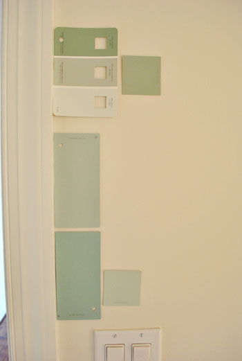
That’s the name of the new bedroom color. It doesn’t exactly roll off the tongue, but it does look pretty good rolled on the walls. We finally made a decision to go with the middle band on the Valspar swatch at the top of this photo (though we got it color matched to Olympic’s No-VOC paint in a satin finish). We liked that it was green and a bit more saturated than a color we’d choose for our last house.
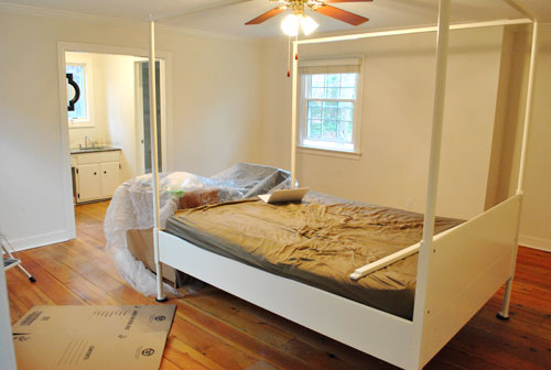
Here’s one last look at the room paint-less (and mostly furniture-less). Oh yeah and look at poor semi-disassembled Ed the Bed. We had to remove one slat on the top so that he could slide forward into the middle of the room without hitting the fan while we painted around him.
And thanks to the magic of the internet, here’s what the room looked like around five hours later after two coats of Sweet Caroline Club Carolina Inn Club Aqua (we never got the name right a single time that we tried to remember it) on the walls. Amazingly we only needed one gallon (we’re not used to rooms this big so we totally expected to run out and have to do that annoying go-back-to-get-more thing in the middle of the project).
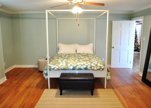
It’s definitely somewhat reminiscent of our last bedroom color (Glidden’s Gentle Tide) but it reads a good deal darker and greener in person, so it’s definitely a step towards our vision of a bolder color scheme when it comes to this house. We debated going a lot darker or brighter when it came to the walls, but ultimately decided that we didn’t want the wall color to be the star of this room. So keeping it somewhat subdued leaves room for colorful curtains, art, and even some painted secondhand furniture if we decide to go that route.
We actually hesitated before painting Carolina Country Club Inn Carolina Inn Club Aqua in the bathroom nook because we thought we might want to go darker, lighter, or bring some other accent idea in there (decorative wallpaper? a tone on tone stencil?).
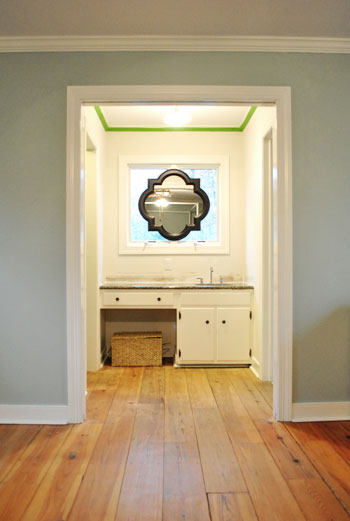
But since our goal has been to de-emphasize the bathroom-ness of this space and help to better connect it to the main room (so that it visually makes sense instead of sticking out like a sore thumb) we went for the cohesive look and used the same color on the walls in there. Good old Caroline County Aqua Carolina Inn Club Aqua. Oh but we used a semi-gloss finish for extra wipeability since it’s near a sink. Don’t mind the fact that it looks lighter in the pics (it doesn’t in real life- must just be the lighting).
And yes, we’re still talking about painting the mirror everything from gray to white. We go back and forth between leaving it and letting the room evolve a little more before doing a thing and whipping out the paint brush and getting ‘er done later today. Whatever we do, we’ll share pics when we do it.
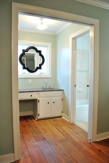
The color on the wall is also reading a bit light in these pics. We’d definitely describe it as something in the “mid-range” (not light but definitely not dark). You can see from the swatch in that top pic that it’s definitely not super subtle, but it’s also not ultra saturated. We actually really love that we landed in that middle-ground area. Everything from the crown molding to the trim and even Ed the Bed really pops, but it’s not too much that it would compete with bold curtains, art, and other stuff that we can’t wait to mix in. Oh and Ed’s poppage is a bit more evident in the first pic of the painted walls above though. Scroll scroll scroll.
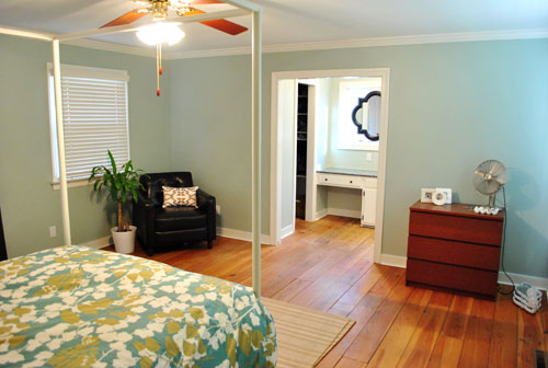
None of the furniture placement is permanent (heck some of the furniture itself may soon be replaced, like that old ikea dresser from our guest room above). But at least it’s starting to feel like a our bedroom. Sherry has this big idea to get two secondhand dressers that “go but don’t match” and refinish them (or paint them a bold color) and then place them on the walls on either side of the bathroom doorway for some nice balance – and some his & hers sock and pj storage. Then the chair will probably go live in the corner to the left of the bed as you face it.
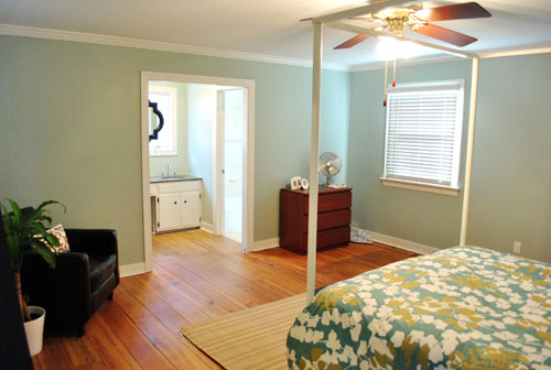
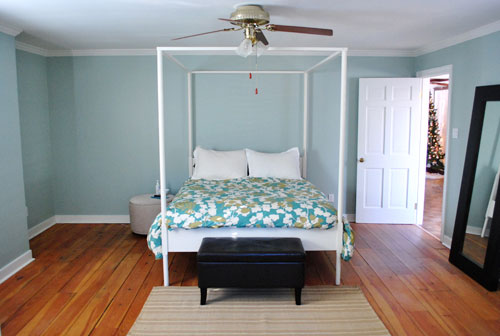
Oh and speaking of going but not matching, we like how Cape Carolina Canaveral Carolina Inn Club Aqua picks up the color of the duvet nicely too, without being perfectly plucked directly from the fabric itself (which we think could have been waaaaaay too much).
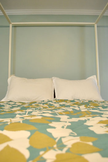
Actually, you can better see how saturated the walls are in this shot with the lights off (so it doesn’t read as yellow on camera). Oh and the walls/duvet look a bit more true to life here (see how they kind of work with each other without competing or looking too flat?).
And yes, that’s still our Christmas tree in the background. It’s on the list.
Anyway, it feels GREAT to have this room painted because it was a big leap towards making “the new house” feel like “our new house.” And consider us as having officially caught the painting bug. We’re thinking one of the big living spaces might be next. If only we could settle on a color…
Psst- We’re spilling one of our favorite money and space saving baby secrets over on BabyCenter. Oh yeah and there’s a video of Clara screaming over there too. Good times.

ashley @ sunnysideshlee.com says
Love it! It’s a great color selection…although I wonder how bad/good it would have looked like if you went yellow or gray… hm. You can really tell how much larger your new master bedroom is though with the paint slapped on the walls! Huuuuge!
Candice says
I’m smiling because I like the color – and because my husband and I both went to UNC-Chapel Hill, home of the Carolina Inn. I love the cheery colors there, and I’m assuming that this color is based on their’s, because they have a lot of “Southern” paint and decor – warms yellows, bright peaches, and “mid-range aqua” (although the only thing I can remember seeing in the aqua is the rugs)!
JM says
RE: the textured wall comment – we have a room in our upstairs that was orginally part of the attic and had textured walls. We bought a roller that had thicker fur (technical term :) and was not as smooth as your typical paint roller. It picked up a lot more of the paint and was able to deposit it a lot better in the ltitle divots of the wall. We grabbed our’s at Lowe’s and if I remember correctly, I don’t think it was white before we began painting with it. Hope it helps!
renee says
Oooooo. I love that color. Looks great!
Kim says
I vote paint the mirror, (I love it btw) but can totally see that waiting while the room evolves will help make that decision easier – especially choosing a color.
LittleMissEclectic says
I love it so much. you are both so inspiring. I can’t wait to get our house sold and buy a new one so we can start the process all over again!
A.C. says
OOH. ‘Kay, second comment of the morning but I had a crazy idea- if you decide to get second-hand dressers for either side of the sink nook, you should look around for a cheap-o slab of granite (maybe at the Habitat ReStore…) to top them with. It’ll make your sink even more convincing when it whispers, “hey, check out how slick and furniture-like I look.” For regular, non DIY miracle workers, this might be a teensy bit on the cost-prohibitive side, but I’ve seen you guys do much more with way less. Just a thought. Keep up the good work. :)
marissa says
That looks great! I’m amazed what a little color can do for a space. Before the darker furniture really seemed to jump out to me as too much contrast, I don’t know why, it just looked odd to me. Somehow that color on the wall pulls everything together. You guys did a great job and way to go for it with a new color – I would have been a chicken about it. :) Looks wonderful!
Sandra says
When you painted the bathroom part a semi-gloss color how much paint did that take?
YoungHouseLove says
Hey Sandra,
We only got a quart of that and have about 1/2 of that left. Thanks to all the windows and doorways it wasn’t much wall in there.
xo,
s
Hilary @ My So-Called Home says
Just love the color and that you used it in the bathroom as well. I think it’s nice that the sunny sink nook makes the color look a little lighter even though its the same paint- unintentional bonus!
And as for new dressers, or any new item you may need, head on over to My So-Called Home for a World Market voucher- $50 worth of goods for only $25!
http://www.mysocalledhome.blogspot.com
Keri Beth says
A friend told me about your blog last week, and I promptly became a YHL fan. We also bought our first ranch home just over 4.5 years ago, then in October bought our permanent home, also a ranch with a master suite addition (and tile in the guest bath identical to yours). Had a couple of babies who use(d) cloth diapers in the process as well. I still had boxes I hadn’t unpacked from our move three months ago, but you inspired me to do some organizing and decorating in the new place. Thanks! P.S.-Your bedroom color looks great!
Rachel says
How on earth did you manage to paint a big room, TWICE, with only one gallon of paint? Did I read that correctly? Amazing!
Any tips for stretching the paint, I’m lucky if I can get one coat out of a smallish bedroom with one gallon. Maybe its the roller?
YoungHouseLove says
Hey Rachel,
Yes, isn’t that crazy! We didn’t do anything special, just cut in, rolled, waited about 30 mins for drying time, started back on our second coat in the same order that we applied the first coat, and cut in again to get it all even. No idea how we still have about 1/10th of it left!
xo,
s
Niki says
I have that color in my hallway! I love love love it. I was actually thinking of painting our dining room that color too.
Michelle @ Dream Home DIY says
you guys are amazing, really…your’e machines! We moved into our house 6 months ago, and while I feel like we have been going non-stop ya’ll are smokin’ us! Great job :0)
Amy @ Shutterly Lovely says
It looks fantastic, no matter how many words are in the paint swatch name! I know you’re probably sick of photo tips, but I like to use a tripod to capture most of my room photos. It allows me to turn the overhead lights off and use more daylight by leaving the shutter open a little longer. That last photo looks great! Everyone has their own way of doing things though, just wanted to share mine!
YoungHouseLove says
Hey Amy,
Thanks for the tip! We usually break out the ol’ tripod for big final reveals, but since so many things are in progress, we’ll have to remember to use it more often!
xo,
s
Sarah @ The Strength of Faith says
I agree with Sherry on the dresser refinishing. I think if you keep the color/stain scheme similar you can get away with different textures. Actually, that might make it kind of interesting and will make the pieces pop a bit! I redid a dresser a few weeks ago – http://www.thestrengthoffaith.com/2011/01/and-now-for-something-completely.html – we don’t really need another one, but if I find something cheap I’ll redo it so we have two!
Chicago Cuisine Critique says
I love how the wall color turned out. It actually looks similar to my own room’s wall color (which I did not pick out but really love).
heidi @ wonder woman wannabe says
La, la, la, la, la, la, la, la means I LOVE….your paint color! I’ve been dreaming of a bedroom that shade for quite some time – looks so airy and bright~
Amy says
So just a random thought. I know you might have addressed it already…. but here I go.
Have you guys brainstormed about maybe matching the cabinet part of the vanity to the mirror or a darker color similar to it?
I feel like that could potentially look really cool(like a little piece of furniture.)
YoungHouseLove says
Hey Amy,
Yep, we’re mulling that around too. Who knows where we’ll end up. We change our minds on an hourly basis lately!
xo,
s
Jen says
Love the color!!!
elizabeth says
It’s beginning to look a lot like YHL in there! Love it!
Lauren says
Someone told me (after we finished painting) that if you put a drop of Vanilla (the kind you use for baking yummy cookies) into the can of paint and mix it up before painting, it will eliminate all paint fumes. No yucky paint smells. Can’t wait to try it!
jbhat says
If I had a seal of approval, I would affix it. Not to the newly painted walls, but to this comment. I think the paint color and the room look lovely.
jbhat
emily @ the happy home says
we totally went for a big, bad bold blue on our bedroom walls, and now i totally regret it.
i love this sort of sea-glass green that you decided on! i think we’re going to switch to a smoky white instead.
bhh says
Your bedroom is looking better by the day! So glad that you are considering some antique/thrift store dressers. After quite a few years of trial and error, if there’s one lesson I’ve learned, it’s that every room needs some signature piece of furniture, linen, etc. that is unique so that the room doesn’t look like a store display or, especially in the case of bedrooms, a hotel room. I know your personal touches will continue to personalize your spaces. Keep up the good work!
Laura says
I love the new wall color + Ed the bed + the duvet. Magnifique! I’ve got an Ed-bed related conundrum that I’ve googled before and have found no sound advice for, so I’m coming to you two: I have the same bed in brown from a few years back, let’s call him Ned, and Ned is nearly Dead and REALLY needs some paint, but I don’t know whether you can paint that kind of IKEA furniture. Am I crazy to tackle a project like this? Have you tried painting IKEA furniture? IKEA’s site lists the bed as being Fiberboard with Acrylic paint, but I’m not sure what that means in terms of my options. Any yay or nay or how-to advice you have would be immensely appreciated! Thanks John & Sherry!
YoungHouseLove says
Hey Laura,
This tutorial will hopefully help: http://livingwithlindsay.com/2009/05/how-to-paint-laminate-furniture.html
xo,
s
Katie says
Hmmm. I don’t know. The orange-y floor and then all the white trim with seafoam green walls, and the floral duvet and black leather chair…it just looks very “Florida Condo Rental” to me. I don’t know if it’s a bad thing, it’s just very different from your past room. It’s just the beginning though and you guys always make things great, so I can’t wait to see how this evolves.
I’m definitely in favor of painting the mirror frame white.
Sara says
And i will join those from UNC Chapel Hill who say that Carolina Inn Blue is perfect!! Will have to look into that color myself for future projects – lookin’ good guys ~
erin says
What a gorgeous color! The room looks great. As for the mirror, what about painting it a similar avocado/mustard color as in the duvet? It would feel cohesive but still fun, imho.
Lauren says
Yay for paint! I love how the whole thing is working together and of course the crown moulding/trim look wonderful with some color on the walls. I will probably giggle in the future every time someone asks you for the name of the color in this room :-)
Mandi says
What a lovely, soothing color! (With one heckuva name!) I like it a lot.
kalibrooke says
great post! (on ed, too… haha.) the color looks fabulous. looks like you need to update your bio over on babycenter to reflect your new space and a whole new list of projects!
YoungHouseLove says
Oh yeah! I wonder how the heck we get them to update that for us…
xo,
s
Christine B says
I love the colors and how you are trying to make both rooms unified. If yall ever get tired of looking at the sink you could always look into sliding doors. My hubby and I replaced all our bifold doors with those in all the bedrooms and laundry nook and love em! They look so much modern! I had some pictures on my blog and I know Nicole B. has them on makingitlovely.com that are just like ours.
form2form.wordpress.com
Jess says
Awesome color choice!
I love both the hue and name, being a Carolina Alum.
I worked with a wedding consultant while in school at UNC-Chapel Hill and we did many weddings at the Carolina Inn. It’s the most popular venue in the area to get married. How fitting that the color is used in your bedroom!
Jess
Eileen says
LOVE the color ~ perfect for coordinating with the duvet and playing up the white trim/bed. And so pretty and soothing!
also, your bedroom is huge! I love the idea of dual dressers flanking the doorway… ooh and if you painted them, you could maybe tie in the same color for painting the vanity, to amp up the furniture feeling in the sink-space. So many possibilities! The biggest challenge for me in terms of decorating is figuring out how to tie things together cohesively, so I am really looking forward to watching this part of your process!
Snickrsnack Katie says
How beautiful, soothing and refreshing! And definitely I am feeling that this room is now YOU GUYS! LOVE LOVE LOVE! (And the dark mirror is even growing on me. Although I still think white or gray would be better). LOVE THE ROOM!
Julia M says
You know, with the dark accents you have going on, the chair, ottoman, full-length mirror, the mirror on the window fits right in. :)
Aimee McM says
Ha. I bought that exact same mirror on Saturday at Lowe’s and have been thinking about painting it a bright red (Pratt & Lambert’s Chinese Lantern) for my entry way. However, it’s plastic and I’ve not had good luck with that and acrylic paint…are you thinking spray paint? I already have a quart of semi gloss from a project I didn’t complete, so was hoping to go that route but then remembered a peeling problem (yes, I did prime before) i had with a frame. Any suggestions/tips that you’ve found?
YoungHouseLove says
Hey Aimee,
We would recommend roughing up the frame with sandpaper and priming and painting. If that route didn’t work before, or still makes you nervous, you can always use spray primer and spray paint (which might yield better results). Good luck!
xo,
s
jja says
I love that colour!
Kathy C. says
LOVE the color! Wow… it really makes the room feel so inviting and just down right relaxing! Excellent choice!
Heather says
I love it…and dont feel bad about your Christmas tree still being up. We just took ours down (well, we moved it to the porch…and I am thinking about bringing it back inside…)
I am really loving your bed and was wondering if you would share where you purchased it? My husband and I are in the market!
Thanks!Loving watching your new place transform!
-Heather
YoungHouseLove says
Hey Heather,
We got that from Ikea pretty recently, so feel free to search “Edland” on our sidebar to find more info.
xo,
s
Krysti says
Beautiful color! The first thing I thought when I saw the your title was “What?! J&S are in Chapel Hill?” As a UNC girl, I love that you seem to have so many readers from UNC Chapel Hill!
Elise says
I think a great way to do an extra pop would be to do a tone on tone stencil on the wall the bed is on as well as the wall above the sink in the bathroom. Then you could have that little something extra you were looking for but still keep the spaces looking like they belong together. I think the fact that the window is there would keep it from being too much too. Just thought I’d throw that out there.
Looks great! You guys are definitely good at sticking to your style. :)
Jennifer says
I am still in love with the floors in your master bedroom! Looks great you guys!
monica says
Oh- have been waiting for this post! . I LOVE it – relly looks lovely. Wondering if you have thought of painting the sink cabinets? Might make them blend in to the room and act to de-emphasize the bathroom-ness…..
YoungHouseLove says
Hey Monica,
That’s a definite possibility! We’ll share any and all changes that we make as we make them! Once we make up our minds of course…
xo,
s
Kathryn says
I LOVE the color. I am going to be painting our living room a very similar color soon. Ours is called “teal ice” (at least that’s what I think I’m going with. (-: Our wall has a lot of a wainscoting/wood border (it used to be wood paneling, now the border is white and the inside is yellow.) We are going to be changing the yellow to that light blue/green color. It will require a LOT of taping and calking around the wood. I am really excited though, and a little nervous!
~K
stacy says
I love the new color..beautiful!! My mind is now wandering back to that lovely coconut chip round mirror and thinking how perfect it would look above the bed to even out the linear lines of Ed…oh West Elm bring it back!!!! =)
Jackie says
I love the color of your room. I think you got your paint at Lowe’s? How did you get them to color match to the Olympic No-VOC? I wanted to do that a few months ago for paint for my den, and Lowe’s absolutely refused (REFUSED!!!) to color match Valspar to Olympic No-VOC. It was against policy. I think next time I will cut out the paint swatch to have it color matched.
YoungHouseLove says
Hey Jackie,
Really?! That’s crazy! We’ve never had an issue at our Lowe’s. They’ll color match anything- fabric, a photo of your dog, anything!
xo,
s
Stephanie says
Your bedroom looks great!
I don’t know if anyone has already mentioned this, but your new color looks so much like the famous Benjamin Moore “Silver Sage”! At least in the pictures it does. I love that color and used it in one of our upstairs bedrooms.
Jany Claire says
I love the color but it’s reading more blue-y than green-y, at least on my monitor. Looks great with the bedding too. Think you should do something darker or a patterned wall paper in the bathroom nook. Something funky and fun. Although I do like the calm, serene thing you guys have going now. Can you tell me what the color name of the middle swatch is? Thx!
YoungHouseLove says
Hey Jany,
That’s Rainwater by Martha Stewart at Home Depot. Hope it helps!
xo,
s