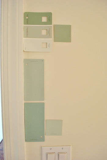
That’s the name of the new bedroom color. It doesn’t exactly roll off the tongue, but it does look pretty good rolled on the walls. We finally made a decision to go with the middle band on the Valspar swatch at the top of this photo (though we got it color matched to Olympic’s No-VOC paint in a satin finish). We liked that it was green and a bit more saturated than a color we’d choose for our last house.
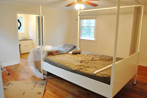
Here’s one last look at the room paint-less (and mostly furniture-less). Oh yeah and look at poor semi-disassembled Ed the Bed. We had to remove one slat on the top so that he could slide forward into the middle of the room without hitting the fan while we painted around him.
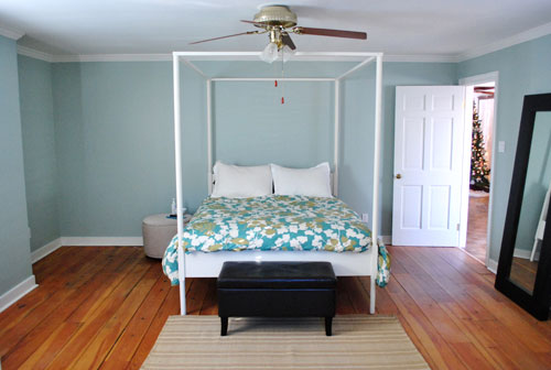
And thanks to the magic of the internet, here’s what the room looked like around five hours later after two coats of Sweet Caroline Club Carolina Inn Club Aqua (we never got the name right a single time that we tried to remember it) on the walls. Amazingly we only needed one gallon (we’re not used to rooms this big so we totally expected to run out and have to do that annoying go-back-to-get-more thing in the middle of the project).
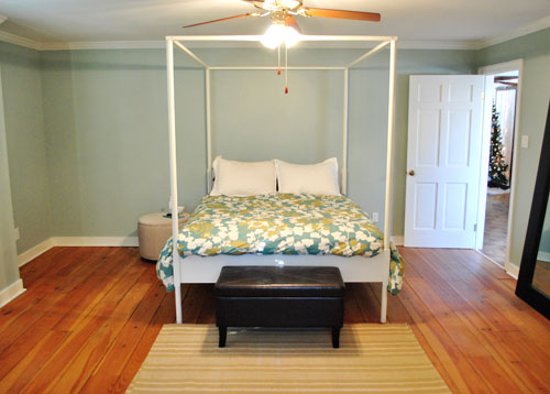
It’s definitely somewhat reminiscent of our last bedroom color (Glidden’s Gentle Tide) but it reads a good deal darker and greener in person, so it’s definitely a step towards our vision of a bolder color scheme when it comes to this house. We debated going a lot darker or brighter when it came to the walls, but ultimately decided that we didn’t want the wall color to be the star of this room. So keeping it somewhat subdued leaves room for colorful curtains, art, and even some painted secondhand furniture if we decide to go that route.
We actually hesitated before painting Carolina Country Club Inn Carolina Inn Club Aqua in the bathroom nook because we thought we might want to go darker, lighter, or bring some other accent idea in there (decorative wallpaper? a tone on tone stencil?).
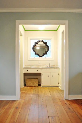
But since our goal has been to de-emphasize the bathroom-ness of this space and help to better connect it to the main room (so that it visually makes sense instead of sticking out like a sore thumb) we went for the cohesive look and used the same color on the walls in there. Good old Caroline County Aqua Carolina Inn Club Aqua. Oh but we used a semi-gloss finish for extra wipeability since it’s near a sink. Don’t mind the fact that it looks lighter in the pics (it doesn’t in real life- must just be the lighting).
And yes, we’re still talking about painting the mirror everything from gray to white. We go back and forth between leaving it and letting the room evolve a little more before doing a thing and whipping out the paint brush and getting ‘er done later today. Whatever we do, we’ll share pics when we do it.
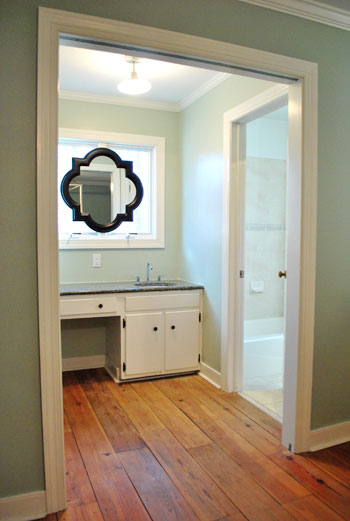
The color on the wall is also reading a bit light in these pics. We’d definitely describe it as something in the “mid-range” (not light but definitely not dark). You can see from the swatch in that top pic that it’s definitely not super subtle, but it’s also not ultra saturated. We actually really love that we landed in that middle-ground area. Everything from the crown molding to the trim and even Ed the Bed really pops, but it’s not too much that it would compete with bold curtains, art, and other stuff that we can’t wait to mix in. Oh and Ed’s poppage is a bit more evident in the first pic of the painted walls above though. Scroll scroll scroll.
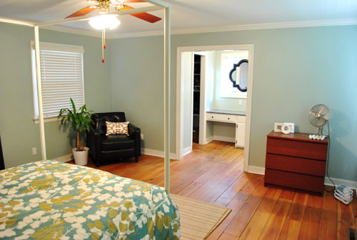
None of the furniture placement is permanent (heck some of the furniture itself may soon be replaced, like that old ikea dresser from our guest room above). But at least it’s starting to feel like a our bedroom. Sherry has this big idea to get two secondhand dressers that “go but don’t match” and refinish them (or paint them a bold color) and then place them on the walls on either side of the bathroom doorway for some nice balance – and some his & hers sock and pj storage. Then the chair will probably go live in the corner to the left of the bed as you face it.
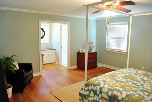
Oh and speaking of going but not matching, we like how Cape Carolina Canaveral Carolina Inn Club Aqua picks up the color of the duvet nicely too, without being perfectly plucked directly from the fabric itself (which we think could have been waaaaaay too much).
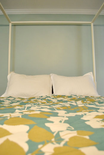
Actually, you can better see how saturated the walls are in this shot with the lights off (so it doesn’t read as yellow on camera). Oh and the walls/duvet look a bit more true to life here (see how they kind of work with each other without competing or looking too flat?).
And yes, that’s still our Christmas tree in the background. It’s on the list.
Anyway, it feels GREAT to have this room painted because it was a big leap towards making “the new house” feel like “our new house.” And consider us as having officially caught the painting bug. We’re thinking one of the big living spaces might be next. If only we could settle on a color…
Psst- We’re spilling one of our favorite money and space saving baby secrets over on BabyCenter. Oh yeah and there’s a video of Clara screaming over there too. Good times.

audrey says
Thats the color I was hoping you would choose! yay
Also your wood floors look amazing with your new painted walls.
Kelly says
Very pretty! Looks very similar to the BM Palladian Blue that we have in our bedroom.
Jordan says
So Light and Airy feeling! I LOVE it!
kelsey says
i love the color and it makes me think of the carolina inn at Chapel Hill too! The other thing I love about your master bedroom are those wide plank floors. i mean they are so great. love seeing all the changes to this house!
Jill says
I love the color. Our wedding reception was held at the Carolina Inn in Chapel Hill NC, which is a gorgeous old hotel on UNC’s campus. So I love the name of the color too!
Robin says
sorry to ask dumb questions but what does “cutting in” mean? I’m not a painting pro (or even beginner) so what does that refer to?
YoungHouseLove says
Hey Robin,
No worries! That just means edging the room with a paint brush (around the trim, baseboards, etc) since a roller can’t get all those areas. Hope it helps!
xo,
s
Jenni says
I love the color! What if you left the mirror frame the way it is and that way if you keep the chair in your room, it will tie in with the darkness of the chair? I also love the dark fixtures of the cabinets under the sink to work with the mirror and chair.
You guys are awesome!
YoungHouseLove says
Hey Jenni,
That’s definitely one possibility! We keep changing our minds but we’ll share what we decide to do when we finally make a decision!
xo,
s
Larissa says
Love the color! I’m curious about your furniture placement. Any particular reason Ed is on that wall?
YoungHouseLove says
Hey Larissa,
Balance! We have two off-centered windows that would have hung over half of the bed if it was placed on those walls (plus an odd shaped indent on one side) so that was the only wall that we thought the bed looked centered. Plus we always like putting a long item in a room longways, it just seems to make the room make more sense and feel more spacious.
xo,
s
Alli says
Hi guys! Looks great, it reminds me of my favorite color which we have in our downstairs bathroom and my office. It’s Coastal Plain by Sherwin Williams.
Just an idea for you, have you thought of using Pax wardrobe doors over the opening to your bathroom? This would definitely separate the spaces, but there are also transparent ones that would still let the light from the window into your bedroom. Can’t wait to see how you transform the rest of your house! :)
YoungHouseLove says
Hey Alli,
We’ve thought of all types of doors but for now we like the challenge of making that nook fit into the room without blocking it off since we love open living!
xo,
s
Carolyn says
I LOVE the color! I am so addicted to checking your blog to see what else you’re up to. Can’t wait to see what color you decide on for the mirror and the other rooms in your house! I think your painting bug is contagious : )
Michelle says
LOVE the color:). Excellent choice, as well as all the other changes in the room so far. I actually used the rendezvous bay color you had in the original mood board in our guest room and LOVE it too! Thanks for the suggestion…you can check it out here if you wanthttp://vabeachhousewife.blogspot.com/2011/01/i-heart-paint.html
Oona says
It looks amazing. I love you two just buckle down and tackle such overwhelming projects together. My fiance hates to paint, so I always end up doing it alone – it took me 5 days (on and off, obvs)to paint our bedroom!
Jessica says
I love that color! And i love that idea of the co-ordinating, but not matchy dressers and then moving the chair. Cant wait to see what colors you choose for the dressers if/when you do that!
pam says
Carolina Inn Club? Hm…I might have to walk across the street and see that color in person. The Carolina Inn is a very charming place! LOVE the color!
kristen f davis says
looks great, my friends!
..but i still think you should do the tone-on-tone stencil somewhere in the house…naturally ;)
cassie says
That colour looks FAB! Totally goes with your bedding and the white of your bedframe. Lovely, lovely.
Lauryn says
Im not sure if you guys have said that you plan on keeping the counter around the bedroom sink for life- but I think a pretty gray on the mirror would go well with the wall color and the countertop. and its not too shocking a color to distract from the light. love the bedroom color btw!
Lindsay says
Very nice! But honestly, it’s the floorboards making me drool!!!
Lisa says
Love it! But… and this is just a thought… would you ever consider going bold, like charcoal gray walls, wallpapering the sink nook, and bringing in some bright, fun accessories?
YoungHouseLove says
Hey Lisa,
We truly believe that not all things can be the star in a room, so if we went bold with the walls and with some wallpaper in the nook, we think it might compete with the duvet and the other accessories that we’d love to add (like bold curtains, light fixtures, etc). We’re considering this wall choice as sort of a neutral base (but not in a boring neutral color) so that we can build on it and add more contrast and color as we go!
xo,
s
Donna says
I have to say I love how the dark color and distinctive shape of the new mirror draw the eye right through the room and then the narrower sink area like a zoom lense. I think it tends to minimize the appearance of the “sink in the bedroom” thing.
I think the dark color would also provide balance if you plan to keep the large mirror and leather bench in the room, too. And conversely, those darker elements would keep the mirror from absorbing all the focus in the room.
I continue to be amazed at all you have accomplished within several weeks of moving. I was never even unpacked in that period of time.
S says
Was hoping you’d pick that color- love it!!
Kristin R says
Love it! Even though it’s darker than your used to it still seems so peaceful, and what else would you want from a nighty-night space?
Oh, and since the rest of the room is on the peaceful, spa-y side, I like the juxtaposition of dark trim on the mirror. What a fabulous idea to hang it there, too!
Emily says
Re: Textured walls
I’m from the Midwest (no textured walls) living in Arizona (textured walls galore, which I hate). It seems to be a trend out here. I hate the textured walls – painting is a beast, but it only takes two coats, just a bit thicker coats with a longer napped roller seems to do the trick.
Regarding re-texturizing (not a word?) after some work – they sell the cans of texture foam and then a good metal flat thing (can’t think of the name) do the trick. Spray it on, use your trowel (ah ha! remembered!) to flatten like the rest of the wall.
Chelsea in Richmond says
Oh. My. Gosh. I LOVE that color! The swatches pic and the pics at the top of this post weren’t showing true on my computer so I was so excited to see the bottom pic. And I think it makes those gorgeous floors just pop!
Isabel says
Hi Sherry and John. Out of curiosity, did you paint the ceilings too? If you must, please lie to me and say you haven’t to make me feel better ;)
YoungHouseLove says
Hey Isabel,
Nope! We’d definitely mention something like that! Down the line we plan to, but we’re not sure what we’re gonna do with them yet. One day at a time!
xo,
s
Tessa says
It’s so refreshing to see other people’s rooms come together step-by-step. You get so used to seeing amazing before and after transformations that it’s easy to get frustrated when you’re in the middle of step-by-stepping it yourself! I wasn’t realizing the full transformation of my own kitchen “facelift” until I went back and looked at the Way Before pictures with today’s pictures side by side!
rosita designs says
so, really kind of a first time commenter here. but, i just had a light bulb moment when i read you are thinking of painting the mirror in the bathroom. soooo – have you guys mulled over the idea of painting the cabinets in the bathroom black to match the mirror instead? it would really look like furniture then, and it would tie in your full length mirror in the bedroom. just a thought.
excited to see all the new renos – we’re pretty much done with our house, so it’s nice to live vicariously.
YoungHouseLove says
Hey Rosita,
That has definitely been on the table for a bit. We change our minds on an hourly basis, but we’ll definitely share whatever we end up going with!
xo,
s
Rebecca says
Do the folks at Lowe’s give you any trouble with color matching? The last two times I asked them to they looked at me like I had asked them to split atoms. Then they told me the usual “It might not be exact.” with a horrified look on their faces and one guy even tried to talk me out of it! Is it just our Lowe’s?
YoungHouseLove says
Hey Rebecca,
Weird! Nope, nothing like that happened to us. And we’ve been in there a lot lately!
xo,
s
Jamie B says
Beautiful color! I’m glad you painted the bathroom nook. Definitely makes it blend in better. Speaking of blending in, I would love to see that mirror frame painted white. It will blend in with the window frame and maybe give the appearance of a uniquely architectural window.
Great job, guys!
JoDi says
Love the color! Our family room was painted a similar color for years until we painted it a sandy tan last Fall.
Glad to see that Rachel asked the same question I had about how on earth you painted that room TWICE with one gallon of paint! I think my husband must be the world’s thickest paint roller because he just painted our tiny bathroom gray and used a gallon+!
Ana says
It looks so restful. That historical color line at Lowe’s has some really great shades. Even if other things at some Lowe’s are … not so great. Cough, cough. :) (I didn’t end getting the washer/dryer pair I mentioned on your laundry post — the models’ regular price is $1,099 each. Even with 20% off, I decided I was crazy and abandoned the idea. BTW, did you guys know that Whirlpool discontinued the Duet Sport models? They were a backup option because of their size but are no longer made.)
YoungHouseLove says
Hey Ana,
No way! We didn’t know that. What a shame, we looooved our Duet Sports! Fingers crossed that you find the perfect pair!
xo,
s
Lilly says
It’s amaizing what a can of paint can do for a room it looks so difernt and the color is beautiful I really love how it looks with ur bedding and bed. R u guys still dreaming about getting that gorgeous mirror from zgallerie for over the bed? And how about nightstands will u b getting matching or his and hers? I personally think that this bed calls for matching if u do get his and hers I know u will still make it work u guys make everything work.
YoungHouseLove says
Hey Lilly,
We’re not thinking we want a mirror over the bed anymore (since we have one across from it and don’t want to have mirror overload) but you never know where we’ll end up. As for nightstands, we can’t wait to find some! We definitely want two that are similar even if they’re not identical.
xo,
s
Autumn says
Love the color! And the duvet! And Ed the bed! And I’m totally drooling over the floor… And the mirror is great, but I’d paint it white. :)
kate says
Great color choice! The room is starting to come together. I love the floors as well, they have such a great look to them.
Julie says
LOVE IT! It looks so fresh and yet colorful. Love the way you’re changing things up a bit but staying true to yourselves!
Jess says
What constitutes the need for primer before painting? For example if you would have had a darker tan wall would you have had to use primer first? I know there are primer-type paints, but if you are wanting to go the no-VOC route then is there a no-VOC primer out there?
YoungHouseLove says
Hey Jess,
We think there are some low-VOC primers and maybe even some no-VOC ones out there so just ask at the hardware store. As for when to use it, we only use primer when we’re sealing something (like wood that could bleed through when we’re painting paneling for example) or when we’re painting over a very very dark color (like chocolate brown). Otherwise we just think it’s cheaper and easier to use an extra coat of paint since we already have it (instead of buying something separate and having to wash brushes between the applications, etc). Hope it helps!
xo,
s
Kate says
I’m sure that you get this all the time but… Thank you, thank you, thank you. I bought a house a year ago October and sometimes I found it so overwhelming that I hated it. I found your blog in May when I needed to paint a set of mismatched trunks that my mom gave to me. Not only did you help me make them look beautiful, but you have helped me everyday since. I am no longer quiet so terrified to buy and try things in my new home. I love watching you in your new house and Sherry I feel you every time you say one day, or project, or thing at a time. I can not tell you how wonderful it is to hear that someone else feels that way too. (too many people I know are willing to not only settle but rack up some major credit card debt in the process) I am loving watching how your house is evolving and it helps me to see that it’s not just one or two things that make things look amazing but rather layers of things till it finally becomes yours. Good luck and thanks again for all the insperation.
YoungHouseLove says
Aw thanks Kate! So glad to help. Good luck with everything and have fun!
xoxo,
s (& j)
Em says
Re: Textured walls
I’m from the Midwest (no textured walls) living in Arizona (textured walls galore, which I hate). It seems to be a trend out here. I hate the textured walls – painting is a beast, but it only takes two coats, just a bit thicker coats with a longer napped roller seems to do the trick.
Regarding re-texturizing (not a word?) after some work – they sell the cans of texture foam and then a good metal flat thing (can’t think of the name) do the trick. Spray it on, use your trowel (ah ha! remembered!) to flatten like the rest of the wall.
Roshni says
Hey guys, I suddenly realized that you have changed your favorite option of matte finish for the walls to satin finish. Could you tell us, why the change of mind?
YoungHouseLove says
Hey Roshni,
We used satin on the walls of Clara’s nursery in the old house and loved how it looked the same as flat but was a bit more wipeable. So we went with that for the extra durability since it looked the same but had some extra function. Hope it helps!
xo,
s
Jackie Smith says
You chose your duvet first, but we chose paint first (Behr Blue Ocean).Now I’m dying to get away from the WHITE but can’t find anything that “matches.”
Lani @ Diapers and Divas says
Awww….I love it! Looks so good! And you’ve made me feel better about still having my tree up! :)
Emily says
Oops, I posted the same thing twice. It said there was an error so I hit submit again! Sorry!
Love the look of your new room!
jenifer says
FYI…..I just bought paint at Lowe’s and was told that all of their paint is now VOC-free, including all of their colorants. So if you prefer Valspar brand over Olympic, it’s now completely VOC-free.
YoungHouseLove says
Hey Jenifer,
Wow- that’s amazing! We can’t wait to check with our store to learn more! As far as we knew last week at our store Olympic was the only one with no-VOC colorants!
xo,
s
kat says
glad you made the comment about placement of furntiure. do you like having the bed essentially next to the door? i wonder it it would work moving it against the other wall?
YoungHouseLove says
Hey Kat,
Ed is staying put. We tried him in all sorts of arrangements and loved this one the best because it gave us the most balanced look by far (thanks to two off centered windows that make the bed look crazy in front of them). We also like putting things longways in a long room if that makes sense. In person he’s a ways away from the door so there’s not a function issue at all. Once we get more stuff in there and share more pics it’ll hopefully make more sense to ya!
xo,
s
Becky says
Do you guys ever have a hard time getting your local Lowe’s store to color match paint across brands for you? Ours keeps telling us it’s company policy to never match Valspar colors in another brand of paint, which is a pain since we perfer the Olympic No VOC stuff, so we feel pretty limited in our available color pallet. I’m wondering if this is a problem specific to my particular Lowe’s store or if they give you a hard time at yours as well.
YoungHouseLove says
Hey Becky,
They haven’t given us any issue at our Lowe’s but we heard that from other commenters (scroll back for more info). So annoying!
xo,
s
kim says
idea for the mirror, how about metallic, a nice pewter!
YoungHouseLove says
Hey Kim,
Nothing is off the table! We keep changing our minds!
xo,
s
Tiffany says
Love the aqua
XOXO,
http://outfitidentifier.com/
Julie at Velvet & Shag Vintage says
I like it! Can’t wait to see what you do for the light fixture. I’m assuming you are going to change out the ceiling fan for something a bit more hip.
YoungHouseLove says
Hey Julie,
Of course! Can’t wait to take that baby down!
xo,
s
Katie says
I’d paint that mirror the brighter,yellower green of the leaves in your duvet.
Cool
harmony says
Your room looks beautiful! I love that color. And don’t feel bad about the tree–ours is still up too! As long as it’s green and happy, I feel bad just throwing it outside (ours is real)!