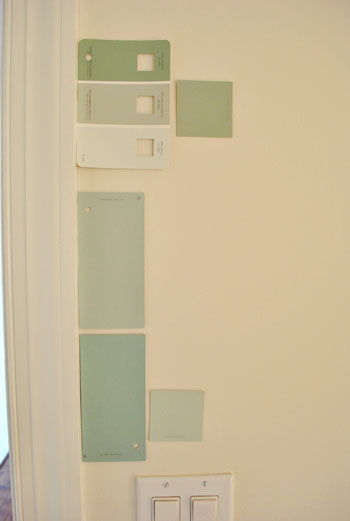
That’s the name of the new bedroom color. It doesn’t exactly roll off the tongue, but it does look pretty good rolled on the walls. We finally made a decision to go with the middle band on the Valspar swatch at the top of this photo (though we got it color matched to Olympic’s No-VOC paint in a satin finish). We liked that it was green and a bit more saturated than a color we’d choose for our last house.
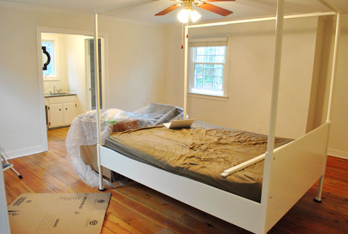
Here’s one last look at the room paint-less (and mostly furniture-less). Oh yeah and look at poor semi-disassembled Ed the Bed. We had to remove one slat on the top so that he could slide forward into the middle of the room without hitting the fan while we painted around him.
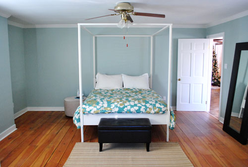
And thanks to the magic of the internet, here’s what the room looked like around five hours later after two coats of Sweet Caroline Club Carolina Inn Club Aqua (we never got the name right a single time that we tried to remember it) on the walls. Amazingly we only needed one gallon (we’re not used to rooms this big so we totally expected to run out and have to do that annoying go-back-to-get-more thing in the middle of the project).
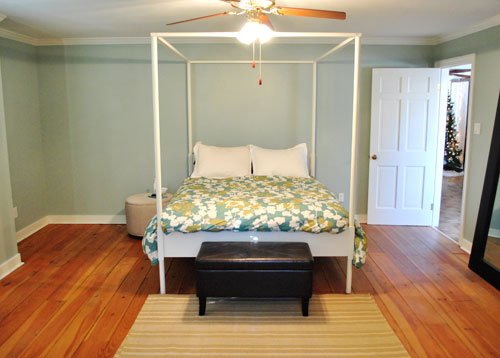
It’s definitely somewhat reminiscent of our last bedroom color (Glidden’s Gentle Tide) but it reads a good deal darker and greener in person, so it’s definitely a step towards our vision of a bolder color scheme when it comes to this house. We debated going a lot darker or brighter when it came to the walls, but ultimately decided that we didn’t want the wall color to be the star of this room. So keeping it somewhat subdued leaves room for colorful curtains, art, and even some painted secondhand furniture if we decide to go that route.
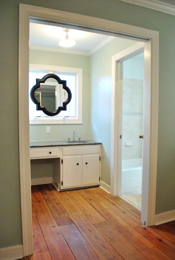
We actually hesitated before painting Carolina Country Club Inn Carolina Inn Club Aqua in the bathroom nook because we thought we might want to go darker, lighter, or bring some other accent idea in there (decorative wallpaper? a tone on tone stencil?).
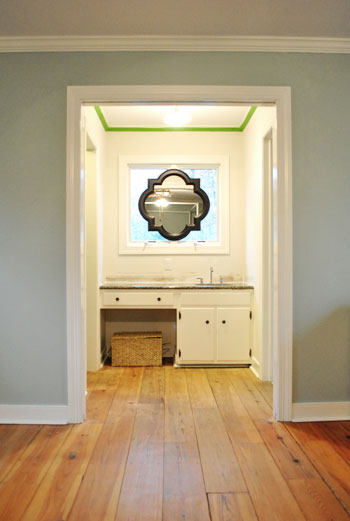
But since our goal has been to de-emphasize the bathroom-ness of this space and help to better connect it to the main room (so that it visually makes sense instead of sticking out like a sore thumb) we went for the cohesive look and used the same color on the walls in there. Good old Caroline County Aqua Carolina Inn Club Aqua. Oh but we used a semi-gloss finish for extra wipeability since it’s near a sink. Don’t mind the fact that it looks lighter in the pics (it doesn’t in real life- must just be the lighting).
And yes, we’re still talking about painting the mirror everything from gray to white. We go back and forth between leaving it and letting the room evolve a little more before doing a thing and whipping out the paint brush and getting ‘er done later today. Whatever we do, we’ll share pics when we do it.
The color on the wall is also reading a bit light in these pics. We’d definitely describe it as something in the “mid-range” (not light but definitely not dark). You can see from the swatch in that top pic that it’s definitely not super subtle, but it’s also not ultra saturated. We actually really love that we landed in that middle-ground area. Everything from the crown molding to the trim and even Ed the Bed really pops, but it’s not too much that it would compete with bold curtains, art, and other stuff that we can’t wait to mix in. Oh and Ed’s poppage is a bit more evident in the first pic of the painted walls above though. Scroll scroll scroll.
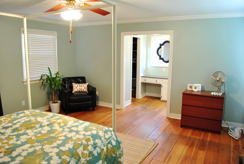
None of the furniture placement is permanent (heck some of the furniture itself may soon be replaced, like that old ikea dresser from our guest room above). But at least it’s starting to feel like a our bedroom. Sherry has this big idea to get two secondhand dressers that “go but don’t match” and refinish them (or paint them a bold color) and then place them on the walls on either side of the bathroom doorway for some nice balance – and some his & hers sock and pj storage. Then the chair will probably go live in the corner to the left of the bed as you face it.
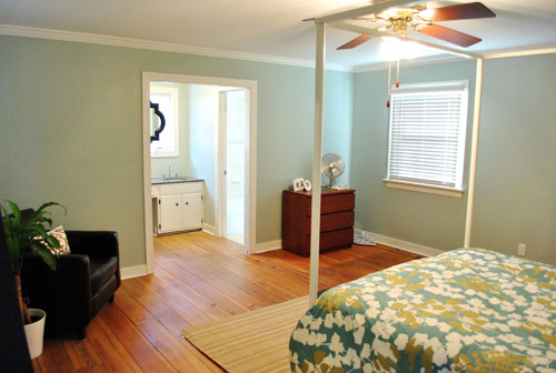
Oh and speaking of going but not matching, we like how Cape Carolina Canaveral Carolina Inn Club Aqua picks up the color of the duvet nicely too, without being perfectly plucked directly from the fabric itself (which we think could have been waaaaaay too much).
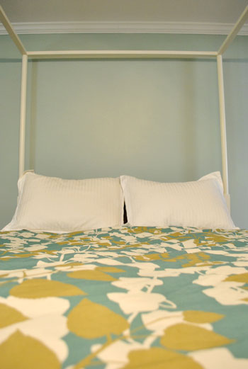
Actually, you can better see how saturated the walls are in this shot with the lights off (so it doesn’t read as yellow on camera). Oh and the walls/duvet look a bit more true to life here (see how they kind of work with each other without competing or looking too flat?).
And yes, that’s still our Christmas tree in the background. It’s on the list.
Anyway, it feels GREAT to have this room painted because it was a big leap towards making “the new house” feel like “our new house.” And consider us as having officially caught the painting bug. We’re thinking one of the big living spaces might be next. If only we could settle on a color…
Psst- We’re spilling one of our favorite money and space saving baby secrets over on BabyCenter. Oh yeah and there’s a video of Clara screaming over there too. Good times.

Rachel says
major lol’s at the variations of Carolina County Court Inn paint.
I love me some Petersik humor.
GreenInOC says
Love the color.
I like the black mirror – that it picks up on the countertop and the hardware (hinges and drawer pulls) in the cabinetry.
I have a question…
Would you, could you put in a pocket door?
Would you, could you paint the floor?
Would you, could you choose boring decor?
Woud you, could you answer any more?!
Okay, after I typed the first question I couldn’t help but go on a bit of a Suessical writing adventure!
My actual question is the first (would you/could you put in a pocket door), closing the bedroom/bathroom? If not, I’m curious as to what your design reasoning would be (besides structural)?
p.s. if you tell me you’ve already answered that question in the comments I am going to turn 14 shades of embarrassed purple!!
YoungHouseLove says
Hey GreenInOC,
Haha, love it!
Yes, we could put in a pocket door.
Although it would mean knocking down walls for sure.
And it would make a lot of dust.
And expert guidance would be a must (since we’d have no idea what we were doing).
So maybe down the road we’ll take a stab.
But for now we’re happy working with what we have.
xo,
s
Carole says
very soothing colour…you’re so lucky to have such a spacious master bedroom, I’d love to have a chair like that to sit in!
I’m sure you’ll be happy with your shift from flat to satin finish once your little one is motoring around! even with my older kids, I’m amazed with the amount of fingerprint marks that have appeared on our flat painted walls.
Erika says
Something about that paint name makes me want to say, “your room shure looks purdy!”
Love it!
;o)
Chelsea in Richmond says
Off topic question. Did your Duets arrive yet? Ours were delivered on Saturday but the guys had to come back on Sunday because they brought the wrong stacking kit. I’ve done FIVE loads of laundry in them so far and couldn’t be happier. Thanks again for the heads up!!
YoungHouseLove says
Hey Chelsea,
Not yet! Soon!
xo,
s
Kristen @JLS says
You guys work fast! Maybe you can just refer to the new paint color as CICA.
I look forward to seeing what you guys choose for the bedroom light fixture!
Sarah says
Love the room! We have a light fixture/fan just like your fan over our bed. I would love to change the fixture but my husband loves having a fan over the bed in the summer. Any ideas for a nice looking ceiling fixture with a fan?
YoungHouseLove says
Hey Sarah,
We prefer high quality desk fans in bedroom as opposed to overhead fans (which we do love in sunrooms) so we’ll be switching ours out for a non-fan version. Anyone know of a chic ceiling fan option for Sarah?
xo,
s
Sheela says
Looks lovely! It’s actually very similar to our master bedroom, which is painted Valspar Jekyll Grand Dining Sea Mist (also a total mouthful to say). I’m now on the road to painting the master bathroom in Luna, which is two shades lighter on the same strip as Jekyll Grand…well, you know. I actually have the paint now, but I bought the Freshaire paint that HD was clearing out last week for $10 a gallon. Amazingly enough, one of their colors was almost identical to Luna, so I was excited about the good deal. Well, I tried the paint yesterday, and the coverage is so poor, I think I would have to do at least 3 coats to cover the light tan color that’s already on the walls. So I may be donating that paint to the ReStore, and going with my tried and true Valspar. Anyway, a long way to say “Great job” to you guys! :) And I can’t wait to hear about the gray color you pick for the dining room (or whichever room you’re thinking of using it in)- I’m currently scoping out a warm, light gray for my kitchen. I’m looking for something with brown/green undertones, so any suggestions are much appreciated!
And by the way, our Lowe’s is the same way about matching Olympic colors to Valspar paint or vice versa, that many people have commented about. The best thing to do is just take your Olympic paint sample, cut out a piece of it, glue it to a white piece of paper, and then come back and ask the Lowe’s to color match “your” sample. Annoying, yes, but at least you can get the color you want in the brand you want.
Wow, can I now win for longest comment ever?
YoungHouseLove says
Hey Sheela,
That’s a great tip we’ll have to keep in mind if ours starts giving us a hard time about that in the future!
xo,
s
Neyir says
It looks fantastic as always. Seeing your vanity I was wondering what you are planning for it. I had one years ago that I painted out black and put crystal knobs on which gave it a distinctive dressing table look. I know black wouldn’t probably be your thing but am curious how it will end up? Gorgeous I am sure :-).
YoungHouseLove says
Hey Neyir,
Yup, we have big plans for that someday. Will post as soon as we get there. We’re trying to take things one day at a time!
xo,
s
Jennifer says
My apologies for leaving a comment without seeing how many other people have said the same thing (rushed on time right now), but I’d leave the mirror as it is until you have nailed down the other major pieces of the room (like the not-so-matchy dressers, which I think is a great idea, by the way). Adding major pieces to the room will probably change its balance, and that may influence whether you want the mirror to “blend” or “pop” – personally I like it’s “poppiness” right now…
Jessica says
Now heading in to Year II of paint swatches all over our MB walls. How do you two do it? Were you just born decisive? I know, I know – paint is cheap to fix but I still can’t take the plunge. The swatches that look lovely in lamplight look awful in the sunlight. Trying desperately to find a soothing, rich gray that does not turn purple or blueish in the light! Any advice, YHL?!
YoungHouseLove says
Hey Jessica,
We’d suggest getting little test pots of color. We’re actually planning to do the same thing when it comes to finding the perfect gray!
xo,
s
Ashley @ According to Ashley says
Haha – Did you guys know that the Carolina Inn is a real place? It’s a ballroom/hotel on UNC-Chapel Hill’s campus. :) Random fact of the day for you!
Amy says
Just another odd little add on…
I know people keep making mention of the cabinet parts and I was curious if aside the color you are looking to do something different with the hinges? No rush on it just curious to see changes since many of our cabinets in house have similar hinges.
An off topic little item that I’d eventually love to see how to rework changing out hinges.
YoungHouseLove says
Yes! We’d love to switch out the knobs and hinges and maybe even paint it. Maybe. We’ll post all about it when we do!
xo,
s
sarah says
I have an idea you might not have thought of for your ‘colour balance’ in photos..
Get an “18% grey card” – A major use of gray cards is to provide a standard reference object for exposure determination in photography.
http://en.wikipedia.org/wiki/Gray_card
YoungHouseLove says
Hey Sarah,
Sounds like just the thing! Off to check it out…
xo,
s
Caroline says
I think Ed and Carolina make a lovely match!
YoungHouseLove says
Haha it’s true! E + C = Love
xo,
s
Verena says
I love the colour and I love how the room is coming together! I wasn’t too sure about the mirror-over-window arrangement, but it’s definitely growing on me, particularly with the new wall colour :)
Can’t wait to see what you’re going to do with the rest of the rooms!
Jenn says
I love the progress of this room! Looks so relaxing!
Random question – is that plant by your chair from Ikea? I think I have the same one, and am having such a hard time keeping it alive! I have it by a window and thought it didn’t need direct light. I water it per the instructions, but the leaves are turning brown. :( Thought I’d ask since yours always looks so alive! Any tips?
YoungHouseLove says
Hey Jenn,
It’s from Home Depot (I think it’s called a corn plant). We just water it once every week and give it some sun. Has been around for years. Hope it helps!
xo,
s
Sonda says
Hi, John & Sherry, you chose the color I was hoping for when you had paint samples on your new duvet in an earlier post! As for your new mirror, my eye was drawn to it right away when you first posted it! I hardly noticed anything else in the photo. If you want to draw attention away from the sink I would leave the mirror black or a darker shade so it continues to stand out.
Emily A says
I love the fast improvements y’all are making on this room. I can’t wait to see the finished product! I’m wondering if the paint color is inspired by the actual Carolina Inn in Chapel Hill. Either way it looks great on the wall. I wonder if y’all can use your awesomeness and perhaps put some drapes or the likes around the bathroom to de emphasis it…or a frosted sliding glass door? I can’t wait to see what you do in there!
Kelly says
It’s so soothing, love the white along with it!
I just watched Clara’s video, lol! I have 3 quiet boys & can’t imagine all of the noise you are going to have in a few years! LOL!
Gina says
Love it! Random question for you seasoned painters…how do you deal with clean-up? Especially rinsing rollers, brushes and the pans out? That is by far my least favorite part of painting as I’ve yet to find the perfect place to do all that rinsing. Bathtub or sink is really messy and can sometimes leave a paint-y residue on my sink, but outside, I feel bad sending all the paint down the local drain into the nearest watershed.
YoungHouseLove says
Hey Gina,
Since we use water based no-VOC paint, we wash our brushes in the sink. We always save the remaining paint in the cans for touch-ups so that doesn’t get tossed or anything. As for paint trays, we let them dry outside and peel the paint right out of them and use ’em again. It’s like peeling glue off your hands in school. So much fun!
xo,
s
Megan says
I really like the color you picked out!!
Quick question and I realize you may or may not answer it. I have a soft blue family room and was wanting something neutral. Any suggestions for how to go about painting over blue hues and any neutral color suggestions?
Love what you have accomplished with the new house!
YoungHouseLove says
Hey Megan,
We love Water Chestnut by Glidden, and two coats should do it (no primer necessary if it’s soft blue). Good luck!
xo,
s
Jamie B says
It looks nice with your duvet cover and the white trim, for sure!
anna see says
I love it! My bedroom is B.Moore Palladian Blue and I love having a soothing but not wimpy color on the walls.
Amber says
I love the color choice! It’s so fun to watch your bedroom (and house) transform.
Katie says
The colour looks fantastic!! I love how quickly you guys are getting things done in your new house (and telling us all about it!) Thank you!!
Mary @ stylefyles says
I just now put together that your bed is literally straight in from the window….so it looks like that mirror has more than just one function! (I mean to say, it functions more than to just protect your privacy while walking in your skivvies from the shower to the closet).
Also, did I spy Frog Tap on the ceiling of the vanity-area? Tell me I did and tell me this hasn’t been posted already. I don’t think I missed anything and I like feeling clever and observant =)
YoungHouseLove says
Hey Mary,
Yes that is Frog Tape! So observant!
xo,
s
Renee says
Hi! I LOVE the new color, your bed, and all of the progress you have been making! I’m really curious about the placement of your bed. I’m constantly thinking about room arrangement, and I was surprised to see that your bed is next to the door, but not again the far wall. Is this a design or function choice?
YoungHouseLove says
Hey Renee,
We moved the bed all around and settled on the current placement because it definitely looks the most balanced. Both of the other two walls have an off-centered mirror that make the bed look crazy, (and one has an odd nook) so the placement that we landed on makes us the happiest with the space. We also always like putting long things in a room longways which helps them feel airy instead of cutting the room in half (if that makes any sense at all). It’s not really close to the door (it looks closer in the pic). We still plan to add night tables, since there’s plenty of room. Hope it helps!
xo,
s
Suzie says
I’m so glad to see that I am not the only person with a Christmas tree in my home.
I really like the color. Can’t wait to see how everything transforms.
Lissa says
This would be great in our bedroom. We have built in bookshelves similar to the ones in your ex-dining room. What would you suggest for a back wall color?
Love the new look.
YoungHouseLove says
Hey Lissa,
Maybe slide to the darker top color on the swatch for the backs? Or go with a light silvery gray if you want them to look lighter? Hope it helps!
xo,
s
Caroline says
Ok so how do you feel about the fan/light? Now you’ve painted your room such a divine shade it appears to be sticking out a bit like a sore tooth? Are the blades – white-paintable? I don’t know how replaceable the whole thing might be?
Or am I over-reacting and does it all work fine?
YoungHouseLove says
Hey Caroline,
Oh that fan is history! It’s so ugly!!!! We can’t wait to update to a nice chic light fixture (in our bedrooms we prefer tabletop fans, which we used in our last house as well).
xo,
s
Megan says
Thanks Sherry, you’re a doll!
Jacqui Bee says
Hi guys looking good so far
With the bed out in the middle I suddenly thought you could maybe have the bed set up out from the wall in front of the bathroom door (the head of the bed nearest the bathroom) It could have a screen or low freestanding wall behind the bed, then you wouldn’t have the focus of the room being the batheroom door and the sink. In th ephoto the room looks big enough.
Cheers
YoungHouseLove says
Hey Jacqui,
We moved the bed all around and settled on the current placement because it definitely looks the most balanced. Both of the other two walls have an off-centered mirror that make the bed look crazy, (and one has an odd nook) so the placement we landed on makes us the happiest with the space. We also always like putting long things in a room longways which helps them feel airy instead of cutting the room in half (if that makes any sense at all). Hope it helps!
xo,
s
Stephanie says
Wow!! It looks amazing! A paintbrush to you all is like a magic wand to me!!
Daria says
Gorgeous color! After your mirror post, I was thinking that you should paint the mirror frame white to blend in better. But I really like the black frame now, with the new color on your walls. If anything, I would consider painting the window trim black like the mirror frame, for a bit more drama. However, it looks gorgeous as it is!
Mary @ Life on 19th says
I love the color.
I forget, do the previous owners know about your blog? I think it would be kinda of neat to be able to see how the new owners (you 2) are transforming the house. They are probably sitting back thinking “now why didn’t we think of that?”
YoungHouseLove says
Hey Mary,
Yup, we know they read at least from time – and they seem just as excited about the changes as we are! If you guys are reading- hiya!
xo,
s
Tarnya Cook says
Hi Guys,
Love the colour the bedroom is coming along very nicely, you think of things that most people would never think of – like removing the splashback.
When you take your Xmas tree down would love to know how you store it all specially the ornaments?
Bye for now.
Tarnya x
YoungHouseLove says
Hey Tarnya,
If you search “basement reveal” you’ll hopefully find the post about how we used to put everything in tupperware in our old basement. We still do that in our new basement! Big plastic bins and a tree bag are the key!
xo,
s
Karla says
Looks fantastic! Love how a lick of colour can make all the difference.
kori says
Love the color choice on the walls! My bf and I purchased the same exact bathroom mirror and spray painted it white. It looks great, it’s been in the bathroom and now has a spot on the back porch :)
Quick question that has been bugging me..where the heck is your closet in the master bedroom?!
YoungHouseLove says
Hey Kori,
It’s to the left of the sink (to the right is a bathroom with the shower/toilet and to the left is a walk-in closet). We’re still dying that we have a walk-in after our last house had shoe-box sized closets!
xo,
s
wendy chatterton says
This is the color we used in our office and we love it! I vote for the mirror to stay black! It sets off the chair and the seat at the end of Ed! Can’t wait for more! Have fun!
Ann Wyse says
I know you said the ceiling fan is a goner (probably a good idea), but for anyone else, I’d check out Modern Fan Company for some nice ceiling fans. I like the Ball Fan:
http://www.modernfan.com/
Melissa S. says
You posted something earlier about the order in which you paint. You said you cut-in, use the roller, then do a second coat with the roller, and then a final cut-in. Is this correct? I always thought the right order was to cut-in, use the roller, cut-in again and do a final coat with the roller. Does it looke more finished and blend better if you do the final cut-in last?
On another note, I am redoing our spare bedroom and have a line going across the middle of the walls where the previous owners did a two-tone room with boarder. I tried sanding it with sandpaper, but it’s still visible. I’m afraid to use coarser sandpaper and risk messing up the drywall. Have you ever had this problem? Any suggestions?
YoungHouseLove says
Hey Melissa,
We actually work at the same time (I cut in while John rolls) so about half the room gets rolled first, then cut in- and the other half gets cut in first and then rolled. We haven’t really ever been able to tell a difference with either method as long as we apply thin and even coats of paint as we go. Hope it helps!
xo,
s
Jennifer Jaime says
Does the bathroom window being open disturb you guys while sleeping?
YoungHouseLove says
Hey Jennifer,
Oh you mean does light come in and wake us up in the morning? Nope. We were surprised to learn that since the room is so large the light sort of splashed onto the floor about 5 feet in front of the bed, but doesn’t get in our eyes or anything. We don’t mind our rooms getting a little bit of light because it helps us wake up, so we close the blinds on the other two windows and like leaving that one un-blocked (except for the part that’s now covered by the mirror).
xo,
s
heather s. says
I’m so glad y’all finally made the switch to satin finish vs. flat! The color looks great – your crown molding really pops now!
Jenny G. says
Love it! Although, I’d be calling my bedroom “the Club” all the time if it were painted that color. Like, “I’m getting tired, if you need me I’ll be in the Club!”. I think two non-identical craigslist dresses painted a really bold color, like your Dragonfly from the built-ins, would look fantastic on the wall that leads to the bathroom!
YoungHouseLove says
We were thinking that too Jenny! Love it. (both about calling it “the club” and about bringing Dragonfly into the room on those two dressers).
xo,
s
caroline says
So glad about the fan – I hated it but wasn’t sure whether that would cause offence – changing lights can really make a room.
YoungHouseLove says
Hey Caroline,
Haha, no worries! We hate it too!!!
xo,
s
October says
Love it! That was the color I was hoping you would choose.
About the mirror, I really think that you should paint it the same color as the trim. Especially with the wall painted, it will look like it’s part of the window.
Layla says
Two words:
LUH.
SHUSS!
:-)
leanne says
I love the colour you chose for the bedroom! Also, loving the mirror placement over the window – it all looks fabulous and like it’s coming together so well!
Liz Penley says
LOVE this color….it’s the color i used in my kitchen and guest bedroom!